Good morning! Before we get started: In case you missed it over the weekend, the Rams are planning to unveil their new colors and logos (but not their uniforms) at 3pm Eastern today. I’ll be speaking with their creative director and merchandise VP a few hours prior to that, so I’ll have in-depth coverage of this story tomorrow.
But today I want to go off-uni and talk about my Saturday, which was my birthday. Part of this is just self-indulgence — I like talking about my birthday. But there’s also a larger point here, which is that I thought my pandemic birthday was going to be a real drag, but instead it turned out to be an improbably wonderful day — like, really wonderful. And some aspects of that were even uni-related! It seems like there’s a lesson there about how to make the best of a tough situation, so please bear with me while I tell you about how the day played out.
So: I slept until about 9am (that’s really late for me) and then got up and went for my daily bike ride. When I got back, the Tugboat Captain and I had a special breakfast: raisin-walnut waffles with bourbon-spiked maple syrup. The Captain doesn’t like raisins, but she went along with them this time because it was my birthday (for all of these photos, you can click to enlarge):

Over on Twitter, longtime reader Jimmy Lonetti was the first of several readers to tweet uni-numerical “3/21” birthday greetings at me:
Happy birthday to Paul Lukas! Without him there wouldn’t be @UniWatch and without that I would still think I was weird for obsessing over uniforms. pic.twitter.com/oa3y5utctv
— MLP (@Pappy_Hour) March 21, 2020
Happy Birthday, @UniWatch! pic.twitter.com/tviBNXiPZZ
— Andy Garms (@atgarms) March 21, 2020
On weekends, when Phil is running the site, I don’t usually look at the blog until later in the day. When I looked at Saturday’s post, I saw that Phil had included a nice birthday shout-out (thanks, buddy!). Then I went to the Uni Watch Facebook page and was surprised to see that our “cover” design — the strip that runs across the top of the page — had been changed to a video:
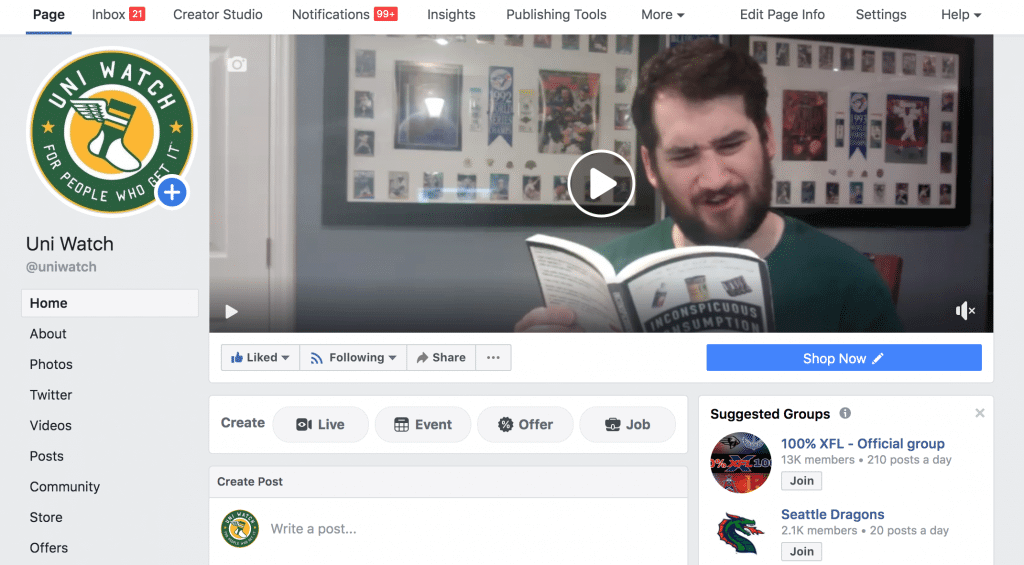
The bearded guy in that video is SportsLogos.net founder Chris Creamer — and the paperback he’s reading is my 1997 book, Inconspicuous Consumption: An Obsessive Look at the Stuff We Take for Granted, from the Everyday to the Obscure! It turns out that “Collector’s Corner” columnist Brinke Guthrie, who also runs our Facebook page, had arranged for Chris to create a little birthday shout-out video for me. How awesome is that?! Now that my birthday is over, the video is no longer featured on the page, but Chris allowed me to YouTube it for posterity:
I can’t even begin to express how special this was. Chris and Brinke, you guys are the best!
For reasons that I’ll explain in a minute, the Captain and I moved our daily porch cocktail happy hour, which usually takes place around 6pm, to 4pm. Since it was a special day, our beverage was champagne, and we were joined, via Facetime, by our friend Carrie (you can’t really see, but that’s her on the Captain’s phone):

The reason we moved up the porch cocktail time was that we had an appointment at 5pm. As I mentioned on Friday, one of my best friends — a guy named Matt Weingarden, who’s also known in R&B radio/DJ circles as Mr. Fine Wine — was born on the same day I was. Another one of his friends arranged a virtual birthday happy hour for him via Zoom, and we were among the invitees. So we all hung out, compared cocktails, and so on. And every time someone joined the group and wished Matt a happy birthday, Matt would say, “Don’t forget, it’s Paul’s birthday too!” That’s Matt at the top-right corner of this photo (he was one of several people who chose to get dressed up for the occasion), and the Captain and I are two squares to the left of him:

By this point we were, frankly, pretty soused. But it was time to make dinner! Earlier in the week, the Captain had asked me what I wanted to eat on my birthday, which was a tricky question — I hadn’t eaten at home on March 21 in many, many years, because I usually convene a party at a bar or restaurant. But when I was a kid, my mom would make whatever I wanted on my birthday, and there were several years when I asked for Chinese-style spareribs, which were my favorite food at the time (and still rank pretty high today). So I suggested that we make that, and the Captain readily agreed.
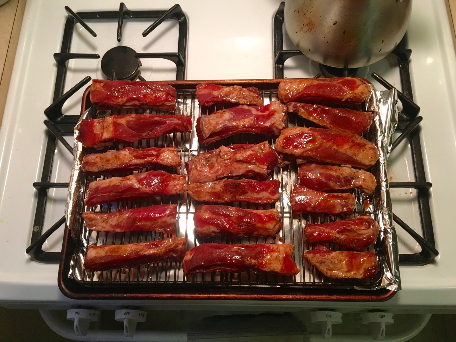
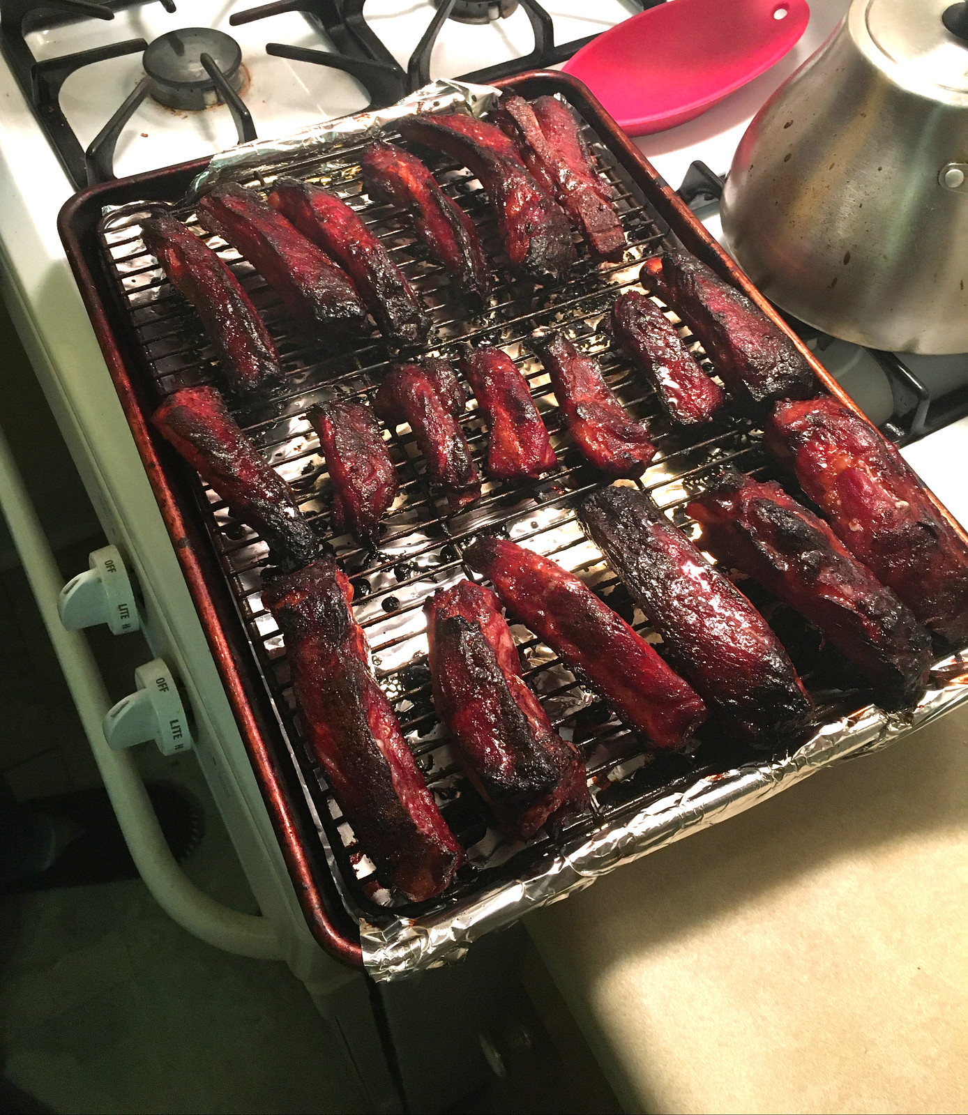
We found a simple but yummy-sounding recipe from the great J. Kenji López-Alt, assembled the necessary ingredients (finding raw spareribs in the midst of a pandemic was a bit more challenging than it would otherwise have been, but I called ahead to minimize shopping trips), and got the ribs marinating on Friday morning. Here’s how they looked just before going into the oven and just after they came out:
Since we were having Chinese-style ribs, the Captain decided to make some fried rice. Add-ins included carrots, scallions, shrimps, eggs, and a lot of spices and flavorings:


The ribs weren’t as charred as they look in that last photo. And man were they good! We’ll definitely be making this recipe again. Highly recommended!
And of course no birthday would be complete without a cake. As some of you know, I love anything mocha, so the Captain made me a mocha cake with mocha frosting:


Finally, a birthday should have presents. I don’t really need anything, especially at a time like this, but the Captain nonetheless got me some good stuff:
• When I got my current phone a few years ago, the Captain happened to have an extra peach-colored case that fit that model. Peach isn’t really one of my colors, but it seemed silly to spend extra money on a new case when this perfectly good peach one was available, so that’s what I’ve used for the past several years. Happily, the peach period is now over, because one of my birthday presents was a new forest green case:

It may not look particularly green in that shot (the color is surprisingly difficult to capture in photos), but trust me, it’s green. And I love it!
• Last month, before the world blew up, we were at a neighbor’s house for a pot luck dinner, and their kids were playing with a toy called Flow Rings, which I found completely mesmerizing. By the next day, I had forgotten about it, but the Captain saw how much I liked the toy and got it for me.
So what are Flow Rings, and why do I find them so mesmerizing? As the manufacturer explains, they “aren’t really rings, but a single piece of super-lightweight metal shaped into interconnected spirals”:
The way they “bloom” is pretty cool, but the best part is how they move along a cylindrical surface — like, say, an arm:
It feels really neat against your skin (or at least against my skin — your mileage may vary and all that).
The instructions suggested that we try having it move down the length of on an extension cord because it “looks like a floating metallic soap bubble!” So we tried that, and sure enough:
• As you know, I love salesman sample catalogs, so the Captain got me this:

Okay, that’s (more than) enough about my birthday. I hope the larger point — that we can still maintain some joy in our lives, even during this terrible period — came through. Thinking about that has been a helpful exercise for me, and I hope for you too.
Finally, I want to acknowledge the many, many Uni Watch readers who sent me birthday greetings via various channels. Thanks so much, people — each and every communiqué made a difference, really.
(Oh, and in the midst of all this, I learned that the Tugboat Captain’s nephew, who’s in junior high school, was also born on March 21. Happy birthday, Jude!)

Click to enlarge
Pin Club update: Reader Jonathan Gutierrez has created his own corkboard display for the monthly Uni Watch Pin Club series. “My plan is to frame it, but I don’t know who would sell a frame thick enough for cork board and pins,” he says. Anyone have any recommendations?
If you want to get caught up on the Pin Club program, the January, February, and March designs are still available until they sell out (plus we’ll be launching the April design on schedule, and the May design is now in production). You can save 15% on the price of the pins — and on everything in the Uni Watch Shop and the Naming Wrongs Shop, for that matter — by using the checkout code COMMUNITY.
Speaking of discounts, the following price breaks are in effect until further notice:
• Custom-designed Uni Watch membership cards, which usually cost $25, are now $20.
• Uni Watch seam rippers, which usually cost $6, are now $4.
And if you’d like to support Uni Watch via a donation, instead of a merch purch, you can do that here. My thanks, as always, for your consideration.

Membership update: Eight new designs have been added to the membership card gallery, including Jim Alexander’s, which is based on Borussia Dortmund’s 2017-18 Champions League jersey (and, as you can see, is one of our rare vertically oriented cards). Let’s heard it yet again for card designer Scott M.X. Turner, who did a sensational job with this challenging design.
Meanwhile: Ten days ago, on Friday the 13th, I ran a post about why some readers have chosen No. 13 for their membership cards. One of the comments that day was from reader JohnMark Fisher, who said, “Awesome ‘13’ post! This immediately got me thinking about how I’d love to see the breakdown of the frequency of each number on these cards. Does ‘7’ appear twice as often as the next-highest number? What is in second place? … As a ‘7’ person myself, I think it’s safe to assume that’s the leader, but maybe not??”
In an attempt to let no good idea go unpunished, I emailed JohnMark and asked if he’d like to crunch the uni-number numbers himself. He agreed, so I sent him all my files and records for the membership program, dating back to the project’s inception in 2007.
JohnMark has now summarized his findings. Before I show them to you, a few disclaimers: First, we’ve had a big surge in membership sign-ups over the past week (thank you!), but JohnMark’s research was based on the files I gave him on March 13, so any enrollments since that date are not reflected in his work. He adds:
I did my best to remove duplicates based on name or reprints, but I’m sure some stuff fell through my quality control checks. Then there are some people with multiple cards with different teams showing the same number. I quickly went through the list and tried to keep those because ultimately it’s a totally new design and justifies the additional tally (I don’t remember who, but I thought I remember someone having three distinct 13 cards). I also filtered out all of the cards with no number, and also the ones where the number was the infinity symbol, the pi symbol, etc., because that would have been too cumbersome to tally and require a lot of fine-tuning that I just didn’t have the time for.
Now then! JohnMark has summarized his findings in this chart:
The chart only shows entries for uni numbers that have been used on membership cards more than once. There’s also this spreadsheet, which shows all numbers, including those used only once.
Among the findings:
• The most frequently used number is, in fact 13! When I ran the entry about people who chose that number, I had no idea that it was the top choice — fascinating! It appears on 89 cards (more than my own quick tally had shown). The runners-up are Nos. 9 and 17, with 79 appearances each.
• No. 7, which JohnMark thought would be most popular (and which he and I both have on our respective cards, coincidentally), is tied for 12th, with 61 appearances.
• Every number from 0 to 99 has appeared at least once, and all of those except 85 and 95 have appeared at least twice.
• If you look at the chart, you’ll see there’s a big drop-off as the numbers get higher than 24 — except there are spikes for the double numbers (33, 44, 55, etc.), which is a fun trope to see.
Please join me in thanking JohnMark for his excellent work. Really fun stuff!
Want to skew this data toward other uni numbers? Ordering a membership card is a good way to support Uni Watch (which, frankly, could use your support these days). And remember, as a gesture of comm-uni-ty solidarity, the price of a membership has been reduced from $25 to $20 until further notice.
As always, you can sign up for your own custom-designed card here, you can see all the cards we’ve designed so far here (now more than 2,400 of them!), and you can see how we produce the cards here.
The Ticker
By Jamie Rathjen

Baseball News: The Triple-A Reno Aces made a “ransom note”-style reminder to wash your hands by using their and other baseball teams’ logos (from multiple readers). … Following up from Thursday’s post about the origin of the term “squatchee,” Joanna Zweip found that Bob Brenly, who helped popularize the term, kept on removing the squatchee when he was a coach with the Giants and the D-backs’ manager. … Mike Chamernik sent us a Twitter feed, Gummy Arts, run by somebody who draws athletes, primarily baseball players, in the style of trading cards. … Parts of the former Bush Stadium in Indianapolis were turned into an apartment complex (from @Yakineko22).

Football News: New Eagles CB Darius Slay is planning to wear No. 24 to honor Kobe Bryant (from multiple readers). … Jon Viera sent us these city-themed NFL helmet concepts. … At the 1995 Orange Bowl, some Miami (Fla.) players had messages written on their helmets (from Ethan Rowley). … Late-’60s BC Lions K Ted Gerela once posed in uniform with a mountain lion (from Wade Heidt). … Charles Allison sent us an article about the University of New Mexico art professor who invented rounded “Douglass numerals” and the copyright he got for them.

Hockey News: Ducks C Adam Henrique was wearing a team-themed racing helmet yesterday for the first of NASCAR’s weekly races on iRacing while its series are postponed (from Jakob Fox).
.

Basketball News: Readers Tony DiRubbo and Jakob Fox sent us a picture of Kansas State’s Chuckie Williams wearing a facemask during the 1975 NCAA tournament.

Soccer News: The National Independent Soccer Association’s Detroit City released two new shirts (from Ryan Keberly). … While looking for something else, I found this picture of Ghana goalie Simon Addo wearing a No. 1 shirt turned into a No. 12 shirt in the 1992 Summer Olympics’ third-place game. That’s doubly interesting, because Addo apparently wore No. 16 in the tournament. … DC United’s red shorts have disappeared on the FIFA 20 video game (from Darian Somers).

Grab Bag: A few items from what was briefly everyone’s new favorite sport, Australian rules football, before the AFL and AFL Women’s were suspended and canceled yesterday, respectively: Adelaide filled the front rows behind one of the goals at the Adelaide Oval with 200 guernseys that are to be signed and given to club members. … Fremantle’s guernseys feature three white chevrons on purple, and vice versa, but the women’s team turns the middle chevron pinkish (officially “crimson”). … Twitter-er @beartorius sent us all 18 AFL teams’ first-choice guernseys, in alphabetical order from left to right and top to bottom. … Australia’s National Rugby League isn’t stopping unless the government tells it to stop, so of course the players elbow bump right after they’re done tackling each other. … My brother Nate Rathjen says Loudoun County (Va.) HS is getting a new logo, which replaces a previous knockoff of Virginia’s logo and is already appearing even though it seems like it’s being phased in for next year. … The editors of Golf Digest weighed in on the topic of which hoodies are acceptable golf attire (from @DeadstockDan). … Here’s an article on the guy who has the world’s largest collection of pull tabs from beverage cans (from Trevor “Teebz” Alexander). … In the latest sign that the Olympics will be cancelled, Canada has announced that it will not send athletes to Tokyo this July, even if the summer games take place. … Remember when Paul said the pandemic was affecting everything except the weather forecast? It actually turns out that it is affecting the forecast’s accuracy, because a lot meteorological data comes from commercial aircraft, many of which are now grounded (from the Tugboat Captain).

Click to enlarge
What Paul did last night : It was chilly yesterday evening in Brooklyn — 39º as of 6:15pm — but we were determined to maintain our porch cocktail ritual, so we got bundled up and went outside. Beverages were a Penicillin for the Tugboat Captain and a Bud Copper for me. (I’ll have more to say about Bud Copper later this week.)
So that was Sunday’s porch session, and I already showed you Saturday’s session earlier in today’s post. But Friday’s porch cocktail was notable because we had a guest! While we were cocktailing, my old friend Virginia, who I hadn’t seen in maybe 10 years, walked by. Turns out she recently moved to our neighborhood. I didn’t recognize her (her hair has changed), but she recognized me. So she ended up talking with us for about 15 minutes — from a safe distance, of course (click to enlarge):

I will continue to put each daily photo in this Flickr set.
Meanwhile, how is Uni Watch girl mascot President Caitlin holding up during the pandemic? Quite well, all things considered:
Daily cat break pic.twitter.com/tcQ6OZnbqo
— Mary Bakija (@mabatron) March 21, 2020
Stay safe, stay well. — Paul
Very cool to have my card featured. Thanks Paul and crew! Scott did an amazing job with the design.
Paul – If you like mocha and booze, I can’t recommend Pabst Hard Coffee enough. I’m a big craft beer fan and there’s absolutely no reason this stuff should taste as good as it does.
I really don’t like to say, “Happy Belated Birthday,” because, you know, it already happened.
So, I’ll just say I’m glad you had a great birthday, and I hope you have an extraordinarily great Monday today!
Where are the ten other handsome geniuses who picked #52?
I presume the spike at 44 is my fellow Orangemen who Get It ™!
Maybe some, but also because of Hank Aaron, Reggie Jackson and Jerry West among others.
Jonathan’s cork-board display is really cool! With the pennants no longer being sold, I’ve been trying to find a way to display the pins. Anyway he can make a .pdf of that available for at-home printing?
Wait – no more Uni Watch pennants? I didn’t realize that! Let me check with Oxford Pennant about that.
Seems like it’s still available:
link
It’s interesting to me that a lot of the popular membership card numbers are odd. Is that a normal phenomenon? I wouldn’t say I’m OCD, but for the most part, even numbers, especially on Unis, look so much more aesthetically pleasing. 24 looks so much better than 23, for example. I wonder if anyone else shares that same thought, or if I’m just spewing off nonsense.
I could do a whole article on different numbers and how some look better, faster or tougher than other numbers. Maybe I will during this extended Lenten retreat we’re all on together…
Regarding the new Loudoun County HS logo in the Grab Bag, it’s pretty much a modern duplicate of Santa Barbara City College Vaqueros’ logo. link
I use Riker Mount boxes to display my pin collection. Inexpensive and available in lots of different sizes. link but they are sold on Amazon and other sites as well. That template of Jonathan’s would fit in one.
Hey Paul. Love seeing the new membership cards every time they come out, especially the featured ones. I remember you encouraging people to add a comment on flickr with the inspiration for their card a while back; any chance you can get this going again? Sometimes the most interesting designs are the hardest to guess!
Paul, any chance of a daily President Caitlin update? My cat Clyde doesn’t have much of an interest in uniforms (apart from when he takes a nap on one of mine) but he does like looking at pictures of other cats.
I’ve been doing it for the past few weekdays, Matt!
Dear Paul, a happy belated birthday. Stay safe and I will faithfully visit Uni Watch every day.
Since I learned hoodies are not acceptable golf attire, I will now wear one every day. Stickin’ it to The Man!
I have always loved those “Douglass” numerals, and I am sure they go by different names (“University Gothic” springs to mind). The most recent team to use them are the UNH Wildcats’ football team (I think). They were also used by the 1979-80 Dallas Mavericks, the 1978-84 San Diego Padres, and the 1977-80 Seattle Mariners.
HBD Paul. Love the view from your front porch.
Happy Belated Birthday, Paul.
March 21st is a day for us, too – it is World Down Syndrome day. The reason is that since Trisomy 21 – three copies of the 21st chromosome – is the most common variant of Down syndrome, 3.21 would be as good a day as any to promote awareness.
World DS Day even has a uniform – mismatched socks. That’s how we let the community know we are aboard.
Never knew that! Thanks for the education, and stay safe.
I’m happy to see that 19 placed so high! Johnny U, needless to say, was the inspiration for my membership card, rendered in Baltimore Colts’ home blue. I’m not surprised to see that odd numbers were popular in general.
I played team sports in grade school, high school, college, and beyond and, it wasn’t until I started playing soccer in my 40’s, that I got to pick my own number. Unfortunately, 19 was already taken, so I chose 13 (my second favorite number…put the 1 and 3 together, and they (sorta) form a “B”).
My high school basketball team had an interesting uni/numbering quirk: we had even numbers at home and odd numbers on the road. Has anyone else ever seen this?
Fellow 19 guy here. But I may have to get a 22 card since that was my childhood favorite.
It used to be standard practice for NBA, college and high school hoops to do the even/odd-home/away thing. Last example I can think of was the Phi Slama Jama Houston Cougars. Hakeem (then “Akeem”) Olajuwon wore 34 at home and 35 on the road.
Pleased to read that you had a lovely birthday!
Lee
I have to say, it’s always warmed my heart the good relationship you and Mr. Creamer have! When dealing with such a specific topic, there could be the tendency for rivalry there, but there has NEVER been as far as I can tell.
Chris and I have always been friends and allies, not adversaries. Lots of two-way respect. One of the nicest days I had in 2019 was the day I spent at the San Diego Zoo with him and his family!
Love to hear that, you’re both good people!
Happy belated birthday, Paul! Thanks for giving me so many hours of enjoyment discussing the fine grained details of the uniform world. Also, your Char Siu look positively delicious.
I was going to argue the semantics of pluralizing shrimp as shrimps. I never realized that you could tack the S on the end. Always thought the plural of shrimp was just shrimp. One learns something new every day.
I love it when a menu includes the “s” — it sounds more festive, more bountiful, more celebratory, just MORE. It’s like there’s an implied exclamation point: shrimps!
Hey Paul, you’ve mentioned “shrimps” over “shrimp” before, and it has been part of my lexicon since you brought it up awhile back. Indeed… it’s festive!
And I think others may disagree with the following… I sometimes say “fishes!” and “crawfishes!” as well.
Seems to work for seafood more so that other types of food.
I am hoping the Rams get it right today.
Long time reader of the site, and this is my first time actually catching an unveiling live :-)
Meh. The Ram Head is a nice touch of “past” and “future”.
That LA logo is hideous.
The new Rams logos are OK; the “leaked” logo (“LA” with the horn rising out & back from the “A”) is not as bad as it first appeared, clearly intending to evoke a 3-sided, 3-dimensional ram horn (the “leaked” version did it in 3 segments, whereas this one does it in 2). This might appear on the uniform front shoulder, if at all. The new “ram head” logo is also OK; not terrible, not great, could appear on the sleeves.
Wordmarks are good. Colors bode well.
The Rams wanted this uniform to coincide with the opening of the new stadium. Virus apparently stopping construction work. Wonder if/when the Rams (and the Chargers) have to make a decision to return to the Coliseum and the Soccer field?
That’s a really great point I hadn’t thought of, Tim — dang.
If I recall, you’ve also got this same issue in Las Vegas with the Raiders’ new stadium.
Will Raider Nation invade Sam Boyd Stadium? We will stay tuned and find out!
According to Pro Football Talk on the weekend, they amended the stay home order to allow for work on the LA stadium to continue.
link
Same with the Las Vegas stadium
link
Granted these updates were as of the 20th and 19th respectively and things are changing quickly, so it could change.
Happy belated birthday Paul…
1. Happy Birthday, Paul!
2. Good job by the Rams on the colors and especially the ram’s head logo. Even the LA logo is not bad when rendered in the new colors.
3. The “NFL city helmet” concepts are actually quite good, the Cleveland “paper bag” one was definitely inspired.
Agreed. On the Rams, it’s a very very extremely OK design. Not bad, not great, perfectly fine. They got the colors right, the old-timey ram’s head is terrific, the wordmarks feel very Los Angeles-y to me, and the horned LA is inoffensively adequate. I wonder whether the segmented horn will show up on helmets? I also wonder if anyone in the design and approval process was aware that there’s another NFL team in LA whose name starts with C and whose main visual identity is a curved lightning bolt?
I assume jersey numbers will be designed to look like they belong to the same family as the wordmarks, and that will be fine too.
I can’t help but think that the helmets will keep the traditional “flat” horn design.
Might be a riot otherwise.
– Agreed, love the colors
– I could swap opinions on the logos tho, I think the ‘LA’ is actually pretty good & the “Tarrant Theory” will prove this overtime. I think the Ram’s head logo could have been better.
I never knew there were neighborhoods in Brooklyn with single family homes! I haven’t had the chance to explore NYC much though, and don’t know the intricacies of the city.
Another tidbit about 321. The area code for Cape Canaveral, FL is 321, as in a launch countdown.
Jonathan Gutierrez: try putting your pins in a shadow box. Just a thought.
Paul, I wish your book was still in print and for sale directly by you along with the other UniWatch merch. I can only speak for myself, but I imagine other readers would also love to buy it directly from you to provide support in these times.
Thanks, Brian. It was published more than 20 years ago, so it’s been out of print for a long time!
I like the new Rams insignia, but I’m wondering how the shadows and modeling will print on paper. Perhaps appearance on screen is considered a higher priority in this day and age.
I have made several displays for pins using shadow box frames.
It creates a really great display case effect
The Rams logo is being crucified on Twitter and fans have already created and submitted an alternate that’s going “twitter” traction.
link
Happy belated birthday to you, Paul! As someone who frequently visits but rarely comments, I’d like to express my gratitude for your outstanding work and attention to the details we enjoy.
Thanks, Doug!
Marry that woman already!!! Sheesh!
Happy belated birthday, Paul!
I am one of the few, the proud, the six people who chose 93 for their Uni Watch card. Why? It was my class year from my college, which Paul once said was one of the few times he liked the use of purple in a uniform.
link