Heads up, people! If you’re sick of bathing in Purell, stocking up on toilet paper, and watching your 401(k) shrivel away to nothing, I have some big news that should help distract you:
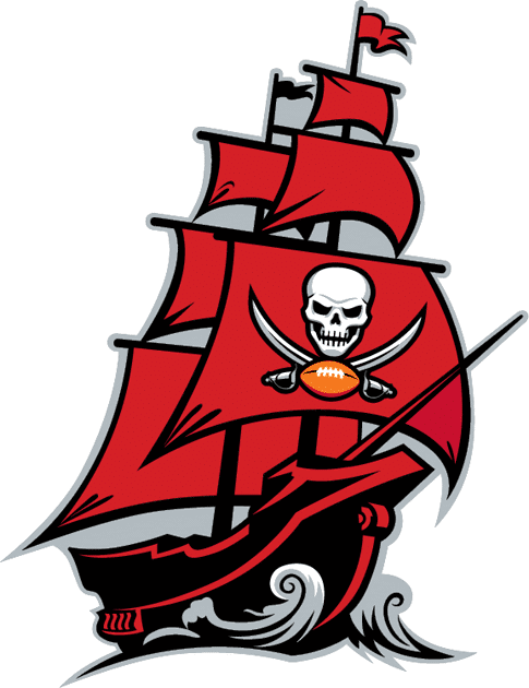
I have seen the Buccaneers’ new uniforms.
The uniforms were shown to me by an industry source who has requested anonymity. I did a fair amount of vetting to confirm the source’s credibility, and it’s clear to me that what he showed me are indeed the team’s new uniforms. I was not permitted to take photos or other visual documentation, but I was allowed to take detailed notes, so I will give you a point-by-point description of the designs — a fairly easy task, as it turns out, because the designs are very straightforward. As Bucs coach Bruce Arians recently suggested, they are very similar to the Bucs’ Super Bowl-era set.
Ready? Here we go:
• There are two jerseys (red and white) and two sets of pants (pewter and white). The pewter pants will not be as shiny/metellic as the old ones, because that’s the reality of the fabric being used these days.
• The red jersey has white block numbers outlined in black (but no orange layer, at least that I could see). The “Buccaneers” wordmark has been restored to the chest, but this time it’s rendered in black (not white, as it had been in the Super Bowl set). Block TV numbers are on the shoulders. The Bucs’ current ship logo appears on the sleeves. The back of the jersey has the same white numbers outlined in black, along with white nameplate lettering.

• The white jersey follows the same basic design, but with red numbers outlined in black (again, no orange, at least that I could see). The chest wordmark is once again black — same as on the red jersey. I was not able to view the back of this jersey, so I don’t know which color they’re using for the nameplate lettering. It’s almost certainly black, but I don’t know that for sure.
• The pewter and white pants both feature fairly wide red side striping with black outlining (no orange layer, at least that I could see).
• Socks for both pant options are black over white.
• I have not seen the new helmet, but I’ve been told that it’s mostly the same as the current helmet — pewter shell, oversized logo — but with a black facemask instead of chrome. The shades of pewter on the helmet and pants will match up more closely than in the past.
• I have not seen the Color Rush design, but I’m told it will be mono-pewter.
That’s it — pretty basic and simple, really.
Since I wasn’t allowed to take photos, I asked Uni Watch reader/Photoshopper Nic Schultz — the guy who does the Mr. Yuk treatments when NBA teams get new jersey advertisers — if he’d be willing to create a mock-up for us, and he generously obliged (for both images, click to enlarge):


Again, I wasn’t permitted to retain any photos or other visuals, but I’m pretty sure the mock-up is a match for what I was shown. My source has also confirmed that it’s accurate. Although we mocked up only two combos — red/pewter and white/white — it’s entirely possible that they’ll mix and match the jerseys and pants, just like in the old days.

So what do I think? Here are some quick thoughts:
• Obviously, scrapping the alarm clock numbers and the sleeve wordmarks are both huge upgrades. On that basis alone, this redesign is a win.
• I’m a bit disappointed by the apparent removal of orange from the color scheme. I love orange as an accent color — it gives a lot of visual bang for the design buck (plus it figures prominently in Buccaneers history, of course). But it’s not the end of the world.
• Assuming they’re actually keeping the oversized helmet logos (again, that’s what I’ve been told but I didn’t see it myself), that’s another mild disappointment. But also not the end of the world.
• Although I personally would have welcomed a return to the creamsicles, or at least some small way of bringing Bucco Bruce back into circulation (couldn’t they have put a recolored version of him as the sleeve logo?), everything I’ve heard from Bucs fans in recent months suggests that they’re going to love this redesign. Kudos to the Bucs for giving their fans what they clearly want.
• They’ve basically turned back the clock here, as if the uniforms from the last six seasons never happened. The whole thing is a big “Never mind.” The Browns will apparently be doing the same thing. It all seems like a pretty serious repudiation of the Nike aesthetic.
Finally, there’s this: While this leak will presumably take some of the juice out of the unveiling event the Bucs had planned for the days leading up to the NFL draft, it’s worth asking whether any of the scheduled NFL unveilings — or even the draft itself — will take place according to plan. Considering the pace at which the world seems to be turning upside-down, the status of any sort of event now seems questionable at best.
(Big thanks to Nic Schultz for patiently working with me on the digital mock-ups.)
Click to enlarge
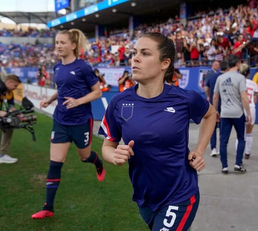
Civil disobedience: Players on the U.S. Women’s National Team wore their warm-up jerseys inside-out prior to last night’s match against Japan. The move, which had the visual effect of hiding the U.S. Soccer crest, was a protest connected to the team’s pending gender discrimination suit against U.S. Soccer. On Tuesday it had been reported that U.S. Soccer’s legal defense in that case included the assertions that that the women should be paid less because the men’s team “requires a higher level of” skill than the women’s team, and that “The job of a [men’s national team player] carries more responsibility” than the jobs of the female players. After that news broke, longtime Sports Illustrated soccer writer Grant Wahl called for U.S. Soccer president Carlos Cordeiro’s resignation.

Virus Watch: Well, my timing sure is impeccable. Yesterday morning I wrote about how it might look if we ended up seeing televised games without live audiences. By the end of the day, that possibility had become a reality on several fronts.
Here’s what we know so far:
• March Madness, which is slated to begin next Tuesday, will take place without fans. That includes the Final Four, which was originally slated to take place at the Atlanta Falcons’ domed football stadium but will now be moved to a smaller venue. Games scheduled for several other large venues may also be moved.
• The remainder of the ACC Tournament will also be fan-free.
• In the NBA, it was initially announced that tonight’s Warriors/Nets game in San Francisco would take place in an empty arena, and that the Warriors would continue to go fan-free at home for the foreseeable future. But then the league just went ahead and suspended its season altogether.
• In the NHL, two teams — the Blue Jackets and Sharks — announced that their home games will be closed to the public. But that may turn out to be moot, because the league is planning some sort of statement today, which could mean that they’ll follow the NBA’s lead and suspend the season.
Update: The NHL has now suspended its season.
• MLB would reportedly prefer that teams find alternate venues in cities that are less virus-impacted, instead of playing in empty ballparks. One team is already moving in that direction: With gatherings of over 250 people now banned in the Seattle metro area, the Mariners will not play their first seven scheduled home games in Seattle. It’s not yet clear where those games will be played.
Update: ESPN’s Jeff Passan is now reporting that MLB will suspend spring training and delay the start of the season.
Obviously, this is a very fluid situation, with more postponements, cancellations, relocations, and empty-building games likely to be announced. Personally, I have a hard time believing the MLB season will begin as planned on March 26, but we’ll see.
That image at the top of this section, incidentally, is one of the many coronavirus illustrations floating around out there. (I chose that one because it’s rendered in Buccaneers colors.) It’s weird to say this about something that’s causing so much pain, stress, and death around the globe, but it’s … kinda beautiful..? Nature makes pretty shapes, even if they happen to be deadly.
In a vaguely related item, the Tugboat Captain’s birthday was a little over a month ago, and one of her friends got her this dried spiny pufferfish thingie. It’s completely bizarre-looking and also completely delightful, and I’ve enjoyed having it on display in our living room. But the other day it occurred to me that it kinda/sorta looks like the coronavirus (click to enlarge):

Did I mention that nature makes pretty shapes?
The Ticker
By Paul

’Skins Watch: Reader Timmy Donahue reports that the Twitter hashtag #notyourmascot is a good source for the latest info on efforts to eliminate inappropriate uses of Native American imagery in sports and beyond. … In a non-binding referendum, students at the U. of Illinois have voted to adopt the Belted Kingfisher as the school’s new mascot, replacing the NCAA-banned Chief Illiniwek. The matter will now move to the school’s administration. … The school district in Paw Paw, Mich., will no longer call its teams the Redskins (from our own Alex Hider).

Working Class Wannabes™: St. John’s basketball coach Mike Anderson says, “New York is a blue-collar kind of town. St. John’s is going to be a blue-collar type of basketball team.” And you can tell he really means it from the suit he’s wearing in the photo accompanying that article (from @TheRealBigCoach).

Baseball News: The new name of City Stadium, home of the Single-A Lynchburg Hillcats, will be an ad for a bank (from Noah Crouch). … The Yankees’ official Twitter account used an out-of-date Marlins logo yesterday. Trolling Derek Jeter, perhaps? (Thanks to all who shared.) … Former MLB OF and new Hall of Fame inductee Larry Walker, who grew up playing hockey, will be the Colorado Avalanche’s “honorary emergency goalie” on Sunday. … The archives at Iowa State University recently acquired an original wool uniform that was worn by an ISU player in 1910! (From @kagavi.) … Here’s a good rundown of new and tweaked minor league logos for 2020 (from Jason Hillyer). … The Rangers’ new ballpark has a pretty cool jersey-based mural (from Dustin Perez). … Illinois State wears black caps with an almost indiscernible black logo. They also appear to have some serious problems with their batting helmet logos…. The U. of Tennessee got new uniforms in 1911 — and the local newspaper wrote about it! (From Timmy Donahue.)
College Football News: Some new uni numbers for Alabama.
.
.

Hockey News: The Canadiens, who had previously worn a “16” memorial helmet decal for Henri Richard, have now added a jersey patch. … Cross-listed from the baseball section: New Baseball Hall of Fame inductee Larry Walker, who grew up playing hockey, will be the Avalanche’s “honorary emergency goalie” on Sunday. … Tortorella for President! Blue Jackets players had some fun wearing campaign-style “Torts 2020” shirts for coach John Tortorella yesterday (from Alan Kreit).

College Hoops News: CBS plans to unveil a new graphics package, including a new score bug design, for March Madness (from Tod Meisner). … See the little “PS” inside Stanford captain Daejon Davis’s captain’s “C”? That’s in honor of former Cardinal captain Peter Sauer (good spot by Matthew Wolfram). … New floor design this year for the SEC tourney.

Soccer News: New retro-style kits for Swedish side AIK (from our own Anthony Emerson). … From our own Jamie Rathjen: “At the SheBelieves Cup, the USWNT’s invitational tournament, England and Spain both wore their second kits in the first game today. England’s is red and Spain’s is white, meaning each team wore the other’s first-choice color. The same thing happened with the USWNT/Japan game, which had the U.S. in blue and Japan in white, so both teams wore their second kits and both wore the opposing team’s first-choice color.”

Grab Bag: Tennis star Roger Federer has reacquired his “RF” logo from Nike. … Drake’s clothing company, OVO, is suing another lifestyle brand for logo infringement. … New volleyball uniforms for Moeller High School in Cincinnati (from proud alum Alex Hider). … Nike is reviewing its procedures after reports that Uighur Muslims may have been coerced into working at the company’s Chinese factories. … The NLL’s Toronto Rock will wear indigenous heritage uniforms on Friday (from Wade Heidt). … Atlanta mayor Keisha Lance Bottoms announced yesterday that her State of the City address is being postponed “upon the request of its title sponsor, the Coca-Cola Company.” Why exactly should a municipal function like this have a corporate sponsor advertiser to begin with? And why exactly would the advertiser be issuing edicts to an elected official? Seriously fucked up (from @jayappletree). … Gotta go to Mo’s? Better go fast — Modell’s filed for bankruptcy yesterday and will close all its stores following a liquidation sale that will begin tomorrow (from the Tugboat Captain).
Our latest raffle winner is Andrew Gelman, who’s won himself a Uni Watch membership card (and has chosen a doozy of a design motif for it — the mighty Caribous of Colorado!). Congrats to him, and thanks again to Kary Klismet for sponsoring this one. — Paul
The Bucs had two jobs:
1) Ditch the alarm-clock numbers;
2) Make orange a prominent accent color.
So 1-for-2. An upgrade, for sure, but still a big miss. Good enough that I can put Tampa Bay back on the list of NFL teams I’ll root for if they’re on TV, but just barely.
Those watermarks are hideous
That’s why they have a ship
One would hope the de-nike trend of uniforms will help other franchises realize what a mess they usually come up with.
Disappointing redesign, I had hoped for this design but basically color swapped for the creamsicle colors (white helmet, orange jersey, white pants). That said, just about anything is an upgrade from the nike designed trash. And I’d second Paul’s thoughts on keeping the oversized helmet logo and lack of orange accents.
FWIW, the un-puffed Spiny puffer fish (porcupine fish) is one of the cutest animal EVER!
link
If such things could be quantified I’m pretty sure New York would be, overall, the least “blue collar kind of town” in the United States. What a joke
Actually, NYC probably has as large a percentage of blue-collar workers as any other city. It’s just not the part of the city that people think about, because they tend to think about Wall Street, Broadway, the advertising biz, the media biz, and other aspects of NYC that tend to be depicted in movies, TV shows, and the popular imagination.
*Every* city has a major blue-collar component. That’s why the whole notion of “We’re a blue-collar town” is such bullshit — it’s so universal as to be meaningless.
Interesting comments from the AS Monaco manager: “When we take the field we represent the billionaires and tax exiles who can’t be bothered to attend our matches. We will play with the arrogance, disdain and sense of entitlement that our fans expect.”
NYC has 8.5 million people. There are plenty of true blue-collar workers.
I’m not disagreeing with that. I’m saying that making a statement like the St. John’s coach did implying that blue collar work characterizes the essence of New York is absurd to me, at least compared to other cities.
Also this Buccaneers redesign, unfortunately and inexplicably dropping the orange accent, reminds me of the late-2000s Jaguars redesign that unfortunately and inexplicably dropped the gold accent
While there are many things to like about the new Bucs set, I’m still disappointed by two things
1) The oversized helmet logo – I’ve never seen the appeal and it just screams amateurish to me.
2) Bucco Bruce should return in some form.
Hey, thanks for the update! A few quick questions (if you happen to remember…):
1. Is the shade of red closer to the 97-13 uniforms, or the brighter red they’ve been using since 2014?
2. Given Nike’s inability to make pants with any kind of sheen, were the new pewters pants more matte?
Is there really no orange in the uniforms? It featured prominently in the teaser/announcement and would be such a slight to the fans if they all but eliminated it. Maybe they’ll use it for accessories, the way Tennessee uses red…
Again, thank you for keeping us posted! Doing the lord’s work.
Pants will not be as shiny as in the old days. I’ll add a note about that to the text.
Not a soccer fan (nothing against it, just no strong feelings either way), but good for the US Women’s team. That is some grade “A” BS going on there with the pay. Talk about tone-deaf.
The Federation has failed US soccer for over one hundred years. It’s a shame. There are so many more that should be standing up, but yet it’s been largely limited to the USWNT.
A casual observer (such as I, unaware of the lawsuit) could view the inside-out jersey thing as a stand against any number of issues the squad may have with current political/economic/social policies.
Poor optics without clear context…maybe not the most effective way to convey dissatisfaction with collectively-bargained(?)salaries and garner wider support.
Well, they also tweeted about it, and their protest was widely reported upon. I’d say they got their message out there just fine.
Not to mention, most of the people who will watch a women’s soccer exhibition tournament will certainly be fans enough to know the situation and have a good idea of the context for it.
If only the US Women’s National Team had agreed to their working conditions through collective bargaining.
Oh, wait. They did.
Further to the Larry Walker Ticker item, here is an article providing detail about his attempts to make the WHL’s Regina Pats as a goalie:
link
Larry Walker is not the only MLB player who is associated with the Pats. Former MLB OF Nyjer Morgan played 7 regular-season games with the Pats in 1999-20:
link
The USSF’s comments are a huge own goal. I don’t see how the players can win a gender discrimination equal-pay-for-equal-work suit. They compete in different markets. The lawsuit seems like an effort to gain political leverage and apply public pressure to negotiate fair financial practices and earn their fair share (which they don’t–the USSF structure obscures what the women generate and forces lower wages.) With those insults becoming public, the women just got a lot closer to winning even if their lawsuit loses.
Agree, it is apples and oranges given the revenue brought in by tickets, broadcasts, etc for the men vs women. To base this on gender discrimination has no standing. But yeah, ideally it opens the books enough to force them to receive a fair share of the revenue that they do generate.
Bucs missing the Florida orange is just not right.
Since the Buccaneers decided to steer away from full-on creamsicles (and I’m disappointed by that choice), it’s better to eliminate the orange than to shoe-horn it in there.
Why not have an actual throwback that they wear once or twice a year like several other teams. I think that would be a great choice.
They can’t have an actual throwback, though, as long as they want the primary helmet to be pewter.
Agreed. They missed a huge opportunity.
Was hoping the Bucs would have gone with white helmet shells to at least make throwback Creamsicles possible but they cleaned up a lot of the mess they made with the current set. And while many are sentimental for the Creamsicles, those uniforms are associated with terrible football. At least they went (almost) back to the uniforms they wore in their best era. Orange would be nice though.
These uniforms are terrible. You went back to the previous uniform, and REMOVED a color. Congratulations.
We miss you Bruce, you magnificent piratical logotype.
A particular former Browns owner was the grandson of the founder of M*dell’s, but didn’t have any hand in running the business.
Therefore, good riddance by proxy.
I grew up with Modell’s, and am sad they are leaving, I still frequently would buy sneakers there, along with Phillies, Eagles and other sports related clothing. Also don’t know why you don’t want to say Modell’s. Also good riddance, so you’re glad another sporting goods store is gone, leaving many unemployed, and now overpriced Dick’s Sporting Goods a monopoly in the NY/Philly metro region?
What is wrong with you.
Because if you’re from Northeast Ohio, we still harbor extreme levels of hatred for Art Modell, his incompetent son, and his entire family.
Great scoop, Paul!
The new Bucs set is definitely a relief. I share your disappointment that the over-sized helmet logo is still there, but maybe it won’t look as bad now that the rest of the uniform doesn’t look like shit.
Before, it was like a weird-looking cherry on top of an already hideous sundae. Maybe now, it’ll just be that quirky helmet that some people love and some people hate…
The inside-out shirts had the effect of hiding the US Soccer crest, but it did not hide the Nike logo or the 4 stars representing their 4 World Cup wins. Either very fortuitous or very well planned.
I tend to believe it was planned. At least the stars bit – the Nike logo is a lot less identifiable inside-out but the stars read exactly the same.
Sports Authority, MC Sports, now Modell’s… I still like buying sports apparel and equipment in person
You left out Herman’s.
Around where I live, Dick’s Sporting Goods is still going strong.
And Oshman’s
We also have Academy Sports here in FL.
In your Buccaneers rendering, he has the old wordmark on the chest. They haven’t used that wordmark in a while. Did you mean to use the old one? Or should it be the current one?
This is the current one: link
The use of the old wordmark in the mock-up is intentional.
BOOO on Tampa Bay, Bucco Bruce or GTFO.
Paul, is there a missing word in the piece on the USWNT? I saw tweets about “skill” last night. The “higher level” part?
Yes, thanks — now fixed.
My first uni watch edit! I’m so proud! LOL
Seconded. The UT color scheme with red accents, the swishy pirate (more Errol Flynn than Robert Newton) rendered in the “NFL Realism” school (Think Pat Patriot and the Raiders) are how I want MY team to look. In stormtrooper white, the Bucs were one of the NFL’s best looks.
The Bucs uniforms are fantastic. The new chest numbers are a huge upgrade and I actually think a little les pewtery pewter is a good thing. Glad they’re sticking with the extra large helmet loo too. That is a great look. And the black buccaneers word across the chest is also a great look!
As for the women’s team I feel terrible that USSF is treating them this way. Our men’s team is a pathetic and embarrassing excuse for a football team year in and year out. The women are dominant, competitive, and exciting.
As for the women’s soccer team being paid less because they bear less responsibility and have less skill, which is arguable.
I would have to say the bottom line is that women’s soccer is just not as popular as men’s, and therefore doesn’t have the same financial following as men’s. If product A is more popular than product B, wouldn’t the folks running product A be paid more (more sales, inventory, etc) than product B?
There’s a lot of stats that show how much more the USWNT has brought in compared to the USMNT. Additionally, the women have been neglected when it comes to travel, per diem, etc. — those things that are easy to keep “equal.”
The biggest discrepancy comes to the FIFA payouts for each competitive event that the NTs compete in.
Shouldn’t representing the country receive the same “reward” as each, regardless of gender? But, the “bonuses” added in be different amounts if each NT meets the criteria that could be established.
No. That money comes from the advertisers. The only alternative would be to reduce the amount that the USMNT gets from participating in FIFA, but it certainly doesn’t make sense that FIFA should get to keep that money.
The real issue is that it’s not the skill on the soccer field that matters, it’s the skills at the box office.
Nope, U.S. Women’s Soccer now brings in more revenue than the men.
I think I agree with your assessment of the Bucs’ redesign (surprise surprise) and also of the larger trend, which is away from the so-called “Nike aesthetic” that started with the Broncos’ 1997 redesign and has been infecting the NFL ever since, particularly since 2012. We’ve seen the Jaguars, now the Bucs, and shortly the Browns, replace the “Nike aesthetic” which much simpler, more basic and traditional designs, we’ve seen the Dolphins tweak their design to make it more traditional-looking; even the Jets’ redesign, while a downgrade and in no way “traditional,” is nonetheless very simple, basic, uncomplicated and uncluttered. In other words, on the football-uniform/clown-suit scale that I’ve arbitrarily made up, the last several NFL redesigns have been on the football-uniform side rather than the clown-suit side, with the Titans being the outlier, the exception that proves the rule.
Then again, let’s see what the Rams and Falcons have in store…
The white/white combo looks far too similar to the Falcons’ older uniforms. A red/white combo would only intensify this similarity. I wonder if these changes were proposed by Tampa Bay due to what the Falcons’ redesign would be?
If the numbers on the white/white combo were to be orange, but outlined in red, I bet it would look better than what we see here (and on a similar front, I’d outline the numbers on the red/pewter combo in orange).
I love your outlining ideas. Small additions like that could have elevated this design.
And they DO look like Falcons uniforms. You’d think a rival would want to create some separation!
Watch Atlanta blow all our minds with their new orange set.
If I were starting a Buccaneers’ uniform from scratch, they would be solid black with a white skull and crossbones on a black helmet. That being said, I’m dreading the revealing of yet another bespoke font for Tampa Bay’s numbers (that horse seems never to return to the barn) and the day the NFL turned away from shiny pants’ material is one of the darkest days in football history. Pewter just looks like a blah brown.
Pewter > Creamsicles. I’m kind of indifferent to the logos the Bucs currently use, but the helmet they’ve been using since the move to pewter/red has been one of my favorites forever. It’s a great color, great sparkle, and is so unique that I can’t think of a single other football team on any level that uses it. Kudos to them for keeping it and not going back to a white shell, which at this point is the least-unique thing you can do to a football uniform these days. I get that the creamsicle uniforms are fun, but they’re not really the Bucs anymore. The Bucs are (rightfully) pewter.
Here, Here! Its not that the creamsicle uniforms ugly, they’re actually a really nice looking uni. Its more that pewter is exactly right for the Bucs and sets them apart from any football/sports team.
It’s Hear, Hear!
*we do nitpick here at uniwatch, don’t we? :)
I agree; the 1997-2013 version was one of my favorite NFL unis of all time.
I really wonder what teams and leagues are thinking with 7 games moved, or delaying for a month. Do they really think this will be solved in a month?
The Final Four looking to move out of the Atlanta Falcons’ domed football stadium, also know as Atlanta United’s domed soccer stadium, could have another aesthetic impact. Atlanta United’s CONCACAF Champions League Game next week was moved to Kennesaw State because the dome was unavailable due to Final Four preparations. There’s some fan speculation (hope?) that the game will now be moved back. Of course there are many logistical hurdles (both virus and non-virus related) to such a move, but it’s another sports-related side effect of the chaos.
Both MLS and CONCACAF have suspended play. MLS is for 30 days, CONCACAF is indefinite.
link
link
Can I get the ‘Most Closest to the Actual New Uni They Ended Up With’ award? link
I love your bloody sword pants.
Thank you! I thought no one noticed that.
Add the National Lacrosse League to the list of cancellations/suspensions
link
I was looking forward to going to the Canucks game this Sunday, but have this feeling that I likely will not happen. Imagine the NHL will do similar but it is not announced yet.
WHL is still playing at this time, but Seattle and Everett scheduled to play in empty arenas for now.
NHL just announced
link
Why black socks? Seems like red would go better with these.
Black is what they had with the old set, so I guess they didn’t want to rock the boat. Realistically, though, NFL socks are a total free-for-all nowadays. Players just wear whatever they want. I bet lots of guys will wear red.
I think the USWNT warm up jerseys have an ad for Volkswagen on them. It is a very effective way to protest because not displaying the VW logo puts pressure on the US Soccer to respond. Well played.
“I have seen the Buccanneers’ new uniforms.”
Buccaneers. :)
Ay-yi-yi! Fixed.
Did you actually trademark “Working Class Wannabes”?
No.
Then I guess you should remove the TM ;)
Is a fan-free NASCAR race at Homestead-Miami a real possibility?:
link
Yes…Sunday’s race in Atlanta as well:
link
I’ve got to say I’m a little shocked at the disparaging comments about Tampa’s uniforms. For the last two decades, the powers that be that get to decide what our teams look like are “getting it” less and less. Wearing what is depicted in the mock ups will make Tampa look like a professional football team. They’ve dressed like minor league clowns for the last few years. Oh and goodness! A proper block number font! How glorious! That’s half a teams look right there. Maybe they’ll eventually make the helmet logo a proper size. I would have preferred orange too, but I don’t root for them. But for those of us that get it, this is a victory! Hopefully the tide will swing back to proper uniforms.
I think the reaction is because sure it is way better than what they were last wearing, but they still missed out on a lot of elements that would have made it a really good uniform. And especially because they basically reverted to the previous set, but an inferior version of that, missing the orange accents and normal sized helmet logo. My reaction was basically “you changed to a clown suit for a few years, realized it, switched back, but didn’t even do that correctly.” These aren’t bad uniforms on their own per say, but bad in the context of the uniform history.
Hooray! My Warren Sapp #99 jersey is back in style – WAHOO!!
Today’s statement from the CFL. Regional scouting combines and the CFL Combine for late March cancelled. GMs will need to draft National players without that data:
link
What does everyone think about the 97-13 version of the Bucs logos vs the 14-present versions? I wasn’t sure if I just disliked the updated ones because they were associated with the ugly uniforms, but after seeing them on the traditional uniform I still think they are significantly inferior. They seem sleek for the sake of being sleek, where the style of the original version seemed better suited to the pirate aesthetic.
I used to turn on the TV when Women’s Soccer was on. Given that I have to see a political statement every time they play, I now turn them off.
Patriotism is not a political statement.
I dare you to watch a Rugby International Test match and tell me the group of guys with cauliflower ears who are singing their anthem (most of them out of tune!) is a “political statement”.
What USWNT and Rapinoe have done is make political statements. Much like what went on in the NFL with the BLM Protests.
Poor baby!
Imagine thinking everything is a political statement.
Another way of thinking of USSF’s defense: IF the men’s game requires more skill than the women’s, then the USMNT clearly isn’t even remotely as skilled relative to their competition. But the USWNT, relative to their competition, is vastly superior. So, to use numbers, if the men’s game requires skill of 100, maybe the men’s team is at about 50 or 60. The women’s team, say we believe the USSF and it really only does require a skill level of 80; they’ve been around 80 for a few decades now.
I kind of hate to be the one to say this, but it is very obvious that men’s soccer requires a higher degree of skill than women’s soccer, because otherwise there wouldn’t be separate divisions.
Or…sure, the USWNT is better at beating other women’s teams, but they probably wouldn’t fair as well as the USMNT when it comes to playing other men’s teams.
Watching the US Women’s team getting routed by an under-15 boy soccer team 5-2 shows the difference. Do you imagine if they faced a mens college team what the score would be?
Really disappointed. I loved the Bucs unique orange scheme and still miss it. Now, even the little creamsicle trim is gone, making us a boring copy of the Falcons.
Meh.
I’m 99% sure USSF soccer’s terrible-optics (at best) defense is essentially required of them by law (that is, they’re simply refuting the USWNT’s argument that requires a specific legal realization of ‘same skill’) but they made this bed by not having a clear and fair policy ahead of time.
If they had just agreed to give the women’s players the same share of revenue as they give the men’s side, less whatever subsidies that are going to subsidize pro player salaries and other gender-specific spending/subsidies, they could have had both sides: A nominally fair policy that would be difficult to argue against, and to reward the men’s side for earning more total cash
Like don’t love the Bucs new look. Miss the orange. Big fan of the block numbers. Am OK with keeping the oversized helmet logo (at least it’s unique). But B+ effort as far as I’m concerned.
The Buc redesign sounds like a huge improvement! I was hoping they’d ditch the pewter for silver, since no NFL teams wears red and silver (a great color combo a’la Ohio State).
It will be interesting to see the Falcons tweaks now. We may end up with two similar looking teams in the same division.
The creamsicle is still there, staring at us. Take a look at the football under the skull.
The mocked up new Buccaneer’s uniform is definitely an improvement. There are definitely still some missed opportunities and they are not great uniforms. Still, they’ll no longer be a bottom 5 uniform team assuming the mock up matches pretty close to the finished product.
The new helmet is a slight improvement with the change to a black facemask. A return to a smaller pirate flag would be better, and a logo that combines the current skull and bones with the original pirate would be even better. Most importantly, I really wish the pewter was a slightly lighter shade. That may not be true to pewter, but I think the metallic look is aided by something lighter in contrast to black.
Th jerseys are definitely an improvement with the removal of the alarm clock numbers and excessive use of pewter and orange on the shoulders. The simplicity of the design is nice, but it is a touch too plain. A pewter sleeve cuff would add a little something; black could work too. Red or pewter for the road would also be good. I approve of the absence of orange.
The pants are also better without orange and partial stripes. I do wish the pewter was lighter on the pants as well. The red stripe is also probably a little thicker than it ought to be for neatness. I also would not mind plain pants with black for the makers mark to mirror the helmet.
The choice of only black for the sock strip is very disappointing. Pewter-Red-Pewter-Red is their best look for overall balance with black as an accent only. Red pops more and helps balance the overall look better. I hope they employ red at least as an alternate option for road contests against the Saints and Panthers. Black does work better than pewter though.
Overall, I would give the new home a B- and the new road a B.
Bucs‘ unis are a HUGE upgrade by getting back to basics. I literally would change the channel because their uniforms made them unwatchable. I’m with others in that orange should be a component of the set, and the logo should be right-sized. So. Better than they were, but not as good as they should’ve been.