The 2020 NFL Draft begins exactly seven weeks from today. That’s notable because there are four teams — the Browns, Bucs, Falcons, and Rams — that are slated to unveil new uniforms sometime around the draft. There have been some new developments on that front in recent days, so I thought we’d spend today doing a team-by-team update. Let’s start with…
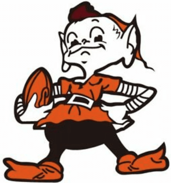
The Browns
Last makeover: 2015
Unveiling date: Not yet announced.
The latest news: Browns beat writer Tom Withers said on Tuesday night that a source who’s seen the new unis told him, “They look like the Browns are supposed to look.” This is the latest of several indications that the team will be going with a traditional design. That’s pretty much been the assumption from the start (if they wanted something non-traditional, they would’ve stuck with the existing design).
Also, there was a report the other day that Browns wide receiver Odell Beckham Jr. was one of the models for a recent photo shoot for the new uniforms. Tea-leaf readers have taken this as a sign that the Browns plan to keep Beckham rather than trade him. But of course it also means that there are already photos of the new unis floating around out there. Can a leak be far behind?
Paul’s take: Ownership has been sending signals for over a year that this will be a back-to-basics move, so there isn’t a whole lot of suspense here. Still, I’m as eager as everyone else to see the Browns looking like the Browns again, so there’s still a bit of anticipation, even if there likely won’t be many surprises.
———
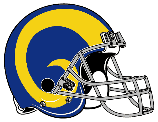
The Rams
Last makeover: Depends on how you look at it. Last full-scale makeover was in 2000. Lots of minor tinkering with all uniform elements since then.
Unveiling date: Not yet announced.
The latest news: Rams beat writer Rich Hammond said on Tuesday that the Rams are planning a two-part unveiling, with the new colors and logo being revealed before the draft and the uniforms coming after the draft. Hammond in turn cited a Twitter account that has said the uni unveiling will be in early to mid-May.
Paul’s take: I’m surprised that the uniforms won’t be shown until after the draft. The Rams were originally supposed to get new uniforms last year (that got pushed back to this year because the opening of their new stadium was delayed), so you’d think they’d have everything ready to go. Hell, why not unveil right now? On the other hand, the Rams don’t currently have a first-round pick (although they could always trade up, of course), so for now they don’t have to worry about their top pick posing with a jersey he’ll never get to wear.
———
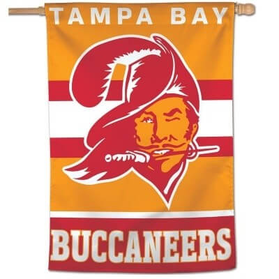
The Buccaneers
Last makeover: 2014
Unveiling date: Not yet announced. But team owner Ed Glazer has said that there will be a true unveiling “event,” which is different from 2014, when they simply posted photos of the new uniforms on the internet without a live event.
The latest news: Head coach Bruce Arians said last week that he’s seen a sketch of the new uni set. “I think it’s more close to the Super Bowl uniforms.” That would be Super Bowl XXXVII in 2003, which would mean the Bucs are sticking with pewter and not going back to the creamsicles. It may also mean that the only Bucco Bruce in Tampa this fall will be Arians himself.
Paul’s take: As long as they get rid of the digital alarm clock numbers, which seems like a given, they can’t help but give themselves an upgrade. But I was hoping for a return to the creamsicles. Maybe the Color Rash design will be mono-orange..?
———
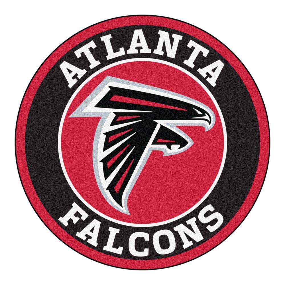
The Falcons
Last makeover: 2003
Unveiling date: Not yet announced.
Latest news: Not much. The Falcons announced in mid-January that they’d reveal a new uni set in April. That caught most observers, myself included, by surprise, as there hadn’t been any rumblings about a new design (although they badly need one). No other information has been forthcoming since then.
Paul’s take: Just like the Bucs will obviously scrap the uni numbers, the Falcons will obviously get rid of the clown-striped sleeves, which will be addition by subtraction. Aside from that, I have no sense of where this franchise wants to go aesthetically. Their throwbacks have always been popular, so will they pull a retro move? Will they stick with their longstanding primary logo (okay, so they’ve actually had two primary logos, but the second one is just a variation on the first one) or go in a completely new direction? Will they be a red team that sometimes wears black or a black team that sometimes wears red? Honestly, I haven’t a clue. Falcons fans, do you have a sense of where your team is heading here?
———
A few other things worth mentioning:
• You may be aware that there are rumors floating around on certain message boards that the Colts, Pats, and Chargers may have uni tweaks, not full overhauls. These rumors are, well, just rumors and are not confirmed at this time.
• The Browns’ outgoing look lasted the league-minimum five seasons, and the Bucs’ outgoing look lasted only one year longer than that. Not a good referendum on Nike, or on “edgy” NFL uni designs in general.
• If anyone out there has solid info on any of these new uni sets, I’m all ears. Anonymity assured if you need it, of course. Thanks.
Oopsie: Bonehead move last night by Cavs guard Kevin Porter Jr., who was supposed to start last night’s game against the Celtics but had to miss the opening tip because he forgot to wear his jersey. At the start of the video clip shown above, you can see Porter wearing his base-layer compression tank but not his jersey just prior to the beginning of the game, so teammate Matt Dellavedova got the nod instead. Porter — properly attired — eventually entered the game after about two minutes.
(My thanks to card-carrying member Nicklaus Wallmeyer for this one.)

Click to enlarge
ITEM! Pin Club launch for March: After a slight supply-chain delay, I’m happy to announce that the March design for the Uni Watch Pin Club is now available!
Like all of the Pin Club designs, this one was a collaboration between myself and Todd Radom. As you can see above, it features a basketball jersey (for March Madness) with a shamrock and orange/white trim (for St. Patrick’s Day), along with a winged stirrup jock tag (for Uni Watch!).
For the first two pins, we were flying blind and overestimated the demand. So for this one, we’re doing a numbered edition of 250 (instead of the 350 that we did for January and February):

Again, the March pin is now available here. And if you need to get caught up, the January and February pins are still available until they sell out, and we also have our basic winged stirrup logo pin. And remember, card-carrying Uni Watch members get a 15% discount on these pins (and on everything else in the Uni Watch Shop).
My thanks, as always, for considering our products.


ITEM! Another membership raffle: Recent membership raffle winner Sam Hozman has decided to pay it forward by purchasing another membership for me to raffle off, so that’s what we’re going to do today.
This will be a one-day raffle. To enter, send an email to the raffle address by 8pm Eastern tonight. I’ll announce the winner tomorrow. Big thanks to Sam for sponsoring this one!
Meanwhile, the winner of this month’s Vintage Brand raffle is Timothy Chiu. Congrats to him, and my continued thanks to Vintage Brand for sponsoring these monthly raffles.

Click to enlarge
Head and shoulders: Who’s that in the Uni Watch “gold circle” cap and the “ransom note” T-shirt? None other than longtime reader and Ticker contributor Robert Brashear, who was making the scene down at spring training. Looking good, Robert!
Click to enlarge
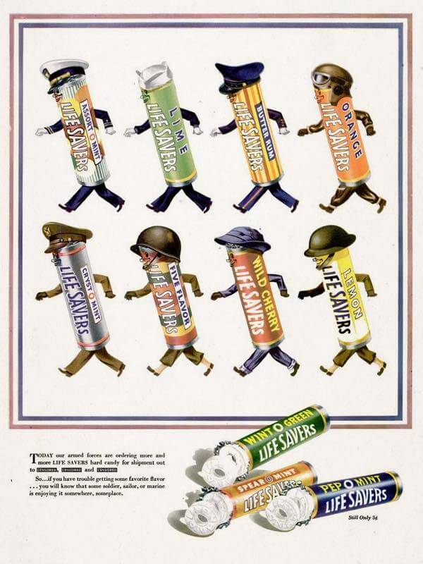
Too good for the Ticker: I belong to a private Facebook group called Anthropomorphic Characters in Vintage Advertising (Excluding Animals). I enjoy almost all of the content, but I particularly like this old wartime Life Savers ad that someone posted to the group yesterday. The assorted package designs basically function like uniforms, and the overall effect is very catalog-y. So good!
The Ticker
By Paul

’Skins Watch: State legislators in Illinois have introduced a bill that would probhit schools from using Native American mascots and iconography (from Kary Klismet). … The Nanaimo Clippers, a Junior A hockey team located on Vancouver Island in British Columbia, have created a new jersey to acknowledge the Snuneymuxw First Nation, from which the city’s name derives (from Niel Scobie). … The Ute Indian Tribe has renewed its agreement with the University of Utah that allows the school to use the Utes name (from Shawn Hairston). … RHAM High School in Connecticut has begun the process of replacing its Native American mascot logo (from Timmy Donahue). … U. of Illinois students began a two-day vote yesterday on whether to adopt the belted kingfisher — that’s a bird — as their new mascot, replacing the now-mothballed Chief Illiniwek. The results of the voting will be announced next Wednesday (from Griffin Smith).

Working Class Wannabes™: And so it has come to this: Ivy League lacrosse teams are being called “blue-collar.” Let that sink in for a minute. … Jesse Marshall, who covers the Pittsburgh Penguins for The Athletic, says Pittsburgh fans will quickly take to new Pens player Jason Zucker because “They love a good blue collar guy” (from @DeadstockDan).

Baseball News: Here’s an interesting Twins photo showing players wearing 1986 BP jerseys with 1987 caps. “Must be from spring training,” says @gimmethewooby. … Murray State’s chest logo and maker’s mark are both positioned ridiculously high on their jersey. “It bugs the crap out of me,” says Josh Claywell. … Malcolm MacMillan blogged about his ticket stub collection, which covers a range of major and minor league games. … Mets RF Michael Conforto lost his glove over the outfield wall while unsuccessfully trying to catch what turned out to be a home run on Tuesday. … After New York Post columnist Maureen Callahan described Rochester as “grim and depressing,” the Triple-A Rochester Red Wings have unveiled a line of “Grim and Depressing” T-shirts. They’ll also have a Maureen Callahan Night promotion on Aug. 21 (from Timmy Donahue). … Giants P Johnny Cueto, who normally wears No. 47, wore No. 73 and NNOB for last night’s Cactus League game against the Dodgers, because someone neglected to pack his jersey (from @rockclimberadd). … A Photoshopped image on MLB’s online shop shows Brewers C Manny Piña wearing the team’s new cream jersey with last year’s batting helmet. … Here’s Clemson softball’s record broken down by uniform. … Another Little League, this time in Ottawa, will stop calling any of its teams the Astros (from Andreas Papadopoulos).

Football News: Check out this beer glass adorned with Tecmo Bowl-style NFL helmet graphics (from Robert E and Brandon Hughes). … New Mexico is going back to silver helmets next season (thanks, Phil).

Hockey News: In the wake of the tornado that hit Nashville earlier this week, the Predators are selling hockey-themed “Nashville Strong” T-shirts to benefit relief efforts. … Hockey Canada has been inviting young fans to submit goalie mask designs, with two winning entries to be worn by Team Canada goalies at 2010 IIHF Women’s World Hockey Championships. You can vote for the four finalists here. … Fans attending Saturday’s Preds/Stars game in Dallas will receive a compression sleeve patterned after Stars C Tyler Seguin’s sleeve tattoo. Alex Jones and Mike Chamernik note that the giveaway tattoo sleeve includes a corporate ad as part of the design. … The Monticello Moose, a high school team in Minnesota, have antlers on their “A” designations. … Dartmouoth has added an “SP” memorial patch to honor the late athletic director Seaver Peters (from Tris Wykes). … The Oklahoma City Blazers will wear new jerseys tomorrow and Saturday to mark the 25th anniversary of the Oklahoma City bombing (thanks, Phil). … “In Wednesday night’s New Hampshire Interscholastic Athletic Association playoff game, I noticed the Portsmouth-Newmarket team wearing an advertisement on its jerseys,” says Tris Wykes. “Never seen that before in this state or in numerous others in which I’ve watched high school sports. The retailer mentioned does not appear to make hockey jerseys, so this seems to be a clear advertisement [rather than a maker’s mark].”

NBA News: Thunder G/F Shai Gilgeous-Alexander trolled Clippers coach Tyronn Lue by wearing an Allen Iverson “stepover” sweatshirt prior to Tuesday night’s Thunder/Clippers game (from @PhillyPartTwo). … No photo, but Gregg Wiebusch says the Mavs had three players with hyphenated surnames on the court at the same time last night: Willie Cauley-Stein, Dorian Finney-Smith, and Michael Kidd-Gilchrist. No other NBA team currently has more that two hyphenates on the roster. … New Pistons G/F Jordan McRae will wear No. 52 and new Cavs G/F Sir’Dominic Pointer will wear No. 15.

College Hoops News: George Mason and Saint Louis went green vs. blue last night (from Mike Sylvester). … Rider gave out three different framed jersey designs for Senior Night (from @PeterStrip).

Soccer News: USL Championship side OKC Entergy have a new kit to mark the 25th anniversary of the Oklahoma City bombings (thanks to all who shared). … The name and logo for the new MLS franchise in St. Louis will likely be revealed in a few weeks (from Wade Heidt). … With youth soccer becoming more popular in NYC and avaialble fields becoming scarce, especially in winter, there’s a move toward indoor soccer (NYT link). … Fans in Germany’s Bundesliga have been waging in-game protests via large banners (NYT link). … The recent funeral for Matlock Town MF Jordan Sinnott featured 862 jerseys with his NOB hanging from the ceiling (from @PeskysPole). … Here are the first of the 17 kits that will be worn this season by the Las Vegas Lights. … “17-year-old Adam Ratajczyk, who plays for Polish side ŁKS Łódź, doesn’t wear the team’s betting ad on his shirt because he’s underage, but he does have the ad for the Polish lottery — one of the league’s main advertisers,” says Ed Zelaski. … New kits for USL Championship sides Orange County SC and Portland Timbers 2.

Grab Bag: After lots of employee complaints, American Airlines has replaced its “toxic” uniforms. … A Maryland woman was attacked by a man wearing a UPS uniform. … New logo for BMW (thanks to all who shared). … A pair of blockchain entrepreneurs are envisioning a world in which people collect digital Air Jordans. … New home whites for Delaware women’s lacrosse. The sleeve patch is for the 50th anniversary of Delaware women’s athletics, not specifically for the laxrosse team (from @BigginsDE and our own Jamie Rathjen). … The official seal for the city of Santa Fe, N.M., has an accent mark in the wrong spot (from David Cline). … UNC’s chancellor tweeted a photo of himself meeting with the school’s new Student Body President-elect, who for some reason was wearing a Texas Longhorns polo (from James Gilbert). … The city of Chicago has a new design style guide, along with a history of the city’s seal (from Chi-town’s own Mike Chamernik). … Stoneham, Mass., is another town whose police officers will wear Autism Awareness Month patches (from Timmy Donahue). … Harley-Davidson is trademarking new logos for electric motorcycles and bikes (from Timmy Donahue). … Also from Timmy: Legibility problems have led the Canadian province of Ontario to stop issuing blue license plates, which were hard to discern at night and couldn’t be picked up by speed cameras.
Are we sure that Kevin Porter just didn’t want to wear that ugly Cavs uniform?
“…beer glass adorned with Tecmo Bowl-style NFL helmet graphics”
Lots of “negative” color schemes: Saints, Jets, Giants, Colts…
Do I see an Oilers helmet???
Yes, caught an Oilers baby blue helmet. I think there is a silver Eagles helmet with a white wing? But a neat design nonetheless.
Also baby blue Panthers helmet and turquoise Jags helmet
A move back to the Creamsicles never worked for me. That combination has an immediately dated look and the red-pewter years were the most successful in Bucs history. It’d be nice if the Creamsicles could be throwbacks once the one she rule is ditched and maybe some orange will be more prominent on these jerseys, but some designs should stay in the 70s.
I’m not sure I agree that the Creamsicles are dated. If you didn’t know they were issued in the 70s, I’m not sure anyone would have a reason to think they were. If we’re only talking about the use of orange, that’s a difficult sell for me. If we’re talking about Bucco Bruce himself, I always had a more 1920s/30s Errol Flynn feel about it.
If anything, get rid of the digital clock and the oversized helmet logo. That’s what makes them look like an arena team to me.
As long as the Bucs either fully embrace the creamsicles or go with the red/pewter, I’m good.
Don’t split the difference!
I think the creamsicles are dated just because the logo is also dated. White helmet, orange jersey, white pants, all with red (and possibly black) trim that featured a predominantly orange version of the current flag/sword logo would be sharp.
I like this idea. Combination of the 2 eras but the creation of something new. Also, with the white helmet, there would be the freedom to do a throwback uniform to Bucco Bruce with the one-shell rule.
I think one possible reason they don’t want to go to white helmet, orange jersey, with say a black or very dark colored trim is that Tampa Bay being a Florida based team doesn’t want their jerseys looking too similar to the University of Tennessee’s uniforms.
Could’ve sworn I read a Bucs person say they want to make sure they can do the Bucco Bruce helmet for throwbacks.
The dilemma the Bucs have is that their current uni set is awful but their pewter helmets and helmet logo are great.
We all know Wint-o-green Lifesavers spark if you chomp ’em hard enough, right? Right?
If you’re in a dark room with a mirror! I went into a closet in our house one time when I was a kid to test that out. It worked!
Triboluminescence.
It really bugs me that whenever a tragedy happens (unfortunately, usually a mass shooting or somesuch) every city has to go with “[insert city name here] Strong.” Boston Strong, Vegas Strong, Nooga Strong, Nashville Strong, MSD Strong (Marjorie Stoneman Douglas HS in Parkland), etc. I know they’ve just gone through an incredibly difficult situation but I feel like there’s gotta be a better way to rally people around a cause rather than using the same thing over and over again.
I’m aware this sounds insensitive but I just needed to put it out there.
I came here to say the same thing. I completely agree!
100% agree. It’s lazy. -C.
As someone who grew up in Cookeville and lived in Nashville for years, I’m okay with whatever slogan gets these folks through. And thoughts and prayers are nice, but food, clothes, money, a place to stay… that’s what people really need in times like that.
there was a mass shooting in my neighborhood a few years ago and ” Strong” was adopted immediately. It rubbed me the wrong way because most of the people using it did not have to demonstrate any strength. Mourns or Remembers would have been more appropriate.
I agree, and think it is less “using the same thing over and over again” as it is was gimmicky from the first time it was used. Living along the coast in NJ, we had “Jersey Strong” after hurricane sandy, as if some particular strength found only in people from NJ was the reason the area didn’t fall into complete ruin after a hurricane. It goes for just about any of these, because really when has there be a tragedy in a city/area when general population wasn’t “strong” and managed to get through and return to normalcy. Humans in general are resilient, and resilient is the better word than strong because as noted by other replies, sometimes after a horrible event strength isn’t particularly the most important thing to get your through it. The desire to rally together in the community in the face of an awful event is great, but the strong stuff is just gimmicky, almost feels a result of the social media world we live in so people can post stuff saying they are ____strong.
This is really the point I was trying to make with my comment. Yours is much better stated than mine.
Glad I’m not the only one who thought this.
Surprised by these rumours of the Colts making a change. Can’t see why they would want to change anything. Would have to be really minor likes stripes added to socks, facemask colour, or return of blue road pants.
Safe bet they do not bring back the ill-fated silver pants :). That look didn’t work.
link
Again: It’s just an unconfirmed rumor. The most likely outcome is that they’re not changing anything.
Same for the Patriots; the only modification I’d like for them to consider would be dropping the jersey side panels.
Agree, side panels need to go on both home and road Pats unis.
Would LOVE to see the Colts go back to blue facemasks. Gray facemasks in today’s NFL have always bugged me. I’d also love to see the Browns bring back white facemasks.
As long as they don’t have a QB as crappy as Pagel was…
I would love to the Patriots drop the silver and just go with red, white & blue. Put “Flying Elvis” on a white helmet, which would allow them to bring back Pat the Patriot and the throwbacks.
Ticker correction in ‘Skins watch. Technically the Nanaimo Clippers are in tier 2 for junior hockey, but the Clippers are a Junior A team. They are not at the lower lever Junior B.
Fixed!
Thanks Wade, that was my error.
Hey Niel, CHLY 101.7 FM and the lads from the Impending Loom say hi!
The Bucs “Super Bowl” uniforms were absolutely perfect. Any move back to the simplicity of that look would be awesome…
I like this month’s pin. It most be an interesting problem trying to get design elements onto something that small.
You are designing for a group that obsesses over little details. I would imagine that it is hard to keep them true to size and highly detailed on such a small canvas.
It might be an interesting blog post some day.
Teaser for the Falcons looks like they are going back to black unless its a red herring at the end. link
Re: advert on a hockey jersey.
I’ve seen commercial advertising on high-school uniforms only once before. In Washington, D.C., the Bell Multicultural School wore Boca Juniors replica jerseys, which included the Pepsi ad on the chest.
(Thank goodness they didn’t use the Quilmes Beer shirts …)
With the Browns and Bucs already reversing course, the Seahawks Nike-haul seems to be the only one that really stuck.
Paul is spot on here, a lot of the new Nike renditions in both the NFL and NBA have not struck a cord with their intended audience.
IMO a lot of the NBA uniforms that changed when Nike took over are absolutely horrid; Suns, Rockets recent change, Lakers (can’t pick the right yellow, or purple), God knows what the Clippers are doing with their uniforms, the Kings still look so off brand, the T-Wolves got a random stripe on their chest, and why are teams wearing dark colors at home?
Less is more. Always been that way, always will be that way.
To be fair, Nike’s Dolphins and Vikings redesigns have “stuck,” or at least stuck around. I don’t particularly like either of them, but they’re still here!
Good point, the Dolphins did quickly flip their shade of orange (I believe?) on their helmets, but other than that those two have stuck around.
Come to think of it, the Detroit, Tennessee designs were rough too.
Jacksonville’s was fine, it’s just a very boring uniform.
Miami also dropped the “marine blue” from their unis when they changed the shade of orange after the 2017 season. Despite using a different number font, those changes did make the jerseys a little more reminiscent of their early years.
Man, Nike really screwed up the Lakers shade of gold. I don’t know if its the fabric Nike uses for their jerseys but it looks banana yellow.
In a sense, the Browns didn’t even make it the minimum five years. You’ll recall, last season they successfully applied to have the Color Rush become the primary sense. Those uniforms were so bad they did everything they could to get rid of them after just four seasons!
Pretty pathetic that today’s NBA player has to wear so much crap, base layers, knee pads, shooting sleeves, compression tank and compression shorts, that they would forget to PUT THEIR ACTUAL JERSEY ON. Good gosh. Jordan, Bird, Magic, etc, would never have this issue…because all they wore was their UNIFORM.
Well, Jordan might’ve come out in his NC shorts, but your point is taken.
Hot take: The old Falcons logo they use for their throwback uniforms, by itself without an outline, on a black background like their current helmets…is the best logo in NFL history. I can’t really explain why, only that I’ve been in love with it since I was a kid with absolutely no attachment to Atlanta or the Falcons whatsoever.
Ive never understood what flying position the falcon is supposed to be in. ?????
If we could return to the classic Browns, with two slight changes;
Numbers on the helmets, they did this in the past, works better than the plain helmet, has an old school feel, and would be unique in the NFL.
Make Brownie the Elf the primary logo, don’t put him anywhere on the uniform, but just stop using the helmet as the logo. Nothing says “we have zero branding ideas” like using a helmet as the primary logo, a plain helmet no less.
I too would love to see numbers on the helmets. I wonder how Browns fans would feel about that, though — they seem very emotionally invested in the plain helmet. Cleveland fans, what say you?
Totally agree regarding Brownie.
Not a Browns fan…but keep the helmet as is (including the brown facemask, though I much prefer white).
If there’s a team what ‘should’ have numbers on the helmet, it’s the Chargers.
Posing/Grinning Brownie…yes.
Running/Scowling Brownie…no.
-The Browns fans I know (lots of them) would freak if they put anything on the helmet. They all raised an eyebrow with the brown helmet stripes having a pattern, even though you typically can’t see it. I agree, though, numbers on the helmets would look great. I’ve always loved the idea of Penn State doing the same. Such a simple thing that makes the helmet much more visually interesting.
-Unrelated complaint: damn, why didn’t I order one of those Uni-Watch gold circle hats when I had the chance??? Love the look of those!
We might make the gold circle hat available again when the weather gets warmer — stay tuned.
“A Photoshopped image on MLB’s online shop shows Brewers C Manny Peña wearing the team’s new cream jersey with last year’s batting helmet.”
The catcher’s name is Manny Piña, not Peña.
Thanks for today’s blog!
Typo fixed. Thank you!
The Lifesavers ad “CENSORED” the supposed locations in a nod to operational security practices during WWII (loose lips sink ships). The ad does not mention “airmen” b/c they were part of the Army Air Corps, USAF would not become a separate service until the late-40s.
Thanks for continuing ‘Skins Watch. It’s important. Also, if I wore T-shirts I would probably order all three of Rochester’s “Grim and Depressing” Tees.
I guarantee Seguin doesn’t have a “Frontier Communications” ad tattoo on his sleeve….
Anyone else think the first photo of the March UW pin looks off? The trim and letters look light blue, and the shamrock and year look white.
Hockey Canada has been inviting young fans to submit goalie mask designs, with two winning entries to be worn by Team Canada goalies at 2010 IIHF Women’s World Hockey Championships. You can vote for the four finalists here.
… I’d love to be back in 2010 right about now…
Forgot to include the link:”I enjoy almost all of the content, but I particularly like this old wartime Life Savers ad that someone posted to the group yesterday..”
Never mind. I see the ad now. It was not loading originally. My apologies.