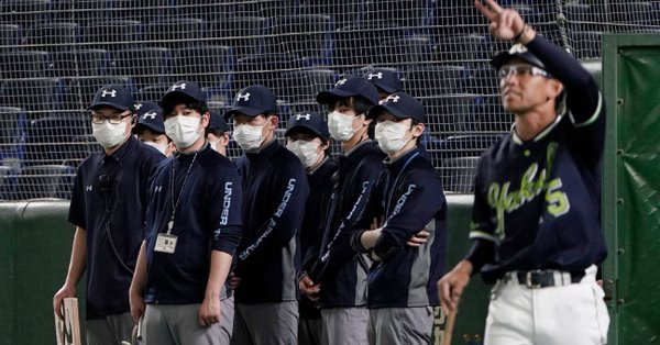
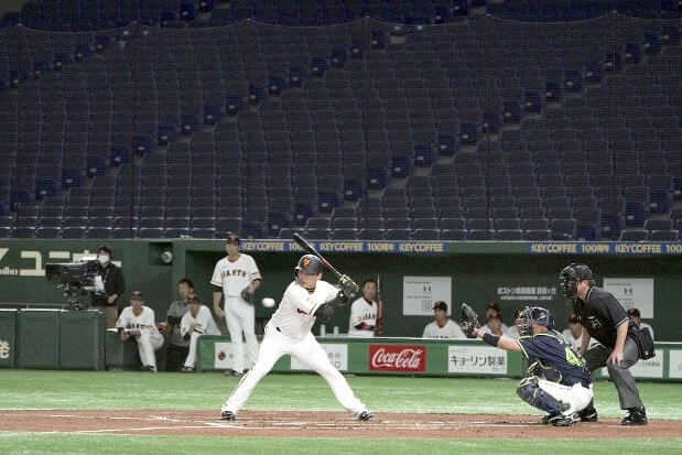
The photo shown above is from a recent preseason Japanese baseball game at the Tokyo Dome between the Yomiuri Giants and the Tokyo Yakult Swallows. The men wearing masks are the stadium’s grounds crew. (Also, it’s interesting that their attire is so heavily Under Armour-branded, right?)
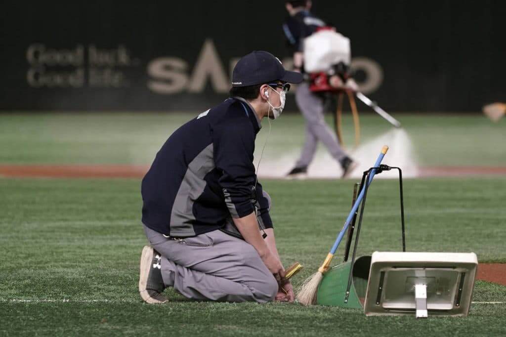
That shot is one of several powerful images showing how the coronavirus pademic has been reshaping athletics aesthetics in recent days. Here’s another shot of a mask-clad groundskeeper from that same game (click to enlarge):
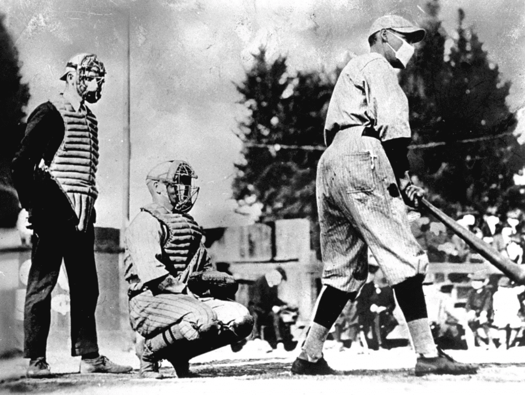
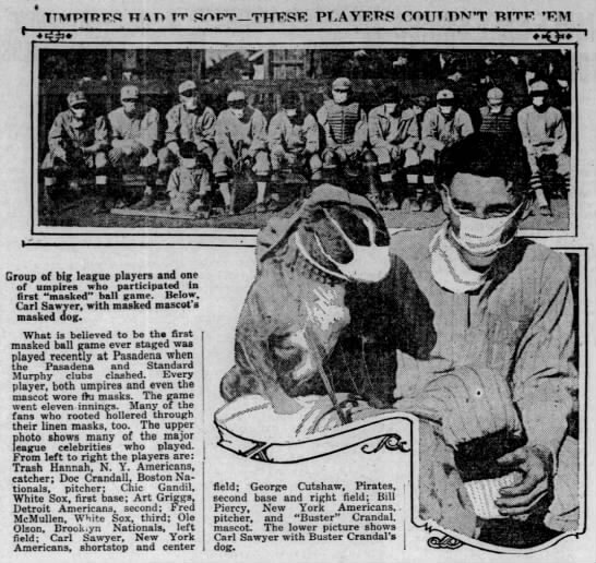
So far I haven’t seen any players wearing masks. If that happens, it wouldn’t be unprecedented, as you can see in these shots from the 1918 Spanish flu pandemic (click first photo to enlarge):
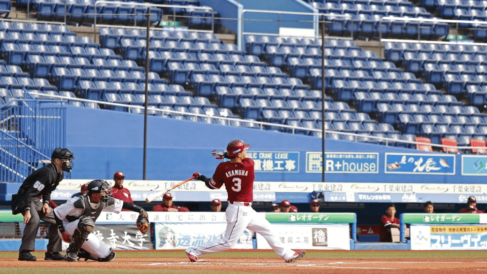
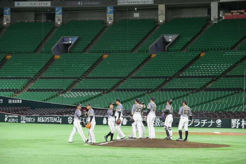
Moreover, all Japanese preseason ballgames are being played in empty stadiums. Fans are barred from the games, to help decrease the risk of spreading the contagion. This has resulted in the odd sight of games being played in front of huge expanses of empty seats:
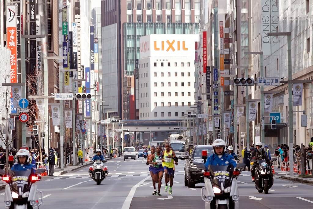
There’s talk that the start of the regular season may have to be postponed. But it’s not just baseball that’s been affected in Japan. Horse racing (yes, they have that in Japan) has likewise taken place in front of empty grandstands. And Sunday’s Tokyo marathon, which was slated to have about 38,000 participants running through streets lined with cheering fans, was limited to 200 elite runners. The public was urged to stay home, so only a smattering of fans appeared along the route (click to enlarge):
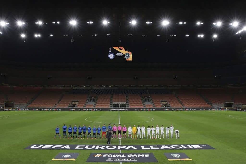
Empty stadiums have also become the norm for Serie A soccer in Italy, another country that’s been hit hard by the pandemic. Here’s a shot taken prior to last Thursday’s match between Inter Milan and Ludogorets (click to enlarge):
So far I’m not aware of any pandemic-related impacts on athletics aesthetics here in the United States, but that may be coming. Yesterday ESPN reported that the NBA is recommending that players use fist-bumps instead of high-fives. (This reminded Twitter-er @ManzellBeezy of former NBAer Marcus Camby’s “reverse high-five,” which he utilized because “not everyone washes their hands.”)
The NBA is also recommending that players avoid having fans hand them items like balls, jerseys, and pens for autographs. At least one player, Trail Blazers guard CJ McCollum, has announced that he’s no longer signing autographs until further notice, while Celtics guard Kemba Walker said yesterday that he’ll keep signing but will probably start carrying his own pen:
The Corona Virus has officially hit Oregon. More specifically Lake Oswego…Make sure y’all washing y’all hands with soap for 20 or more seconds & covering ya mouths when you cough. I am officially taking a break from signing autographs until further notice.
Sincerely,
CJ
— CJ McCollum (@CJMcCollum) February 29, 2020
A doctor came to talk to the Celtics about coronavirus. Kemba Walker: "Everybody just needs to be a little cautious. I'm pretty sure I'm still going to sign some autographs, but maybe I'll just walk around with my own marker."
— Nicole Yang (@nicolecyang) March 2, 2020
Also: With the NCAA gearing up for the start of March Madness in a few weeks, there have been calls for the tournament games to take place in empty arenas.
(In addition, lots of sports events around the world have been postponed or cancelled (NYT link), but that’s not really an aesthetic issue, so I won’t get into that here.)
Meanwhile, given the amount of licensed sports merch that’s made in China, it seems likely that the retail pipeline will also be affected.
Obviously, none of this is any fun, and I certainly don’t mean to underplay the seriousness of the pandemic by focusing on how it’s affecting something as trivial as athletics aesthetics. But I do think it’s interesting to see that even our little niche corner of the world isn’t immune, so to speak, from the coronavirus. Let’s hope these examples turn out to be the worst of it.
Collector’s Corner
By Brinke Guthrie
Follow @brinkeguthrie
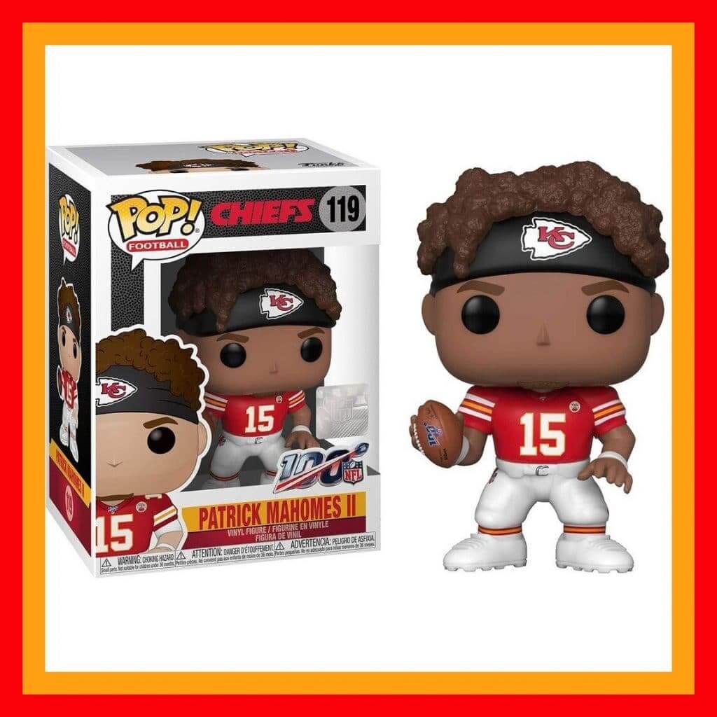
I have a real affinity for Funko POPS!, which are these cute little figurine collectibles. (There’s a short documentary about them here.) I have the entire James Bond line, plus Mulder and Scully from The X Files, and I just ordered the brand-new Roger Federer and Bjorn Borg figures. I happened across this Pat Mahomes Funko POP! this past weekend and was intrigued by the level of uni detail. Being a Niners fan, it pains me to say this, but look at the logos, the striping, the league badges — all perfect. Funko has the license for all the major sports leagues, and collectors are going to expect that level of authenticity. (Especially if they Get It™.)
POP! faces are pretty much the same, with the big round eyes, (rendered in two different colors for Max Scherzer, of course), but what sets ’em apart is the hair, maybe a raised eyebrow or two, the body’s outfit (or uniform as it were, and the presentation box (which I don’t even keep). Maybe the cost factor, too — usually no more than about $15 a pop (ahem). They’re also small, which is handy if space is a concern. They seem to be a polarizing category — you either love ’em or hate ’em. Which camp are you in?
And look — I made mock-ups (POP!-ups?) of myself and Paul:

Okay, that’s enough about Funko POPS! Now for the rest of this week’s picks:
• Be well-groomed with “The Pro’s Choice of Comb, Brush and Dryer!” This version of “The Major League Baseball Comb” is adorned with the 1970s Pittsburgh Pirates logo.
• Wanna hang out with Shaq? Okay, maybe this is closest thing — a life-sized Shaquille O’Neal stand-up, complete with Reebok Pumps.
• If you don’t recall the Michigan Stags, that’s okay. They were briefly in the World Hockey Association, for part of the 1974-1975 season. That’s a pretty good logo on the front of their first and only media guide. Halfway through the season, they moved to Baltimore to become the Blades.
• Don’t know how old this item is, I just know I’ve never seen one: a St. Louis Blues hockey stick ice scraper for those cold St. Louis winter mornings.
• This 1976 American League Red Book is decorated with the then-current AL team logos. The Red Book (and its NL counterpart, the Green Book) was a very comprehensive media guide. They were phased out a few years ago, another Internet casualty. (Query: Anyone know why red and green were the designated colors?)
• When you’re the Greatest, you get your own doll: This is a 1970s Muhammad Ali action figure. Floats like a butterfly, stings like a bee, complete with the appropriate Everlast trunks.
• OK, so this 1970s Cleveland Browns button looks to be rather beat up (or maybe it’s the bad photo). What I noticed here was that they decorated it with what resembles a Cowboys star — a solid star with a thin outline.
• This button (probably 1970s) proclaims Sears to be “Your Headquarters for N.F.L. Merchandise.” Darn right it was!
• This is your standard 1970s IHOP gumball helmet for the New York Football Giants. But what caught my eye was the font and slogan on the tag: “Helmets on Parade.” Just 24 cents each!
• Here we have a pair of 1970s kids’ size New England Patriots mittens. Take a close look at the logo on the one mitten — see how they wrapped the team name around the circle. A tight fit!
Click to enlarge
Hmmmm: As the #NoEra remove-ment has been growing, some people have asked me if I think New Era will respond in some way (by making their maker’s mark harder to remove, for example). I figured that was unlikely for a variety of reasons, not the least of which is that we’re talking about a very small cadre of seam ripper-wielding obsessives, so it seems like something that New Era could safely ignore.
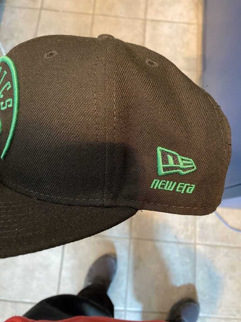
Then again, maybe not. Anthony DiNunzio was in a Lids store the other day and noticed this Celtics cap with a wordmark added below the New Era logo. “Looks like they’re trying a new tactic to make us earn it,” he tweeted. I followed up with him and he said, “First time I’ve seen it. From the stuff I was looking at, it was only on a couple of the NBA snapbacks.”
Interesting.
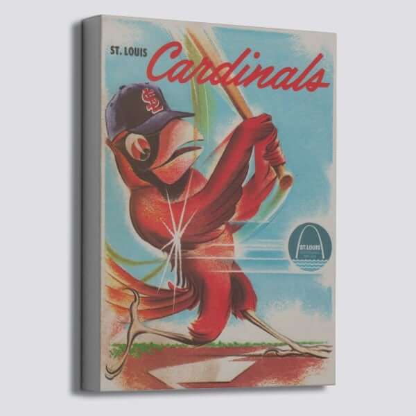

Raffle reminder: The folks at our longtime advertiser Vintage Brand are doing another giveaway. The winner will get to choose any item from the VB site (including the groovy Cardinals canvas shown above).
To enter, send an email to the raffle address by 8pm Eastern this Wednesday, March 4. One entry per person. I’ll announce the winner on Thursday. My continued thanks to Vintage Brand for sponsoring these giveaways.
The Ticker
By Alex Hider

Baseball News: Cardinals 2B Kolten Wong has been pairing a red-and-powder blue glove with bright yellow cleats during spring training (from Brinke Guthrie). … Cubs 3B Kris Bryant was wearing the team’s traditional game cap instead of a spring/BP cap for at least part of yesterday’s game (thanks to all who shared). … Lots of good stuff in this listicle of White Sox items at the Hall of Fame. … Never seen this before: While returning home from a west coast trip, some Rutgers equipment and luggage was ruined when it got sprayed with jet fuel. (from Kurt Esposito). … Not exactly uni-related, but this man’s baseball hobby is fascinating: He visits the graves of dead ballplayers (from Sean Clancy). … This Little League has some teams outfitted in some great Padres throwbacks (from Dan Berman). … Check out this vintage Spitball Magazine warmup jacket available on Etsy. Pretty slick (from @CLERallyChicken). … The great Wafflebored found this vintage tequila sunrise jersey with a unique wordmark. … Here’s a commercial that MLB and New Era have been running to promote the new spring/BP logo-mashup caps. It includes a brief glimpse of the Padres’ cap, which was shelved after the swastika issue (from @chargersfan_73).

Pro Football News: The 2020 NFL Draft caps have reportedly leaked. Of course, take these leaks with a grain of salt, but it’s worth noting that none of the none teams due for uniform redesigns next month — the Browns, Bucs, Falcons, and Rams — are shown with new logos (from Drew Winthrop). … Pats WR Julian Edelman wore a throwback Syracuse jersey to the Orange’s game against North Carolina on Saturday (from Max Weintraub). … Bryan Beban notes that a 1983 Saints/Washington game at the Superdome included the 1983 Sugar Bowl logo at midfield, Penn State markings in one end zone, and Saints markings in the other end zone. … Here’s a list of 20 NFL QBs in uniforms they’re not usually associated with (from Timmy Donahue). … The XFL’s DC Defenders wore white jerseys over red pants for the first time on Sunday (from Wade Heidt). … Also from Wade: A Winnipeg Blue Bombers fan celebrated the team’s recent championship by getting a tattoo of RB Andrew Harris hoisting the Grey Cup.
College Football News: Reader Chad Fields has completed the Vols Uniform Tracker — a database that tracks Tennessee’s record by every uniform combination they’ve ever worn since 1960.

Hockey News: The Athletic asked all the Blackhawks why they chose the number they wear (paywalled) (from Kenneth Traisman). … It appears Pens C Patrick Marleau used his Sharks gloves for at least one of the three games he’s played with his new team (from Jared). … Hockey is a big deal at Adrian College in Michigan. Even though they only have about 1,700 students, they have seven (!) hockey teams: NCAA DIII for men and women, ACHA DI-III for men, and ACHA DI-II for women. According to Ted Arnold, whose daughter attends the school, each of the seven teams has a unique uniform style. … The Hamilton Steelhawks of Allan Cup Hockey are auctioning off the jerseys they wore during their Youngblood night earlier this season. … The great Wafflebored was wondering what a white “Flying V” Canucks jersey might look like, so he DIY’d one for himself. Great work! … In 1985, Minnesota’s Goldy Gopher mascot wore a “G,” instead of a “C” or “A,” on his jersey (from Snowdan13).

NBA News: Of course, you can look up NBA uniform matchups for every game on LockerVision. But the Thunder tweeted their uniform schedule for the entire month yesterday (from Devon Kuckenbecker). … New Grizzlies F Anthony Tolliver will wear No. 44.

College Hoops News: Cross-listed from the pro football section: Julian Edelman, who plays for the NFL’s New England Patriots, wore a throwback Syracuse John Wallace jersey to the Orange’s game against North Carolina on Saturday (from Max Weintraub). … Loyola Marymount unveiled a statue of former player Hank Gathers and wore 1989-90 throwbacks against San Francisco on Saturday. Gathers collapsed during a game that season and later died (from Timmy Donahue). … According to his daughter, Northwestern women’s coach Joe McKeown forgot his shoes before the team’s second game of the year against Marquette. His daughter and wife found a replacement pair at a Milwaukee shoe store at the last minute. He’s worn them for every game since, and the Wildcats have won the Big Ten, and McKeown was named conference coach of the year. Talk about lucky shoes! (From Philip Brown.)

Soccer News: Las Vegas Lights FC of the USL Championship announced yesterday that they will wear 17 different uniforms — a new one for every home match in the 2020 season (from @JoseAItuve). … New Mexico United of the USL Championship is selling retail versions of the team’s road jersey with a different ad than the ones featured on the field (from @fakinginsanity). … Staying in the USL Championship, Sacramento Republic unveiled new uniforms yesterday (from Josh Hinton). … Scotland’s 2020 away shirt has reportedly leaked (from @jayappletree).

Grab Bag: Of course, NASCAR doesn’t retire car numbers — they’d run out of numbers pretty quickly. But there’s a bit more to it than that (from Timmy Donahue). … ESPN mistakenly referred to Virginia Tech’s women’s track team as the Cavaliers in a graphic — a big no-no, given the school’s rivalry with Virginia (from Andrew Cosentino). … New Mexico State’s women’s golf team uses a logo based on the New Mexican state flag (from James G.). … Not every day we get a Harry Potter note in the Ticker: A Redditor got a homemade Quidditch uniform for his birthday (from Holden McComb). … On last night’s episode of Antiques Roadshow from Portland, someone brought in a set of vintage wooden Pac-8 mascot figurines (from Andrew Muccigrosso). … The Washington Post has a recap of all the merchandise 2020 presidential candidates are selling. … Notre Dame’s fencing team uses gold masks, similar to the football team’s gold helmets.
Though the Browns aren’t using a new logo on their draft hats, it’s worth mentioning that the Brownie the elf logo hasn’t been used in a primary capacity since the 60s. The OTA and ALT hats use the helmet/wordmark logo.
All the other draft hats use the team’s primary logo.
Even though it’s confirmed by the team spokesman that there won’t be a new logo or rebrand as part of the new uni set, a lot of fans are hoping that Brownie is now elevated to the primary logo
Well, except Green Bay really doesn’t use the word “Packers” under the “G” logo like that. Certainly not on the helmet.
link Photo shoot today so hopefully some one leaks these out soon!
From the ticker: The mascot figurines would be of the Pac-8, as the two Arizona schools are not represented. That would mean the figurines were probably produced between 1964-1977.
Fixed!
According to AR, the figurines were produced by the Carter Hoffman company ca. 1950, so those are Pacific Coast Conference (ancestor of the Pac-12) mascots. There’s an Idaho Vandal (Idaho being a member of the PCC until it dissolved in 1959) mascot between Oregon State and Stanford. The UC Berkeley bear is missing. Otherwise a fun collection! (Also see link)
Enjoyed the informative piece on Funko Pops as part of the collector’s corner. Would love to see that as a somewhat regular feature, expanding a bit on a corner of the collectible uni-verse. It would be interesting to get a bit more background, especially on some of the retro items. great job Brinke!
Also, doesn’t it undermine the power of a logo if you add the name below it? Seems silly.
Thank you!
Not uniform related, but Ji-Man Choi of the Rays is from South Korea and has asked that his interviews with the South Korean media be conducted outside of the locker room “out of respect for his teammates”. He also said that he will be avoiding hugs and handshakes with fans.
What if New Era’s logo was the same color as the cap that it’s on — say black on black. Would we be so obsessed with it? Just wondering. I’d rather not see it either.
This is sort of like asking, “What if that jerk was actually a nice guy — would we still be so annoyed by his behavior?”
In other words: The whole point of the maker’s mark, at least from New Era’s perspective, is for it to be visible. That’s why they put it there! So yeah, it wouldn’t be so bad if it was the same color as the cap, but that’s not going to happen.
Actually, it already has happened! New Era makes some Heritage Series caps with the “tonal” flag logo the same color as the crown. Last year, i bought the current O’s home cap with a nearly imperceptible black flag – 59Fifty model with a low crown, so it’s not the official on-field cap.
And for New Era’s 100th anniversary, they have a released a line of vintage caps called Heritage Series Authentic with tonal flags and no MLB logo. My opinion is no maker’s mark should by on replica historic caps, but it’s only noticeable up close… no complaints from me for the 1908 and 1937 Senators caos – and they rival Ebbets Field Flannels for comfort/softness, fit and quality, though made in China and not USA.
Go to Baseball HOF and Mickey’s Place websites to view the caps.
Most Hat Club offerings of MLB/MiLB designs have the tonal flag logo, and I 100% don’t mind the same-color maker’s mark.
Supply chain problems..The local Pony Baseball League my son plays in here in Northern California ended up cancelling the kids hat order. It was coming from China and was delayed until April at the earliest which is near the end of the season. The league has sourced a local supplier and while we won’t get the hats by their opening day they will only be a week behind.
here’s another mock up of the draft hats, showing them not as outline logos. note how the browns logo is back to the helmet design
link
I enjoyed the Collector’s Corner, Brinke! I share the affinity for Funko Pops and have a few myself.
Not to counter the comment about Funko’s licenses/”level of authenticity”, but I have a Von Miller Funko Pop, and they’ve got Von in a Broncos white jersey w/blue stripes over blue pants w/ orange stripes. So, sadly, they don’t always Get It.
Is New Era typically associated with basketball? If nba hats are new territory for the company, they may just be trying to get fans associated with the brand name.
New Era started doing the NBA draft hats in ’17, so i am guessing that’s when their partnership really started, but they’ve been making NBA hats way before that
Oh wow, Funko. My guilty pleasure. I’m up over 200 now, mostly Star Wars.
I do have a few hockey ones, a couple football, and saw there was a Rangers Captain Pop so now I really want that.
I think my General George Washington is my only Funko POP, but admiring the new ones is one of my favorite parts of visiting the comic shop each week. There was an amazing Blue Beetle/Booster Gold two-pack a while back, and I don’t think my inner 1980s DC Comics nerd has ever felt more validated.
The sleeve stripes on the Mahommes Pop are incorrect.
So, those Pac-8 figurines. I see a duck for Oregon, a beaver for Oregon State, a Trojan-helmeted horse for USC, a bruin for UCLA, a husky for Washington, a cougar for Washington State, an Indian for Stanford, and a…Viking for Cal? Anyone know what’s up with that?
The White Sox “listicle,” can be replicated for each team. Just change the end of the URL with other teams names…dashes in between city and team name. Faa-scinating other items in there! (Joe Charboneau’s song 45-record, baseball from Marco Scutaro’s first hit at Target Field…”first grass stain on a baseball for a Twins home game in almost 30 years.”
Actually, only 3 of the 6 divisions are currently available: AL & NL East, & AL Central. NL Central will be available March 9, AL West on March 16, & NL West on March 23.
Dammit I told myself I wasn’t going to buy anymore Funko Pops! but now I have Roger…
also, it is really cool that they have the tennis racquet right too. That’s some good detail there.
That double-barrel New Era logo has been around before. Check out this Baseball Canada hat that from the white wool sweatband and other tagging looks like it’s from the early 2000’s (hope the link works…):
link
Japanese preseason games look eerily like Tropicana Field regular season games.
While NASCAR doesn’t retire numbers, I would like a return of the #28 to competition.
And it’s a pity that when the #8 was obtained by Childress Racing, it couldn’t be rendered in the same style as their #3…I guess they were lucky to obtain the rights to the number from the prior holder at all(something Hendrick Motorsports was unable to do), so it was probably wise not to push it.
What will we see first: Facemasks in team colors and/or with team logos, or facemasks with branded maker’s marks (or really, just Nike swooshes)?
When the CART/Champ Car series was in operation, they had reserved #14 for cars driven or owned by AJ Foyt, with the stipulation that once AJ Foyt was no longer involved in auto racing, the number would be permanently retired. They also retired #99 in honor of Greg Moore after his death at Fontana in 1999, and #13 was not allowed to be used (I believe Formula One also has this restriction). They also did not allow #0, or any 2 digit numbers with a leading zero (ie, 00-09).
Might have to add the Vegeta Eating Noodles and the Max Scherzer Funko POPs to my collection.
And “Yakult Swallows” seems too on the nose
The Yakult Swallows have one of the most esoteric names in sports. First, they’re named for the Yakult health drink company, and that company originally named itself yahurto, the Esperanto word for yogurt; the company founder, Minoru Shirota, wanted to spread his product all over the world so he chose a name in this international language.
And while everyone associates the name “swallows” with the bird — the mascot is the bird, and the Japanese word tsubame, which only refers to the bird, is used all the time — there is the obvious wordplay with “swallowing” Yakult-brand yogurt.
Normally I dislike the corporate names that some Japanese teams have, but this one is so interesting that I almost don’t mind it.
Did I miss the March Pin Club release?
Nope. I mentioned last week that the coronavirus has resulted in a slightly delayed delivery. Hope to launch on Thurs or Fri!
I like Funko Pops. They’ve made collecting fun again.
Funko Pops are great because they’re fun and valueless. Collecting anything lately has become a drudge as greed has taken over. Cards, autographs, etc., its all been about what’s rare and what something is worth. Everybody knows these are common, cheap, and will never go up in value.
They cover sports, movies, TV, video games, all parts of pop culture. If you like some offbeat thing, there’s probably a Funko pop for it.
I like looking for fun collectibles again, not thinking at all about value.
There’s a Funko Pop store in my neighbourhood and I love stopping in and exploring. They must have 10,000 pops. My kids love it and they’re within their allowances.
This is my current favourite (from Christmas). We don’t do “Elf on the Shelf” in my house but we do the next best thing.
link
“Fun and valueless” – that’s a great insight. I tend to accumulate more than collect, but stuff I’m interested in collecting is either consumable or “fun and valueless.”
Ha, like anything, the secondary market for the things can be crazy. Sure, the ordinary ones aren’t in demand, but if you’re looking to complete sets, prices for “exclusive” ones can be nuts.
My first Funko Pop was the black eye/blue eye Max Scherzer. I never expected that I would get more, but then I saw one for Kurt Cobain. I think Cobain would roll over in his grave if he knew he’d been turned into a Funko, so I had to have it. I only planned to have those two, but now my collection is up to 9. The only other one that’s sports-related is Alex Ovechkin, but I just placed my order for Roger Federer.
Side note that’s Uni-Watch related: I have all of my Funkos on my desk at work, and sitting on top of one of them are my two Uni-Watch gumball helmets.
you know, someone on FB told me about the Federer, and I jumped on it. I told my wife, ‘now they need to do Borg.’ I hadn’t seen that one in the new releases, and got that too.
Unitas as a Charger always makes those “uni-cameo” lists, but I had forgotten that Dan Fouts also wore that uniform:
link
Not to nitpick but I wouldn’t say the details are perfect on Mahomes’ POP.
The striping on the sleeves include red stripes when it should be white-yellow-white. Also Chiefs wear red socks but the POP has white.
Apparently Steven Seagal is a southpaw and owns a cat.