
By Phil Hecken, with Kyle Evans & CJ Fleck
Follow @PhilHecken
Hey everyone — it’s day two of the annual MLS Preview, and I’m back once again (for their fifth season!) with soccer guys Kyle Evans and CJ Fleck, who’ve not only previewed and reviewed the MLS kits and jerseys for five straight years, but have also reviewed other leagues plus the Olympics and World Cup. If you missed yesterday’s p/review of the Eastern Conference, click here.
I’m going to include yesterday’s introduction along with this, before the lads review the Western Conference kit tops. Here’s Kyle & CJ:
2020 MLS Preview – Western Conference
By Kyle Evans & CJ Fleck
Thanks Phil! We’re back for another season of MLS with another two new teams (Inter Miami and Nashville SC) and at least one new kit for each of the now 26 teams in the league. To begin, here are the league-wide uniform updates:
• As usual there’s a new Adidas template which supplies all of the league’s uniforms and this time with 3 stripes are asymmetric as they are only located on the right shoulder. This is meant to evoke a “90s-retro” look as it is the league’s 25th anniversary.
• There is a new number and name font appearing on all uniforms that was also “retro but modern” inspired.
• For the first time, sleeve advertisements are allowed and so far four teams (Atlanta, DC, LAFC, and Toronto) have announced a second jersey ad.
• We recently learned that some teams will have third kits next season which haven’t been in the league for a couple of years now. This, along with the decision to sell long-sleeved versions of uniforms, are completely based on business and their profitability (or lack thereof).
The season kicked off yesterday and we’ll showcase the new jerseys for the Western Conference teams today. Enjoy!
Western Conference
Nashville SC
Primary: all-yellow with navy accents
Secondary: all-navy with yellow shoulder stripes

Kyle: Both expansion teams seem to have taken the “safe” route in their initial kits, hoping to gain attention from their style of play rather than their uniforms.
CJ: They look like training tops, as many others have said. And I’m sure somewhere in corporate speak, it’s not the same shade of yellow as Columbus, but I have my doubts.
Colorado Rapids (primary)
All-maroon with light blue shoulder stripes, sublimated diagonal stripes

Kyle: A great color combination which looks especially good when paired with light blue shorts.
CJ: It’s not offensive, but it’s not brilliant either. Hopefully that isn’t a descriptor of the Rapids season.
FC Dallas (primary)
Red with blue “hoops” increasing in width

Kyle: Given that this will be paired with blue shorts, I like it because the jersey stripes will transition well.
CJ: One of the few kits where the garish adidas stripes don’t feel like a massive negative.
Houston Dynamo (secondary)
Black with orange/black graphic print and orange shoulder stripes

Kyle: This screams “90’s” to me and not in a good way – for me this is an example where the design takes over the jersey as opposed to a more subtle design that would have been easier on the eyes.
CJ: I doubt this will be noticeable on TV or in person, but it is quite garish. Houston’s use of orange and black is usually pretty well done, but this is an exception.
LAFC (primary)
Subtle black and dark grey vertical stripes, effectively all-black with gold accents

Kyle: This is effectively an uninspired repeat of their initial primary kit with no need for the dark grey elements.
CJ: At least the ad is less terrible? Baby steps towards progress.
LA Galaxy (primary)
White with silver gradient sash and silver shoulder stripes

Kyle: The Galaxy are known for using the sash design, but the lack of their yellow and navy colors doesn’t help to distinguish them from the many all-white kits in the league.
CJ: Kyle is completely right here. A lost opportunity for sure.
Minnesota United (primary)
Return of wing design from NASL days, dark gray with light blue shoulder stripes

Kyle: The clear winner of this year’s new jerseys to me with a beautiful return of their classic pre-MLS wing design.
CJ: Fantastic. Finally something the league can be proud to trot out on gamedays.
Portland Timbers (secondary)
White with thin green horizontal stripes, gold shoulder stripes

Kyle: I’m not a fan of the asymmetric shoulder stripes on this template in general, and I think it looks the worst on this particular jersey. Take away those gold stripes and you have one of the best white jerseys in the league!
CJ: I disagree with Kyle a little here. I think the gold is an okay accent choice, I just wish it wasn’t an obscene adidas advertisement.
Real Salt Lake (primary)
Dark red with red/blue wavy graphic print and blue shoulder stripes

Kyle: Apparently inspired by their local landscape and definitely “90’s-esque,” this is the jersey I most want to see on the field before fully making a judgment.
CJ: I don’t need to see it on the field, it’s horrid regardless. No thank you.
San Jose Earthquakes (secondary)
White with a blue and yellow horizontal stripe based on San Jose city flag, blue shoulder stripes

Kyle: I don’t mind them throwing in some yellow as a nod to the city flag, but it’s strange seeing the front ad forced to be lower due to the blue stripe location.
CJ: I like flag-based designs, and I like that the ad looks terrible. A nice reminder that ads don’t belong.
Seattle Sounders (primary)
“Rave” green with wave-like horizontal stripe print, blue accents, white shoulder stripes
• Includes gold star above the logo as defending MLS Cup champions

Kyle: The wave-like design will be subtle enough on the field to not take over, which makes this a perfectly fine version of their classic primary look.
CJ: Simple, not offensive. Works for me.
Sporting Kansas City (secondary)
Navy with light blue dot pattern and silver accents

Kyle: Feels very similar to the new NYCFC jersey (not the first time this has happened), but I do like the dot pattern.
CJ: They tried? I’m not sure, I find this boring. It certainly could be worse.
Vancouver Whitecaps (secondary)
Navy with horizontal wave design based on Vancouver city flag, light blue accents and shoulder stripes

Kyle: The Whitecaps continue to be one of the best looking teams in the league and I think this is a beautiful combination of colors, design, and city (drawing from their flag).
CJ: While I’m not sure they’re one of the best, they are consistently good. This is definitely good. Not too busy, good mix of colors, I like it.
Thanks, guys! As always, a great p/review! Looking forward to your next reviews — and it’s an Olympic year (hopefully — if the coronavirus doesn’t explode and cause a postponement/cancellation), so we can expect a full rundown of all the participating nations’ kits!


Uni Concepts & Tweaks
After being dormant for a while, the Uni Tweaks/Concepts have returned!
I hope you guys like this feature and will want to continue to submit your concepts and tweaks to me. If you do, Shoot me an E-mail (Phil (dot) Hecken (at) gmail (dot) com).
I received an e-mail from Jimmer Vilk who (unbeknownst to me) has been working with a man named David Pinto on some MLB uniform tweaks. They’d been exchanging e-mails and concepts for several months, dating back to last summer! That original e-mail contained a whole league’s worth of concepts, and I’ll probably be running those as a lede at some point in the near future. But Jimmer sent me a follow up with just a few concepts, which I’ll run in this section today (which will go under the heading “Jim Vilk Alts 2020”).
Jim,
Following your requests, here’s what I’ve come up with. A few notes:
• I’ve converted both the Giants and Indians alternates into traditional button-down jerseys to better suit their respective primary uniforms.
• The Giants alts use the Red Sox/McAuliffe style numbers also used on the home and road uniforms.
• I also paired each Giants alt with solid colored pants as the orange and black tops with plaid pants looked absurd.
• The pinstriped Angels set is based on the late ’90s uniform you mentioned but uses the logo and numbers from the ’60s Angels, which makes for a fun combination of eras type design. I imagine it could be designated as a Sunday/Saturday home alt or something like that.
And with that, enjoy! Let me know if you’d change anything.
-Dave
And here are the “Jim Vilk Alts 2020”
Angels Home Alternate

Giants Home Alternate

Giants Road Alternate

Indians Home Alternate

Indians Road Alternate

Thanks Jimmer. That’s just a taste of what Jim & David have come up with in terms of reimagining MLB. More to come!
OK readers (and concepters). If you have some tweaks or concepts, shoot ’em my way with a brief description of your creation and I’ll run ’em here.

Guess The Game…
from the scoreboard
Today’s scoreboard comes from ojai67.
The premise of the game (GTGFTS) is simple: I’ll post a scoreboard and you guys simply identify the game depicted. In the past, I don’t know if I’ve ever completely stumped you (some are easier than others).
Here’s the Scoreboard. In the comments below, try to identify the game (date & location, as well as final score). If anything noteworthy occurred during the game, please add that in (and if you were AT the game, well bonus points for you!):

Please continue sending these in! You’re welcome to send me any scoreboard photos (with answers please), and I’ll keep running them.
And new a few words from Paul
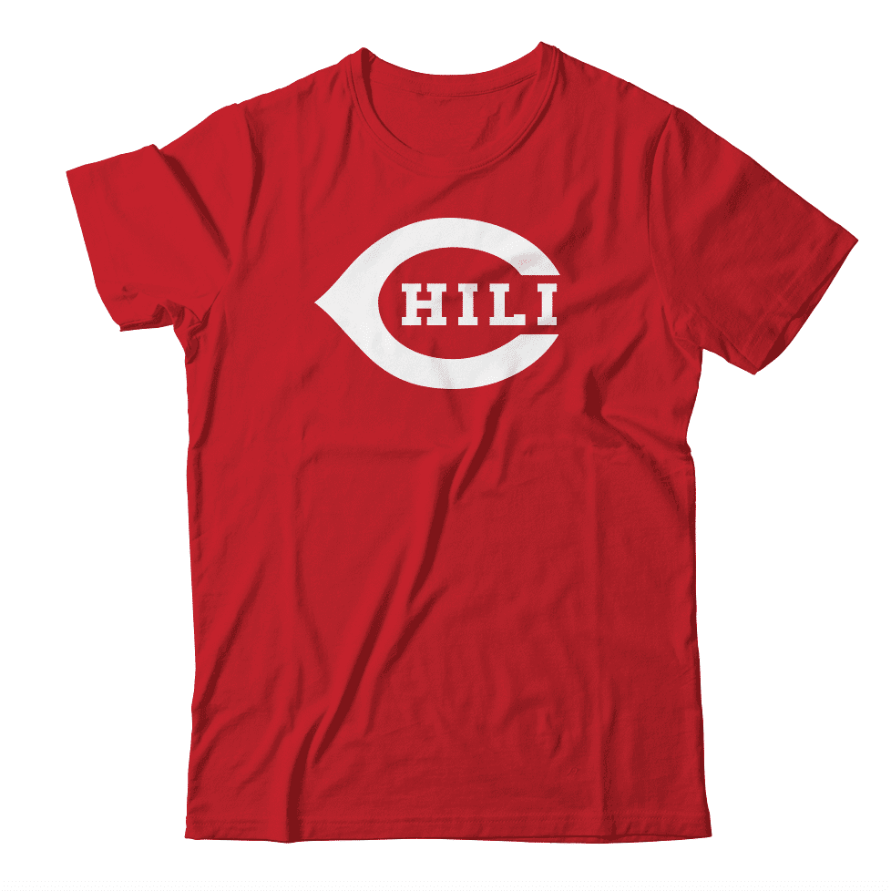
Hi there. In case you missed it a few days ago, Thursday was National Chili Day. Of course, for many of us, every day is National Chili Day. So I had this design mocked up. Just hypothetically speaking, wouldn’t it make a great shirt — you know, theoretically? If you agree, feel free to tell me.
Meanwhile: The results of our “Redesign the Patriots” contest are now available over on InsideHook. Enjoy!
Okay — back to you, Phil!
Uni Watch News Ticker
By Phil

Baseball News: From Clemson Uniform Tracker: Credit to
@ACCNetwork for applying the color vs color matchup to the scorebug Red circle They even used the South Carolina’s baseball logo, but not Clemson’s ‘C’. … Pretty cool field mowing pattern in this preseason game between KC and Chicago (from Lee Wilds). … It’s not exactly a new phenomenon for spring training, but there are times when color vs. color is really brutal (from 8/24). … Ooops! The Cubs broadcast somehow forgot there’s supposed to be a baseball in the Brewers logo (from Eric Schmitz). … “Appears that all teams in the Shriners College Classic are wearing event patches,” writes Chris Mycoskie. If you look closely, you can see that Mizzou baseball was wearing the patch on the back of the uni. … Kyle Mc tweets, “I’m pretty sure this is new, looks like Twins are finally recognizing the history of the original Senators, which is part of our franchise. Hopefully they retire Walter Johnson’s non number next,” (via Paul). … New road grays for Mississippi State baseball (from Timmy Donahue). … Check out this “pretty unusual” purple vs green color matchup in LSU vs Baylor (from Evan Saacks). Wonder who Paul would be rooting for. … This weekend, ECU baseball is wearing #23 for Coach LeClair (from Michael Grubb). … (Also posted in NBA): LeBron James was celebrating BHM last night by wearing a Jackie Robinson jersey and some kind of custom Brooklyn Dodgers cap (from Jakob Fox). … What’s worse than a “Los Rojos” (Reds) jersey with a Mr. Met patch? I’m guessing not much (from Brandon Ramõn). … Here’s a cool concept for the Washington team that moved from Montreal (from Timmy Donahue).

NFL/XFL News: You know things are getting out of hand when Garth Brooks’ wore a Detroit Lions Barry Sanders jersey, and it was mistaken for Bernie Sanders endorsement (not that he’s wrong though). Yeah, I mean things can get out of hand. … In the XFL (yes, they’re still in business), the Guardians have shortened shoulder stripes to make room for a longer NOB (from Donovan Shartswell). … Running back Johnny Davis was missing a helmet logo during the 49ers 1981 NFC West division clincher vs the Giants (from Jess).
College Football News: Running out of numbers? Why not add one: College football players set to be allowed to wear No. 0 in package of newly proposed rules. The rule still needs to clear one more hurdle before it is fully approved.

Hockey News: The Tri-City Americans wore special pink trimmed uniforms for Breast Cancer Awareness Night (from Wade Heidt). … Also from Wade, the ice was painted pink for the game. … More from Wade: QMJHL’s Charlottetown Islanders wore special uniforms on Player’s Night. He explains, “These uniforms were designed to honour the history of hockey on Prince Edward Island. The crest, colours and number font all represent different teams from the past on Prince Edward Island. Had nicknames on back in the nameplates. Here is an explanation of the different sources of inspiration found in this article.” Here are the uniforms, including matching goalie equipment in green for Matthew Welsh. Also notable during this game Friday night, the visiting Cape Breton Eagles wore a white jersey paired with their black helmets and black socks. They are on a 2 game road trip and road teams usually wear their dark uniforms. … Here’s some Boston Bruins pregame video which includes a discussion about how retail dictates what teams wear on the ice (from Justin Hicks). Apologies if this doesn’t open (you may be able to watch it via download). … “Governor Cuomo with team-appropriate orange tie as he announces Islanders will play home games at the Coliseum for the playoffs and future home games,” says Matt Shevin). … And speaking of the Isles (and as God intended), the team was wearing white at home and a 91 patch for Butch Goring number retirement from USA USA USA). … And a few Isles legends were in attendance (from James Beattie). And here’s the number being raised (also from James). … Also from James, “It’s (sorta) color vs color in LA” (yesterday). … Louis Domingue was traded to the Canucks from the Devils at the trade deadline. His Vancouver Canucks mask is now ready. Here it is. He had a mask wrap done by Mario Design in Barrie, ON. (from Wade Heidt). … Stars representing BC Hockey National championships positioned too far below collar resulting in oddly positioned nameplate and number (from Jonathan Fox).

NBA News: Pretty cool story here of a company that takes old NBA jerseys and turns them into “upcycled” merchandise. … “Allen Iverson wearing number 6?” asks Luke McCarnan. “Apparently to honor Dr. J at the 2002 All Star Game.” … (Also posted in Baseball): LeBron James was celebrating BHM last night by wearing a Jackie Robinson jersey and some kind of custom Brooklyn Dodgers cap (from Jakob Fox). … Noah Castroll notes on the side of the Big Z Bobblehead box yesterday evening, the Cavaliers featured all of their logos in a timeline as they celebrate 50 years.

College/High School Hoops News: Yesterday, former Syracuse Orange player Big John Wallace had his jersey retired by the team. … Wake Forest’s Brandon Childress with his dad’s #22 WFU jersey number on his warm-up shirt. Dad is also a WFU assistant coach (from James Gilbert). … ESPN’s score tracking has included striped referee jerseys for TV Timeouts (from Jeremy Brahm). … Timmy Donahue observes, “Marquette in BFBS so the score bug is accurate. It’s just too bad that the floor at Marquette matches Seton Hall’s unis.” … Color on Color for DII final regular season conference game between Coker University v. UVa Wise (from Coach Greene). … Oops! Watch the score reversal on bottom of screen (from ChiTown Tiger). … LSU retired Mahmoud Abdul-Rauf’s (fka Chris Jackson) #35 jersey during halftime of the TX A&M game on SAT, Feb. 29. Abdul-Rauf still holds college basketball’s freshman scoring record (from Timmy Donahue). … UNI & Drake with a color vs color matchup yesterday (from Adam Nilles). … Peep the warmup jerseys for Keenan HS! (from Chitty2Bang2). … “Color v. Color as Arizona State takes on USC. Good luck figuring out who is who,” says Timmy Donahue. … Also from Timmy, the Canton Central (NY) High School Golden Bears going GFGS in the Section X tournament at SUNY Potsdam. The look was not well received by all. … Here’s a look at the Strickland pins Portland State coaches wore last night (from Brett Hein).

Soccer News: Here’s a look at this week’s Premier League kits (from Josh Hinton). … XFL lines and markings were visible on the pitch at Audi Field for yesterday’s MLS opener between DC United and Colorado Rapids (from Josh Hinton). … Also from Josh, Chelsea changed into their all-white away strip at Bournemouth yesterday. When the two sides met earlier this season in December, both wore their home kits w/o any issue. … The New Mexico United Away jersey was released. Tweeter Brendan Kearns says, “Looks like they’ll pair the all-yellow outfield player kit with an all-blue keeper kit.” More on that in this thread.

Grab Bag: American Airlines employees are getting new uniforms. Those will, in theory, replace the old unis that were blamed for rashes and headaches. … A man and his flag collection: Interesting video of a gentlemen collecting flags (from Jon Vieira). … The subject of the e-mail from Trent Guyer read: Royal City Roundup Major – World Champions Rodeo Alliance. He writes, “Using the crown from the Royals alternate logo. With permission? Not sure.” … It’s not really logo theft (image appropriation?) but here’s an interesting name and logo for a local Plumbing Company (from K-Dill). … The OKC Nat’l Memorial & Museum honored OKC’s 1st responders. Heads of OKC PD, Fire, & EMSA recieved specialty 25th anniversary badges honoring “those who were killed, those who survived & those changed forever.” (from Timmy Donahue). … BRA-GRE 2004 Olympics Women’s Volleyball, white vs white. Both teams with accent colors, but could have been really confusing in a major international event (from Jeremy Brahm). … The Louisiana State Univ at Alexandria Generals introduced their new mascot “Tank.” The white bull terrier w/ a military helmet represents the Generals nickname & the connection of LSUA Athletics to the military (from Timmy Donahue).
I know soccer uniforms, especially in Europe, traditionally have corporate logos, but in yesterday and today’s posts I find it hard to appreciate the MLS uniforms with my eye zeroing in on each of the logos over everything else. Great for the advertisers, but…
It’s hard to even classify those things as uniforms imo – players are just walking billboards.
Would help to see entire uniform, not just jersey review. Taken as a whole (jersey, shorts, socks) the advertiser is less dominating. And as Paul always reminds us, a “jersey only” is as much a retail product as a uniform. And particular to soccer/football, seeing the entire kit makes a big difference. Blue/white/white is very different from the same blue with blue/blue or red/blue etc.
I give credit to Minnesota for using an advertiser logo that doesn’t really look like advertising, and could *conceivably* be a uniform element.
New York’s XFL team is the Guardians.
Other XFL uniform news. The St. Louis BattleHawks wore mono-blue at home for the first time.
link
I tip my hat to the fans in St. Louis. The attendance for the BattleHawks has been decent and what you would want for most all the teams so that the league can be successful. Probably some of that backing in response to being abandoned by the NFL and proudly showing that the fans can support football. It has a similar feeling to me to the mid-90s Baltimore Stallions in the CFL with their attendance success, before the NFL rolled back into town.
However, problem spots existing in the league. The “crowd” for the New York Guardians game yesterday was painfully small. They announced over 12,000 fans in that giant stadium, but it looked like it was less than that.
Not a fan of the Twins embracing their previous corporate incarnation. Just as Gary Carter never played for Washington, Walter Johnson never pitched for Minnesota. Enough with celebrating corporate history!
Given Cal Griffiths racist motivations for abandoning DC, it’s even more unseemly.
I can’t for the life of me understand why any fan would want to co-op the team history from a city they’ve already taken (received?) a team from. It’s not like the streets of Minnesota were flowing with people celebrating the Washington Senators World Series victory, or bars and barbershops were full of people talking about the team. I think ‘corporate history’ is a great way to describe what people are ultimately ‘celebrating’ when they try to honor that aspect of a team’s history.
The Cal Griffiths angle definitely makes it even worse.
Last link in baseball section (Washington/Montreal) seems to be dead.
July 20, 1950 for the scoreboard. Reds 3, Dodgers 1. First game of a doubleheader. Ted Kluszewski homered. Game was played in one hour and forty three minutes.
It’s nice to see the buildings behind Crosley Field’s scoreboard. There used to be a whole neighborhood or, more likely, a warehouse district behind Crosley Field. Pictures of the Red’s scoreboard chronicle its demise until eventually there’s nothing around the ballpark.
I like Jimmer’s concepts! One question though, on the Indians caps, why not go with the “Caveman C” to match the font on the jerseys?
I like Jimmer and David’s designs, just one question. Why go with the block C on the Indians caps instead of keeping the font consistent from the cap to the jersey?
My own takes on MLS.
Nashville: The yellow is different than Columbus; I was formulating that thought before I read the reviewers.
Galaxy: The white has too much white on it. From twenty yards away the sash might as well not exist.
Minn U: Anything which suggests the NASL is great by me.
San Jose: Too much a jumble with the shoulder stripes and the yellow/blue marks on front.
Chicago: By the dint of not changing, NWSL’s Red Stars have the best pro soccer logo in Chicago now.
Montreal: Grey jersey is dull, and in the era of too many plain white tops, that’s saying something.
Some of them are really impressive but the grey one is very dull
So I guess Seattle gets a gold star on their kit for being the prior year cup winner and second white star for the prior cup win?
Yes. The general rule is a gold star for the current reigning champion, and silver stars for past championships. The only exception is the Galaxy, who wear a gold star to symbolize their record fifth title.