There are a lot of significant visual changes on MLB diamonds this season — the addition of the Nike maker’s mark, the Padres’ return to brown, the return of the Brewers’ ball-in-glove logo, and more. But arguably one of the most important design revisions was unveiled yesterday, as the Phillies revealed the new-look Phillie Phanatic.
In case you hadn’t heard, the latest tweaks to the Phanatic’s visage were prompted by a legal spat between the team and the mascot’s creators. So how does the new version compare to the old? Twitter-er and Phillies fan @PhillyPartTwo spent a good portion of yesterday breaking down some of the before/after issues:
He's also now a lighter green, no fur on his hands, scales under his arms, light blue tail, stars over his eyes, bigger and lightbluer eyebrows, and seems to have lost like 50 pounds. #PhilliePhanatic pic.twitter.com/5sHGrTdQxv
— Michael MPH 🇺🇸 (@PhillyPartTwo) February 23, 2020
Hard to tell from the photos so far, but it appears his horn snout might be a bit stubbier as well, which would be in line with the lawsuit. Hope the blowout noisemaker is still intact. #PhilliePhanatic pic.twitter.com/L2gKmjQ36O
— Michael MPH 🇺🇸 (@PhillyPartTwo) February 23, 2020
@Uniwatch One more look at the new #Phanatic… from the front. Yikes the eyes. Didn't I see him in Rocket Man? And looks like he's wearing New York Rangers leggings. pic.twitter.com/tOOtTvA54j
— Michael MPH 🇺🇸 (@PhillyPartTwo) February 23, 2020
Hmmmm. At first I thought, “A blue tail? For the green Phanatic? That’s crazy!” But it turns out that he already had a blue tail — I just didn’t realize it. (Did you? Be honest!) It’s now a lighter blue, as you can see here:
Phillie Phanatic Before and After. Looks like our boy is coming into spring in the best shape of his life. pic.twitter.com/fDgTUp9wah
— Crack the Bell (@crackthebell) February 23, 2020
Overall, I’d say most of these changes are not for the better, but at the same time they don’t seem to be doing any irreparable harm to the character. Speaking of which, his character is still, well, very much in character:
He has evolved, but clearly hasn't matured. pic.twitter.com/Tmo5jHNQOB
— Philadelphia Phillies (@Phillies) February 23, 2020
There’s some additional video (which I wasn’t able to embed properly, alas) here, which again makes it clear that the Phanatic’s essential Phanaticism remains intact. It’s like when your favorite comic book character — which is what the Phanatic basically is — is suddenly being drawn by a new artist: mildly jarring, but the character is still the character.
Of course, it helps that the Phanatic has such a strong behavioral identity. His individuality is rooted as much in what he does as it is in how he looks. If you compare that to, say, Mr. Met, I’m a big Mets fan but I couldn’t really tell you what Mr. Met does other than wave and cheer (and occasionally flip the bird). So if they changed his design — maybe give him a cube head instead of a spherical one? — it would be tougher for fans to swallow, because he doesn’t have much of a behavioral identity.
Meanwhile: It’s also worth noting that the Phanatic’s new jersey doesn’t have the Nike maker’s mark. Looks like his old one didn’t have the Majestic mark either. So in some ways, he’s the best-dressed guy on the field.
Click to enlarge
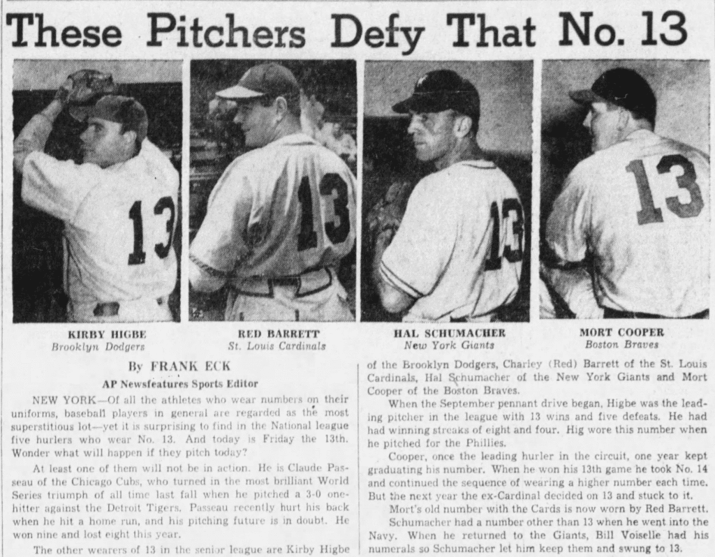
Uni Watch before there was Uni Watch: It’s always interesting to see uni-centric articles from the era when such articles were rare. Longtime reader Kenn Tomasch found one of them yesterday, when he came across this old AP wire story about MLB pitchers who defied superstition by wearing No. 13. Even better, the article ran on Sept. 13, 1946 — which was Friday the 13th!
No quotes from any of the pitchers, unfortunately, but it’s still nice to see that some sportswriters were paying attention to uniforms way back in the day.

Click to enlarge
Too good for the Ticker: Ooh-la-la, what have we here? It’s a vintage thrift store find by Twitter-er @kingtaay. I love warm-up tops like this one. Let’s have a look at the back, shall we?

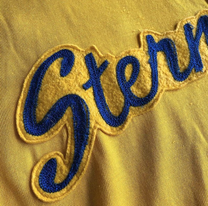
Very nice chain-stitching! But the best part, of course, is that mascot patch on the front. Let’s take a closer look:

Hmmm, a diapered, halo-clad baby wearing what appears to be boxing gloves. So was the team called the Fighting Angels? The Fighting Kewpies? Something else? @kingtaay doesn’t know, and my initial googling hasn’t turned up any promising leads. Anyone know more..?
Click to enlarge
The movement continues: Reader @ClintFromOhio is the latest to perform a logo-ectomy on one of his caps, and I think you’ll agree that his work is among the best we’ve seen. Very nicely done!
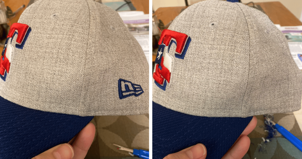
Meanwhile, Jason Sonnabaum has become the first cap surgeon I’m aware of to remove the MLB logo from the back of the cap:
@UniWatch It's more challenging than removing the NE logo, but nice and clean now. pic.twitter.com/jUX9AnH0rh
— Jason Sonnabaum (@JasonSonnabaum) February 24, 2020
Also: In case you missed it on Friday, reader and cap surgeon Wes Muniz has created an excellent video tutorial on how to remove the logo with a seam ripper. It has been viewed over 1,000 times so far — amazing! Here it is:
If you need a seam ripper of your own, you can get one at any fabric store, or order one from me. #NoEra
Click to enlarge
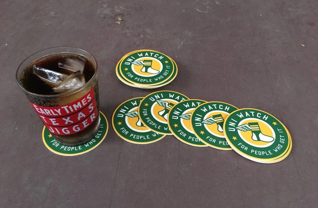
Going fast: As of now, I have only Coasters now sold out, sorry!two one remaining sets of these great-looking Uni Watch coasters. I’m selling them in groups of three for $9 with free shipping. Who wants ’em?
The Ticker
By Jamie Rathjen

Baseball News: Reader William F. Yurasko tells us that the U.S. Capitol Police, D.C.’s Metropolitan Police, and the D.C. fire department all had patches celebrating the Nationals’ World Series championship. … USC debuted camouflage jerseys and caps this weekend (from multiple readers).

Football News: The St. Louis BattleHawks are apparently the first XFL team to add captaincy patches (from multiple readers). … In a bizarre coincidence, the BattleHawks also have one player named President and another named Hillary (from Jeff Greinstein). … The BattleHawks’ logos also have some hidden symbolism (from Brad Eenhuis). … Brad also sent us this Iowa high school with odd sleeve stripes ca. the early ’80s, but doesn’t remember which school it is. … Cross-posted from hockey: The WHL’s Brandon Wheat Kings wore Winnipeg Blue Bombers-themed jerseys (from Wade Heidt). … In this video, you can see “Broncos” painted in the end zone during a 1970 Bills/Broncos game in Buffalo. Great uniforms, too (from Jason Gutierrez). … Here’s a ranking of the NFL’s worst helmets (from Tim Dunn).

Hockey News: The Kings saluted Kobe Bryant yesterday by wearing L.A. Lakers-themed pregame sweaters with Nos. 8 or 24. … The Capitals will give out jersey towels tomorrow for their celebration of Alex Ovechkin’s 700th goal. Twitter-er @the_casserole points out that the jersey has yellow laces, like Ovi’s skate laces, but obviously the Caps’ jerseys don’t normally have laces. … The pads used by Hurricanes emergency backup goalie David Ayres on Saturday apparently were an old set from the AHL Toronto Marlies’ Kasimir Kaskisuo (from @OlegKvasha). … The Rangers wore dark blue warmup jerseys with flag-themed numbers on Saturday (from Wade Heidt). … More junior hockey items from Wade: The WHL’s Brandon Wheat Kings wore Winnipeg Blue Bombers-themed jerseys. … The WHL’s Regina Pats wore autism-awareness jerseys. … The WHL’s Victoria Royals wore pink-accented uniforms with a crest based on that of the Pacific Coast Hockey League’s Victoria Cougars, who became the last non-NHL team to win the Stanley Cup in 1925. … The OHL’s Kingston Frontenacs wore camouflage — it may not be related, but the Royal Military College of Canada is located in the city. … Down a level in junior hockey, the British Columbia Hockey League’s Merritt Centennials wore uniforms in support of the Ty Pozzobon Foundation, a charity founded in memory of a professional bull rider from the city who died by suicide in 2017. … Bowling Green wore throwbacks this weekend (from @CLEsportsfan3)

Basketball News: Cross-listed from the hockey section: The NHL’s L.A. Kings saluted Kobe Bryant yesterday by wearing Lakers-themed pregame sweaters with Nos. 8 or 24. … Celtics players paid tribute to Bryant in their game against the Lakers by wearing purple sweatbands with his numbers on them (from @HitTheGlass and Jakob Fox). … In what seems like another Kobe tribute, Spurs SG Lonnie Walker wore one yellow and one purple shoe (from Devon Kuckenbecker). … Women’s college teams wearing pink or pink accents included Georgia Tech (from Richard Musterer), Wake Forest (from James Gilbert), and Michigan State. … Cincinnati’s men’s team wore black at home to create a color-vs.-color game with Wichita State (from John Muir). … Northern Iowa’s men’s team wore purple at home. … Yesterday was “2000s Night” in Portland, so the score bug for the Blazers/Pistons game included a throwback Pistons logo (from many readers).

Soccer News: German teams in the Bundesliga and 2. Bundesliga wore black armbands in memory of the victims of the mass shooting in the country last week. … Staying in Germany, 3. Liga teams wore warm-up shirts in support of Würzburger Kickers center-back Leroy Kwadwo, who was racially abused recently. More info here. … French team Paris Saint-Germain replaced their front ad with a message of support for Chinese coronavirus victims. … Scottish team Aberdeen wore a patch of a logo they released last week celebrating the club’s recognition by UEFA as 2019’s best professional European club for work done in the community. … Twitter-er @VictoryCB sent us this badge from current English League Two team Northampton Town, which as far as I can tell never appeared on their shirts, though the player’s type of collar and the style of ball would date it to probably the 1950s or early ’60s at the latest. … 1976-77 throwback kits for Israeli side Maccabi Tel Aviv (from Ed Zelaski).

Grab Bag: Thailand cricketers wearing single-digit numbers at the ongoing Women’s Twenty20 World Cup in Australia have a leading zero before the number. … Four AFL Women’s teams wore rainbow accents for the league’s pride weekend: Carlton, Geelong (separately from their game this weekend), St. Kilda, and Western Bulldogs. … Jeremy Brahm also sent us some long-sleeved AFL guernsey concepts. Because AFL Women’s takes place during the Australian summer, some players there actually do wear sleeves. … Wales’s rugby union teams both wore green clash socks in the men’s and women’s Six Nations this weekend (from Sy Hart). … Major League Rugby’s Houston Sabercats are the only team in the league with their own stadium, so they have their logo at midfield — elsewhere in the sport there’s usually nothing or an ad there — and it’s oriented towards the end zones, not the sidelines, like bygone center-ice logos in hockey (from Josh Lurie). … The helmets worn by Boston University’s women’s lacrosse goalies feature a Boston city skyline (from @FrozenRodent). … An Anchorage police officer was apparently saved by a gunshot hitting his badge (from Timmy Donahue).
Our latest raffle winner is Glenn Chavez, who’s won himself a complimentary Uni Watch membership. Congrats to him, and thanks again to William Beebe for sponsoring this one. — Paul
The DC patches were made by an enthusiast. None of those shown were authorized or worn on uniforms. It has become a cottage industry to make and sell coins, patches and badges anytime something of note happens.
We did miss something significant for Ticker. Saturday night the Los Angeles Kings wore white throwbacks:
link
link
Also, they had white warmup jerseys that night with their infamous Burger King logo on them.
Soooo much nicer than the current uniforms.
Port Neches-Groves (TX) High School used to have stripes like that Iowa HS on their sleeves and pants. Those were some nice-looking unis. They should bring those back. (Alas, PL, their colors are purple and white.)
The Phillie Phanatic makeover reminds me of when the KGB Chicken (aka the San Diego Chicken) went through a few different designs. But as long as Ted Giannoulas was inside the costume, nobody really noticed.
Yes, exactly — great point!
(Aka the Famous Chicken!)
Had no idea the Phanatic had a blue tail, mind blown on that one. It’ll take some getting used to, but I agree, as long as he acts the same it’s all good. The blue socks are weird though, did the creators claim ownership on all variations of red hose? If he couldn’t wear read stirrups, why not high red socks? Another question: is there a chance that this issue is resolved, and the Phanatic goes back to “normal”?
Honest question – what would be the motivation behind removing the MLB logo? I get removing the maker’s mark but I feel as if the MLB logo would be ok here.
It’s right there in the guy’s tweet: He thinks it looks “nice and clean” without the MLB logo.
In short: aesthetics.
Since he doesn’t show the front of the hat to know what team it’s for, it could also be a Cooperstown/throwback hat where the MLB logo is anachronistic
There’s no right or wrong with this particular hobby – it’s a clear example of Duke Ellington’s dictum, “If it sounds good, it is good.” But personally, I would only want to remove the MLB logo on a cap representing an era in which teams did not wear the MLB logo on their caps.
On the other hand, do I leave the New Era size sticker on the bills of hats from the 2000s, when it was common for people to leave those stupid stickers on their caps? No, no I do not. So period fidelity isn’t everything to me. (And yeah, I get that there’s a difference between on-field and fan wear, but for a number of years those ridiculous stickers telling everybody just how small your head is were everywhere.)
The Wheat Kings/Blue Bombers uni is gorgeous! Buffalo Sabres, take note!!!
Love the football in the logo. It looks like the football in the old primary Blue Bombers logo that they stop using after the 1994 season.
It looks alright but I would have prefer them incorporating something like the logo on this Roger Edwards sweater:
link
Paul, I’m still stuck with the desktop view on my Android. Any progress on getting the plug-in problems fixed so I can view the site in mobile? Thanks.
We’re working on it. Thanks for your patience.
Hoping to have it resolved today.
I’m in the same boat. Desktop version on an Android.
I think what might bug me the most about the Phanatic redesign is that none of the Phillies uniforms have blue socks, (Even though I’ve said from day one the Sunday alts should), So why does the Phanatic?
Tampa Bay Bucs confirm uniform change, but no pictures (sigh) link
The item about pitchers wearing the number 13 reminded me that Ralph Branca wore 13. Not so lucky five years after the article appeared.
Paul, any changes to your thoughts on the XFL. For a minor spring league it actually better than expected. The talent is obviously not NFL level, but a lot of the game presentation and rule tweaks actually are really good and make it watchable. It really appears they did pay attention and focus on the football aspects in stark contrast to gimmicks of the original XFL. In my mind this is what the NFL should have as their official spring developmental league, which could allow young players to skip or leave college early and make some money on a minor league deal (for the players who will not get any value out of a free college education). I could actually see this making it beyond season 1.
I haven’t watched any of it, so I have no opinion on the product.
I remain skeptical. But as I’ve said all along, it would be fun to be proven wrong, just as it would be fun to find out that there really is a Tooth Fairy. Let me know if they make it past a second season!
You said they wouldn’t make it past a first season.
No, actually, I did not say that. But either way, if they tank after one season or two, it’s pretty much the same difference, no?
If you think a three-week sample is somehow indicative of a venture’s long-term viability, be my guest. I remain skeptical.
The XFL games I’ve seen have been surprisingly good – and surprisingly well-uniformed. The XFL is the rare example of a league whose uniforms seem to have been designed to look better on the field and in action than draped on a hanger in a store.
As for your thoughts about a developmental league, hear hear! I’d go a step further, and say that I’d much prefer if the NCAA shut down athletic scholarships entirely, and let the NFL and NBA run their own paid minor leagues. If a child can get more out of a four-year college degree than he can out of playing a ball sport, great! That child should go to college. If the reverse, great! That child should play minor-league ball as a professional and try to work his way into the top league.
The Phanatic’s new blue eyebrows remind me of Andy Rooney. This redesign feels like a knock-off Elmo you’d see in Times Square. It’s like if a friend of yours got facial reconstruction surgery. Maybe it doesn’t look worse, but it doesn’t look like your friend anymore.
Two things:
Proofreading: I love warm-up tops like this one. Let’s havea look at the back, shall we?
I tried to zoom in on the tag on the Sternhagen shirt but couldn’t read it when I did. Is there any information on the tag that might help?
No, unfortunately.