Click to enlarge
Good morning! Greetings again from Florida, where the Tugboat Captain and I are spending a few days visiting her parents.
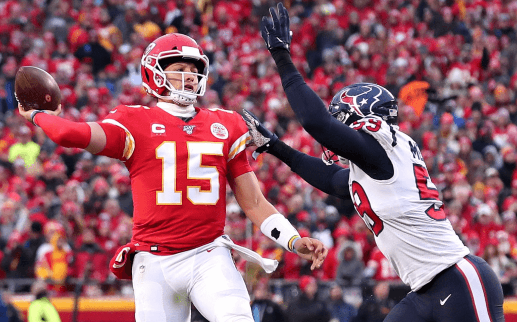
An annual postseason ritual came into play yesterday in Kansas City, where the Chiefs wore captaincy patches — something they don’t do during the regular season but add for the playoffs — for their game against the Texans. (The Packers used to have this same protocol, but this season they wore captaincy patches for regular season games.)
Interestingly, the Chiefs even added the captaincy patches to their pregame warmup gear. I don’t recall seeing any team do this before, although I admittedly don’t keep close tabs on pregame attire (click to enlarge):
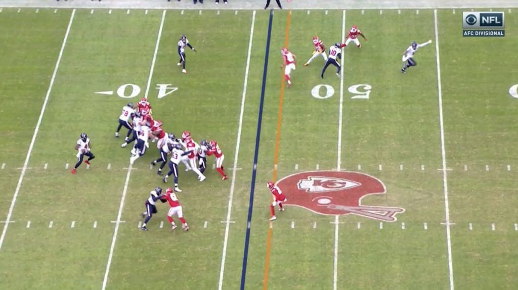
The Chiefs also went old-school by changing their midfield logo from their primary team logo to a helmet with a grey two-bar facemask — a particularly odd move considering the team has worn white masks since 1974:
The Chiefs ended up scoring so many touchdowns that the stadium crew ran out of fireworks — and apologized for it on the scoreboard:
The #Chiefs literally ran out of fireworks because they scored too much!! pic.twitter.com/boBomUjVq5
— Alex Gold (@AlexGold) January 12, 2020
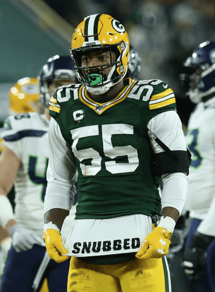
As for yesterday’s NFC game — Seahawks vs. Packers — there was one uni-notable moment, when Packers linebacker Za’Darius Smith recorded a sack and then exposed the bottom of his undershirt, which featured a protest about his omission from the NFC Pro Bowl roster:
Looking ahead, next Sunday’s NFC championship game should be a beauty — Niners in red vs. Packers in white on grass. The AFC game won’t be quite as attractive, since the Titans’ uniforms are several notches below the Chiefs’, but it won’t be a disaster. And unless the Titans win next Sunday, we should have a very good-looking Super Bowl.
(My thanks to Adam Good and Mike Chamernik for their contributions to this section.)
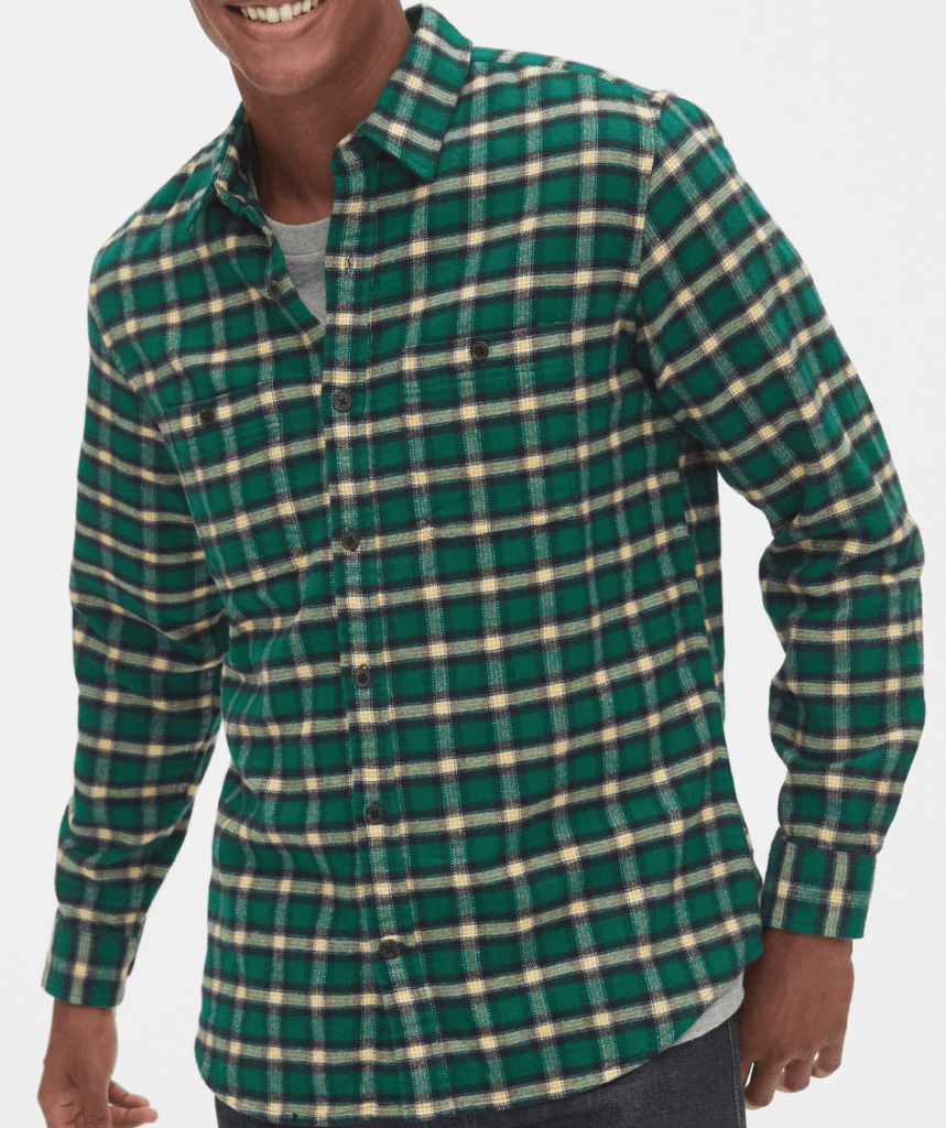
A little story: Aside from underwear and socks, my clothing purchases are almost exclusively vintage items, not new. But I was recently at a party where my friend Garth was wearing a really nice green check flannel shirt. After I complimented him on it, his wife said she got it for him at the Gap. I was surprised, and also intrigued, so the next day I looked up the shirt on the Gap’s website, found that it was on sale for $31, and ordered it.
It arrived with one button missing. Hey, it happens. No problem, I thought — shirts always come with a couple of extra buttons sewn into the inner front shirttail. But this one didn’t. (Maybe that stopped being the norm at some point during the many years since I last purchased a new shirt..?)
No problem, I thought — they probably keep extra buttons on hand for this type of situation, so I’ll call their customer service number and have them send me a new button.
But when I called, they said they didn’t have extra buttons, so instead they sent me an entire new shirt, along with a mailing label to return the first one.
This is, frankly, easier for me, because now I don’t have to sew a new button onto the first shirt. But it still seems ridiculous, sort of like the toast scene in Five Easy Pieces. I mean, geez, why not just keep including the extra buttons on the shirttail? Has that really gone out of vogue?
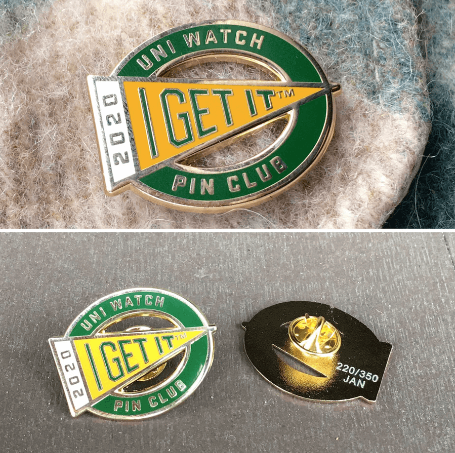
Assorted reminders: In case you missed it on Wednesday, I’ve partnered with the great Todd Radom to create the Uni Watch Pin Club, which will feature a new limited-edition enamel pin design for each month of 2020. The January pin (shown above) — a numbered edition of 350, well over 100 of which have been sold so far — is now available, and you can get the full scoop on all the Pin Club particulars here.
In addition:
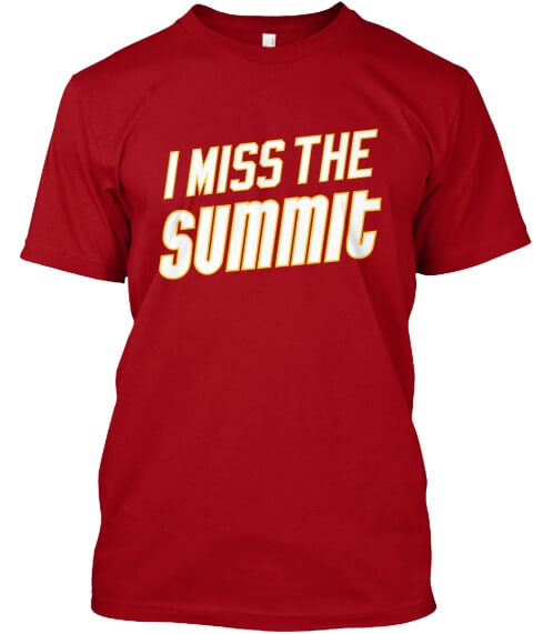
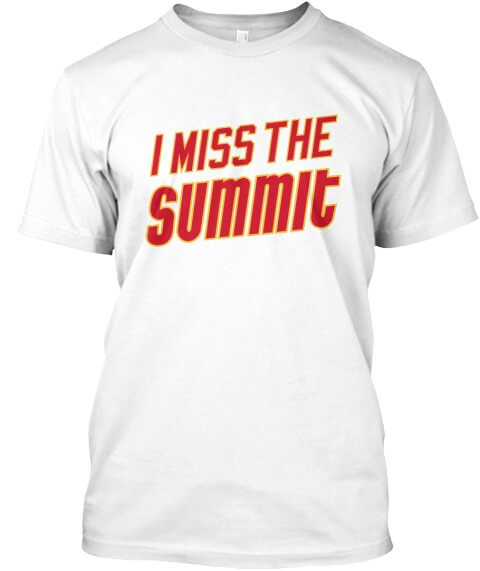
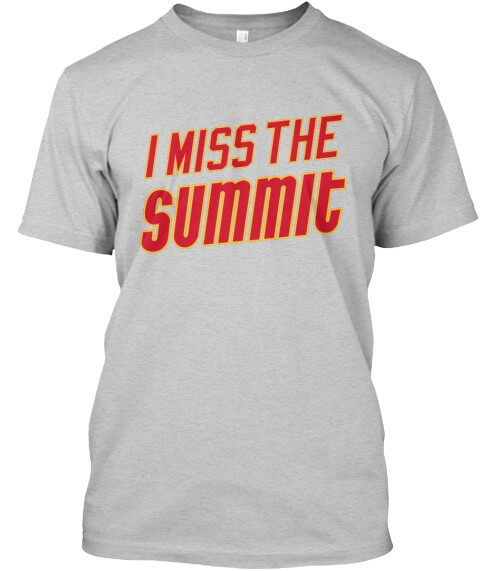
• On Friday I announced the launch of some new Naming Wrongs shirts for the Summit in Houston. It’s available in red, white, and grey:
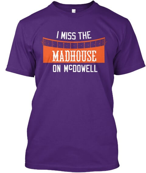
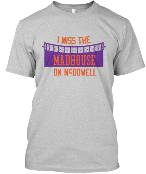
• And on Saturday I announced the launch of an additional pair of Naming Wrongs shirts, this time for the Madhouse on McDowell in Phoenix. This one’s available in purple and grey:
Okay, end of sales pitch!

Membership update: Some new designs have been added to the membership card gallery, including Todd Arnesen’s 1997 Newcastle United treatment. (Card designer Scott M.X. Turner did a bang-up job on that one, no?)
Ordering a membership card is a good way to support Uni Watch (which, frankly, could use your support these days). And remember, a Uni Watch membership card entitles you to a 15% discount on any of the merchandise in our Teespring shop and our Naming Wrongs shop. (If you’re an existing member and would like to have the discount code, email me and I’ll hook you up.) As always, you can sign up for your own custom-designed card here, you can see all the cards we’ve designed so far here (now more than 2,400 of them!), and you can see how we produce the cards here.
The Ticker
By Jamie Rathjen

’Skins Watch: On Friday we had an item about an Idaho state legislator who planned to introduce a bill that would prohibit school districts from changing their mascots or team names, which was in response to an Idaho school that decided last summer to stop calling its teams the Redskins. That legislator now says he has changed his mind (from Brad Iverson-Long). … The NHL’s Winnipeg Jets and their AHL affiliate, the Manitoba Moose, have unveiled indiginous-themed logos created by a graphic designer from the Pimicikamak Cree Nation. The Jets will wear jerseys featuring the new logo for their pregame skate on Jan. 17, and the Moose will wear theirs for their game on Jan. 18 (from Andrew Forbes).

Baseball News: Reader Andy Shain tells us that the Single-A Columbia Fireflies retired three numbers of pioneering black baseball players over the summer: No. 14 for Larry Doby, who was from the area; No. 20 for Frank Robinson, who played for a different Columbia minor league team; and No. 42 for Jackie Robinson. … We’ve previously mentioned the 1988 Dodgers writing “JH” on their sleeves during the playoffs in support of suspended P Jay Howell. Michael Miller sent us a New York Times article from then about the tribute. … Remember the Uni Watch design contest to create a “futuristic” jersey for the summer collegiate team the Portland Pickles? Brad Meadows bought one of those jerseys from the team but has now decided to sell it on eBay — a genuine piece of Uni Watch history, if you’re so inclined.

Football News: In the run-up to tonight’s national championship game, helmet historian Blaise D’Sylva is counting down his top 17 “coolest” college helmets, and yesterday had No. 5 through No. 2. … Daniel Smith notes that tonight’s title game is the first one — and this seems to include both the playoff and the BCS and its predecessors — not to feature a team that wears red (or a shade thereof) or blue. … Here are some good screen shots of the WFL’s experiment with position-specific pants (from Jerry Wolper).

Hockey News: NHL ref Kelly Sutherland, who was working yesterday’s Canucks/Wild game, appeared to put in his teeth before announcing a penalty. … A Flames fan has a collection of 40 jerseys from Calgary teams, as well as some Canada jerseys (from @omicbumz). … The AHL’s Bridgeport Sound Tigers wore camouflage warm-ups Saturday (from Zach Pearce). … The ECHL’s Toledo Walleye wore Spiderman-themed jerseys (from Mark Monroe). … Minnesota-Duluth’s women’s team revealed city-themed jerseys for next weekend, which include curling stones as a shoulder patch (from Paul Friedmann). … We mentioned Rush drummer Neil Peart’s drum kit covered in NHL team logos, but in this video he’s also wearing a sweater with the logo of his restaurant (from Gabe Cornwall). … Wade Heidt has a bunch of junior hockey items for us: the OHL’s Ottawa 67s wore Schrute Farms Beets jerseys, a reference to a shirt worn by Dwight Schrute in an episode of The Office. … The OHL’s Sudbury Wolves dressed up as doctors and auctioned the jerseys off, with the proceeds going to a local health science center. … The OHL’s Peterborough Petes honored former NHL player and executive Colin Campbell with a banner and throwbacks from when he played for the Petes. The throwbacks have TPT on the front because the team had an advertiser, Toronto-Peterborough Transport, in its name at the time. … The OHL’s Erie Otters wore cancer-awareness jerseys. … Two WHL goalies, the Prince Albert Raiders’ Max Paddock and the Moose Jaw Warriors’ Boston Bilous, moved teams but still had pads from their previous teams. … Down a level in junior hockey, the British Columbia Hockey League’s Trail Smoke Eaters and Penticton Vees both wore throwbacks for a “world championship weekend.” Until 1963, the winner of the Allan Cup, Canada’s senior amateur championship, represented Canada at the world championship instead of a true national team. The Smoke Eaters and Vees’ throwbacks were patterened after senior teams of the same name that won the world championship in 1961 and 1955, respectively. … The BCHL’s Salmon Arm Silverbacks also wore jerseys accented in orange and teal, the city’s colors.

Basketball News: Duke revealed, and wore, dark blue alternates at home on Saturday. The men’s team appears to be slated to have six uniforms this season, but it’s worth noting that so far none of the alternates have been extended to the women’s team (from multiple readers). … On the other hand, N.C. State’s women’s team wore black yesterday, which Gabe Cornwall says makes four uniforms for them this season. … Miami (Fla.) G Chris Lykes wore two different colored shoes yesterday, not for the first time this season (from Miami mop guy Rich Friedman). … New Mexico State wore throwbacks Saturday (from @NMStateFlush). … The D League’s Texas Legends wore Special Olympics-themed jerseys on Saturday (from Chris Mycoskie). … Recent color-vs.-color college games included Purdue/Michigan State yesterday, Texas Tech/West Virginia on Saturday (both from Josh Hinton), USC/UCLA on Saturday (from Matt Shevin), and Iowa and Maryland’s women’s teams on Thursday. … Spanish team CB Estudiantes wore rainbow uniforms to, as they put it, “promote diversity” (from multiple readers).

Soccer News: The English Championship’s Welsh teams, Cardiff City and Swansea City, wore black armbands in memory of former Cardiff players Alan Harrington and Chris Barker. Cardiff also wore the armbands last week in the FA Cup together with their opponents, League Two’s Carlisle United (from Josh Hinton). … The next three are also from Josh: Mexican team Querétaro got two new shirts, switching to Charly from Puma. … Mexican team Pachuca apparently prefaces single-digit numbers with a zero, and in a previous version of their font, the zero was shaped like the club crest. … Italian team Cagliari wore their 100th-anniversary shirts. … Also in Italy, Lazio revealed and wore 120th-anniversary shirts — basically, they have a real collar and black accents (from Ed Żelaski). … You can see more on Josh‘s Twitter feed. … A Serie A game between Hellas Verona and Genoa was delayed because the 18-yard box didn’t have straight lines. … New second shirt for Colombia’s Atlético Nacional. … In Australia’s W-League, both Melbourne City and Canberra United wore black armbands for the victims of the country’s bushfires. … The NWSL’s Washington Spirit released a graphic which to me implies that they’re going to switch to wearing mono-white as first choice. While the Spirit have always worn red with varying amounts of blue, they’ve recently worn mono-white at home when playing at D.C.’s Audi Field.

Grab Bag: The NLL’s Georgia Swarm wore purple cancer-awareness jerseys on Saturday (from Wade Heidt). … The Australian Football League is to hold a charity match Feb. 28 between a Victoria representative team and an all-star team in support of relief efforts for the country’s bushfires, which means AFL players are to wear Victoria’s distinctive blue jumper with a large white V for the first time since 2008. … AFL teams Adelaide and Port Adelaide are also to play a charity Twenty20 cricket match Feb. 2, which already has its own logo. … Here’s a survey seeking input from the public on a new Utah state flag design (from Jonathan Martin). … Here’s the story behind one man’s enormous golf ball collection (from Justo Gutierrez).
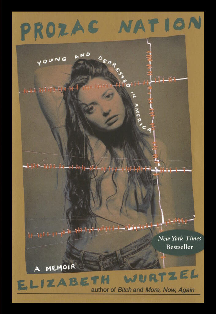
A complicated life: As you’ve probably heard by now, the writer and self-obsessive Elizabeth Wurtzel, best known for her 1994 memoir Prozac Nation, died last week at the age of 52. She had major issues with depression and addiction throughout much of her life, so I’d always figured she would die by suicide, but instead it was cancer.
I never read any of Wurtzel’s books (I remember skimming through a chapter of Prozac Nation at Tower Books shortly after it came out and then putting it back on the shelf after deciding it was drivel), but I did read a fair amount of her articles over the years — she wrote a lot — and was often impressed by them. I’ve read more of those articles in the days since her death, and have also read several appreciations and remembrances of her and have listened to this 2013 podcast interview with her, all of which has gotten me thinking a lot about her and her work.
Like many people — especially male writers of my generation — I initially dismissed Wurtzel and later came to respect her. Looking back, that initial reaction was largely fueled by envy (why was everyone making such a fuss over her while I had to hustle so hard?), resentment (when I act like an asshole, people call me out; when she acts like an asshole, she gets a book contract!), sexism (the only reason she gets this much attention is that she’s good-looking!), and other forms of pettiness. In other words, I had a lot of insecurities and self-loathing. So did she — but she seemed better at making those deficiencies work for her. And that just made me feel more insecure.
Over the years, though, as I read more and more of Wurtzel’s articles, I became a fan. I was impressed by the fact that she didn’t just become a professional celebrity or marry some rich guy, which seemed like the predictable trajectory. Instead, she kept writing, went to law school at Yale (“on a lark,” she said), wrote some more, and generally seemed to remain true to herself, for better and worse. She also seemed to be pretty self-aware about her personal flaws and was able to laugh about them. Good for her.
I never met Wurtzel (although a few of my friends knew her). She was famously self-absorbed, logorrheic, and dramatic — all things I have a hard time dealing with — so I’m sure I wouldn’t have had the patience for her theatrics. I tend to process information in a very linear way, and I tend to surround myself with people who do likewise, but Wurtzel clearly processed the world in non-linear ways, more stream-of-consciousness ways. People like that make me itchy, probably because they seem to have tapped into some inner part of themselves that I can’t tap into or just don’t have (more insecurity), so I usually steer clear of them. That’s often my loss, and it certainly would have been my loss in Wurtzel’s case, because the things that made her so hard to deal with were clearly the same things that made her so interesting.
Wurtzel wrote primarily about herself and was probably the premier confessional artist of the last generation. I’m a bit of a confessionalist, too — nowhere near as much as she was, but I do tend to share a fair amount of my life in my work. As I do that, I’m always thinking about the line between public and private, between an interesting anecdote and an overshare, between being relatable and just enjoying the attention (hell, I’m doing it right now with this essay, this paragraph, this sentence). Those can be hard lines to draw. Wurtzel didn’t blur those lines so much as she simply ignored them. As a result, she was routinely described as being self-absorbed, self-aggrandizing, masturbatory. She didn’t care. As she once wrote, “I believe everyone is entitled to my opinion.”
Why do some of us have that need to express ourselves so personally, whether through essays, blogging, songwriting, art, or whatever? In Wurtzel’s case, a lot of it clearly had to do with depression. As she once wrote, “I was born with a mind that is compromised by preternatural unhappiness, and I might have died very young or done very little. Instead, I made a career out of my emotions.” That appeared to be the best anti-depressant for someone who was clearly in a lot of pain, of various sorts. I’ll miss her work, but I’m glad her pain is finally gone. R.I.P.
Of all the shirts I’ve bought lately, there’s been a couple that came without extra buttons, but most of them still do.
Then again, I haven’t bought anything from the Gap.
I think all of my dress shirts came with extra buttons, but none of the casual type shirts did.
I spot-checked some of my newer shirts and they all came with extra buttons. They weren’t all sewn on the inner front shirttail though. Some were sewn by one of the side seams and one shirt had them sewn to the care label. Not sure if they still do it but Banana Republic (owned by the Gap) attached the extra buttons to a small card along with thread.
I bought a blazer recently with one button missing – the last one in that size and no spares. They gave me 20% off and I figured I could just replace the 2 buttons but later found the missing one loose in the inside pocket. Score!
I agree that sending a whole shirt is wasteful – these large companies claim its more efficient (and then apparently the returned item just ends up in an outlet rather than being repaired and sold again).
Or returned items might just end up in a landfill, sadly.
link
I buy shirts in that price range about once or twice a year. Most still come with those extra buttons.
Agreed, GB @ Niners will be a classic looking uni game. Forecast is for good weather too, so no sloppy unis.
I think that’s a shame. The 1996 game was a messy delight for the eyes.
link:
Classic. Edgar Bennett looked like Andy Dufresne after crawling through a river of s—- in that game.
That game was in Green Bay.
So when people say “two bar facemasks”… do the connecting bars not count?
To me, this is a two bar facemask
link
Where this is four
link
Otis Taylor is actually wearing two one-bar masks in those photos!
But yeah, what you refer to as a four-bar is what I (and I think most others..?) call a two-bar. I don’t count the connecting bars.
Thanks. That’s my literalism getting in the way.
Since I was young there’s been a lot of change. That ‘two-bar’ I always associated with Staubach, Charlie Joiner, Mark Duper, Kenny Anderson…gone.
And now facemasks with center vertical bars like almost all linemen used to wear seem to be very rare. I see linemen now wearing facemasks I would’ve associated with running backs or QBs.
Cats and dogs, living together, it’s anarchy, I tell you!
I was watching an NFL Films entry on Don Meredith over the weekend. Noticed he started with a single bar mask, went to a double bar mask and then towards the end of his career, went with what I would term a Quad mask, usually worn by running backs.
Single Bar, no chinstrap
link
link
Single Bar
link
Dual Bar
link
Quad Mask
link
This is the kind of mask I wore in high school.
Can’t remember the last time I saw one in live action.
link
I always liked this 80’s version of the classic 2-bar:
link
link
link
Not to mention the Lester Hayes…
link
Those were the styles that were introduced as I entered/exited high school. We had a mix of suspension helmets and water/air helmets back then.
I have a Bumble water bottle that they sent me and my wife as part of a swag bag when we got engaged. That’s where I keep all the extra buttons that come with clothes. I’ve only needed to dip into it once for a pair of shorts. Not sure if it was even the right button, but it worked!
1. It pains me to say this as a proud UNC graduate and Tar Heel for life but those Duke alternates are really nice. Anything that moves them away from BFBS is a step in the right direction.
2. Sounds like the Idaho legislator is too cowardly to admit he overplayed his hand trying to make it harder for schools to eliminate racist names, so he is falling back on his government philosophy instead of simply admitting his idea went over like a wet fart in church. Whatever gets you through the day, my man…
MJ
Totally agree with your assessment of DUKEEs alts. One could do so much with that color scheme other than BFBS…. and so they have.
My wife is a Tar Heel grad as well, though she still has them on “probation” (not watching them on the youtube TV) due to that decades long cheating scandal. Journalism school grads are like elephants – the never forget.
Or as the locals call it “Why punish us? Everybody cheats!” Not true Congressman Christensen!
UNC will do better if only because the Dookies, who take great pride in beating UNC, take even greater pride in the quality (and cost $$$$) of their Dukish education, laugh with sheer delight watching UNC step on a rake with cheatin’ boobery.
Speaking of Neil Peart, I saw Rush on the Hemispheres tour at Nassau Coliseum the night before the Islanders were about to win their first Stanley Cup in the same building. The band came out for the encore wearing Islander jerseys . I haven’t been able to find a photo of that all these years later…
-Jet
Apparently Neil Peart’s “restaurant” only exists virtually – link
Seems to be a creative project that Uni Watchers would appreciate
“Speaking of Neil Peart…” perhaps I am missing it, but was he mentioned in the blog today somewhere? That said, as a fellow writer and music-lover, I wonder what Paul thinks about Mr. Peart’s writing and lyrics (and perhaps the band’s music)? When I first saw the last portion of the blog for a second I expected it to be about Mr. Peart.
In the hockey section of the Ticker.
Wurtzel was a solipsist, and had she been unattractive she would’ve been ignored. She just happened to exist during the GenX zeitgeist where navel gazing was a sport, and we GenX’ers were looking for voices. Whatever the case may be, I’m saddened to read that another soul was lost to cancer. May she rest in peace.
If the Chiefs and Packers win it will be a rematch of Super Bowl One. Too bad the Chiefs would be the home team so we won’t have the same uniforms in the game. Of course the Chiefs would most likely wear red pants, where they wore white back in the first Super Bowl.
Technically, it would be a rematch of the first AFL-NFL World Championship Game, which is what the Super Bowl was called for the first two years it was played.
Really splitting hairs at this point. The game had been referred to informally, even in league circles, as the “Super Bowl” before it became the official name with the third iteration. And the NFL wasn’t the NFL for its first two seasons.
Sometimes you just gotta let it slide.
This picture shows the use of “Super Bowl” during the pre-game.
link
Maybe the 2Bar was a little subtle honor and maybe a little good vibes to be thrown their way commemorating the 50th anniversary of Super Bowl IV? (Saturday the 11th was the date)
Ah, good call!
Yes it was to honor the 1969 team. The end zones were done in that style as well.
Okay, so, on those Duke uniforms…why do two of them look the exact same?
I seriously cannot tell a difference.
Which 2 Duke uniforms? All 5 are very different: traditional home white; traditional home blue; “traditional” black alts; grey with gold trimmed “G.O.A.T.“ jersey; and navy gothic with white trim “Brotherhood” jerseys. The 6th jersey appears to be Durham themed based on the clues. Also the Duke women generally have 4 jerseys: white, blue, black and white with pink trim or pink breast cancer jerseys.
At 0:02 of the Twitter video, both the top left and right uniforms look exactly the same.
RE: buttons, I think it might be a gap thing. Had not noticed before, but it seems all my shirts from the gap dont have buttons, but non-gap shirts do have the spare buttons.
I’ve never seen Prozac Nation and have not read anything from Elizabeth Wurtzel, but all the tributes to her I’ve read since she’s passed suggest I’ve missed following the career of a unique writer. I will have to remedy this.
Paul, thank you for the tribute. I went to school with her and Prozac Nation hit me really hard.
Perhaps I’m playing devil’s advocate here, yet I’m not trying to stir up a big controversy, but isn’t it a bit hypocritical of us to continue to use the Redskins logo (which we find so inherently offensive) to represent the ticker section of native American team names and imagery? If we find the logo so offensive, why can’t we design something else to represent that section? (We could have even have a design-the-symbol contest.) How can we preach that teams are offensive for using native American names and imagery, and then use one of their logos for purposes we find justified, especially when the vast majority of ticker items mentioned in this section are for teams other than the Redskins? (My brother-in-law annoys the hell out me because he’s always whining about all the ways he claims liberals are hypocritical, but when I really got to thinking about it, maybe we are being hypocritical in this situation. Luckily he doesn’t read uni-watch as I would hate to give him any more fodder.)
“Do as I say, not as I do”
-Liberals.
If it’s KC vs the 49ers in the Super Bowl, will that be the most “red” Super Bowl ever?
In addition, it would be two teams with similar color schemes, replace old gold with athletic gold. And each team generally does not wear black, with the exception of the outlining on their helmet decals.
Perhaps grey facemasks for both the Packers and Chiefs, if they get in? I know, wishful thinking..
Not sure how Wyoming’s Bucking Cowboy helmet doesn’t make the top 17. Boise State’s lunatic horse? Really?
Interesting trivia for Championship Week: All four teams have letters of the alphabet in their helmet logos, and all four starting QBs wear double-digit numbers. That has never happened in the Super Bowl era.
The only time all four teams had letters of the alphabet in their helmet logos was 1984-85 (49ers, Bears, Dolphins, Steelers); the Bears started Steve Fuller in the NFC title game, wearing #4.
The last time all four starting QBs wore double-digit numbers was 1990-91; Jeff Hostetler (15), Joe Montana (16), Jim Kelly (12) and Jay Schroeder (13). It also happened in 1981-82 (Montana, Danny White (11), Ken Anderson (14) and Dan Fouts (14)), and fairly regularly prior to that.
Here’s the story behind the Chiefs’ helmet and the gray facemask. The field is a throwback to the 1969 season when the Chiefs went on to win Super Bowl IV. 2019 of course being the the 50th anniversary of that season. The Chiefs tried to replicate the field at old Municipal Stadium which is where the team played that season, at least with the end zones. There are a few photos floating around of the old stadium and the team routinely used the arrowhead logo to mark where kickoffs would take place. (35 or 40 yard line) Multiple logos were used at the 50–helmet, arrowhead, etc.
Here is an in-action shot of Team Canada (Penticton Vees) vs. Team Canada (Trail Smoke Eaters) this weekend:
link
I know Junior A hockey has a budget, but too bad Penticton did not get some blue pant shells like the team back in 1955:
link
They managed to get a set of brown gloves to mimic the tan gloves, but wore their regular pants. Canadian Tire should have sprung to set them up with pant shells if the team has going to have that large ad on their jersey.
A bit of disappointment with Trail having the phantom shoulder yoke on this jersey. That is not throwback like 1961:
link
Re: the Chiefs’ old-school gray twin-bar helmet at the 50 on Sunday: I’d heard something along the way that it was the day after the 50th anniversary of their Super Bowl, and the end zones were also done up circa ’69-’70 for that reason.
The Arizona Veterans Memorial Coliseum still goes by that name, so no actual naming wrong at play.
Also, the saloon font for Madhouse should gave a border, but I’m sure going to a 3 color setup costs more for so little added.