For all photos, click to enlarge
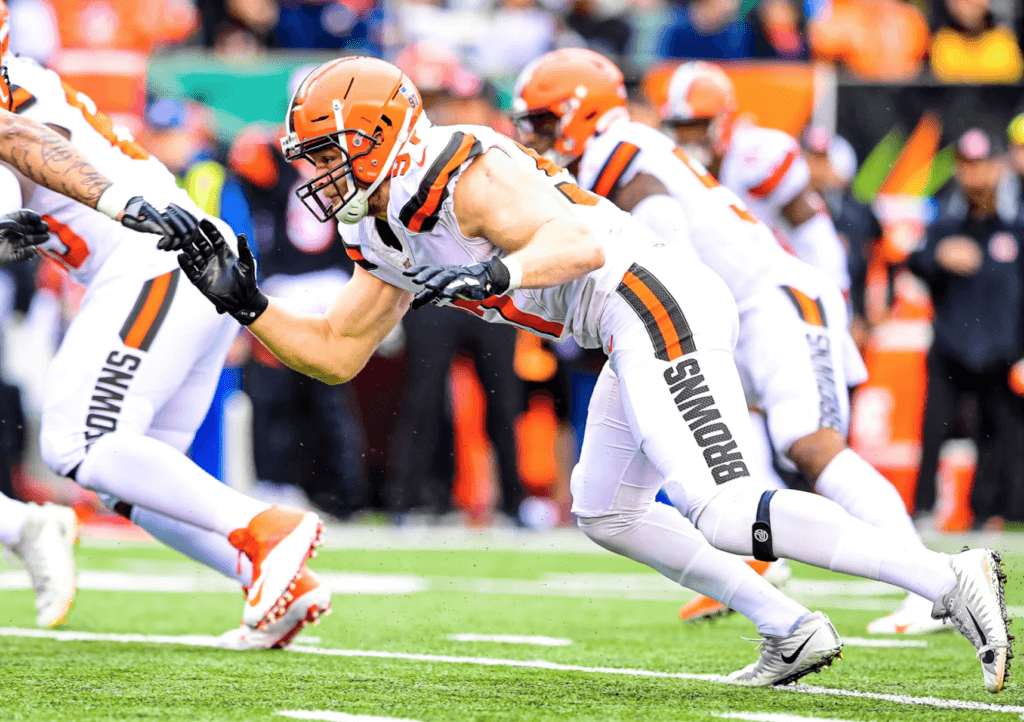
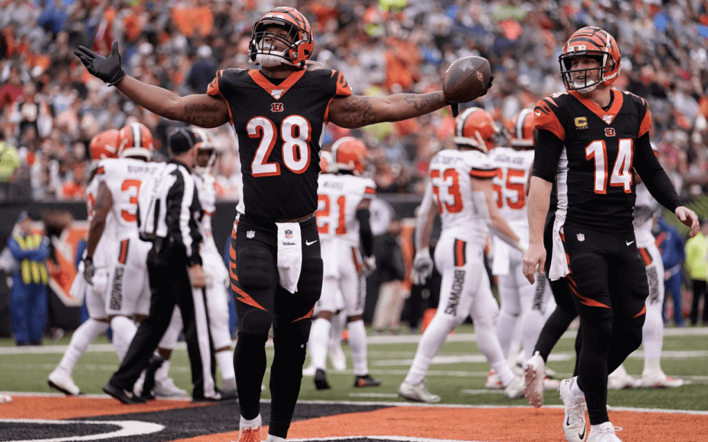
Good morning! Notable moment yesterday in Cincinnati, as the worst pants in NFL history took the field for the final time. The uni-verse won’t be quite the same without that big honking wordmark to make fun of, but I’m sure we’ll all manage to persevere somehow. (Bonus points to reader/Twitter-er Doug Helmreich, who got the last laugh by asking, “What happens next year when they replace “BROWNS” with “PANTS”?)
In other news from around the league yesterday:
• In that Browns/Bengals game, Cincy went mono-black:
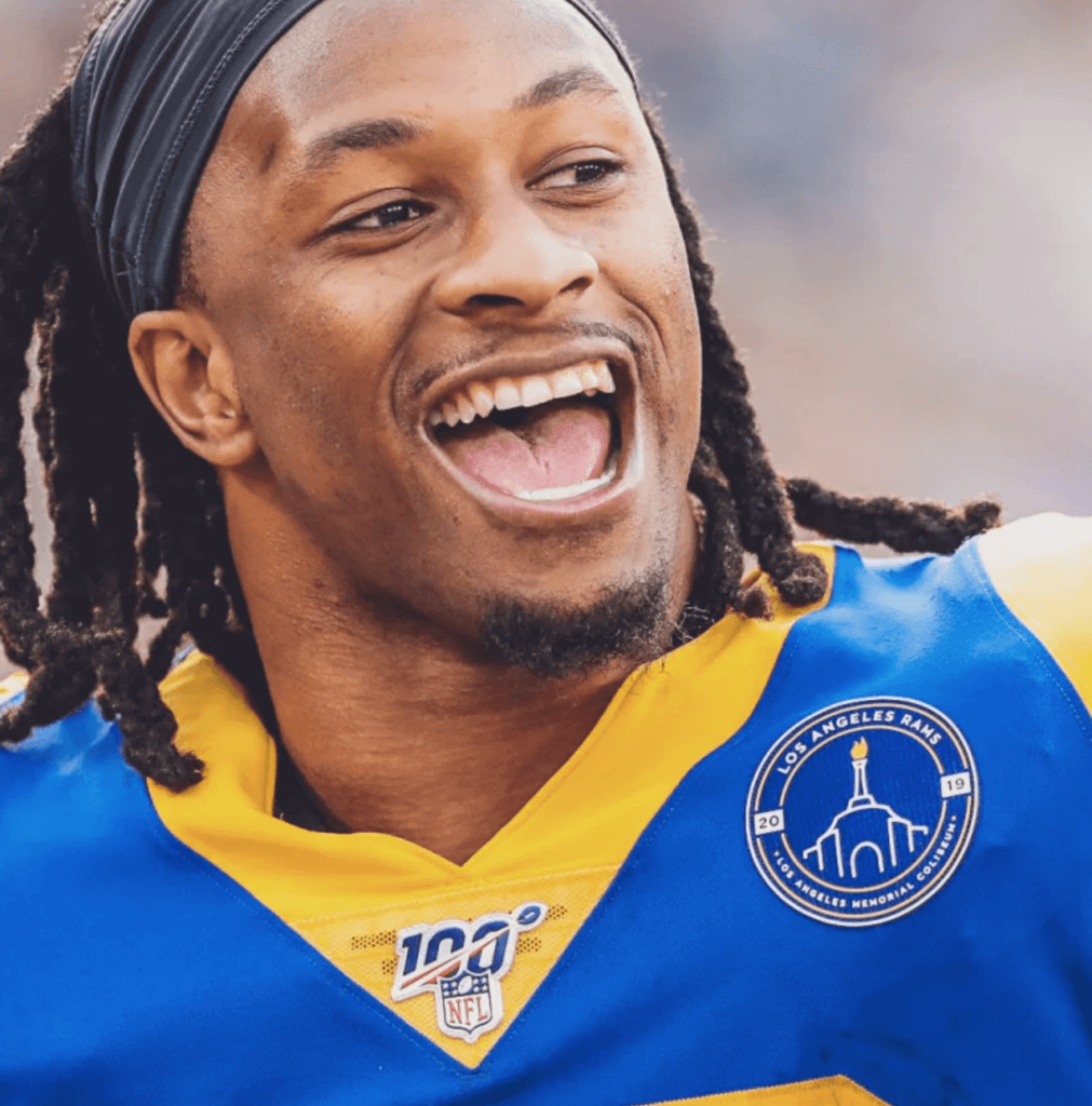
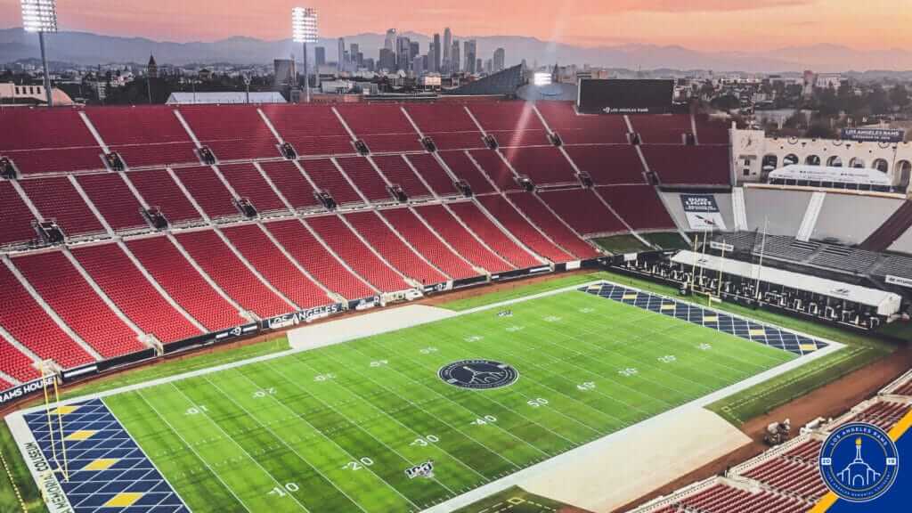
• The Rams added a jersey patch for their final game at the L.A. Coliseum:
The Rams also put the patch logo at midfield and used retro end zones inspired by the 1951 NFL championship game:
• The 49ers wore their white throwbacks:
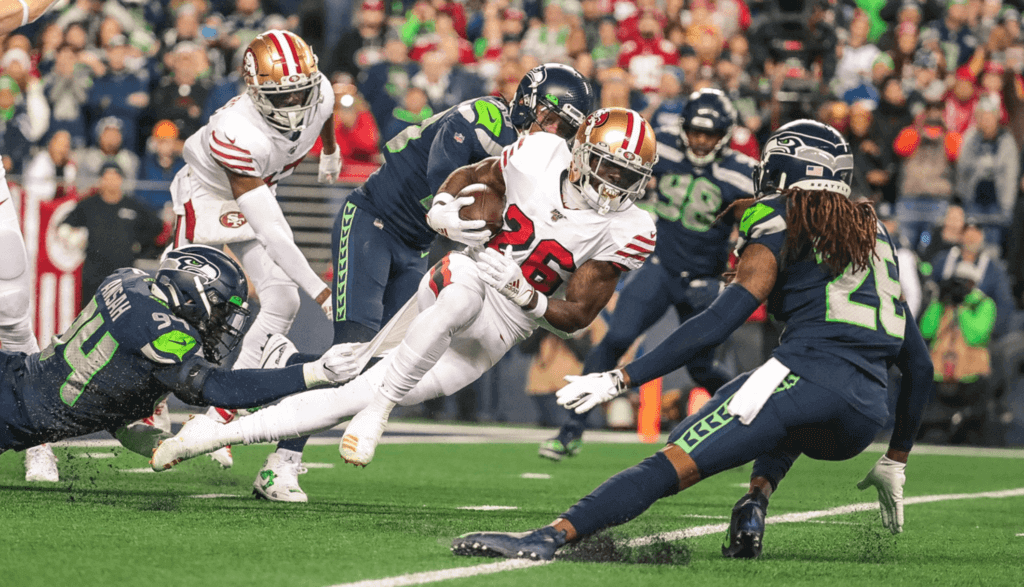
Interestingly, the Niners wore their contemporary helmet logo, instead of the throwback logo that they’ve previously worn with this uniform. Here’s a comparison — throwback logo on the left, modern logo on the right:
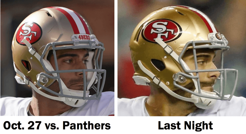
As you can see there, they didn’t bother to use the throwback bumper logo last night either.
• Prior to that Niners/Seahawks game, former Seattle linebacker Brian Bosworth raised the Seahawks’ “12” flag and wore an unusual jersey for the occasion:
Brian Bosworth wearing a #Seahawks jersey with 55 on the front (his Seattle number) and 44 on the back, which is the number he tried to wear, but the NFL wouldn’t let him because he was a linebacker. @UniWatch pic.twitter.com/QTIhU1lx1p
— Cork Gaines (@CorkGaines) December 30, 2019
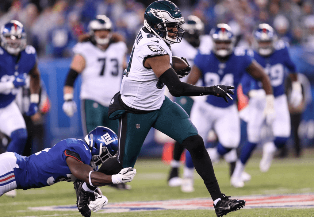
• After not wearing their green pants for two years, the Eagles have now worn them twice in three games. It’s a good look:
• Here’s something I completely missed over the past few weeks (and apparently so did everyone else): Back on Dec. 12, the NFL announced the 32 nominees for this year’s Walter Payton Man of the Year Award. So for the last three weeks of the season, including yesterday, the nominees were wearing the Payton logo as a rear-helmet decal, as seen here on Cardinals running back David Johnson:
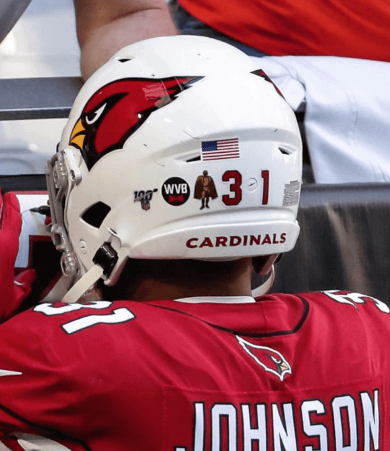
The winner will have the Payton logo added to his jersey next season, and will continue to wear it for the rest of his career.
• Only one team wore white at home: the Cowboys, of course.
And that’s it — not just for this edition of MMUW, but for the 2019 NFL regular season. I’m feeling pretty good about my favorite team’s chances in the playoffs. Go Niners!
(My thanks to Jakob Fox and our own Brinke Guthrie for their contributions to this section.)
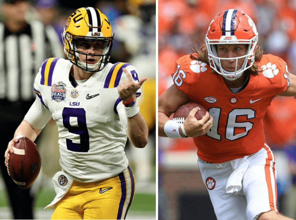
Yikes: As you’re probably aware by now, both teams in the college football national championship game wear purple trim, so you’d think I’d be in a deep funk, right?
But here’s the thing: Of all the purple-clad teams out there in the uni-verse, I think LSU looks pretty good. Not just good for a purple team — good overall! So I’ll be okay on game night — no need to coax me off the ledge.
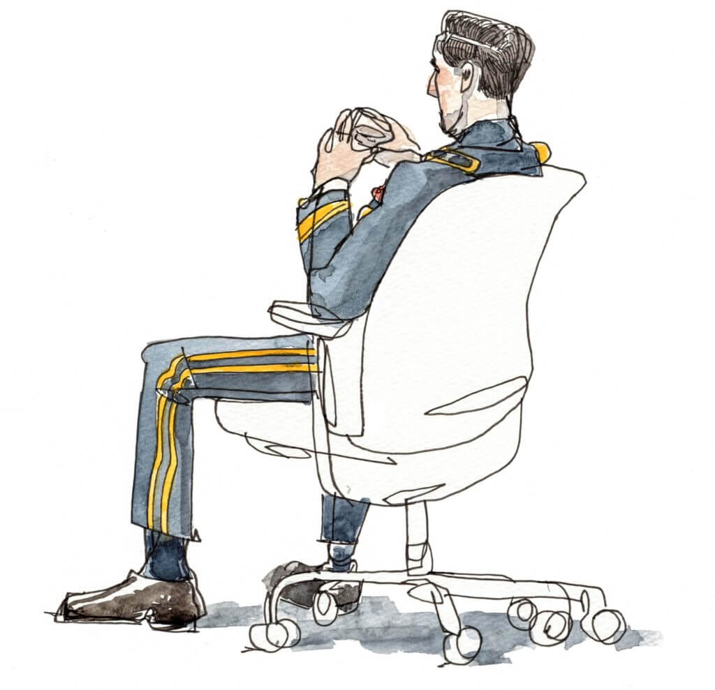
Illustrations by Wendy MacNaughton; click to enlarge
Different kinds of uniforms: By far the most interesting thing I read over the weekend was a New York Times piece about the uniforms and other clothing worn by the defendants, attorneys, judge, and other personnel at the military court at Guantánamo Bay, where the Sept. 11 terrorists are being tried. Photography is not permitted, so the Times sent an illustrator to document the proceedings. The illo shown above is of the chief war crimes prosecutor, Brig. Gen. Mark S. Martins, in his dress blues.
We’ve all seen courtroom illustrations before, of course — newspapers and other media outlets have been using them for over a century. But what’s different about these Guantánamo sketches is that they had to be reviewed and approved for public release by the military before they could be published. In some cases, the Times included the approval seal along with the sketch, as seen in this illo of defendant Ammar al-Baluchi:
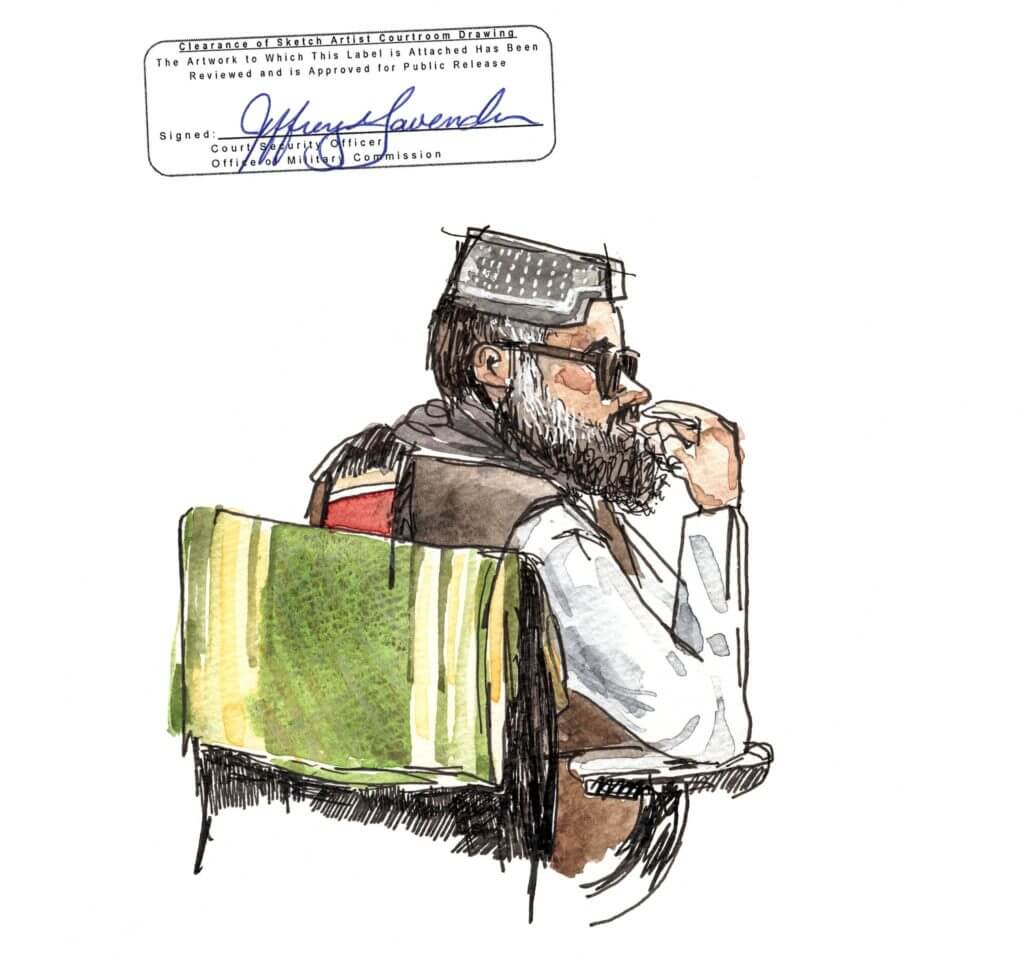
That’s pretty fascinating! But as an aside, it’s depressing that the military, or the government, or whomever made the common mistake of lowercasing “is” in the seal. (Proper title case style is to capitalize all verbs, regardless of how many letters they are. Lots of people make this mistake, but I expected better from the U.S. military.)
Anyway: The entire article is super-interesting and educational, and offers lots of insights into how uniforms and other clothing can play into the proceedings at a trial. Highly recommended.

Click to enlarge
Raffle update: Almost all of the prizes from this year’s year-end raffle have shipped out (if you missed it on Christmas Day, you can see all of the winners here), and some of the winners have already received their prizes. That includes Scott Steffes, who won the five numbered patches that were generously donated by Charles Neiswender.
Just one problem: Although Scott listed the patches as one of his prize choices, he says he doesn’t know what to do with them now that he’s won them. Do Uni Watch readers have any ideas? If so, post them in today’s comments. Thanks!

Click to enlarge

Culinary Corner: We had some leftover Hanukkah latkes, so I crumbled one of them up and put it in my salad the other night. Better than croutons!
I know, I know — how could any delicious latkes possibly go uneaten in the first place? But the Tugboat Captain made so many of them that we couldn’t finish them all. And this turned out to be a really good use for the leftovers. Recommended!
The Ticker
By Jamie Rathjen

Football News: The Bills let players wear non-Bills jerseys before yesterday’s game, and some examples included QB Josh Allen in an NBA Buffalo Braves throwback and WR Duke Williams in a Boobie Miles jersey from Friday Night Lights — with some liberties taken for the movie, of course (from @mrmichael21 and Timmy Donahue). … The marching bands for the two teams meeting for the NCAA championship, Clemson and LSU, are outfitted by the same company (from James Gilbert). … Here’s the Orange Bowl patch on Virginia’s jerseys. If you haven’t seen, the game is going to be color-vs.-color, apparently at the request of the bowl itself. Wahoowa! … Other combos for today’s bowl games include white/orange/orange for Illinois, black/red/black for Louisville, and mono-white for Mississippi State (all from Josh Hinton). You can see more bowl-related items on Josh’s College Footbowl Tracker. … The recipient of Virginia Tech’s No. 25 for the Belk Bowl is K Brian Johnson (from Andrew Cosentino). … The latest school of the day from Blaise D’Sylva’s helmet collection was Florida. … A sustainable clothing shop in Athens, Ga., has been doing repairs to Georgia’s uniforms since last summer (paywalled) (from David Clemons).

Hockey News: The first three items are from the world junior championship in the Czech Republic: Two brothers playing for Finland, Aku and Aatu Raty, wear “Ak. Raty” and “Aa. Raty” as NOBs (from Wade Heidt). … Canada C Barrett Hayton didn’t remove his helmet during Russia’s national anthem at the end of the game yesterday, angering some of Russia’s players. … U.S. G Spencer Knight’s mask features a shout-out to Miracle on Ice goalie Jim Craig (from Kristian Evans). … Another from Wade: The two Nova Scotia teams in the QMJHL, the Cape Breton Eagles and Halifax Mooseheads, annually play a two-game aggregate series for a trophy called the Hurley Cup. Both teams wore jerseys based on Nova Scotia’s flag, with Halifax in light blue and Cape Breton in white for both games. … Yesterday was the anniversary of NHL officials wearing zebra stripes for the first time (from Jerry Wolper). … Here’s the logo for the NWHL’s outdoor game in Buffalo on Saturday.

Basketball News: A Nike template for practice jerseys worn here by Marquette’s women’s team has a net-like pattern on the back (from Ty Ferrin). … Also posted in football: The NFL’s Buffalo Bills let players wear non-Bills jerseys before yesterday’s game, and one example included QB Josh Allen in a Buffalo Braves throwback (from @mrmichael21 and Timmy Donahue). … Back in 1949, Pepperdine had horizontally striped shorts and matching socks (from Jerry Wolper). … The Grizzlies and Hornets went purple vs. teal last night. “A ’90s color matchup for the ages!” says Tom O’Grady.

Soccer News: Liverpool wore the Club World Cup champions’ patch for what is presumed to be the only time in a domestic game. If it is the only time, it’s going to be memorable for the wrong reasons (from multiple readers). … Scottish Championship team Partick Thistle wore black armbands Saturday in memory of Colin Weir, a lifelong supporter who lived a fan’s dream: he won the UK’s then-largest lottery prize with his wife in 2011 and invested in Thistle, achieving ownership of the club a few months ago. The club previously named their youth academy — which Weir helped establish — and Firhill Stadium’s main stand after him. … This purported New York Red Bulls second shirt for next season would be way better for D.C. United, though the Red Bulls looking like their rivals is probably in this case dressing for success. You can see that and more on Josh Hinton‘s Football Kit Watch. … Dec. 28 is Día de los Inocentes, the equivalent in Spanish-speaking countries of April Fools’ Day, so one website mocked up Barcelona and Real Madrid shirts, each in the style of the other’s manufacturer (from Gabriel Hurl). … A fan in Peru of German Regionalliga Südwest team 1. FC Saarbrücken draws his own match posters for the team’s games. … The BBC has some year-end quizzes: identify for which tournament or period 11 match balls were used — reposted from earlier this year — and place the shirts of Premier League top-six teams in order by the season in which they were worn.

Grab Bag: Penn State is involved in a lawsuit with a local RV company that toes the line of logo-poaching by having a suspiciously similar website address, among other things (from William F. Yurasko). … The Dutch tourist board, in its logo and otherwise, is among several Dutch institutions that wrongly call the country Holland instead of the Netherlands, so the government finally wants everyone to use the right name. … English rugby union team Harlequins annually host a year-end Big Game at London’s Twickenham Stadium and always wear a special kit, which this year was a black shirt and lime green shorts and socks. For the first time, the Harlequins women’s team also played at Twickenham immediately afterwards, but wore the club’s normal look. … The website Rugby Shirt Watch chose their shirts of the decade, including picks from union, league, and sevens (from @GreetingsADM). … Cycling teams that have revealed 2020 kits recently included Movistar and the women’s team Boels-Dolmans.
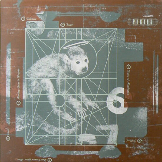

This monkey’s gone to heaven: Sad news yesterday out of the UK, as word came down that graphic designer Vaughan Oliver had died at the age of 62. For nearly 40 years, he designed staggeringly vibrant and original album covers for 4AD Records, giving the label a more coherent and original look than any other recording company of its era. You can see some of that work here.
I only liked a few 4AD bands (including the Pixies, whose Doolittle album cover, one of Oliver’s most famous, is shown above), but I always loved looking at Oliver’s design work in record stores, where I’d pore over albums by the Cocteau Twins and His Name Is Alive even though I had no interest in purchasing them. His work was interesting enough to enjoy for its own sake.
Nowadays, of course, internet streaming has transformed album covers and record stores into endangered species. I use Spotify a lot myself, so I’m in no position to complain about that, but I do think it’s a shame that the next generation of music fans won’t get the chance to discover whoever the next Vaughan Oliver would have been. If you care about design, he’s someone worth learning about. R.I.P. — Paul
Does the color v color matchup in the Orange Bowl produce the largest amount of orange possible? Or am I overthinking it?
Orange cubed! I think it will be a good looking matchup, especially with different blues for a nice contrast.
I guess Florida could wear orange pants, but otherwise, yes.
Did the Niners ever mention why they stuck with their current logo on their helmets last night?
Not that I mind the end result.
Not that I’m aware of.
Not sure why you would be on a ledge Tuesday night, since the CFP Championship is Monday night.
Hmmmm. Not sure why I thought it was Tuesday. Will fix!
Maybe use the patches as an element on bowling team shirts (understanding, of course, that there are usually only four members of a bowling team)?
I’ll admit that I’ve never heard of Vaughan Oliver. I’m pretty sure Raymond Pettibon is the only prolific album artist that I could name. Thanks (once again) for including stuff like this, Paul.
This is probably too soon. Possibly inappropriate. But deeply irresistible. When I read in search of Vaughn’s cause of death (which is unknown), I was somewhat wishing he was killed by ten million pounds of sludge from New York to New Jersey.
In all seriousness… Rest In Peace, brother.
Listening to “This Monkey’s Gone to Heaven” right now…
As a die hard Bengals fan, I think our best uni combos are the white color rush jerseys/pants with orange helmets, and mono black jerseys/pants with orange helmets. Cut the side panels, and I actually don’t think the unis are all that bad!
I appreciate that you like your team’s uniforms, but I see it like this: if you have to explain and “what if” your team’s informs, they’re probably not good looking uniforms.
Any news on when the new Browns unis will be unveiled?
Sometime in the spring, probably around the time of the draft.
“For all phtoos, click to enlarge”
As an aside, it’s depressing that Uni Watch, or Paul Lukas, or whomever made the uncommon mistake of misspelling “photos” underneath the lead photo. ;)
It’s even more depressing to me than it is to you! Will fix.
I would much prefer the Payton Man of the Year winners had the logo as a helmet decal rather than a patch on the front of the jersey.
Agreed
We’ve all heard the “Tigers will win the championship!” jokes, but:
Western KY and Western MI are bowling against each other right now. I’m sure there’ve been some Tech v. Tech, State v. State, and A&M v. A&M tilts in a bowl game. However, does anyone know of another “directional” pair of teams doing this?
(Disclaimer: This isn’t a quiz. I don’t know if and when it’s occurred.)
Northern Iowa and Northern Illinois played earlier this season in basketball.
Good add!
Easy way to spot each of these Northerns in the wild?
Northern Iowa is UNI
Northern Illinois is NIU
I’d like to see USC vs USC…
Southern Cal vs. South Carolina.
The Rams are getting a new set, yes?
Believe so, lots of fans were sharing what they were looking forward to about next season’s move to SoFi and these messages were displayed on the scoreboard at the Coli. A lot of fans said new uniforms…would imagine that these messages would not have been displayed had they not been changing. Also the Rams were having 50% off at the team store for fan appreciation but “gold logo” items were 70%…these are items with the gold ram logo (like the logo on their current white jerseys) not the yellow they used yesterday, so hopefully they keep the yellow in there along with a version of blue (probably will be similar to the Brewers and not fully navy or royal).
Penn State is very protective of its visual identity and whatnot. We had a devil of a time trying to come up with a (ROTC) unit patch that reflected we were at Penn State but didn’t actually use anything officially copyrighted, trademarked or otherwise claimed by the university or remotely similar. A local apparel company had been sued by the university for so much as putting the Lion Shrine or even the words “Penn State” on shirts for campus organisations without clearance by the university itself. We couldn’t even have “psu.edu” on our recruiting shirts or swag…
Here’s another older Penn State infringement example
link
What I find uncommon about the college football national championship. Not so much that it is Tigers vs. Tigers. It is 2 teams named the Tigers that wear purple. You won’t see that often in the sports world unless it is these 2 schools playing each other.
So I went to a school with the nickname “Tigers” (Rochester Institute of Technology). Our official school colors are orange and burnt umber, but all the sports teams wear orange & black, and in many other official school materials, black is used somewhat interchangeably with the burnt umber, to the point where black has almost become a de facto replacement as an official school color. So for colors, that’s about as “tiger” as it gets. So it’s always bothered me a little bit when a team has the nickname “tigers,” but doesn’t at least have orange as one of its colors. But for some reason, this doesn’t bother me with any other animal-based mascots. The only thing I can think of is that most of the other animals that are commonly used as mascots tend to be “earth-tone” colors, which typically don’t make for great uniform colors.
The Cardinals/Rams game on the real grass was beautiful yesterday. The bright colors stood out amazingly as I watched the red zone channel… It would be on the eagles/Giants or texans/Titans drab dark games, and then switch to LA and just a burst of color. Not to mention you could immediately tell the teams, which was not the case with a team like the Titans when they’d switch back to that game and be zoomed out a ways. Felt like a bit of a throwback to when it wasn’t all about dark colors and looking “intimidating”.
I was at that game, and the contrast in colors of the teams was great. The throwback and end zones and the midfield logo was visually appealing also.
Yeah those endzones were pretty sweet, can’t believe that didn’t show up here somewhere.
Up at the top, there is one that looks Computer Generated.
If you go to the Twitter Feed for Empty Seats Galore, you can see some in-game photos.
Following on Paul’s post about Vaughn Oliver, RIP to sci fi artist and futurist Syd Mead, who worked on such films as Blade Runner, Aliens and Tron.
(No sports connection off the top of my head)
Both play in so-called “Death Valley” stadium nickname.
The number patches would look great on vintage wool caps.
Watched the beginning of the Harelquins game over the weekend. Was wondering why they determined the need for a lime green kit when their normal kit is so distinctive and really unique.
Less is more….
Much like receivers now wearing numbers 10-19 in the NFL, linebackers are wearing 40-49 in addition to 50-59 and the odd backer in the 90s. So if he played today, Boz could be #44 for the Seahawks. Guess he’ll have to make do being the sheriff of Fansville in those ads. (I thought it was Kurt Russell at first!)
RIP Vaughan Oliver and a big thank you to all of the great artists, designers and photographers who brought art to kids like me in the form of album covers. My daughter gets all of her music on Spotify and has missed out on the joy of album art and liner notes. Your tribute reminded me of one of my favorites, the great jazz photographer, Chuck Stewart, who also did some terrific work for Chess Records — link
Thanks, Paul for posting stuff like this. I probably would have missed it.
Of course, sales of vinyl albums are at their highest point in at least 28 years, so there is some possibility of cover designers also making a comeback.
Who is designing the David Stern memorial patch? What should it look like? Or will the teams all just have a black band?