
Merry almost-Christmas from Uni Watch HQ, where the stirrups have been hung by the chimney with care (read: with packing tape). We still have a bit of gift-wrapping to do and maybe a few more cat toys to buy, but otherwise we’re pretty holiday-ready.
In addition to the pre-holiday anticipation, I’m excited today because I’m having lunch with one of my Very Favorite People — one of my heroes, in fact — who I haven’t seen in many years. More on that later.
Meanwhile, in actual uni-related news, last night’s Heat/Jazz game took the whole concept of “color vs. color” to a new level. Check this out:
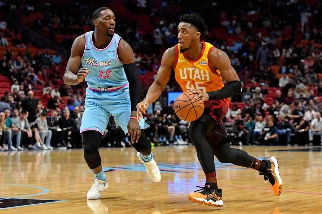
In this case, I’d say a photograph doesn’t fully capture the visual dynamics, so let’s go to the videotape:
THAT MAN HAS A FAMILY! pic.twitter.com/C7EOWyflp4
— Miami HEAT (@MiamiHEAT) December 24, 2019
Yowza! I’m on record as a big color/color fan, but I’m wondering if this one might be too much of a good thing.
(My thanks to Andrew Cosentino, John Flory, and everyone else who singled out this game for special attention.)
Farewell to the Coliseum (again): When the Rams host the Cardinals this Sunday, it’ll be their final game at the L.A. Coliseum, so they’re adding a commemorative jersey patch for the occasion (see design at right). According to the press release, “The patch has been developed as 3D Silicon Tatami, a three-dimensional rubber style appliqué on woven fabric, the first time this process has been done for an NFL uniform.”
Intriguing. I asked a Rams spokeswoman for a photo of the patch itself — either on its own or, ideally, on a jersey — but she wasn’t able to provide one in time for this morning’s post. If you Google “3D Silicon Tatami,” however, you get lots of hits, so that should give us an idea of how the Rams’ patch will look.
Update: Just got this photo of the patch (click to enlarge):

This is actually the second time the Rams have left the Coliseum. The first time, in 1979 (when they were preparing to move to Anaheim Stadium for the 1980 season), there were notes in the end zone, although it’s never been clear to me if the team was saying goodbye to the stadium or the other way around:
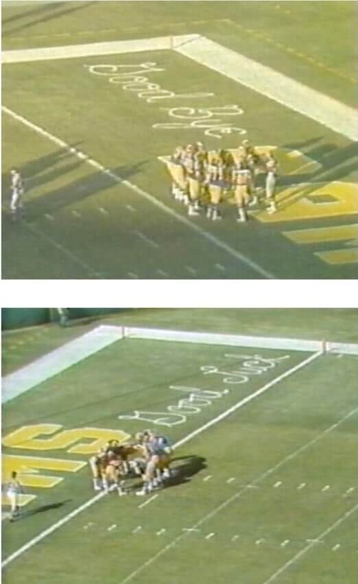
(My thanks to @LASportsFan68 for the reminder on the 1979 end zone notes.)
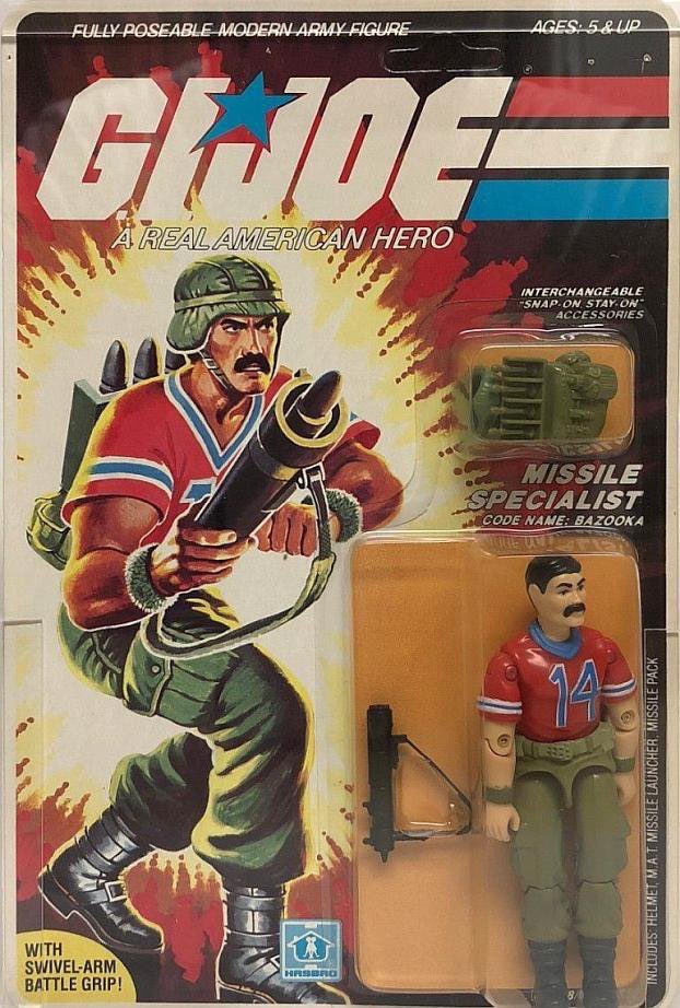
Flipping the script: Nowadays we’re used to seeing athletes wearing camouflage uniforms, which I often refer to as “G.I. Joke.” But back in 1985, there was a G.I. Joe action figure wearing a football jersey! We have truly come full circle.
(Big thanks to Lucan Denfield for this one.)
Click to enlarge
Collector’s Corner
By Brinke Guthrie
Follow @brinkeguthrie
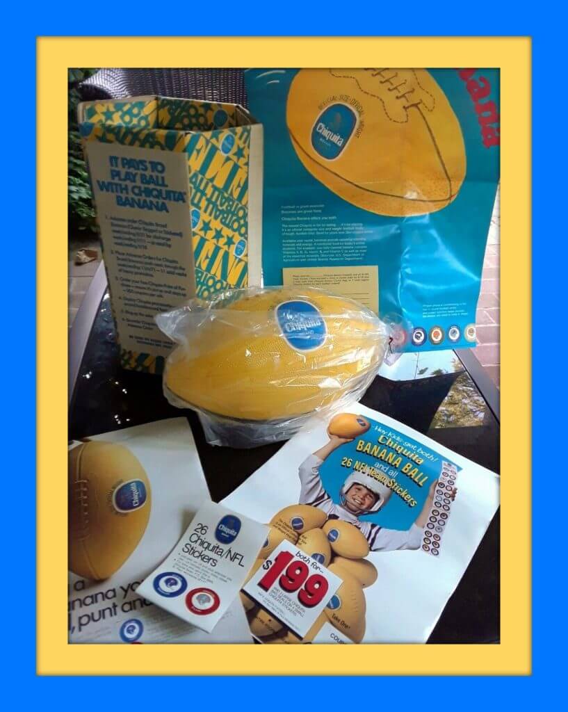
It’s Christmas Eve. By the time you read this, Santa is already airborne, headed for a chimney near you. In keeping with the spirit of the season, “These Are a Few of My Favorite Things,” beginning with this NFL Chiquita football/sticker set. You get a Chiquita football still in the bag and a set of pristine NFL stickers. The seller, who we’ve featured here before, notes that his dad designed the promotion for Chiquita!
Now for the rest of this week’s picks:
• Let me tell you, I pounded down a lot of Gatorade in 1971-1972 to collect the entire set of NFL helmet caps. (Side note: It never tasted the same after they took out the cyclamates.)
• One of my favorite logos ever: the Cincinnati Stingers, shown here on a 1970s bumper sticker. The seller says this is an original bumper sticker from the 1970s, although I think it’s a repro.
• My first “name brand” pair of sneakers was the Adidas ABA Americana sneaker from 1972. These look like reissues, though. I’d swear mine had a royal blue heel patch.
• You simply won’t find a better quality sweatshirt than this 1990s Russell Athletic NFL Pro Line sweatshirt for the Pittsburgh Steelers.
• Here’s the Master, Dave Boss, with his classic 1960s San Francisco 49ers poster art.
• Had these! This is a set of 11 1970 Kentucky Colonels “Pro Star” portraits done by another well-known sports artist, Nick Volpe.
• Had one of these, too! A Troy Aikman double-star Cowboys jersey for the 1994 season. (I had the original Apex model; this is a Mitchell & Ness repro.)
• Yep, had this one too: a terrific Cowboys V-neck pullover shell from Starter.
• Always wanted one of those late-1960s/early-1970s NFL Sears plaques. I would’ve chosen a Cowboys or Bengals version, but this one is for the Atlanta Falcons. (They call it a “Pro-Football Decorator Plaque, made of an exclusive new plastic formulation.”)
• Had two of these circa-1970 NFL helmet banks growing up — Bengals and Cowboys, natch — and I still have the Cowboys one. This is a Chiefs model, and you got one when you opened a new checking or savings account at the local bank.
Got an item to include on Collector’s Corner? DM your submissions to us on the Uni Watch Facebook page. Collector’s Corner will be on that page for New Year’s Eve, then back here on Jan. 7, celebrating 10 years of Collector’s Corner!

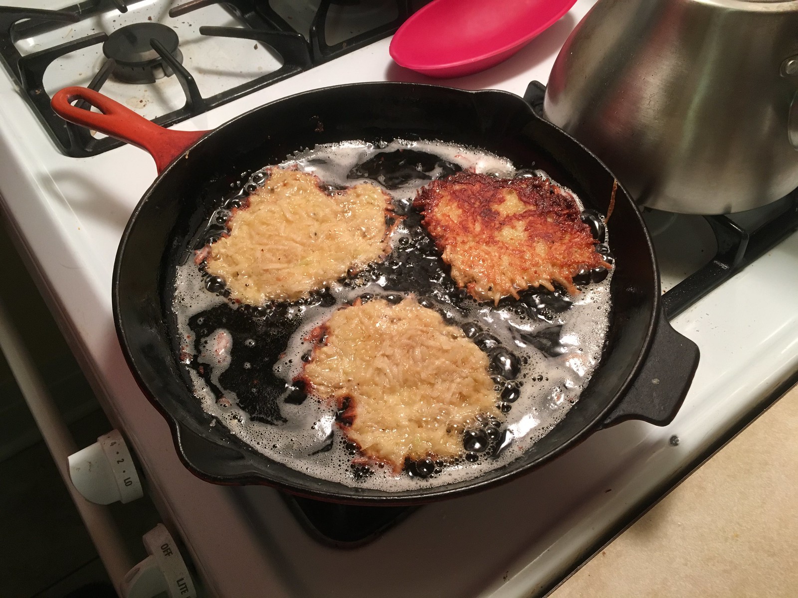
Culinary Corner: On a scale of zero to Jew, I rate about a 0.02. Fortunately, my girlfriend makes very, very good latkes. Some potatoes, some onions, a box grater, some egg, some breadcrumbs, and a bit of potato starch from the grated potatoes — perfection!


The Ticker
By Alex Hider

Baseball News: Reader Matt Austin found a photo of his great-grandfather’s 1930 Independence Producers baseball club on eBay. That’s him in the second row, third from the left. … Chris Grosse is home for the holidays and shared a photo awesome MLB blanket of this that his dad brought out.

NFL News: We’ve had this before, but it seems appropriate for the holiday travel season: Some of the gate signs at Chicago’s O’Hare Airport have Bears-themed designs. According to Bill Wilson, the signs have been up since the preseason (from Anakin Forrest). … Here are some original sketches from one of the designers who created the Broncos’ current identity back in 1997. He also explains why the horse is depicted with no teeth (from Tom O’Grady). … Kade Witten made a Chiefs-themed cornhole set for his boys.
College Football News: Iowa is removing the Tigerhawk logos from its helmets for Friday’s Holiday Bowl as a memorial for former coach Hayden Fry, who died last week. They’ll add a memorial patch for Fry to their jerseys next season (thanks to all who shared). … Oklahoma incorporated their uniform manufacturer’s logo into a wordmark for their trip to Atlanta for the Peach Bowl (from Lendsey Thomson). … UCF wore two different helmet logos on each side of their helmet during yesterday’s Gasparilla Bowl. The one on the right side included a sublimated Orlando city flag, while the one on the left included a sublimated Florida state flag (from Blaise D’Sylva). … Speaking of UCF, they wore GFGS against Marshall, who wore green, making for a color-on-color game (from Josh Hinton). … More from the Gasparilla Bowl: UCF WR Marlon Williams had major NOB issues, as his letters peeled off his jersey. It’s not clear why they were only heat-pressed instead of sewn on (thanks to all who shared). … A couple of more notes from Josh Hinton: Here’s what the fields will look like for Thursday’s Independence Bowl and Friday’s Texas Bowl. Also, we have a first look on how the bowl patches will look like on Hawaii and BYU’s jerseys for the Hawaii Bowl and Oklahoma’s jersey for the Peach Bowl. … South Alabama was Blaise D’Sylva’s mini-helmet team of the day yesterday.

Hockey News: Rangers players wore T-shirts honoring Flyers LW Oskar Lindblom prior to yesterday’s game against Philly. Lindblom was diagnosed with Ewing’s sarcoma about two weeks ago (from Al N. Kreit). … The Golden Knights have a commemorative logo for their annual father’s trip, which the dads wear as a patch on replica jerseys (from Mitchell Witmer). … We had an old-school clock sighting on the score bug during last night’s Islanders/Jackets game (from @cannolifactory). … The jerseys worn by the Columbus (Georgia) River Dragons of the Federal Prospects Hockey League have real TATC vibes (from Christian Gardecki). … Pinckney High School in Michigan wore camo uniforms with military branch NOBs in a recent game (from Burrill Strong). … The Hamilton Steelhawks and the Dundas Real McCoys of the Allan Cup Hockey League will dress up as the Hamilton Mustangs and Thunder Bay Bombers from the 1986 movie Youngblood on Feb. 7 (from Ross Taylor). … @lifewithmikey52 spotted a Rangers-themed Santa hockey sweater for sale — complete with tie strings! … The Kings’ mascot, Bailey, wore a Hanukkah-themed jersey last night (from Moe Khan).

Basketball News: A coach for a team in Australia’s National Basketball League is calling on the league to remove advertising from the floor, as he believes the ad decals are slippery and endangering his players (from @j_foreigner). … Great feature by The Boston Globe, which followed 7’6″ Celtics C Tacko Fall as he got fitted for a tuxedo (from our own Anthony Emerson). … New Wizards PG Gary Payton II will wear No. 20.

Soccer News: For the first time in three years, Real Madrid is not the holder of the Club World Cup. As a result, the club played their first game in three years without the FIFA Club World Champions badge on their kit yesterday (from Josh Hinton). … New home shirt for Japanese side Jubilo Iwata (from Jeremy Brahm). … For more on the latest soccer uni updates, follow Josh’s Football Kit Watch Twitter account.

Grab Bag: The uni-verse will certainly appreciate Presbyterian College’s nickname — the Blue Hose! Here’s a good background on how the nickname came to be (from Brandon Weir). … WFRV in Green Bay published a look back at all their former station logos (from Randy Koeh). … Timmy Donahue was watching The 12 Dogs of Christmas last night. The movie is set in 1931, but the Mayor is shown wearing a National Defense Service Medal, which wasn’t established until 1953.
Tomorrow: The winners of our annual year-end raffle. See you back here for that! — Paul
“3D Silicon Tatami”
Is the patch made of silicon or silicone?
Yes.
;)
Bazooka’s jersey is basically a Steve Grogan New England Patriots jersey, with certain details changed such as the arrangement of number colors. There’s no name or number on back of the figure, though.
There was also Cutter, the driver of the WHALE hovercraft, who had a Boston Red Sox cap.
I came here to say the same thing. No way they could do that today.
With Swivel-Arm Battle Grip!
Don’t forget that William “The Fridge” Perry had his own GI Joe figure, although he was wearing a royal blue jersey with red trim (still #72 though).
I also like color vs. color, but it’s important that the luminance levels of the colors are different; light blue and dark red, for example. The part of the eye that senses luminance is different than what senses hue. When luminance and hue are different, it’s easy for our brains to coalesce those signals. If the hues are different, but the luminance is the same, it plays tricks on our brain. In an image like this (link), the luminance is the same throughout, but the hues are different, and it hurts to look at. Claude Monet used this to his advantage, making the sun appear to twinkle: link.
More than you wanted to know about the optics here: link
I agree with Paul’s aesthetic opinions about 75% of the time, and of the 25% where I disagree I understand where he is coming from 24% of the time…
…but man, I have no idea why anybody likes color vs. color, (with the rare exception). It’s almost always a moving eyesore. I’m not just saying it doesn’t look good, but often it makes the games visually painful to watch.
It’s not an aesthetic issue, it’s actually based on physiology! It’s literally an eyesore!
Very ahem illuminating links, that Monet example was new to this novice.
That GI Joe looks an awful lot like Larry Csonka.
I thought he looked like Freddie Mercury myself.
Besides the previous G.I. Joe comment mentioning Cutter in his Boston cap, don’t forget about The Fridge in his 72 jersey.
Also, Hardball wore a baseball jersey & cap. Big Lob wears a basketball jersey. Big Boa wears boxing gloves as he was meant to feud w/ a G.I. Joe Rocky Balboa that never came to fruition.
And while he doesn’t wear his famous Hot Rod shirt, the Rowdy Roddy Piper G.I. Joe does sport the kilt he wore to the ring & wrestling boots.
I thought the Rams were already in Anaheim when Leo Farnsworth bought them.
Nah
link
I had that blanket!
William “the Refrigerator” Perry also had a GI Joe figure, of course in a generic football jersey.
link
link
The photo of the Bears-style numbers at O’Hare airport reminded me of a line from comedian John McDowell, talking about livening up a bingo game at a retirement home: “B-9. Anyone? B-9. Your tumor is… B-9.”
Silly, but it always made me laugh.
Great looking latkes and plating!
Anyone notice that the “14” font on the Bazooka action-figure doesn’t match the font on the artist’s rendition on the package? The upper serifs don’t match.
Here’s the killer…neither matches the curve-top font from the cartoon.
link