
For all photos, click to enlarge
When I was in San Diego last month for the Padres’ unveiling, I paid a visit to Brandiose, the San Diego-based design studio that has put a huge visual stamp on the world of minor league baseball.
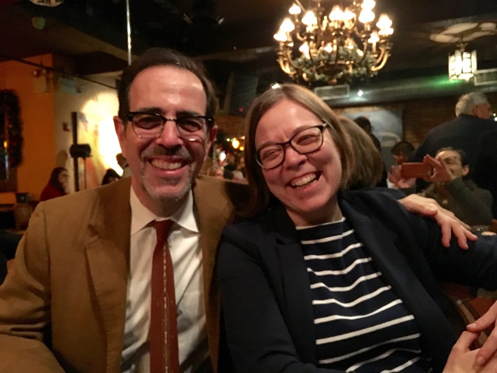
Brandiose is run by Jason Klein (on the left in the photo below) and Casey White (on the right). They met in kindergarten and have been close friends ever since, which is pretty amazing:

I asked if they were, you know, sick of each other, or if they at least got on each other’s nerves, after so many years of close proximity. They said no (which I guess is what you’d expect them to say, but it seemed pretty convincing, and the friendship and closeness running between them was palpable).
These days Jason and Casey are headquartered at a former military base that was decommissioned and converted into offices and working spaces. They were nice enough to meet me there on a Sunday afternoon while I was in town. (SportsLogos.net’s Chris Creamer and Uni Watch reader Richard Craig were also on hand, as were Jason’s and Chris’s young sons, who quickly bonded over a video game.)
The good news is that we talked about all sorts of interesting things. The bad news is that a lot of the topics were off the record, so I can’t share them with you. But here are some interesting tidbits:
1. I kind of figured Casey and Jason had grown up as outcast nerds — lots of D&D, getting beaten up by the local bullies, not very good at sports, that sort of thing — but they said they were always pretty popular. In fact, when they were in high school, one of them was prom king and the other was homecoming king (I forget which was which), and Casey was a good enough athlete to play college football (albeit at a small school, but still). Impressive!
2. One of Casey and Jason’s first designs was for an Albany arena football team. They had never been to Albany and didn’t visit there before doing the design. Afterward, they felt like the uniforms didn’t have a strong connection to the town, so ever since then they’ve had a rule: Whenever they’re designing or redesigning a team’s look, they insist on visiting the town so they can get at least a little bit of a feel for the local culture. (When you consider how many teams they’ve worked with, that’s a lot of travel!)
3. A table in the studio was piled high with fabric swatches featuring embroidered logos. Casey and Jason explained that this is how they used to get proofs or samples from New Era — the NE factory would send them these swatches:

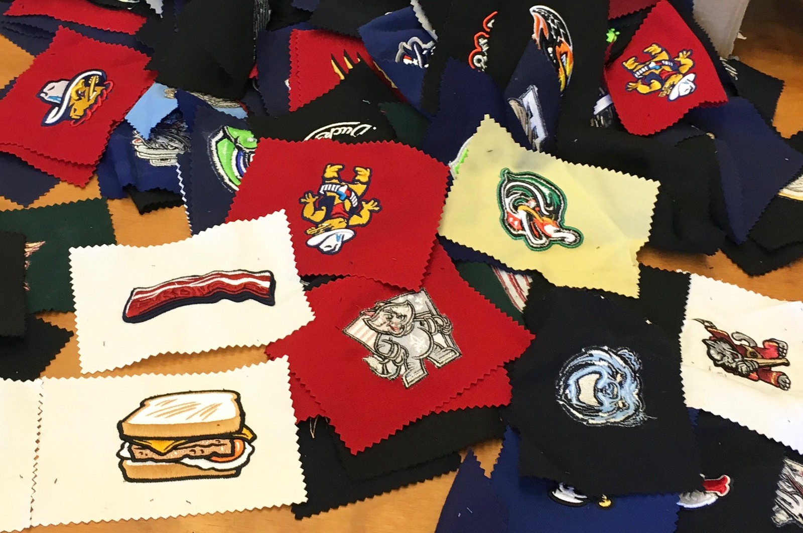

Nowadays, though, New Era provides full sample caps instead of the swatches. Why? Because it’s actually cheaper for them to make and ship a cap from Asia than to make the swatch domestically.
4. Almost every Brandiose design starts with Casey doing drawings by hand. He has books and books of sketches, which are pretty amazing to see. I was impressed that he did so much hand-drawn work (you can see more of his drawings here):


———
And now, the baseball-playing elephant in the room: I know some of you out there really dislike how Brandiose’s signature style — the anthropomorphized animal or foodstuff cartoon mascot, the gritted teeth, the heavy black lines — has become almost a boilerplate approach for MiLB.
My feeling is this: I think a lot of Brandiose’s work is really fun and creative — but much of it is fun and creative in the same ways over and over again. The sheer volume of their work is so prodigious that it begins to feel repetitive and formulaic. I wish they’d take on less work and/or that MiLB would use a greater variety of designers, which I think would be good for MiLB (more visual diversity) and also good for Brandiose (their individual designs would stand out more instead of blurring together), but of course that’s easy for me to say.
In any case: Whatever you think of Casey and Jason’s work, I can totally vouch for them as extremely friendly and generous-spirited — they’re good people. I enjoyed hanging out with them and hope I’ll get the chance to do so again. Thanks for your hospitality, guys!
Click to enlarge
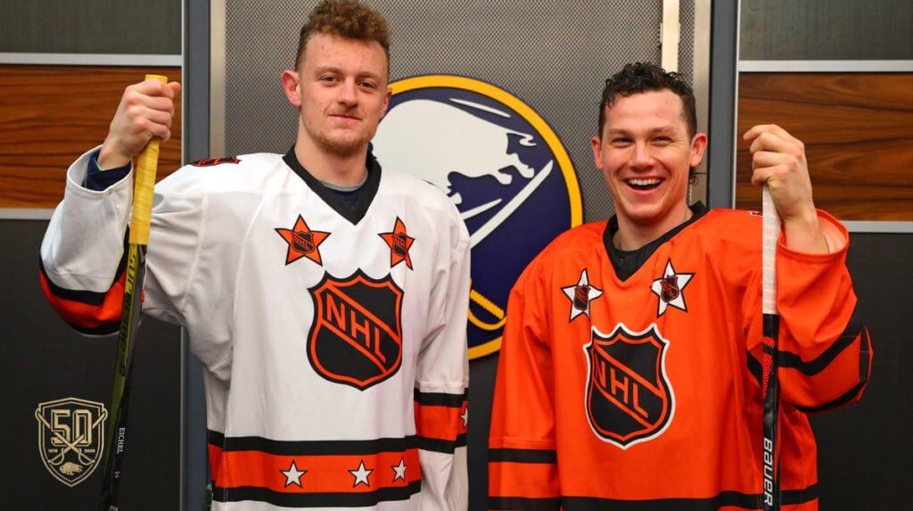
Unuusal throwback: So this is interesting: The Sabres are having an All-Star–style skills challenge competition on Jan. 5, with the team’s players divided into two teams. But instead of wearing something Sabres-related, as you’d expect, they’ll wear 1978 NHL All-Star Game throwbacks (shown above), because the ’78 ASG was played in Buffalo at the Aud. It’s all part of the Sabres’ 50th-season celeabration.
Obviously, this is just an exhibition, not a real game, so it ranks pretty low in terms of uni status. Still, it’s fun to see the Sabres honoring this somewhat obscure chapter from their history. And it really highlights how the old NHL All-Star designs, as simple as they were, were so much better than the more recent/current ones.
(My thanks to @jeffreybigmoney for bringing this one to my attention.)
Click to enlarge
Collector’s Corner
By Brinke Guthrie
Follow @brinkeguthrie
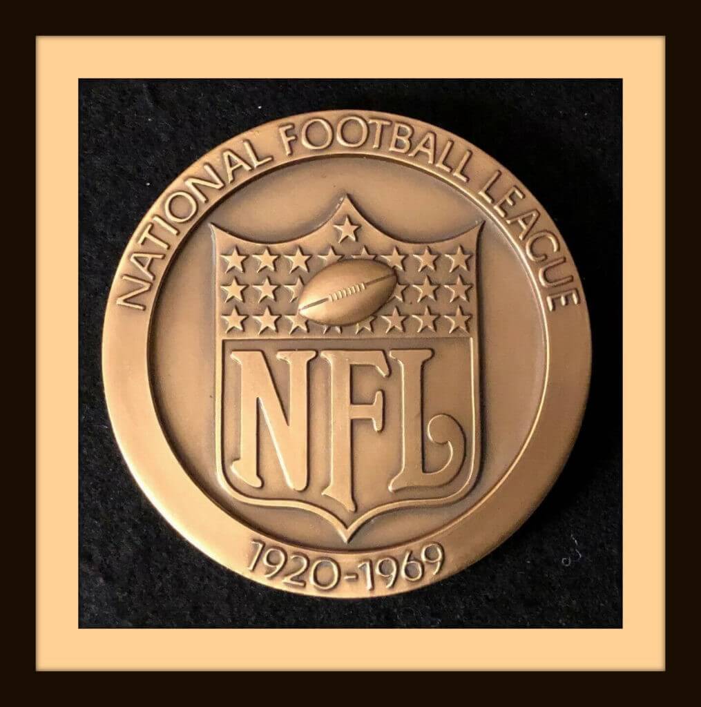
The NFL’s 100th season is winding down. Back in 1969, they celebrated No. 50 — we all know the NFL 50 patch from that season (far superior to the junky plastic thing on this season’s collars), but you might not have seen this NFL medallion, which commemorates the 1969 season and has an old-school player design on the reverse.
Now for the rest of this week’s picks:
• Check out this poster! It’s for Snelling & Snelling, which is an employment agency. This poster says, “Professional employment service for the National Football League and the American Football League.” Players needed off-season gigs in those days, and Snelling was the place to go. Can you imagine someone like Tom Brady sitting in this office after the season ended?
• This New York Football Giants Acrometal plaque would look great on the wall at Uni Watch HQ.
• Look closely at this 1960s NFL wallpaper for some single-bar facemask helmets of the period.
• Stroh It Home, Cincinnati Reds exclaims this 1973 Reds schedule poster. I remember this one! “From One Beer Lover to Another.” You also get a poster from Schmidt’s Beer in this eBay lot.
• This 1970s NHL vinyl poster includes all teams in the league at that time.
• Here we have a 1970s NFL wall poster. The NFL shield is accurate, but for some reason the team fonts are all incorrect. The Bucs, Jets, Patriots, Oilers and Seahawks are close, but not quite. The rest miss by a mile.
• If you love the old Quebec Nordiques logo (as I do!), then this NHL 75th-anniversary season jersey by CCM/Maska should be right up your alley.
• Mets fans — including Paul! — should enjoy this 1960s Mr. Met Bucket Hat.
• Broncos fans will go for this DIY Bucking Bronco helmet buggy.
• Bucco Bruce looks pretty good on this 1970s Tampa Bay Bucs helmet plaque.
That’s it for this week. Coming next Tuesday: Our Christmas Eve edition!
Got an item to include on Collector’s Corner? DM your submissions to us on the Uni Watch Facebook page.

Seam ripper update: Got a big delivery of seam rippers yesterday (finally!), so all colors are back in stock.
If history is any guide, green will sell out again quickly (I’ve already ordered more), so get ’em while you can! Full details here.
Click to enlarge
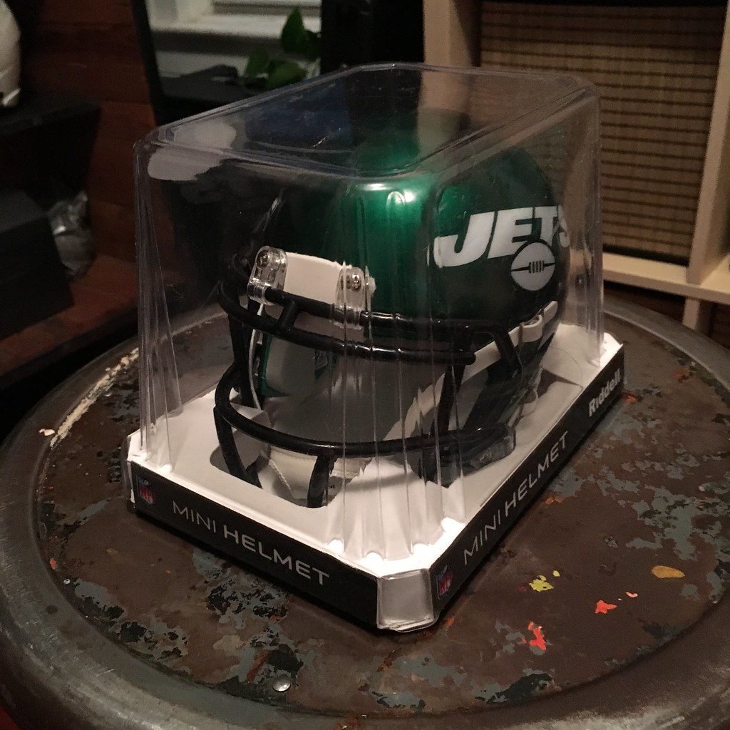
Year-end raffle reminder: In case you missed it on Friday, our annual year-end raffle is now underway, with dozens of cool items available for you to win (including the Jets mini-helmet shown above). Full details here.
The Ticker
By Alex Hider

Baseball News: The Phillies introduced P Zack Wheeler and SS Didi Gregorius yesterday, giving us our first look at their Nikefied jerseys in the wild (thanks to all who shared). … Check out the satin jacket worn by A’s 2B Eddie Collins in this 1928 photo. A beaut! (From Matt Aber.) … I love the Trenton Thunder’s batdog, Rookie. What I don’t love is the ad on his bandana (from Dan Ulrich).

Football News: The Toronto Argonauts released their 2020 schedule with a pinball game video — a reference to their General Manager, Mike “Pinball” Clemons (from Ted Arnold). … Hawkins High School in Texas is using a variation of the New York/New Jersey Hitmen logo. Paul wrote about how the Hitmen logo is inexplicably popular with high schools way back in 2011 (from Tommy Forrester).

NFL News: Contrary to yesterday’s MMUW report, the Saints did not wear a jersey patch last night to mark the 10th anniversary of their Super Bowl XLIV. The patch was worn only by Saints alums during a halftime celebration. … Pete Woychick points out that the negatives of Sunday night’s Bills/Steelers game almost perfectly swaps the team’s uniform colors. It would have worked better if the Steelers wore their typical home uniforms. … For 50 years, Leo Pilarski was a staple at Steelers home games as part of the chain gang. He worked his last game on Sunday night (from Jerry). … Bengals RB Joe Mixon tweeted after Sunday’s game that he regretted not asking Tom Brady for a jersey swap. Brady replied yesterday and promised to send Mixon a jersey (from Timmy Donahue). … A Bears fan at Lambeau Field on Sunday switched between wearing QB Mitch Trubisky’s jersey and LB Kahlil Mack’s jersey, depending on whether the Bears were on offense or defense (from Dan Kennedy).
College Football News: For whatever reason, the Camping World Bowl included what appears to be an Adidas jersey logo on a generic graphic (from Josh Sandin). … Speaking of the Camping World Bowl, here’s how the bowl patch and helmet decal will look on Iowa State’s uniforms (from Chad Lehman and Al Gruwell). … Wyoming will wear white in the Arizona Bowl (from Josh Hinton). … Also from Josh: There will be pink end zones in Orlando when Liberty and Georgia Southern play in the Cure Bowl. … @TaReefKnockOut and Cayden Ledford mocked new uniforms for Florida State. … Here’s a graphic showing every uniform Auburn has worn in a bowl game (from Clint Richardson). … Donald Duck is known for his bottomless sailor’s uniform — but what if Navy did the same for the Army/Navy game? (From Dave Scocca.) … Appalachian State was Blaise D’Sylva’s mini-helmet team of the day yesterday.

Hockey News: LW Taylor Hall was traded from the Devils to the Coyotes traded yesterday. In a graphic introducing Hall, the Coyotes switched him from left-handed to right-handed (from Nathan Hogue).

NBA News: Thanks to the Nets’ white jerseys and gray court, it looks like the Sixers are the only ones colorized in this photo from Sunday’s game (from Tim). … This season, the Mexico City Capitanes play in the Mexican Liga Nacional de Baloncesto Profesional. But beginning with 2020-2021, they’ll join the NBA’s D League (from James Gilbert). … PF Kevin Hervey will wear No. 15 for the Thunder (from Etienne Catalan).

College Hoops News: St. Mary’s arena has sold the naming rights to its arena. I’m still calling it McKeon (from Mark Chiarucci). … Kansas State will wear lavender throwbacks on Saturday against St. Louis. They’re pairing the jerseys with lavender shorts — in years past, they’ve paired that lavender jersey with purple shorts (from Cameron Schneider). … You rarely see a basketball team using nameplates for its NOBs, but Southern Miss is using them (from Timmy Donahue).

Soccer News: As English soccer tries to fight racism and bigotry in supporters’ groups, Tottenham polled its supporters on the use of the “Y-word.” While the word is used as an anti-semitic slur throughout the soccer world, Spurs fans (of which there is a large Jewish contingent), adopted the word in the ’70s as a defense against actual anti-Semitic abuse from fans of other teams. One-third of fans said they use the word at matches. Still, while Tottenham has said it tolerates the Y-word at games for now, they said they’re willing to “reconsider the appropriateness” of it (from our own Jamie Rathjen). … New crest for Louisville City FC — or should I say Lou City — of the USL. More info here (from Josh Hinton). … Vancouver Whitecaps FC’s graphic introducing new ST Lucas Cavallini shows him in a jersey with weird NOB kerning (from @joshcoles). … The Whitecaps also celebrated Cavallini’s signing by parking a custom tank outside their facility, complete with team logos and Cavallini’s number.

Grab Bag: The San Diego Seals of the National Lacrosse League will play a regular season game on a runway at U.S. Marine Corps Air Station Miramar on Feb. 22 (from Wade Heidt). … As we’ve reported before, the International Team at this year’s President’s Cup used a new crest and colors. Here’s a great piece on the new logo design (from Stephen Krupin and Nate Rathjen). … Gavin Kentch compiled treatise on the history of the American cross-country ski team national team race suit. … Here are some mocks for potential North Carolina wrestling singlets (from James Gilbert). … This photo taken from the Battle of the Bulge (which began 75 years ago yesterday) shows soldiers using white bedsheets as camouflage in the snow-covered forest (from Timmy Donahue).
Click to enlarge

What Paul did last night: Got dressed up for the second time in three nights! Yesterday was my friend Jay’s birthday, so a bunch of us convened at a Manhattan club to see the great Vince Giordano and His Nighthawks Orchestra, a long-running NYC band that specializes in hot jazz from the 1920s and ’30s — perfect party music. Here are some snippets.
Such a great night! Hope yours was swell as well.
Brandiose is a lot like HOK/Populous with stadium design. They became so successful that they’ve saturated the market. But they keep getting work because people looking for a successful brand redesign or new stadium associate then with being the standard. While I agree that I like a variety of designs in the marketplace, I understand why they keep getting work, even to the point of diluting their own brand.
That’s a great comparison! I’m not so sure they risk diluting any brand, their own or their clients’. The typical MiLB fan or merch buyer – which includes youth leagues as well as individuals looking for a cap or shirt with a cool design – does not experience MiLB as a whole, and thus doesn’t see a third of all teams sort of looking alike. The typical fan or merch buyer encounters their local team, or a small handful of teams. So Team X’s Brandiose identity is new and fresh to that individual, and in almost all cases an attractive improvement on what went before.
My favorite part of today’s report from Brandiose HQ are the pictures of the notebook entries. The thick-line, smooth-curve cartoon style of the stereotypical Brandiose artwork is not an artifact of computer design, but rather the personal style of one artist drawing by hand. That’s nice to know, and runs counter to a common complaint about Brandiose’s visual work.
Great points, all. Agree.
Now that is an NHL AS sweater!!!
I had the privilege of working with Casey and Jason during their Clink Room days. I was fortunate to have a few of my designs chosen by them, and it was great to work with them on improving the logos. I worked with Casey and he was very generous with his time. And, when I was between jobs, they even hired me as a freelancer for a few projects. They are A+ people and are deserving of all the successes they have worked very hard for. I love that you were able to visit them. I’d love to see them if I ever get out to San Diego. :)
Miss the Clink Room with some of the design contests they had back the – Shadow League, Rejects League, etc.
Re: Brandiose’s work for the Albany football team. Presuming it was the old Arena League Firebirds, their logo (even with no particular tie to the Capital District) represented a massive improvement from the previous logo and helmet:
Old logo: link
Revised logo: link
Old helmet: link
Revised helmet: link
The team kept the revised logo and uniforms even as they moved to Indianapolis. No idea if there’s a local tie to Firebirds there, either, heh.
Further to the Toronto Argonauts schedule release in the Ticker item. Noticed the vintage Football with Sails logo on the pinball machine.
It appears its’ use might not just be a one-off throwback for just last year. It appears the Argonauts’ use of their old logo may become part of the regular look moving forward as a secondary logo?
Noticed something unusual when the Argos announced the hiring of new head coach Ryan Dinwiddie. Photos were taken with him holding the Argos helmet featuring the Football with Sails logo. One would expect the head coach to be holding the helmet with the primary logo for photos for an announcement such as this. A hint we can expect the logo is not being mothballed.
link
My heart skipped a beat when I first saw the pic of the NHL ASG jerseys. I thought the item was going to say they’re being used for this season’s ASG. Bummer.
“Nowadays, though, New Era provides full sample caps instead of the swatches. Why? Because it’s actually cheaper for them to make and ship a cap from Asia than to make the swatch domestically.”
This is a very disheartening fact.
It’s very hard to continue to support any local designers and / or companies as they continue to work with outsourced materials or labor.
Is it really that much less expensive to have a hat shipped from Asia than made in North America?
I agree, Peter. -C.
Any good, local embroidery shop could do it almost immediately on the same fabric. Seems like overkill on New Era’s part, in the interest of ‘accuracy’.
Yes, when they are shipping hundreds of samples in bulk. You can have well digitized samples created for pennies, shipped in bulk to America, then distributed via mail for cheaper.
Just a quick thing I’d like to add about Bradiose & perceived repetitiveness. You have to remember, to us in the Uni-verse that see all of these regularly, yes, they can seem similar. But to the average Minor League Sports fan that goes to a hand-full, if more than one, games a year, the design is very unique to them. They don’t see these designs all the time, so for their hometown, is very unique and new, and still works.
HELL YES. Comment of the year. I was coming here to say the exact thing. We see these logos all the time, but your random fan from the middle of Iowa doesn’t follow sports logo design/uniforms like we all do, so it isn’t “just another Brandiose design” to them, it is something new and amazing.
This… is a good point I hadn’t considered. For me, all minor league logos exist in a vacuum. I guess if my local team put even a little effort into the design process and ended up with a Brandiose-esque logo, I’d probably be thrilled.
This is a good point, I never considered that a lot of these logos Brandiose makes are for the fans of whatever team they’re working with — not for people like me who just look at and judge logos at a macro scale from a distance.
Maybe I can be less harsh on the company’s designs in the future. Speaking for myself I tend to like a designer taking unique approaches to each design—I like Todd Radom’s work particularly because of the diversity in his designs, especially his work for Big 3. Whereas with Brandiose I can almost predict their designs like clockwork. But I will definitely take into account that these designs are for fans of a team, not for me.
Paul, thank you for bringing up the elephant in the room (I’m guessing it wasn’t a difficult topic and probably something brought up in jest?), as well as the write-up and behind the scenes with the Brandiose gang.
At the same time, though, *are* these rebrands really being made for the local fans or are they looking to chase some vitality?
Around this time last year, there was controversy over the Sod Poodles rebrand, covered very well at this site. One of the main grievances was that the “local suggestion” was a sham from the start: link
The Y-word? I don’t even know what that word could be. I skimmed the article but it doesn’t appear to elaborate past using “Y-word” as well. Oh well, I’m probably better off not knowing.
Might take years for supporters not to use “y**” in or out of the Tottenham context.
They could always go with Triffid.
It’s “Yid.” The only time it’s stated fully in the link is way at the bottom when quoting a Jewish supporter mentioning chants of “Yiddo.”
As a relatively new Spurs supporter, I understand its origins for the club, but I have never used it when referring to the team.
Any other Spurs supporters who have been around longer care to weigh in?
I think Brian was an early Spurs supporter (and given this time of year), he said it best:
“I’m not a Roman, Mum, and I never will be! I’m a K**e! A Y**! A H**e! A Hook-nose! I’m Kosher, Mum! I’m a Red Sea Pedestrian, and proud of it!”
When I lived in Holland in the early aughts, more experienced expats would take newcomers from North America aside and explain a few things, particularly why fans at the local soccer stadium regularly changed “Yoda!” or hissed. The local team, Ajax, sort of the Yankees of Dutch soccer, had a longstanding fan identity as the Jews or the Super Jews, so locals would chant “Juden!” and waive Israeli flags. So visting fans of certain rivals, sort of the Dutch equivalent of the Red Sox, would make hissing noises to simulate the sound of a gas chamber. I don’t know how the situation stands today, but at the time Dutch soccer authorities were trying to dissuade non-Ajax fans from anti-Semitic cheering and also trying to dissuade Ajax fans from pro-Semitic cheering so as not to “provoke” the anti-Semitism. The campaign wasn’t working with regard to Ajax fans at the time; our apartment overlooked the main downtown subway stop on the line out to the suburban stadium, and on gamedays huge crowds of fans waving Israeli flags and star-of-David scarves would spill out of the subway after games.
This is an excellent primer on the history of Spurs and their Jewish fans – link
An important point from this article is that at most 5% of Spurs fans at their games are Jewish (the same as their biggest rivals). So the large Jewish contingent of fans is only true in comparison to teams in cities that don’t have a significant Jewish population. The vast majority of fans who have reclaimed the word have no authority or right to do so.
Sorry Spurs. No – you do not get to keep using that word because of its history. It is offensive now just as it was then.
Just think if the Ravens had an old chant with the N-word or something and were trying to justify it. It’s the same thing!!
Looking forward to Paul’s weekly Spurs watch in the ticker!!
I think the Eddie Collins jacket is leather not satin.
Just came here to say the same.
The Wyoming White/White/Yellow is one of the better road looks in football.
The Camping World graphic with the Adidas logo on the jersey is probably a recovering of a photo of a Notre Dame player from when Adidas made their uniforms.
link
Why would you think they were “outcast nerds”?
Because I knew they had met in kindergarten and had spent a lot of time obsessing over baseball cards, Disney animation, and other classically nerdy things while they were growing up.
So yes, I was culturally profiling, you might say. And I was wrong! Live and learn.
(Just in case, from left: Ty Cobb, Connie Mack, Tris Speaker, Eddie Collins)
Great writeup on the Brandiose company. Always nice seeing new team logos, for whatever sport in whatever league.
Those All-Star jerseys looked great then and they look great now. I’d love to think the league sees these and takes a hint, but let’s face it, it’s the NHL.
Can confirm at least seven high school teams in Texas use the NY/NJ Hitmen H logo
So bizarre that that particular obscure logo has gained such a foothold!
I think there are just so few “H” logos out there to use. With Houston being the only H US based pro or major college sports town. The Oilers or Texans haven’t had a particularly memorable signature style H, nor the Rockets, and the Astros has always been a pretty plain H located in a star. If you are looking for a signature stylized H to steal from the sports world, the only other one out there that comes to mind would be University of Hawaii. I think the logo just found niche based on the rarity of H teams. And though the XFL’s life was brief, it did burn hot with hype for a few weeks compared to other failed leagues.
Can confirm one for sure in South Jersey. Same colors too.
What a great time we had hosting Paul! We’ll have to host a Uni Watch Meetup at the studio to give everyone a tour….
One other note is that at the end of the day MiLB is a business. We work really hard to test ideas and try new approaches to see how they impact retail sales – because thats what were hired by the clubs to do: get them maximum attention for the business, get people in seats and drive retail sales.
The MiLB look has success because of its audacity in the face of the MLB look. That irreverence is what drives its success.
Thanks, guys. “Irreverence” is a great word, and I wish I’d used it in this piece — captures the spirit of minor league ball so well!
Do you have examples of how these brands’ irreverance translates 5, 7, 10 years later?
No offense intended, but for example, the Charlotte Knights’ identity looks dated. And kind of did so out of the gate.
How does irreverance hold up over time without feeling goofy-ly stale? (And avoid requiring a complete re-do.)
Great question. As you can imagine, every club is different, and each has its own vision. And to a degree, each club brings a different creative commitment to the project. There are so many factors – New market/old market, new stadium/old stadium, new ownership/existing ownership, new name/existing name – size of retail store, and who is running the retail store. But if you look at the teams consistently in the top 25 merchandising clubs year after year, they are pretty quirky
I would like to see the top 25 list for last season and overall top 25 for the past five and ten seasons. Is that something you can share?
A meet up at the studio would be rad!!
Hey Uni-fans has anyone ever seen this helmet design before? Do you like it? Would do you think about the scripted “G” on it? Does anyone know where I could get more of this decal re-made?
link
Also I’m looking for some easy to use uni design site’s. I’ve been sitting on an idea that’ll blow you all up. It’ll make that genius Headdress Helmet I did years ago look lame. I can’t believe nobody has tried this uni trick and it’d work for so many other teams.
Japanese outfielder Yoshitomo Tsutsugo held link, and the jersey he showed was a little different from what the Rays have been wearing: there’s no nameplate under the NOB, which I think was already revealed, but the NOB itself seems to be bigger and has a white layer under it.
None of that is new, as you can see from this 2019 gamer:
link
Whoa, sorry about that! (In my defense, I don’t think I watched a single AL game last season.)
There is no better night out in New York than a visit to the Iguana to hear Vince and the boys.
Interesting video (not for sporting reasons…) shows 1991 Celtic players wearing numbers only on their shorts.
link
“Littler guy” and “bigger guy”? “Left” and “right” wouldn’t have worked?
Good point! I had mentally shorthanded them in my own mind as “bigger” and “littler,” but you’re right. I’ll change it now.