
Click to enlarge, if you dare
In case you were wondering how your favorite MLB team’s home jersey will look with the Nike maker’s mark on the chest next season, here’s a view of all 30 home whites. Additional info and individual jersey photo downloads are available here.
Let’s shift into FAQ mode:
Wait a minute — wasn’t Under Armour supposed to be MLB’s new uniform supplier?
That was the original plan announced in 2016. But Under Armour, which has had significant business problems in recent years, withdrew from the deal in May of 2018. At the time, it was reported that Nike would be swapped in for Under Armour, although that didn’t become official until January of this year.
So is every team getting new uniform designs?
No. Whenever Nike takes over a league’s uniform contract, people seem to mistakenly believe that the whole league will get a makeover. But when Nike got the NFL contract in 2012, most NFL teams retained their existing uniform designs. Ditto for the NBA in 2017. And ditto for MLB in 2020. A few teams are getting new uniform designs, and most are sticking with their existing designs — just like any other year.
Okay, but at least the fabric and tailoring templates must be new, right?
Nope. These 2020 jerseys have the exact same tailoring and fabric as Majestic’s 2019 jerseys. The only difference is the removal of the Majestic sleeve logo, the addition of the Nike chest logo, and the corresponding change to the jock tag. Everything else is the same.
Will there be tailoring and/or fabric changes in 2021?
Possibly, although I’m hearing that the template and fabric will likely carry over to 2021 as well.
What about 2022?
We’ll see.
Looking at the photos, it seems like the Yankees jersey is the only one that doesn’t have those mesh side panels. How come?
That’s a carryover from their Majestic jerseys (the Yankees were the only team that didn’t have the side panels in recent years). Like I said, nothing is changing from 2019.
I hate that Nike logo on the chest.
Probably not as much as I do.
Why can’t they put it on the sleeve, like Majestic did? Why does Nike always have to push things too far?
Nike didn’t unilaterally decide to put their logo on the chest. They put it there because MLB decided to sell that space for the maker’s mark at a higher price, and Nike was willing to pay that higher price for added exposure. (MLB had originally struck that same deal as part of the contract that Under Armour backed out of.) So don’t blame Nike for purchasing something that was available for sale; blame MLB for selling it in the first place. Say what you want about the NFL, but at least they haven’t sold that space.
I don’t understand all the fuss about the Nike logo on the chest. What’s the big deal?
If you don’t care about the logo on the chest, that’s fine. We’ll have to agree to disagree.
This is the first step in the move toward ad patches, isn’t it?
That’s been the speculation since July, but we’ll see.
Why do the photos show the Brewers’ 50th-anniversary patch but not the Twins’ 60th-season patch?
Good question. Several 2020 commemorative patches seem to have been omitted from these photos, including the Dodgers’ All-Star Game patch and the Rangers’ stadium-inaugural patch. Seems like they were just inconsistent with the photo shoot.
Why are they showing the home jerseys but not the road or alternate jerseys?
At least one team hasn’t yet unveiled its new road uniform, and at least two teams haven’t yet unveiled their new alternates. Stay tuned.
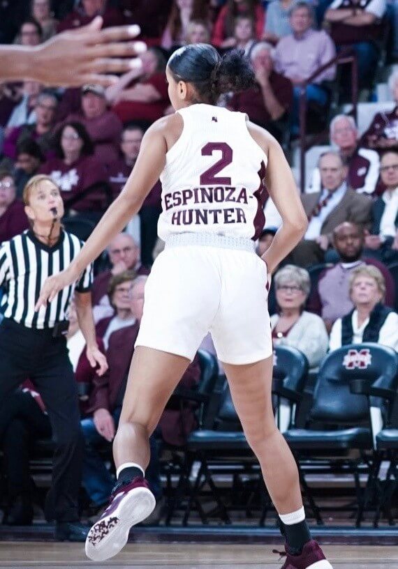
Click to enlarge
Yowza: There are double-decker NOBs and there are NOBs positioned below the uni number, but Mississippi State guard Andra Espinoza-Hunter has the rare combination of the two. It looks particularly unwieldy because State uses such massive NOB lettering, so even the team’s single-decker NOBs look clunky. Weird typography choice.
(My thanks to @TheVeaze for this one.)
Click to enlarge
Collector’s Corner
By Brinke Guthrie
Follow @brinkeguthrie
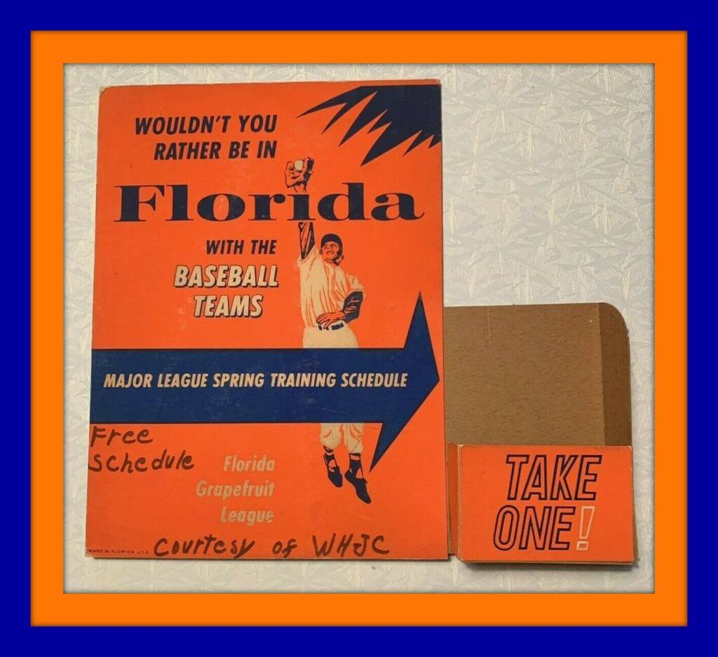
“Wouldn’t You Rather Be in Florida With the Baseball Teams?” Well, of course, who wouldn’t? This 1960s display stand held Grapefruit League spring training schedules for vacationers to take on their way south, I guess. I particularly like how someone wrote “Courtesy of WHJC” and “Free schedule.” The seller notes that “WHJC” is in Matewan, W.V.. It is now a Southern Gospel station.
Now for the rest of this week’s picks:
• This record album is called The Fat Lady Sings for the Bullets and has highlights of the 1977-78 World Champion Washington Bullets. Still sealed in its packaging! Nice plaid sports coat on coach Dick Motta, too.
• Check out this cool 1970s Phoenix Suns switchplate.
• This 1967 Dallas Cowboys football gear set from Rawlings comes with the helmet, shoulder pads, No. 17 jersey for Dandy Don Meredith, and a pair of plain white pants. What, no blue-green?
• One more from the NFL Sears Shop — this lined parka for the St. Louis Football Cardinals.
• Staying with Sears but moving on over to the sporting goods department, this 1960s Ted Williams Major League Baseball is stamped, “Genuine Horsehide!”
• Yes, there were actually ashtrays with sports logos on them, like this one for the New Orleans Jazz.
• This 1970s sticker advertises Schaefer Stadium, the former home of the New England Patriots. I never knew back then that Schaefer stood for the beer (an early example of naming rights), just like I didn’t realize Rich Stadium in Buffalo was named for a food company or that Ericsson Stadium in Charlotte was for a cell phones company.
• This lot of four Sportoys buggies represents the AFC Central of the 1970s; Steelers, Browns, Bengals and Oilers.
• Here’s another lot of 1970s NFL gumball helmets, this time with built-in pencil sharpeners.
• This 1960s “Sports Waving Ball Car Decoration” is basically a suction cup with a baseball attached to it. This one has the word “Cincinnati” in red. No Reds logo, though.
Got an item to include on Collector’s Corner? DM your submissions to us on the Uni Watch Facebook page. Open 24/7/365!
Click to enlarge
Almost gone: As of last night, there were only two Uni Watch mini-helmets remaining (which, if you want, can be autographed by me and/or by Phil). We will not offer these again — when they’re gone, they’re gone. So if you want one, move fast. Mini-helmets are now SOLD OUT.
While we’re at it: White gumball helmets are now sold out (but green ones are still available).
Click to enlarge
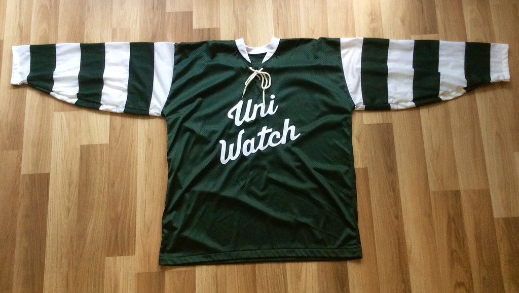
Looking ahead: Check out this gorgeous jersey made by DIY genius Wafflebored! He’s generously donating it to this year’s year-end reader-appreciation raffle, which will be taking place either this Friday or, more likely, next Tuesday. Stay tuned!
The Ticker
By Alex Hider

Baseball News: The Nats used the signing of P Stephen Strasburg to introduce a 2019 World Champs logo yesterday. No word yet on whether this will be worn on the field (thanks to all who shared). … The Lakewood BlueClaws, the Phillies’ Class A affiliate, have unveiled a 20th-season logo (from Kevin Clark). … The Savannah Bananas of the Coastal Plain League capitalized on the viral news story about the duct-taped banana art installation with an excellent tweet (from @mikeobs).

NFL News: The Eagles wore their mono-black alternates last night. In addition, at one point backup QB Josh McCown was preparing to enter the game as a receiver, which had helmet implications: ““I was ready to go,” McCown said. “We had the helmet ready to go. The equipment guys were all over it. Had the radio-less helmet because you can’t have two green dots on the field at the same time.” And no, that wouldn’t violate the one-shell rule — it’s one of the exceptions that the rule allows for (from @ThatRodneyGuy). … In that same game, Giants QB Eli Manning didn’t have the NFL100 logo on his jersey last night (thanks to all who shared). … You’ve heard of non-basketball teams wearing the jumpman logo, but how about a football player wearing a baseball player logo? That’s Pats WR Julian Edelman did on Sunday, as he wore baseball-themed cleats for the Israel Baseball Association (from Blake Fox). … The Browns made some slight field design alterations on Sunday, adding orange outlines to numbers and adding brown outline stripes to the 20- and 50-yard lines (from Dylan). … It appears the space between the numerals on Titans WR AJ Brown’s jersey has gotten wider as the season has gone on (from Jacob Turner). … The lobby of the Buccaneers’ training facility has all sorts of uni- and logo-related displays, including prototype designs and lots of interesting background info. Kevin Brown took these photos of the displays (and apologizes for the glare). … Lots of players do postgame jersey swaps, but Ravens QB Lamar Jackson swapped a purple jersey that he didn’t wear following Sunday’s game. The Ravens wore white on Sunday against Buffalo, not purple. He did the same thing the previous week against the 49ers when Baltimore wore black (from Ray Bergman). … In 1995, Vikings RB Robert Smith lost one of his shoes during a long TD run against the Steelers. He ran the last 45 yards with only one cleat and even managed to break a few tackles (from Mike Chamernik). … Remember how some of the Chiefs’ gear got lost in transit and made it to Foxboro shortly before Sunday’s game against the Pats? As people scrambled to resolve the situation, at one point it looked like the Chiefs might end up wearing helmets from a Massachusetts high school team that uses red shells and a very Chiefs-like logo (from Jason Tierney).
College Football News: Reader Scott Cummings points out that two of Ohio State’s best players — DE Chase Young and RB J.K Dobbins — both wear No. 2. That raises an interesting question: Are they the most successful pair of teammates to wear the same number throughout a season? … Speaking of the Buckeyes, it appears Ohio State will once again wear throwbacks in the College Football Playoff (from Ben Teaford). … The honorary captain during Georgia Tech’s coin toss ceremony at a game earlier this season was wearing a strange jersey. Rex Henry thinks it looks like a generic jersey Adidas put together right after they took over the Jackets’ apparel contract. … Glenn Riley mocked up a Mardi Gras-themed alternate for LSU. … The ACC Tracker has been updated to reflect the ACC Championship game. … Cork Gaines and Brian Cox found all of the edits the Old Dominion graphics team made to a photo of new coach Ricky Rahne to get him into an ODU shirt.

Hockey News: Sportsnet went longform for a story about Marco Argentino, who has become a legend through the years for creating custom hockey equipment for the NHL’s star players (from Neil Vendetti). … A youth hockey program in Columbus, Ind., uses the Flames’ logo (from @PureLipschitz).

NBA News: Check out this awesome poster celebrating the 1978 Washington Bullets’ NBA Finals championship in Mike Rosenberg’s DC office. … The Wisconsin Herd, the Bucks’ D League affiliate, wore ugly Christmas sweater jerseys during a recent game (from D. Hempel).

College Hoops News: Rutgers will wear throwback uniforms on Wednesday against Wisconsin (from @RutgersRivals). … Throwbacks also in the works for Colorado State (from @youngreid71). … Navy’s women’s team will retire Courtney Davidson’s No. 21 next month (from Will Ricks).

Soccer News: Here are a few notes from Josh Hinton: China’s 2020 away kits have leaked; Australia has unveiled its third new crest in three years. For more kit news, head over to Josh’s Twitter feed. … New home shirt and logo for Japanese side Shimizu S-Pulse (from Ed Zelaski).

Grab Bag: Have you noticed that legacy sportswear brand Champion is making a bit of a comeback? Reader Max Weintraub passed along some photos of a retro-styled Champion display he spotted at the William & Mary bookstore. …. New cycling uniforms for the pro cycling team formerly known as Bahrain–Merida (from Craig Ackers). … The International Team in golf’s Presidents Cup has a new team shield (from Luke Gabel).
Raffle results: The winner of yesterday’s membership raffle is Amy Marantino. Congrats to her, and my continued thanks to David Cline for sponsoring so many of these recent raffles. — Paul
I know you replied to someone on Twitter yesterday about the Marlins not “officially” changing their colors (again), but why would the photo background not be “Caliente Red?” The background is VERY orange (a new shade they hadn’t used previously), and the high-res photos Nike released clearly show the red being orange on the jersey.
So, officially, they haven’t announced they changed the red to orange, but is it possible they’ve done so in a low-key manner?
MLB Style Guide shows no change.
I guess we’ll know eventually. I’ve heard rumors that the Marlins hve one of the new alternate uniforms that haven’t been released yet…supposedly Caliente Red.
Not that you could or would confirm or deny that!
Given that the Padres are still depicted with a navy blue background, I think you may be reading too much into this graphic.
Is it known how the Nike-fied uniforms are going to affect throwbacks? If the Swoosh is going to be present on throwbacks (barf), every team should just scrap them, no one wants to see that.
Just like in any other sport/league/etc., the maker’s mark will appear on throwbacks (just like the the Majestic logo did).
That’s going to be disappointing.
Interesting. A Flames C inside the Oilers blue jersey.
That is just wrong.
Came here to say the very same thing. My 80’s brain exploded when I saw that.
I don’t typically have a negative reaction to maker marks on uniforms but these look especially bad. It might be that there’s so much more negative space on the front of a baseball uniform vs. other sports, but the Nike logo really sticks out like sore thumb. I think it is especially bad on the teams where the swoosh is too close to elements of the uniform (ie. it looks like an accent over the P in Phillies”
On the Cincinnati Reds’ road uniforms it might look like a haček right on top of the initial C. If there were more eastern European players in baseball, like there are in hockey, the announcers could have some fun pronouncing it as if the logo really were a diacritical mark (as “chinchinnati“).
That Uni Watch hockey sweater is sweet! That would sell like crazy I’m thinking. Make it happen!
It’s one-of-a-kind!
if they were really going to let the Chiefs wear a high school team’s helmets that would kind of expose the silliness of the one-shell rule would it not? Just one more reason to let the Bucs bring back Bucco Bruce!
Frankly, I think it’s absurd that they were considering wearing high school helmets (or any helmets not their own). That seems unwise and unsafe.
The fact that the NFL would OK using the used and borrowed high school helmets and not allow just waiting for the damn bus to show up is absolutely absurd. The cognitive dissonance is stunning.
From reading the story, it looks like it was Riddell that had borrowed the helmets, not the NFL. My guess was in the scramble to deal with the equipment problem someone reached out to Riddell and they came up with this idea. I don’t see anything that says the NFL or the Players Union would have allowed it. Something that could be investigated further, I suppose.
Would the seam ripper work on the jerseys as well? In other words, is the Nike symbol just sewn on?
It’s a sewn-on patch:
link
Seam ripper would presumably work fine.
Some of the Nike Jersey elements are fixed with that iron on stuff before stitching so I would be cautious. I found this out on the name plate on a NFL jersey.
Not just Nike; Majestic has been using adhesive under their sewn-on patches for at least twenty years. But there are ways of removing that residue as well.
Be careful with sewn patches, they’re sometimes tacked in place to insure it doesn’t move while the seamstress stitches it on. This glue is usually temporary but in my experience it can stay for years. If you’re having trouble peeling a tacked patch you can try heating it up with an iron, being extra careful not to melt the polyester, and if you end up with glue residue there’s a spray product called goof off that seems to work.
Chris Paul plays for the OKC Thunder, not the Rockets. It’s possible his sneakers are from last year when he was on Houston?
Those are Paul George’s sneakers, although I guess I can’t be positive he’s the one wearing them.
link
Thanks for the ticker listing the Sportsnet article about the hockey equipment repairman. Great read, and something I would have missed had it not been listed.
QB Everett Golson and LB Mantai Teo both wore #5 for the Notre Dame team that went to the National Championship game in 2012. I don’t know if they were more successful than the mentioned Ohio State duo, but it’s notable nonetheless.
Q — Two of Ohio State’s best players — DE Chase Young and RB J.K Dobbins — both wear No. 2. That raises an interesting question: Are they the most successful pair of teammates to wear the same number throughout a season? …
A — Has to be Lincoln Kennedy and Steve Entmann, both wore #75 for Washington Huskies, both drafted in First Round of NFL Draft, both pretty good NFL careers. if not mistaken, Steve Entmann was drafted with First Pick in First Round that year, and Colts had second pick also and took a LB, can’t remember name.
MY QUESTION — When two stars on same NCAA Football team wear same number, whose jersey are you buying when you buy a NNOB replica at the school bookstore? Always intrigued by that situation. Makes for good post-game icebreaker conversation with coeds after a game ….
If your team isn’t changing their uniform (or if you prefer their old one anyways) and you like to wear replica or authentic jerseys, now is the best time to get the outgoing majestic ones. I got a gray Phillies harper replica for $60.
that’s the only silver lining I can see with this. happy shopping!
Alphabetizing by team nickname really makes my head hurt.
Was just about to say that. And no separation between the divisions or even the two leagues.
Looking at these jerseys feels like looking at the wedding photos of “the one who got away.” You try to not care, but then you’re overwhelmed by a stomach dropping sense of disappointment, uneasiness, and crushing finality.
The A’s Jersey is obscene. It should be pixelated.
I’m an A’s fan I was actually thinking that of all the jersey’s, the A’s one is one of the ones that actually looks the least bad with the swoosh. Maybe it’s just because I really like green, but I also think that it’s far enough away from the actual script, and the uniform number being on the opposite side makes it easy to ignore. I can only assume the swoosh will be gold or white on the kelly and hunter green alternates. We’ll see what those ones look like.
I mean, melodramatics aside, I actually kind of agree. I think it looks the best of any of the jerseys with the cross-chest text because of the lower positioning of the initial few letters. It makes it look less crowded and provides for some white space around the logo.
But even the best of a bad bunch is still terrible. The A’s are the only team in all of pro sports in whom I have a genuine emotional investment, and it’s just so sad to see the Jersey I’ve watched for 30 years compromised like this.
Those are Paul George’s sneakers. Chris Paul has a jordan sneaker deal
I find the Cardinals and Red Sox most painful to look at, even as a Yankees fan. There’s something about adding that mark to historically consistent and significant uniforms that have a lot of sanitary white. This is a sad day.
It almost looks as if the birds are deliberately looking away in disgust from the Nike mark. This is sad day indeed.
It’s also off-putting that they would ‘un-retire’ the #20 for a few teams for this unveiling.
I get it…it’s symbolic of the 2020 season, but it’s kind of disrespectful (especially to Frank Robinson).
Those NASA sneakers are worn by Iowa Hawkeye Joe Wieskamp.
link
They are Paul George’s NASA x Nike PG3 “Apollo Missions”
link
Obviously, that whole Ticker entry was botched. I’m heading out for a bunch of meetings and don’t have time to revise it properly at the moment, so I’ve just removed it.
I personally don’t mind the makers mark on the unis and for the most part it doesn’t seem to just have a glaring look at me type feel except for the Cubs, Nationals, Tigers and Yankees. Three of those the primary team logo is on the left chest and the right side is blank with just the Nike logo which screams look at me now. Maybe if they could move it to the other side it wouldn’t look as bad. As for the Nationals they have the uni numbers below like a couple of other teams on the right side but their numbers sit so low on the uniform compared to others like the Reds or White Sox.
I’ve argued with Paul before about the offensiveness of maker’s marks, but damn these are bad. I hate them so much. It completely changes the aesthetic of the jersey. One thing that hasn’t been brought up is the inconsistency of the color of the swoosh. Some teams have them in team colors like the Phillies and Red Sox, but others just have black like the Orioles and Braves. What the hell is thinking behind that?
Black is an Orioles team color. And FWIW, that Braves swoosh looks the same color as the navy piping.
But I hate it too.
I anticipate this going over in here like a fart in church, but I don’t mind the Nike logo on the jerseys. Maybe I am so used to all the teams now showing the Nike logo in a pretty visible manner, but it’s not anything where I’d look at the jerseys and even really mind.
Is it just me or does the Eagles helmets look much more midnight that green when they wear their black alts. They look like they’re wearing black helmets. If you put them next next to a picture of the Ravens they’ll look exactly the same. I swear their helmets used to be a lot more greener and they would still appear to be green even when they wore the black alts. Anybody seeing that or should I get my eyes checked?
The Iggles need to go back to the kelly green/silver of the Norm Snead era. IMO.
My color blindness always makes it a challenge to find the anthracite stripe on the Eagles pants; it has the exact same value brightness as the midnight green. Do the black britches even have it?
The yankees are abit different if you look at the pinstripes on the shoulders, looks very awkward
Actually, the pinstripes have been that way on the shoulders (due to the Yankees’ use of raglan sleeves) for many, many years. Not new.
They have been very anal-retentive about *THE* *PINSTRIPES* for a long time. The raglan sleeves, the removal of the side panels, the lack of a maker’s mark, the refusal to drop the doubleknits for years because the Coolbase “didn’t look right”.
The Yankees are right about one thing: All jerseys with pinstripes should have raglan sleeves, not set-in.
Also, all shirts for people doing athletic stuff should have raglan sleeves. But that’s a functional argument. Purely in aesthetic terms, pinstripes look soooooo much better with raglan sleeves. Pinstripes always get funky at seams, but they’re less funky with a curved raglan seam than at a straight top-of-shoulder seam.
I could not agree more.
link.
I could not disagree more. I feel the Yankees made a mistake in 1973 when they went to raglan sleeves and now will probably not go back.
This is a better look IMO
link
I’m gonna be honest, I’ve never really cared too much about marker’s marks on any sports uniforms or apparel. Probably because growing up, having the newest starter jacket or Nikes was considered cool; you know, back before I realized how much of my parents hard earned money I was wasting. This might be the first instance where it really does seem in your face and out of place to me. I’m not one for buying or wearing jerseys, but I almost want to go buy an NOS Majestic jersey now for spite.
1989 Japan-Cuba amateur exhibition ball. Aluminium bats, Cuba wearing plain red helmets AND blue helmets. And Nomo’s tornado!
link
Saquon Barkley was still wearing a military branch decal on the back of his helmet last night, it didn’t look like anyone else was I dont think.
The thing I noticed about the Nike uniform display is how common off-center chest lettering is. Nearly all the lettering that crosses the placket is off-center to some degree, including such beloved classics as the Mets, Dodgers, Phillies, and Giants. Which was an unexpected discovery for me, given how much vitriol has been directed at recently unveiled lettering for being off-center (such as the Astros and Brewers). Off-center is the norm. Show me someone who thinks baseball jersey script must be perfectly centered, and I’ll show you someone who loves the new 2020 Rangers script.
The Nike mark is still ugly, but I’ve already reached the point where seeing it hurts but it doesn’t hurt more than the last time. I’m not like accepting it or whatever, but I’ve reached the point where there’s no further marginal increase in my disgust from new viewings. Perhaps that will change when I see players in uniform on the field, or many fans at a ballpark, with the mark of the beast.
Off-centeredness: Bit of an apples/oranges comparison. There’s a big difference between something like the Mets’ script (in which one letter is much larger and more impactful than all the others) and the Astros’ chest lettering (in which all the letters are the same size and weight). The point is not about being centered but being *balanced.* Those two things are more or less synonymous when the letters are all the same size (Astros) but not when they’re not (Mets).
Let me preface by saying that I hate the Yankees, but man the Nike mark really takes away from that jersey. They should apply for done kind of waiver or something.
George Steinbrenner would have told Manfred to take a leap.
Champion is actually the official outfitter of the NBA2K League. All the uniforms and other “training” wear is Champion with a very old school look to the sweats.
It’s funny because we spend hundreds of $$ on these HD 4K televisions so we can enjoy gorgeous colors while watching our favourite teams play on national television. But what’s the point when most teams wear their black vs white uniforms. I might as well hook up my grandpa’s black and white tv.
I’ve been saying it for quite a while, and even though Paul doesn’t want to hear it…it’s only a matter of time before all US major league sports teams feature ads on the uniforms.
But really they already do.
Because you guys calling the Nike swoosh a “maker’s mark” are in denial. It’s an ad. It’s meant to promote the brand. A true “maker’s mark” would be found in a place not meant to be visible on the uniform while worn.
you guys calling the Nike swoosh a “maker’s mark” are in denial. It’s an ad. It’s meant to promote the brand. A true “maker’s mark” would be found in a place not meant to be visible on the uniform while worn.
The notion that a “true” maker’s mark must not be visible is patently ridiculous. (In fact, the term “maker’s mark” is a variation on “hallmark,” a term that originated with guild metalworkers who put their mark — literally their hallmark — visibly on their work.) A maker’s mark can be visible or inconspicuous. Either way, it is a maker’s mark.
As for the rest, Dan’s creating a straw man argument here. Is a maker’s mark a form of advertising? Sure. Nobody’s “in denial” about that. Hell, that’s one of the reasons I’ve been *opposed* to maker’s marks for over two decades now. But maker’s marks are a form of advertising that at least has a connection to the garment (i.e., it’s an ad for the manufacturer), as opposed to a third-party ad that has zero connection. Both are advertising, both are bad, one is more egregious than the other, and nobody has ever claimed otherwise on any of those points. Let’s move on. Thanks.
While watching that clip of “Shoeless” Robert Smith, I wondered…
When was the last NFL game played on an Astroturf field with baseball infield cutouts, such as Three Rivers Stadium?
I suspect it was not as fondly remembered as was this season’s Chiefs/Raiders natural grass baseball diamond match-up in the Coliseum.
Additionally, did the Metrodome have sliding pits?
Eric Hubbs, Barstool Sports’ Yankees beat writer and lifelong Yankees fan had perhaps the worst take on the internet about the Nike MLB jerseys. ”The horizontal stripes at the top instead of all vertical? Nope.”
link
Someone might want to tell him that the Yankees have been wearing their pinstripes like that for almost fifty years.
Not to mention the fact that he also owns just such a jersey…
link
Really, you could have stopped at “Barstool Sports” and we’d have known not to take him seriously.
Re: Chase Young and JK Dobbins wearing #2, the Buckeyes also have Justin Fields and Jeffrey Okudah wearing #1. Pretty tight race for who’s a better pair.
Twins and Giants have some glaring centering issues. The white space between red and blue on Rangers new script makes it look ridiculous, while the script with shadow drop on the powder blue works for me for some reason.
Q — Two of Ohio State’s best players — DE Chase Young and RB J.K Dobbins — both wear No. 2. That raises an interesting question: Are they the most successful pair of teammates to wear the same number throughout a season? …
A — Has to be Lincoln Kennedy and Steve Entmann, both wore #75 for Washington Huskies, both drafted in First Round of NFL Draft, both pretty good NFL careers. if not mistaken, Steve Entmann was drafted with First Pick in First Round that year, and Colts had second pick also and took a LB, can’t remember name.
MY QUESTION — When two stars on same NCAA Football team wear same number, with NNOB, whose jersey are you buying when you by a replica at the school bookstore? Always intrigued by that situation. Makes for good post-game icebreaker conversation with coeds after a game ….
Something that could be looked into by this site is that the Ravens are set to wear their black uniforms again on Thursday Night. This will be the 4th time this season they will be wearing an alternate uniform this season. 1 more than is allowed by the league, it will be the 3rd season that they have worn the alt uniform more often than allowed, do they just pay the fine or something?
Australian National Teams wear the national coat of arms, that legally can’t be reproduced on non-player/coach apparel. The tweet linked about the national soccer team displays different approximations used for commercial merchandise.
The “prior 2018” design is just the coat of arms defaced with a ball. I have a 2006 jersey with it and always assumed that was too close to the real coat of arms to be legal.
The “2018” design shown appears on a jacket I bought in 2014. The shield of state emblems is replaced by the logo of the sport’s national governing body, Football Federation Australia (FFA).
FFA changed their logo 12 months ago so future consumer jerseys may feature something like the “Now” logo, but they’re not due to be released until mid-2020.