
For all photos, click to enlarge
Fun promotion yesterday by NBC, which dressed up five guys in football uniforms to take part in the Thanksgiving Side Dish Bowl. They appeared yesterday morning on Today, prior to NBC’s coverage of the Thanksgiving Day Parade. I think there was some sort of online vote to pick the best side dish or something like that, but of course I care more about the uniforms.
The five “teams” were the Cranberry Sauces, the Potatoes, the Pumpkin Pies, the Green Bean Casseroles, and the Stuffing. Here’s how they looked from the back, followed by a closer look at each team:


The designs were done by a branding agency called the Barn. They’ve put together a really good page about the project here. I wish more real teams would document their uniform designs this well.
I had a good email back-and-forth yesterday with Nick Matarese, the Barn’s president and creative director. He said:
The idea was thought up jointly by us and NBC back in August/early September. It was originally just going to be a just a social media engagement campaign, but when it all started coming together the decision was made to ramp it all the way up, make the jerseys, put it on TV, etc. So our timeline was cut in half to be able to hit production schedules. No idea how NBC pulled off that part — custom unis and helmets were pulled together in 10 days!
The designs seem just cheesy enough — fun stuff. Naturally, I like the Casseroles’ color scheme (although I hate green bean casserole), and I got a kick out of all the stripes on the Cranberry Sauces’ uniform, symbolizing the canned sauce’s telltale ridges.
A few additional notes:
• It’s interesting that the jerseys have the NBC peacock logo instead of a maker’s mark. If you look at the live photo at the top of this entry (instead of the mock-ups), you can see that the pants have the Rawlings logo, so I assume that’s who made the jerseys as well. (I asked Matarese about that. He referred me to someone at NBC, who said he’d get back to me but never did, which isn’t surprising given that all of this discussion was taking place on Thanksgiving.)
• They apparently planned to have merit decals for the Mashed Potatoes team, although I don’t think they used them:
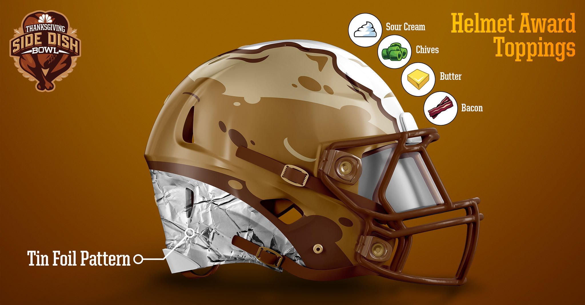
• I thought it was funny that all of the players wore hip pads — something that real football players haven’t worn in ages.
• I asked if the players were athletes, actors, or what. Again, the NBC guy said he’d get back to me but hasn’t yet done so.
• Two of the glove slogans have apostrophe catastrophes. Grrrrr.
And there’s more: The Barn also created three hockey teams for Thanksgiving leftovers (two of which, unfortunately, are just Side Dish Bowl retreads):
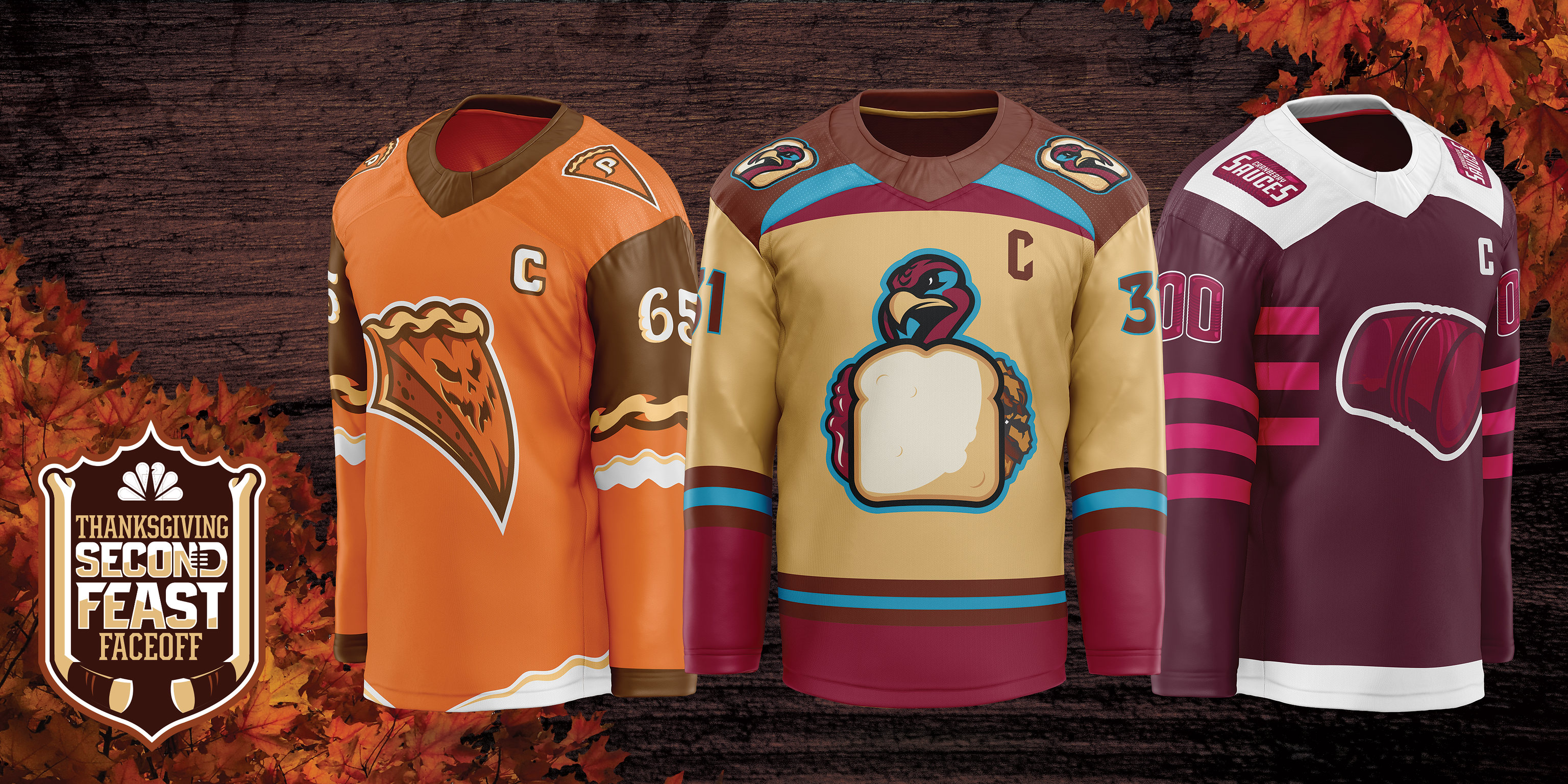
As you can see above, those look like Adidas jersey templates. But the individual team mock-ups look more like Reebok templates:


It’s not clear to me when, or even if, we’ll see these uniforms in real life. There’s a page with more info on the hockey designs here.
Click to enlarge
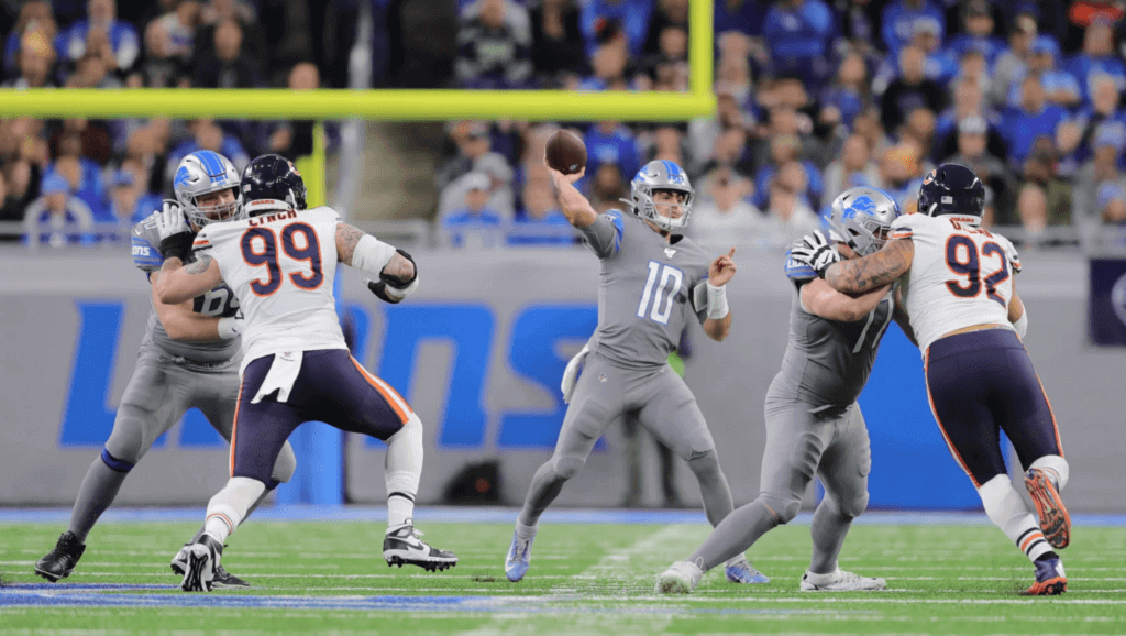
NFL roundup: All three of yesterday’s NFL games were uni-notable. Let’s start in Detroit, where the Lions wore their mono-grey disasters. It’s a crying shame that the pro team with the longest Thanksgiving Day tradition, dating back to 1934, would wear this crap on the holiday (or any day, really). What a disgrace.
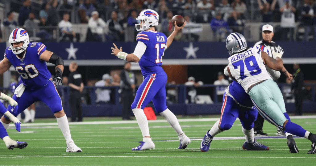
Things were only slightly better in Dallas, where the Bills somehow thought Thanksgiving was a good time to go mono-Smurf (with white facemasks to boot):
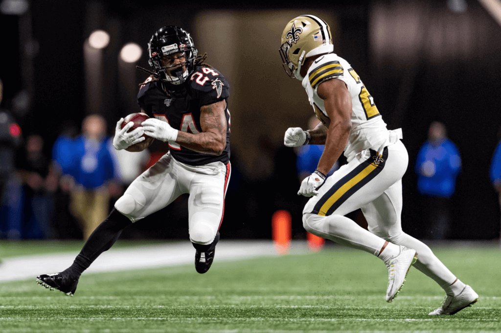
Fortunately, the last game of the day found the Saints wearing their mono-white alternates against the throwback-clad Falcons — very easy on the eyes:
Sorry, no Ticker today, because it was hard enough for me to put together this much content on a holiday and everyone else had the day off. Thanks for understanding. Phil will have full weekend content over the next two days, and then I’ll see you back here on Monday. Hope everyone is enjoying a great holiday weekend. — Paul
I don’t know if the potatoes were referred to as “mashed” on TV, but that’s clearly a baked potato.
Look at the NOB.
Seems like the team name is just Potatoes. Gloves and NOB reference mashed, but helmet elements align with baked.
OK.
Even worse, they got it wrong. But if they put ‘BAKED’ on the back that may have led to some dank memes brah.
I thoroughly enjoyed these and actually laughed out loud when I saw your post yesterday.
The Pumpkin Pies should have white helmets to replicate whipped cream on top!
Got excited at the possibility of seeing Detroit’s awesomely plain throwbacks against Chicago’s stripes galore throwbacks. Nope. I’ve come to learn that if you anticipate a hopefully good NFL uni matchup, those teams will usually wind up doing the worst possible alternative instead.
I did actually like the white facemask look for Buffalo though!
Paul – I am not a green bean casserole fan either, but my wife found this recipe and we made it yesterday. It was amazing, though quite heavy so may need to adjust the bechamel amount. Basically, by deconstructing the mushroom soup element it’s just wonderful.
link
Yep, you’re one of the oldest teams, you rarely get to play on a national stage, and what do you do, you show up looking like shit……no wonder you’ve had 60 years of at best mediocrity with 0 Super Bowl appearances
I thought it would be cool – just for the Thanksgiving day game they play at Comerica. Yeah they’re lose a little gate revenue, however it would be fun. But the NFL never does anything that’s fun, unlike the NHL (the winter classic), MLB (a game in Williamsport) and even the NBA is trying to start to do things more fun (mid-season tournament is just on the horizon)
Right on! I like that idea about being outdoors at Comerica for Thanksgiving.
Calling out the Bills on their look yesterday too. Rarely get to play on national stage, playing in Dallas with Cowboys in their usual uniforms. Nothing wrong with the white mask, but wear blue over white pants! Mono-colour jersey/pants with a different colour helmet is not a good look at the pro football level. Looks like what a college team would wear. Not your best look Bills if you are in the spotlight on Thanksgiving.
A couple of things that I think work against this. First, there are far fewer NFL games per season than the other sports you mention, and therefore proportionally more to lose by tinkering like that. Second, you could argue that the NFL has fulfilled its requirement for “fun alternative venues” with the games in the UK and Mexico.
My thinking on the UK and Mexico – there’s zero creativity behind it, and every league does something similar. i.e. the NHL plays a few games in Europe every year.
My view, as a one off, television ratings would go up (NFL sponsors happy), tv viewers like watching games where the elements come into play. The site lines would be likely crappy, but the game becomes more of an event. The one wrinkle I was wondering – could Comerica accommodate all the Lions much beleaguered season ticket holders
The NFL needs to start worrying about the quality of the game on the field. Clean up the awful officiating. Stop all the nonsensical on field celebrations for every piddly thing that players do. You paid a ridiculous amount of money to make these plays, act like you expected to do it. Rule changes that ruin the game. I grew up loving the game itself. I never needed goofy uniforms, pregame and halftime concerts, special venues, or any of the other idiotic things they come up with to distract from the fact that the game itself is a shadow of what it once was. And yes, get the hell off my lawn!
Add striped socks to any of those mono uniforms and I think they would look great.
Team Potatoes for me. Best side dish and best uniforms. They look great.
In both sports, the Cranberry Sauce uniforms are so good that I would root for the team for that basis alone.
Just FYI: If the NBC hockey uniforms are going to be on TV I assume that would happen either during the Today show or as a pre-game intro for the Thanksgiving Showdown between the Rangers and Bruins (I believe puck-drop is 1 PM).
I would rock the hell out of one of those pumpkin pie jerseys. Those are fantastic, and it’s probably my favorite Thanksgiving dish, to boot. (The whipped-cream white helmet suggestion up above would really top it off though.)
I think the pumpkin pie pant stripe is one of the best elements of these uniforms. I saw that and it took me a second to realize that it’s the pie crust. But I could see a team using that at some point.
The cranberry sauce team has an interesting color scheme, but it’s insipid to have your number font the same color as the jersey.
Team mashed potato has the best number font but green bean casserole has the best overall look.
I love the cranberry sauces one. I think the logo is perfectly proportioned for a football helmet, and the yoke stripes are awesome. And somehow the magenta/fuschia combo works for me.
The Falcons were more fauxback clad than throwback clad considering they never wore the white pants with the black helmets and jerseys back in the ’90s. They wore gray pants back then. They wore white pants from 1966 to 1977, but they wore red helmets during that entire tenure. They didn’t go back to white pants on a primary basis until 2002 when they unveiled the disasters they currently wear as their primary uniform.
link
The one helmet rule. That is why the Falcons have the hybrid throwbacks. Other teams have done similar, with varying degrees of success.
Everyone down South knows its Dressing, not Stuffing.
I zeroed in on two things which are incredible:
The fluted pastry stripes for the Pumpkin Pie.
The cornflower emblem, a la Corningware, for the casserole. I wish it were cornflower blue.
Sorry to burst you bubble, but the Lions all grey uni’s are honestly the best rash uni’s in the league. It’s just too bad our team can’t win game.
I’ll leave the ranking of color rush uniforms to others, my only feeling about the Lions is that on Thanksgiving, they should wear either their regular homes, or preferably, their plain throwbacks.
Lee
Greatly disagree on the Lions’ Rash. It’s not the worst in the league, but it is the worst set for the team.
I didn’t have interest in watching the game because after that Monday night Meltdown in Green Bay had me so frustrated for so long that it became a health concern, I decided I wouldn’t watch the Lions again this year unless they managed to sneak into the playoffs. Still, I was at least curious to see if they were wearing the throwbacks, and when I saw they weren’t, I turned the game off immediately in disgust.
The black & blue lions jerseys were even better than the drab crap they wore yesterday.
If you’re not counting the white Rashes, maybe.
The Giants’ white edges out the Saints’ white by virtue of being a 100% accurate throwback. The Saints are one of a couple of teams who wear a correct throwback jersey with the wrong pants.
Since when is pumpkin pie considered a side? It’s a dessert!
That’s exactly what I was thinking too. Its a dessert where I’m from too.
And occasionally a breakfast food on Friday morning!
Lee
It was a great day of football yesterday too bad the uniforms looked like crap on national television. I liked the Saints helmet and the logo the Falcons used, but not Falcons uniforms.
Someone neglected to tell the Nike geniuses and the Lions that mop bucket water gray is not really a good look. Even in their worst years (and that includes ’08), the Lions at least had Thanksgiving tradition on their side, and that includes Honolulu Blue and Silver. Yesterday, it really didn’t. One friend opined that it looked like they were in their pajamas. I responded that they played like they stayed in bed.
That said, my Saints (and the shades-of-Deion Falcons) played a classic-looking game to balance it all out. I’ll scream it until I turn black and gold: The Saints’ Color Rashes should become their No. 1 uni next season (and if they make the Super Bowl, the NFL should give them permission to wear them again). The Color Rashes are one step above what I’e long considered the best unis of all, the original ’67-’68 home whites, as the mono-white is a much cleaner look. (Besides, white looks good on saints …) The team also needs to ditch, at last, the 1999 fleurs-de-lys and the mid-’70s old gold helmets and go back to the original ones. The bright gold is much more dazzling, especially since they’re now among the league elite.
Metal legends Iron Maiden team up with West Ham for a footy kit: link
Hey Paul! The makers of the jerseys were CHAMPRO. We had an absolute blast making them!
Thanks, Robb!
I would like to see the Browns utilize the number font from those Pumpkin Pie jerseys!