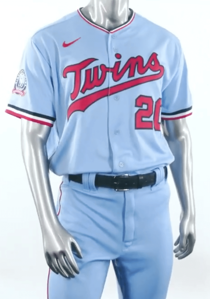
The MLB uni-verse’s hot stove action heated up a bit more yesterday, as the Twins unveiled a new powder blue alternate uniform. It can be worn either at home (which will be weird) or on the road (which is where it belongs).
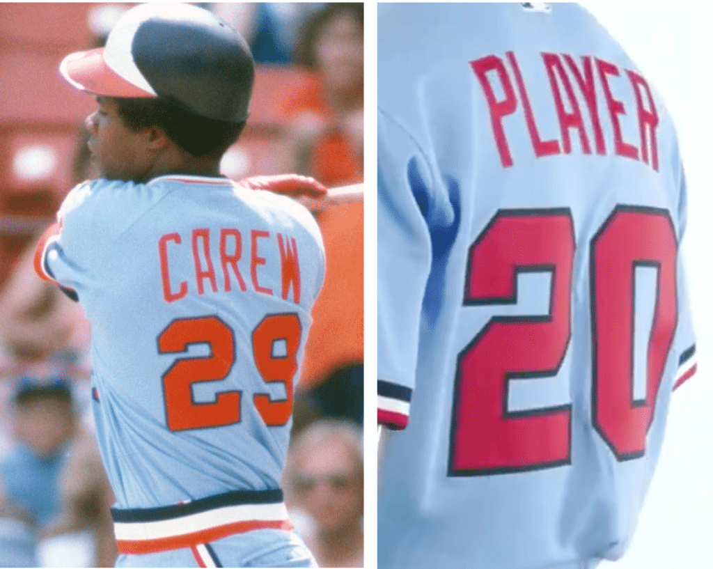
The design is a variation on the road uni the Twins wore from 1973 through 1986, although that one had a pullover jersey and sansabelt pants, while the new alternate will have a traditional button-front jersey and belted pants. Also, the original powder blues had vertically arched NOBs, while the new NOBs will be radially arched:
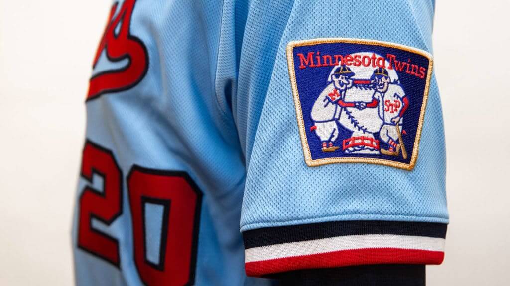
The left sleeve will have the old patch of Minnie and Paul shaking hands across the Mississippi River, symbolizing the spirit of the team’s namesake, the Twin Cities (click to enlarge):
The right sleeve will have a new 60th-season patch, which will be worn on all of the Twins’ jerseys in 2020 (click to enlarge):
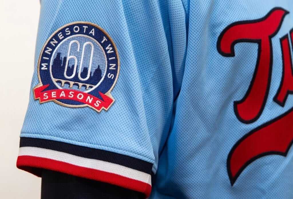
As always, I wish they’d been patient enough to wait for the 60th anniversary, instead of going with the 60th season. On the other hand, as I’ve been saying for years, one reason I prefer anniversary patches is that they have cleaner, more satisfying year spans — and this patch doesn’t even show the years! When’s the last time we saw an MLB anniversary or ordinal logo that didn’t reference the relevant years? Very odd.
By my count there are now five MLB teams with powder blue uniforms in their wardrobes: the Twins, Cardinals, Phillies, Royals (jersey only), and Rays (jersey only). And that number will get higher before the start of the 2020 season — stay tuned.
Want to learn more about MLB’s powder blue history? Check out this piece I wrote for ESPN last year.
Finally, one footnote to all of this: Although the Twins have never worn a button-front powder blue jersey on the field, they were apparently toying with that idea at one point. Back in 2010, when we had a Uni Watch party in Minneapolis, longtime reader/contributor Jimmy Lonetti showed up wearing what he said was a salesman’s sample prototype jersey — powder blue, button-front, and featuring an unusual variation of the team’s script (click to enlarge):
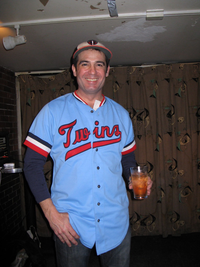
That same prototype design appears in Bill Henderson’s jersey guide.
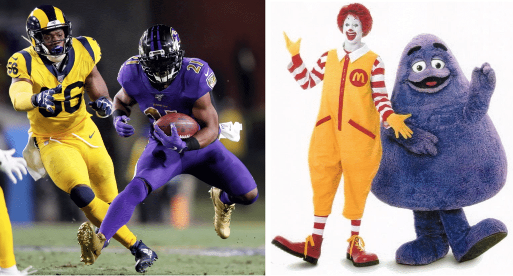
The Rash spreads to Monday Night Football: The Evil Grimaces beat the Ronald McDonalds last night. Tune in next week for the Cookie Monsters against the Teletubbies!
(My thanks to Mike Trozzo for his contribution to this section.)
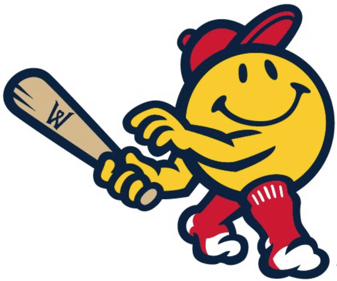
This made me smile: The Triple-A Pawtucket Red Sox are moving to Worcester, Mass., in 2021, and yesterday the team’s new name was revealed. Officially, they will be the Worcester Red Sox. But colloquially, they will be the WooSox (much like the Pawtucket team became known as the PawSox). The great minor league writer Ben Hill has all the info on the team’s name, logos, and uniforms here.
The thing that particularly interests me is the team’s new smiley-faced mascot. It turns out that the ubiquitous smiley face icon was created by a Worcester resident and has become part of the culture of the town. It’s nice to see a mascot who isn’t snarling or scowling, and I especially love that he’s wearing stirrups and sannies — and no shoes! Perfect for a team called the Sox.
The mascot pose is supposedly based on Red Sox stars Ted Williams and David Ortiz:
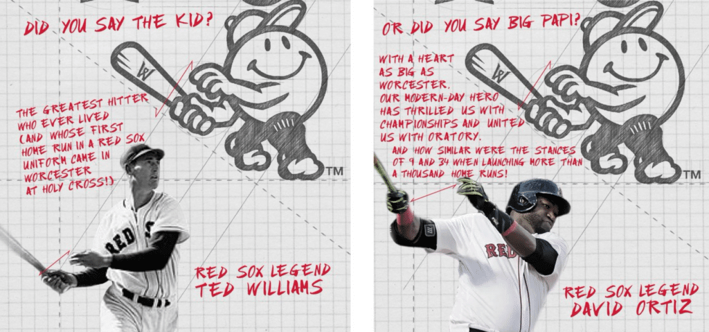
Color me skeptical. I suspect you could find similar similarities in the follow-throughs of countless other left-handed batters (just as countless batters could have been the basis for the MLB logo).

ITEM! New seam ripper colors: As promised, Uni Watch seam rippers are now available in yellow and white, in addition to our previous colors of green, blue, and red. (But green is temporarily out of stock. Will have more soon!) Full ordering info here.

Meanwhile, remember that Uni Watch cufflinks make a classy holiday gift. I’ve been very pleasantly surprised by how popular these have been so far — there are apparently more French-cuffed Uni Watch readers than I would have guessed!
Also, we still have two — count ’em, two — Uni Watch 20th-anniversary plates still available. You can get one here.
You can see more fine Uni Watch products here. My thanks, as always, for considering our merchandise.


ITEM! New raffle: Today we’re going to raffle off another Uni Watch membership that was generously donated by reader David Cline.
This will be a one-day raffle. To enter, send an email to the raffle address by 7pm Eastern today. I’ll announce the winner tomorrow. Big thanks to David for sponsoring this raffle.
Meanwhile, if you’d like to order a membership card instead of trying to win one in the raffle, you can do that here.
The Ticker
By Alex Hider

Baseball News: Reader Gary Hunter spotted new Nationals jerseys for sale at the Nats team shop, and noted that the Nike logo on the jerseys appeared to be rendered in black, not navy. Certainly looks darker than the navy lettering on the jersey. … New uniforms for Cambodia, who will wear them in the Southeast Asian Games (from @LukeBronJames). … Whoa! Check out the chevron hose worn by Harold Hull of NW Missouri State Teachers College in 1941 (from Michael Clary). … Are those 5s or backward 2s? It’s hard to tell on the Auckland Tuatara’s jerseys. They play in the Australian Baseball League (from Camryn Brown).

NFL News: It appears the Bills will be wearing mono-blue when they visit Dallas on Thanksgiving (from Mike Chamernik). … Rams LB Clay Matthews showed up to Monday Night Football wearing a Los Angeles Lakers hoodie (from Jakob Fox). … The Eagles have a display of helmets throughout team history outside of their stadium (from Sam McKinley).

Other Pro Football News: Couple of Grey Cup notes from Wade Heidt: Alberta Premier Jason Kenney wore an “I love Canadian oil & gas” sweatshirt during the coin toss, which some fans found inappropriate. Also, the Winnipeg Blue Bombers won the game, meaning that longtime fan Chris Matthew could finally change out of his shorts and into pants, per a bet that he made during the 2001 CFL season. … Whoops! The Grey Cup itself broke during the Blue Bombers’ celebrations yesterday (from Ariana Grandelorian and Sara Klein). … The XFL unveiled its game balls for its inaugural 2020 season. The league logo on the balls will be rendered in team colors, and each team will use its own ball on offense (from William F. Yurasko and Christian M. Zummer).
College and High School Football News: The Oklahoma defense added patch a with the unit’s slogan, “Speed D,” to its practice jerseys (from Sam McKinley). … The ACC Tracker has been updated for week 13. … Lots of great old pictures in this piece about the Fitchburg/Leominster High School rivalry in Massachusetts, including this shot from 1930 of coaches and players bundling up under hay on the sidelines (from Timmy Donahue).

Hockey News: Two fans at last night’s Wild/Rangers game at Madison Square Garden wore frankenjerseys for Mats Zuccarello, who’s currently with the Wild but used to play for the Rangers (from Josh Berger).

Pro Hoops News: After months of leaks, the Heat have officially unveiled the newest version of their “Miami Vice” unis — this season, they’re light blue (from Mike Chamernik). … A new arena for the WNBA’s Atlanta Dream and the Hawks’ D League affiliate has opened near the Atlanta airport (from Kary Klismet). … The Canadian Elite Basketball League, which began play with six teams last spring, will expand to 7 teams in 2020 with the addition of the Ottawa BlackJacks (from Wade Heidt). … Cross-listed from the NFL section: LA Rams LB Clay Matthews showed up to Monday Night Football wearing a Lakers hoodie (from Jakob Fox).

College Hoops News: Georgia Tech and Arkansas played a color-on-color game last night in Atlanta (from Michael Rich). … Ohio State wore grey throwbacks last night (from @tresselball). … San Diego State wore turquoise uniforms for Native American Heritage Month last night (from @oh_swick). … Lots of purple in Fort Myers’ Suncoast Credit Union Arena, as Kansas State and Northwestern — both in Florida for the Fort Myers Tip-Off tournament — warmed up in front of a bunch of empty purple seats (from Alan Saunders). … It’s not often you see a basketball coach wearing a visor. That coach is a member of Southern Oregon University’s staff (from Nathan Mindeman).

Soccer News: Manchester United paired their black third shirt with white change shorts and socks at Sheffield United on Sunday (from Josh Hinton). … USL League One team Revolution II, the reserve team for the MLS’s New England Revolution, unveiled their new crest (also from Josh Hinton). … The Athletic has published a piece about independent kit makers (paywalled) and how they help small clubs develop an identity (from Jon Eidukas). … New first shirt for Irish (League of Ireland Premier Division) team Dundalk. “They also switched back to Umbro from a company called CX+ Sport,” says our own Jamie Rathjen.

Grab Bag: Following up on yesterday’s Ticker note about Yuma (Ariz.) High School’s teams being called the Criminals, Brice Wallace notes that Orofino High School in Idaho uses the team name “Maniacs” because the state mental hospital was once located in the town. … Kary Klismet recently visited the Colorado State University Athletic Hall of Fame, which features lots of great uniform and memorabilia displays, including this gorgeous vintage basketball jersey. More photos here. … This poster shows every suit worn by Robert DeNiro’s character in the movie Casino (from @zadelstein). … A car on display at the Los Angeles Auto Show had a “Saugus Strong” decal on its windshield in honor of those killed at nearby school shooting earlier this month (from Jakob Fox).
Didn’t the grimaces beat the Ronald McDonalds?
Yes, duh. Fixed!
Zucc was (a fan favorite) with NY. He’s now with Minn. The frankenjersey copy states the opposite.
Actually Zuccarello is currently with the Wild but spent 9 seasons with the Rangers
Right. Fixed.
The Twins going powder blue at home is less weird these days. Maybe I am desensitized because the Phillies have done it for a couple of years. With every sport going mix & match with their laundry, abnormal is normal. What interested me is that the 2 on the display jersey has no serif off the base stroke. The number set the Twins have been using, and the set on the Carew-era uniforms, had the serif.
I think Tampa and KC did the powder blue at home the best when they paired the blue jersey with white pants. It’s the blue pants at home that makes it a little strange, I think.
“What interested me is that the 2 on the display jersey has no serif off the base stroke. The number set the Twins have been using, and the set on the Carew-era uniforms, had the serif.”
It looks like they’re borrowing the San Francisco Giants’ number font. I’m in favor, as the old jerseys had that weird big-NOB/small-number style that never looked good. The Tigers, Cincinnati, and (I think) the White Sox were similar offenders.
Of course, ideally, they wouldn’t have names on the backs at all; wasn’t that the style for some of the years in which these powder blues were worn? I know that in the late ’80s, just before they went back to white and gray, the blue jerseys had these big NOBs while the white home jerseys had link.
It is the Giants’ number font.
And I was always a fan of the comically-oversized Reds and Tigers NOBs. The fact that Davey Concepcion went rib cage to rib cage was so bad, it was good.
This may have already been answered during the other MLB uniform reveals this offseason, but is the material and cut for the Nike versions the same as the Majestic versions?
Yes. Exact same uniforms. Only difference is the maker’s mark.
This may change for 2021, but no changes to fabric or tailoring in 2020.
Looks like that Bills tweet also shows they’re going with white facemasks instead of gray, too
Love the WooSox name and mascot. The mascot looks like he walked right out of the Mr Men universe. Maybe a cross between Mr Happy and Mr Strong – link
That’s not the first time I’ve seen Nats gear where the navy comes across more as black. I’ve got a hat where the outline of the curly W definitely reads more as black when you look closely at it
Unless blue is an official color of the team powder blue doesn’t belong at all.
Not sure what your point is here, since all five MLB teams that currently wear powder blue (Twins, Cardinals, Phillies, Royals, and Rays) do indeed have blue as an official team color.
Powder blue isn’t a “team colour” for most MLB teams, it was the base colour of the road uniform for a bunch of teams in the 1970s. The way grey is today.
No team has “grey” as a team colour, but they all use it.
I’ll agree on this: powder blue looks the best if a shade of blue is the team’s primary color (Royals, Cubs, Rays), but it can also look good if the team doesn’t really have a secondary color, like we saw with the Phillies in the ’80s.
I have no problem with the Twins wearing that light blue uni at home. This iteration doesn’t have a road or home designation, so wearing it at home shouldn’t be a problem. I’m glad to see another light blue uni because gray is overused for road games IMO.
For all that I have some real problems with the new Twins powder blue unis, on the whole I’ll call it a win purely for the return of red script. The Twins should be a red script, red name/number, navy cap team. Preferably with pinstripes, but get the script and cap colors right (and consistent home and away) and I’ll be happy. Even with powder blue at home, terrible Griffith-era script, and stupid non-anniversary anniversary patch.
Interesting…since original Twins home unis were pinstripes but with navy script, navy numbers. That’s their best look. Original roads were same but in plain gray. Red on the powder blue is fine (I like this new alt) but they are a navy script/number team in their original iteration.
“The Eagles have a display of helmets throughout team history outside of their stadium”
Well, sorta. :^\
They are all modern helmets/facemasks. To me that don’t count as historical.
Who’s next with the powder blue, Toronto? I guess the other options are Cubs, White Sox, or Rangers, unless someone comes out of the blue with. Random alternate.
You’re leaving out the Braves and Mariners as possibilities.
Mariners went with powder blue for Spring Training in 2019. So they could make the jump.
If it’s the Cubs, it’s gotta have white pinstripes. In fact, I’d trade any number of further teams bringing back powder blue for the Cubs bringing back powder blue with white pinstripes.
I would buy a powder-blue-with-white-pinstripes Cubs jersey on day one. I’d pre-order if they brought back white pinstripes on a dark blue uniform.
Hopefully we’ve not seen the last of the Nationals’ fantastic Expos throwback (though I suspect that set is one-and-done).
Paul-
2010 Uni Watch Party was in Minneapolis. Held at the now dearly departed Grumpy’s (to make way for more downtown condos). If you ever make it back to Mpls we’ll hit up the original Grumpy’s in NE Mpls. Definetly your kind of place.
link
Ah, yes — I confused it with the party we had in 2008 at Nye’s in St. Paul.
Nyes is (was, more condos now) in Minneapolis too although geographically it may be confusing because it was located in a portion of Minneapolis east of the Mississippi. Kind of related to this, the Twins 60th season patch features the well known stone arch bridge that spans the Mississippi in Minneapolis. To the left of the image is the sillouette of the state capitol in St. Paul which is in no way visible from the stone arch bridge. Unlike the Mets logo, this is a totally made up skyline.
Moved away from Minneapolis four years ago and was incredibly bummed to see the DT Grumpy’s close — my wife and I had our first date there, and we made a point of stopping by anytime we were back up there.
On the other hand, the Twins powder blues and that curtain in the City Club room are two MPLS classics that look great together. :)
I know there are no plans nor official announcement on the Rangers altering their look as they move into the new stadium (which I find odd), but I’d love to see them mix in the powder blues to tie the old with the new. Bring back the Buddy Bells!
Another great look. I suspect the “coming soon” Powder Blues may be Toronto?
THAT is an idea.
But powder blue would lean the Rangers too strongly toward blue for a team that tries to balance red and blue. So in addition to powder blue unis, they’d need a set of powder red unis. That is, pink. Which would be awesome.
I would refer to those as the “medium rare” unis.
Or the breast cancer awareness unis.
It is 2019.
Ft. Myers, not Meyers (though you’re hardly the first to make that minor error)
Thanks. Got it.
Those Twins Powder Blues are gorgeous.
The WooSox mascot is wearing red socks with white heel and toes like on the Red Sox logo, not sannies and stirrups.
Good catch.
glad you had fun on the eastern shore! im from hampton roads, VA (757) right over the ches-bay bridge tunnel. we love visiting the shore from time to time , its awesome
anyway i know you cringe like most of us at the constant barrage of NBA uniform choices, but one odd thing of note about the Miami Vice jerseys is that the wordmarks and numerals have TWO drop shadows hahahaha. has that ever happened? if one drop shadow gives the 3D effect, is this like 6D lol? . just thought it was odd and at first thought it was trim but nope its double drop shadow
sorry if you’ve already covered this in the past, it took me four jerseys to even notice hahaahah
The Twins powder blues are awesome! I hope the Mariners do the same thing.
Also, my mom is a “Maniac”. She graduated from Orofino High School. They’re still the “Maniacs” with a guy in a straightjacket and hair sticking straight out as their logo.
Is there a rule in the NFL as it pertains to throwback/alternate jerseys and their matching helmet decals? Example – could the Bills wear their throwback helmet logo with their current jersey, or do they have to wear the matching throwback jersey? And what is the rule on face mask colors? Does it have to be a team color, or gray? What about white?
No firm rules on this that I’m aware of, and even the less-than-firm rules appear to be very much in flux.
As a southpaw myself I love seeing that Sox mascot as a full-blown, unambiguous lefty.
I know I’ll eventually get used to it, but every Nike uniform reveal so far has made me think “Damn, these look like college uniforms!” I think I’ve grown accustomed to seeing the maker’s mark on the front and got the “less than” professional feeling.
Good! Now hold onto that feeling and don’t get numb to it.
I always thought Forrest Gump created the Smiley face design….
Paul, I noticed a typo. Regarding the Twins’ powder blue uniforms, you wrote:
“It can be worn either at home (which will be weird) or on the road (which is where it belongs).”
While I’m pretty sure you meant to write:
“It can be worn either at home (which will be weird) or on the road (which is where it belongs).
“It can be worn either at home (which will be weird) or left in the dustbin of history (which is where it belongs).”
Please correct.
Huh?
I guess this was my way of trying to say those Twins unis suck.
Can you repeat the part of the stuff where you said all about the things?
(Thx, Matt Groening et al.)
I thought MNF last night was more of an homage to the Lakers, with the purple…er Forum Blue…and gold/yellow
Does no one else here agree that the WooSox logo is utterly terrible? It’s like the Walmart smiley face and an emoji had children. I initially saw it and thought I was taking crazy pills for thinking it’s ridiculous but then went online and saw the (justified) ridicule towards it. If that’s not enough, its arm is coming out of its chin. I’d be embarrassed to wear a cap with this on it.
Most of the Worcester caps, though, won’t feature the mascot, but rather will have some variation of a W.
Hard to say whether this logo will be loved or hated by Worcester fans. Everyone blasted the Hartford Yard Goats and Amarillo Sod Poodles, and both teams have been hits at the box office and merchandise counter.
Spotted while Googling for Twins jersey designs: link. The year “1984” is assembled from jerseys numbered 1, 9, 8, and 4 hanging in lockers. Those nice, clean block numbers, no annoying NOBs; it’s perfect!