Click to enlarge
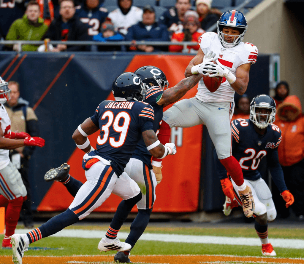
Good morning! Greetings from Virginia, where I’ve been spending the past few days. As you can see above, the Bears wore 1960s throwback helmets — a white “C” logo, grey facemasks — for yesterday’s game against the Giants.
Interestingly, on Friday we Ticker-linked to a video showing the Bears’ equipment staff preparing the helmets. The video clearly showed them adding “GSH” memorial decals for George Halas to the helmet shells — but they didn’t wear that decal in the game.
I didn’t really understand why they were adding the “GSH” decal to begin with. They were wearing their regular primary jerseys that have the “GSH” sleeve lettering, so why repeat the memorial on the helmet? I guess they eventually came to the same conclusions. (By contrast, their 1936 throwback does include the helmet decal, because the throwback jersey doesn’t include the sleeve lettering.)
In other news from around the league yesterday:
• The Cowboys wore their mono-white alternates. But defensive lineman Maliek Collins wore the wrong pants:
@UniWatch @PhilHecken 96 with different pants (Silver vs. White) for the Cowboys. pic.twitter.com/AS5zvVAcU9
— Josh Richardson (@jr_richardson) November 24, 2019
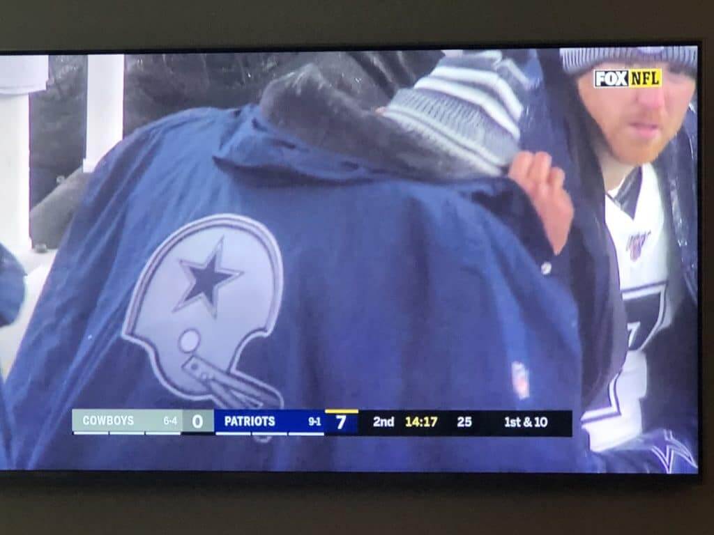
In that same game, the Cowboys wore sideline capes featuring an old-school two-bar helmet graphic:
Also from that game, check out this great photo from Boston Herald photographer Nancy Lane, who captured what appears to be a stray fragment of Cowboys safety Jeff Heath’s helmet logo:
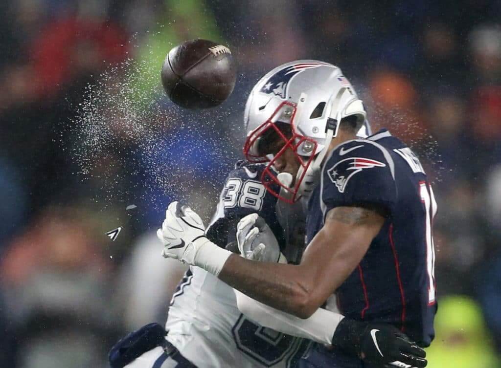
You can also see that the water droplets mirror the shape of the New England receiver’s helmet — amazing!
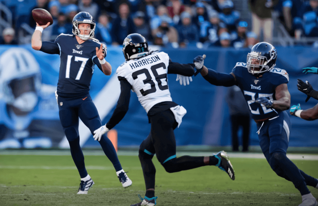
• The Titans went mono-navy against the Jags:
• 49ers wideout Deebo Samuel wore a Louis Vuitton visor during pregame activities:
Deebo Samuel rocking the Louis Vuitton tinted visor 🔥 pic.twitter.com/wKLHY6QhKB
— ESPN (@espn) November 25, 2019
And that’s it. No other monochromatic uniforms (unless you count the Saints going mono-black, which is no longer uni-notable because they do it all the time), nobody wearing white at home, no nothin’. A very quiet week.
(My thanks to Pete Clark, Charlie Eldred, Joe Giza, Justin Hicks, Bill Schaefer, Mark Stevenson, and Larry Schmitt for their contributions to this section.)
Virginia road trip report: This is the third consecutive year that I’ve spent the weekend before Thanksgiving on Virginia’s Eastern Shore, where my friend Carrie’s father lives. As usual, on Saturday we attended the annual Ducks Unlimited Eastern Shore Oyster Roast. And as usual, it was a hoot:
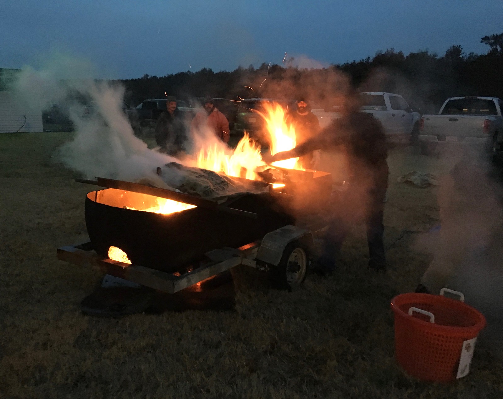


And as usual, I was excited to score a few pea crabs in my oysters (for those who don’t know what pea crabs are, you can check out this article I wrote last year):


Speaking of oysters: In restaurants, they’re typically sold by the dozen. Clams, too. Now, if you buy a dozen doughnuts or a dozen bagels, you often get 13, not 12 — a baker’s dozen. The Tugboat Captain and I have long maintained that anyone who orders a dozen oysters should get 13 — a shucker’s dozen! So we were surprised when we had lunch at a seafood joint yesterday and saw that they were offering a “baker’s dozen” of steamed clams (but only a “full dozen” of oysters):

It’s a start. I count this as progress!
The trip also included a very nice walk on a beach, where we found an impressively barnacle-encrusted object; a really good shrimp and oyster po’ boy; a sighting of some wild horses; and more. But the best part was reconnecting with Carrie’s dad’s pooch, Tuck. I missed you too, cutie:

We’ll already be driving back by the time most of you read this. Should be back at Uni Watch HQ right around sundown.

Click to enlarge
ITEM! Anniversary plate finally available: As you may recall, the 20th anniversary of something is the “China anniversary” (that’s China as in plates, dishes, etc.), so I had some Uni Watch 20th-anniversary plates made earlier this year. The design was done by Scott M.X. Turner, with the little cherubs at the top by the great Rob Ullman.
We took pre-orders on these several months ago and had three additional plates made for retail sale. Those three plates were listed on the UncommonGoods website of the weekend — and one of them has already sold, so only two are left. If you want one, you can order here.
Click to enlarge
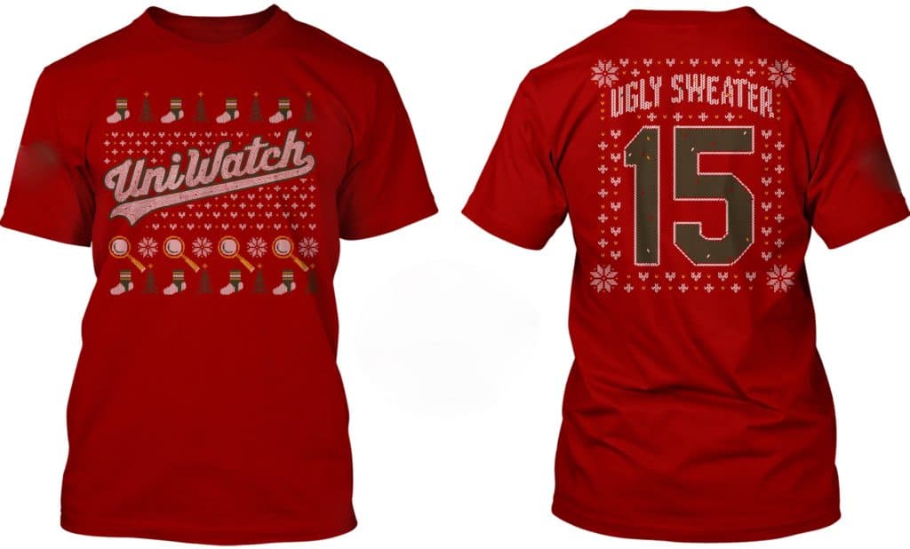
’Tis the season: With the winter holidays fast approaching, it might be time to break out the ol’ Uni Watch ugly sweater shirt. If you don’t already have one, it’s available in long-sleeved and sweatshirt versions, too. Details here.
The Ticker
By Jamie Rathjen

Baseball News: The Japanese Pacific League’s Orix Buffaloes revealed new uniforms, including an alternate of white pinstripes on black that Shawn De Haven says “many fans are saying look like pajamas.” … The Green Bay Press Gazette did an article on the designer of the Brewers ball-in-glove logo (from Kurt Rozek). … Angels P Shohei Ohtani appeared on the anime Sazae-san in full uniform wearing a rough approximation of their red alternates (from Jeremy Brahm). … Paul Deaver sent us pictures of a 1946 Oklahoma City junior team.

Football News: You can see Wade Heidt‘s review of the Canadian college championship, the Vanier Cup between Calgary and Montréal, in yesterday’s comments. … Jordan Grimes sent us a ’60s Bears concept. … The latest school of the day from Blaise D’Sylva’s helmet collection is Colorado State. … Ohio State and UCLA went color vs. color in 1975 (from Kenny Kaplan).

Hockey News: The Bruins revealed a third uniform, confirming long-running rumors (from multiple readers). … The OHL’s Hamilton Bulldogs wore Hockey Fights Cancer jerseys, (from Wade Heidt). … Going down a level in junior hockey, the British Columbia Hockey League’s Vernon Vipers wore yellow first-responder themed alternates (also from Wade). … The Federal Prospects Hockey League’s Danbury (Conn.) Hat Tricks (in black) and Battle Creek Rumble Bees played a color-vs.-color game (from Casey Bryant).

Basketball News: East Tennessee State is wearing what looks like throwbacks on Tuesday (from Brooks Savage). … The Grizzlies debuted their Vancouver throwbacks last night, but they apparently got the number fonts wrong.

Soccer News: German team Fortuna Düsseldorf wore their special kit incorporating the logo of the local band Die Toten Hosen — the socks even say “F95 x DTH.” … German fans bring all sorts of colorful protest banners to games, but Borussia Dortmund fans brought a new kind on Friday asking for a women’s team. “Football is for everyone — women’s team now,” it says. … Scottish team Aberdeen’s center-back Andrew Considine made his 500th appearance for the club — he is one of perhaps 15 or so active players in the world to reach that milestone with one team — and received a special captain’s armband. … The Rainbow Laces campaign, in which players in many sports wear rainbow shoelaces and teams break out other rainbow-accented items, started this weekend in the UK. Premier League teams didn’t participate this week, but some English Football League and women’s teams did, and you can see some examples on the Twitter feed of Stonewall, the organizing charity. The next two items were also done in support of the campaign. … In Scotland, teams in the Scottish Cup third round wore rainbow captain’s armbands and Partick Thistle wore their white/black rainbow-trimmed second kit at home. … The Cheshire League team in the FA Inter-League Cup, a competition featuring representative teams from amateur leagues covering English counties, also wore a rainbow shirt with Stonewall as the ad.

Grab Bag: The NLL’s former Rochester Knighthawks moved to Halifax to become the Thunderbirds, so Wade Heidt sent us the team’s new floor. … Timmy Donohue sent us a Life magazine article listing all the shoulder insignia worn by U.S. Army troops in World War II. … Tennis’s Roger Federer, who is a big sneakerhead, invested in a small Swiss sneaker company called On (NYT link) (thanks, Brinke). … Yuma (Ariz.) HS’s nickname is the Criminals, because it was once briefly located in a disused prison. It’s better than another Bulldogs or Tigers school (from Alan Kreit). … Reader JohnMark Fisher says the logo for Hennepin County, Minn., which contains Minneapolis, cleverly references the county government building in the negative space of the H, though if you ask him, “all I see is a bottle of wine.” … Here’s a Sporcle quiz: Can you identify these logos from now-defunct sports teams? “I scored 14 out of 16,” says Christopher Fyfe.
The Bruins actually did post pictures of the entire uniform.
Yep. They made their debut at a season ticket holder event. The linked picture looks like it’s from a guest’s phone. Here’s pictures from the Bruins’ Twitter feed.
link
link
link
Early in the Giants-Bears game (the first Giants punt return) returner Golden Tate was drilled by a Bears defender… A large portion of his white “C” came flying off.. FOX ran a great slo-mo clip showing the white decal fluttering in the air…
Sorry I could not search for the video.
Here’s the punt with the ‘flying C’… no slo-mo, but still clearly visible.
link
Logos: 16/16. Now to find out how to spend the rest of my work day. (Just kidding, bosses.)
The Hennepin County Government Center opened in 1977, and the county logo was in use when my family moved to the county in 1982. The story I heard at the time was that the logo came first.
New logo & nickname for Red Sox AAA affiliate coming later today:
link
With the Cowboys’ rain gear plus the 49ers end zones, there’s been a slight resurgence of the two bar. I also notice that there’s merch being sold with the two bar on it for some teams.
I think that facemask is illegal now, yes?
Yes, the plastic 2-bar and1-bar facemasks have been banned for quite a while now; punters and kickers were exempted for a while after they were banned for other positions.
That’s too bad. I also kind of like the goofiness of this style, which is kind of in between.
link
When I started watching NFL football as a young kid in the 1980s, thought the receivers who still sported the two-bar masks were pretty cool looking. Mark Duper, Steve Largent, and Billy “White Shoes” Johnson (who sported it during his time in Canada too).
Love the Butkus/Sayers era helmets on the Bears.
Wish they’d combine it with the old white-over-white road uni.
And the Twins are bringing back the baby blues. A look that is gorgeous for them, and they pull it off splendidly.
link
It’s a great look, but it kills me to see the terrible old 1961 script instead of their current, and competently designed, home script.
The 1961 script, and the various seemingly random versions of it that popped up over the years, has an uneven baseline, randomly oriented ascenders, and inconsistent line thickness and curves/angles. It’s not charmingly handmade, it’s sub-handmade. Like, no calligrapher or sign letterer would ever produce a work of lettering that bad. “Amateurish” would be a huge improvement, because even the most amateur letterer would not make the mistakes that ruin the old Twins script.
Well, I love it.
Give me your tired, your poor, your randomly oriented ascenders.
It’s a bit surprising to me how much the fans were apparently clamoring for the baby blues, considering they started winning World Series as soon as they mothballed them.
Show a fan anything they remember from their youth and they’ll grab for their wallets.
It’s good the Twins are also going with the powder blue pants, though the uniform really should only be worn on the road, like it was back in the day.
You must love the Brewers new script on their navy jerseys then
Also, a 60th Season patch. Boo! 2021 is the team’s 60th anniversary. Do the 60 patch then, not 2020!
They have been inconsistent over the years. 30th anniversary in 1991. 40th In 2000, 50th in 2010, then 60th in 2020. Well, more consistent of late. Unfortunately.
Hey Paul, is that giant “Welcome To the South” sign still there at the Virginia-Maryland border on Rt. 13?
Yup! Not just a sign — it’s a shop. Dixieland.
*looks up on Google Street View*
Yeeeeeeeah… I guess I’m nut surprised the sign features that certain flag.
Absolut Hennepin?
Vodka that tastes like road salt.
Pretty sure that cowboys player has the same pants it’s just the light reflecting. They dont have any other pants besides those and the silver/blue ones they normally wear
The Cowboys have three sets of pants. Their normal home Tex Schramm pants, white, and the away silver.
Right, but these are the only white pants they have? So unless Nike made him the wrong pants its gotta be the reflection.
Everyone else is wearing Blue Silver Blue stripes.
He is alone with his Blue White Blue stripes.
Oh man, that oyster bake looks like my idea of heaven. Jealous.
Of course those Japanese uniforms look like pajamas, I wonder how they’d look with short pants and stirrups. Anybody know of any other white pin stripes on color uniform instances?
Late 70’s Chicago Cubs and Vanderbilt come to mind.
Vanderbilt University has white (or gold?) pinstripes on a black uniform.
In the Negro Leagues, the Chicago American Giants wore white pinstripes on a dark blue uniform, echoing those worn by the Cubs and White Sox at various times.
The Hiroshima Carp also had a link a few years ago. It was an alternate but I really loved it. It also had only a number on the back; nice and simple.
Do I spy Paul wearing a Minnesota Wild shirt?
Yes. Given to me by their equipment manager in 2010.
According to the Browns uniform schedule yesterday was the last time the current brown jersey, orange pants combo will be worn. The remaining weeks the team will go all white or all brown.
All Ugly until they change the uni’s back.
OK – so about the Vancouver Grizzlies throwbacks. As a Vancouver resident who did get to go to some Grizzlies games live, thought it would be kind of neat to see them in action again when I first heard about it.
Then I watched some of the highlights and checked out team’s Twitter for the photos. As a former Grizzlies fan, was not so thrilled about it when it was happening in real time. Resentment and jealousy kicked in while I watched the Memphis fans enjoy having their team play in our uniforms that were never worn there. With our city name on the jersey. And we get to have one exhibition game a year instead of having a team.
& enjoy your Wooster Smiley Faces- link
Autographed photo of Cedrick Hardman wearing a 1969 49ers uni…even though he was a rookie in 1970. I suppose it was a leftover from the previous season. Note the NFL 50th anniversary patch on his left shoulder.
link
Yuma High is also the criminals because the Territorial Prison (before Arizona became a state in 1912) was located in Yuma. #themoreyouknow
Nancy Lane’s photo is absolutely amazing.