For most photos, click to enlarge
The Brewers released their long-rumored new uniform set last night. The new logos and uniforms were created by Rodney Richardson of Rare Design, who’s best known for his work with the NBA. This is his first MLB team makeover (additional info here).
There’s a lot of ground to cover here, so let’s go one element at a time, beginning with …
The Colors
Like a lot of people, I was hoping they’d go back to royal blue. Instead, they’re sticking with navy. I initially thought it was a different navy than the one they’ve been wearing in recent years, but sports color maven Donovan Moore assures me that it’s the same shade. In any case, while I was rooting for royal, the navy does pair quite well with the new shade of yellow.
The New Ball-in-Glove Logo
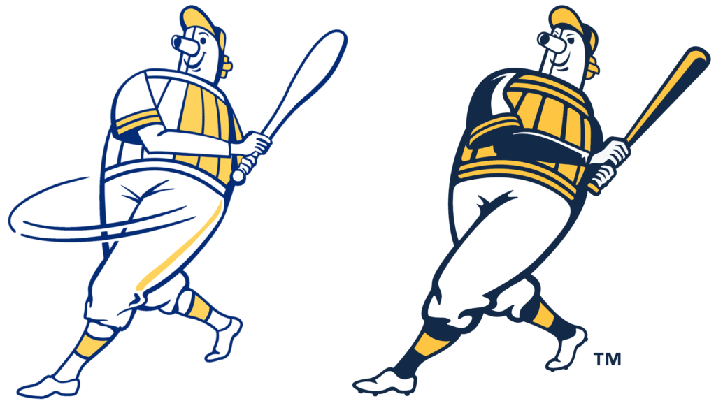
The Miller-style “M” has been scrapped, while the old ball-in-glove “mb” logo, which had been a throwback mark, is now the primary mark. They’ve made some alterations to it, however. Here’s a comparison — old version on the left, new on the right:
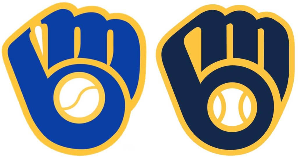
I know some Brewers fans, several of whom are prominent members of the Uni Watch comm-uni-ty, really hate the new BiG version. Personally, I like some of the changes (especially centering the ball within the pocket of the “b” and smoothing out the outline on the right side of the logo) and am less thrilled with some of the others (I preferred the old seams on the ball), but I don’t see any of it as a big deal either way. The main thing is that the BiG is back, which is something we should all be happy about, and it’s obviously a massive upgrade over the Miller-style “M.”
The ball-in-glove also serves as the centerpiece of the new primary logo:
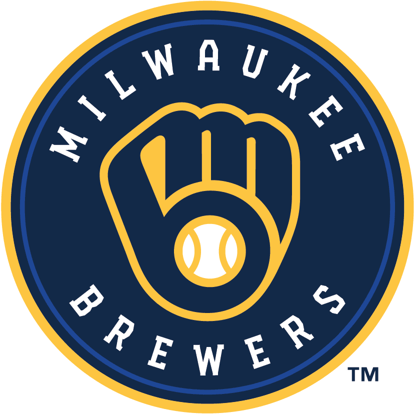
Can’t say I’m in love with this. For starters, the royal blue inner ring (which is supposedly to “represent the past”) feels unnecessary and out of place. More importantly, I don’t like the lettering. Which leads us to …
The Typeface
Not a fan. I gather it’s supposed to look like brickwork or lug nuts or something similarly blue collar, or maybe a beer barrel (there was no mention of it at the unveiling or in the press release), but it just feels clunky. Here’s the full set, along with the lettering at the top of the unveiling press release:
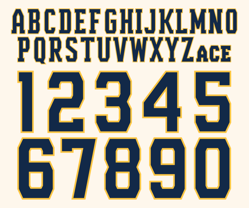
Ugh. That’s going to be brutal for NOBs. You can get a sense of what I mean from this mockup:
I reaaaaally don’t care for that.
Meanwhile: As you can see from that mock-up, the Brewers will have two sleeve patches this year, so let’s take a look at those designs, beginning with …
The 50th-Anniversary Logo
Next season will mark the 50th anniversary of the Seattle Pilots moving to Milwaukee and becoming the Brewers. Here’s the logo they’re using to commemorate that milestone:
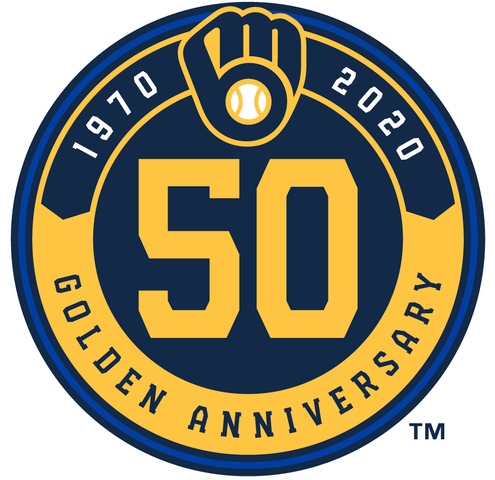
Good on them for waiting an extra year to celebrate the 50th anniversary and not the 50th season. As for the design, it’s okay, but I have the same issues here that I have with the primary logo: Don’t love the royal blue on navy, don’t love the typeface.
The Secondary Logos
The two home uniforms feature a round left-sleeve patch, while the two road uniforms have a patch shaped like the state of Wisconsin:
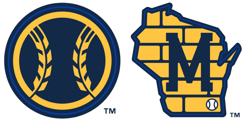
The home patch is fine. The barley stalks remind me a bit of a wheat penny and provide a nice bridge from the outgoing uniform set. Again, I could live without the royal blue outline, but whaddaya gonna do.
As for the road patch: I’m generally in favor of geography-based patches, plus Wisconsin is my favorite state and I get positive vibes whenever I see its shape or outline. But I do not care for this patch. The Bucks already played the Cream City brick card four years ago, so this feels like the Brewers are just playing catch-up or jumping on a bandwagon. Also, the bricks are a Milwaukee thing, not a Wisconsin thing, so why have the whole state bricked up like that?
Also-also: I realize the baseball in the lower-right corner is meant to mark Milwaukee’s location, but it feels more like an afterthought, almost like they said, “Looks great — oh wait, let’s slap a baseball on there, just to make sure everyone knows which team this is for.” (And while we’re at it, shouldn’t the seams on the baseball be barley stalks?)
The New Barrel Man
They’ve brought back the old Barrel Man logo, although it’s not clear how it’ll be used (it doesn’t appear on any of the uniforms). They’ve made a few tweaks, which you can see here — old version on left, new on right:
At the unveiling, they said they wanted to give him “more of an edge,” which is mostly visible in his face:

Not as endearingly joyous as the original version, but at least they don’t have him gritting his teeth. Here’s hoping they use him to replace the anniversary patch in 2021.
Okay, enough preliminaries — let’s get to the uniforms, beginning with …
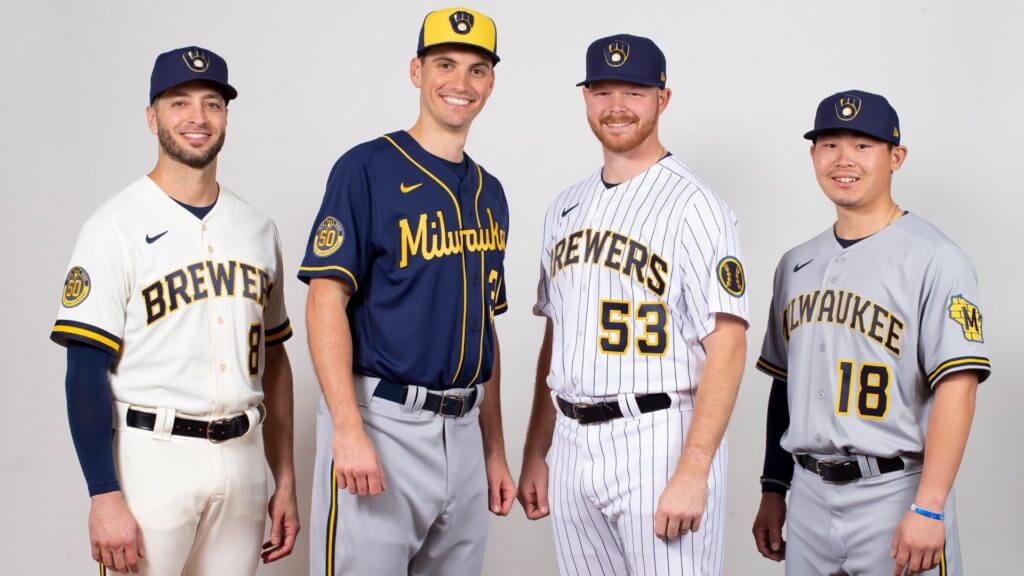
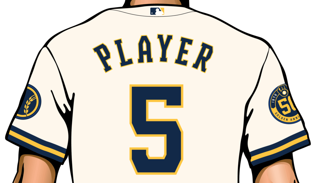
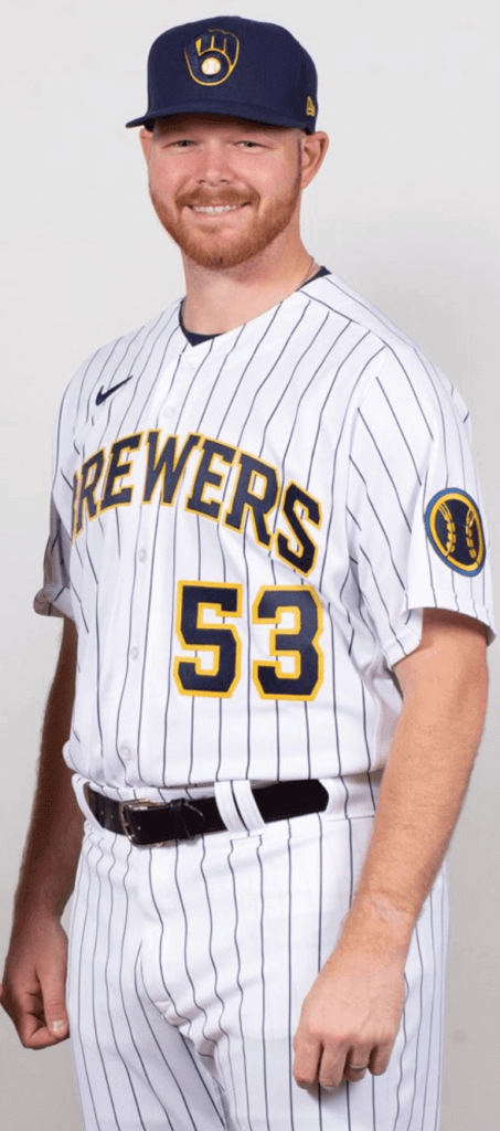
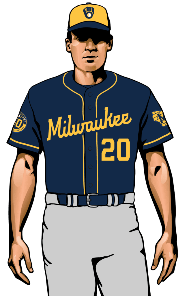
The Home Whites Creams
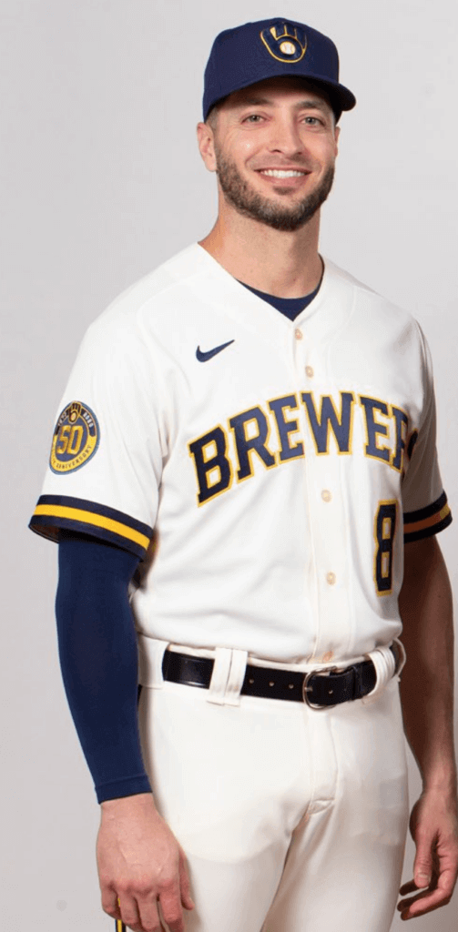
I included that last shot just so you can get a better sense of the cream tone, which wasn’t so evident in most of the other images I’ve seen.
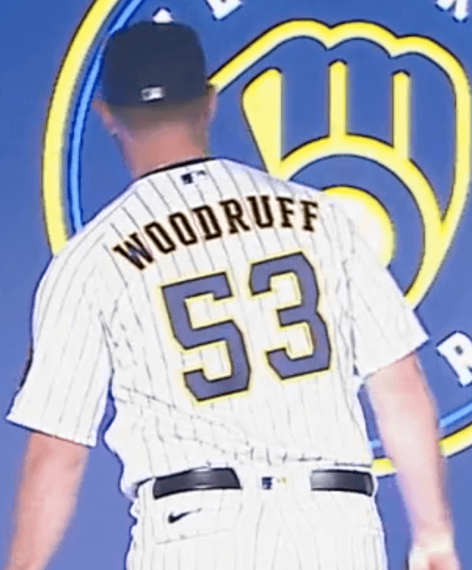
So: I wish they’d gone with white instead of doing the cream thing, but otherwise I like this a lot. The lettering looks much better in this vertically arched treatment, and the color combo looks solid. I’m not going to like it as much from the back, where the number font and radially arched NOB lettering will make me itchy, but it looks very solid from the front. Grade: A-
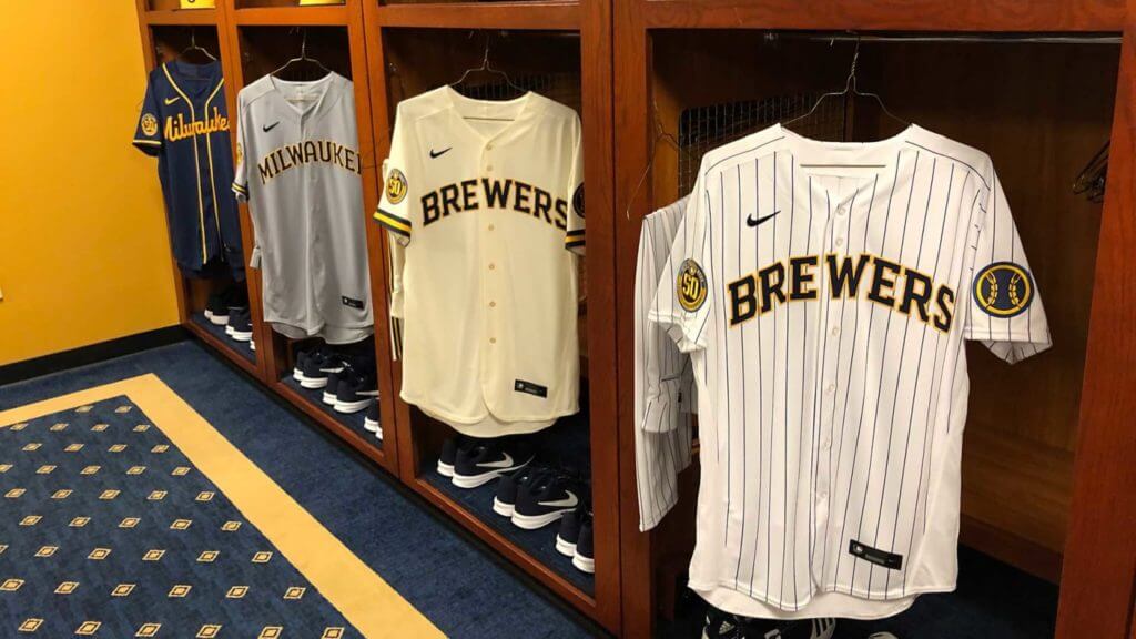
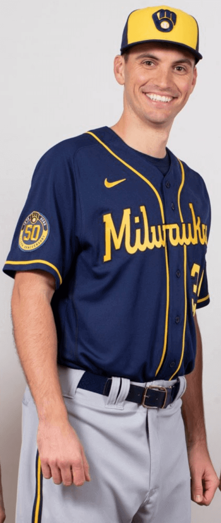
The Home Alternates
This is basically the same design (except for the sleeve trim and the pants piping), but transferred to a white uni with navy pinstripes. No indication yet of whether it’ll be worn on a specific day or anything like that. In any case, looks as good as the primary — maybe even a bit better. Grade: A-
The Road Greys
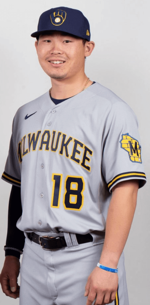
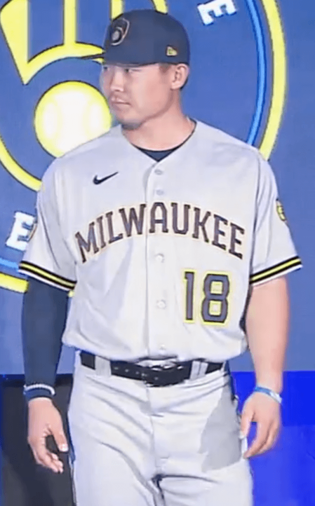
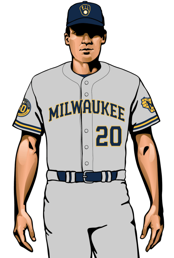
This one doesn’t work as well for me, because it’s harder to hide the typeface issues in a word as long as “Milwaukee.” Really dislike the “A” and “U” here. Not a disaster, but not as good as the home designs. Grade: B to B+
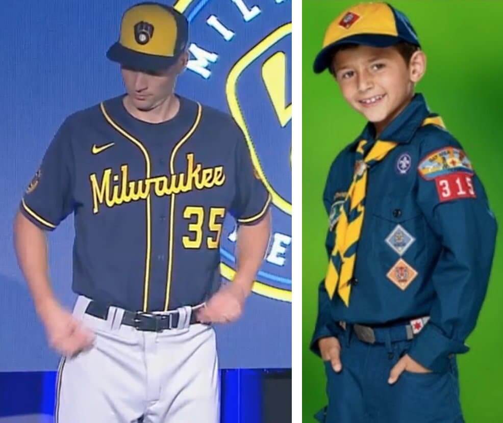
The Road Alternates
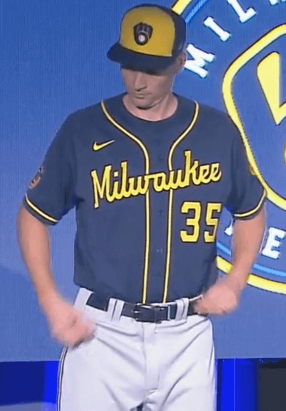
When I was in college, I lived across the street from a city park that had a few baseball diamonds with all-dirt infields (you know, the kind with no grass at all). There were adult hardball and softball leagues that played each night during the summer, and sometimes I’d go out and watch them. That’s what this uniform reminds me of. It also feels like a cynical excuse to stock another jersey and another cap at the pro shop. Grade: C-
Update: As several readers have pointed out, the road alternate also looks a lot like a Cub Scout uniform:
———
Overall: A big, big upgrade over the Miller/Cheers set. I still don’t care for the typeface, but this is nonetheless a major return to aesthetic respectability. Nicely done.
I’ll be discussing these uniforms on this Milwaukee sports radio show today at about 12:30pm Eastern. Looking forward to it!
(My thanks to @bullyday and Andrew Wagner for their contributions to this section.)
Click to enlarge
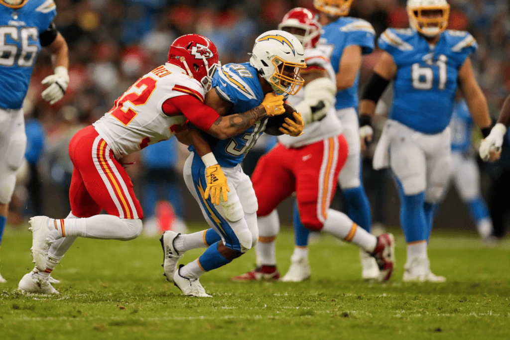
Mmmm, tasty: Last night’s Chiefs/Chargers game was a thing of beauty — two great uniforms with just the right amount of contrast, on a grass field. I had it on in the background while I wrote about the Brewers’ unveiling, and it made me smile every time I looked up. Lots of additional photos here and here.
Incidentally, this game was played in Mexico. Isn’t it interesting how the NFL, which is so often derided for being all about the money, can somehow manage to play a game in a foreign country without plastering its uniforms with annoying ads, unlike at least one other league? Hmmmmm.
Click to enlarge
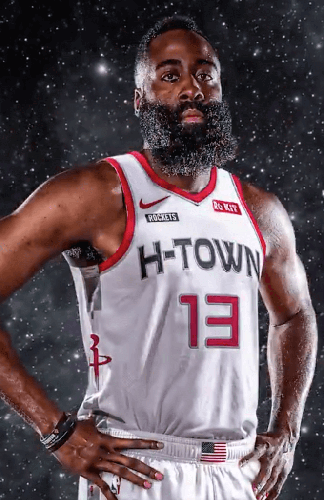
Lots of new NBA alternates: The Rockets unveiled their eleventeenth uniform, or whatever it is, last night. The space/NASA-themed design (a good excuse to put an American flag on the waistband and a team nameplate on the upper chest) will make its on-court debut on Nov. 30 and be worn for Saturday home games thereafter.
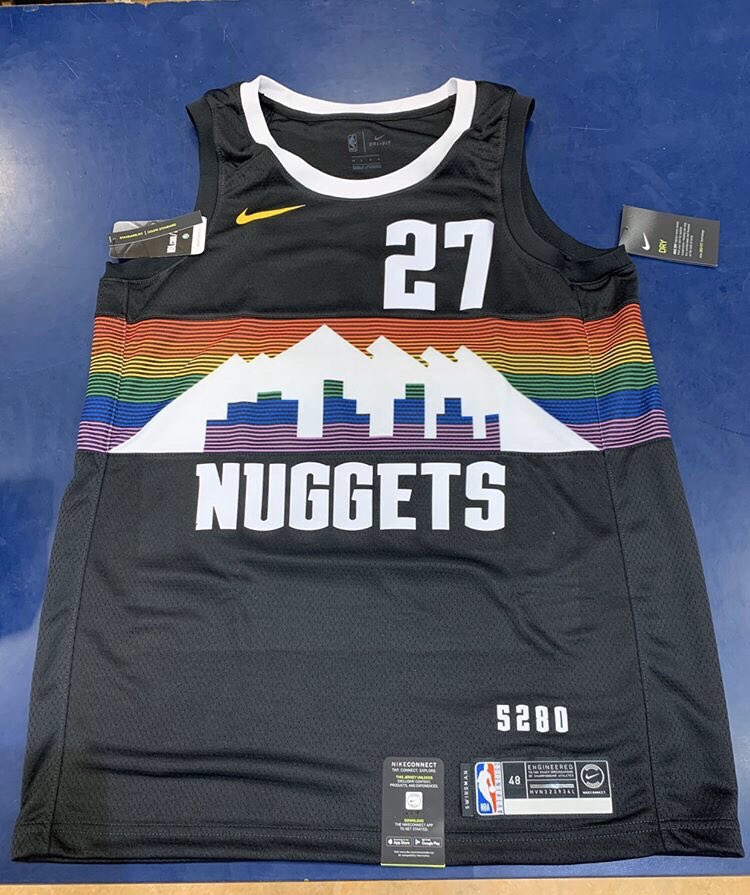
In addition, the Nuggets’ and Pistons’ new alternates appear to have leaked:
Were these announced, or did I catch Champs slippin? 🤔 pic.twitter.com/7QuPYJoF0Z
— badboysremix 🏁 (@badboysremix) November 18, 2019
And for good measure, the the Timberwolves will apparently be unveiling their latest alternate tonight, with the Cavs to follow on Thursday.
If you can keep track of all these designs, which ones they’re replacing, how they fit into the grand scheme of things, and how to take any of this seriously, you’re way ahead of me. The NBA uni-verse no longer has any past or future — there’s just now now now, which is disposable as soon as the next now now now comes along (roughly the day after tomorrow). It’s all given me a serious case of NBA uni fatigue.
Click to enlarge
Collector’s Corner
By Brinke Guthrie
Follow @brinkeguthrie
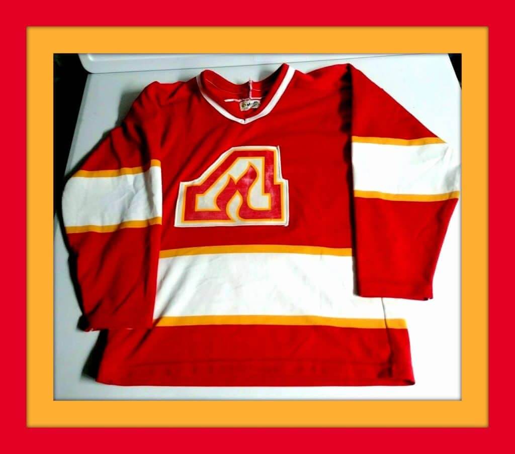
One of the truly great sports logos ever — ladies and gentlemen, your Atlanta Flames. Sure, they kept the name when they moved up to the Great White North, but to me, the flames just look better in the middle of the A. This 1970s jersey is made by Maska and says “Superfil” on the tag.
Now for the rest of this week’s picks:
• Back in the late 1950s or early ’60s, product endorsements were a little on the “quaint” side. Case in point: The great Yankee Mickey Mantle lent his name and image to this pencil set.
• Nice-looking 1972 Boston Celtics promo poster!
• The seller says this New York Giants candy dish is from the 1960s, but of course we know better. If you’re reading this, you obviously Get It™.
• We’ve all seen NFL Alumni attire (like this New England Chapter sweater vest), but players could also get items like this Seiko desk clock.
• Always like to highlight The Master whenever possible: This 1968 NFL poster by Dave Boss is a composite of all of the league’s then-current teams.
• The seller calls this 1970s Cleveland Browns glass a “roly-poly” glass.
• A rather chubby friar graces this late-1960s San Diego Padres pennant . I doubt he will be a part of the new “Brown Is Back” campaign.
• This 1971 NFL/Chiquita football — kinda like a Nerf Ball of the period — is in good shape.
• You’d think the maker would’ve gone with purple as the main color for these 1970s Vikings kids gloves, but they went with yellow instead.
• Finally, I just wanted to include this 1965 Topps NFL card in here, because of the player’s name. Ready? Goose Gonsoulin.
More on The G-Man here.
Programming Note: No Collector’s Corner here on the blog next week, but you can find an abbreviated version of CC next Tuesday on the Uni Watch Facebook page. See you back here on the mothership Dec. 3.
Got an item to include on Collector’s Corner? DM your submissions to us on the Uni Watch Facebook page.


ITEM! New membership raffle: Reader David Cline has generously purchased five memberships for me to give away, and we’re going to raffle off two of them now.
This will be a one-day raffle. To enter, send an email to the raffle address by 8pm Eastern tonight. One entry per person. I’ll announce the two winners on Wednesday, and then we’ll raffle off David’s other three memberships in the weeks to come. Big thanks to him for making this possible!

And speaking of memberships…: Eight new designs have been added to the membership card gallery, including Steven Bost’s card, which of course is modeled after Eddie Gaedel’s St. Louis Browns jersey. A great choice!
Ordering a membership card is a good way to support Uni Watch (which, frankly, could use your support these days). And remember, a Uni Watch membership card entitles you to a 15% discount on any of the merchandise in our Teespring shop and our Naming Wrongs shop. (If you’re an existing member and would like to have the discount code, email me and I’ll hook you up.) As always, you can sign up for your own custom-designed card here, you can see all the cards we’ve designed so far here (more than 2,300 of them!), and you can see how we produce the cards here.
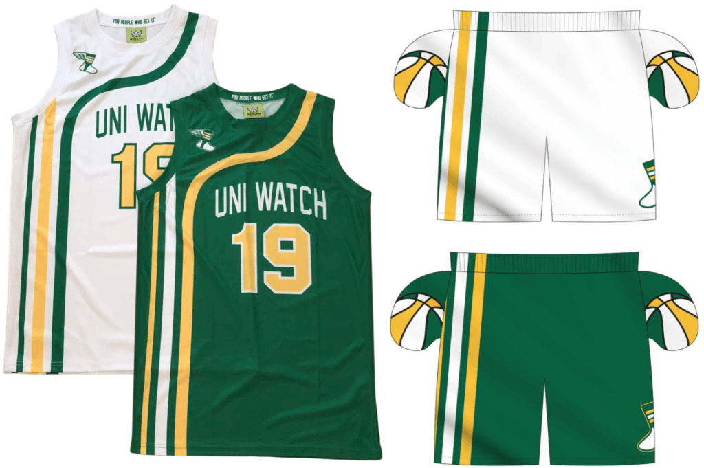
Going, going…: Time’s running out for you to get your order in for Uni Watch basketball jerseys and shorts. As always, you can customize the number and NOB on the jerseys. We’re taking orders today and tomorrow for Christmas delivery. Full details here.

While we’re at it: In case you missed it last week, Uni Watch cufflinks are now available. I had these made mainly because I like cufflinks myself, but I’ve been pleasantly surprised by how popular they seem to be, with two dozen pairs already sold in the first few days — nice.
Speaking of which: A few people have said, “What about a matching tie tack?” Our basic enamel pin should function quite nicely in that capacity. Enjoy!

Sometimes the system actually works: When I posted my Ireland travelogue two months ago, I mentioned how our return to NYC was pushed back a day due to a British Airways computer meltdown that resulted in lots of flights — including ours — being cancelled. They put us up in a hotel, but the overall experience was a total shit show.
Reader Aaron Roggensack posted a comment urging me to file a claim for compensation, as provided for in EU law. That was news to me, so I followed up with Aaron, got a bit more info from him, spent the better part of an hour filing the claim, and then forgot about it — until yesterday, when I received this email (click to enlarge):
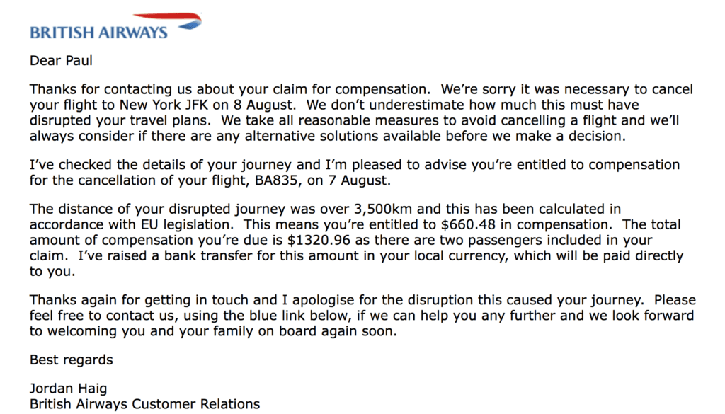
Holy moly!
Pretty amazing. Big thanks to Aaron for making this possible!
The Ticker
By Alex Hider

Baseball News: Red Sox great Pedro Martinez was signed by Boston 22 years ago yesterday. Apparently he was introduced wearing a road uniform — definitely seems out of the ordinary (from @twittaJak). … The Single-A Kannapolis Cannon Ballers are holding a contest to name their new mascot. … Auburn baseball and softball will have a few uniform tweaks when they hit the field in a few months (from Clint Richardson). … New Pirates GM Ben Cherington was introduced wearing a black and gold tie (from Jerry Wolper).

CFL News: Good catch by David Hein, who notes that the Saskatchewan Roughriders included a registered trademark next to its bleed-through midfield logo during the CFL Divisional Finals on Sunday. David notes that the Roughriders did not include a registered trademark on their end zone logos, and did not include the mark the last time they painted over the midfield logo in 2018. … More CFL news: The Winnipeg Blue Bombers are the designated home team for the Grey Cup but will wear white jerseys. The Hamilton Tiger-Cats will wear mono-black (from Moe Khan).

NFL News: The Vikings are considering frosting the glass panels on their stadium roof to prevent birds from trying to fly into the stadium. More than 100 birds die every year flying into the roof (from Kary Klismet). … The Panthers uniform tracker has been updated to reflect Sunday’s game. … Speaking of of the Panthers, yesterday’s MMUW roundup didn’t mention that they wore helmet decals on Sunday with the initials of Purple Heart recipients.
College Football News: North Dakota State wore throwback helmets over the weekend to celebrate the program’s 125th anniversary (from Darick Richard). … Georgia Southern is bowl-eligible, and its athletic department made a social media graphic with all the team’s potential bowl destinations. The only problem is that they used an old logo for the Mobile Alabama Bowl (from Josh Hinton). … The ACC Tracker has been updated to reflect the weekend’s games. … Scott M. Trembly spotted a truck with magnets previewing this weekend’s projected uni matchup between Pitt and Virginia Tech. … Here’s a really good Twitter thread about Clemson’s 1967 “Orange Shoes Game” (from @theauthentiEli). … Here’s some great football of an old USC/UCLA color vs. color game. “The YouTube title says the film is from 1953, but the credits say 1945,” says Richard Craig. “The same film has some brief PCL baseball footage at 4:57.”

Hockey News: The Sharks wore these wild warmup jerseys Sunday night, which were designed by skatewear designer Jimbo Phillips (from @GameplanChicago). … Speaking of the Sharks, G Martin Jones has a new mask design. … Last night, all NHL refs wore memorial patches honoring Senior Vice President of Hockey Operations Jim Gregory. They’ll wear the patches for the rest of the year (from @markinvictoria). … Following last week’s discussion about cap/lowercase NOBs, Ryan Friedman notes that Northeastern wore that style about 20 years ago. … New third uniforms for Illinois (from Claudine Barnhart). … The Coyotes trolled the Kings during last night’s game in Phoenix by putting a fake Taylor Swift banner over the Kings tunnel. The Kings had covered up a real Swift banner in their own arena because it was seen as a jinx. After the Coyotes’ stunt, the Kings had a pithy response on their Twitter page (from Jerry Wolper).

Basketball News: Illinois broke out their new orange jerseys for the first time yesterday. … Carmichael Arena, home to North Carolina women’s basketball, is still using the old center court logo that the Dean Smith Center used before 2015 (from James Gilbert). … Back in the 1984 WAC Tournament, New Mexico brought the wrong colored jerseys and had to wear UTEP’s uniforms in the semifinals. UTEP beat New Mexico the next day (from Sam Wasson).

Soccer News: New jerseys for Japanese second division club Omiya Ardija, which will be worn beginning in 2020 (from Ed Żelaski). … It appears Nashville SC has unveiled its inaugural season logo (from @NashSCTracker). … Albania and Hungary debuted new stadiums for their national teams over the weekend (from Kary Klismet).

Grab Bag: Remember when Serena Williams broke her racket during the 2018 U.S. Open final, which eventually led to a game penalty in a loss to Naomi Osaka? That racket is being sold at auction (NYT link), and is expected to reach a five-figure price. … Here’s a great breakdown of the aesthetics of the Nigel Benn/Chris Eubank boxing rivalry. … The IAAF, the governing body for track and field and other running sports, is now known as World Athletics and has new logos to go with its new name (from James Gilbert). … Lots of uni nuggets in this Philly sports caricature by artist Park Tyson (from @PhillyPartTwo). … In case you somehow haven’t heard, everyone’s flipping out over South Dakota’s new “Meth. We’re On It.” campaign, although state officials say that’s the whole point. … The Pennsylvania Dept. of Transportation is having a “paint the plow” contest where groups of high school students create custom-painted snow plows and the public will vote on a winning design (from Joe Werner).
Yeah, count me among those who hate it.
I think Ross Yoshida nailed why this new logo is such a downgrade:
link
It’s damn dispiriting. I hated the old look, and really wanted to like the new one. And there are things I love like the colors and the number font. But the new logo is a deal-breaker for me, and with the classic logo and colors now officially retired (again) I can’t be anything but sad about the whole thing.
I’m not a Brewers fan like you are, Chance, so I realize the emotional stakes aren’t the same for me as they are for you.
But … while I totally agree about the seams, I disagree about the centering. It makes the “b” look much more like, well, a “b,” which is something that’s bothered me literally for decades.
I’m baffled as to why there is this tone of “the centering of the ball in the glove is obviously terrible design.” I’m a professional designer myself and to me the new version looks more coherent, elegant and pleasing. Would it have been a disaster if it had stayed how it was, no. But the logic behind the shift is completely understandable and positive from a design perspective as far as I’m concerned
The bricks in the Wisconsin on the road sleeve patch. My first thought on seeing that was, “is that a tribute to Harvey’s Wallbangers?” Which, if so, would be an example of being too cute for its own good and trying a little too hard.
My first thought was a wheels of cheese stacked up.
A lot of Milwaukee buildings are known for their cream city brick. So, I think that is the reference.
I don’t agree with Paul’s criticism of the new Brewers typeface, especially as regards the back-of-uniform appearance, but I suspect that we can agree it’s an improvement over the faux-Times New Roman lettering and numbers on the current uniform.
The new BiG is a useful acid test of the quality of the old version. The four changes are so minor that any judgment rendered of the new version stands as a judgment of the old. To say that the new version is terrible is to admit that one would have called the old version terrible had one’s judgment not been warped by sentiment and nostalgia. If the original BiG didn’t exist and the new one came out today, I’d hope that we’d all recognize its greatness as a design. (And I would still personally think of it as a great design but a weak mark for the Brewers.)
The color-on-color treatment of the BiG on the regular cap still bugs me; the logo just disappears from view. The effect is worse in navy than royal. This is the one place where I regret the move away from royal blue. I’d much rather see the logo’s colors inverted on the navy cap.
I liked the immediate prior Brewers uniforms, but these are a huge improvement and are strong enough uniforms that they stand up well in the otherwise excellently uniformed NL Central. Everything I’ve seen and heard from the Brewers front office about the redesign had led me to fear that the new unis would be a mess, so I’m surprised and delighted that it’s turned out so well.
And for what it’s worth, my wife watched the unveiling with me, and the road patch with the Wisconsin and the bricks was her favorite new element.
But does your wife realize that Cream City brick is fast becoming a sports design cliché? I mean, maybe she does. But I’m just askin’.
Moreover (and I should have included this in the text), the patch design makes no sense. Cream City brick is a Milwaukee thing, not a Wisconsin thing. Doesn’t make sense to have the whole state bricked up like that.
My biggest issue is that a majority of Wisconsin counties are layer out grid-ish style, especially in the southern part of the stare, including the are surrounding Milwaukee. At first glance, the state outline/brick logo seems like it wants to emulate this, but it doesn’t. And the baseball seems to center around Burlington rather than Milwaukee. The whole thing seems both clunky and rushed which gives off an unnecessary vibe.
“fast becoming a sports cliche” – honest question here: What are the prior examples of Cream City brick in Milwaukee pro sports design? I can only think of one prior, but I also don’t follow any other Milwaukee teams closely. I’m curious to see how other teams have executed on the concept on the road to making it cliche.
Milwaukee’s two primary sports teams have both embraced Cream City brick in their most recent redesigns. This is the standard “uniform design as travel bureau” approach to sports branding. Yes, a cliché.
Ah, so just the one prior example. We’ll just have to agree to disagree about whether to trust the dictionary on the word “cliche.”
On a less teasing note, what makes two instances of teams in the same city playing with the city’s nickname cliche but four teams in a city all adopting the same color scheme not cliche? I’m of mixed mind on Pittsburgh’s black-and-yellow thing: On the one hand, the literalist and symmetry-obsessive in me loves it. On the other hand, it does sometimes feel a bit constraining for the teams involved. Like, for me the one thing the Washington NFL franchise has going for it is that it’s not yet another red-white-blue team in DC.
what makes two instances of teams in the same city playing with the city’s nickname cliche but four teams in a city all adopting the same color scheme not cliche?
Straw man argument. I never said the latter wasn’t a cliché.
Straw man argument. I never said the latter wasn’t a cliché.
Apologies! I didn’t mean that as an argument on the question of whether the Brewers’ Cream City references are cliche. No straw man intended. Just sort of meditating on the concept a bit. I don’t personally see the Pittsburgh thing as cliched, but I think that if I thought about it from first principles I might. Given that, I should probably be more open to considering what’s happening with Cream City to be more tired than I do.
I think there’s an element of uni-watching perspective at play here. Like, when every MiLB team seems to adopt the same trendy practice, it seems like a tired cliche to those of us who pay attention to the whole world of MiLB. But most fans don’t experience it that way; it’s not some tired cliche that every team is doing. They don’t know what any other team is doing; for them it’s just a cool thing their local team is doing. In this instance, I don’t follow the Bucks, but I am interested in Milwaukee’s civic history and culture, so the Brewers nodding to Cream City probably feels fresher to me than it would if the Bucks were top-of-mind to me.
Anyway, my bottom line is that I wish the Brewers home alt had cream, not white, beneath the pinstripes. I want more cream, even if it is a hackneyed cliche, which I’m starting to see that it might be!
Since you brought it up: I wouldn’t call all four Pittsburgh teams wearing the same colors a “cliché,” but I do think it’s sort of slavishly doctrinaire, and I’m glad teams in other cities haven’t tried to do the same thing.
I would love to see, for example, every Cleveland team wearing orange and brown, or every Minnesota team wearing purple.
Anyway, I only have two quibbles over the new Brewers unis: 1) I can’t stand the swoosh on the front, and 2a) and 2b) I would have preferred royal blue as the primary color and a powder blue alternate. Other than that, I’m in love. I like the font, the lettering Respects The Placket and the Ball In Glove is back, baby. Behind my Pirates, the Brewers are now my second favorite NL Central team. They probably were anyway, but now they are for sure!
I gotta say I like the new font. It different and interesting.
As a Brewers fan I love them. I like the nod to the 70’s home unis in with the cream set, I think the logo changes are much ado about nothing and I’m very happy they brought back the barrelman and WI state logos. I do agree that the blue alternates and font leave a bit to be desired but overall it’s a HUGE upgrade.
Isn’t the logical explanation of why Pedro was introduced in a road jersey is so it could have MARTINEZ on the back? As a Red Sox fan I confess that I should know more about whether this is a regular thing (or was at one time) but it at least helps make sense of Pedro’s introduction.
That seems likely. That’s the same reason I ordered the road uniform on my membership card.
I don’t remember for sure, but I would guess the tradition of donning and hat and jersey over a business suit started around that time. So there may have been no established single “right way” to do it.
I was told years ago that the same color scheme is frowned upon within the same division. Cubs I suppose are the royal blue royalty so navy suits the crew well. I love the new set but agree with you Paul about the softball top alternate. But I Love , Love , Love the alternate cap. Feels like 1982 all over again!
I don’t know about “frowned upon” in any official sense, but I can vouch for the fact that royal Brewers merch can be and is mistaken for Cubs merch here in Wisconsin. For the Brewers, trying to compete for public brain-space with the Cubs over royal blue would always have been a losing battle. Much better for the Crew to be the navy team in the division, and the only navy and yellow team in baseball. And the uniforms use yellow well, so the navy is not at all dreary or monotonous as it could be. The yellow accents really pop and for me recreate a lot of the charming qualities of the 1970s-80s Brewers uniforms.
If you could show me where the RED was in the Brewers uniforms I might be able to understand any confusion with the Cubs – ????
Confusion between Cubs/Dodgers makes more sense. Are people that dense or not paying attention?
Quick: You’re within 150 miles of both Milwaukee and Chicago, and you see a stranger from behind wearing a royal blue cap and a royal blue t-shirt. No red or yellow is visible. What team does she root for?
Good question, but here’s a better one: Why do you need to know which team she roots for?
Because it would seem to me that the biggest reason to wear team colors is to express to others who you root for. Personally, I don’t wear team related clothes because I consider it my own business who I root for.
Milwaukee Admirals hockey from the 1970’s
Don’t see any red in “Royal blue Royalty “
I was referring to the the 2 shades of blue.
Navy Brewers
Royal Cubs
I didn’t say anything about red. So does that still make me “dense”?
There is actually a big difference in blue between Cubs & Dodgers if you look closely. Cubs are royal blue but the Dodgers are a darker shade of blue. Step into any Lids store & you’ll see what I mean.
I love everything about all of these new Brewers uniforms, to kind of an absurd length. The grain-seamed baseball logo in particular is fantastic, to the point that a friend and I both immediately agreed on getting hats with that logo.
With all respect to Paul and his unparalleled credibility in the uni-sphere, I personally wish that we could permanently ban “it looks like a corporate softball/adult baseball/beer league/amateur/etc. jersey” as a critique. At least for when it doesn’t come with any other substantive explanation of the critique. To me it feels so lazy (not to mention tired and cliche at this point) to just slap that well-worn insult on something and move on. Feels to me like a copout to say you don’t like something while not offering any rationale.
Actually, I provided a *very specific* rationale: It reminds me, quite literally, of the uniforms I saw in the park across the street from where I lived in college. I did not use “softball” as a catchall term or shorthand or code; I used it to refer to something very specific that this uniform reminds me of. Your mileage may vary, of course, but that’s how this jersey/cap combo strikes me.
But surely you can see how that a. doesn’t actually explain at all why you think it isn’t good design (for all we know, those uniforms in the park across the street were masterpieces), and b. is very much within the genre of the “this is bad because it looks like my conception of amateur” catchall criticism that crops up constantly, even if you didn’t literally use the term “softball” or “beer league” etc. Just look at how many people regularly use the term “softball top” to refer derisively simply to any baseball jersey that isn’t white or gray.
I actually like the blue alts, but I think the most “amateur” thing about it is that it looks like one of those “fake” cursive fonts that you’d find in a word processor or something. A script mark should give the impression of being designed with care, where this one just looks a bit half-assed.
The sport of softball really gets disparaged here for some reason.
So Paul was reminded of something he saw across the street while in college. But I wasn’t there so his comparison isn’t useful to me without further description. I agree with Martina. Criticism that calls out specific details and comparisons that are likely accessible to a wider audience are better, imho.
Zephyr, the idea is that *most* people — not just me — have seen recreational teams playing at night in municipal parks. So spelling out my recollection probably spurred a similar recollection in many other people’s minds (but perhaps not yours). And maybe some of those people said, “Oh, right — I see what he’s getting at. These look amateurish.”
That seems pretty “accessible to a wider audience” to me. I’m sorry if it didn’t work for you.
(Also, while I can’t claim to have come up with it myself, the Cub Scout comparison pretty well speaks for itself, does it not?)
I’m with you, Martina.
(To me, the swoosh is what makes these look amateur.)
Thanks DAF, can’t believe no one else said that. The Brewers set is an upgrade and everything is great, good or OK except the Nike swoosh. It just downgrades the dignity of the uniforms to have that there.
I won’t get into what I think of Nike as a company or organization. But it would have been diminished with any of the uni suppliers logos right there on the shoulder.
Forget the corporate/beer league/etc. comparison. The navy-topped road alts look like Cub Scout uniforms. How does one not un-see that?
link
Better link:
link
I swear to god I just posted that myself. Cub Scout uniforms.
I can’t speak to the addition of the brick, but the baseball piece to the state-outline logo is reminiscent of an alt logo they used in the 70s
link
link
Also lol to New Era for coming out with their new “Elements” fashion line of MLB caps last week and basically using the now-outdated part of the BiG logo as the focal point of the Crew’s offering:
link
I am a fan of the new Brewers unis. I especially like the blue road alts. My only “gripe” about them is the “w” to “a” transition. Just looks odd to me. But other than that, I love them.
OK, so woke up this morning and really pissed about the Winnipeg Blue Bombers’ decision to wear the white jerseys in the Grey Cup this upcoming Sunday. Just because they have won two road games on their way to the Grey Cup.
The uniforms with the blue jersey are so excellent. The one problem with the Bombers uniform is the blue shoulders on the white road jerseys. The Tiger-Cats have been advised they will need to wear the black jerseys and have decided to go mono-black instead of the much better black over yellow.
Grey Cup could have and should look much better. Thanks Bombers :(.
Very excited to see my new membership card in the gallery! The Red Sox are my favorite team, but the Mariners have long been my favorite uniforms–including their bat-shit insane Turn Ahead the Clock unis. I’ve been looking for one of those hats for a long time, to no avail.
I like the new typeface. It’s not perfect but it feels appropriate, and in a similar (but still unique) family as the Bucks.
The navy and royal colors could’ve found a happy medium. The uniform sets are a major improvement.
The new BiG logo is at best fine. The heavy stroke is a bit much. The wicket / pocket change was noticeable and not an improvement. I’m ambivalent about the ball and centering. I guess it’s logical.
That pocket is bothersome, though. Weak sauce on eliminating the potential “ink trap’ and thickness of the connector there. It’s supposed to replicate laces!
I dislike the road alt the most. The whole thing just needs a block M and now Michigan’s baseball team is all set because the uni looks like something a college team would wear.
That typeface is painful, especially that “A”. I like everything except the type, too, which makes it specifically painful. I recommend reading the thoughts over on Brand New (link) when they inevitably cover it.
What are the various levels of Uni Watch membership, and how are they attained? I see the person in the picture is “Vertically Arched”.
We originally had multiple levels with different prices. I scrapped that soon after the program started and changed the “Membership Level” field to “Member Since.”
As far as I recall, membership card levels were an annual feature at first (higher levels got you different perks, with one high level involving Paul flying to your city to your city for a Uni Watch gathering, or him taking you out to dinner in NYC). These lasted less than one year and were abandoned because Paul got a good enough ESPN contract that he didn’t need to stratify members anymore.
This is kind of dumb, but the 7 in the Brewers’ font — and nothing else — is almost identical to the one link. Like, the height of the hook, the angle made where the horizontal and vertical strokes meet, etc. I get there are only so many different ways to design a number, but the only difference is that the Brewers’ vertical stroke is a little straighter.
-Overall it has been a good year for unveiling of MLB uniforms. Quite happy. Have liked what we have seen so far from teams like the Diamondbacks, Padres and now liking this Brewers set.
-Not a fan of all these NBA uniforms popping up. Many with abbreviated names on the jersey front, colours that don’t match the club identity. Seeing a uniform change in the NBA used to mean something to me. Does not anymore. Quite frankly, it feels minor league.
H-town? Just another example. I guarantee if we still had the Grizzlies here in Vancouver, they would have had a jersey that said Van City at some point. Oh wait….
link
Agreed on the MLB uni upgrades Wade. The D-backs got a necessary clean up and the Padres and Brewers have embraced their history while coming up with a fresh look that improves upon what they had. As a Cleveland fan I’m quite jealous because my team may now have the worst uniform set in MLB with no plans to change them for 2020. After years of denial I’m at the point where I’m willing to rebrand the team and start over with a fresh name, logo and color scheme.
Do you know anything about the other blue uniform the mascot was wearing? It said brewers on it, not sure what it’s for
This has definitely been a banner offseason for MLB with the uniform changes. You have San Diego bringing back the brown, Arizona normalizing their set, the Champs bringing that nice white jersey with script to the regular season from Spring Training, and now Milwaukee doing a beautiful marriage of the past with the future with this set. (and that is hard for me to be nice about anything Brewers-related being a Pirates fan.)
I also have to admit I submitted a name for the Kannapolis mascot contest: Evel Kannaevel. I thought that was the most clever play on words with what they were going with on the design
I was surprised/relieved that the Brewers didn’t trot out a powder blue alt.
I was hoping the Padres would have went with a yellow front panel cap, but it’s nice to see that the Brewers have done so.
I too submitted (TFPIC) a name for the Kannapolis Cannonballer…Aaron Hart…,and suggested to the team that since female mascots are trending now, he should receive a female counterpart named Erin.
Nuggs alts should read Denver.. Just for a little more authenticity to the orginal.. The 5280 is a nice touch tho..
The Brewers’ new look is good but it would be even better if it weren’t so “busy.” I say lose the gold headspoon on the blue alternate, lose the brick motif in Wisconsin shape logo, and lose the gold and royal rings on the roundel logo. Matter of fact, just make the BiG alone the primary logo. Too many roundels in pro sports.
Correction: In the CFB section, you wrote “Georgia State is bowl-eligible” but it is actually Georgia Southern.
Fixed.
Thanks for your attention to detail!
I was under the impression that all the retail jerseys came sans advertiser patches. But apparently not.
From Altitude Authentics…
“Western Union is the official sponsor of the Denver Nuggets and all jerseys sold in the team store and online will come with a sponsor patch. This process could delay your order in order for our staff to hand stitch patches to jerseys.”
My understanding is different from yours, and my read of the announcement is not inconsistent with my understanding. Jerseys sold at the team store get the ads, but jerseys sold at other retailers like Dick’s Sporting Goods and equivalents do not.
…so the ad makes it more “authentic”?
Different question, but I’ll answer with my opinion: The ads makes it more obnoxious, but no more authentic than otherwise for me. If I had to guess why they’re restricted, it probably has to do with the team-specific deals, and also a bit of inventory control. Instead of a jersey inventory going on sale at Dick’s because of a new ad, Dick’s gets the (better, IMO) ad-free jerseys, while the team slaps the ads on the ones on their own racks.
If the jerseys worn on the court or rink or field or whatever by players have swooshes or a pyramid or double U’s and a league or conference patch and an ad patch and you can buy that exact same jersey at retail, and it’s isn’t some Chinese counterfeit, THAT is authentic.
The jerseys actually worn by the athletes during games are authentic and only jerseys that match those down to the last detail that are sold to the public are authentic.
This really isn’t that hard to understand.
Ben, I see what you’re saying, but for me that implies that the jersey isn’t complete without the ad patch or the maker’s mark.
And while correct, that leaves a bad taste.
At this point the NBA needs a site like Historical Kits does for English soccer.
Probably not a novel observation but the entire project really does seem like it was directly cribbed from European soccer, with constantly changing uniforms and away/clash uniforms not in the team colors (this actually makes some amount of sense given that the NBA is loving color-on-color more and more these days, so a “color clash” uniform is a logical step)
Re the trademark on the Riders logo, it was probably league-mandated. In the CFL, the league operates playoff games, which is why the on-field sponsor logos usually change. In this case, the Mosaic logo at centre-field was most likely changed to the Riders logo because Mosaic is not a league sponsor, and whoever the CFL contracted to do the field put the trademark down, not the team – whereas the permanent end zone logos are done by the team.
Am I the only one who looks at the facial changes on the Barrel Man and immediately thinks of the Stay Puft Marshmallow Man in Ghostbusters?
Maybe I am.
Now that you mention it, that seems like it should be obvious.
I don’t like the changes to the facial expression, but they’re all such fine detail within an otherwise excellent mascot cartoon that I’m OK with it. Especially given what serious upgrades the rest of the changes to Barrelman are. I hope we’ll be seeing more of the Barrelman on Brewers uniforms in seasons to come, even with the Stay Puft face.
Can anyone explain how the old center court logo at UNC’s Carmichael is different from the current one at the Dean Smith Center?
The new Brewers road alt reminds me of my Cub Scout uniform for some reason.
Bingo.
Add a yellow neckerchief to the blue jersey and there you go.
I feel like once Brewers execs hear it referred to as the “Cub Scout Uniform” it will be short-lived. Which is too bad because it’s a nice and different look. Wouldn’t be shocked to see it replaced with a powder blue in a couple of years.
I feel like the type face, with the angled tops and bottoms, kind of look like a beer barrel… If you look at the zeros you really get the effect. Not sure if it’s on purpose, or they probably would have mentioned it in some corporate speak, but it’s a happy accident if not, and if you see it that way, you’ll probably never un-see it :)
Oh shoot, you said that… I should learn to read instead of just observe… Ugh
RE: Serena’s broken racket – the (what I assume) in-game photo shows a white grip. The auction photo shows a black grip? No explanation given why they tediously photo-matched every detail but overlooked the most glaring one – unless I missed something?
Reminds me of a comic juggler who claimed to be juggling the actual hatchet that George Washington used to chop down the cherry tree – all he did was “replace the handle…and the head — but it occupies the same space!”
Serena uses Wilson Pro white overgrip on her rackets — similar to wrapping it in gauze, but it’s a tacky, highly absorbent , ultra-thin synthetic textile. Not unusual that it would have been peeled off and tossed out.
Did someone say “cliché”?
link
Tweet taken down. Very curious what the comment is referring to.
“Sorry, that page doesn’t exist!”
I think the impact of this change would have been much bigger if the Brewers has not used the ball in glove logo with navy periodically over the past few years. I’m glad it is back full time. It just feels like they have already been using this now for a while. It could have been more momentous had they not added the BiG to the navy set alternates of the past few years.
Love the uniform upgrade though.
The NBA is turning into soccer, where the uniforms can be any color as long as the logo, or crest patch, is there. Even teams that are referred to as the “reds” are frequently in pink, black, or other color schemes. I think it’s a given the NBA will eventually have a larger ad on the front, like a soccer jersey.
Speaking of Ben Cherington’s Tie, how about the print tie being worn in the picture of Pedro being signed by Boston? Fortunately we’ve gotten past that era…
AAAAA+++++ on the new Brewers uniforms. I was SO tired of that played out plain “We look like a really dully corporate uniform for Miller Beer” look. AAAAA+++++ on each and everyone one of these bad boys! Please redo the Braves, Marlins and Angels next!
ACC Tracker link in the ticker goes to Week 11. This past weekend was Week 12.
link
Fixed. thanks!
Just listened to your interview on Milwaukee radio, since the timing worked with my lunch hour. Very well done!
Thanks!
The more I see of the Brewers logos with the thin royal blue line, the less I like the royal blue accent. But it works better on the 50th anniversary, Wisconsin, and barley-ball logos, where the royal sits outside the yellow. There, it’s a bit more visible and almost has a neon-sign quality. Whereas on the primary, sitting inside the yellow dulls it and makes seem more like a color clash or a printing mistake.
Kind of surprised there’s not more debate about the year of that USC/UCLA footage. Bruins didn’t go to powder blue until 1949 and those jerseys don’t look navy to me (even faded navy) so it can’t be from 1945. No hoops (1954), so it seems to be between 1949 and 1953.
Paul, I’m sure this question has come up before but have you considered doing a Uni-Watch podcast? I’m sure you could gain some advertiser support and you could feature not only uniform discussion but your culinary corner, travel pieces, and your many diverse interests. Uni-Watch for the ears.
Yes. Hope to do it in 2020 (although only for uni content, not the other stuff).
I listen to way too many podcasts, and subscribe to more, and would definitely make room in my audio day for a Uni Watch podcast. I hope it comes to fruition!
Paul, I would definitely be a loyal listener to a Uni Watch podcast (“Uni Listen”?). Your substantive style would work great for a podcast, and you have a fantastic voice for audio formats (radio, podcasts, etc.). Imminently listenable!
Thanks, Kary — I appreciate the kind words! (Insert joke about also having “a good face for radio” here.)
The yellow vertical lines forming the m in the new logo are straight, while they’re tapered in the old BiG.
I’ve got to say, the tapering adds just a little extra flair that feels lost in the new.
Overall the new set is a wonderful improvement, but do feel that some opportunity was missed to pay tribute to the old.
Those straight m lines are a tribute to the original submission of the BiG logo?
link
Wow… $454.99 for the road and road alternate Yelich jerseys. I’m out.
I’m loving these new prices. If they keep it up, people will stop buying jerseys, and I’m all for that!
It’s madness. Especially if you consider Nike is employing the exact same factory Majestic used with the same materials. It’s a $100 upcharge for the almighty swoosh.
I am still waiting in terrified anticipation for how dreadful the maker’s mark with look on Yankee, Cub, and my beloved downtrodden Tigers’ jerseys.
Think of all the baseball uniforms that will be lost if MLB does follow through with its MiLB contraction.
That will be a very sad day for small-town baseball and much history will be lost.
Here’s the info about the proposed contraction:
link
Love the move to the MiB logo (tweaks and all). What bugs me is the lack of coherency between the different sets. I’d rather see the wider stripes used on the cream alt on the standard away jersey as well…no one uses that currently so it’s a look they could own, while the thinner pattern on the away jersey is pretty commonplace across MLB these days.
Same for the blue alternate…use wider striping and get rid of the piping and generic (and dare I say lazy) script and use the same font as the other sets.
And Barrel Man should be the standard sleeve patch. Period.
Still a significant upgrade.
All I can say is the different striping must be a nod to different eras of uni for them. 72-77 is the cream; 2000-2019 is the Grey Away; 94-99 is the Navy Away….
That Flames jersey ain’t right. The striping is the original 1972-1973 version (when the yellow-white-yellow striping didn’t have orange stripes in between), but the crest is the wrong crest – its from the white home jersey.
Man, the NIU/Eastern Michigan game tonight must be hell for the spotters.
Not a fan of yet another custom number font that is subtly different from established ones but doesn’t try to do anything special or stand out.
Also, I wish that at least one of the variations did not have NOBs, as the pinstripe jerseys did not back when they were the regular home uniform.
The tweaks to the BiG logo don’t bother me. The increase in yellow is good because so few baseball teams employ yellow. The yellow-front hat in particular looks really nice and the BiG logo just jumps out at you.
The detail that spurred my OCD is the sleeve stripes coming at the ends of the home jersey sleeves, but leaving a sliver of grey at the ends of the road jersey sleeves. Why not be consistent, one way or the other?
Thank for the information.
link
link