For all photos, click to enlarge
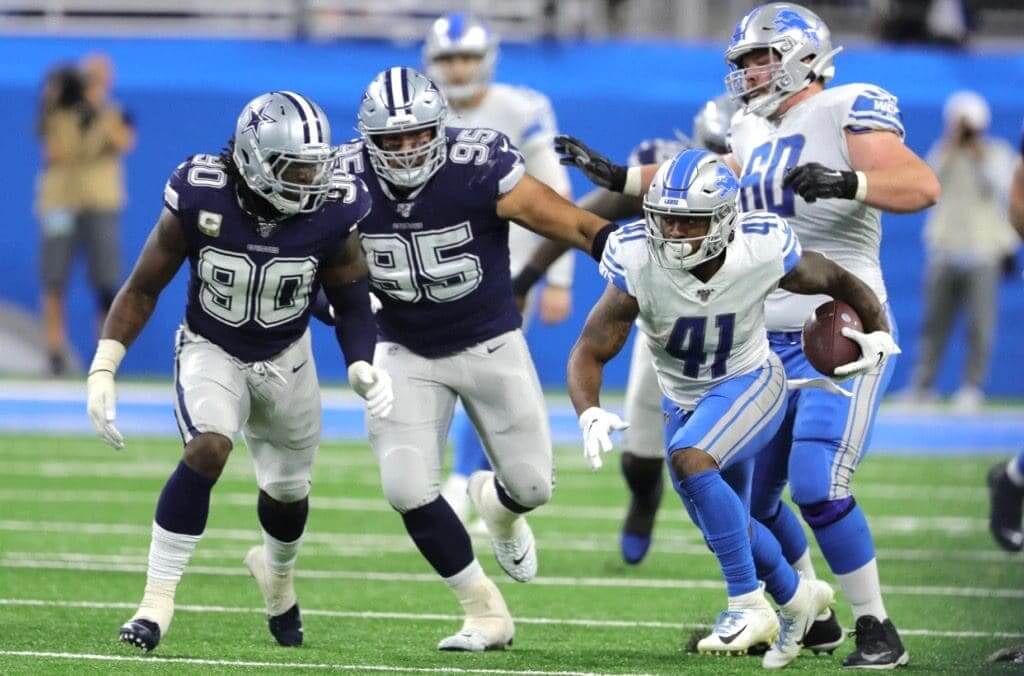
Uni-historic game yesterday in Detroit, as the Lions wore white at home for the first time since — get this — Thanksgiving Day, 1970, when they hosted the Raiders, and only the third time ever (that info courtesy of the mighty Gridiron Uniform Database’s excellent “White at Home in the NFL” page).
Wondering about other teams that have gone a long time without wearing white at home? According to the GUD, the longest holdouts are the Vikings (last wore white at home in 1964), Steelers (1969, although they did wear white as the designated home team in Super Bowl XL in 2005), and Seahawks (never!).
Getting back to the Lions, 25 of their players wore a fallen service member’s initials on their helmets yesterday (additional info here):
This is similar to what the Lions did three weeks ago, when players wore the initials of cancer victims. In both cases, the team has extended its cause-based messaging beyond the level used by most other NFL teams.
In other news from around the league:
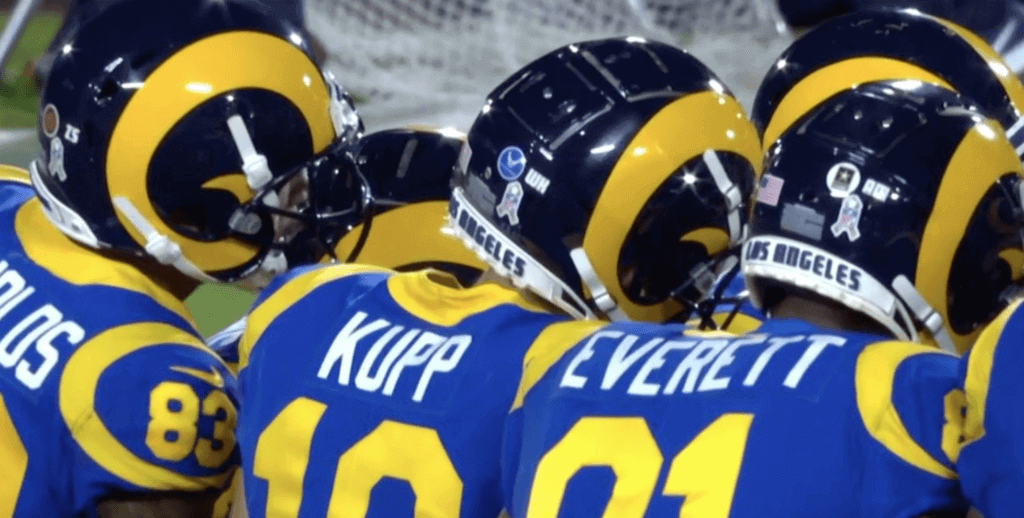
• The Rams also wore fallen military members’ initials, although theirs were much harder to read:
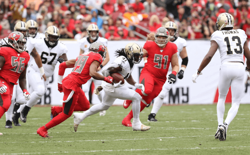
• It was the Bodysuit Bowl down in Tampa, as the Bucs and Saints went mono-red vs. mono-white:
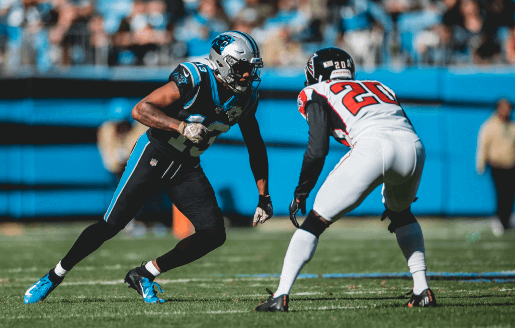
• The Panthers went mono-black:
• Who needs fanny packs? At least 18 Ravens — and probably more, I’d be willing to bet — had pockets sewn into their jerseys:
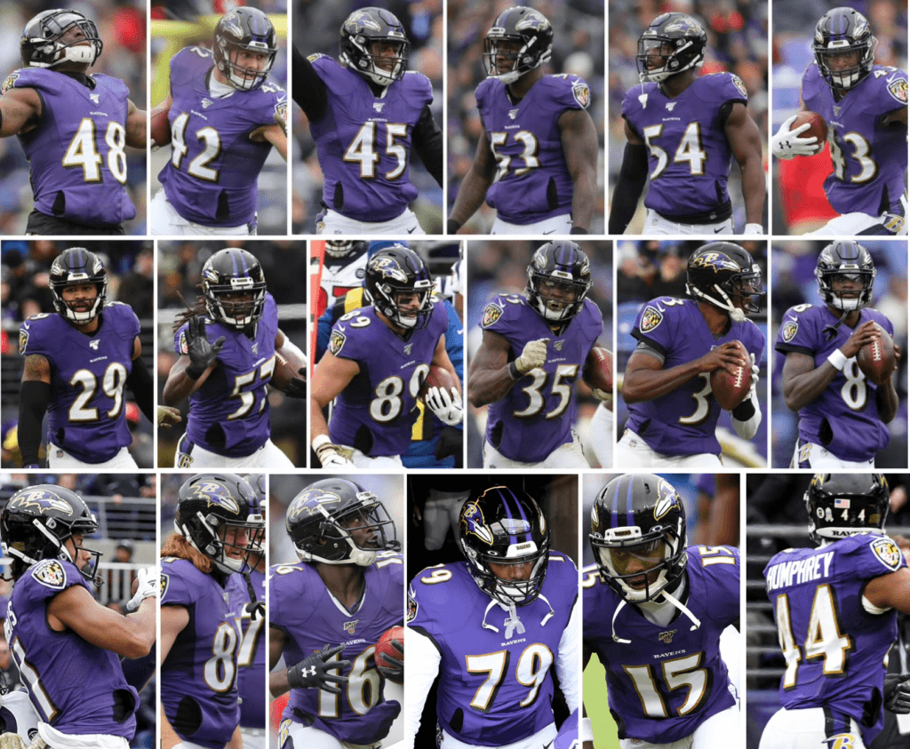
Adding pockets to a jersey isn’t unheard of, of course, but it’s fairly uncommon in the strap-on pouch era, and I don’t think I’ve ever seen so many players doing it on one team. I’ve asked the Ravens for more info — stay tuned.
• It’s not uncommon for kickers and punters to wear mismatched shoe colors. But Raiders kicker Daniel Carlson has mismatched shoe brands:
Oakland kicker uses two different brands of shoes. I’ve seen two different shoes before but not two different brands @UniWatch pic.twitter.com/itHrjnzcn1
— Michael Kinney (@mpkinney) November 18, 2019
Some quick photo research reveals that he’s been doing this all season long. Last season, however, his footwear was consistent on both feet.
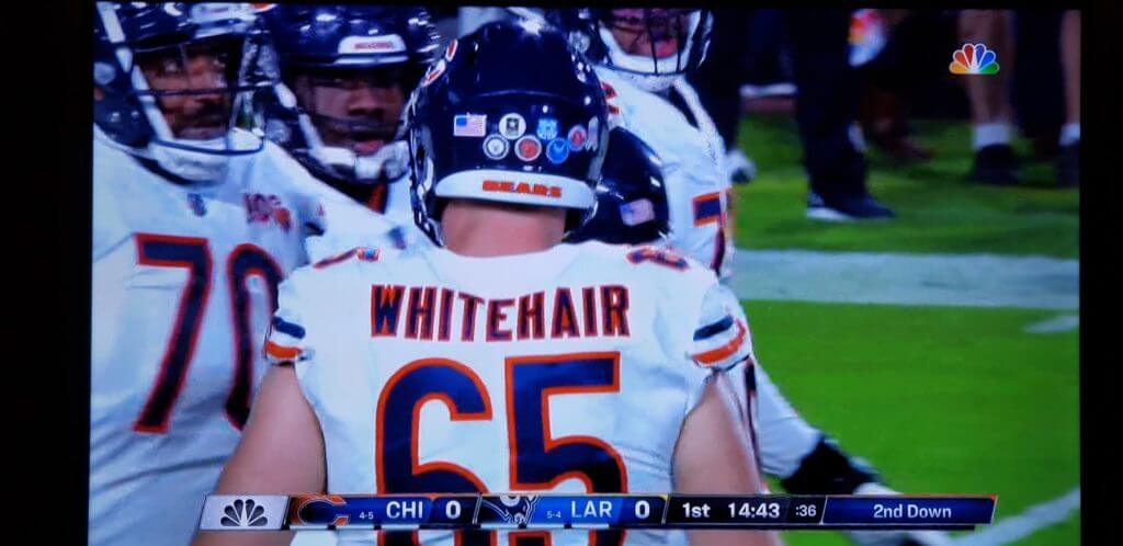
• Instead of wearing a helmet decal for one division of the armed forces, Bears offensive lineman Cody Whitehair engaged in a bit of overkill by wearing decals for all of them:
• Only one team wore white at home: the aforementioned Lions.
(My thanks to Jakob Fox and Tim Donahue for their contributions to this section.)
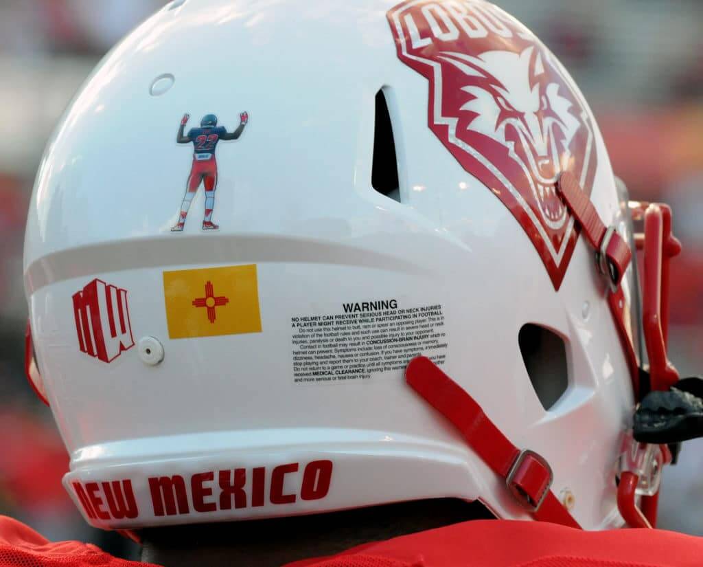
Click to enlarge
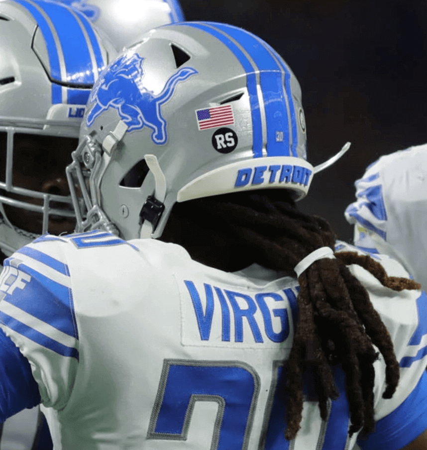
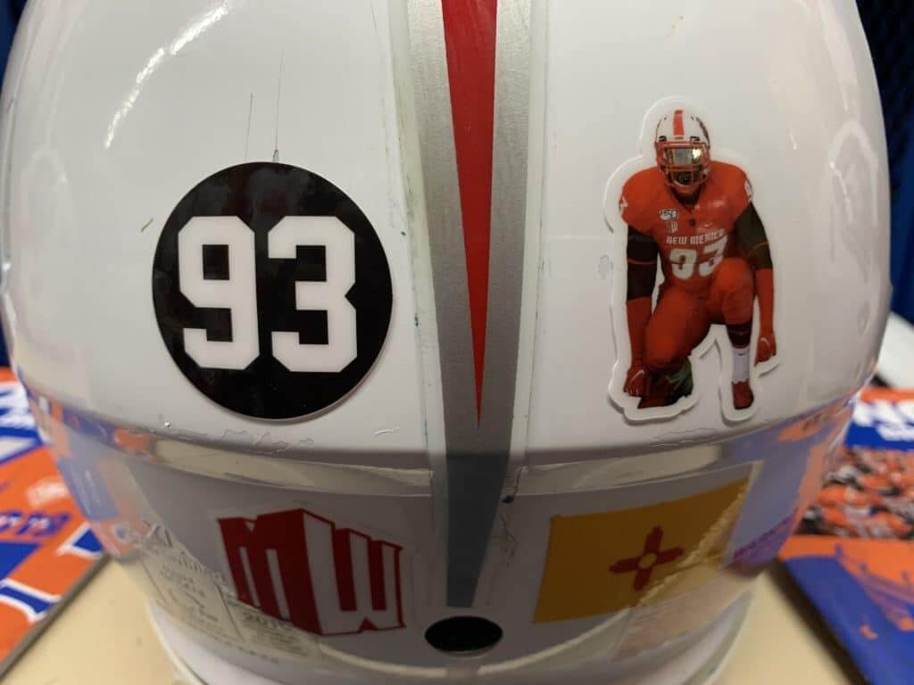
A different kind of memorial: New Mexico nose tackle Nahje Flowers died by suicide on Nov. 5, and the team is now honoring him with the two helmet decals shown above. UNM communications czar and longtime Uni Watch reader Frank Mercogliano says they’ll wear these decals at least through the end of this season and possibly next season as well.
This is at least the second time that UNM has worn a memorial decal featuring a photo of the deceased. They previously did it for defensive back Markel Byrd, who died in a car crash in 2016. But unlike the Flowers decal, which shows him from the front, the Byrd decal showed him from the back:
I’m not aware of any other school or pro team that has used a straightforward depiction of the deceased as a uniform memorial. Does anyone know of other examples?
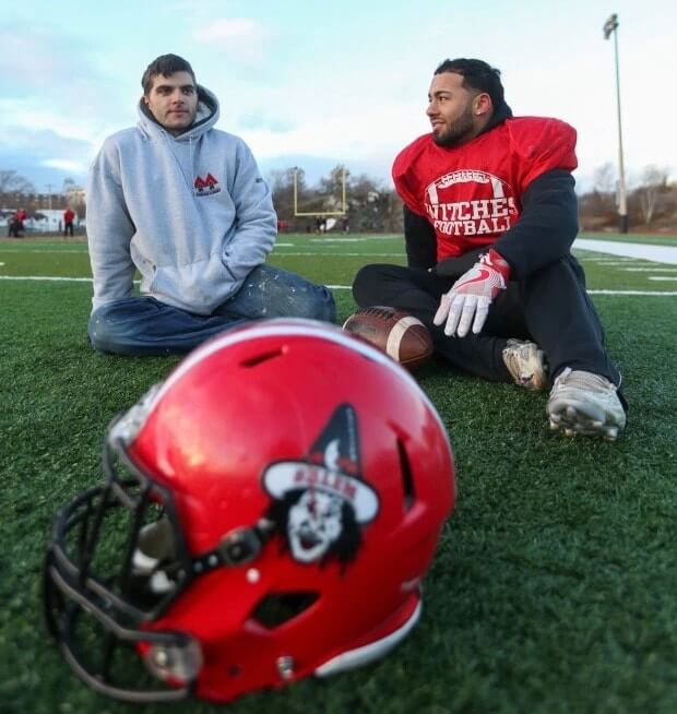
“Well, she turned me into a newt”: Our recent discussion of female team names prompted a really interesting note from reader Tim Medeiros, as follows:
I recently moved to Salem, Mass., and of course the high school sports teams are called the Witches. In the past, even during the witch trials, both men and women were considered witches, so the school could have kept the mascot neutral, but I’m happy to report that the school actually went with female representation for all sports! I think it’s neat to have sports like football and hockey to have a female mascot and showcase it.
Interesting! I did a bit of digging and found some logos that the school has used:
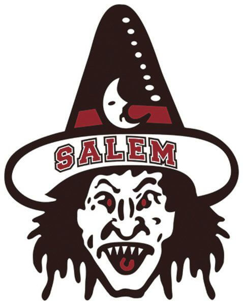
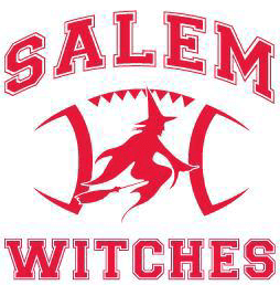
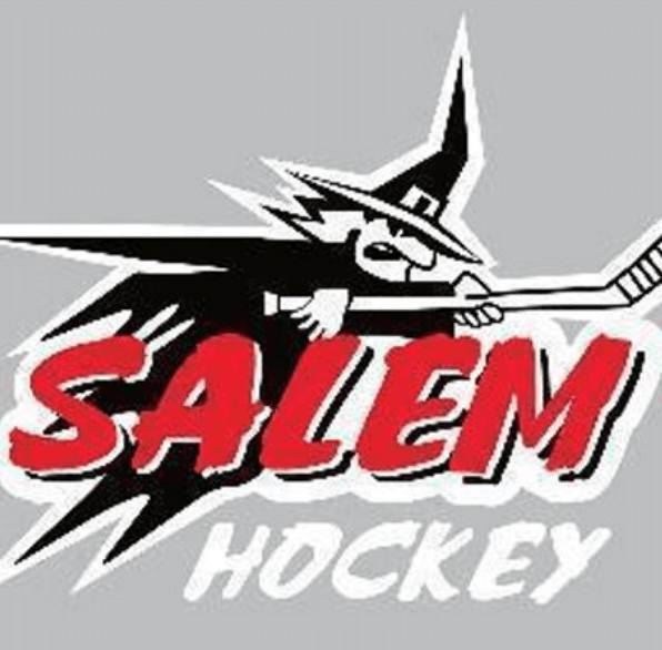
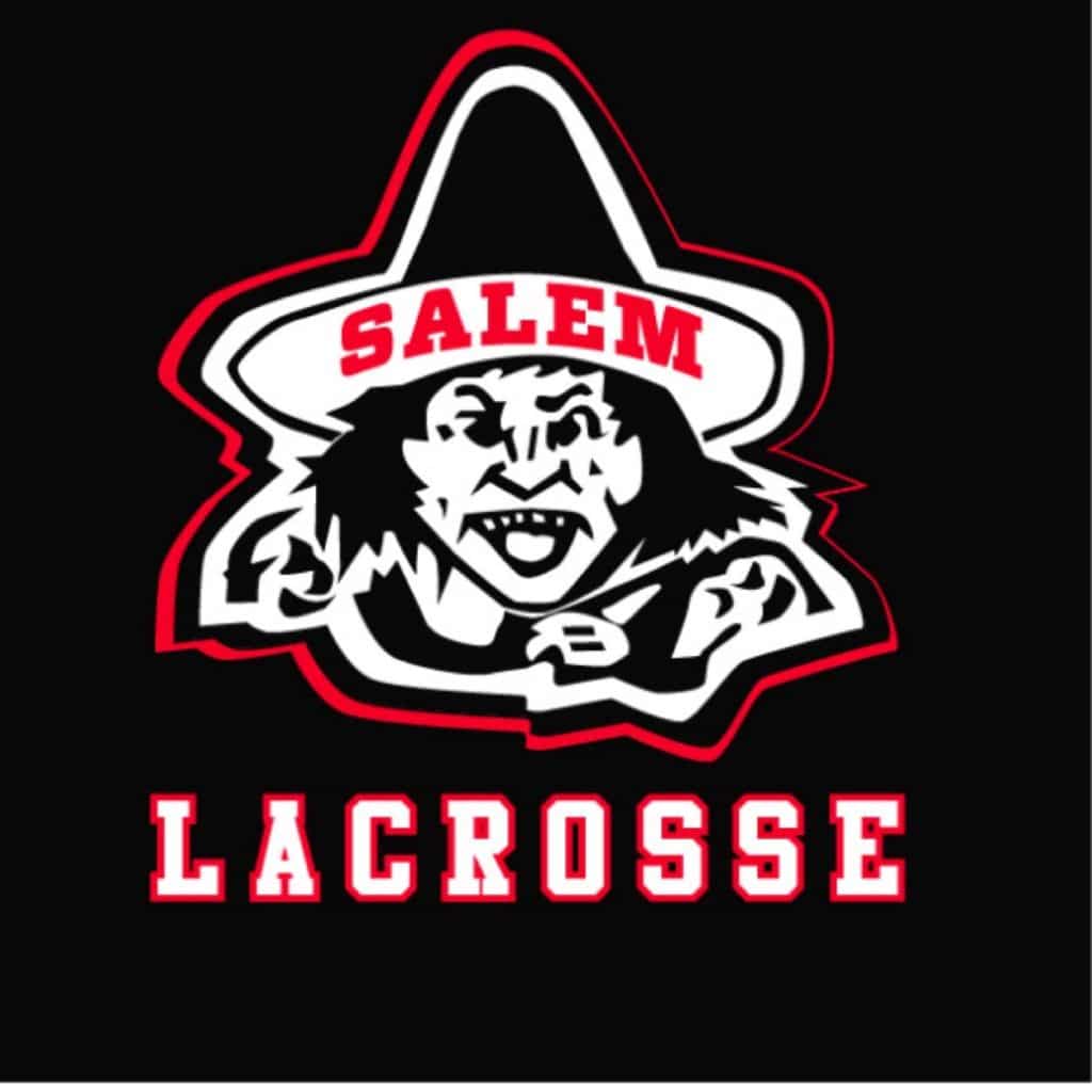
Faaaascinating. I especially like the hockey logo. Big thanks to Tim for bringing this one to my attention.
In addition, the Single-A MiLB team the Fredericksburg Nationals, who already had a secondary logo of George Washington swinging an axe, have now added a logo of his mother, Mary Washington, tossing a ball:
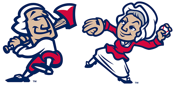
It’ll be interesting to see if the players actually wear this female logo on the field as a patch and/or as an alternate cap logo, or if it’s just a move to get women (and maybe southpaws) to purchase merch.
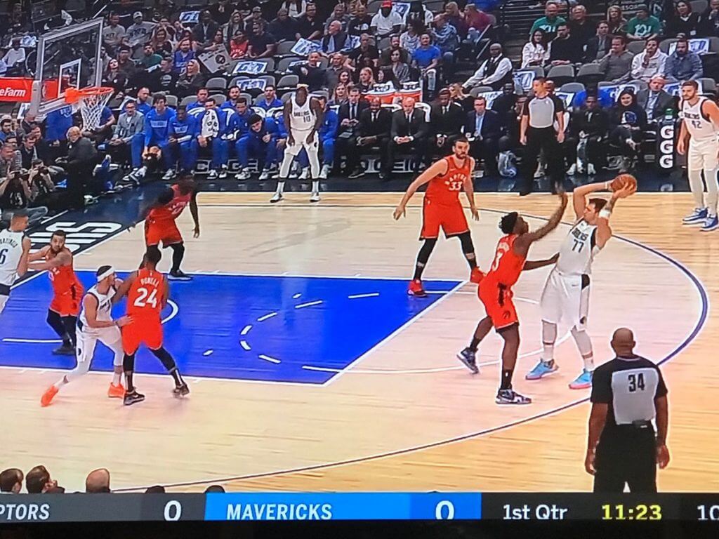
NBA free throw circles, continued: When we began discussing the number of dashes in NBA free throw circles a few weeks ago, the team that got the whole ball rolling was the Mavericks, because their circles had 10 dashes — an unusually high number. But Twitter-er @nomuskies — the guy who started us down this rabbit hole — reports that the Mavs’ circles had only six dashes for yesterday’s game against the Raptors (shown above). Crazy!
The change was apparently made sometime between the Mavs’ previous home game on Nov. 8, when they still had 10 dashes, and yesterday.
When we first began discussing this, I contacted a Mavs media rep and asked him why they were going with 10 dashes. He never responded, so I followed up with him yesterday and asked if my previous inquiry had led to the design change. Got this response: “It had nothing to do with your email. It was something we were working on with the league and I didn’t have an answer for you at the time of your email. It was rectified while I was on the road with the team. My apologies for not getting back to you.”
So then I asked for more details about why they started the season with 10 dashes and why they changed it to six. He said he’d talk to their VP of operations and get back to me. Stay tuned.
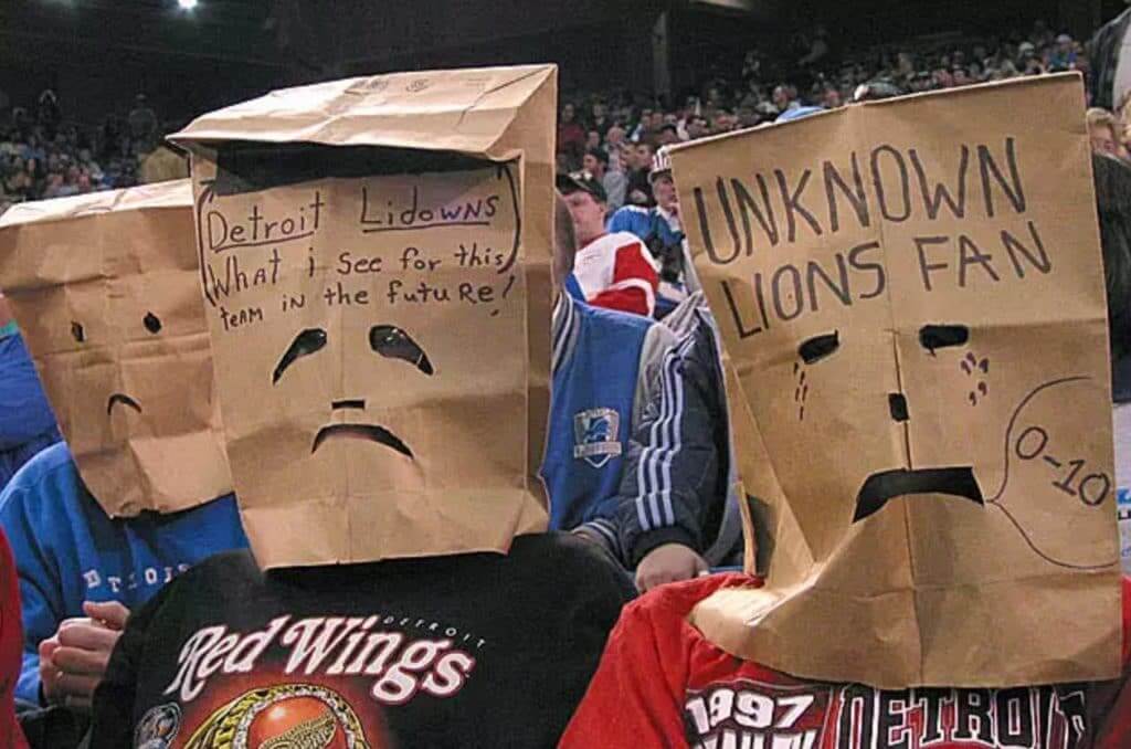
ITEM! New idea in the works: We all know how fans of really bad teams will show up with bags over their heads — a symbol of embarrassment and protest. But what if your team is fine in terms of on-field performance but has really bad uniforms?
Here’s a potential answer that I’ve been considering: a Uni Watch paper bag — a way for the discerning sports aesthete to express embarrassment and protest over a team’s on-field look. Now, I’d have no need for such an item myself, because all of my favorite teams currently look pretty good (thanks, Mets, Niners, Giants, Rangers, and Habs!). But if you’re a fan of, say, the Hawks, Marlins, Bengals, or any number of other teams, the Uni Watch Paper Bag could be just the thing.
I’m envisioning a head-sized paper bag with the winged stirrup logo and a phrase. The phrase could be insider code, so only other members of the comm-uni-ty would understand it (“My Team Doesn’t Get It™,” for example), or it could be more uni-versal (“My Team’s Uniforms Suck”). I’m also envisioning that the eyeholes would be crying tears — then we could call it the Uni Watch Sad Sack.
What do you think? Would you be interested in such an item? What phrase would be best? Should the paper bag include the words “Uni Watch” anywhere (maybe on the back side), or would that just muddy up the larger message? Should the eyeholes and tears be precut/preprinted, or would it be best to let the user do that because everyone’s head shape and eyeball positioning is different? Feel free to offer feedback in today’s comments.
Also: I know nothing about sourcing paper bags. There are lots of places on the web, but it’s hard to know who’s reputable, who’s not, etc. If anyone out there works in the bag biz, feel free to be in touch. Thanks.

For all photos, click to enlarge
A perfect fit: Longtime reader/contributor Jim Wooley recently purchased one of our chain-stitched logo patches. A few weeks later, I received a package from him in the mail. It contained the jersey I’m wearing in the photo above, along with a letter:
Dear Paul:
I’m enclosing a vintage hockey jersey. I believe this was worn in the ’70s in my hometown of Snow Lake, Manitoba, by the Snow Lake North Stars. I have no idea how I ended up with it. Perhaps one (or more) of my brothers wore it. I also have no idea where the original crest went. It’s obviously seen better days — some holes and tears, etc. — but it’s still a pretty good jersey and still has the original tag.
I had a local seamstress stitch the Uni Watch logo patch to the jersey, and I think it looks great! You can do with it what you wish. If you want to keep it, great. But if you’d like to pass it on to someone else, that’s fine too. I just thought you at least might be interested to see it!
Hope all is well with you. Thanks for keeping us all up to date in the uniform world!
Yours truly,
Jim Wooley
How great is that?! As you can see, it fits me quite well, and I love the backstory, so I’ll definitely be keeping it. Thanks so much, Jim!
Jim’s note mentioned the original tag — here’s a look at that:

As you can see, there’s a split in the rear collar. That’s one of several rips and tears — some very small, others more significant. I haven’t decided yet if I’ll get them mended or leave them as they are.
There’s a number on the back, but everything about it — its size, its color, and its positioning — seems a bit off, so I’m assuming it’s not original:

When we started offering the chain-stitched patches (each of which is made by hand by the great Amy Bengtson), I figured they’d look good on a varsity jacket or a cardigan sweater. It never occurred to me that they could work on a hockey jersey, but Jim has shown otherwise! I guess you could say it’s maybe a smidge too small, but it still fits the space quite nicely.
As it happens, I have a blank Minnesota North Stars jersey. Would our patch also work with that? I grabbed a patch, grabbed the jersey, and set the former down on the latter:

Not bad, but the patch looks too small this time. That’s because the space between the collar and the belly striping is greater on this jersey than on the one Jim sent me, so the patch can’t quite fill the space. Maybe I’ll ask Amy to make me a larger one for this jersey!
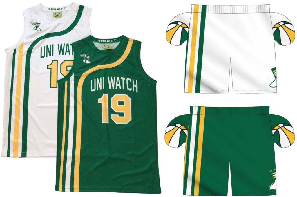
Next-to-next-to-last day: Time’s running out for you to get your order in for Uni Watch basketball jerseys and shorts. As always, you can customize the number and NOB on the jerseys. We’re taking orders today, tomorrow, and Wednesday for Christmas delivery. Full details here.

While we’re at it: In case you missed it last week, Uni Watch cufflinks are now available. I had these made mainly because I like cufflinks myself, but I’ve been pleasantly surprised by how popular they seem to be, with two dozen pairs already sold in the first few days — nice.
Speaking of which: A few people have said, “What about a matching tie tack?” Our basic enamel pin should function quite nicely in that capacity. Enjoy!
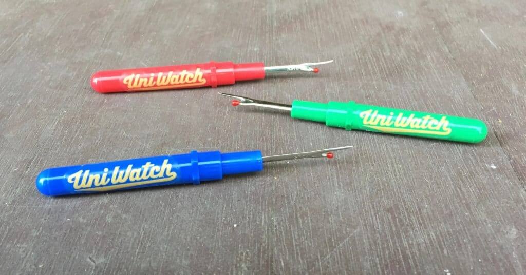
IMPORTANT seam ripper update: While a few seam ripper customers say they’ve received their rippers with no problem, a larger number of people say their rippers have either arrived damaged or not arrived at all. Clearly, my local postal clerk who advised me that I could mail the rippers in a regular envelope, marked “Non-Machinable,” gave me bad advice.
So here’s what we’re going to do:
1. Anyone whose ripper arrived damaged or didn’t arrive at all will get a new one, free of charge. I’ll mail the new ones out in small bubble mailers, so there shouldn’t be any shipping issues this time. (If you fall into this category and haven’t yet told me, please let me know now.)
2. I’m currently sold out. The new inventory is coming from Asia (green and blue rippers are surprisingly difficult to find in America) and is still a few weeks away. As soon as it arrives, I’ll send out the replacement rippers.
3. Going forward, I’ll use bubble mailers for all new orders — which, unfortunately, means post office will classify the mailing as a package. When you throw in the cost of the bubble mailers, this means to the total charge for one seam ripper plus shipping will be in the $11.50 range (instead of the $7 I had been charging). I had really been hoping to avoid that — I realize it probably seems like a lot for one small item with a decal on it — but the higher shipping cost seems unavoidable.
Sorry for the hassle, and thanks for your patience.

Click to enlarge
Hmmmm: I was walking on West 14th St. in Manhattan on Saturday when I passed this storefront. Note the sign in the window on the left. Can’t decide if they were being clever/ironic or oblivious.
Uni Watch girl mascot Caitlin has a favorite blanket. No matter where we put it, she'll curl up on it. pic.twitter.com/ielV84XoHa
— Paul Lukas (@UniWatch) November 18, 2019
Li’l cutie: She’s very territorial.
The Ticker
By Jamie Rathjen

Baseball News: We mentioned that the OHL’s Erie Otters wore uniforms in support of the minor league baseball Erie Seawolves, but we did not know that the socks looked like stirrups. … Ferdinand Cesarano has been reading two books about John McGraw and the New York Giants: Stealing Games by Maury Klein, and Manager of the Giants by Lou Hernandez. The Klein book includes this passage about the 1911 World Series: “McGraw sprang a surprise on the crowd: the team wore new black uniforms with white belts, a white ‘NY’ logo intertwined on the left sleeve, white stockings, and black caps with white visors, a throwback to those worn by the 1905 and also the 1899 champions.” Both books also refer to the Giants’ 1905 World Series uniforms (ellipses in original): “McGraw outfitted his team in stunning new black flannel uniforms with white trim and a large ‘NY’ across the chest in white. ‘I will never forget the impression created in Philadelphia,’ he recalled, ‘and the thrill that I got personally when the Giants suddenly trotted out of their dugout … I have heard army men say that the snappiest-looking outfit is usually made up of the best fighters. I can well understand that. The psychological effect … was immediately noticeable upon the players. The Athletics in their regular-season uniforms appeared dull alongside our champions.” … Craig Clavin tells us that he attended a John Fogerty concert where Fogerty played his song “Centerfield” with a bat-shaped guitar. [I saw him do this way back in 1987! — PL]

Football News: During his workout on Saturday, Colin Kaepernick wore a shirt bearing the name Kunta Kinte, the main character from the 1970s book and TV miniseries Roots. … The school of the day from Blaise D’Sylva’s helmet collections was Miami (Ohio). … The CFL’s Saskatchewan Roughriders painted their own logo at midfield yesterday. The logo for the stadium’s advertiser is usually there, and it could still be seen bleeding through (from @SteveBCreations). … The Roughriders also wore throwback alternates on the occasion of hosting the CFL’s Western final for only the second time since 1976 (from Wade Heidt). … The Bears use compressed lettering for DL Roy Robertson-Harris’s lengthy NOB (from Omar Jalife).
You can also see uni tracking from the Canadian college national semifinals, the Mitchell Bowl and the Uteck Bowl, as well as the Canadian Junior Football League championship from Wade in yesterday’s comments.

Hockey News: Former NHL winger Wendel Clark, who briefly played for the fisherman-logoed Islanders, described in a radio show (starting at 26:34) how the fisherman crest was so big and stiff that players would have to break it in (from Andreas Papadopoulos). … The WHL’s Saskatoon Blades’ logo is often called the “Pac-Man logo,” says Wade Heidt, so for a promotion they wore jerseys that looked like a Pac-Man maze with a pixelized verison of the logo. … Also in the WHL from Wade: the Regina Pats wore “Experience Regina” jerseys. The jerseys both support a local entrepreneurial board and reference an 11-year-old satirical promotional video for the city. Wade also tells us that the bottom stripes didn’t wrap around, but it looks like they did on at least one jersey. … The next two are from Wade: the Canucks wore their 50th-anniversary throwbacks for the first time. … Cross-listed from the baseball section: We mentioned that the OHL’s Erie Otters wore uniforms in support of the minor league baseball Erie Seawolves, but we did not know that the socks looked like stirrups. … Back in 1932, the Red Wings and Canadiens both showed up for a game, in red jerseys, forcing the Wings to wear plain white pullovers (from Jerry Wolper).

Basketball News: New throwbacks for the Colorado State women’s squad (from Robert Sudar).
.

Soccer News: Interesting observation by weekend colorizer George Chilvers in Saturday’s comments: the English Football League earlier this year said it would no longer use a yellow winter ball except when it’s actually snowing. That means there are at least three different winter-ball schedules in the UK: the Premier League switches to yellow between the European time changes in October and March; the EFL only uses yellow for snow; and Scotland always uses yellow. … A number of teams qualified for Euro 2020 this weekend, but Austria seemed the most excited, giving the players a somewhat unnecessary celebratory T-shirt — which you can buy, of course. They also wore a new black/cyan second kit at home. … After England wore cap numbers against Montenegro last week, they moved the numbers to the inside of the collar starting yesterday, which was promised but is disappointing.

Grab Bag: With the European competitions in rugby union starting this weekend, here is an overview of many teams’ European shirts. … A reader who prefers to remain anonymous works for Gardaworld, which provides armed guards and messengers who transfer cash between banks and businesses. “When I started there, we wore light blue tops,” he says. “They looked nice, but most of us felt a little like postmen or some other ‘friendlier’ entity. That changed when we switched to what is almost an industry-standard black top. Many coworkers feel that we now look sharper and more professional. On a personal level, I feel safer in a black uniform that seems to say, ‘We are here for serious business and not to randomly talk to strangers.’ It really shows how uniforms can make a difference in real world situations.”
Scotland always uses a yellow ball. LOL – not sure what that says about our weather…
The northern Irish League seems to have determined a heavily day-glo accented ball to be a good compromise and is still being used well into November: link
Presumably if it snowed they’d go full yellow. Interestingly, two years ago they followed the Premier League model with a yellow ball through the winter months and white for the rest, but have switched to white throughout since.
Add one more to the order if we’re talking about a jersey size patch.
Hmmmm. OK, I’ll check in with Amy and see if she’s willing to do it (and how much she’ll charge).
Can’t believe I’m the first one to suggest this but in regards to the Uni Watch logo on a hockey jersey, how about a version of the logo that is modified to be a winged skate? Not sure how the stirrup would be handled but worth a thought. I also have a nice blank Doreen North Stars jersey it would look great on.
I think the bag should be a phrase universally known so that it can inspire change. If we are making a statement, we want our statement to be known and taken seriously.
While this idea is good, I think it could be even more applicable to another problem: uniform advertising. I think you should consider an advertising patch-related bag. Right now we are limited to having to deal with this in the NBA. But if it comes to baseball and other sports, a powerful protest statement will be very necessary. In that case, hopefully the bags will be flying off of Uni Watch’s proverbial shelves as aesthetics enthusiasts stand together in protest.
And if it goes that far, why stop there? Anti-advertising (yet tastefully done) shirts could be added to the collection, too. This will be the biggest uni issue of our times.
“Here’s a potential answer that I’ve been considering: a Uni Watch paper back”
I read that sentence a few times…was like “is Paul writing a book about bad uniforms?”
Now fixed to “paper bag.”
Re: Regina Pats Ticker item. That last photo where it is indicated the waist stripes did wrap all the way around on at least one jersey. Indicating it was the 2nd intermission. That is a stock photo that the team used from a previous game against Prince Albert, not the one that was happening live. That photo is in their regular jersey.
Sorry, Wade. I would like to register a protracted eye roll at teams that do that (a lot do).
No worries. They were tricky about it – using a photo just showing the back.
Totally forgot about the Experience Regina song. I was lucky enough to experience Regina as a resident for 23 years of my life.
I lived in Brewer, Maine for a while, and the sports teams there are also The Witches. This extends beyond the high school and to all the youth community teams as well. According to the Brewer website, they’re not able to determine how this affiliation came to be. Here are some links:
link
link
And another connection between these two Witches is a shared football coach. Coach Ken Perrone left the Brewer Witches after a very successful run and took over the Salem Witches for another successful run. I spent a couple years coaching football in Brewer, and no one batted an eye that the mascot/team symbol was female.
RE: the “Walk-Ins Welcome” sign….
As a frequent visitor to Walt Disney World (I live in Orlando) I saw a rented electric scooter at Epcot this weekend and noticed the company name.
link
From the article Paul linked about Nahje Flowers, this quote from another New Mexico player:
“If you want to send guys to class or put them in front of a counselor — we’re football players, like we don’t talk to counselors, you know what I mean? They tried bringing them in early on and it was just almost, like, a negative.”
What a ridiculous, and unfortunate, sentiment. I didn’t know football players were emotionless automatons…
I posted this yesterday but might gain more traction today. Mother’s Day the St Louis Cardinals should use female Cardinals on their uniforms. Much better than the pink. Thoughts? And how can we make that happen?
Even better, how about one male and one female cardinal *every* day?
I don’t know about “even better” then every day, but since female cardinals are gray/brown, how about making the cardinals on the bat on the road uniform female?
That could be an homage, of sorts, to the franchise’s original nickname (1882-1898), as well as the city’s long-gone AL team (1902-1953).
Hi Paul,
I grew up in a small town in upstate New York called Greenwich. The town name is not pronounced like the village in NYC or the city in Connecticut. The town name is pronounced as it is spelled (green witch). Anyways our school colors are green and white and our mascot is a female witch. If you google Greenwich NY mascot, you can see our mascot which is a silhouette of a witch on a broom. If you google Greenwich NY sports you can see some images of our gym with the mascot painted on the wall. Interestingly the girls teams where known as the lady witches. One last interesting thing. The mascot was also painted on the town police cars.
Growing up there I never thought our mascot was strange. It was not until I got to college and others pointed out to me how strange a mascot it is. However, if you live in Greenwich, I think it would be strange to have any other mascot other than a Green Witch.
Thanks for sharing, Nick — awesome story!
I am originally from Fort Ann.
I should have known it.
I was still stuck on the Warrensburg team called the Burgers
Hey Paul–
Just bringing this to your attention, regarding the New Mexico memorial decal:
link
Ah, good point — thank you. Will adjust text now.
Re: CFL Saskatchewan logo.
The Painting over of the Mosiac stadium sponsor logo with the team logo is because the League and not the team owns the rights to all 5 playoff games. The League sells the onfield advertising and the team must pay $100,000 plus expenses to host the game. All in stadium advertising that is normally there during the regular season is covered up.
From: link
How much does it cost to purchase the rights for a CFL playoff or Grey Cup game? Who holds the rights to CFL playoff games? Who pays for the CFL playoff share and travel expenses?
Starting in 2018, the league is phasing in a new collaborative Grey Cup hosting arrangement. Hosts will no longer receive all profits after costs, including a fee to the league, are covered. Instead, after costs are paid, hosts will receive a larger portion of the profits with the remaining profit split equally amongst the remaining clubs. The 2018 Grey Cup result from Edmonton is the first example of what this new arrangement provides to the host and other teams. The league is also developing an evaluation methodology to score Grey Cup bids and plans to assist in selecting Grey Cup hosts. The awarding of the 2020 and 2021 Grey Cups were the first to use the new selection process
Starting in 2011, teams are required to purchase the rights to playoff games from the league for an apparent $100,000 (thanks Jacquie). (Last available figure, likely increased since 2011). Prior to 2011, teams had the option of purchasing the rights to playoff games from the league for a specific dollar amount and keep all profit (or incur any loss), or let the expenses/revenue be shared at the league level. It is unknown whether this practice has change since these reports.
Purchasing the game from the league has a cost of $100,000 plus assuming all expenses for the game, specifically both team’s playoff shares and the visiting team’s travel expenses (flights and hotel) as well as marketing costs. The host team’s profit/loss is determined after all their expenses are paid against their ticket, concession and other ancillary revenue received from the game.
History
Prior to 2011, if a team chose not to purchase a playoff game, the gate was split equally among all teams in the league and expenses were paid by the league. Without a stake in the game, franchises were more tempted to spend less promoting the game, even when a smaller crowd affected their home field advantage. We assume the CFL closed this embarrasing loophole for this reason.
Based on Tiger-Cat President Scott Mitchell’s comments on Prime Time Sports Nov. 4, 2010 (about 3:12 in, 11:41 5.4MB) it appeared the cost at that time to hold a semi-final game was in the $900,000 range (north of $750,000, close to seven figures). Assuming this includes the playoff shares for two teams (50 x 2 x $3,300 = $330,000) and travel expenses ($150,000) this would indicate additional expenses of $300,000 – $450,000 for the game, including a $100,000 guarantee to the league.
This is similar to the cost of $100,000 reported just a few years earlier. Teams had tight timelines and complicated decisions to make regarding purchasing a playoff game from the league. Based on Mitchell’s comments, it appeared in the last few years the option existed that teams needed to provide notice to the league of their intentions before it was even clear whether they would host a game or who their opponent may be.
After requiring $3 million from Grey Cup host committees for many years (dating back to mid or early 1990s), the guaranteed revenue or fee for the Grey Cup game increased over the years 2005-2017 until the present revenue sharing formula was adopted. Winnipeg paid a $4.3 million license fee for the right to be the 2015 Grey Cup host. For the 2013 101st Grey Cup, the host Saskatchewan Roughriders paid $3.78 million to the league for the game and recorded $3.36 million in game operation expenses (of which approx. $1.25 million would have been for player bonuses). It has been long believed teams paid a $3 million fee to the league for the right to host the Grey Cup game (2009 – $3 million, 2008 – $3.5 million, 2007 – $3-$4 million, 2006 – $3 million, 2004 – $3 million). Mitchell’s comments indicate it was north of $3 million in 2010. Terry Jones indicates the Eskimos paid $3.6 million for the 2010 Grey Cup and the 100th Grey Cup in 2012 may have cost $4-5 million.
Here’s another witch logo: Italian soccer club Benevento Calcio.
link
I’ve been an inconsistent Uni Watcher of late. I remember that there were once rumblings that the Indians would have a pretty significant update to their wardrobe this off season. I also speculated on a personal level that the script Indians might be going away based on their refusal to repair and/or replace bulbs in the giant script Indians sign on the scoreboard at the ballpark. Have I missed any news?
I think the only rumblings were that they’d have a new sleeve patch logo for 2020. It turns out that they’re going with a blank sleeve instead.
Thank you, Paul. I must’ve been mistaken.
I can attest to the awkward stiffness of the Islanders’ fisherman logo on my replica jersey. The Capitals’ old black jersey’s crest had a similar “uni-boob” effect.
While I’m in favor of female mascots in every instance, I’m not a huge fan of the “evil witch” approach in Salem. It’s not far off depicting lynching victims as hulking red-eyed monsters.
Yeah, I live near Salem and was surprised by the depiction, especially since so many locals who are descendants of the accused probably don’t approve. But the town is kind of a dichotomy of stuff that memorializes the accused (I believe there’s a newly built memorial on land they just discovered where public punishments were held) and the kitschy stuff that draws tourists every October.
I think the “she turned me into a newt” is the first Monty Python reference I can remember seeing on Uni Watch?
Possibly. But I’m a nearly lifelong fan!
Fortunately he got better.
NASCAR teams payed tribute to drivers Jason Leffler(2013):
link
…and Buddy Baker(2015):
link
with “straightforward depiction(s) of the deceased”.
Brewer Witches (high school here in Maine) has used a female logo for as long as I can remember: link
The Milwaukee Brewers are now promoting a “special announcement” tonight at 6:30 Central on social media:
link
Previously, the Brewers had scheduled a minor shindig for renovations at their primary stadium team store for tonight. So I assume we’ll see a typically Brewers-esque slapdash 2020 uniform unveiling of some sort.
They sure fucked up their logo alright!
La Liga also decided this season to only use their winter ball when needed, after the first matchday when they used it a few weeks ago.
La Liga also decided this season to only use their winter ball when needed, after the first matchday when they used it a few weeks ago.
Great content as always. I am a daily reader, but not a daily commenter. However, when I see your cat in the post, I have to leave a comment. Thanks for posting the cat photos.
Mary Washington’s a southpaw? Nice!
-a fellow lefty
Who the hell is “Mary” Washington?
You might want to go back and re-read today’s entry.
My wife walks with a cane, so I am primed to sarcastically notice things like that “walk-ins welcome” podiatrist not (apprarently) having a ramp from the street level.
Welcome to New York City where the Americans With Disabilities Act has yet to extend to the subway system.
Almost all the stations have multiple sets of stairs which are the only means of ingress/egress to and from the stations.
NO escalators and if you are in a wheelchair you are REALLY fucked. There are only a handful of stations that have elevators and when it was proposed that more stations be outfitted with them you’d have thought someone had blown Santa’s head off on live TV at the climax of the Macy’s parade on Thanksgiving. Supposedly it would cost AT LEAST $25,000,000 per station to install an elevator. given the usual kickbacks and bribes you should push that closer to $70,000,000.
The small patch on the 70s era dureen hockey jersey actually looks appropriate. I feel like crests were smaller then, at least on replica jerseys of the time – even today’s column reports how awkward some more recent jersey crests are (Islanders/Capitals), something I’ve noticed in my own collection as well. I say it looks just right for either of the jerseys you showed.
Very nice gift, by the way!
I actually considered having the seamstress add “Uni Watch” wording to fill up some space but I did look at some examples of vintage jerseys and noticed that a lot of them had smaller crests so I think it looks just fine with just the patch!
Glad you opted to leave it with just the patch, Jim — love it the way it is. Wearing it right now, in fact!!
I dig the paper bag idea, and would like to take it a step further. I’m a longtime Braves fan who disapproves of the team’s use of Native imagery. I’ve written the Braves on this a few times, and always get the canned “Thank you for your concern, we’ll pass it along” message back. I know there are more than a few fans who agree with me, but like myself grew up a fan of the team. Maybe if we started showing up to the park with a T-shirt or some other kind of message to the team, we could implement real change. Now that I think about it, I could start this movement myself. Thanks for getting my wheels turning on this!
I know of someone in Atlanta who’s working on this. Stay tuned.
I watched the Roughriders game yesterday but did not realize until I saw the still photo how much off-center it was.
Painting over the logo is going to happen every time the Riders host a playoff game because they chose to make all the lines and logos colored grass instead of painting them.
Best centrefield logo the Saskatchewan Roughriders ever had? Has to be the green heart with “Rider Pride” written inside during the 1980s. A little faded on the old turf by 1985, as can be seen here at the 4:10 mark:
link
Seems like it used to be pretty common for kickers to wear two different brands of shoe.
Here’s Scott Norwood wearing a Nike on his plant foot and an Adidas on his kicking foot (circa 1991): link
Here’s Morten Andersen with a Nike plant shoe and a Reebok kicking shoe (circa 2006 or 2007): link
Tony Zendejas wore two different brands in the USFL
link
and the NFL.
link
link
Wendall Tyler of the Rams wore two different brands of shoes in Super Bowl XIV.
The late Darryl Dawkins destroyer of multiple backboards during his NBA career was signed to two different shoe companies at the same time.
Are the Washington State and BYU mascots considered female?
It looks like the movement to force the Cowboys to wear blue is back in full swing. This jinx has been a thing now for 50 years, and now as prevalent as ever. Detroit nearly pulled off an upset with their rare white at home uniform. Dallas won, but this blue jersey nervousness has got to be in the back of their minds when they continue to play poorly. To me it is a key element of the most over hyped and under performing franchise in pro sports.
Seems like every team scheduled to play the Cowboys at home would want to wear white. Why wouldn’t you give it a try?
The Cowboys-Lions game looked really good as did the Redskins-Jets. There was a missed opportunity though in Miami. The Bills and Dolphins could have worn their throwbacks for a sweet looking AFL era game. Oh well.
It looks like the whole “make the Cowboys wear blue” movement is back. I vividly remember the trend during the late 70s and early 80s.
Regarding the Uni Watch paper bag idea…. (and yes, I realize I’m several days late):
What do you think? I love it but I actually prefer this idea executed as a true reusable shopping bag. This allows the bag to be actually used for shopping and/or to be worn in shame to a sports game. And interestingly enough, apparently there are already reusable shopping bags out there designed to look like paper bags: link
Would you be interested in such an item? Yes, absolutely.
What phrase would be best? I love Uni Watch sad sack. How bout something double sided. Much like recent tees have had a saying and number on the back (“GI Joke” and 19) maybe the bag is also double sided. One side is for the sports fan in all of us. That’s the “sad sack” side. The other side is the more utilitarian “Uni Watch shopping bag” with the standard “For Those Who Get It” verbiage added. Not sure if this is feasible but another idea is for the bag to be reversible. Perhaps the interior is the “shopping bag” which can be turned inside out and thus converted into the “sad sack.”
Should the paper bag include the words “Uni Watch” anywhere (maybe on the back side), or would that just muddy up the larger message? Yes, absolutely. That’s the brand we believe in and support. Uni-Watch is our shared community of interest.
Should the eyeholes and tears be precut/preprinted, or would it be best to let the user do that because everyone’s head shape and eyeball positioning is different? I like the precut/preprinted teary eyeballs idea. Let’s face it, even when customized to someone’s face a paper bag need only be jostled ever so slightly for one’s vision to be fully obstructed.
Feel free to offer feedback in today’s comments.