
By Phil Hecken
Follow @PhilHecken
There weren’t a lot of clown costumes alternate unis — at least not by NCAAFB standards — although we did have a few flag desecration helmet decals, during yesterday’s action. There were a few of course (Utah, Temple and Cal, to name three), and all of those looked really good. In fact, the Utah Utes, who were throwing back to the 60s (a rundown of their throwbacks was the lede yesterday), looked really really good.
Sporting a silver dome, red jersey (which was period-correct NNOB) and silver/gray britches with a red/white/red stripe, the uniforms were perfect throwbacks except for the UTES (a better look is in the splash photo) on the shoulder caps. The original uniform had a drum and feather on the shoulder.
Unfortunately for the Utes’ opponents, UCLA, the game wasn’t so pretty. But the Utes looked great. I’d love for them to return to this color scheme, even though I was at times reminded of THE OSU, UNLV, and to a lesser extent, Wazzu. The color scheme isn’t unique, but it’s still better than some of Utah’s regular combos.
Anyhoo, that’s all I got for the intro. Here’s TJ with the rest of your…
Sunday Morning Uni Watch
By Terry Duroncelet, Jr.
From Wednesday:
• Miami (OH) wore new Myaamia helmets against Bowling Green. These helmets are part of a partnership between the university and the Miami Tribe of Oklahoma.
From Thursday:
• Blue camo helmet decals on white helmets for Kent State. All I can say is… OOF. White pants would’ve made this SO MUCH more palatable (at least, as far as G.I. Joevember is concerned).
• I don’t know how to feel about this matchup. On one hand, it genuinely was a good-looking game. Plenty of contrast, and no dumb look-at-me demonstrations to speak of. On the other hand, I can’t help but to wonder how amazing it would look if North Carolina wore this instead.
From Friday:
• Marshall wore black, and they also wore special helmets, in honor and memory of the 1970 team.
From Saturday:
• Okay, there are layers to this matchup. First off, you have Iowa doing mono-black for their regular uniforms (not counting any specialty looks from the recent past). In the umpteen years that the B1G Steelers have had every iteration of their current uniform, this is the first time that I’ve seen them do mono-black with the regular look (although I’m sure they’ve done it several times waaaaaaaaay back in the day) … but it doesn’t end there. We then get to the helmet, which not only goes full-Rooney with having no logo on the left side of the helmet, but the side that does have a decal is S&S! I-O-uhhhhhhhhhhhhh, slow down, Hawkeyes. *ahem* Hawkeyes— oh, FFS, we are NOT doing this again: H-A-W-K-E-Y-E-S!!! THANK YOU (stupid brain and its attempt at witty humor). And then we have Minnesota wearing white decals and facemasks to match their mono-white uniforms, which I don’t think I’ve seen yet, or I have, and simply don’t remember. Yeah, this game had more layers than the sin-child of an onion and a buttermilk biscuit.
• SEVERAL teams wore some type of flag/camo demonstration in some form (mainly helmet) throughout Week 12, including, but certainly not limited to: USF, Middle Tennessee, Ball State, New Mexico State, Utah State, Arkansas State, the aforementioned Kent State, and probably a few others.
• Temple wore some really nice retro unis against an equally-handsome Tulane squad on Saturday.
• Mizzou channeled their inner-Midshipmen with these helmets over the weekend (closer look, plus the lore behind them).
• Kansas State presents: CATS. Ju- just Cats. This was an alright game, apart from the fact that there was too much white.
• Obligatory overused scrimmage game comment #1.
• Obligatory overused scrimmage game comment #2 (okay, that’s not exactly fair; Notre Dame’s shade of gold is noticeably richer and darker. Too bad the Saints can’t seem to get a clue outside of Color Rush).
• At least they aren’t wearing the grey at home (this time).
• Contrast Matters: That State Up North Edition.
• Oklahoma State wore their Cowboy Battalion uniforms against Kansas (details here, lore here).
• Every time Vanderbilt wears this against a team that’s wearing white, I want to slap them at 5,086 mph with this video.
• Duke… more like DOOK, because that’s certainly what they looked like against Syracuse. GAHHHSQDIWRFLWRKEYSMASH, this is frustrating. Imagine how beautiful this game would’ve looked had the “Blue” Devils… ya’know, ACTUALLY WORN BLUE.
• Rough Rider roads for Oklahoma against Baylor.
• Classy helmet numbers for Ole Miss.
And that’ll do it for Week 12! Tune in next week as Rivalry Week(s) really start to ramp up. Until then, see you next week. Also, please don’t turn that last statement into a drinking game of how many times I can say “week” in one breath. Save the muckled keystrokes for Thanksgiving. See you next week Sunday!
Thanks, TJ! OK, now on to the rest of the SMUW…


Memal’s 5 & 1
Following in the footsteps of the original “5 & 1,” Jim Vilk, Catherine Ryan after him, and finally Joe Ringham, for 2019 we have a new “5 & 1” (five good looking and one stinker) uni-vs-uni matchups — Michael “Memal” Malinowski. Like Joe, Catherine & Jim, Memal will pick HIS 5 best looking/1 awful matchup, and occasionally have some honorable mentions (both good and bad). You may agree and you may disagree — these are, after all, just opinions and everyone has one. Feel free to let him know what you think in the comments section.
Here’s Memal
Some of the most memorable moments from the college football season come when the shadows lay long on the field and you can see every breath they take as they try to catch it in the cold. Amongst all the big games were some unique looking matchups with less at stake, but were just as fun to take in from the standpoint of one Who Gets It.
Honorable mention – Ohio State @ Rutgers

5. Florida @ Missouri
I enjoyed the contrast in colors between the Gators orange/white/blue combo against the white/black/white set the Tigers wore and the design elements Missouri choose in designing this special uniform. If I would have done some more research as to why they borrowed visual elements from the Air Force and what connections that had to the university I might have appreciated it more.

4. Texas @ Iowa State
If you’re a fan of uni matchups with a lot of contrast then this might be the game of the year for you. The Longhorns in their standard mono-white road combo stood out more than normal against the BFBS set the Cyclones wore. I think most of you Who Get It have learned that I prefer teams to wear their school colors, but Iowa State did well to stick strictly to black and white and leave out any red and gold to make a great looking set.

3. UCLA @ Utah
The Bruins wore their gold/white/gold against the Utes throwing back in silver/red/silver. I was very enamoured with how good “UTES” looked spelled out on the sleeve and the U in U logo on the helmets of Utah. More than that, I think both teams showed uniforms with simple elements but with a little flair look a lot better than attempting to realize some grand design.

2. UMass @ Northwestern
In a game where a lot of people on Twitter were talking about the 39.5 point spread, the Wildcats came out in my favorite combo of theirs, purple/black/purple. I didn’t know what to expect to see from the Minutemen, but I was delighted to see a more traditional uniform set with a little unique touch, the short stripes. It was the kind of find that has made writing this piece this season worthwhile. And to continue with that train of thought…

1. Tulane @ Temple
My favorite discovery this year has been the Green Wave’s uniforms, and they delivered another great look today in white/sky blue/white and with the angry wave logo on the side of their helmets. Temple wore white at home in solid looking throw backs Phil wrote a terrific blurb about in yesterday’s post and I hope they bring this look back at least once more before the season is done!
And because somebody has to be the sacrificial lamb…

&1 Wisconsin at Nebraska
If there ever was a case for teams to have a third jersey that’s a completely different color than your team’s regular color it would be this matchup. It wasn’t an ugly looking game, but it looked so plain that it screamed for another color to be present to help us tell these two teams apart.
Thanks Memal! You can follow Memal on the Twitter and let him know what you think of his choices or make a 5 & 1 suggestion of your own!
NCAA Uni Tracking
Uni Watch will again track the uniform combinations worn by the “Power 5” conferences. All of the 2018 trackers are back!
We’ve got Rex Henry (tracking the ACC), Dennis Bolt (tracking the PAC-12), Kyle Acker (tracking the Big XII), and Ethan Dimitroff (tracking the B1G AND the SEC). Rex, Dennis, and Kyle and are all returning from 2015, and Ethan is back after joining the NCAA Uni Tracking a couple seasons ago. Ethan continues his dual role of tracking both the B1G and the SEC.
Here are the Uni Trackers for the Power 5 Conferences:
Rex is up first today (ACC):

ACC
More Here.
Follow Rex on Twitter here.
And (new for 2019!) — check out Rex’ Weekly Update.
And now, here’s Dennis with the PAC-12:

PAC-12
More here.
Follow Dennis on Twitter here.
And here is Ethan, with the SEC:

SEC
And be sure to check out Ethan’s WVU Mountaineer Tracker.
Follow Ethan on Twitter here.
And here is Kyle with the Big XII:

Big XII
Follow Kyle on Twitter here.
And here’s Ethan with the B1G:

B1G

Welcome to the 2019 Oregon Ducks Uni Tracker. This little project was originally begun way back in 2008-09 by Michael Princip, who retired after several seasons, whereupon the project was continued by Tim E. O’Brien. He, too, retired from the tracking, but the project has been ably kept up by the man who also tracks the Pac12, Dennis Bolt.
Here’s this week’s Uniform Combo for the Ducks (you can click to enlarge):

You can read about this uniform, and MUCH MORE, by checking out the Duck Tracker here!
Thanks Dennis!
Click to enlarge
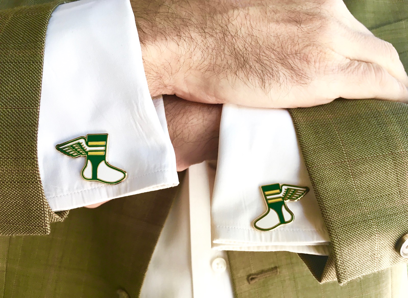
Assorted reminders: Paul here. In case you missed it earlier this week, Uni Watch cufflinks are now ready for ordering in our Teespring shop. A nice way to add a touch of class and formaily to your holiday season! (And for those who’ve been asking, our enamel pin doubles nicely as a matching tie tack.)
While we’re at it, there are only a few days left for you to get your orders in for our Uni Watch basketball jerseys and/or the matching shorts:
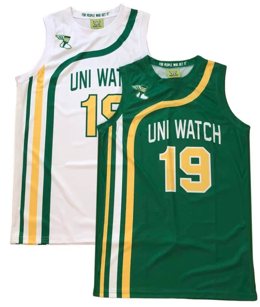
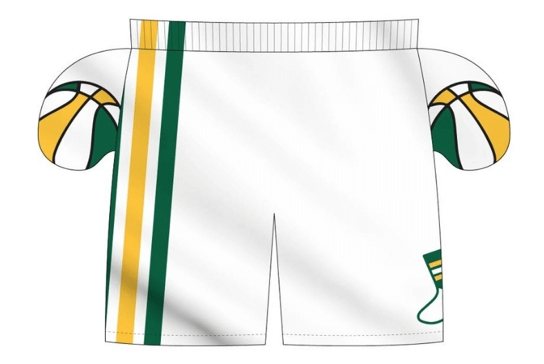
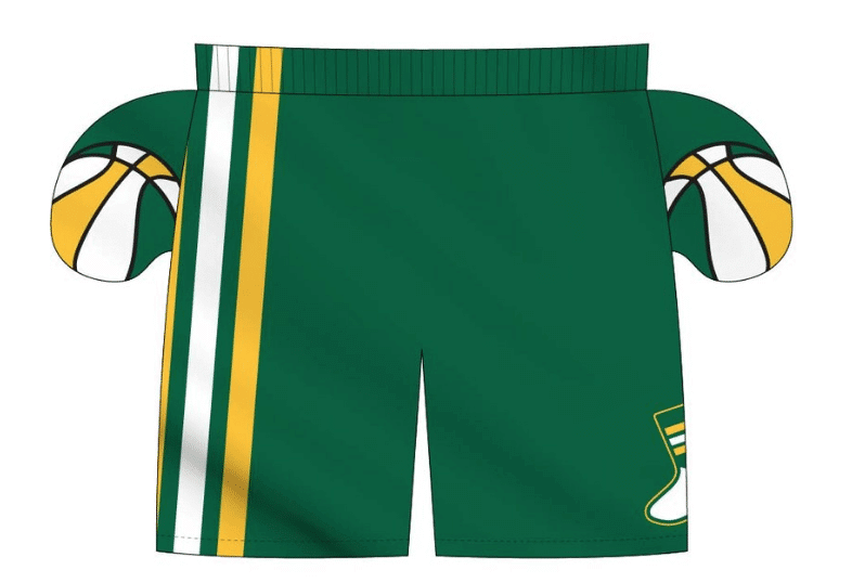
We’re taking pre-orders on these through this coming Wednesday, Nov. 20, for Christmas delivery. Full details here. (Also: The pre-order page doesn’t offer an option for international shipping. But if you want that, email Nathan Haas at Adelph Wear and he should be able to help you out.)
Uni Watch News Ticker
By Phil

Baseball News: We already saw how the Cardinals tweaked their “StL” logo via ‘soft launch,’ but now it’s official. Adam Chkautovich sends in this article collecting the history/reasons for the logo change as well as explaining the new changes. Highly recommended. … Single digit pitcher alert! The Mets Marcus Stroman, who wore “7” last year, has announced he will wear “0” for 2020. … Check out this cool t-shirt at the Tokyo Giants team store with the franchise’s logo history on the back (from Tyler Maun). … The Fredericksburg Nats (a Warshington Nats farm club, duh) have introduced red, white and blue jerseys for 2020 (from MiLB Promos). … Very sad (non-uni) news yesterday, as Vera Clemente, Roberto’s widow, passed away (from SABR Bio Project). … The San Francisco Giants’ Mauricio Dubon needs jersey number after the team’s new manager Gabe Kapler took his (from Brinke).

NFL News: By now you’ve all probably seen (either live or video of) Myles Garrett’s vicious helmet attack on Mason Rudolph. But he’s not the first guy to do that, and the rule prohibiting it was written in 1982. … Here’s a photo of New Orleans Saints nose tackle Tony Elliott, a replacement player during the 1987 strike. He’s wearing his full name on his jersey because the team had another nose tackle by the name of Ted Elliott (from Bill Kellick). … OK, so it’s not quite the same thing as seeing Jesus’ image on a piece of toast, but Kurt Rozek sees a Titans logo in his beer ring left on the table.
College/High School Football News: “Saugus Strong” decals were worn by West Ranch Football (another high school in Santa Clarita) in light of the horrendous act that took place at Saugus HS on Thursday (from James Brooks). Another school wearing “Saugus Strong” decals was Hart High School (Also from James Brooks). … How do you guys feel about script/cursive as a helmet element? I’m torn, myself, but I think the shorter names work better (tweet from Evan Moreland). If you look at the thread, there are a bunch more script hats. … The always awesome helmet guy Blaise D’Sylva continues his look at CFB hats with Kent Read, Kent Write Kent State‘s helmet history. … Neat: Corvallis, OR, Oct 4, 1924 – On campus of Oregon Agricultural College (aka Oregon State), Beavers fans pay 50¢ to follow the school’s football team beat Whitman College 41-0 on an electronic scoreboard that worked much like the baseball animatronic scoreboards (from Ronnie Bolton).

Hockey News: Most pro sports teams don’t really do giveaways with Thanksgiving in mind. But is that about to change? Check out this Anaheim Ducks gravy boat giveaway! (from The Goal Net). … The Prince Albert Raiders have shown us what their jersey will look like on Ugly Christmas Sweater Night on Dec. 13 (from Wade Heidt). … Also from Wade: Both the Boston Bruins and Toronto Maple Leafs had the Hockey Hall of Fame logo on their sweaters of Friday night in Toronto. Hockey Hall of Fame class of 2019 was in attendance ahead of their induction coming up on Monday. … There are good color on color games, and then Hockey Fights Cancer jerseys (from Rob Caplette).

NBA News: The Boston Celtics’ Jayson Tatum wore his socks inside out while debuting new shoes (from Mario Vasquez). … Why did Paul George change his jersey number from 24 to 13? … Did the Rockets new City alternate uniform leak yesterday (via Ethan Catalan). … This cool interactive site shows NBA logo changes year by year (from Ticker-er Emeritus Mike Chamernik).

College Hoops News: “Kansas Basketball unveiled some new grey alternates Friday night,” observes Ryan Grimes. “They 1st introduced these in 2012-13. These appear to be an ‘update’. Changed number color and from the circus font to Trajan.” Here’s another look at the new unis. … Someone stole the uniforms of the Texas Southern, who were scheduled to play the University of Oregon women’s basketball team Saturday afternoon. They ended up having to play in their practice unis (second link from Ignacio Salazar). … There are good throwbacks, and then there’s this (from James Gilbert).

Soccer News: The Puma Football 2019-20 Monterrey third kit has leaked (from Josh Hinton). … Also from Josh, the first images of the PSG 2020-21 home and away kits have leaked. … More from Josh: Germany debuted their new Euro 2020 home kit at Belarus yesterday. … For more, be sure to check out Josh’s twitter feed. … The USMNT honored DaMarcus Beasley Friday night for his time playing for the USMNT and gave him a #126 jersey. Adds submitter Jakob Fox, “Don’t believe he ever wore that style jersey however.”

Grab Bag: “Fan Wishes Team Was Sponsored By A Cooler Corporation,” literally is an Onion article, but it’s already frighteningly close to reality (from Jeff Pollock). … Interesting “color clash” in yesterday’s rugby match between Fiji and the Barbarians, with stripes vs solids (from Craig King).
I’m not offended UW-NEB was the &1, as it’s an opinion piece.
That said. Home team wore white. Road team wore a color. Unlike Duke, both teams were identifiable as their school
A lack of color? Sure. But when there are often complaints of “I didn’t know what teams I was watching”, I don’t think this was one of those.
I would agree, had I not been at a curling club in Wisconsin during the Huskers-Badgers game and seen two older folks misread the score and the possession based on on the uniforms. It’s a perennial issue with Nebraska and Wisconsin, but either team would be better served by having some kind of alternate for facing the other.
Opinions are opinions. But it inconceivable that the “&1” game has 2 teams in their traditional uniforms and school colors while a team went BFBS head-to-toe and faced a team in (their traditional) all-white road uniforms made the Top 5. That’s ridiculous. At least I knew who was playing in the Wisconsin/Nebraska game.
Agree 100%. BFBS would never be in my Top 5. One subtle alternative for The Badgers would be a red helmet, which I believe they have worn before.
When both teams look great it can’t be a bad-looking game.
Small correction: the game was in Nebraska, so the home team wore color and the road team wore white.
But yeah, the rest of your comment stands.
I am finding it best just to skip the 5&1 section this year. While in past there was a game or two I would disagree with, this year more often then not I am finding the &1 to be worthy of a top spot and at least one or two costumes in the top 5 with each passing Saturday.
The guy is either trolling for attention or completely incompetent. Either way it’s a bad look for uni watch. I think it’s about time I start sticking to weekdays.
I’m starting to think dude just lists the games he happened to catch on TV that afternoon. 3 BFBS in top 5? Come on..
Aw Yeah! Time for some College Football Uni Tracking Canadian Rules Style!
Saturday featured the national semifinals for U Sports football. The Mitchell Bowl and the Uteck Bowl. So how is it determined which of the schools play for which trophy?
The teams and host sites of the Uteck Bowl and the Mitchell Bowl rotate on a six-year cycle, so that in each cycle each of the four conferences hosts and visits every other conference once. Yep, that’s confusing. So I just look at the schedule. This year the Mitchell Bowl features the Ontario champs at Canada West champs. The Uteck Bowl is Quebec champs at Atlantic champs.
-Mitchell Bowl:
Calgary Dinos wore mono-red at home. McMaster Marauders went white over white.
link
-Uteck Bowl:
Acadia Axemen went with the red over grey combo at home in Wolfville, NS. Montreal Carabins wore their blue/white/white combo.
link
So the Vanier Cup is set for next week in Quebec City. It will be Calgary against Montreal. Montreal last won the Vanier cup in 2014. Calgary last hoisted the championship in 1995.
Bonus!
Saturday also featured the national championship in the Canadian junior football ranks. The Canadian Junior Football League’s Canadian Bowl this year saw the Prairie Conference winner visiting the BC Conference winner.
The formidable Langley Rams wore their usual primary white/navy/navy combo at home in the rainy Vancouver suburb yesterday. Neat thing about the Rams jersey is the nameplates.
Instead of the players last names, all the nameplates say Rams.
The powerhouse Saskatoon Hilltops wore their standard road look of yellow/white/blue.
link
link
Close game, but the dynasty continues for the Saskatoon Hilltops. The win yesterday was their 6th straight Canadian Bowl championship. The Rams have been in existence since 1948 (originally as the Surrey Rams) and have still never won the national championship.
The Langley Rams have the team name on back, like certain soccer leagues/teams. Except for a few specialty jerseys in the NCAA I never noticed this in a (gridball) football team before.
Thanks as always, Wade.
Always a pleasure!
Speaking of team names in nameplates in Canadian university football, the Western Mustangs used to have “Western” on all the nameplates. Back in the days when Western also used to wear a logo just on one side of their helmet. Photo from 1998:
link
Two comments about today’s and yesterday’s posts:
1. The “Fred Nats” introduced a Mary Washington logo to go with George. Does “Nationals” now count as a female mascot? I believe it does.
2. The Nats “actual” introduced an alternate home jersey and two caps Friday on the MLB Shop website. The jersey (Nike-fied, sadly) and one of the caps are updates to their Spring Training uniforms in 2019. This set, meant for home, is
blue-dominant and certainly at odds with their “red” identity at home per the excellent Ben Rose video from Friday.
The Nationals were born…err, transplanted…with red at home and blue on the road. Maybe for political reasons, not sure, but I’ve heard stories. This new set, which I really do like, does give them a little bit of an identity crisis because they (save the postseason and World Series
run) have been a red team at home
for their existence.
Which leads me to the other new cap, the red one with the front white panels and the pitcher in front of the block “W”, not curly. The logo is not bad, but looks a bit awkward with the color balance between red and navy. I prefer the other with the Capitol dome, block “W”, and the stars.
Save even more new jerseys, I have no idea with what the Nats would wear this mostly red cap. It doesn’t really work with anything they have now. Mixing the block and curly “W” logos should be avoided.
It seems like they are doing more than ever to give us the block “W” over the curly standard. I am of the camp that if Walgreens was ever going to sue then they should have in the 1960s when the Senators first wore the logo and that ship had sailed. But the introduction of more and more block “W” elements is interesting considering it would signal a big change for the Nationals just as they have made their mark as WORLD CHAMPIONS!!!
I hope they don’t force Charlie Slowes to modify the type of “W” put in the books. Use the block occasionally, it’s a nice nod to DC’s baseball past, but ultimately stay curly.
My only problem with the new caps is the mismatched stitching on the white front panels. Contrast seam stitching on a contrast cap panel always looks bad.
Fredericksburg Nationals, not Frederick. Fredericksburg is a city near Washington in Virginia. Frederick is a city near Washington in Maryland.
And oddly both Frederick and Fredericksburg play in Carolina League although neither are, you know, in the Carolinas.
Ugh. Thanks, fixed.
I mentioned Stroman’s number change in the comments yesterday. What occurred to me later is we could get a zero-vs-zero pitching matchup when the Mets play the Yankees if Stroman and Ottavino start.
Flip the beer ring stain on the table over and you have Detroit Red Wings winged wheel logi
Big Badger fan. Any time Bucky squares off against Nebraska it looks like an intrasquad scrimmage.
Once again, 5&1 leaves a lot to be desired. I know it’s an opinion, but it feels like someone trying to be edgy every week rather than do a good job
I have disagreed with most of his picks all season. While the past pickers were pretty much spot on, give or take here or there, Memal is way off just about every single week.
No mention of the great looking game USC at Cal. Cal wore there Joe Roth tribute royal blue and gold (yellow), yellow/blue/yellow. Fantastic look, and USC of course wore their road uniform cardinal/white/gold (yellow). Best looking game of the day. However you probably missed it if you are in the eastern or central time zone, with a ridiculous start time of 11:00 & 10:00 PM respectively.
I think Jayson Tatum has actually been wearimg his socks inside-out all season.
Shouldn’t it be the 1970 Marshall team, not 1975?
Fixed
Who knew Martha Washington was a southpaw?!
5&1 comments.
Missouri look is unbalanced. It’s off. That jersey doesn’t work with white pants and helmet. The numbers should be white. Or helmets should be black with black or yellow pants. This alone should negate a spot in the list.
The only thing wrong with Nebraska vs Wisconsin is the Badgers not having proper block number font. Otherwise the teams were properly dressed for home and away. Maybe it’s not a top 5 but certainly not the &1.
Cal vs USC and LSU vs Ole Miss looked fantastic. I figured one of these would be #1.
I watched UT play Iowa State and figured that’s the &1. Because BFBS is always bad.
A manager took a uni number from a player? That’s weak.
Kapler gave up #22 when the Phillies signed Andrew McCutchen before the 2019 season.
“Here’s a photo of New Orleans Saints nose tackle Tony Elliott, a replacement player during the 1987 strike. He’s wearing his full name on his jersey because the team had another nose tackle by the name of Ted Elliott (from Bill Kellick).”
Tony Elliott was a member of the Saints from 1982-88. He may have crossed the picket line during the 1987 strike, but he was not a replacement player. Ted Elliott was a true replacement player. He played three games in 1987, presumably the three strike games.
Tony Elliott
link
Ted Elliott
link
I had a great idea for Mother’s Day. The St Louis Cardinals should use female cardinals on the uniforms instead of male. How can we make that happen?
The obvious first question is “do male and female cardinals look different?” Wikipedia says they do.
I would point out that the Cards made an attempt at “ornithologically correct” in 1998, and it was apparently unpopular enough that they dropped it after one year.
Just a note that the original shoulder caps for the Utah uni’s were not a drum and feather, but a profile of a Native American face. So maybe it was a good idea to use the ‘UTES’ instead.
“Check out this Anaheim Ducks gravy boat giveaway!”
I’m instantly reminded of this Jean Shepherd classic:
link
Excelsior, You Fathead!
Notable uni-first today: Lions wearing white jerseys over blue pants. First time they’ve ever done so at home, according to GUD.
No, this is actually the third time the Lions wore white at home. Both previous times were on Thanksgiving Day. 1961 against the Packers and 1970 against the Raiders. Both game are properly documented on the GUD.
I had to look twice while watching parts of the UCLA/Utah game. Looked like UCLA at Ohio State if you had a quick glance.