Way back on Sept. 3, one of my Twitter followers, Forest Lawrenceton, pointed me toward a YouTube video called “Milwaukee Bucks Uniforms — The Theory of Everything, Vol. 1.” The video is 15 minutes long, and I didn’t have time to watch the whole thing right away, so I kept the video in an open browser tab and figured I’d get to it later. Then I kept putting it off longer and longer, until I finally watched it in late October.
Whoa — it’s so good! For starters, it’s not just about the Bucks — it’s about sports uniforms in general and the Bucks’ uni history in particular. The analysis is smart, the production and editing are excellent, and even the voiceover narration sounds really, really good. Who the hell made this video?

A guy named Ben Rose, that’s who (that’s him at right, along with his son, Harrison). I tracked him down and recently did a phone interview with him, which I kept short because I want his video to speak for itself.
Before you read the interview transcript, go ahead and watch the video, which is embedded at the top of this post. It’s worth 15 minutes of your time — trust me. If you don’t have time to watch it now, bookmark it or put it in a new tab, and don’t wait as long as I did to circle back to it. (Just to be clear, I don’t agree with every single thing in the video, and you may not either, but I love the way it’s all presented, and I think you will too.)
Once you’ve done that, you can check out how our conversation went:
Uni Watch: First, please give me some basic information about yourself. How old are you, where do you live, and what do you do for a living?
Ben Rose: I just turned 41. I’m a Milwaukee native, but I’ve lived in Phoenix for the past 14 years or so. And I’m a rental truck driver and salesman. I’m just kind of a regular dude.
UW: Tell me about your YouTube channel and your approach to the content that you post there.
BR: I really just kind of stumbled into it. What happened was that my first video — kind of a Rocky IV parody, which I did about five years ago — kind of popped. All my videos are pretty dumb. But this one, because it had all this great footage of Mikhail Prokhorov working out in the gym, it got picked up by a lot of websites. So I was kind of off and running after that.
UW: Your YouTube channel is called “Teutonia World,” and your videos begin with a Teutonia World logo. What’s that about?
BR: Teutonia is a street that sort of cuts through the northwest side of Milwaukee, which is where I grew up. So it’s basically a shout-out to that.
UW: Do you have a background in video production or sports media?
BR: No, not at all.
UW: So you just like doing these mash-ups and throwing in pop culture references and all that?
BR: Right, exactly. When my kids were born, I was always taking videos of them, so at some point I learned how to make videos.
UW: I know you don’t actually talk or do narration in most of these videos. But in this latest one, the “Theory of Everything Vol. 1,” you narrate the whole thing, and you have a great voice! Have you ever worked in broadcasting?
BR: Thank you very much for saying that! Just like everyone else, I hate the sound of my own voice. Frankly, I was working out the kinks a bit with that one. I’m hoping the next one, Volume Two, will be better…
UW: Dude, this one is so good!
BR: I’m honored that you would say that. It took about 40 hours to put together.
UW: You obviously have some strong ideas about uniforms. How would you describe yourself, from a uniform standpoint, and what are some of your favorite and least-favorite uniforms?
BR: I guess you could say I’m pretty conservative. I like certain wacky uniforms, like the Astros’ tequila sunrise, and I liked the Tampa Bay Bucs’ first pewter uniforms. But I think there are a lot of disasters out there when teams try to reinvent the form on the fly.
I’ve come full-circle on this. I certainly didn’t feel this way when I was 18, or 25. But I’m from Wisconsin, where everyone is a Packers fan, and they haven’t changed their look. Even the Flywire collar — is that what it’s called? When other teams went to that, the Packers didn’t. And I think it gives them such credibility, because it maintains that connection to their legacy of winning.
UW: Unless I just missed it, I didn’t see any other uni-centric videos on your YouTube channel. Is “Theory of Everything” video the first time you’ve actually done a video about uniforms?
BR: Yes. The others are about the Bucks or Wisconsin sports, but this is the only one about uniforms. Basically, because I now live in Phoenix, I spend a lot of time at Diamondbacks games. And they’ve basically tried every color. And because they don’t really have an identity, they’ll just keep changing their look. And even if they hit on something that’s great, they’ll change it, because that’s the kind of team they are, they’re in the business of change. Whereas all of the really great brands in sports are in the business of selling you slightly different aspects of the same thing over and over again.
UW: When will Vol. 2 be posted?
BR: I was aiming for Thanksgiving. We’ll see. At some point you have to stop editing and say okay, that’s good enough.
UW: Do you think you’ll do more videos about uniforms, or is “Theory of Everything” a one-time digression?
BR: Well, I’m always trying to quit making videos! I’m sure my wife would like that. It becomes this thing — you have an idea, and it’s not in the front of your mind but it kind of rattles around in the back of your mind and you have to do something with it.
———
Big thanks to Ben for sharing his story and his considerable video talents. I’ll be sure to feature Vol. 2 once it’s available.
(Bonus thanks to Forest Lawrenceton for bringing Benjamin’s video to my attention.)
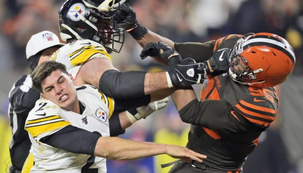
[Editor’s Note: If you watched last night’s Steelers/Browns game, you probably did so on a conventional TV. But Uni Watch webmaster John Ekdahl watched it on an enhanced platform, and he says it’s a serious game-changer for uni watching. Here’s his report. — PL]
I Have Seen the Future and It’s 4K
By John Ekdahl
The commercial television market tends to be inherently gimmick-based. The problem for manufacturers is that they need you to buy a new television about twice as often as you are willing to do so, so we sometimes have to endure a marketing cycle on some “hot” new technology that no one actually wants. A recent example of this was the 3DTV push, which was built into nearly every new TV sold for three years and never went anywhere. Before that was HDTV, which was a very noticeable upgrade. But content struggled to catch up in a timely fashion, as anyone who watched butterfly or frog documentaries on repeat can attest.
The latest new gimmick is 4K TV. Just like the jump from standard to high-def, it is a noticeable jump in quality. It is not a gimmick. Unlike with HDTV, content providers (mostly streaming services) are scrambling to meet demand, with Netflix, Amazon Prime, HBO, and now Disney+ (among others) offering 4K programming. What has lagged behind, unfortunately, is sports broadcasts.
Well, last night I watched my first football game in 4K, and let me tell you it is a uni watching game-changer. I had to watch it through a Fox Sports television app, but I almost instantly noticed the difference. The on-screen graphics were crisp with clean straight lines like you’re used to seeing on a computer monitor. And when the teams took the field, it was wild how many details you could make out.
For example: I noticed immediately that the stitching around the Steelers logo on one player’s jersey looked faded or worn, as if it had seen action before. You can make out the jersey material/hole pattern very clearly on close-ups. The difference between the Steelers’ glossy helmet and Browns’ matte was very obvious — not obvious like a reader of this site would notice, but obvious like if a matte-finished car parked next to your detail-oblivious friend in a grocery store parking lot obvious. You can instantly see the difference without even thinking about it.
In fact, speaking of the Steelers helmet, I was able to easily count the individual lights from the light tower reflected on the helmet. There was a play toward one of the sidelines where a player dragged his foot across a field line, and you could see the chalk dust puff up as if it were right in front of your face. Many times during the game, mostly with the Browns, I was able to see the reflection of the lights off the shoulder/back pads through the jersey. I’m sure I’ve seen this muted effect before, but it happened so often and was so clear, it caught me a bit by surprise.
I tried to get some screencaps, but the details don’t really translate. You need to see this for yourself — definitely try to catch a game this year in 4K if you get the chance.
Click to enlarge
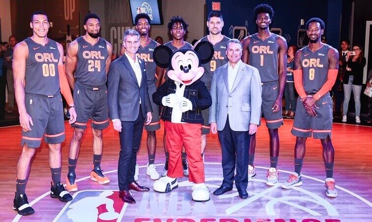
Orange you glad: Ever since an orange-themed Magic court design leaked back in August, it’s been pretty much an open secret that the team would have an orange-themed alternate uni this season. That assumption became a reality last night, as the Magic unveiled their latest City design. Additional info here.
Here’s the rear view:
A lack at the back of the new @OrlandoMagic jerseys. pic.twitter.com/FNXT51IHgE
— John Denton (@JohnDenton555) November 15, 2019
Like so many of the new NBA alternates, this isn’t an terrible design per se, but it feels completely unconnected to the team and its visual history. Definitely one of those uniforms where people will turn on the TV and have no idea who’s playing.
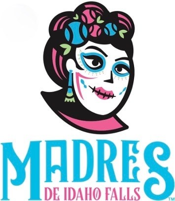
El futuro es femenino: Minor League Baseball unveiled a slew of new Copa de la Diversión team names and logos yesterday (the uniforms will apparently follow later). The most interesting one is for the rookie-level Idaho Falls Chukars, who will become the Madres de Idaho Falls. In other words, they will be the Mothers — complete with a female logo mascot, which the team is claiming to be the “first female logo in baseball history.”
I don’t know if that claim is accurate, but it’s certainly true that female-based team names for men’s teams are rare. In fact, most team names are non-gendered (Eagles, Astros, Chargers, Nets). But the gendered ones are unfailingly male (Padres, Cowboys, Kings, Gamecocks), and even the non-gendered ones often have logo mascots that are either explicitly male (Patriots, Celtics, Senators) or have a very masculine bearing (countless). So the Madres are definitely staking out some rare territory here.
Now, some of you may be thinking, “Of course the team names are male — because the players are male!” Fair enough. But pro team names are used by lots of youth league teams, and those youth sports are increasingly coed, so it’s good to have team names that girls can identify with too. Also, I think it’s good to challenge the longstanding cultural default that equates competition — including athletic competition — with masculinity. Hell, with the arguable exception of the New York Liberty, there isn’t even a female team name in the WNBA. That’s nuts!
So here’s to the Chukars for their Madres makeover — a good change of pace.
(My thanks to Andrew Wade Smith for bringing the Madres to my attention.)
Click to enlarge
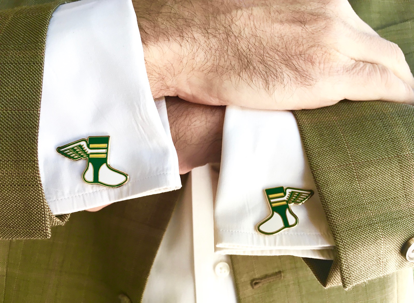
Cufflinks reminder: In case you missed it earlier this week, Uni Watch cufflinks are now ready for ordering in our Teespring shop.
Incidentally, you may recall that yesterday I said a Uni Watch reader who works as Senior Litigation Counsel at the U.S. Justice Department plans to wear the cufflinks for his argument in federal court next month. Today’s update is that a self-described “Assistant Attorney General Who Gets It™” says the cufflinks will also be representing the Commonwealth of Massachusetts!
I wouldn’t have guessed that Uni Watch cufflinks would be so popular with the legal trade, but it’s a fun development. And you certainly don’t have to be a federal or state attorney to wear them — you can get yours here.
Click to enlarge
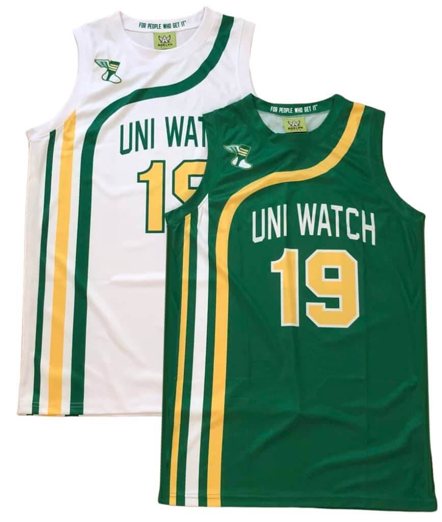
FIVE DAYS LEFT for hoops gear pre-orders: We’re now taking pre-orders on Uni Watch basketball jerseys. You can choose your own number and NOB, and you don’t have to have the winged stirrup on the shoulder if you don’t want it there.
We also have matching shorts:
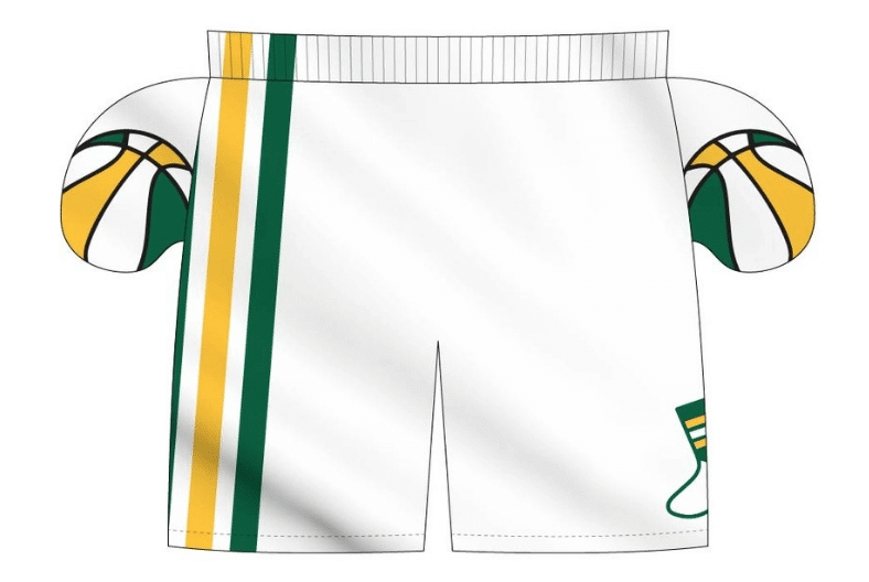
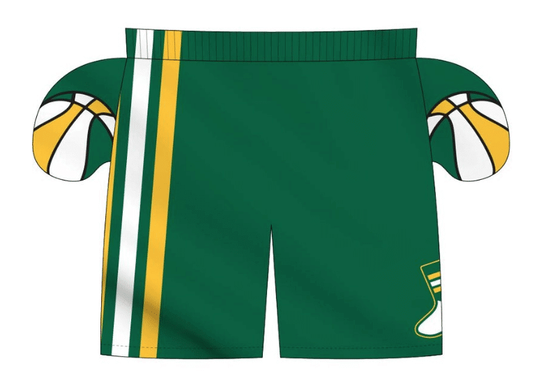
We’re taking pre-orders on these through next Wednesday, Nov. 20, for Christmas delivery. Full details here. (Also: The pre-order page doesn’t offer an option for international shipping. But if you want that, email Nathan Haas at Adelph Wear and he should be able to help you out.)
LAST CALL for the Bucs-redesign contest: Today is the last day to get your entries in for my Bucs-redesign contest. Full details here.
The Ticker
By Anthony Emerson

Baseball News: The inaugural season logo for the Rangers’ new stadium gets some details wrong regarding the ballpark’s design (from Mike Duchock). … Fans really, really don’t like the name of Wichita’s new baseball team, the Wind Surge (from Mark Chiarucci). … Back in 1980, Ohio University had some awesome-looking tequila sunrise uniforms (from several readers). … Paul discussed the Padres’ new uniforms on this new podcast episode.

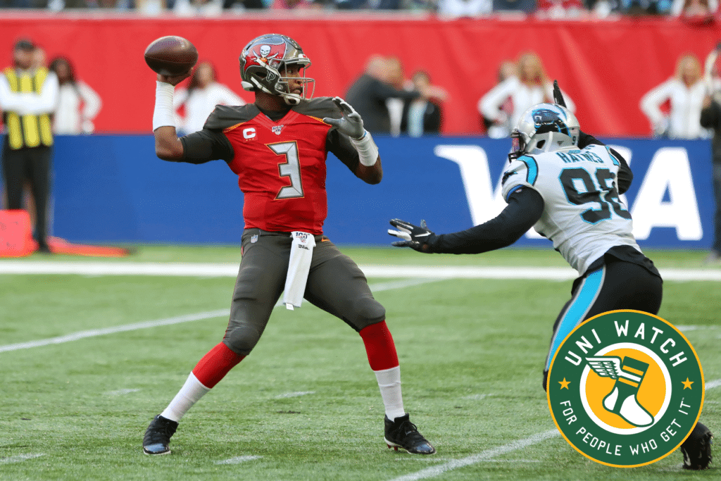
NFL News: Reader John Williams has finished designing a poster featuring almost every helmet every current NFL team wore during their time in the league. Well done, John! … Bucs HC Bruce Arians was the victim of one of the most half-assed Photoshop jobs I’ve ever seen. The Bucs logo doesn’t just go off the front of the cap and onto the bill, it goes off the cap completely! (From Jim Lighthall). … A retailer in the Kansas City area is selling Chiefs-branded hockey sweaters (from Chris Mattox).
College/High School Football News: Drake University’s new soccer stadium will be used by Des Moines Public Schools to host middle and high school soccer and football games (from Kary Kilsmet). … Oregon will go “nightmare”-yellow-“nightmare” tomorrow (thanks, Phil). … Louisville is going black-white-black tomorrow (from M. Brinston Berry). … UNLV is going mono-red tomorrow against Hawai’i. … Marshall is going mono-black tonight in honor of the 75 players killed in the 1970 plane crash (from Chris Mycoskie).

Hockey News: Blues G Jordan Binnington will have a throwback mask and throwback pads for the Blues’ throwback game on the 21st (from Jacob Bischoff and Mike Judy). … The Capitals’ thirds have 3D helmet logos (from @RivalsMD). … As a Bruins fan, I wish we had Sidney Crosby, like this screen-saver news report on Chromecast says (from @PhillyPartTwo).

Pro Hoops News: The Pacers’ new alternates will be unveiled next Thursday, and the team has posted a teaser video (from multiple readers). … Valencia of the the Spanish Liga ACB is getting a new arena (from Kary Klismet).

College Hoops News: Michigan State added “Smoothie” memorial patches in honor of Cassius Winston’s younger brother, Zachary “Smoothie” Winston, who passed away recently (from multiple readers). … Canisius men have unveiled their throwback unis for their Nov. 23 game against St. Bonaventure.

Soccer News: Looks like Nashville SC, the newest MLS team, may be unveiling their kits next week (from @TennTimber). … Here’s a great article about the England national team wearing a “winter” kit that weighed 11 pounds in the blistering Spanish heat in 1982 (from Josh Hinton). … Also from Josh: Irish players seemed to have no undershirt color consistency during their win against New Zealand. … One final one from Josh: teams of Ligue 1 and the French national team wore the Bleuet de France on their sleeves, which is the French equivalent to the poppy in the Commonwealth nations.

Grab Bag: “Fan wishes team was sponsored by cooler corporation” writes America’s finest news source (from Hugh C. McBride). … USA Nordic — that’s the American ski jumping and Nordic combined teams — has released their 2020 uniforms (from Jim Vilk). … The Washington Post’s fashion columnist has an article critiquing Ohio Congressman Jim Jordan’s frequent decision not to wear a jacket or blazer in committee meetings (from John Chapman). … Some GWU teams wear three stars above or below the logo. The stars stand for “determination, commitment, and respect,” and are also a nod to the flag of Washington, D.C. (from Matt Eliot).
Happy almost-birthday to Collector’s Corner columnist Brinke Guthrie, whose special day is tomorrow. Enjoy, big guy! — Paul
John’s poster is really a sight to behold (and I love it!!!) but a small part of me is sad that the greatest Uni Watch / Broncos find wasn’t able to make it onto the poster.
I can remember going over old fiche at Metro State while being one of a few people trying to suss out the 1962 orange helmet with the colored logo being blue or brown like it was (wrongly) assumed.
The new Magic jerseys aren’t bad by itself, but it is bad considering it’s the Orlando Magic. I am sick to my stomach as to what the NBA has done to its visual identity. It’s completely incoherent. Excluding throwbacks, teams aren’t wearing their traditional colors (Wolves in purple, Pacers in red/gold, Magic in orange, Hawks in peach, etc). The home team doesn’t wear the white or color jerseys consistently (either the home or road team should wear white, every game). If you turn on a game, you have to first figure out who’s playing and then who’s the home team. There’s no game to game consistency. And don’t get me started on the ad patches.
This is big reason as to why I have not turned on an NBA game this season.
I heartily echo everything you said. Like you, I have barely watched the NBA since uniforms outside of the teams color scheme began showing up. I’ve watched even less since the ad patches.
I know that the NBA is the league that most explicitly markets player over league, but part of the beauty of sports is the almost primal emotional attachment people have to teams they’ve watched all their lives. Sometimes when I turn on an A’s game, I smile unconsciously at the recognition of their colors and caps and various visual identifiers, the same way I would when seeing an old friend across a crowded room.
And that makes sense. These teams are things we grow with and recognize as part of our lives and relationships. To render them unrecognizable aesthetically for the sake of jersey sales or simple novelty is to slowly erode that part of sports on at least a visual level is a complete disservice to the sport.
Russell, that was so eloquently stated. I couldn’t have said it better myself.
NBA teams should wear white (or in the Lakers case yellow) at home and your darker color uniforms on the road PERIOD!! The NBA is a clown show with the multitude of uniforms and ridiculous alternate colors, logos, courts, etc.
Those Cheifs hockey sweaters are just hockey-jersey inspired hoodies.
link
John:
Regarding your experience viewing TNF in 4k, what size display were you watching it on, and at what viewing distance?
I was going to ask a similar question, cause I went from a 32″ hdtv (1080) tp 50″ 4k for my apartmen (I sit about 5 feet from the tv) , so even 1080 content looks much better to me now being bigger.
And I watched a video showing the differences between 1080 and 4k and I didn’t notice too much of a jump.
I have a 55” in my living room and a 49” in my bedroom. Mostly watched in my bedroom last night at maybe 8 to 10 feet. I was closer at times just to really see the details. I stood arm-length a few times and I swear it was as if I was sitting in a stadium seat.
There is science behind visual acuity (the physical limits of the pixel density your eye can resolve) with the pixel density of the display and the viewing distance. 4k is definitely as you said–a significant jump in picture quality–but we are starting to hit the practical limits of how much detail the casual viewer can discern at typical viewing distances. Your viewing distance is fairly close, so you were clearly able to notice the benefits of 4k and get additional detail. For us uni-watchers, what 4k means is, if we see something interesting, we pause the image and get up on the screen to pick out the detail. :-)
There is another female logo in MiLB Copa de la Diversiòn, Lloronas de Montañas Rocosas (The Weeping Woman of the Rocky Mountains), so there will be another female-based team name. I love it.
The Toledo Mud Hens is technically a female name for a bird. A Mud Hen is a coot.
Also Delaware Blue Hens
I suspect the name “mud hen” has been applied to several different birds. Personally, I’m most familiar with it being a name for the Barn Swallow (because of the mud nests they make).
In any case, I’ve never heard of it being used for just the females of a species, despite the fact that it contains the word “hen”. And I would expect that to be especially true in the case of coots, where females and males look identical.
You know, if I’m going to wear Uni Watch cufflinks, I’m probably going to need a tie tack as well…
Well, our lapel pin also works as a tie tack:
link
Lifelong resident of Milwaukee here – I knew exactly what Teutonia was when I saw it. Great video Ben and way to represent the city!
Happy Birthday Brinke – you and I share that awesome birth date!
Thank you sir
The Photoshop is even worse. You can still see parts of the Cardinals logo on Bruce Arians’ hat.
And shirt.
Speaking of good looking games on the tube last night for all you green lovers out there.
We don’t get 2 teams that wear kelly green play each other in the Big Four leagues often. There should be more.
Dallas Stars at Vancouver Canucks is a beauty for those who love green.
link
Someone should move heaven and earth to get the San Diego Madres in the WNBA.
The only other female team name I can think of is the Univ. of Delaware Blue Hens.
That’s *Fightin’* Blue Hens.
A Phillie is a female horse ;)
Speaking of the Phillies, let’s not forget Philadelphia Phyllis:
link
Well, a *filly* is young female horse, to be specific. The Phillies are basically just called the Philadelphias, which was a format that was quite common during the early days of baseball iirc
“England national team wearing a “winter” kit that weighed 11 pounds in the blistering Spanish heat in 1982”. Not exactly what it says in the article: “I think Paul Mariner lost over 11lbs” I’d say the heat and exertion was the important factor in the weight loss and not the uniform.
This may sound odd, but John’s 4K experience happened to me, although in a much less cool way. Like many people first show I saw on a 4K TV was one of the David Attenborough nature docs. I was so astonished by the clarity that I sat in the closest chair to the TV, maybe 8 feet away when I suddenly got overwhelmed with nausea. The feeling was quick and intense and completely subsided within a minute or so of sitting down away from the TV. I’ve never had motion sickness before, but that’s what my symptoms seemed to match. It was as if my brain was so confused by how real everything looked, that my body freaked out. Ever since, the I’m leery of watching something like football on one. Has anyone had a similar feeling.
Good on the Chukars for adopting the Madres name! I’ve long wished that the Cardinals would put the female of the species on the bat of their road jersey script.
John Williams did a great job on that helmet poster. Really sharp looking and retail ready.
Would the WNBA’s New York Liberty count as a female? I know it’s a statue, but it’s a statue of a female. Pretty cool logo, too!
You might want to go back and re-read that section of today’s text, Dave!
Oops!!! I have to stop posting before the morning coffee has kicked in.
UNLV, not New Mexico, is going all red vs. Hawai’i.
Fixed.
I’m still on 720p tv’s in my house (panasonic plasma!), and maybe it’s because I haven’t seen 4k content but I don’t really feel like I’m missing out on much. I haven’t checked in a while, but I think a lot of TV has been done in 720 and not 1080, maybe that has changed in recent years. But I do think 4k might catch on more than the 3d gimmick.
“Michigan State added “Smoothie” memorial patches in honor of Cassius Winston’s younger brother, Zachary “Smoothie” Winston, who passed away recently”.
– Have we seen a memorial patch/armband for someone who took their own life before?
One example that immediately comes to mind: Orioles wore a “Flanny” patch for Mike Flanagan in 2011.
link
Was there anything for Junior Seau?
There was!
link
In 2013, several NASCAR Cup drivers added memorial decals to their cars for Dick Trickle:
link
link
I always thought “Mermaids” would be a cool identity for a team, be it pro or college. Concise, evocative, not offensive to American Indians:)
What a great video!! Ben Rose’s take on identities and their link to success is pitch perfect. Not only does he get it (TM), He might have just written it!
I think most everyone in Wichita wants a different MiLB team name. All my friends there do anyway. I keep saying bring back the Wingnuts name. Especially when the cheer starts with Let’s go nuts!!
The Wichita Wranglers had one of the best MiLB identities – logos and uniforms – of all time. A shame the team didn’t go that direction.
I suppose “Linemen” has been bandied about.
Just remember, this is the same ownership that forced Baby Cakes onto the Zephyrs faithful. All for the sake of a buck…
My alma mater, Wheaton College (MA, not IL one), has a female lion as its athletic logo. The team name, the Lyons, is an homage to founder Mary Lyon. Wheaton was founded as an all-women’s school and stayed that way until the late 1980’s, when it went co-ed.
link
It’s Division III sports and all, but we’ve got an MLB player to our name (Chris Denorfia)!
2 things:
1) That’s UNLV and not New Mexico. New Mexico is playing Boise State, and unless Frank knows something different, I would expect to see either all-white or white-white-red.
2) The new version of the Sky Sox (Rocky Mountain Vibes) is going to be known as the Lloronas de Montaña Rocosa.
Yup, UNLV item already fixed, thanks!
I know the NBA All star game is MONTHS away, but I just want to put it out there that I’d REALLY like to see the players wear the unis of the team they play for rather tha unique All-Star unis.
Lebron would wear a Lakers jersey, Harden a Rockets etc.
They did this for a few years at the end of the 20th century and I thought it looked cool seeing all those different colors out there on the court.
And spare me all of the, “NOOOOOOOOO!!! How would I recognize a player that way!!!”
I don’t know, maybe because he’d be wearing the jersey of the team he actually plays for rather than some one off jersey that is identical to everyone elses.
But I have another idea which I’m sure will at least mildly infuriate you Paul, have Nike make up special unique All-Star game version of the players jerseys using the teams they play for.
Lebron and Davis would have unique one time only Lakers jerseys. Westbrook and Harden would have unique one time only Rockets jerseys. And so on for the rest of the players on the All Star teams.
And OF COURSE they’d be available for retail sale.
So, Paul and anyone else jump all over me and tell me what a horrible stupid idea this is.
Your second suggestion is more realistic
I really enjoyed Ben’s video. Even though he didn’t cover hockey much, I still felt like he was talking about the Canucks the whole time.
I’m super looking forward to Part 2! I hope Paul will post it here when it comes out.
Ben didn’t not cover the NHL, he actively excluded it. When he discusses the number of teams total or wearing various colors, the numbers reflect NFL+NBA+MLB. Which, fair enough, but it stuck me as odd that a Wisconsin sports fan would talk at length about green and red as a color combination without mentioning the state-next-door’s NHL team.
One quibble I expect to have with Part 2: At one point in Part 1, Ben shows a recent list of NBA teams by merchandise sales to demonstrate how Houston underperforms, and Milwaukee is number 6. Milwaukee is not the 6th largest city or metro area in the United States, so by that standard, the new/current Bucks branding is a smashing success. I understand the nostalgia for the team’s earlier looks, especially its 1970s outfits, but the new/current logos and uniforms are huuuuugely popular here in Wisconsin. Even the primary logo’s similarity to Jagermeister has a feature-not-bug effect for local fans.
Still, quibbles aside, it’s a great video essay and I’m really looking forward to Part 2.
I will certainly feature it on the site when it goes live, yes.
Ben’s video is great. However I felt like when I watching ESPN and here that dreadful term. 3 major sports. Ben its the 4 major sports. If you are going to tease NHL uni’s in your piece got to reference all 4 major sports. I would love some inclusion of original 6 era, were the Bruins brought only change. Agreed from above lost opportunity with no Stars or Canucks.
I’m just a fan, I’m not an expert, Dom. Didn’t mean to disparage hockey, I just don’t know enough about it. It would seem that a lot of the same principles apply
Thank you for watching, RS Rogers. I think the parallel that may apply the most is the Cleveland Cavs in both LeBron stints. The Bucks have an incredibly likable face of the league type personality. That’s where the merch sales are coming from.
However if you go to any Bucks game, I would estimate that 25% of fans are wearing purple, another 25% are wearing merch associated with the red and green era, and the rest are wearing all-black, Mecca yellow, cream, or even the current white and green. A blue jersey has been rumored forever. This in my opinion is madness. The Bucks have claimed ALL THE COLORS.
As such, whenever Giannis leaves (or retires) they will leave no visual footprint. No ties to the past. Just a fad that came and went. Like the Cavs now.
“Zips” is not a female name, but the Akron Zips’ mascot, Zippy the kangaroo, is female.
With the Rocky Mountain Vibes rolling out Lloronas (a “folkloric ghost mother”) it looks like two MiLB teams announced female names/logos at the same time.
link
Hadn’t seen that someone else mentioned the same thing above. My mistake.
In reference to the male/female team names, my high school boys’ teams were the Minutemen, the girls’ teams were Minutemaids. That was over 50 years ago, so I don’t know what they do now. But there is a school in my area now that uses Sammies for the boys and Suzies for the girls.
Well, it’s better than Lady Minutemen.
As someone who keeps a mental list of the Lady Friars, Lady Bucks, Lady Knights, and Lady Bulls, etc, playing collegiate sports, I wish I had any idea about Madres de Idaho Falls’ claim.
All I got are the Delaware Fightin’ Blue Hens, the only mens’ team with a female mascot I can think of.
…and I didn’t notice someone upthread name-checked the Fighting Blue Hens. Oops.
New alt caps & alt jersey for the Nationals-http://news.sportslogos.net/2019/11/15/two-new-caps-and-a-new-jersey-for-nationals-in-2020/
Wow, I had to do a triple take to see a reference to my hometown Idaho Falls Chuckars/Madres. Blows my mind to see them in a blog I read daily. I can’t wait for the games this summer! Should be better than the Hawaiian shirts they had last season.
The Chukars are making a thing of it—the local Idaho Falls TV station (the CBS one out of Pocatello I think) had a feature on the new branding this morning. Been in Idaho Falls for work for the majority of the past 3 months—great ballpark y’all got up there.
Gonna watch the video right now, but I have to ask, what’s with the son being in a Bears sweatshirt and dad in a Packers one? That’s bad parenting, man! : )
My son has always known what’s funny, especially at my expense…
How about the Queens Kings? A minor league team from several years ago. Yeah yeah I know… Queens was the city name. But still a great city/name combo. I believe their caps were purple with a yellow Q.
That first link about the angry Wichita fans just takes me to someone’s Facebook page. Um, what?
That Vučević jersey for the Magic — nice to see them print both the haček and acute accent! Even a decade ago you could get *maybe* a tilde in a NOB but nowadays they’ll print all the diacritical marks. I’m betting that with the Eastern European players, today the NBA has the greatest variety of diacritical marks in NOBs in North American sports history.