
For all photos in this section, click to enlarge
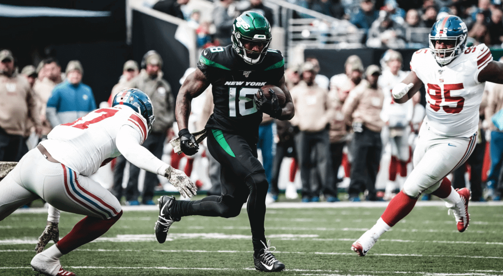
It was a tale of two cities yesterday — or maybe two teams from one city that both play in a different city that’s in a different state — as the Jets and Giants couldn’t have looked more different in their Futility Bowl matchup. The Giants looked ultra-traditional, wearing essentially the same road design they had 60 years ago, while the Jets wore their mono-black alternate superhero costumes. Quite a study in contrasts.
Also from that game: The Jets’ chain crew apparently has FiNOB on their pinnies:
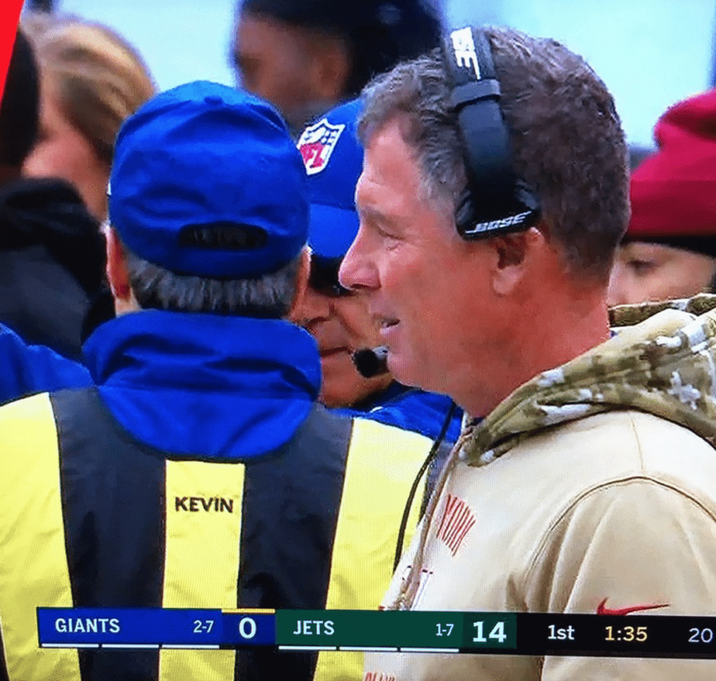
Technical difficulties on FOX make for an old school viewing experience for the Giants/Jets game, except for the black jerseys of course. #GiantsPride #Jets @UniWatch @PhilHecken pic.twitter.com/nyf3qeLKKq
— James Beattie (@JamesGBeattie) November 10, 2019
In other news from a relatively uni-uneventful NFL week:
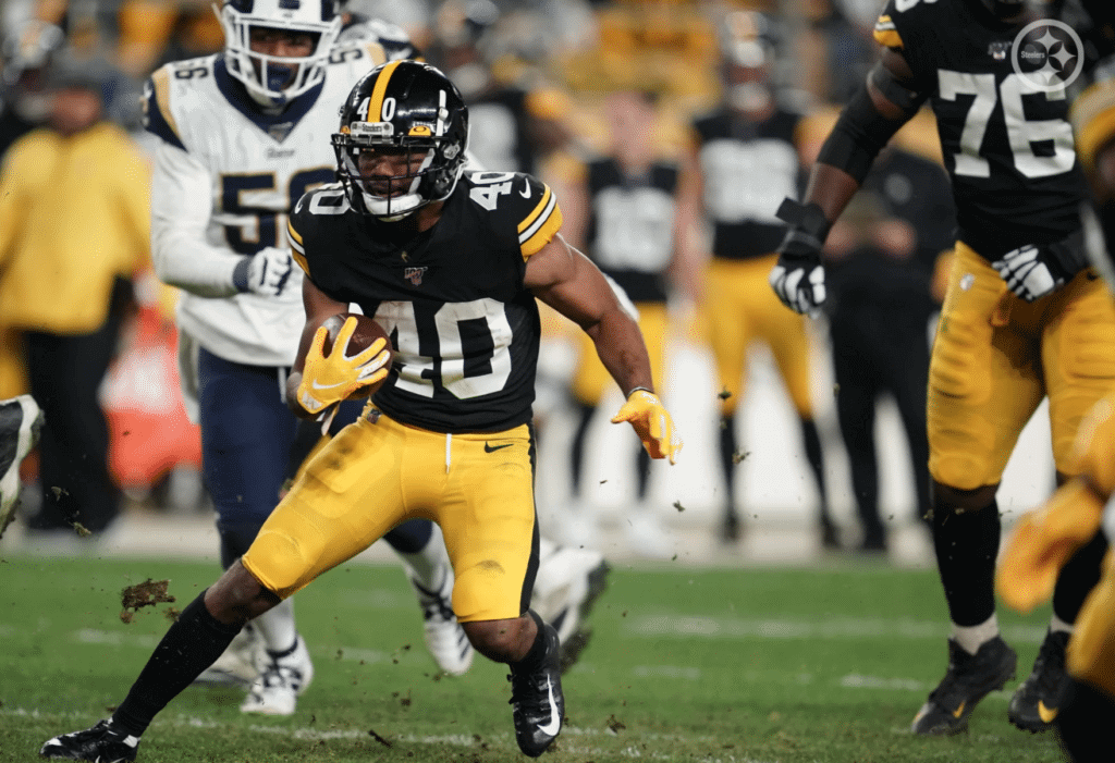
• The Steelers wore their block-numeral throwbacks:
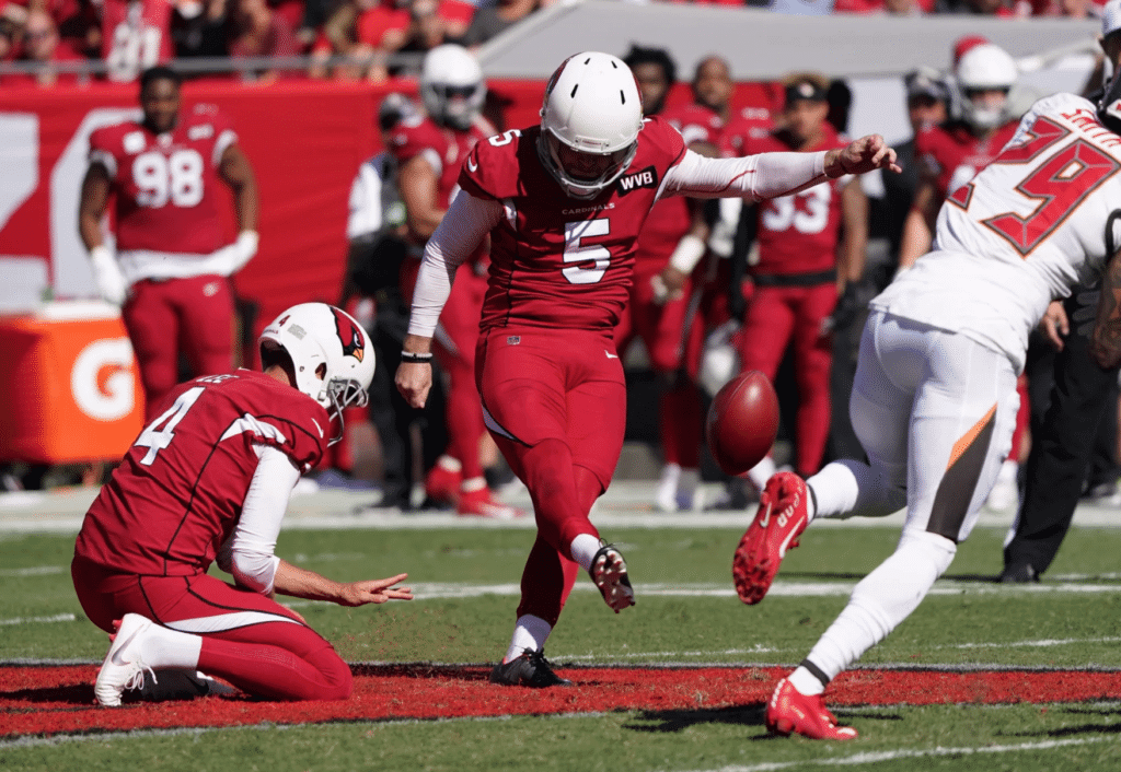
• The Cardinals went mono-red on the road in Tampa:

.@MarcSessler you have been heard! #Browns pic.twitter.com/GXNUE1kK8j
— Daryl Ruiter (@RuiterWrongFAN) November 10, 2019
• Rare sight in Dallas, as the Cowboys wore blue (with white pants) at home:
Football. pic.twitter.com/79tkPKICp1
— Ƒunhouse (@BackAftaThis) November 11, 2019
• Only one team wore white at home: the Bucs.
(My thanks to Jesse Agler, Charlie Eldred, Alan Kreit, Jerry Wolper, and our own Alex Hider for their contributions to this section.)
Three Uni-Notable Commemorations in One Weekend
By Jamie Rathjen
This weekend saw two siginificant milestone anniversaries in Germany as well as Remembrance Sunday in Commonwealth countries, meaning teams in soccer and beyond in Germany, England, Scotland, Australia, New Zealand, and Canada combined for a variety of uni-related tributes.
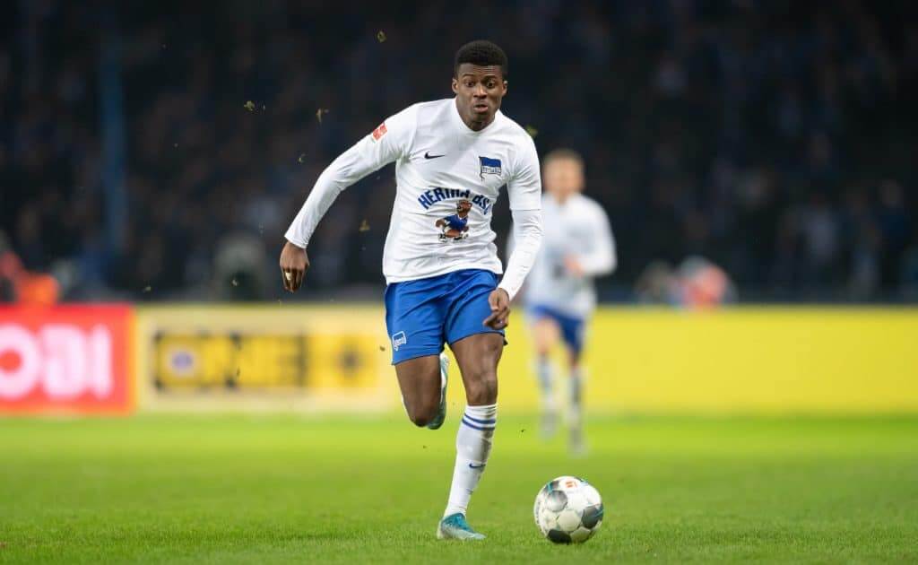
The 30th anniversary of the fall of the Berlin Wall was on Saturday. One of the city’s teams, Hertha BSC, built a replica of the wall in the middle of the pitch before their game before ceremonially taking it down. “Together against walls, together for Berlin” was written on the wall. Hertha also wore throwbacks (also pictured above) based on what they wore in the first game after the wall fell, a West German 2. Bundesliga game attended by fans from both east and west.
Also in Germany, 2. Bundesliga team Hannover 96 commemorated goalie Robert Enke, who committed suicide while with Hannover on Nov. 10, 2009, with warm-up shirts. “Robert Enke, not forgotten. Treat depression openly [or candidly],” the shirts say. Hannover also wore all-black, but whether that was related or just because of a color clash was unclear. All teams in the country also held moments of silence, displaying a graphic that incorporates a convenient play on “Gedenkminute,” the word for a moment of silence.
Almost all high-level soccer teams in England and Scotland wore Remembrance Sunday poppies. As usual, the promotion was much more visually interesting in Scotland, so the following three items start there:
• Ross County and Greenock Morton wore armbands instead of patches.
• Celtic is the only high-level team that doesn’t wear poppies, and they once again did not do so. The smaller semi-professional teams in the Scottish Championship, Alloa Athletic and Arbroath, also didn’t wear poppies. All three teams did participate in the requisite ceremonies, however.
• For reasons that are unclear, Livingston routinely wears the two-petaled English poppy instead of the four-petaled Scottish poppy, and did so again this year.
• English League One team Tranmere Rovers bizarrely had someone dress up as a poppy.
• England’s women’s soccer team wore armbands, which the British national teams are required to do if they want to wear poppies as a sanctioned way around FIFA’s ban on national teams wearing political statements. Scotland’s women’s team also did so last week.
• Teams in Australia’s A-League wore yet another poppy patch. The patch for the league’s one New Zealand team, Wellington Phoenix, was a little different.
• Teams in rugby union’s English Premiership also wore armbands. Two of the Welsh teams in the multiple-country Pro14, Cardiff Blues and Ospreys, wore patches.
• At least one top-tier English field hockey club, East Grinstead, also joined in.
• Australia’s men’s Twenty20 cricket team wore sleeve poppies.
• All Canadian NHL teams wore poppy helmet decals, all in the same spot.
• Major junior teams wore similar decals to the NHL teams’. The WHL’s Edmonton Oil Kings wore an odd mix of poppies together with Star Wars Night alternates.
• There is also a purple version of the poppy recognizing animals.
(Thanks to Mark Coale and James Gilbert for their contributions to this section.)

For all photos in this section, click to enlarge
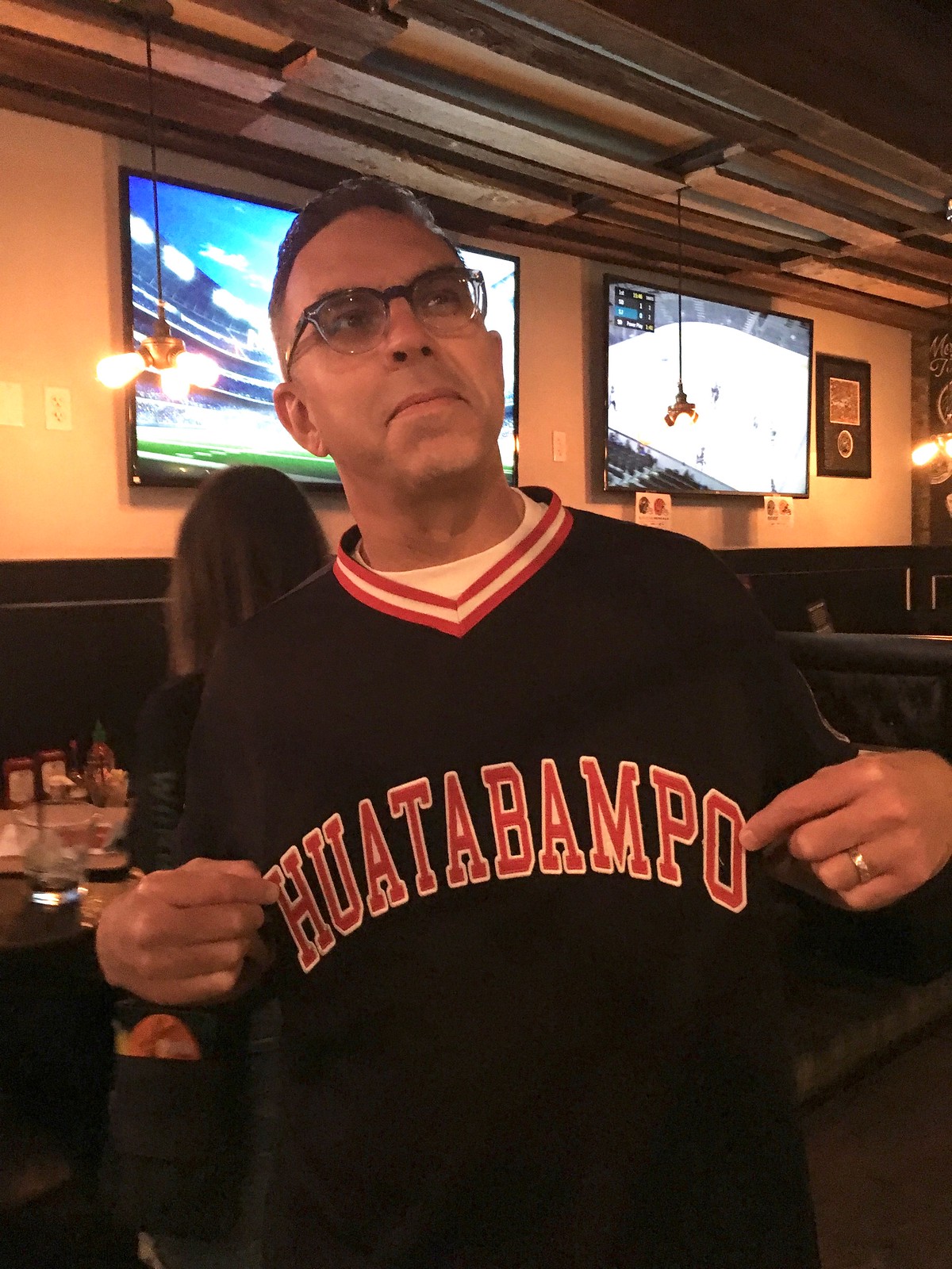
San Diego party report: Great time at last night’s Uni Watch gathering here in San Diego. Reader Drew McClintock took the logo we’d been using to promote the gathering and ordered some stickers, one of which looked pretty excellent on a bottle of Sriracha.
The lighting was terrible and I don’t remember everyone’s name, but here are pics of some of the folks who were in attendance:
• Nearly two years ago, DIY genius Wafflebored described how he made a spectacular jersey for reader Chuck Eldridge to wear in his hockey league. Chuck, who drove down from Orange County for the party, wore that jersey — along with two other Wafflebored jerseys. Unfortunately, I only photographed two of them:


• Here we have the great Russ Havens, who runs the excellent TicketStubCollection.com site. It was great to finally meet him after many years of admiring his work:


• This is longtime reader and Ticker contributor Matt Shevin. He’s a Maryland alum — hence the Terps jersey:


• My favorite apparel item at the party was this great brown/yellow plaid shirt worn by a really nice guy whose name I kept forgetting. Bruce, I think..? In any case, the shirt is perfect for the Padres’ brown revival:


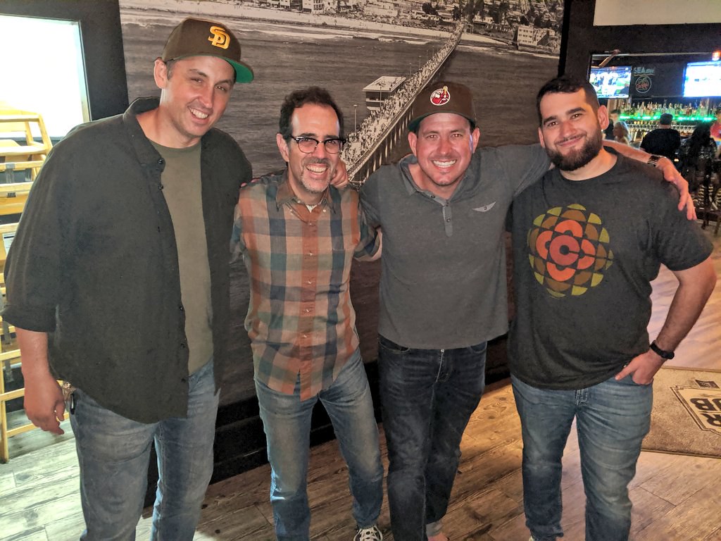


Thanks to everyone who came, and for all the incredibly nice things that so many of you said about Uni Watch. It means a lot, really.

Click to enlarge
Of course he sat in my row: On the plane ride to San Diego on Saturday, the guy sitting next to me was wearing a maroon cap with a Phillies-esque logo. I asked him about it and he said the “RF” stands for “Righteous Felon,” which is a Philly-area beef jerky company.
Mmmmm, beef jerky and uniforms — two great tastes that taste great together.
Click to enlarge
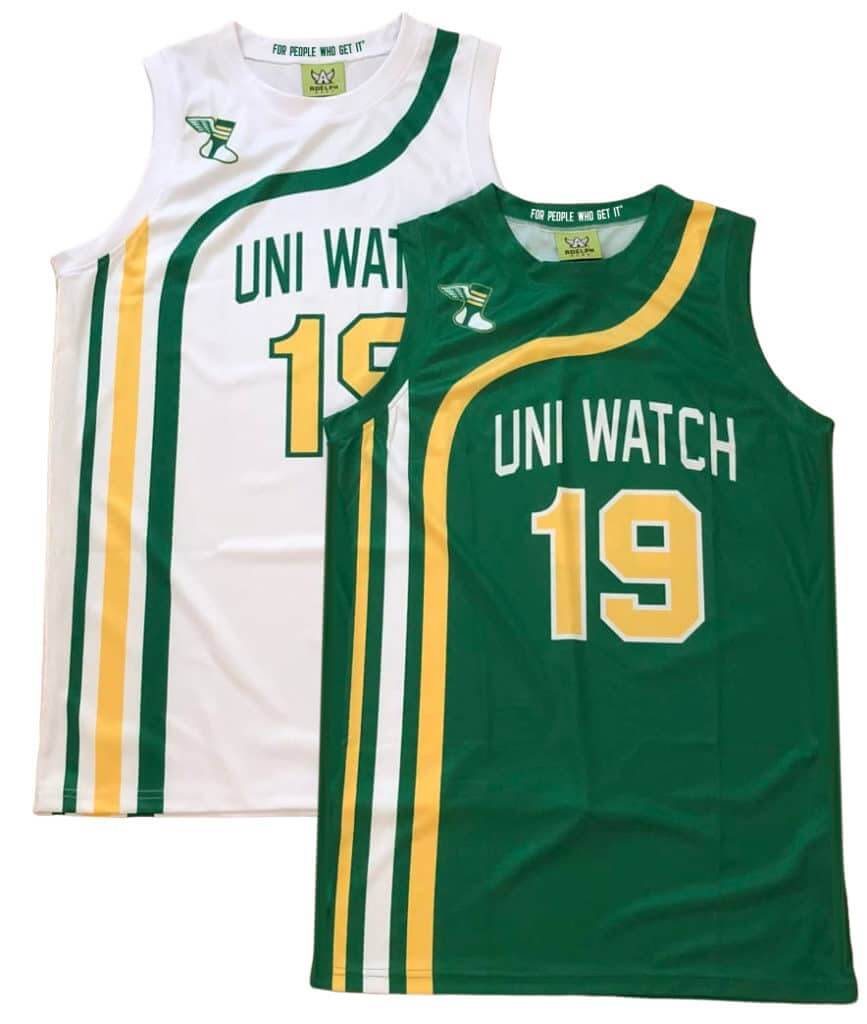
Uni Watch hoops gear reminder: In case you missed it on Sunday, we’re now taking pre-orders on Uni Watch basketball jerseys. You can choose your own number and NOB, and you don’t have to have the winged stirrup on the shoulder if you don’t want it there.
We also have matching shorts:
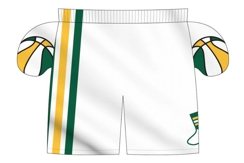
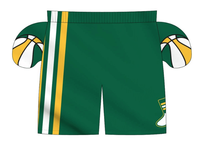
The ABA-style basketball-themed inner pockets are a nice touch, right? I can’t take credit for that detail, though — that was Adelph Wear honcho Nathan Haas’s idea. He’s my partner/collaborator on this project, just as he was with our recent cycling jerseys.
We’re taking pre-orders on these through next Wednesday, Nov. 20, for Christmas delivery. It’s possible that we’ll offer these again in 2020, but for now it’s a holiday offering, so move fast if you want to get in on it! Full details here.
Bucs-redesign contest reminder: My latest Uni Watch design contest, conducted in conjunction with InsideHook, is to redesign the Tampa Bay Bucs. Full details here.

Gift Guide reminder: I’m currently working on my annual Uni Watch Holiday Gift Guide, which will be running on InsideHook. If you know of any interesting or unusual uni/logo-related items — or if you produce such an item yourself — please get in touch.
As usual, no need to tell me about the standard caps and jerseys that everyone already knows about. I’m looking for things a bit more unique. Can do? Thanks!
By Jamie Rathjen

Football News: Reader K.C. Kless noticed that Raiders captains were wearing two different captaincy patch designs on Thursday night. It looks like they mixed the ones from the team’s two white jerseys. … Timmy Donahue noticed several oddities with NBC’s graphics last night. … Multiple readers told us that the CFL’s Calgary Stampeders wore mono-red at home for the Western semifinal, which Wade Heidt says is “really something unexpected,” because the Stamps wear red pants on the road. … You can see uni tracking of the Canadian college conference finals from Wade in yesterday’s comments. … Military-themed alternates next week for Oklahoma State (from multiple readers). … Blaise D’Sylva‘s daily college helmet histories have switched over to the MAC, starting with Akron.

Hockey News: Every NHL team will wear, or has worn, Hockey Fights Cancer warm-up jerseys at some point this month. Here’s the Canucks’ version, for a better look than we’ve had before. The NHL also has a calendar so you can see when your team is wearing theirs (from Wade Heidt).

Basketball News: Bucks F Giannis Antetokounmpo airballed a free throw and proceeded to tear apart part of the front of his jersey (from @Zanerzas). … New uniforms for Illinois (from @tjg312), Wright State (from Negan Gains), and Lexington Catholic (Ky.) HS (from Josh Claywell). … At one point last night, the five Lakers on the court wore Nos. 0, 1, 2, 3, and 4 (from many readers).

Soccer News: Scotland revealed their new first kit yesterday. … Josh Hinton tells us that Manchester City and Liverpool avoided a socks clash by both wearing alternate socks, when only one team really needed to. … Josh also tells us that Spanish teams Alaves and Real Valladolid both wore blue and white stripes against one another. However, Valladolid wore white shorts and socks and Alaves blue, and both were solid-colored from the back, so it worked out. … You can see more on Josh’s Twitter feed. … Costa Rica played the USWNT last night, and their number font features seven with bar, which is much more common in people’s handwriting than typefaces (from Jakob Fox).

Grab Bag: The women’s team of Australian Football League club Gold Coast revealed a clash guernsey.
.
.
It’s been so long since the Steelers have worn the block numbers that my first thought on seeing the picture was that they looked like Iowa.
Yeah, I think it’s weird that you would ever change your number font versus what it was in the prime of your team history. Clearly the ’70s were the pinnacle of existence for the Steelers, so why change the font from then? Same for the Cowboys, they had a unique font in their glory ’70s too.
I agree on the Steelers. I hated when they switched out the classic block numbers for the racing font style. As for the Cowboys; I believe they changed the style of the blue jerseys to break the jynx. They lost quite a bit back in the 70’s when they wore the blue. Not only did the font change, but made them more of a navy blue and opposed to the original lighter blue.
That mus be a new logo for Righteous Felon, as the beef jerky on our shelf has a block letter logo.
I really like the philly style logo!
I don’t think it’s their official logo or anything like that — just a fun thing they did for a cap.
Also, that’s Adam Ferrone ‘Rone’ in the pic—he’s a world champion battle rapper from Philly
link
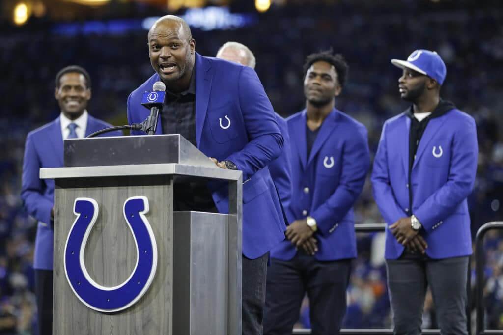
Dwight Freeney was the only inductee into the Colts Ring of Honor yesterday. Those standing behind him in Colts blazers are previous inductees.
Thanks. Fixed.
In that USWNT item in the ticker, nothing says US Soccer like being sponsored by a German Car Company. “US Soccer presented by Volkswagen”.
The Browns didn’t bring back striped end zones as much as they changed from horizontal to vertical stripes.
I parked next to the coast guard station which is very close to the stadium, and noticed the sailors have Kubota tractors that they added the Browns’ stripe pattern to. They also had Cleveland sports themed logos on their hoodies as part of their unit insignia.
Your comment about being in sunny San Diego watching a game in snowy Green Bay brings up how I’ve always enjoyed watching games in sunny San Diego, LA, Miami, Oakland, etc while inside my home in snowy Minnesota. It’s always been one small way for me to get somewhere warm and sunny during the long winter.
Like those Cowboys white pants.
Jets black uniforms doesn’t have to be that bad. Wear the green pants with them, or diff color socks. Something, not just all black..
I’m hoping we’ve reached peak-poppy in the sports world. Like a lot of things that are started with good intentions it has gone too far.
This piece highlights how absurd and over-the-top some of the Premier League displays are and points out how it has become a glorification of the military and a recruiting tool – link
On Hockey Night in Canada Don Cherry harshly criticized immigrants because he doesn’t see them wearing poppies. The NHL issued a statement condemning what Cherry said the rest of the hockey world seems to be silent – link
The Independent piece is depressingly reminiscent of what Paul’s written about the intertwining of American sports and the military.
The raiders captain patches looked like that because Derek Carr has been a captain for 5 years thus why everything was black, they only had looked like that because of the color rush / throwback jersey they wore that night , normally his patch would’ve had a gold C
A few random thoughts:
I definitely prefer the Steelers’ regular number font to the block numbers. That more rounded style is instantly recognizable as Steelers, and putting them in block numbers almost has the effect of looking like a cheap knockoff.
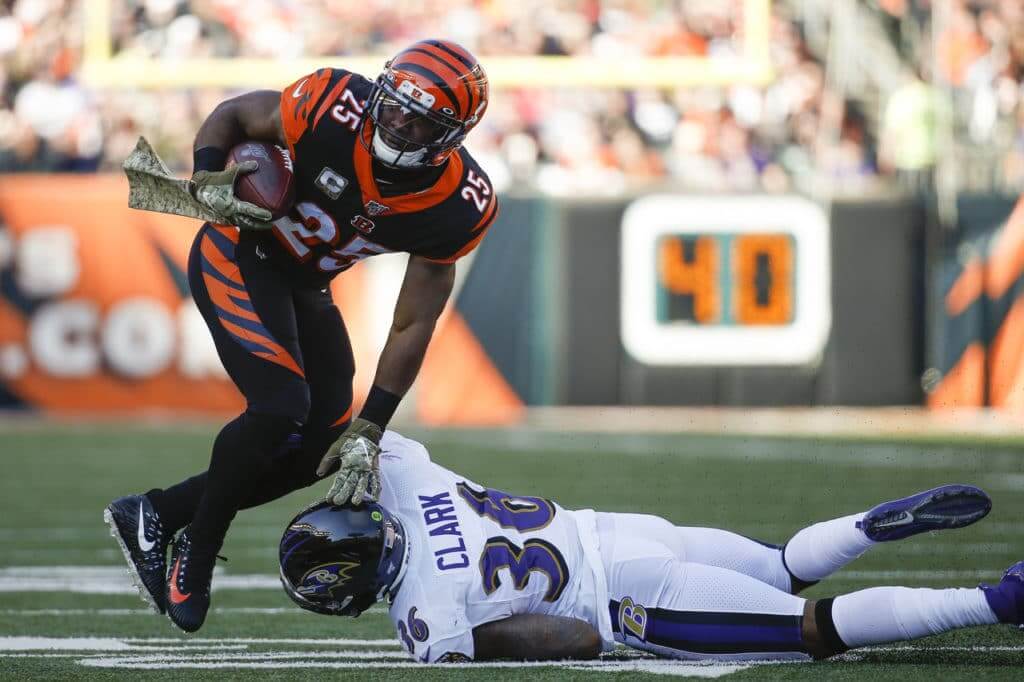
I’m generally on-board with disliking mono-color NFL unis, but the Bengals have so much orange throughout that uniform, I think it breaks up the mono-black look enough to be acceptable.
…and here’s hoping someone asked Chris Creamer why his website seemingly randomly excludes certain NHL logos (e.g., the Sharks’ 3rd jersey shoulder logo and several outdoor game logos).
Growing up with the Steelers in block numbers, I almost have the opposite reaction. I still think of them in the block font first. I just don’t see Jack Lambert in Futura.
That’s weird because to me, having actual memories of Bradshaw, Mean Joe and the rest, I think the silly font they wear now looks like a knock off. They looked normal to me last night.
I agree with you. The rounded numerals just don’t look correct.
I’m guessing age is probably the biggest factor in our differences here. I’m young enough that the Steelers have been wearing round numbers for as long as I’ve been following them.
As someone who lived in Chicagoland for 31 years, then moved to New Orleans… whenever I watch a football game in the snow for a protracted period of time… I immediately assume it is also snowing outside.
Then I go outside, and of course it is not.
It is a short but surreal experience. Sort of like those optical tricks of staring at a reversed-color image for a minute or two, then having it flip off. Your eyes then see the normal colors as a trick of the brain.
This happens a lot.
If the recent MLB uni reveals are what we can expect from the swoosh, I say not bad. And if it’s a simple de-stitcher from the gift shop to remedy a blemish, that’s cool too.
These new uniforms have nothing to do with Nike. They were in the works well before Nike came on board.
Have you gotten any feel for how Nike will approach MLB uniforms going forward? They produce some wonderful throwbacks and faux backs in college, but I don’t pay too much attention. I just hope we don’t get things like the Browns or Bucs in the majors.
Thanks again for the get together last night….wasn’t able to stay that long but enjoyed meeting you and other uni-watchers!!!
My takeaway from the Packers/Panthers game was a reminder of just how annoyingly tiny the TV numbers are on the Panthers jerseys.
Those can’t actually be of any practical use, can they? And how many other teams suffer from this affliction?
Has there ever been a team more hyped for being mediocre than Dallas? They are supposed to be the most valuable franchise in the NFL but they can’t figure out how to match the shades of blue or silver or metallic blue or silver green-blue or whatever the team colors are supposed to be. Why is this so difficult?
Meanwhile, their blue jersey curse lives on. They’ve tried to act like it doesn’t exist but when you make a rare decision to wear blue at home and lose, you build on the blue jinx. As I recall, they lost to the Jets earlier this season in blue. Yes, the Jets.
The ‘boys mismatched blues and other quirks are a feature, not a bug. I always point folks to one of my favorite PL pieces ever, link, which takes a deep dive into all that crap. Still as valid today as it was when Paul wrote it over a decade ago.
Thanks for the link. I enjoyed reading this old Dallas assessment by Paul. He seems to agree with what I just wrote about the mismatched colors, the blue jersey curse and the general over hyping and high dis-likability of the Cowboys. Since this article was written, they’ve worn white pants and a mono-white set which are worse looks in my opinion. I have to agree that their helmet looks very good when viewed by itself and without the mismatched elements of the rest of their uniform. But no team has created a greater jersey jinx than the Dallas blues, and each new loss in blue just adds to the “see I told you so.”
As a lifelong diehard Cowboy fan, I don’t see why they keep trying to wear blue at home. It doesn’t work. I love their home whites, and be livid it or not the royal and navy blues are heavenly to me. That look reminds me of the 90s. I wish they would stop with the blue at home
If Roy of Roy and Angela sees this, can you tell me what that SD hat is that you’re wearing? It looks awesome!
It was certainly a sweet hat. If memory serves me correctly, he got it from a hat store in the mall. They are tried and true readers of the site, so I’m guessing they will certainly read the entry from today.
Thanks Drew!
Hey, Roy here. I bought it at a sports store in the shopping mall about a year and a half ago. It’s a 5950 and I don’t know that the hat has any specific name or model. I just got it because I liked the color and logo combination, and it’s become my “go-to” hat. Thanks for the compliment!
Brown & gray go really well together IMO. I was hopeful that there would be a road gray with brown accents but I love the tan pinstripe road unis they just revealed.
Roy here, thanks for the compliment! I bought it at a shopping mall sports store almost two years ago. I like the color combination and the logo, and it’s become my “go-to” hat. It’s a New Era 5950 but I don’t know what its name is. I don’t see it listed anywhere so it must be a discontinued model.
I really like how gray and brown work together. I was hoping for a gray road uniform with brown accents but I love the tan pinstripes they unveiled this weekend.
I was trying to reply from work and the firewall wouldn’t let the comment load after I submitted. Sorry for the double post!
Thanks for responding!
“The 30th anniversary of the fall of the Berlin Wall was on Saturday. One of the city’s teams, Hertha BSC, built a replica of the wall in the middle of the pitch before their game before ceremonially taking it down.”
– I really, really hope they played “Another Brick in the Wall” by Pink Floyd as they tore it down.
It looks like true Padres fans have always maintained loyalty to the original brown and gold color scheme. Can’t wait to see the Padres back in those colors again and if we could see the return of the swinging friar, then all would be perfect in Padreland!
There’s a couple things about the Uni Watch b-ball Jersey that seem slightly off. The front name and numbers are off-set to the right by the stripes, but it’s so slight that it almost seems like a mistake. A more deliberate shift would make it obvious, but this looks almost like a sewing error from the factory. The logo in place of the maker’s mark feels VERY contradictory because of how much those have been railed against…yes, I know it’s optional to remove, I’m just so surprised it’s even being offered. Doesn’t it further promote that it’s okay for manufactures to do it?
The shorts are brilliant.
The logo in place of the maker’s mark feels VERY contradictory because of how much those have been railed against…yes, I know it’s optional to remove, I’m just so surprised it’s even being offered. Doesn’t it further promote that it’s okay for manufactures to do it?
I honestly don’t understand your point. My argument all along has been that uniforms should be about the team, not about the manufacturer or an advertiser. This is a Uni Watch team uniform, so we’re offering it with the Uni Watch logo. There’s nothing “contradictory” about that. On the contrary, it’s completely consistent with what I’ve always advocated.
We’re offering the option of not having it there because it’s not traditional for a hoops jersey to have a logo in that spot, so I realize that some people might prefer to skip it (which is fine). But there’s certainly nothing wrong with it, at least not from the perspective I’ve always stood for.
I think this sort of makes Paul’s point about maker’s marks. The fact that there is a spot on the uniform that immediately evokes a makers mark (at least to some), just because of the position, hammers home the point that an advertisement for the manufacturer is driving the design.
Your point is well-taken and I see why it is not contradictory given the philosophy behind it. The exact placement is what feels encouraging to manufacturers, aka normalizing the look of a logo in the spot Nike chooses to put their swoosh. If teams were using this space for, say, secondary logos, there would be zero question. But because of current jersey sets my mind immediately went to “maker’s mark” rather than “team/Uni-Watch logo.” There’s also some similarity between the Uni-Watch logo and the Cavaliers ad patch (wrong side, same relative placement.)
It’s a nice option to allow traditionalists to order without.
So sorry I missed out on the San Diego party, but it’s just a little too far to drive down from LA for the day. Here’s hoping that the Rams will invite to you to an unveiling for their new uni set and you can do a party here.
The Cardinals mono red is terrible, but I like it 100x more than their black alts, because at least it makes sense for Cardinals to wear red. Leave the mono black to the Ravens and Falcons.
Something seems slightly off with the Steelers block numbers. Is it the spacing? They look closer together than the originals. They should pair them with gray face masks for a better effect.
I think the numbers are a little thicker than the originals, which makes them a little less readable from the upper deck.
A shout-out to Russ Havens and his jersey of choice at the Uni Watch party. Representing The Dub down in San Diego, CA. Love it.
Don Cherry apparently fired from HNIC due to his poppy commercial on Coachs Corner this weekend.
As a churchgoing Catholic who attends Mass every Sunday, I must admit I’m appalled and greatly offended that the goofy-faced, barefooted Friar has re-emerged from the archives to find a prominent part of the Padres new uniforms. Really?
So now after all the years it took to rid the game of the goofy-faced Chief Wahoo, now MLB has found a new demographic to demean … religion.
Seriously, Mr. Commissioner?
The possibilities were limitless–there are thousands of images that could be more representative of San Diego and baseball for a sleeve patch and you had to drag this one out of the archives?
It is condescending, demeaning, religiously offensive, and flat-out tasteless, and being a “throwback” logo does not excuse your anti-Catholic religious bigotry any more than tradition excused Chief Wahoo.
The hypocrisy is monumental.
Under no circumstances is this even remotely acceptable.
No problem with the Fighting Irishman at Notre Dame?
Are you serious, or is this sarcastic overreaction to the “political correctness” of sports mascots?
I’m sorry you feel personally offended by the Swinging Friar logo. But there’s a pretty big difference between the cultural appropriation of Native American imagery — peoples who suffered a genocide at the hands of many of our ancestors — and Catholic imagery, an institution that has dominated world affairs for over a millennium (and was a perpetrator of part of that Native American genocide).
Also, unlike with redface, there isn’t a history of using goofy friars as a racist way to demean a certain group of people.
And for the millennium before that the Christians were fed to the lions for the amusement of the crowds at the Coloseum.
So tell me, is there a statute of limitations on atrocities visited upon humankind?
And since there apparently “isn’t a history of using goofy friars as a way to demean a certain group of people,” what better time to start than right now, right!
Damn the Catholics!
As a churchgoing Catholic who goes to Mass on Sundays (and any other day I can), I love the return of the swinging friar. I hope you’re just being sarcastic.
I also love the sublimated UW Brown Is Back jersey. It looks really light in Paul’s photos…which is a compliment, not a criticism.
In other news:
Good thing I don’t watch the NFL anymore or I’d be upset at yet another missed opportunity. A week after the Vikes didn’t throw back against their SB 4 opponents, the Chiefs, the Rams didn’t throw back against their SB 14 opponents, the Steelers. While I’m the one person who loves the Rams’ current mismatched look, if Pittsburgh goes to the trouble of throwing back, so should you.
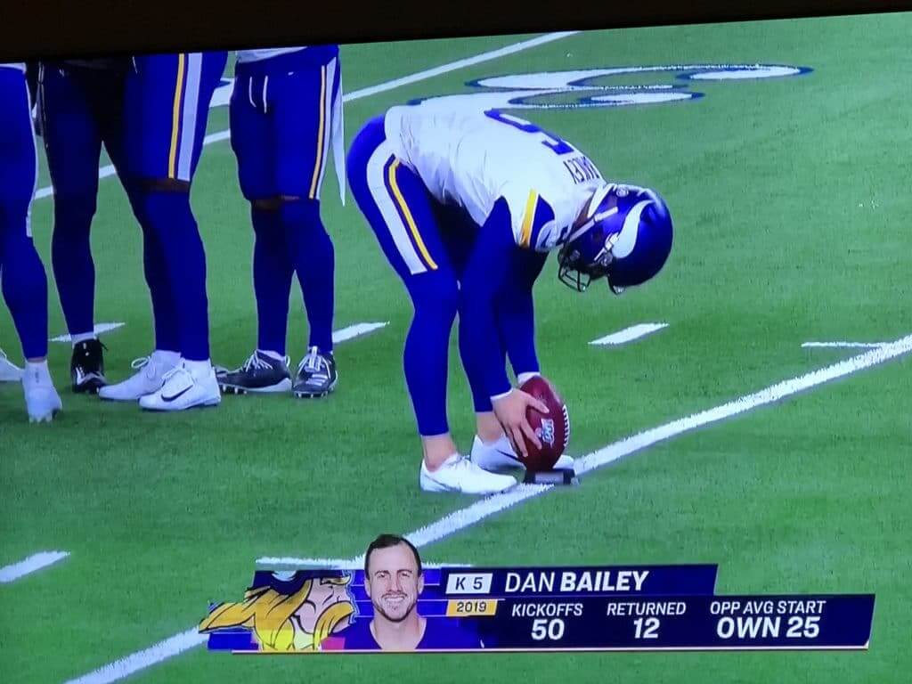
Speaking of the Vikes, seeing kicker Dan Bailey’s picture reminded me of when Bob Costas called a Washington/Cincinnati game. He said about Washington kicker Mark Moseley, “one leg (his kicking leg) looks like the Incredible Hulk’s…the other (his plant leg) looks like Mary Tyler Moore’s.” Both of Bailey’s legs looked like Mary’s in comparison. Just an observation.
The current Cardinals uniform is not good, but that all-red option is their best look.
I don’t care who the home team is, when the Jets and Giants play each other they should share the field graphics.
As a (lapsed) Catholic, I agree and think that the Detroit Lions should change their name and imagery to something less triggering. While we’re at it, change the name of the L.A. Coliseum.
So you’re saying religious bigotry is acceptable.
Interesting.
As a huge Steeler fan from the 70s and on, I obviously prefer the block font, which many recognize as the Sand-Knit font that was so prevalent in the NFL in the 60s through 80s. Last year’s Steeler throwbacks tried to use that font, but missed the mark. This year’s throwbacks look much closer to the original and I looked at about 90 pictures of it. The Packers, from WI the home of Sand-Knit, still use the authentic font as do the Raiders I believe. Those two teams have over the years added a lower serif on the TV number 2, which the Steelers correctly did not yesterday (and I applaud).
link
The only thing bugging me about the Steelers yesterday was the 6’s and 9’s…you can see in the photo up top, the closed portion looks too narrow
Finally, a word on the Jets yesterday…HIDEOUS
Did Nick Vannett’s nob font look different than everyone else’s for Steelers yesterday- appeared that way to me- but couldn’t find any pics
I guess “mono-turd” isn’t considered negative on your website, Paul? Or “too plain” despite having having many of the traditional aspects you seem to love about other teams (Packers, Chiefs).
1) Yes, I’m opposed to monochromatic NFL uniforms (not just brown). I wouldn’t want the Padres to wear mono-brown either.
Similarly, I’m fine with red as a team color, but we sometimes refer to mono-red as “blood clot.” That’s a commentary on the *format,* not on the color.
2) Referring to a uniform as “plain” (which I don’t recall saying in regards to the Browns, but I’ll take your word for it) is also not a commentary on the color.
Thanks for playing. We have some lovely parting gifts for you.