Photo by San Diego Padres; for all photos, click to enlarge
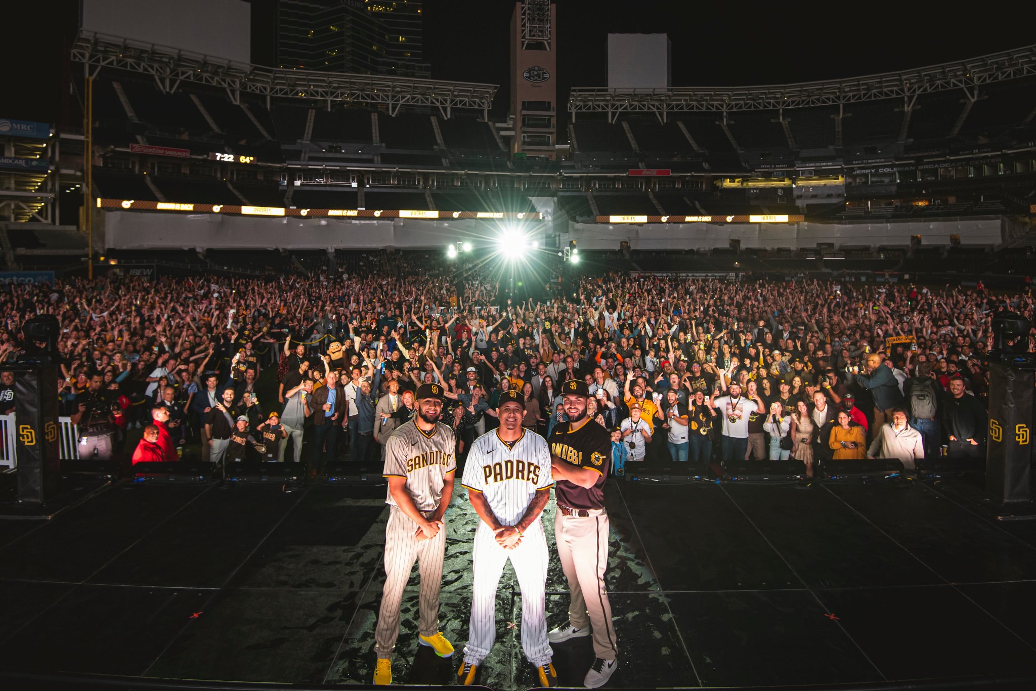
Paul here, making a rare Sunday appearance on the site. Greetings from San Diego, where I arrived yesterday afternoon and attended the Padres’ uniform unveiling last night. (If you look closely over Padres first baseman Eric Hosmer’s shoulder, you can see my vantage point for the event.)
As unveilings go, this was an interesting one. First, as you can see in the photo shown above, it took place at the ballpark, out on the field, which felt so much better and more appropriate than having it in some sterile conference center, which is how these things are usually handled.
Second, most unveilings have a significant air of mystery or suspense. But in this case, the main storyline — bringing back the brown — was already known well in advance. I don’t want to say that the actual design details were afterthoughts, because of course that’s not the case, but I’d say that the overall feel last night, even before the new look was revealed, was more celebratory than anticipatory, which is not how it works at most unveilings.
A few other notes to give you a sense of the scene:
• They had cocktails made with bourbon and pineapple juice (brown and gold, get it?). The “Brown Is Back” thing floating on top was made of edible sugar:

• There were brown napkins with a gold Swinging Friar logo:

• The Swinging Friar was also used for the VIP passes:
VIP pass. pic.twitter.com/Jwla7omWYp
— Paul Lukas (@UniWatch) November 10, 2019
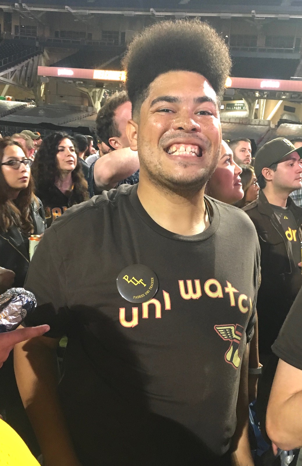
• The guy who runs the Padres Uni Tracker Twitter account (sorry, dude, I’ve already forgotten your name) was there, and he wore one of our Uni Watch brown shirts, which was very cool to see:
• Padres blogger Brady Phelps, who I’ve been communicating with for many years but had never met before in person, was a great ambassador all night long. At one point he introduced me to former Padres pitcher and Cy Young winner (and former Met!) Randy Jones, who was wearing his original 1973 warmup jacket! I asked if I could take a photo of him, and he smiled and said, “Why don’t you get in the photo with me, you asshole?” A real character. Brady took this shot:

As you can see, I wore a brown-ish shirt and a brown cap. It’s a little hard to see, but that’s my Uni Watch Press Pin on the side of the cap.
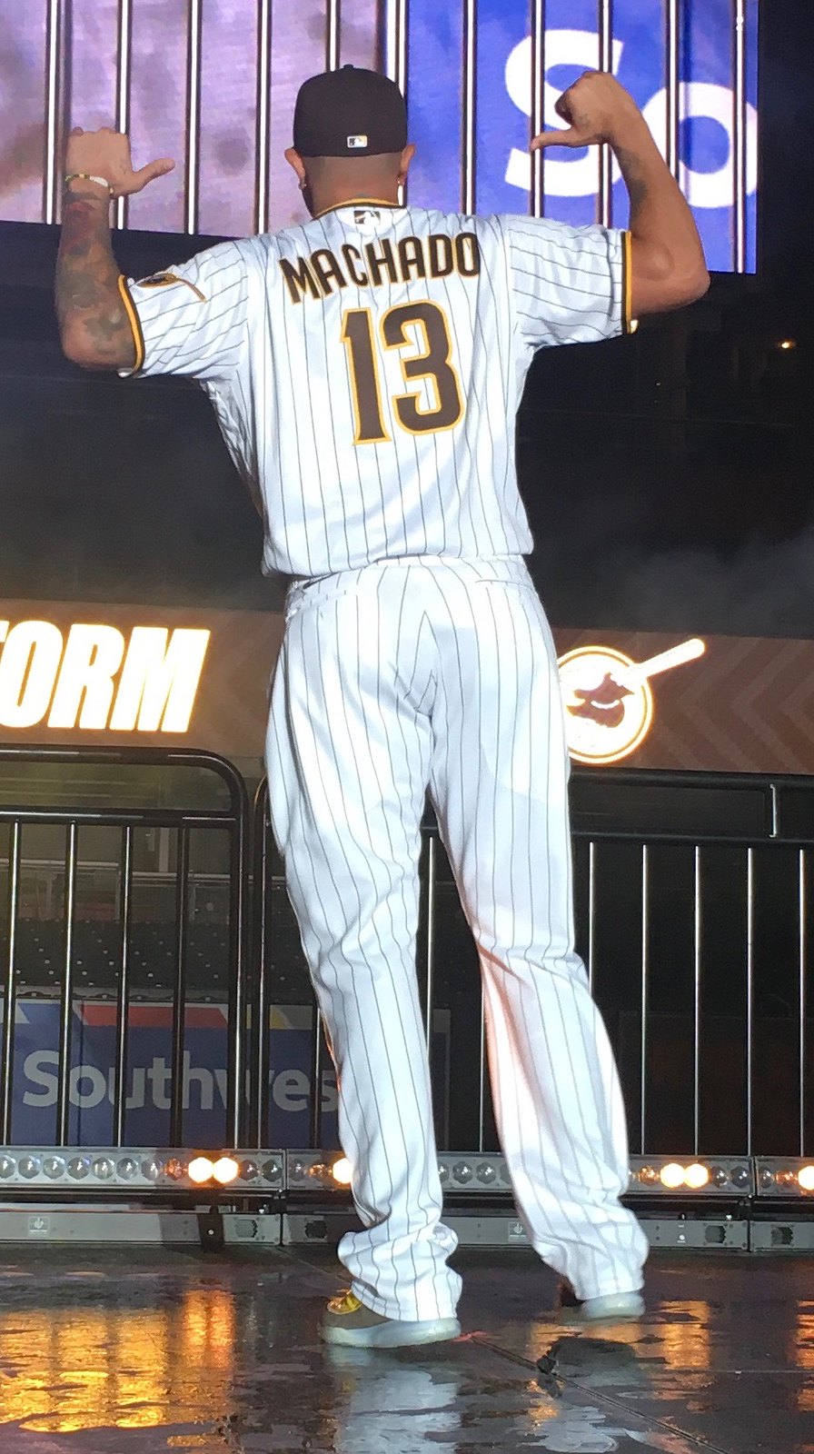
• They had a “brown carpet” where fans could have their photos taken with Padres players Eric Hosmer and Manny Machado. Here they are flanking Uni Watch reader Mike Ortman, who won the raffle to be my plus-one at the event (photo by Orlando Ramirez/San Diego Padres):
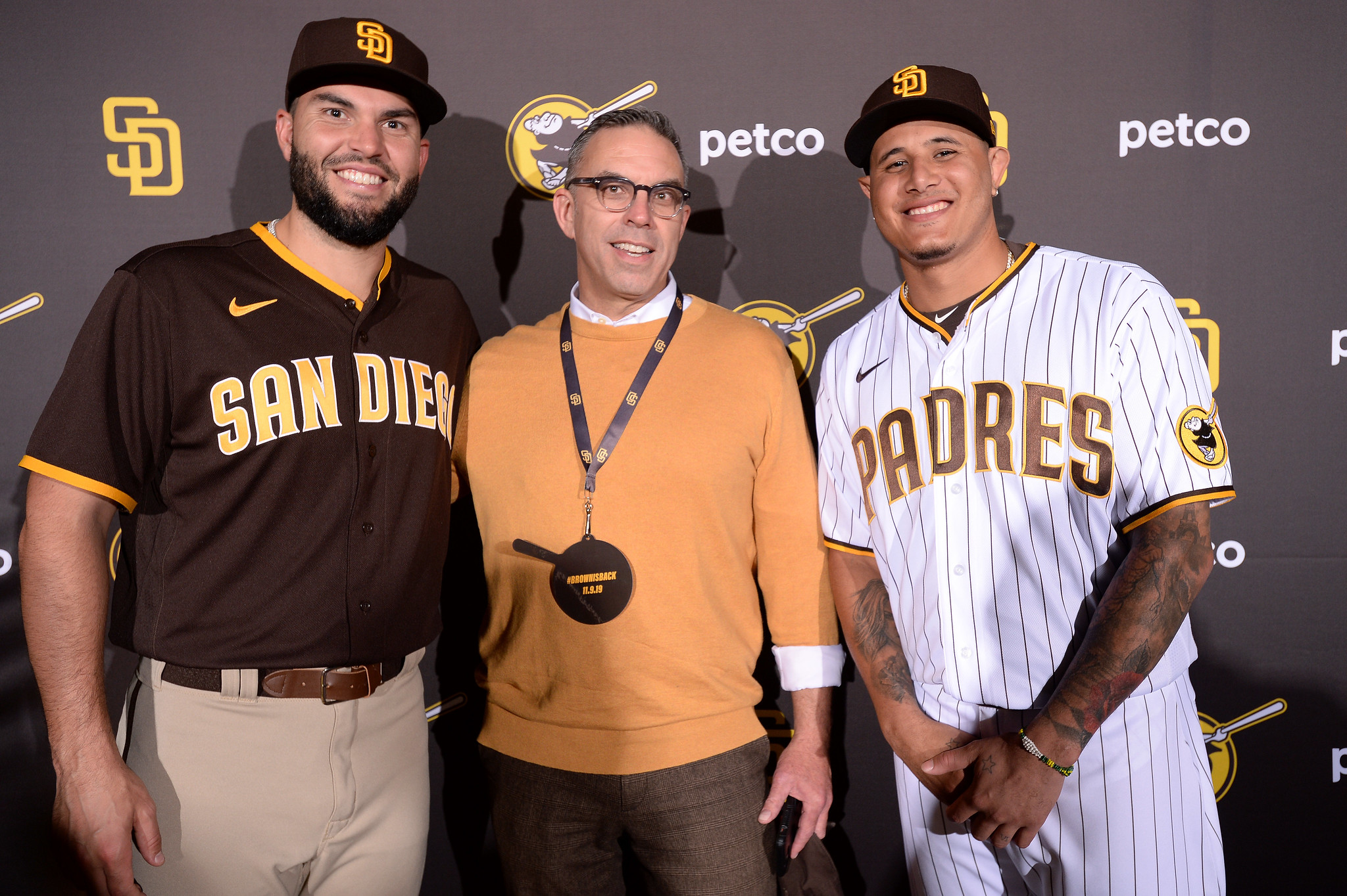
I really enjoyed meeting Mike and hanging out with him, and I’m pretty sure he had a good time as well.
As for the new uniforms, here’s all the info you need to know:
The Design Team
The new uniform set was created by the Padres’ in-house design staff — not by Nike, not by Majestic, not by any outside design firm. Some of the logo and typography work was outsourced to Brian Gundell, a Portland-based designer who created the team’s 50th-anniversary logo, which was worn last season as a sleeve patch. (He was there last night — very nice guy.)
The Primary Logo
The team’s interlocking “SD” logo has been tweaked ever so slightly. The new version had already been used for more than a week as the team’s social media avatar. Here’s a comparison:
Here is the difference between the old and new Padres avatar. (Dark one is the new one) pic.twitter.com/6a5p3qSQXe
— colecole (@COOK17) October 28, 2019
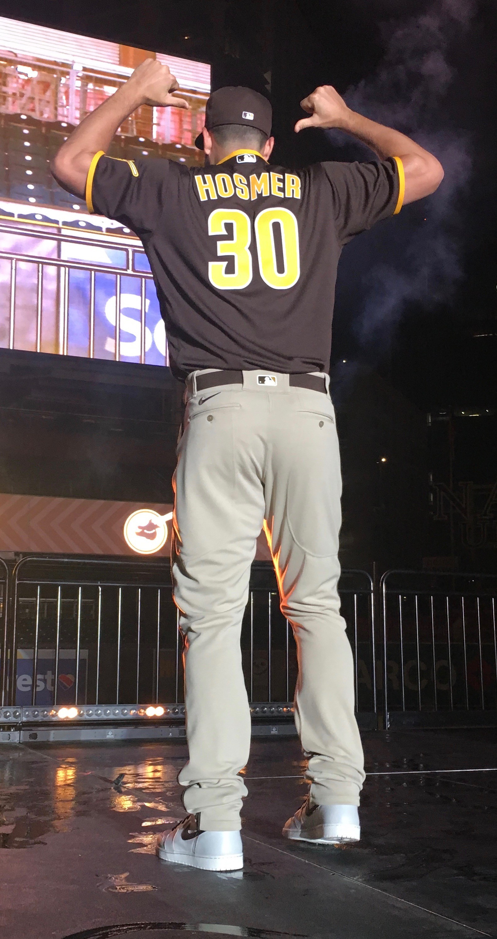
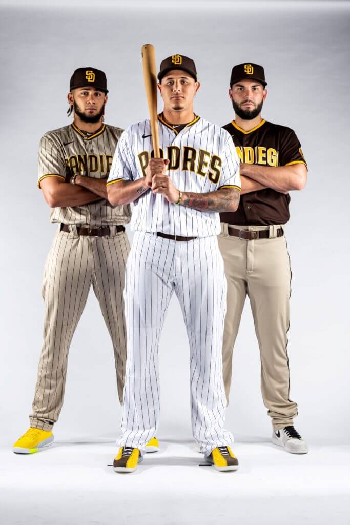
The Home Uniform
There is one home uniform: white with brown pinstripes; “Padres” arched across the chest in brown outlined by gold; gold trim on the collar and sleeve cuffs; a Swinging Friar sleeve patch (this same patch appears on all of the new jerseys); a brown belt, and a brown cap.
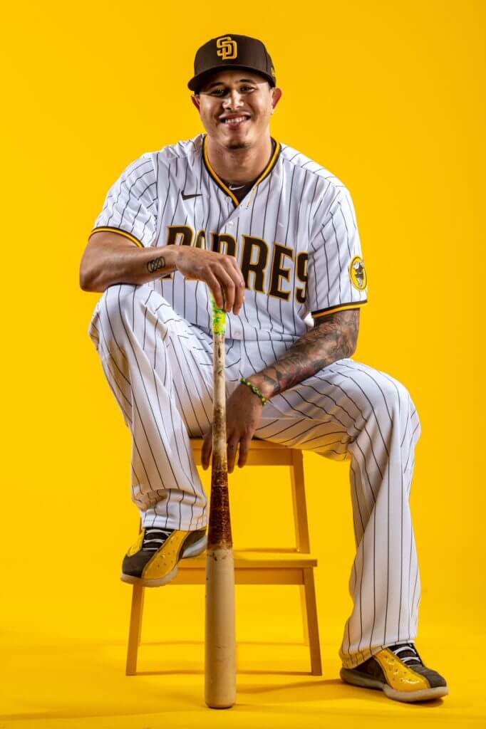
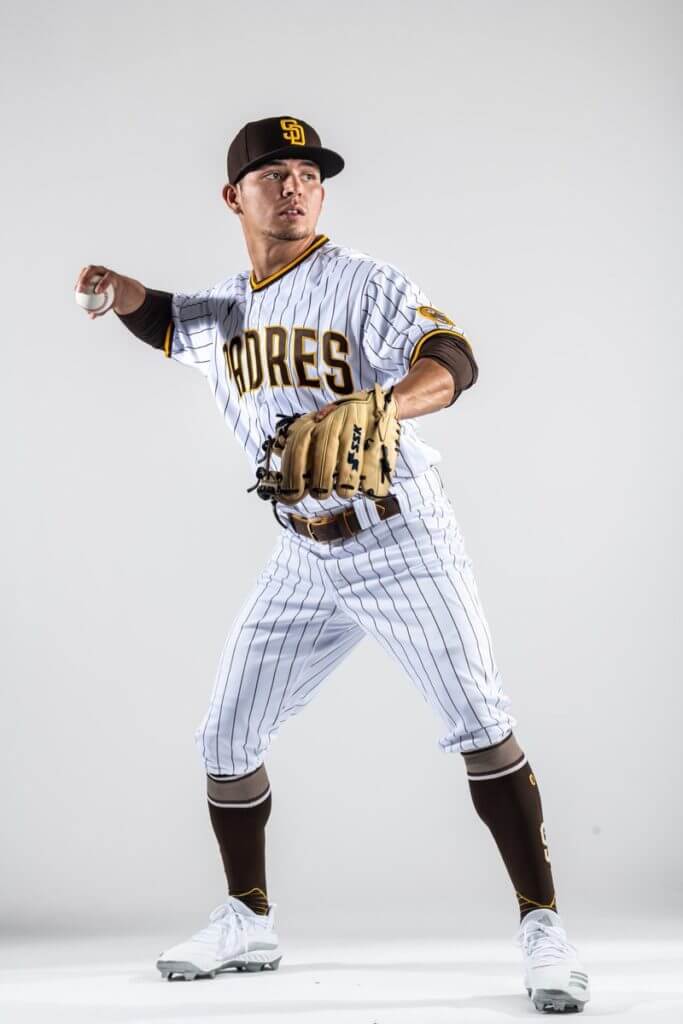
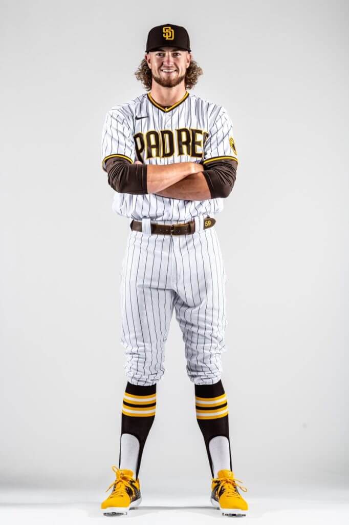
Aside from camouflage designs (more on those in a minute), there is no alternate home uniform.
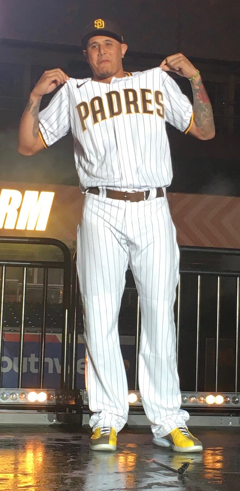
The Primary Road Uniform
The primary road look features a brown jersey with “San Diego” arched across the chest in gold; tan pants (the Padres are calling this color “sand,” but it’s a darker, more brown-based sand than the one the team previously used); a brown belt; and the same brown cap used with the home uniform.

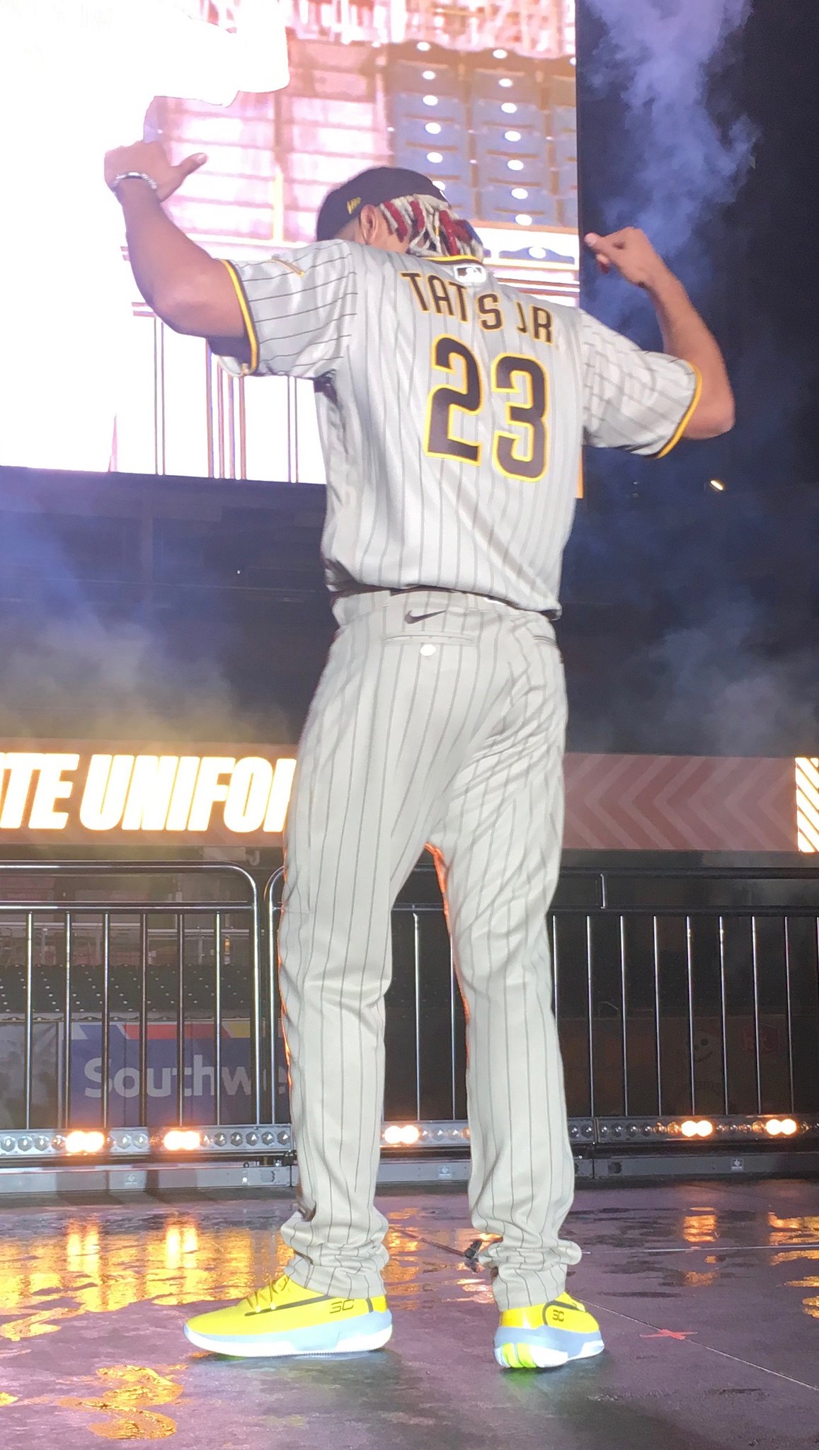
The Alternate Road Uniform
The alternate road uni is rendered in pinstriped tan/sand, with “San Diego” arched across the chest in brown. Once again, the same primary cap will be used.
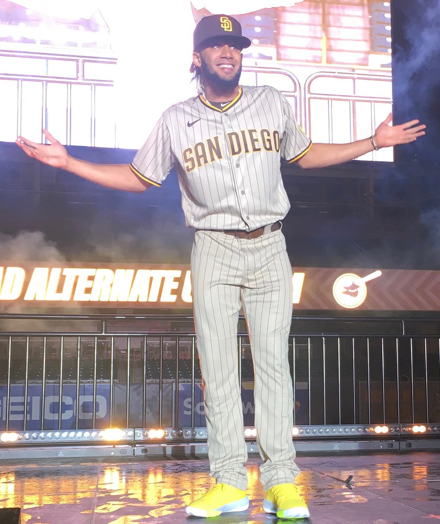
In those photos, which I took myself, the tan/sand looks a bit closer to grey than it actually appears a real life. You can get a better sense of the true color by looking at this promo shot (photo by San Diego Padres/Matt Thomas):
Interestingly, the Padres’ initial plan was to go with just the home pinstripes and the primary road uni with the brown jersey, with no road alternate. But fairly late in the process, MLB told them that they had to have some sort of lighter-colored road option, in case the home team is wearing a solid-colored alternate. So the pinstriped tan/sand design, which had been the runner-up choice to be the primary road uni, was taken off the back burner and designated as the alternate.
The Camouflage Alternates
There are two new camouflage alternate home uniforms that were not part of last night’s unveiling. These will be revealed at a later date.
The Sleeve Patch
All of the jerseys — including the camouflage designs that haven’t yet been released — include a Swinging Friar sleeve patch. When Gundell, the Portland designer, created the 50th-anniversary logo, he did some very minor touch-up work on the Friar, and that’s the version that’s being used for the new sleeve patch. Here’s a comparison — original Friar on the left, new Friar on the right (click to enlarge):

To see the differences, look at the toes, the smile, and the hair, among a few other subtle changes. The “Padres” script on the bat was removed because it mostly looked like an indistinct squiggle except in close-up views.
The Maker’s Mark
As you can see in the photos, the Nike logo appears on the upper-right chest of the jersey and above the left rear pocket on the pants. Up until now, it was not clear to me whether it would be embroidered (like the New Era logo on caps), a sewn patch, screened, or what. Having now seen it up close, I can report that it’s a small sewn-on patch:

In other words, it should be very seam-rippable. Just sayin’.
———
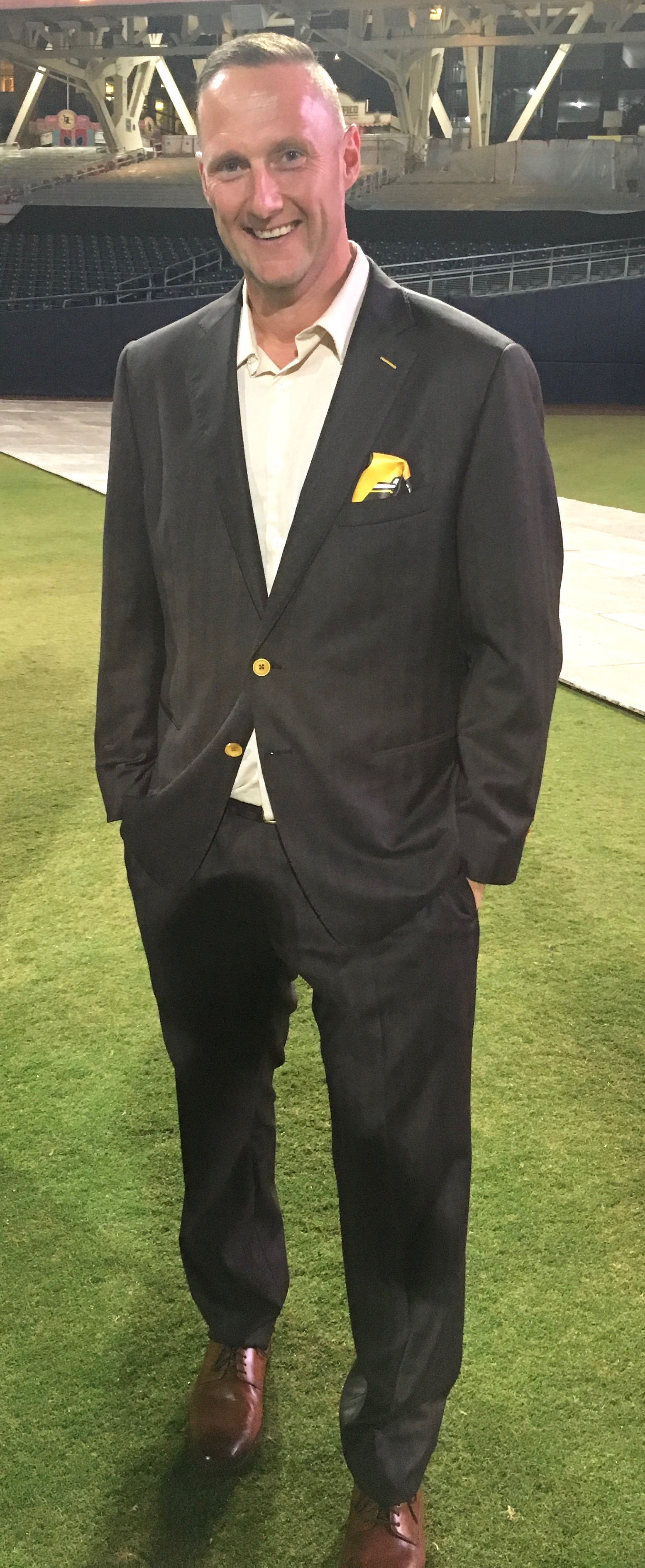
Those are the basics. Before I get to what I think about all of it, I want to bring in some perspective from Padres chief marketing officer Wayne Partello, who I spoke with by phone on Thursday afternoon (and who, as you can see at right, wore a brown suit with gold buttons and trim for last night’s festivities). Here are some excerpts from our conversation:
Uni Watch: What was your goal with this redesign?
Wayne Partello: We did brand research back in 2014, and one thing that was abundantly clear was that there was no clear direction for our brand. In fact, when we used the word “brand” back then, we were mocked for it.
The only consistency in our uniforms over the last 51 years has been our inconsistency. So we really needed to address that. Our fans want a uniform set so that when they turn on the TV, they know it’s the Padres. We heard that across the board.
The goal here is that this will be it going forward. We don’t want to be one of those franchises that are always changing their brand. We want to build on consistency.
UW: Why the return to brown?
WP: At the end of the day, this was about what the fans wanted, not what ownership liked. Ron [Fowler, the majority owner] has publicly said he’s not a fan of the color. But the fans should have a say, and we wanted to give them that say.
We did a lot of fan research. When we laid out all the color schemes, brown and gold was the winner. It wasn’t the majority choice, because there were so many options, but it got the most support.
And here’s the thing: People who liked blue and white were also pretty okay with brown and gold. But if you liked brown and gold, you hated everything else.
UW: Is it the same shade of brown you’ve used in the past?
WP: It’s darker. The brown had gotten a little soft over the years. We wanted something dark and strong.
UW: You’ve made some very, very subtle tweaks to your “SD” logo. What was the intention there?
WP: When you looked at our “SD” logos, they were all different. The serifs didn’t match, nothing lined up. It was crazy. So we wanted to clean all of that up.
UW: Why did you opt for pinstripes on the home uniform?
WP: It’s what the research showed us. Pinstriped outperformed non-pinstriped. It spoke of heritage, it spoke of tradition. It’s also a piece of our Padres uniform history — in some good eras of Padres baseball, we wore pinstripes.
UW: I’m surprised there isn’t a brown home alternate jersey. Is that something you might add after a year or two?
WP: One of the things we really wanted was a consistent look for our franchise, especially at the beginning of this new chapter. Could there be an alternate jersey at some point in the future? Absolutely. But for now we want to set the bar and establish that consistency.
UW: Is that also why there are no alternate caps, aside from the camouflage?
WP: Yes, exactly. We want to present a consistent look. It’s all about consistency.
UW: Why did you opt for a solid-colored road jersey?
WP: It’s unique. Every team in baseball wears grey on the road, so we tried sand. When we tested it, there wasn’t as much enthusiasm for plain sand over plain sand. When we added pinstripes to the sand, that did better. But sand with the brown jersey did the best.
UW: Why aren’t you presenting the new camouflage designs at the unveiling?
WP: I want to let the browns breathe and not distract from that excitement.
———
Okay, so that helps to set the stage. What do I think? I’ve been saying for years and years that they should go back to brown, so I’m happy about that. As for the individual uniforms, let’s go one at a time:
Home: I’m a little surprised they’ve gone with pinstripes, but I don’t mind them. What I do mind — or, more specifically, what I find disappointing — is the chest lettering. It feels too bland, too staid, too similar to the team’s recent characterless period. That’s apparently what Gundell was asked to create, so I don’t blame him (and I should add that the sans serif version of this lettering, which is being used for the NOBs, looks very good), but I think a more significant departure from the previous typography was needed. The great thing about the Padres’ bygone brown era was how fun and playful it felt. This chest insignia feels leaden by comparison. Is it an upgrade over what they’ve been wearing lately? Absolutely. Does it return the franchise to aesthetic respectability? For sure. But I don’t think it’s as good as it could have been. Grade: B+
Road Primary: Going with a solid-colored jersey as the primary road look isn’t unprecedented (the Cubs did it for most of the 1980s), but it’s unusual. It’s not a bad look, and the tan/sand pants are fine. But if you’re making a big point of bringing back a color — brown, in this case — why are you showcasing it more on the road than at home? I would have preferred to see a brown home alternate instead of a brown road jersey. Grade: B+
Road Alternate: Love it. I know some people think pinstripes don’t belong on a road uni, but I’ve never felt that way. I think it can work, and I think it works here. Frankly, I wish this was the primary. Grade: A
———
And there you have it. I want to thank everyone at the Padres for their help, especially Vanessa Dominguez and Wayne Partello. I also want to thank all the Uni Watch readers who contributed to my travel fund and made this trip possible. Hope I delivered on the faith you showed in me!
Click to enlarge
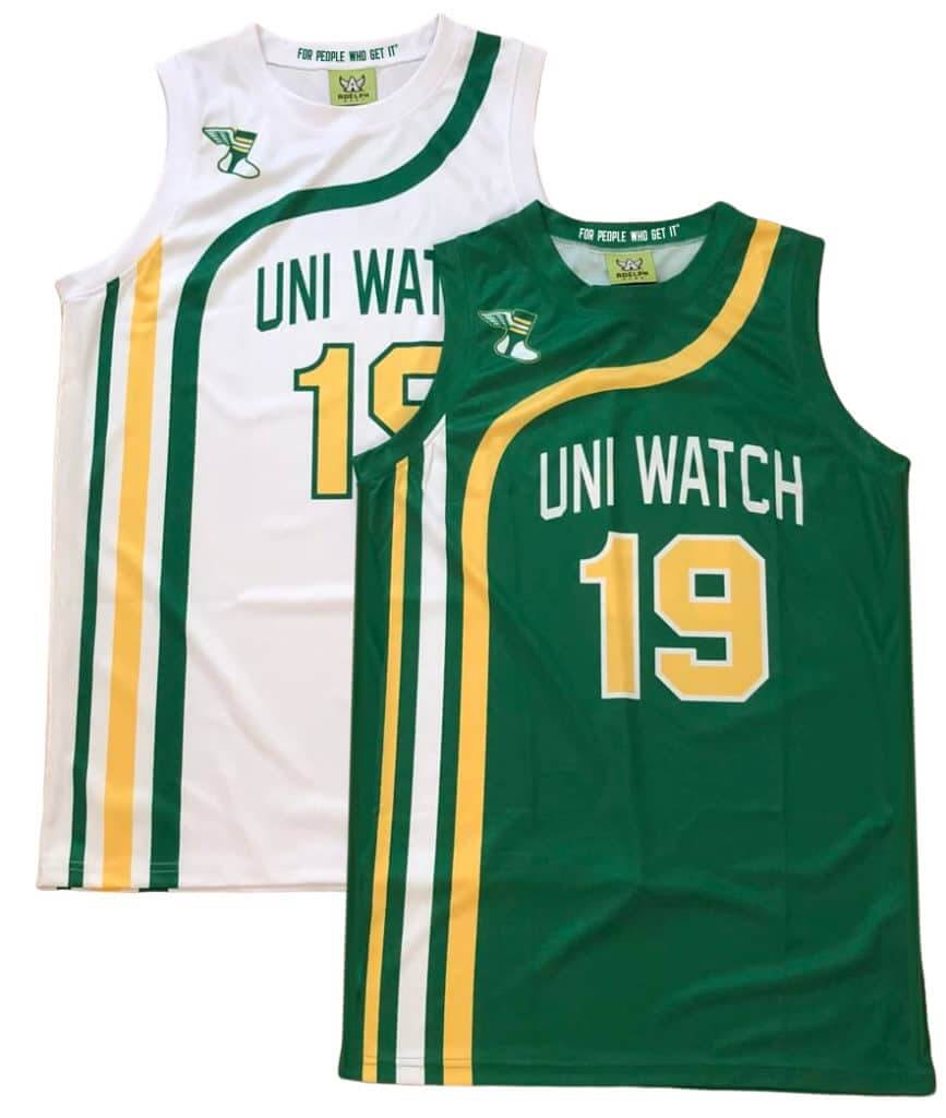
ITEM! Uni Watch hoops gear now available: A few weeks ago I showed you the Uni Watch basketball jersey prototypes shown above. I’m happy to announce that they’re now available for ordering. You can choose your own number and NOB, and you don’t have to have the winged stirrup on the shoulder if you don’t want it there.
Also! We now have matching shorts:
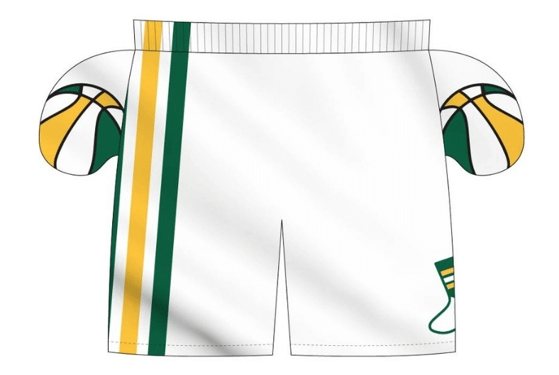
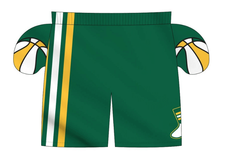
The ABA-style basketball-themed inner pockets are a nice touch, right? I can’t take credit for that detail, though — that was Adelph Wear honcho Nathan Haas’s idea. He’s my partner/collaborator on this project, just as he was with our recent cycling jerseys.
We’re taking pre-orders on these for the next 10 days, to ensure Christmas delivery. It’s possible that we’ll offer these again in 2020, but for now it’s a holiday offering, so move fast if you want to get in on it! Full details here.
Click to enlarge
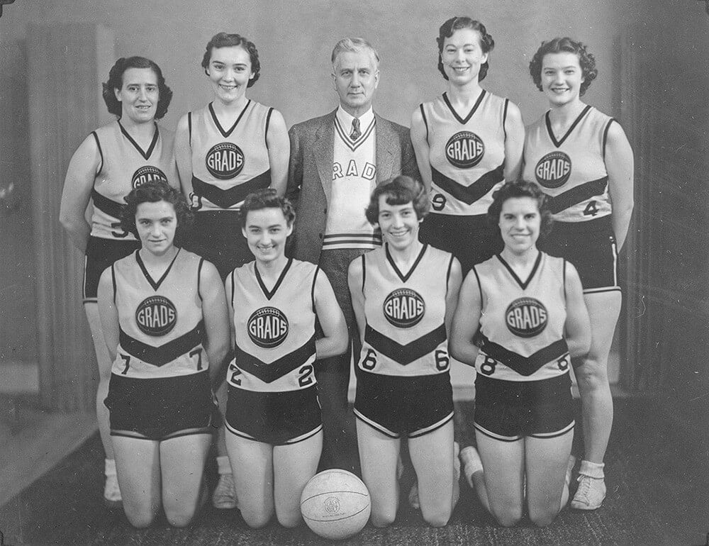
Long before the Raptors: Yesterday’s Google Doodle showed a bunch of women playing basketball in old-school uniforms. If you clicked on it, you learned that this team was the Edmonton Grads, one of the most successful teams in basketball history. And man, look at those uniforms — love the team name inside the old lace-up basketball shape, love the chevron shape on the lower part of the jersey, love the coach’s sweater, love the whole shebang!
The Grads were featured in the Google Doodle because yesterday was the anniversary of their 2017 induction into Canada’s Sports Hall of Fame. There’s additional info in this video clip:
(My thanks to Craig Brown for pointing this one out to me.)
Bucs-redesign contest reminder: My latest Uni Watch design contest, conducted in conjunction with InsideHook, is to redesign the Tampa Bay Bucs. Full details here.

Gift Guide reminder: I’m currently working on my annual Uni Watch Holiday Gift Guide, which will be running on InsideHook. If you know of any interesting or unusual uni/logo-related items — or if you produce such an item yourself — please get in touch.
As usual, no need to tell me about the standard caps and jerseys that everyone already knows about. I’m looking for things a bit more unique. Can do? Thanks!
Sorry, no Ticker today, as Phil had yesterday off and I was busy with San Diego stuff. Thanks for understanding. See you later today at the Uni Watch Party at Wonderland Ocean Pub, where we’ll get started at 4pm! — Paul
Saying a team is required to have a light-colored road uniform in case the home team is wearing a color alternate seems like strange reasoning considering there are countless examples of both teams wearing that kind of alternate. If there’s any good reason for insisting on it it might be so that the Padres wouldn’t be out of place at a AL-hosted All-Star Game. In any event the road “sands” might be my favorite of these three uniforms to be honest. Not enough road pinstripes anymore!
Perhaps going forward, MLB will take steps to reduce those occasions. As in, home team chooses, visiting team must wear something contrasting.
I really look forward to watching the Padres wearing those uniforms which finishing last in the NL West for the next 15 years.
I am at work right now. I actually laughed out loud at this.
As a long time Padres fan. It really hits home;)
They kind of are on the uptick with Tatis, jr. and some pretty darned good pitching. I wouldn’t count on them being in the cellar much.
Yes, the Padres stole last place from the also traditionally horrible Rockies on the last day of the season this year. But both these teams now at least own their very own MLB color. No other teams have brown or purple as a team color. If you see a game on with team wearing brown or purple, you know immediately who it is. Oakland also owns green, but every other team is red, blue or black to some extent.
Plus, the only real contrast with dark brown would seem to be black (Pirates, D’backs, Marlins, Rockies, Giants, a couple of AL teams). I guess that’s a lot of potential clashes but this is also a reason teams should stick a primary home and road. The road doesn’t even have to be gray.
I guess it might be worth caring about that just from an aesthetics standpoint (which I suppose is why we’re all here lol) but there have been examples of both teams wearing the same color jersey in regular season MLB games and it was fine. No reason why that should be a problem from a gameplay point of view in baseball. It happens all the time in Spring Training.
It doesn’t just happen in the regular season or spring training. The 2016 World Series had the Cubs in royal blue jerseys against the Indians in navy blue jerseys.
And even more recently, didnt the Nats ditch the dry cleaner throughout their entire wild card to Game 7 World Series run playing exclusively in their navy blue Nationals jersey.
Three of those teams being division rivals to the Padres (and thus playing 19 games against them (as opposed to six or seven). That also may have played into it.
Dark navy blue will also be low-contrast against the new Padres road primaries. I’m pleased to hear that MLB demanded the Padres have an option to contrast with other dark-jerseyed teams; now let’s see if MLB acts on the implicit promise to enforce more uniform contrast during the regular season.
It sounds and looks like the Padres did everything right. It’s like the are genuinely celebrating a return to an unique identity and it is a great way to motivate the fans, especially for a team that seems to be moving up into becoming a force in the NL West. I think the Padres should be commended on a marketing job well done and frankly, the uniforms just look awesome. I am a lifelong Mets and Blue Jays fan, but I am going to be ordering a Padres cap.
I might be in the minority but I hate the road pinstripes I would’ve liked to see what the all tan would’ve looked like without pinstripes
I’m with you on the road pinstripes.
I’m not a fan of the road pins either and would have loved a yellow alt. They should have thrown back to 1978 and called it a day.
Agreed, I think there’s room for a yellow alt in this set. It would look great with white pinstripe pants and brown hat. Reserved for home games. It could be a certain night of the week thing. The Giants only wear their orange alts on Friday nights for example.
The Padres are not a pinstripe team, period. I wouldn’t have gone there. But pins=more brown on each uniform, is I guess why they did it.
I don’t like three-stripe collar and sleeve trim combined with pins. Too busy.
The PADRES wordmark is pretty huge; better if it was the same size as the SAN DIEGO road wordmark.
I didn’t expect to be disappointed by these. Glad I’m not a Padres fan, anyway.
The Padres are not a pinstripe team, period. I wouldn’t have gone there. But pins=more brown on each uniform, is I guess why they did it.
Well, no. As Wayne Partello clearly stated, they did it because their fan research showed that their fans liked pinstripes. Which I guess means that they *are* a pinstripe team, or at least that their fans consider them to be one.
Moreover, as Anthony Gwynn states in the hype video, it was well known that his dad’s favorite uniform was the brown pinstripes of ’85-’91.
Even from beyond the grave, Tony Gwynn’s opinion carries a hell of a lot of weight in this town. As it damn well should.
Any reason why the unique “Bell” cap wasn’t retained ?
Also the road pants with Brown jersey should have had Gold pipping added to single Brown stripe. Looks a little dull.
I love the road pins. I like the set a little less overall after reading they’ve been relegated to alternate status.
I love ’em! Modern but classic, which is the right place to be. I appreciate the restraint of not having five different hats or two home alternates etc…. really well done SD.
The restraint is for now. I’m betting that within 3-5 years, there will be an alternate cap (yellow somewhere, maybe colored front panels) and a brown home alternate.
Thank God that the BROWN IS BACK!
Spot on Paul. Excellent review on the Padres. In the old days they always wore white at home and brown on the road, but I generally agree with your assessment. The pinstripe roads should be the road primary and the brown jersey should be a universal Friday or Sunday alt, home or road. Agree on the typography, but overall having them back in brown is great. The biggest disappointment is the elimination of the bell cap. Would have gone nice with the brown jersey. I know that New Era hates making them, though.
I can’t help but be a little disappointed that none of the players modeling the Padres uniform showed off any hosery, but such is the time we live in.
Didn’t you see the photos up there? One player was even wearing stirrups! Albeit not as Strasburgian as they could be.
So happy the brown is back and these uniforms are excellent.
I did watch the unveiling live on the Padres’ website. Were able to see Paul near the front on the stage in the filming of the event.
Happy to see the swinging friar joining Mr. Red & the Brewers ball in glove logo making a return to prominence. Seems odd that the Padres didn’t go with a brown alt home jersey or an alt cap (like one with a yellow bill or the friar in place of the SD) though. Still, the sets are an upgrade.
The Uni Watch basketball jerseys are beautiful.
OK, so College Football Uni Tracking is on a bye week. But hell yeah, Canadian College Football Uni Tracking is taking no days off!
Then there were 8 left in the playoffs. The conference finals took place on Saturday on the road to the Vanier Cup.
-Atlantic conference (AUS) – Loney Bowl:
Acadia Axemen went with their best home combo in Wolfville, NS. Red over white. Bishop’s Gaiters wore white over purple:
link
-Quebec conference (RSEQ) – Coupe Dunsmore:
In Quebec City, Laval Rouge et Or went with the gold/red/red combo. Visiting Montreal Carabins wore their blue/white/blue combo:
link
Of course, the winner get to hoist the funky Coupe Dunsmore, a trophy that looks like it belongs in a rumpus room with shag carpet:
link
-Ontario conference (OUA) – Yates Cup:
Western wore their primary home combo in London.
Silver/purple/purple. McMaster Marauders went white over white:
link
-Canada West – Hardy Cup:
In a light dusting of snow in Calgary, the visiting Saskatchewan Huskies went white over green. The Calgary Dinos went with the mono-red combo from head to toe. Staunch defensive battle in first half:
link
So a couple of upsets. The number 1 and 2 ranked teams in the country that were the participants in the last 2 Vanier Cups are out. Western and Laval packing up their lockers earlier than expected.
Great as always. And I learned who the Acadia Axemen are today.
I know the geography doesn’t line up, but now all I can think of are the Acadia Axemen felling trees and the Ottawa Rough Riders (link) riding the logs downriver to the mill.
Acadia is a really interesting story. Of the 27 schools that play U Sports football, Acadia has a really small student enrollment. Only about 3600 students. Wolfville, NS is a small place itself with only about 4200 residents, so it does grow quite a bit when students are there for school.
Despite the small size of the school, Acadia is the #4 ranked football team in the country and have not lost this year. They have 2 Vanier Cup wins in their history.
Go Axemen! Great write-up as always, and I enjoyed the bonus info on Wolfville. Takes me back to my years at Acadia…
Great to have the brown back. Not a fan of the pinstripes on either. Machado’s pajama pants are ridiculous. The 2 pictures of high socks, I don’t understand why they don’t match. I love the one with the yellow stripes. I just assumed that the brown jersey could be worn away or home, but I guess not.
Went on the Red Sox “team shop” website today and found most jerseys at least $30 off. Checked a couple of other sites and found the same discounts. I wonder if Fanatic is trying to blow out the non-Nike merchandise. Does anybody know if this discount has been done in previous years or is this something new?
I remember Majestic had offered jerseys for 50% off in the off-season before the FlexBase jersey was first introduced. I’m hoping for a similar sale but now that their online stores are through Fanatics, there may not be as huge a discount.
Possible, it is also out of season,so they’re probably trying to get rid of anything they have.. also, Fanatics took over creating uniforms for the NBA and NFL retail versions (not sure of the details) so they will probably have fanatics branded jerseys next season.
As a friars fan, glad brown is back.
Glad they did not show the camoduring the unveiling.
My guess is that they’ll do it tomorrow, being Veterans Day and all.
The Padres also wore their 50th anniversary patch on the right side of all their caps last year as well as on the sleeve!
Love how the brown turned out. Good review.
Ya know I wasn’t a huge fan of the Padres brown because I thought they were so ugly they should be worn as a novelty, short life link, ala 90’s NBA jerseys coming back into the mainstream now. But I really these like these, especially the alts
They nailed it. Great post.
Nice unis. It’s great that they gave the fans what they want. And I know I’m maybe the only one who thinks this…but I can not stand the color brown and the Padre’s browns are probably my least favorite ever.
Have you seen what the Cleveland Browns wear now? Even if you hate brown, the Padres look like fashion masterpieces compared to that.
Seems like an overwhelming majority of us like these new unis. I agree with you Paul, the road pinstripes should be their primary and the UPS jersey should be the alternate. Also, it looks like belt tunnels are back?
I briefly saw the SD contributor at the event last night. It was a great evening. The road pinstripes sold out very quickly in the team store. Those were definitely the more popular jerseys with the fans. Now the team needs to play better.
Love them. Unlike Paul I really dig the typography. If it sticks around for a while, could become as “Padres” as the wonky letterforms of their past.
And Machado’s shoes… I know they’re street shoes, but DAMN
Is it possible they actually did reveal the camouflage uniforms and you just couldn’t see them?
:)
Paul said it all. Can we officially say that Wayne Partello “gets it”? It was a really well done event, and Paul is the nicest guy ever. (You too, Brady and friends!) Hope to see everyone in Ocean Beach later!
I can’t stand sleeve stripes with pinstripes. Clutter city.
And I wish they brought back a yellow front panel cap
I would assume it’s a safe bet that we’ll see frequent use of throwbacks with the Taco Bell caps, maybe even in 2020, and whenever the Padres get around to adding alt caps, that’s a highly likely design to appear.
God I hope not. I’m the world’s strongest devotee of Padres brown, but I detest the Taco Bell cap with every fiber of my being.
The #1 thing they got right yesterday is that this team has one cap only, the crown and bill are one color only, and the logo mark is one color only.
I had resigned myself to some version of the Taco Bell cap being present in the new redesign. I am overjoyed beyond words that it isn’t. That is the #1 thing they got right.
Paul, this is quite possibly the greatest news ever. The only other uni-related news that could break this would be New England going back to the “red and white” uniforms they wore in Super Bowl XX.
I don’t ever see that happening… first of all, they got stomped by the Bears in that one and secondly, they’ve won far too much in the current set to go back… if anything, they’ll change at some point after Brady retires and the fans will be clamoring to go back to unis they won in.
Agreed. I’m certain the current Patriots uniform has the highest winning percentage in NFL history with six Super Bowl titles. I like the old Red jerseys with Pat Patriot hiking the ball on the old helmets better also. But superstition says they will keep the winning duds.
I’m still in shock that the new Padres uniforms are so good. This would be a solid A for me if the road pins were the primaries. A-minus for me with the brown jersey and non-pin pants as the road primary. Even so, in most MLB divisions other than the NL West, the new Padres would be the best team in the division. Kind of impossible for any team playing alongside the Dodgers, but at least now the Padres are visually distinguishable from Los Angeles.
Seems doubly amazing that the Padres and D-Backs have made such positive changes, while the Brewers appear poised to unleash a mishmashy mess ahead of 2020. What is happening in baseball when San Diego and Arizona are making good back-office decisions and Milwaukee is screwing this stuff up?
nah… should’ve gone back to the 1984 design..
The 84′ set was subtle in how they were both modern (in a goofy early 80s sense) and classic (button down/belted).
I’m suddenly much more anxious to catch the Padres on the road next season! Congrats, SD Fans.
Kinda surprised the marketing guy didn’t respond to the “brown on the road” question by saying “Well, that’s a tribute the brown road jerseys we wore in the past” instead of some horsebleep marketing-speak.
It may be marketing speak, but it doesn’t sound like horseshit to me. We’e been hearing leaks from the Padres marketing research on their visual identity for years now, so we know that the team really did engage in extensive research on fan opinions. Too much research, if you ask me; this is the kind of no-brainer decision that if you do market research, you do it to verify your assumptions and decisions, not to inform them. But the Padres clearly did the work, and the length of time it took strongly suggest to me that execs were following, not driving, the push for bold uses of brown. Personally, I see zero reason to distrust the statement that the Padres adopted solid brown road primaries because it got stronger support from surveys and focus groups. Why a brown jersey? “Because the fans we spoke to preferred it” seems a 100% legit and almost certainly true answer to me.
Having interviewed more corporate marketing execs than I’d care to think about, I can say with some certainty that Wayne had a lower corpspeak/BS level than about 90% of them.
It’s pretty common knowledge around here that in the upper echelon of ownership, they either intensely dislike brown (i.e. Fowler) or they’re too colorblind to care (i.e. Seidler).
Having said that, even though it took quite a while and some of us had to pe pretty obnoxious about it, when owners are willing to subordinate their own tastes and preferences to those of their customers, that is a sign of good ownership.
Great report, Paul!
Hey Paul. Having nightmares over the brown polyester suit I wore in high school, I long had an allergic reaction to it most times (not as bad as you and purple, but …). But I’m over it now, and I’m glad the Padres went back to brown and yellow. Not only is it a throwback to the earliest days (and BTW: digging the pinstripes!), but it conjures in my mind’s eye the image of one of the old California missions on which the nickname is based in the first place. (Hey, it’s the estranged Catholic in me; what can I say?) It speaks to SoCal. Were this color scheme to be used anywhere else, it wouldn’t work.
And one item in the story gave me hope: that the team designed the unis in-house. None of those Nike geniuses being “cutting edge” for the hell of it and imposing something ridiculous on everyone. (And yes, I guess I’m thinking of the Buccaneers’ alarm clock and the Diamondbacks’ now-retired puke gray.) It’s nice to know teams still have that control (if I paid a billion or two for a franchise, I’d be doing things my way, too), and that at least the Padres exercised that control.
I have a soft spot for the orange the Padres added at some point in the ’70s(?), but very good stuff overall. And maybe they’ll add the orange in a few years.
Orange was added as a second accent color in ’79, and that look persisted until ’84 (and everybody remembers that set because they won the pennant the last year they wore it).
From ’85 to ’90 it was brown/orange with no gold (pinstripes home and away), then the Werner group bought the club and immediately put them in Mets colors.
what happened to live blogging the event? instead silence from your twitter all night. that’s what we paid to send you out there for?
I think the Padres put the kibosh on that.
other people live tweeted, and at least tweeted sporadically during and AFTER the event. nothing from paul.
He did a more thorough write-up of the event, as an out-of-town media guy, than we got from anybody in the local media.
As a Padres fan and longtime provocateur for a return to our real colors, I really appreciate that Paul flew out here for the event and used his national platform to draw so much attention to it.
And you’re gonna sit here and complain about him not live-tweeting as much as you would’ve liked? That is so incredibly weak.
The guy flew 3000 miles to be at our uniform event, and we’re a 70-92 club that hasn’t sniffed the playoffs in a decade. Sorry if that wasn’t enough for you.
So are the stirrups (with two sets of gold/white/gold) the “official” Padres stirrups? Or are expecting there to be team-issued stirrups something only an old troglodyte like me would expect? The ones shown are awesome and I’d love to see more than one or two players per game wear them.
Speaking of things an old-school troglodyte would notice: there’s the piping/soutache/colorful stripes around the collar and sleeve ends. I kind of wish they’d used the classic baseball pattern of three stripes. Maybe by using a two color striping pattern similar to the one the White Sox use, the Padres are signaling that they also plan to keep these unis in play for decades. Not a bad plan.
Going with one home and two roads is really a great switch. Who knew that a “consistent look” would make a comeback!
I don’t think there are any “official” stirrups anymore. It’s the Wild West, and it looks awful.
Chris Paddack is the rare young man who knows how to properly wear a baseball uniform.
I loved the kid from the moment he showed up wearing full-on glorious stirrups. That he wound up being a kickass starting pitcher was a nice bonus.
I wasn’t crazy about the pins at first, but after seeing the entire presentation, I’ve decided I kind of like them. I also am one of the few (apparently) who likes the striped collar and sleeves with the pins. That is always one of my complaints with pinstriped jerseys is that they’re kind of boring. LOVE the sand instead of gray for roads. Wish the road sand was the primary. Otherwise a solid set. And kudos for keeping it simple with one cap choice and one alternate jersey.
These are terrible.
Can I get a Big Mac Extra Value Meal?
No. No you may not.
“You’ll get nothing and like it!”
Love the new unis. Could nitpick a little. Like the pinstripes with sleeve and collar striping. Looks like their old pro types a bit that were not used. Only thing not a fan of is this swoosh on the front that will make everything in MLB look collegiate!
As a lifelong Pads fan, I am glad to see the switch back. I agree 100% with you Paul…my least favorite element of these is the font of the lettering (my preference would have been the font from the original ‘69 set), but at least they cleaned up the mess of the different size P & S…that was hideous (not too mention that godawful “bow tie “ look we had to suffer through). I also prefer the road pinnies over the primary roads. But, overall, I can get used to these. They definitely upgraded.
The ’69s are still the best thing our club ever wore (though the ’74s are also quite good). If we’d stuck with that set and never changed anything, it would be an immortal classic today.
But, in predictable Padres fashion, they ditched it after one year and proceeded to follow all their worst aesthetic impulses for the next 20 or so years.
Ty — I’m with you on the loving the lettering from the original 1969 set. That’s not only my favorite Padres uniform it’s developed into one of my favorite uniforms of all time.
In terms of uniform sets that only lasted one year, I think one would be hard pressed to find a better one than the ’69 Padres.
Great report, Paul. I hope you enjoyed San Diego.
Has anyone heard what Nike plans to do with MLB dugout jackets? Majestic’s were…. uninspired. I remember coveting the old satin jackets, Starter and pre-Starter, and Nike could redeem themselves a bit by bringing back a similar style.
If I never see another godawful hoodie on a manager or coach, it’ll be too soon.
What was ever wrong with satin jackets? They look good, provide warmth, and are unique to baseball. A hoodie is just a random everyday garment.
Here’s one more vote for the all-sand uniform as the primary road set (I’d just as soon never see a “softball” top at home or away). The original 1969 home and road uniforms remain all-time classics to my eye and the closer to those the better for me. In any case, kudos to the Padres for listening to their fans and showing so much appreciation for tradition and consistency.
Great reporting, Paul!
Great unveiling, Padres!
I hope the sales proceeds from the new Okie St tribute uniforms are going to veteran related charities: link
I really like these new Padres uniforms and am so happy to see that there is no gray anywhere. So refreshing to see some pushback against the encroachment of gray that has made the last 30 years in baseball so colorless.
The number font, though — that’s not the one they had a few years ago with the sand road uniforms, is it? It is something new? The NOB font is certainly completely new. I think I would have gone with the mid-’80s number/NOB font, which looked normal but distinctive at the same time. (Japan’s Seibu Lions also used it for many years.)
I’m glad you brought up the number font.
I’m of the belief that if you’re going to use pinstripes, you have to use block numbers.
I don’t think rounded/modern number fonts ever look good with pinstripes. Granted, this is a less rounded number font than the one they had with the brown pinstripe set of ’85-’91, but the one thing the Werner group did right when they dressed us in Mets colors was to switch to a block number font, which looked ten times better on the pinstripe jerseys.
As a Cubs fan, I think non-block numbers look just fine with pinstripes, but then again the Cubs’ Eurostile-like font is about as blocky as a rounded font can be. I liked the heavy varsity block that the Padres used this year, though; those look fine with pinstripes. (I also think NOBs look terrible on pinstriped uniforms. The letters drown in the pins and the shirt gets too busy.)
“The guy who runs the Padres Uni Tracker Twitter account (sorry, dude, I’ve already forgotten your name)”
It’s Brandon Wright-Rowan. That took me less than 15 seconds to look up using the Twitter link you posted, Paul.
I’m not usually one to be critical of this site, but come on. “Sorry, I’ve forgotten your name” is pretty bad and not really up to the standards of Uni Watch.
Agreed wholeheartedly with Anthony. That remark about not remembering Brandon’s name was incredibly rude. Shame on you Paul, you owe him an apology.
And two things that you also got wrong:
Wayne Partello isn’t the “marketing director” for the Padres, he’s the CMO.
And Brady from Lobshots hasn’t done any blogging about the Padres in years
Can I ask about the players? The three players that were the models are probably the biggest stars on the team.
How do they get players to do this? Are they paid extra? Is it in their contract?
Thanks for the report.
Perfect? No. BUT…
BROWN IS BACK!!!
Sure, I wish the home jersey Respected The Placket, and I wish the swoosh wasn’t visible on any of the jerseys, but in general I love the new look. Road pins are awesome.
The brown had gotten a little soft over the years. We wanted something dark and strong.
I also didn’t like this statement. I can’t stand when teams darken their colors so much *cough*Cleveland*cough*Oakland* that they almost look black during night games.
Overall, though, I’m loving the whole thing. My least favorite NL West team just became my favorite NL West team again.
Love the team, love the colors, love your reporting. Kudos all around. I had the impression the brown-hating contingent were curmudgeonly old players, not to be regarded for their imagination or taste.
Great reporting Paul! Congratulations on a job well done.
Anybody remember when the Daytona Cubs gave a jersey numbered 1000 to a fan who attended 1000 games? Four slightly-small digits squeezing their way onto the back!
You can bid for it on eBay right now:
link
And since they say the tag has faded from washing, it sounds like that fan wore it for quite a few more games!
Nike is really planning to cash in on those new Padres jerseys. $359.99. Roughly over $100 more than the Majestic authentic jerseys were. Wonder if that is going to be the new “going price” for authentic jerseys around the league just to have a swoosh sewn on the front. Because, are they not still using the Majestic template/fabric this coming season?
Nice to see you love the Brown being back in SD but trash it as a team color of the Browns…a team with real history and an iconic look (before the current clown suites).
Actually, I’ve never said anything negative about the Browns using brown as a team color, and I’d never want them to change from using it.
Reality — you should try it sometime.
These uniforms are such a massive improvement, I don’t want to nitpick them at all. And Swinging Friar is back…perfect.
The big disconnect now is all the blue seats at Petco park. They should swap with Dodger Stadium which inexplicably has tan seats.