How ya feelin' about these Celtics jerseys? 🧐
(🎥: IG/eneskanter11) pic.twitter.com/wssiqNdBEu
— theScore (@theScore) October 28, 2019
Is a leak really a leak when it comes from a player? That’s what happened yesterday, as Celtics center Enis Kanter apparently revealed the team’s latest alternate jersey on his Instagram story.
The color seems to shift back and forth in that video, ranging from green to something teal-ish, presumably due to the lighting. That led some observers to do a bit of on-the-spot color correction:
I'm gonna guess there was some weird lighting and the Celtics alt is supposed to look more like this color-corrected image.
Doesn't do anything for the dumb font, though. pic.twitter.com/tDoGM5SzOA
— Ben Watanabe (@BenjeeBallgame) October 28, 2019
The color notwithstanding, the typography reminds me of that dopey Notre Dame Shamrock Series uniform from a few years back:
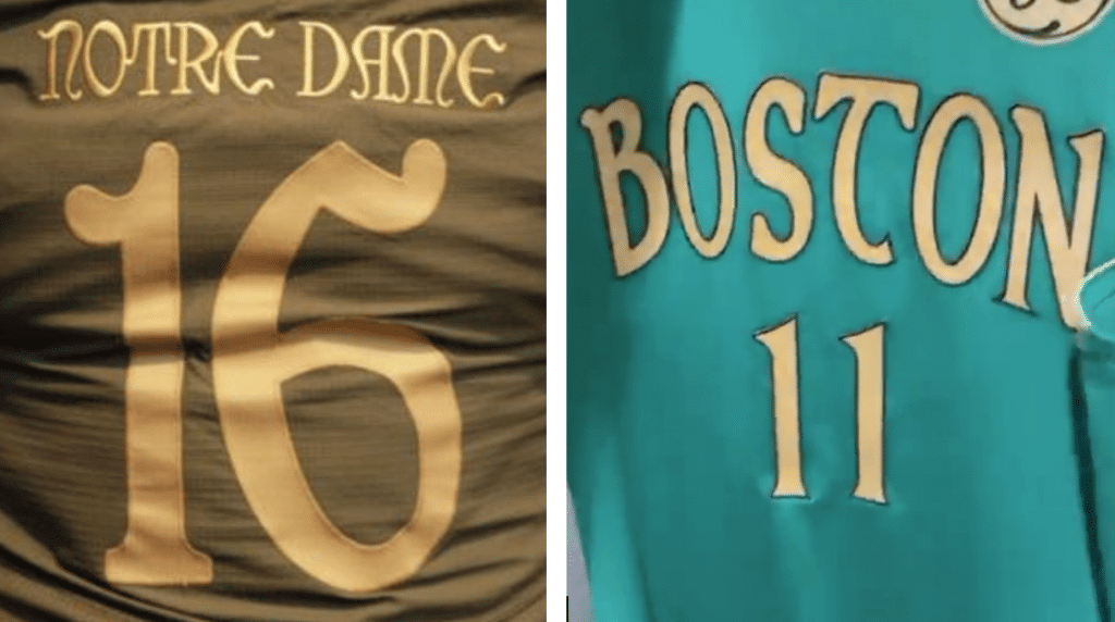
Yes, we get it — you’re Irish. I assume there’ll be a replica Blarney Stone at center court, corned beef at the concession stands, the Pogues on the sound system, and free Lucky Charms for all, wheee!
It’s tempting to say the Celtics should be above this sort of nonsense, except, well, you know.
Click to enlarge
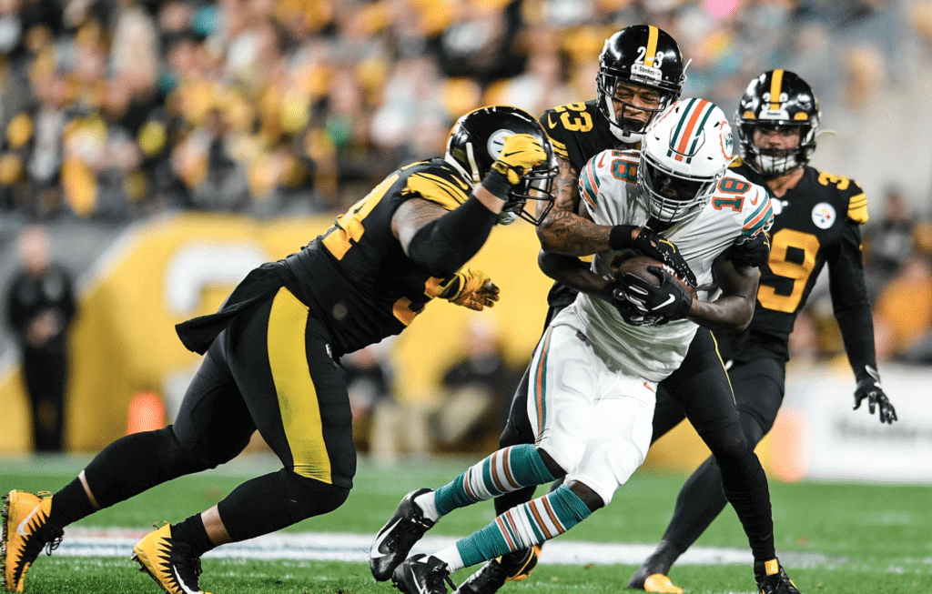
What might have been: Unusual game last night in Pittsburgh, as the Steelers wore their mono-black alternates and the Dolphins wore their throwbacks. Lots of additional photos here.
It’s surprising that Miami would wear the throwbacks on the road (teams usually save that for the home fans, although I guess the Dolphins wanted to showcase the retro look on national TV), and disappointing that the Steelers didn’t go with their own throwbacks, which would have created a nice 1970s vibe. I mean, the NFL is supposedly celebrating its history this season, isn’t it? Much like the Packers’ last two games (when they faced the teams they played in the Super Bowls I and II but didn’t wear the right uniforms to match those historic games), this should have been an easy lay-up and instead goes down as a missed opportunity.
Click to enlarge
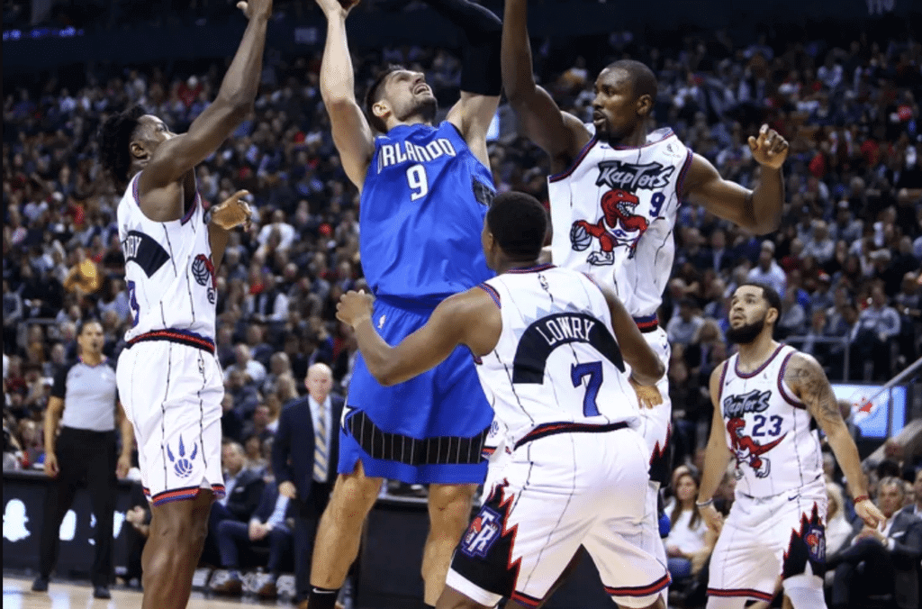
Raptors turn back the clock: We’re going to be seeing a lot of 1990s throwbacks in the NBA this season, and the Raptors did their part last night by debuting their new white inaugural throwbacks.
Here’s a closer look at the front design:
Toronto also had a throwback court for the occasion:
33 years young & still got that hangtime @Klow7 | #WeTheNorth pic.twitter.com/BJizV2WM4Z
— Toronto Raptors (@Raptors) October 29, 2019
This that different latitude. #WeTheNorth pic.twitter.com/FMvDTmBITi
— Toronto Raptors (@Raptors) October 29, 2019
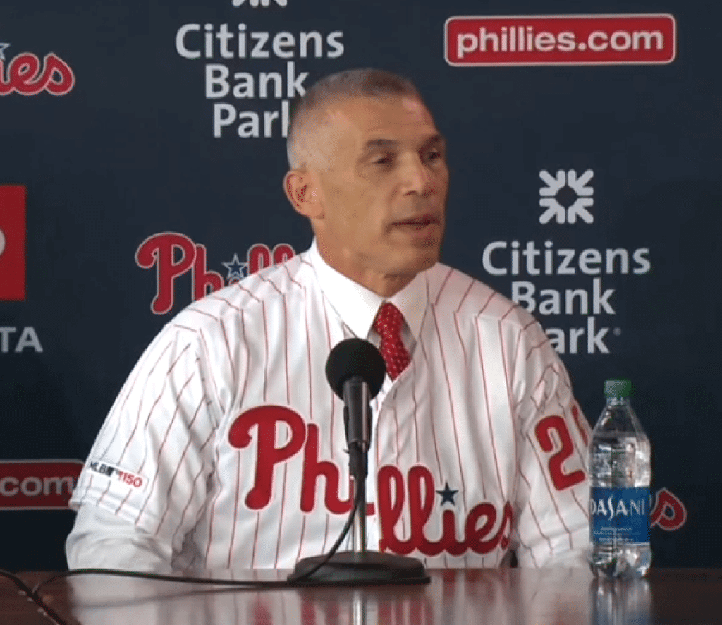
Oops: Not a good start for new Phillies skipper Joe Girardi, who mis-buttoned his jersey at his introductory press conference.
Several other uni-related notes from this photo:
• Remember last week’s entry about managers who wear jerseys at their intro pressers that they’ll never wear on the field? It’s interesting that the Phillies gave Girardi a jersey with the MLB 150 patch, since he’ll never wear that in his managerial capacity (and the two World Series teams aren’t even wearing it).
• When Girardi began managing the Yankees, he chose to wear No. 27, symbolizing his desire to lead the Yanks to their 27th championship. And after winning a title in 2009, he changed his number to 28. Since the Phillies have won two championships, some people were wondering if Girardi would want to wear No. 3 (which would create a conflict with his star player). Nope: He’s going with No. 25, which is the number he wore in the late 1990s with the Yankees as a player.
(Thanks to Kevin Malarkey for the image at the top of this section.)
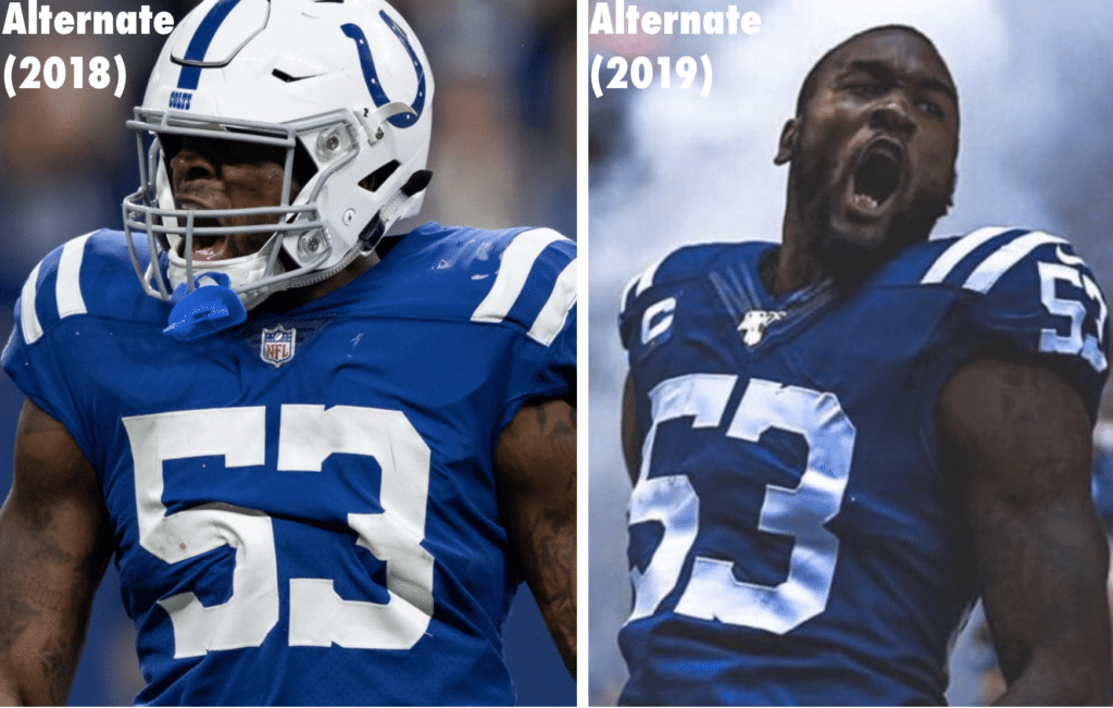
Colts update: Remember how I said yesterday that I’d ask the Colts why they changed their Color Rash jerseys from the new Nike template to the old Flywire template, but I didn’t expect to hear back from them because it was too esoteric of a question?
Shame on me for doubting the professionalism of Colts spokesguy Matt Conti, who emailed me yesterday to say, “I wish I had a great answer for you, but it really came down to a team preference.”
Not the most satisfying response, I’ll admit, but at least they got back to me! (I suppose I could follow up by asking why they prefer the older template, but I think I’d really be pushing my luck there.)
Padres begin teasing new identity: With the Padres’ new uniforms set to be unveiled on Nov. 9, some hints about the new look are starting to emerge.
Yesterday people noticed a small but discernible change to the “SD” logo in the team’s Twitter avatar. Twitter-er @cook17 helpfully created an animation that shows the subtleties of the situation:
Here is the difference between the old and new Padres avatar. (Dark one is the new one) pic.twitter.com/6a5p3qSQXe
— cook (@COOK17) October 28, 2019
Okay, so it’s not earthshaking. But it’s a fun step in the unveiling countdown.
Speaking of which: Remember, I’ll be in San Diego for that unveiling (thanks again to everyone who made that possible by contributing to my travel fund), and then we’ll have a Uni Watch party the following day — Sunday, Nov. 10, starting at 4pm — at the Wonderland Ocean Pub. They have amazing ocean views, but sunset will be at 4:51pm, so plan accordingly!
While we’re at it: If you’re going to be at the party (or even if you’re not!), you can make the scene in style in one of our new brown Uni Watch T-shirts, available in cotton white wing, cotton gold wing, or sublimated poly with contrasting collar/cuffs and a custom sleeve patch. Here’s a closer look at that one (click to enlarge):
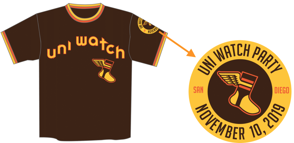
All of these items — and many other fine products — are available in the Uni Watch Teespring Shop.
Click to enlarge
Collector’s Corner
By Brinke Guthrie
Follow @brinkeguthrie
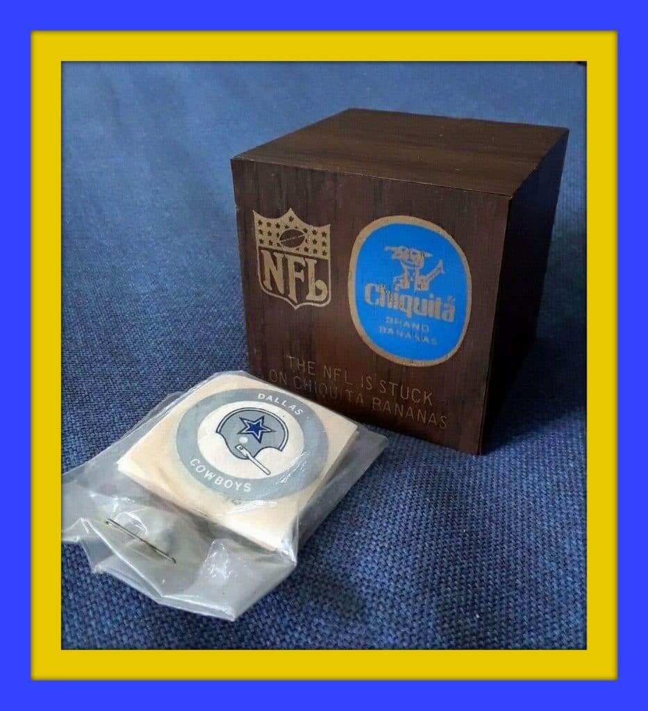
Wow — this is a Chiquita/NFL wooden puzzle kind of thing, complete with a set of the helmet stickers. I’d sure like to have it, but it’s a bit cost-prohibitive.
The interesting thing is, the seller’s listing mentions that his dad worked on this promotion. He says:
I think this came out before or during the collaboration between Chiquita and the NFL. The stickers are cut individually to be inserted inside the Chinese puzzle box. The supermarket promotional stickers are all grouped together on a single folding sheet. There is also a similar set of stickers in the NFL promotional Chiquita football package.
My father’s papers are in New York. Perhaps he has something about this, as he developed all the promotions. He worked at an ad agency called Trans World Display in NYC. Chiquita was one of his clients. Aside from the NFL stuff, they designed dozens of other promotions, including banana walkie-talkies, Chiquita tents, kites, boats, T-shirts, etc.
Interesting! I’ve only seen this item once before. In fact, we listed it in Collector’s Corner on Oct. 29, 2013 — exactly six years ago today!
Now for the rest of this week’s picks:
• Halloween is but two days away, so how about this Pittsburgh Steelers Terrible Towel — Halloween Edition. Non-Steelers fans may not know the history of the TT, which was created by Steelers announcer. (And if you want to get a jump on the year-end holidays, there’s also a Christmas version.)
• This Tampa Bay Bucs decoupage plaque is just the kinda thing you’d see sold in Florida gas stations.
• Here’s another 1970s wooden plaque, this one for the Dallas Cowboys.
• We’ve run this one before, but this 1970s NFL IHOP placemat is so cool, it’s worth the repeat.
• The Reds put “New Riverfront Stadium” on their early-1970s ticket envelopes.
• This can of 1970s Phil Esposito Boot Wax shows some age, (notice the Bruins’ “B” is blanked out) and the seller assumes the wax “is not usable at this point.” Man, Espo put his name on everything back then!
• Here’s a nice-looking 1970s Buffalo Bills thermal cup with their classic “Standing Buffalo” logo.
• Flower Power for this 1970s Cleveland Cavaliers key ring.
• You’ve probably seen helmet lamps for NFL teams, but have you ever seen one for the NFL Alumni Association? I hadn’t until now!
• This auction is just for the boxes for mid-1960s NFL gumball helmet kits. Oddly, it includes a helmet for the Saints, who didn’t come into existence until 1967, but also includes the Browns’ phantom “CB” logo, which the team considered but ultimately discarded in 1965. Maybe the gumball folks kept using the “CB” logo for the Browns just so they’d have something to put on there.
• Here we have a 1970s NFL helmet bank that says, uh, “NFL Helmet Bank” on the side. Just so you know what it is.
Got an item to include on Collector’s Corner? Send any submissions to uniwatchcollectorscorner@gmail.com.

Click to enlarge
IMPORTANT (and sad!) membership news: Yesterday afternoon I biked over to pick up our latest batch of membership card sheets from Rolling Press, the Brooklyn print shop been printing the sheets for us over the past decade or so. The owner, Eugene, handed me printouts and then said, “This is the last job we’ll be doing for you, because we’re closing the shop.” (It turns out that journalism isn’t the only industry that’s been decimated by the internet.)
This was terrible, terrible news. The Rolling Press folks are consummate professionals who were always incredibly friendly and patient. I’m sure I was one of their smallest customers (running off a few sheets of membership cards every two or three weeks is not the kind of gig that keeps a business afloat), but they always treated me like a valued customer and were always happy to see me when I stopped by to pick up the latest batch of sheets. Their demise feels like a death in the Uni Watch family. Sigh.
So now I need a new place to get the cards printed. As I see it, I have a few options:
1. I could find a shop in my neighborhood (or at least within biking distance). When I moved to the new Uni Watch HQ last year, I tried a local print shop for another project, and the results were poor (plus the shop owner was insane), so that’s out. But there are a few other nearby-ish shops, so I’ll try them. I’m not optimistic, though — I’ve learned over the years that printing two or three sheets of something every couple of weeks, with a wide range of colors that have to be Just Right, is the sort of high-maintenance, low-volume, low-revenue job that makes most printers roll their eyes. But we’ll see.
2. If I can’t find a good shop within biking distance, I could find a good shop that’s farther away. And frankly, once it’s beyond biking distance, I don’t care if it’s in the Bronx or in Wyoming — it’s all the same to me, because I’ll be emailing the files to the shop and the shop will be shipping the printouts back to me in the mail.
So that raises a question: Do any of you out there run or work at a good print shop? Would you like to have a new, somewhat nitpicky customer who wants fairly fast turnarounds on a low-volume, low-revenue project? Would you like to plaster an “Official Printer of the Uni Watch Membership Program” sign in your shop window and on your website, so your customers can ask what the hell Uni Watch is? If the answer to all these questions is yes, let’s talk.
3. I could buy a good ink-jet printer and print the cards myself at home. The Rolling Press people actually recommended that I go this route, but it makes me itchy. For one thing, ink-jet paper is only printable on one side, so I’d have to print the fronts and backs of the cards separately and then put them together when laminating them, which sounds dicey. Also, bringing a new hunk of technology into my small NYC apartment is not my fondest dream (or, I’m sure, the Tugboat Captain’s), and I’ve noticed over the years that technology tends to break down at critical moments, and that I’m usually ill-equipped to fix it. In short: I’m not ruling out this option completely, but my general sense of things is that I’d rather not be in charge of the printing.
4. I don’t actually see a fourth option. But if there’s something I’m overlooking, let me know.
Whichever one of these options I end up pursuing, there will almost certainly be a bit of a delay in the membership program. We currently have about two dozen orders in the queue (the result of the huge spike in enrollments that has come in the wake of the latest unpleastantness — thank you!). If one of those orders is yours, don’t worry — Scott Turner will still design your card, and it will still be added to the membership card gallery. But it might take a little bit longer than usual for me to get it printed, laminated, and mailed to you. Thanks for your patience.
Hypothetical reminder: In case you missed it on Monday, I’m wondering — just hypothetically, mind you — how many people would have been interested in a T-shirt based on that Uni Watch ransom note design that I showed on the site last week.
Of course, these are all trademarked logos, so this mock-up is just for “What if?” illustrative purposes. I probably can’t produce the actual shirt. Still, it would be fun to know how many people would have been interested — you know, just hypothetically — if such a shirt were possible in real life.
So: If you would have been hypothetically interested in this shirt, shoot me a note. Thanks.
Speaking of reminders, only a few days left to order yourself a Uni Watch Cycling Jersey with your choice of number and NOB. Full details here.
The Ticker
By Alex Hider

Baseball News: The Brewers’ new ball-in-glove logo — apparently the first concrete sign of a new redesign — has leaked. … A good sign for the Nats? Alex Burbidge notes that each of the last three teams to win the World Series clinched the championship while wearing softball tops. The Nats, of course, have been sticking with navy for most of the postseason. … Here’s a good article about MLB’s authentication process (WaPo link) for game-used memorabilia (from Tom Turner).

Football News: Former 49ers DT Spice Adams wore a custom jersey to Sunday’s game with a NOB commemorating his iconic laugh (from Tyler Hicks). … An NCAA rule mandates that the 50-yard-line must be painted over the midfield logo (scroll through that whole thread to get the full scoop). However, a lot of schools tend to ignore that rule. Two notable rule-followers were Michigan and Ohio State — both of which painted their midfield logos over the 50 this weekend (from Zak). … It appears Utah State will be wearing black this weekend against BYU (from @akaggie). … Colorado State will wear their Colorado flag-themed alternates on Saturday (from several readers). … Arizona will apparently wear throwbacks this weekend to honor former coach Dick Tomey (from Rocky De La Rosa).

Hockey News: The Belleville Senators of the AHL will wear camo jerseys for military appreciation night on Nov. 21 (from David Foot). … Speaking of the AHL, the Ontario Reign will wear purple sweaters on Saturday for Hockey Fights Cancer night (from Jakob Fox).

Basketball News: Kentucky G Immanuel Quickley wore a large black belt while on the sidelines during the Wildcats’ exhibition game Sunday night. It turns out it was a “vibrating belt” that was supposed to “keep him loose” while on the sideline (from Josh Hinton).

Soccer News: Celtic FC Women of the Scottish Women’s Premier League have a new shorts advertiser (from Ed Żelaski). … LOTS of notes from Josh Hinton: It appears new alternate jerseys for Liga MX’s Club America have leaked; an Arsenal fan wore a team-branded bathrobe to a game this weekend; La Liga has canceled the full use of the newly released winter ball due to poor visibility issues. It will only be used when absolutely necessary — when there is heavy rain or snow on the pitch; AC Milan’s new third jersey will reportedly have a green houndstooth pattern; French club PSG’s 2020-2021 home, away and third jerseys have reportedly leaked; Man City will reportedly have a mosaic sublimation on their 2020-2021 home kit.

Grab Bag: Ever wonder where the New York Marathon winners’ wreaths come from? Apparently, they come from a Long Island backyard, and are grown by the wife of a former marathon winner (NYT link). … Here are the Rugby World Cup winners’ medals (from Jeremy Brahm). … The Buffalo History Museum has a great collection of local sports unis through the years (from Mark Palczewski). … The country of Montenegro is holding an open design contest to pick its “country brand” (from James Gilbert). … Also from James: Check out this 1979 ad for a North Carolina Tar Heels van. … And one more from James: Here’s the new logo for the Paralympics.
Tonight’s World Series game may turn out to be the last MLB game of the year. Which means it may also be the last time we’ll see an MLB game without a maker’s mark on the front of the jersey (and if tonight isn’t the last time, tomorrow night will be). Dang. — Paul
Hi All
Quick observation/question: Raptors throwbacks did not seem to have the gold Champions tag for last year’s win. Do other teams follow that same protocol? Do alternate jersey’s have the tag?
Jerry
If the Celtics sold corned beef and cabbage at games and played the Pogues over the PA, I would at least have to consider becoming a Celtics fan. Won’t happen, since I am a Sixers fan since childhood. But I would at least check out a game…
I’m a bit irked by the blathering assumption that insular script, the Pogues, corned beef and cabbage, and Lucky Charms cereal are all equally inauthentic expressions of Irish culture and history. That’s nonsense. The Pogues were an actual, and influential, Irish band. Corned beef and cabbage is overplayed every mid-March, and not very Ireland-Irish, but it is a real, actual traditional dish within the Irish-American community. Lucky Charms is an American breakfast cereal with stereotypical branding that’s about as Irish as the Washington Redskins are Indian.
And insular script, as the Celtics have on the front of their new alts and Notre Dame sometimes wears on its uniforms, is one of the only surviving artifacts of an important period in Irish history. From a broad swath of medieval Irish history when Irish culture was hugely influential across much of Europe, about all that survives is a little architecture and a lot of manuscripts written in insular script. Insular script is so important to Irish culture and identity that when a republic was first declared in 1916, Irish rebels literally put insular script on their flag: link
Insular lettering is very much not like the faux Asian brushstroke lettering – sometimes called “wanton” or “chop suey” fonts – that used to be ubiquitous on Chinese restaurant signs and menus: link
Go raibh míle maith agat! From a half Irish-Canadian who studied the Irish language for 12 years. We shouldn’t hide our past, nor should we accept stereotyping.
third graf of collectors’ corner “exactly years ago today!”
Thanks, Gregg. Fixed.
The new Padres SD is an upgrade, and a surprisingly positive development. I have incredibly low expectations for anything the franchise’s leadership touches, so I’ve been afraid that the team would undermine the very positive switch to brown and gold by getting all the details wrong. So far, so good. Also surprising to me is essentially giving away the cap so far ahead of the big unveiling.
On the Brewers leak, the lettering appears as if it might mirror the under-appreciated late 1990s Germanic scripts designed by Todd Radom. If so, that’s on the good side of the ledger. The changes to the BiG though all appear to be on the bad and the ugly sides of the ledger. They’ve taken a charming but generic logo and made it less charming by making it less generic. That plus the leaked news about pinstripes at home make me very uneasy about what the Brewers are about to foist on us.
Concur. The subtle change in the “SD” font makes it much cleaner.
Agreed on the Brewers thoughts – but I think the lettering might be from the spring training signage they debuted last year
RE: the gumball helmet kits….
The Bronocos helmet is a disaster.
the Chargers helmet has the straight lightning bolt.
Who know what the Bengals helmet has. Probably the disjointed logo
And if you read that listing carefully, the auction is for the box only. No helmets are actually included.
Oddly, it includes a helmet for the Saints, who didn’t come into existence until 1970
The Saints’ first season was 1967.
Fixed.
Can we call this the Celtics’ Stereotypical Irish Pub Edition?
Let’s just call it the Blarney Stone design (since that’s what such pubs are often called) and be done with it.
My olde High School: JFKennedy (La Palma) sported a sandknit version of this poorly lettered, (the comic sans of it’s day) Generic Irish Pub inspired design in the 1970’s. I know because I had to wear them along with GREEN velour converse high top shoes. Still have nightmares over those.
We voted to never wear them.
I wonder what happens to old high school team unis once they live out their service life. Auction? Packed away in sone dark dingy closet. I say this only because Halloween is right around the corner.
Green velour converse high-top sneakers sound pretty awesome!
i’ve seen old high school stuff in thrift stores. i still kick myself for not getting a girls softball rainbow guts in blue and yellow from my hs that i saw in a thrift about 20 yrs ago
At our school, they were handed down from varsity to JV to freshman to 8th grade teams.
How about the Stereotypical Horrible Irish Text edition?
That’s not a great look for the Celtics (never did like the green/gold alternates), but they could be worse, and the font is not as awful as the Notre Dame version. At least they’re better than those mustard-stained monstrosities the team forced on us last year…
The Notre Dame “version” is actually more of a Military tribute than an evocation of Ireland. The uniform was worn against Army in San Antonio as one of their off-campus “Shamrock Series” games. The opponent explains the olive drab color. The font is taken from the carvings above Notre Dame’s first war memorial, above the East door of the Basilica of the Sacred Heart.
The Celtics uniform and the Terrible Towel have something in common — alternate versions just detract from their iconic status.
HOT TAKE: The new Celtics jerseys are actually kind of nice. Lovely, even. Reminds me of kind of an NBA version of NW’s Gothic alternate uniforms, which get almost universal praise; so the near-universal scorn the C’s have gotten so far is puzzling to me.
If most people like the original green uniforms for them better, fine. But there are about fifty CURRENT NBA alternate jerseys that are worse than this one, let alone retired looks like the sleeved gray nonsense you linked to in the post.
It’s funny, I really like the Celtics uniforms, just not for the Celtics. It’s similar to how I feel about CitiField – nice stadium, but doesn’t feel like it’s where the Mets belong.
I think it’s gonna look a lot worse when we see it rendered for uniform numbers that include numerals other than “1.”
That’s possible, but I can only react to what’s known.
I reserve my right to change my mind in the future :)
Interesting, please explain further, I’m really curious as to why you don’t think the Mets belong at CitiField.
I’ve been a Celtics fan for 60 years (yup, I’m old). When I go to a game or even watch a home game on TV it saddens me to see the team in all these costumes and not the traditional home whites.
That said, adding some gold to the uniform is not that horrible to me. During the 60s and 70s the warmups had a slight band of gold around the lettering… CELTICS on the white warmups, BOSTON on the green warmups.
I’m a 37 year old Celtics fan (not old yet, but getting there) and I too am saddened by this uniform nonsense as well. it used to be so simple, white at home, green on the road. I didn’t even get upset when they introduced the green & black alternate in the mid 2000s, or the green & gold St. Patrick’s day uni because they were worn sparingly. But now it’s a mess, on any given night they could be wearing white, green, black or this new green/gold monstrosity. Coupled with the obnoxious GE patch just makes it even more infuriating.
I wonder what Red would say if he were still alive.
Trivia: Joe Girardi originally wore #45 for the Yankees, and switched to #25 when Cecil Fielder was acquired at the trade deadline in 1996.
From Baseball Reference:
Girardi as a player wore:
7 with the Cubs (1989-1992)
7 with the Rockies (1993-1995)
45 with the Yankees (1996)
25 with the Yankees (1996-1999)
8 with the Cubs (2000)
27 with the Cubs (2001-2002)
8 with the Cardinals (2003)
Girardi as a Coach/Manager wore:
52 with the Yankees (2005)
8 with the Marlins in the Press announcement; 25 during the year (2006)
27 with the Yankees (2008-2009)
28 with the Yankees (2010-2017)
25 with the Phillies (2020-
Best Girardi Trivia was he was National League manager of the year and yet was fired in 2006 because he and Loria didn’t get along. He likely had to be paid a Mgr of Year bonus as well…
Paul, thanks again for doing the cards, I love my purple-amnesty-day Northwestern membership card.
You should be able to print on both sides of the paper with an inkjet printer. I do that all the time at home for different purposes. And that’s with a $100 printer (yeah, they break every few years and they’re basically disposable, which is sad but a topic for a different day).
To get the kind of crisp results we need for the membership cards, I’d have to use photo-quality inkjet paper, which is only printable on one side.
Not true. Double sided photo ink jet paper is readily available. Red River Paper is among the best in this category.
Huh — not what I was told! But I readily admit to my ignorance on this point. Thanks for letting me know!
Missed opportunity or not, the Steeler-Dolphins game was still a good uni show. Those block font numbers are so clearly superior to the rounded ones they use now. Another reason to return to the current throwback full time. The photo “Terrible Towel Christmas edition” raised an interesting question. The nutcracker on the right has a white jersey with the black pants. I’ve wondered what that combination would look like in real life. Couldthey do that or are there special rules for the CR alts? Has any team mixed a CR element with a regular uni?
I remember seeing this mockup from awhile back of white jerseys/black pants link and the general consensus in the message board where I first saw it was that it made the sleeve stripes feel out of place; they need the yellow pants to bring it together. Maybe it would work better these days now that the sleeve stripes are so much smaller/tapered, but it doesn’t fix the leotard look with the black socks that I’ve never been a fan of :-/ maybe they could introduce some striped socks to wear with the black pants that match the sleeve striping pattern?
Personally I’d be much more interested in inverting your hypothetical: throw the color rush jerseys on with the yellow pants. That would be a winner, I think.
What Bud said!!!!!
Lifelong Steeler fan here, and also generally not a fan of mono uniform combos (other than mono-white, which for some reason generally looks good to me).
When the Steelers first debuted their color rash unis, my very first thought was “I don’t care for that look, but that jersey would probably look great with the regular gold pants.” I would love to see a mockup of that.
Those Raptors nameplates… oof. Don’t remember them being that long.
It’s going to mess up your picture, but Joe Girardi’s uniform shirt yesterday was not misbuttoned. It was unbuttoned. He buttoned the top button, as seen clearly in the picture posted there. But, when leaning forward, the shirt flopped differently for each portion. He later buttoned it the rest of the way.
Here too?:
link
Not saying you’re wrong (I didn’t watch the video, and you seem to be implying that you did watch it), but that photo doesn’t seem to show what you’re describing.
The Reuters pictures from the event clearly show Girardi’s jersey with a misaligned top button for some portion of his press conference: link. The misalignment is present when Girardi was standing: link, when he was sitting upright: link, and when he was sitting leaning forward, as in the first linked photo. At some point, Girardi fixed the buttoning: link. And Girardi’s jersey was buttoned correctly when he met with fans at the end of the event: link.
Video of the press conference shows Girardi originally button the jersey with his top button misaligned: link and he continues to button several buttons below the script, all of them misaligned. Girardi corrects it later in the press conference.
As a Brewers fan, I am thrilled to see them finally moving back to the classic glove logo. They finally listened to what the fan base wanted! Good trends by both the Brewers and Padres.
They’re not going back to the classic BnG logo tho – they tweaked it & im not a fan
As much as I like the Pogues, I still think Thin Lizzy is my favorite Irish band.
I’ll go with The Boomtown Rats.
The Cranberries.
The Commitments ;)
them
Boston’s own Dropkick Murphys
Lick the Tins!
I actually like the Celtics design.
We see that font a lot in connection to Irish heritage because its Insular Script.
Insular was developed in Ireland during the early Middle Ages in the first Christian monasteries on the island. Thanks to comparative isolation from Orthodox Christianity, the monks developed a unique strain of Celtic theology and literature. The manuscripts written in the Insular script during this period are among the most beautiful illumination in the world, representing a high point of Irish art and culture.
So why do we call them “sell-ticks” and not “kell-ticks”?
Celtic FC in Glasgow is pronounced Sell-Tic as well. They’re about as Irish of an organisation as you can get. I think the pronunciation just depends on where in Ireland you live. The accents are quite regional.
Not uni related, but I saw this on Twitter and thought it might get a chuckle out of a few people here…
link
Introducing : HELLvetica. Like helvetica, but with like, much shittier kerning for Halloween. Download it at link !
Love the Purple Reign!
AHL “Purple Reign” takes me back to the 2005 Philadelphia Phantoms:
link
I love the Uni-Watch Ransom Note T-Shirt. Unfortunately as a lifetime Toronto Maple Leafs fan I can’t bring myself to wear a shirt with the Habs logo on it. It might make a great gift though if it was actually real! Thanks Paul.
“Unfortunately as a lifetime Toronto Maple Leafs fan I can’t bring myself to wear a shirt with the Habs logo on it.”
I also love the shirt concept but as a Bruins fan, this applies ten-fold!
In the embedded twitter link for Kyle Lowry “33 years young &
still got that hangtime”
Am I insane or is Lowry wearing two completely different shoes? Is this a thing in the NBA that I didn’t notice until now?
I first noticed it looking at the bottoms of his shoes when he’s on the court (at 18 seconds of the video). The bottoms of his shoes (pink, blue and yellow) are completely different from one another.
link
(I posted this to Twitter as well mostly because I don’t have an image host)
Anyone notice how the Dolphins has mis-matched stripes on their socks last night? I know the NFL doesn’t care about socks anymore, but I’m pretty sure some players wore the “home” throwback socks while others wore “Road”. Can anyone confirm this?
I can confirm that I saw it posted on Twitter last night, a shot of a bunch of players on the bench with a variety of socks, but I can’t find it again.
There are worse ways for Celtics games to go than selling corned beef and cabbage….link
Does anyone else feel that the NFL doesn’t seem very invested in their 100th anniversary? I remember as a kid how the 75th anniversary resulted in throwbacks for every team and a big commemorative patch. Maybe it’s because that was before there were constant alternates or random uni combinations, but it felt monumental in a way that doesn’t exist at all today.
I totally agree with you Chris!!
the few promotional things they are using are often lame: eg. the Colts’ sideline hats saying 1953. i’d guess that not very many Colts fans could immediately answer that as the year of the team’s establishment.
heck, the NFL 50 patch was a better campaign – but given all the other geegaws and doodads on the jersey and the elimination of sleeves, they couldn’t do something that big these days
The NFL doesn’t do anything right these days. That’s all that needs to be said.
Late answering this, but I have a theory that next year’s will be throwback heavy to celebrate the 100th anniversary of the 1920 season. Basically, I think they’re stretching the “celebration“ out to two years.
I realize I’m a little late to the party, but wanted to share my personalized ransom note with you all: link
Why did that link say “may contain adult or erotic imagery”? Anyway, I looked. Good job Jacob!
Those Raptors throwbacks are yet another example of the Tarrant Theory that any uniform design, no matter how ugly, will be seen as a classic given enough time.
Because I remember when those came out, they were considered a joke. And rightfully so.
And yes, I am going to keep referencing the Tarrant Theory until Paul makes it an official part of the UW lexicon.
It’s too bad the Rams can’t wear the road version of their throwbacks when they go to Pittsburgh in a couple weeks, seeing as the Steelers will be wearing theirs. It would make for a rematch of what I think is one of the best looking Super Bowls ever: XIV. I hoped the NFL would’ve accommodated these kind of games and allow teams to remake the Super Bowl matchups considering they’re pushing the 100 year anniversary so hard.