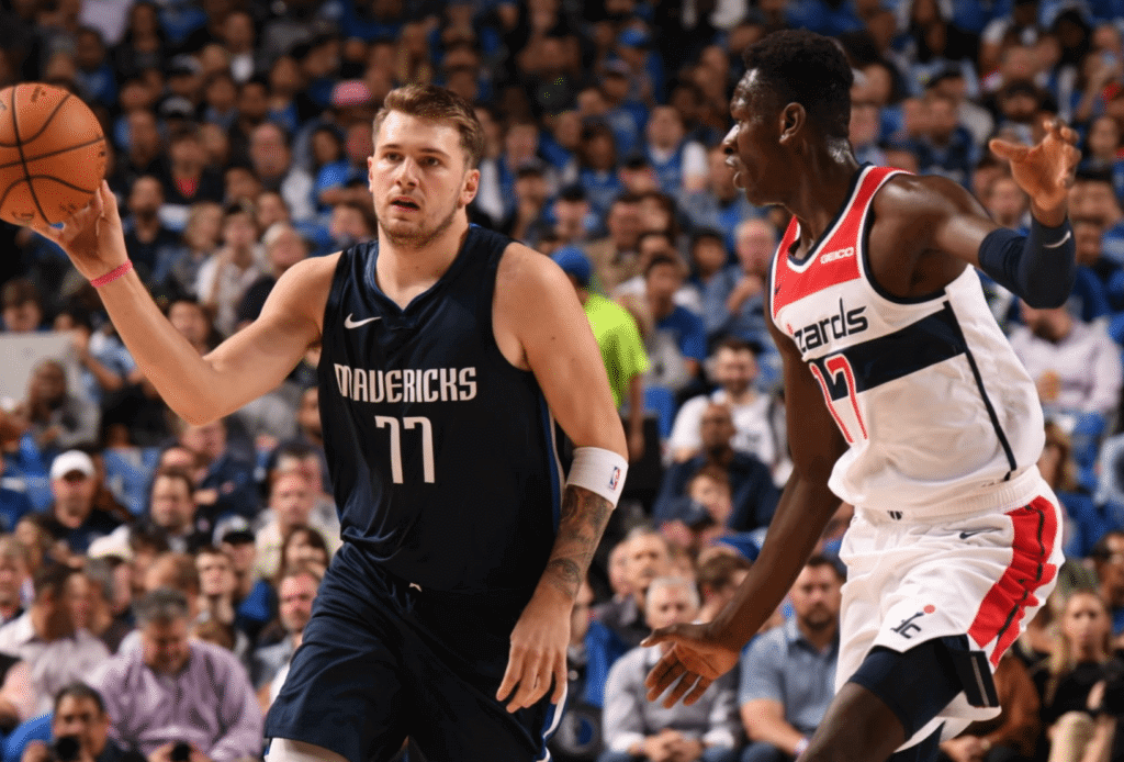
Click to enlarge
There was a very surprising development (at least to me) as the Mavericks opened their season by hosting the Wizards last night: No 5miles ad patch on the Mavs’ jerseys! What was that about?
Some quick photo research revealed that the Mavs didn’t wear the ad patch during the preseason either, but I hadn’t noticed because none of you told me and you can’t expect me to keep track of all this shit by myself I don’t pay attention to the NBA preseason.
So I dug a little deeper and discovered that the Mavs and 5miles had abruptly dissolved their partnership in early August. That was right when I was getting back from Ireland — and as you may recall, my return was pushed back a day and generally chaotic due to a British Airways computer snafu — so I apparently missed that news. Maybe the rest of you knew about it, but I had no idea until last night. (As an aside: This is every journalist’s greatest fear, especially for those of us who cover a 24/7 beat. It can actually be stressful to take a vacation, because we worry about missing something and being out of the loop, which is exactly what happened to me in this case.)
Some quick background: The Mavs began wearing the the 5miles patch on March 6, 2018 — late in the first season of the NBA’s uni advertising program. At the time, they were the 21st NBA team to add an ad patch. The patch was worn for the balance of the 2017-18 season and again for the entirety of the 2018-19 season, and the deal was supposed to run a third year. It’s not clear why the two sides mutually chose to end the agreement a year early.
At the start of the 2018-19 season, only three teams — the Wizards, Pacers, and Thunder — were still ad-free. But all three of those teams began wearing ad patches during the course of the season. When the last of those teams, the Thunder, announced an ad patch deal on March 15 of this year, that made the entire NBA ad-clad.
But that state of affairs has turned out to be short-lived, as the Mavs have now rejoined the ranks of the ad-free. They also have the distinction of being the first NBA team to drop their uni ad. They’re reportedly searching for a new jersey sponsor advertiser, so their ad-free status may not last for long, but let’s enjoy it while we can, shall we? Go Mavs! #NoUniAds

San Diego update: I have lots of things to tell you about my upcoming San Diego trip. One thing at a time:
1. Party venue: My thanks to everyone who suggested places where the San Diego Uni Watch party can be held on Nov. 10. After a lot of consideration, I’ve decided to go with the Wonderland Ocean Pub. It’s a sports bar, which is something I’d usually disdain, but it also has a great ocean view (their website even has a live ocean cam!), which really appeals to me. They also have a side room where we can congregate.
I had originally thought the party would commence at 6pm. But sunset on Nov. 10 will be at 4:51pm, and there’s no point in starting an ocean-view party after the sun has already gone down, so I’ve decided that we will congregate at the Ocean Pub at 4pm. I hope to see lots of our San Diego readers there, and it would be great if L.A. readers would make the trip as well.

2. Plus-one raffle: I have a plus-one for the Padres’ uniform unveiling at the Padres’ ballpark on Nov. 9, 6pm, and it is now time for me to raffle off that spot to a lucky Uni Watch reader.
The winner of this raffle will be responsible for getting to the ballpark on his or her own. While there’s no way for me to enforce a “Padres fans only” rule, it would be nice if only true Padres fans entered this raffle, since the unveiling will obviously mean more to them than to anyone else.
To enter this raffle, send an email to the raffle address by 7pm Eastern tomorrow, October 25. One entry per person. I’ll announce the winner on Monday. Good luck!
3. T-shirt update: The deluxe sublimated version of our brown shirt is now available. It features multicolored collar and sleeve-cuff trim plus a custom sleeve patch commemorating the upcoming Uni Watch party in San Diego (click to enlarge):
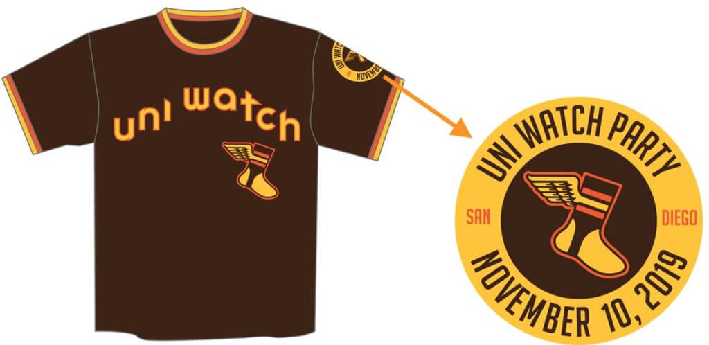
That shirt is available here. Meanwhile, the conventional brown T-shirts (cotton, no sleeve patch, no contrasting collar or sleeve cuffs) are also available in white-wing and yellow-wing versions. Interestingly, although the yellow-wing logo won both rounds of reader voting, the white-wing version is selling better so far. Hmmmm.
I’m excited about the trip. My continued thanks to all of you who contributed toward my travel fund!
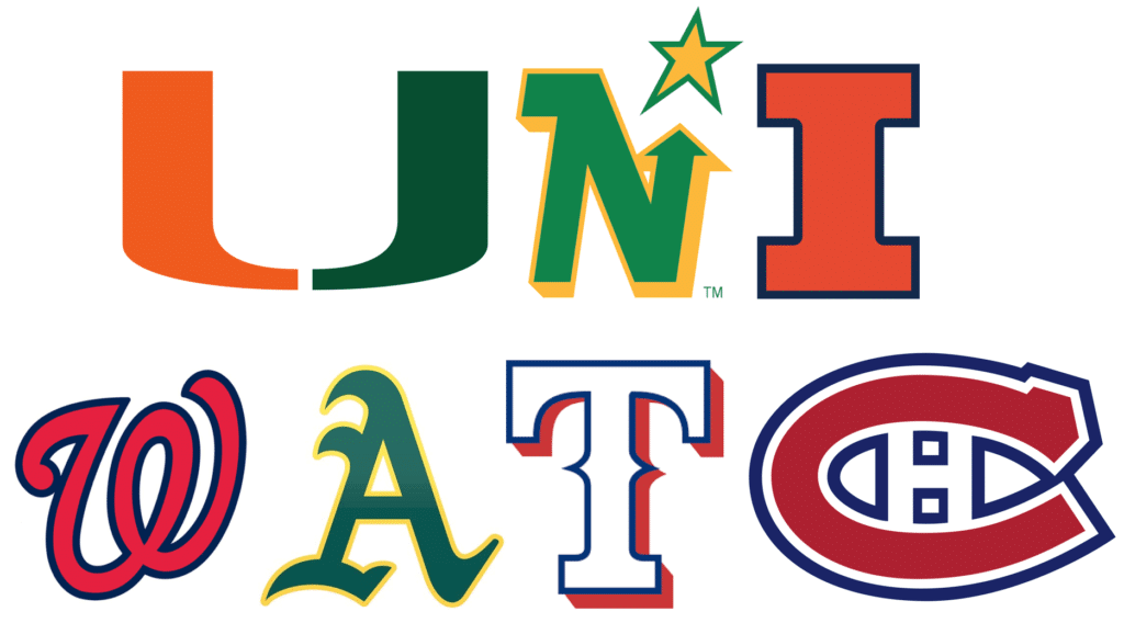
Click to enlarge
Ransom note: I was playing around with a logo-lettering-related project yesterday and ended up taking a detour to create the design shown above. Fun, right? I’ll admit to being very pleased with myself for coming up with the Habs’ logo at the end.
Can’t believe I’ve been writing about uniforms and logos for more than two decades and never thought to do something like this before!
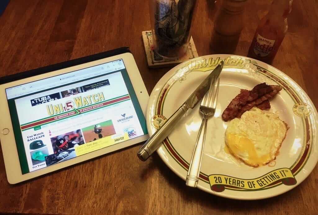
Click to enlarge
Breakfast of champions: People who pre-ordered the Uni Watch 20th-anniversary plate are (finally!) receiving them (including longtime reader/contributor/pal R. Scott Rogers, who shared the photo shown above).
The idea behind the plate is that the 20th anniversary is traditionally the china anniversary (as in plates, dishes, etc.), so I thought it would be fun to add a commemorative plate to Uni Watch’s 20th anniversary celebration. Not many people were interested in purchasing one (not surprising, since it’s an odd and somewhat pricey item), so we only had a few of them made.
People who pre-ordered the plates should be receiving them this week. We made three additional plates that should be available for purchase on the Uncommon Goods website next week, so stay tuned for that.
Meanwhile, a few reminders:
• We’re taking orders for another round of Uni Watch cycling jerseys. Just like last time, you can customize your number and NOB. You have to get your order in by the end of the month, so move fast. Full details here.
• If you have a Uni Watch Press Pin, please enter it on our Press Pin Registry.
• I still have some Uni Watch Gumball Helmets available. Get yours here.
The Ticker
By Paul

Baseball News: Amazing: After last night’s World Series Game Two victory, the Nats’ blue alternate jerseys are now riding a nine-game postseason winning streak. … A Brewers beat writer is hinting that a team redesign may be in the works. … Interesting note from John Muir: “Maybe it’s coincidence, maybe it’s nothing, but the Nationals gave out interlocking-DC rally towels for the World Series Game One watch party at Nats Park — a change from the curly W towels from NCLS Game Four. There’s also been an uptick in DC-logo merchandise in the team store toward the end of the season. I asked several random staffers about a potential return of the DC logo and the general answer was ‘It appears to be the case.'” … Here are the inaugural-season logos for the Rangers’ new ballpark. The one on the right will presumably be used as a sleeve patch (from @wombatnation99). … The NHL’s Washington Capitals are supporting the Nationals’ championship drive by putting the Nats logo on their locker nameplates. … ” Nats reliever Daniel Hudson has made a quick update to his glove,” says Jason Whitt. “He missed the NLCS opener for the birth of his daughter, and then added her initials (in Sharpie) next to the embroidered initials of his wife and his two oldest daughters.” … Check out these amazing murals — including an Astros tequila sunrise scene — made of Lego (from @GoatJerseys). … The Single-A Kannapolis Cannon Ballers — formerly the Kannapolis Intimidators — have released their new their new logos and uniforms.

Pro Football News: The XFL 2.0’s first and possibly last uniforms will apparently be released next month (thanks, Phil). … Some new uni number assignements for the Patriots (from @peskyspole). … One week after going mono-red, the Bills will go mono-blue this weekend. … The CFL’s Montreal Alouettes are having a design contest for an alternate jersey to be worn during the 2021 season. Designs are due by Nov. 30 (from Chris Zuccaro). … The Charlotte Ledger is reporting that the NFL originally wanted the Panthers “to be named the ‘Carolina Rhinos’ instead of the Panthers and worried that too much black in the uniform might appeal to ‘street gangs'” (from Duncan Wilson). … Newly acquired 49ers WR Emmanuel Sanders will wear No. 17, with fellow WR Jalen Hurd switching to No. 14 (thanks, Brinke). … If you want 46 photos of the Vikings’ equipment staff preparing the mono-purple uniforms for tonight’s game, today’s your lucky day (from Michael Princip).
College and High School Football News: A Missouri high school team has forfeited all its wins from this season after it was determined that they used an ineligible player and tried to cover it up by having him wear a different uni number (from Chris Hickey). … Here are this week’s uni combos for Iowa State and UVA (from Chad Lehman and our own Jamie Rathjen). … Here’s UCF’s annual astronaut/space-themed uni (from many readers). … Blaise D’Sylva’s latest helmet collection is for Southern Mississippi. … A 7-Eleven football uniform? Sure, why not. John Cerone received that GIF with his rewards email.

Hockey News: “When Sergei Bobrovsky joined the Florida Panthers this season, he was able to pry No. 72 away from teammate Frank Vatrano,” says Wade Heidt. “Payment has now been made with wine, a Rolex and McDonald’s.” … Cross-listed from the baseball section: The Capitals are supporting MLB’s Washington Nationals’ championship drive by putting the Nats logo on their locker nameplates. … For the third straight season, WHL teams will wear Don Cherry-inspired uniforms (from Wade Heidt).

NBA News: Here’s a look at how NBA championship rings are made (from Griffin Smith). … New on-court ad for the Spurs (from Stephen Walker). … The Pacers apparently have a “Craft Beer Partner” logo for breweries whose product is served at the team’s arena (from @DLBrown24). … For last night’s home opener, the Hornets gave away a “teal towel” that was actually white (from Brant Wilkerson). … At last night’s 76ers opener, the 13-star circle outside the paint was replaced by the “Join or Die” snake that they’ve previously used in the postseason (from John Clark). … New generational suffix for the Knicks: PF Kevin Knox is wearing a Knox II NOB (from @HitTheGlass).

College Hoops News: Pretty cool new throwbacks for Louisiana Tech (from Eric Konkol).
.

Soccer News: Chelsea CB Kurt Zouma’s sleeve patch was mis-positioned yesterday. “It’s supposed to be centered on the sleeve,” says Josh Hinton. … Also from Josh: Russia’s Euro 2020 home kit has leaked. … Lots more soccer news, as always, on Josh’s Twitter feed. … New 90th-anniversary shirt for Ross County (from Ed Zelaski). … Real Salt Lake G Nick Rimando’s jersey was missing its championship star last night (from David Kendrick).

Grab Bag: Interesting intellectual property development: The Florida chapter of the Society of Professional Journalists is trying to trademark the term “fake news” and has sent cease-and-desist letters to people that are misusing it, including President Trump. … A retired U.S. Navy service member removed his uniform in court on Tuesday after being sentenced on assault charges. … Metro Los Angeles is selling off a bunch of cool-looking transit signage from the Blue Line (from Brian Addison). … The latest from Pinktober: New York State court offices are wearing pink uniform patches and using — get this — pink handcuffs (from Tim Donahue).
The winner of the Art of Words raffle is Aeneas Koosis. Congrats to him, and big thanks to Art of Words for sponsoring this raffle. — Paul
re ransom note: This former North Stars fan approves.
The Kannapolis Intimidators were named after Dale Earnhardt Sr, cringey yes, but Cannon Ballers is much, much worse!
Ah, didn’t know the meaning. Thanks for schooling me. I’ve removed that descriptor from the text.
Dumb as it may seem, my first thought was of Ron Burgandy when I saw the new name, and then the mustache on the baseball.
Why is Cannon Ballers bad? I thought the SportsLogos story was fantastic and the branding great. Plus, you can’t beat an unintentional Ron Burgundy tie-in.
link
Really wonderful write-up in the vein of Paul’s Milwaukee Bucks story from a few years ago
Not for nothing, but the Kannapolis Intimidators got their name as a tribute to the late NASCAR champion, Dale Earnhardt, who is from Kannapolis. If it were the result of focus groups and modern marketing, I would totally agree that is cringeworthy. But as a tribute to a native son with a huge following in North Carolina, it makes a lot more sense.
I find Theresa Earnhardt’s ‘protection’ of Dale’s legacy cringe-worthy.
The Intimidators name, and possibly the Sam Bass-designed logo(?), remained the property of Earnhardt’s widow even after the team’s ownership changed hands.
Aside from the tri-color hat, I’m not a big fan of the new uniforms (the roadies are solid but the “Ballers” alt jersey is egregious) but I do like both the subtle and obvious references to the town’s history and to Earnhardt which are found in the logos and wordmarks.
RETRACTED, someone beat me to it. ;)
“… the Nationals gave out interlocking-DC rally towels for the World Series Game One watch party …”
That logo looks odd. Perhaps because it is not “3D” like those on the Creamer site. It just looks weird with the semi-connected yet semi-overlapping letters. Maybe it’s just my eyes.
The 3d logo hasn’t been their alternate logo for a while. They went to a 2d version of that logo in 2011.
link
It does look a bit weird without the depth-providing beveling.
What’s equally odd is that for a home event the logo is rendered gray, as if acknowledging the team is on the road. But the towels for NCLS G4 had a gray curly W, ot white, so who knows.
What’s jarring about the DC monogram is that it represents no part of the team’s name. Most monograms represent the team’s city/state per their official name; in rare cases, it reflects the nickname or an abbreviation thereof. If the Nats were called “The District of Columbia Nationals”, it would make sense to use the DC. This is like using an M monogram for the Royals or Cardinals for playing in Missouri.
To me, it’s like the Twins using the “TC” logo, acknowledging a common name for their city.
“DC” is a very common nickname for the city of Washington by residents of the Metro area. In fact it’s the actual official name of the city of Washington, which doesn’t formally exist anymore. “Washington” is effectively a nickname for the jurisdiction that’s legally known as the District of Columbia. It’s exactly like the Twins TC logo, except moreso.
Thank you Mr. Rogers for that succinct and clearly ‘splained reply.
Wow. It’s a beautiful day in the DC Neighborhood.
Your example of “Missouri” for the Kansas City and St. Louis teams is not parallel with the how the Nats use the “DC” logo. “Washington” is not a subset of D.C. (i.e., it’s not one city among others within a larger geographic area known as the District of Columbia). They are one and the same, so there is better cause to use what is a synonymous name. A closer example would be the “New York” Knicks’ “NYC” secondary logo, of which I haven’t heard any arguments against.
Actually, I retract that last sentence, as the Knicks’ logo in question reads as “NYK” — better is the Warriors’ lauded “The City” or the aforementioned Twins “TC” logo.
I wouldn’t be surprised if the Nats reintroduce the DC logo next year. They also used their spring training logo with the silhouette of the Capitol building on a fan towel during the NLCS. I have had a feeling they were getting ready to change up their look next year and started wearing the blue alts on a more regular basis this post season in preparation of making it a primary next year. Of course now they can’t stop wearing them while on such a streak. Go Nats!
Hope you’re right on a refresh because I’ve been bored with the new uniforms since they debuted. Three identical Ws on the base home uniform, two on the base road, three on certain alternate combinations…it’s all just blah.
Reintroducing the DC mark breaks the monotony and adds my favorite effect from the 2006-2010 seasons, the road gray has WASHINGTON DC when reading chest to left sleeve.
Maybe we get the chest script Nationals with a refresh.
Will there be a “white wing” option for the deluxe brown sublimated shirt? I hope so… I love the contrast of the small fleck of white in the logo. It reminds me of the neon lime green in the Seattle Seahawks eyeball.
Fingers crossed for a deluxe white wing.
No, sorry. Only one version of the deluxe shirt.
Please make the “ransom note” your next t-shirt. That would undoubtedly be a best seller (especially this month since it features the Curly W)!
Love this idea. So many variations possible, this could easily become an annual thing. Maybe an annual Black Friday thing??
I love the idea but as beautiful as it is I can’t imagine that selling a shirt made up of logos owned by others is ever going to happen
“A Missouri high school team has forfeited all its wins from this season after it was determined that they used an ineligible player and tried to cover it up by having him wear a different uni number”
I think this is beautiful!!
btw, they also fired all the coaches. Even more beautiful.
When I saw that, it made me wonder if that sort of ruse has been tried before successfully. It couldn’t be done in basketball or baseball, but a football team at the high school level where everybody wears helmets and players aren’t quite so high-profile…maybe?
That Sixers snake logo looks like crap. Like they just cut and paste from the Ben Franklin cartoon and called it a day. Would be awesome if they made an actually well designed modern take on it (in a better way than Philadelphia Union’s Slytherin aesthetics take)
As someone who longs for the days when hockey players’ jersey numbers never went above 35, and goalies were usually 1 and 30 with the odd goalie going with 31 or 35… I can’t wrap my head around goalie Sergei Boborovsky WANTING #72 from a teammate!!
But he had a funny line in that twitter regarding the payment required to obtain the number: “Thanks god he didn’t speak of a Ferrari…”
-Jet
…and I quoted it wrong: “Thanks god he didn’t speak ABOUT Ferrari…”
-Jet
The Ransom Note today is something I had done myself with my name.
And just like the Montreal logo, In my name, I used the Yomiuri Giant’s logo. AND, because I have a D and a V in my name, I got to use 2 of my favorite teams..The old school Denver Bronco logo, and the Vancouver Millionaires logo from the Canucks Throwbacks. Plus the O from my homestate Ducks.
I’ve always been a fan of interlocking baseball caps – Yankees, Rockies, Cards… And I thought the Nats nailed it with their DC caps. I hope they bring them back.
Don’t forget the new BROWN SD caps that will be making a comeback!
-Jet
Something weird, i noticed while watching Simone Biles first pitch highlights – it looks like when for womens jerseys, the Astros completely shift the balance of their lettering, I guess due to the left to right button issue? That doesn’t make sense to me but it’s consistent.
link
link
You can also look at the astros shop and see it’s consistent with what is selling:
link
Are there other teams that do this?
Good catch! I’m in the minority that doesn’t mind the Astros’ off-center lettering because the “dead space” it creates on the right is balanced by the number on that side. The women’s version shifts the dead space such that a number would make it even more un-balanced.
not quite proofreading, but the second link in grab bag: “including the President Trump” is quite an odd usage. usually one would say either “the President” or “President [insert name here]”
The “the” shouldn’t be there. I’ll remove it now.
Given the “trademarking of Fake News” entry, and that it’s being registered by a “journalist” organization, it’s no wonder why people are leaving traditional news outlets (newspapers, magazines, etc.) in droves.
Actually, readership for printed products has declined mainly because of changes in technology and the resulting changes to the media business model. Overall readership for standard media outlets, including their websites, remains high (and in some cases is higher than ever). But because most of those websites give away their content for free, and because most online advertisers have chosen to spend more on Facebook and Google than on media sites, the business model for standard media websites is in peril.
It’s fine if you dislike traditional media outlets. But please don’t mischaracterize the state of the industry or its readership. Thanks.
So a journalist organization saying “you can’t say Fake News because it’s trademarked” is good journalism? And going to drive people to read it?
Guess I better stop saying Super Bowl ™.
I didn’t say it was good journalism (or bad journalism).
I said that your assertion of why people are “leaving traditional news outlets in droves” was false, or at best misleading, and asked you not to mischaracterize the state of the industry in which I work.
That’s all.
Re: The NHL’s Washington Capitals are supporting the Nationals’ championship drive by putting the Nats logo on their locker nameplates.
Wouldn’t it be great if the Capitals created an alternate sweater using the curly “W” or the interlocked “DC” as the main logo on the front?
The lede about the Mavs always makes me think about the Bad News Bears and Chico’s Bail Bonds.
I find the use of the word “sponsor” just wrong. It’s not like the jersey “sponsors” are actually subsidizing the purchase of the uniforms.
I made precisely that point a few years ago:
link
The brown seems off on the conventional t-shirts, yes? Is there going to be a deluxe version that doesn’t have the patch on the sleeve?
Conventional shirt comes in only one stock shade of brown. Not a perfect match for the Padres’ official shade, but close enough.
For the deluxe shirt, we tried to match the official shade.
It’s possible that we’ll offer the deluxe without the patch later on. But I kinda like the idea of leaving it there. It becomes a record of a particular set of events — the unveiling, the comm-uni-ty pitching in to send me to SD, etc. Even if you don’t attend the party, the patch can be fun in a “concert t-shirt for a show I didn’t attend” sort of way.
Wonderland is a solid choice of venue. It doesn’t feel overly Sports Bar-ish and Ocean Beach as a whole has more of an old school California vibe than many other places in San Diego. It’s also in walking distance to some nice old school bars.
Thanks for the vote of confidence, Jeremy!
How about a Purdie vs UCF all spaceflight game!!!!!
Purdue-UCF – bad typing in the original!!!!
Just got the letters shuffled around.
Is there a description of what exactly a “sublimated” shirt means?
-Jet
Good description here:
link
Lots of videos on YouTube. Basically, the dyes is imprinted into the fabric. You can print anywhere on the garment, not just in certain areas (which is why we can do contrasting cuffs, collars, sleeve patch, etc on the sublimated shirt but not on the regular shirts).
Thanks for that link because it says sublimation can only be done on polyester, not cotton, so I’ll have to pass on that Padres shirt. But I already ordered the standard one (with white wings)!!
-Jet
Regarding the Panthers originally being named the Carolina Rhinos, the name was recycled in 2000 for the Greenville SC Arena League team: link
I highly recommend the cycling jersey as I plan to get a second. Not only does it have that sweet flash, you get to personalize it, and proud to say I have received more than one shout on the road from those that “get it”.
My favorite product that has come out of this terrific site. Keep it up!
Awww — thanks, Marc!
Earnest question: do you actually believe the lack of an ad patch makes the Mavs uniform the best in the league, despite it being otherwise uninspired? In other words, is the presence of an ad patch so off putting that you actually prefer the Mavs to, say, the Warriors?
Earnest answer: Yes.
Forbes Magazine article on termination of Mavericks 5smiles partnership, 8/9/19
link
Well, yes, I linked to that exact article in today’s text.
Oooops, sorry. There are so many links on the daily page that I lost track.
Paul got a name drop on Deadspin today in a blurb about OBJ’s ongoing uniform saga.
link