For all images, click to enlarge
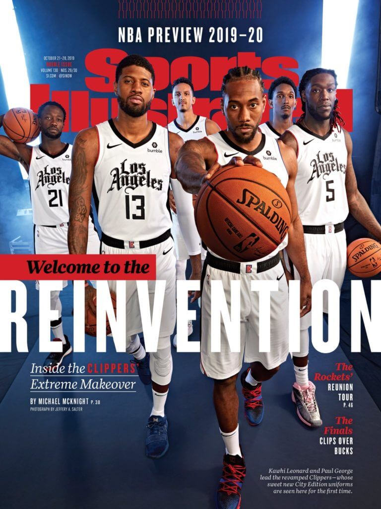
As you may recall, a certain sports publication recently pink-slipped a certain uniform columnist after employing him for only seven weeks. How fascinating, then, to see that this selfsame publication yesterday used its coveted cover spot as the platform for an NBA uniform unveiling. Seems like a situation where the erstwhile uniform columnist might have come in handy, no?
I have to admit, when I saw that happen yesterday, it was a bit of salt in the wound. Like, really? You give me the heave-ho and then do a uni reveal on your cover 12 days later? Ouch. Sent a note to my former boss (who’s now co-editor-in-chief), giving him a bit of shit about it. He basically said — I’m paraphrasing here — “Yeah, I know, I know. Wish we had you here to be part of the coverage.”
And it gets weirder. The Gothic chest lettering, which was reportedly done by an L.A. tattoo/graffiti artist named Mr. Cartoon, looks a lot like the masthead of The Los Angeles Times. Here’s a comparison — chest insignia on top, masthead on the bottom:
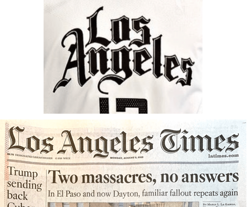
It’s not an exact match (the white trim/highlights don’t match up), but it’s mighty similar. Yes, I realize it’s probably meant to reference a certain video game logo, but come on — it’s clearly closer to the Times lettering.
So let’s review: A printed magazine — which is something most people no longer read — used its cover to showcase a new uniform whose chest insignia evokes the masthead of a printed newspaper — another thing people no longer read — and I wasn’t around to write about it for the magazine because I lost my job, a situation brought about in large part because people no longer pay to read magazines or newspapers.
Got it?
Meanwhile: Is this the first time a Big Four team has used a magazine cover as the mechanism for a uniform unveiling? (It’s almost certainly going to be the last time, because soon there will be no more magazines!) If you’re aware of any previous examples, please post them in today’s comments.
As for the design, it’s not bad, but it could be so much better. I like the chest mark, and it’s kinda refreshing to see an NBA alternate uni that’s white instead of colored. But the standard number font clashes badly with the insignia, and the splashes of color on the armholes and waistband logo feel out of place with the black/white theme.
This uniform will make its on-court debut on Nov. 22 and will be paired with a new alternate court design:
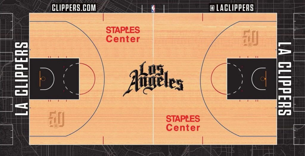
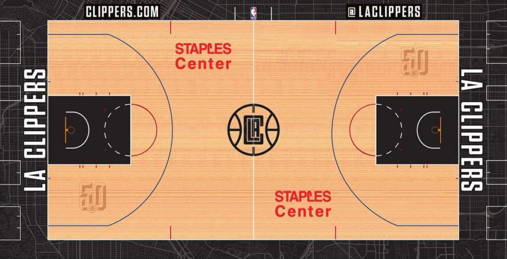
In addition, the Clippers’ primary court has been given a black-themed makeover, including a black version of their “LAC” logo — which makes it even odder than they used the red/blue version of that logo on the waistband of the new alternate uniform:
That concludes today’s episode of Irony in Media. Tune in tomorrow, when we’ll see an NFL team do a surprise uni unveiling on SportsCenter.

ITEM! Press pin registry now open: People are starting to receive their 2019 Uni Watch Press Pins (which, in case you missed it, launched on Friday and sold out three days later). Since we did a limited edition of 200 pins, with each pin individually numbered on the back, a few people have expressed interest in possibly trading for specific numbers, or just knowing who got which number.
With that in mind, I’ve created a spreadsheet document where everyone who purchased a pin can enter their name, their email address, and any notes or comments. If you scroll down through the form, you’ll see that I’ve listed the pin I’ve been wearing (No. 195) and eight other pins that I’m currently saving for special occasions but am willing to trade if someone really wants or needs those numbers.
Now then:
• If you’ve purchased a pin and would like to enter it on this registry, feel free to do so. (Be sure to use number shown in the “Pin Number” column, not the spreadsheet’s line number column. Those two columns are consistently one number apart, so it’s an easy mistake to make — be careful!)
• If you’re a big fan of, say, the number 73 and see that the person who has pin No. 73 is willing to trade, go ahead and email that person and see if you can strike a deal. (Obviously, shipping arrangements, postage charges, and so on are up to the two traders — work it out amongst yourselves.)
• I suppose people who missed out on purchasing a pin could also use this registry as a way to buy one (“I’ll give you 20 bucks for pin No. 53!”). Personally, I find that notion less appealing — I’d rather encourage trading, not selling. But if it happens, so be it.
• Participation is completely voluntary. If you purchased a pin but would rather not enter your name on the spreadsheet, that’s fine.
• I realize there are privacy issues about sharing email addresses on publicly viewable documents. If you’re willing to enter your name but would rather not list your email address, that’s fine. (You may also want to consider creating a new email address just for this spreadsheet. It’s certainly easy enough with Gmail and many other services, and that way you won’t be giving away your primary address.)
• Obviously, this will only work if everyone behaves and nobody fucks with the spreadsheet. So: Please behave and don’t fuck with the spreadsheet. Thanks.
Again, the spreadsheet registry is here. Enjoy.
(My thanks to Wafflebored, who was the first to suggest this idea.)
The Ticker
By Lloyd Alaban

Baseball News: Astros 2B Jose Altuve tore his pants stealing second base during the second inning of yesterday’s ALCS game (from Kary Klismet). … The Nationals are now 7-0 when wearing their navy blue tops this postseason. Think they’ll keep wearing that uniform throughout the World Series? … Speaking of the Nats, SS Trea Turner wore an NC State football helmet during last night’s champagne celebration. Turner went to college at NC State (from John Muir). … A cameraman at last night’s NLCS game wore a catcher’s helmet (from Ethan Hopkin). … Here are the uniforms for the Auckland Tuatara, the first New Zealand-based team in the Australian Baseball League (from Gareth Hooton).

Football News: Chiefs S Tyrann Mathieu wore a thigh pad embossed with a picture of a honey badger, his nickname, on Sunday (from @DrSoup_MD). … Per Titans Uni Tracker, the Titans are going light blue over navy this Sunday. … Here’s the Panthers Uni Tracker through week six. … The Broncos sent out a gameday experience survey for last Sunday’s game, and it included a question about the use of their navy blue alternate jerseys (from Zeke Perez Jr). … The Museum of Jerseys blog, which is usually about soccer, rugby (union), and Gaelic games, had a guest poster choose the top four NFL uniforms of all time (from our own Jamie Rathjen). … A Packers fan group has created a sober section at Lambeau Field, complete with their own stickers (from @KroenkeOut2019). … It looks like ESPN photoshopped new Rams CB Jalen Ramsey’s head onto former Rams CB Marcus Peters’s body (from Jakob Fox). … Also from Jakob: The Rams posted a photoshopped photo of Ramsey wearing the team’s throwback blue jersey with a missing TV number in the horn on the shoulder. They also commented that his number is TBD but Ramsey posted with a number 20 (currently used by CB Troy Hill). … One more from Jakob: The LA Kings of the NHL wore Chargers-themed warmup jerseys last night.
College Football News: Texas will wear throwbacks from their 1969 national championship season this weekend. Here’s a more detailed look (from Griffin Smith). … North Dakota State is going mono-green alternates this Saturday. It’s apparently the first time in NDSU history that they’ve worn that uni combo (from Ryan Workman). … The Navy equipment staff is in need of unit patches for its players to pick from for its Army-Navy game uniform (from Shawn Hairston). … The latest helmet collection from Blaise D’Sylva showcases FAU. … Cross-listed from the baseball section: Washington Nationals shortstop Trea Turner wore an NC State football helmet during the team’s champagne celebration after winning the National League championship. Turner went to college at NC State (from John Muir).

Hockey News: Predators Winter Classic fan gear has hit the shelves, even though the uniform for that game hasn’t yet been released (from Hudson Nuckolls). … Cross-listed from the football section: The Kings wore Los Angeles Chargers-themed warmup jerseyss last night (from Jakob Fox).

NBA News: A screenshot that reader Charlie Roush found from Heat SG Tyler Herro’s Instagram story pretty well confirms the long-rumored existence of blue Miami Vice uniforms. … Add Hong Kong to the list of places where people have burned LeBron James jerseys.

College Hoops News: New unis for Princeton men’s (from Nikhil Lal). … South Carolina men’s revealed their throwbacks (from Ross Mashburn and Andy Shain). … Florida State men’s has released their uniform breakdown for this season (from @VictoryCB). … New court for NC State men’s (from Chad Lehman). … The NCAA has released the 2020 Women’s Final Four logo (from Joey Harvey). … Here’s a breakdown of what each college basketball venue is named (from James Gilbert). … New court design for Washington State (from Jeff Peterson).

Soccer News: From Josh Hinton: Manchester City is ditching the purple for next season. … PSV Eindhoven is switching to Puma for the 2020-21 season. … AS Roma’s 2020-21 third shirt has leaked. … New info about Galatasaray’s second shirt for 2020-21. … West Ham United has released their esports home shirt. … Japan’s 2020-21 shirt has leaked. … As always, you can catch up on the latest kit news by checking out Josh’s Twitter feed.

Grab Bag: The Ole Miss track and field and cross-country teams are going Pinktober (from Greg Elkin). … NASA revealed new spacesuits yesterday. Astronauts will wear them in future missions to the moon and Mars (from multiple readers). … Not to be outdone, Under Armour and Virgin Galactic, Richard Branson’s space company (yes, that Virgin), are set to reveal new spacesuits today (from James Gilbert). … Here’s a breakdown of the lapel pins worn in last night’s Democratic presidential candidates’ debate. What, no Uni Watch pin?
Raffle results: The three winners of the NHL/Carhartt cap raffle are Chris Ray, Peg Kelly, and Pete Mensching. Congrats to them, and thanks to all who entered.
Meanwhile: I’m heading back to the Puppy Bowl today, so I won’t be checking in much on the site. Play nice while I’m away. Thanks! — Paul
The Panthers wore black pants in London. The linked YouTube video is from the week prior.
Great idea about trading pins! Mine is due to arrive today, I was already curious about the number. I’ll share my Twitter handle and direct anyone to DM instead of sharing my email in case anyone else has that as an option and is hesitant to share their email.
Good idea! I’ll add Twitter handle as an option.
Seems like the shots of the Panthers “blue pants” are maybe more just the way the black pants are folded? The black pants have that stripe that is predominately blue.
link
Some people are thinking that the Clips’ City insignia reminds them of the logo for Grand Theft Auto: San Andreas.
Yes, I specifically linked to that logo in today’s text.
Yea, paul kinda mentioned this, but referred to it very vaguley “a certain video game”, which I find irritating. Could’ve just said GTA San Andreas, guess he really wants people clicking links.
guess he really wants people clicking links.
Uh, no, actually. I get nothing from that click and don’t care whether you click on it or not. I didn’t bother spelling out the full name of the video game because it mainly seems tangential to the larger point, which is that the jersey lettering is much more clearly based on the LA Times lettering.
Fair enough, point taken.
Both the clippers and the videogame took inspiration from early 90s hiphop (I know gta san andreas did), so essentially LA hiphop culture used the la times head letter for their style. I will admit I don’t dabble too much into hiphop/rap culture, but that seems to me what it is. It looks better than what the nets did with their BKLN ones.
Where in the wide world of sports is TR when you need him?
A ripoff of two cultures in one shot: LA Times( major media) and Hip Hop Gangstas (another LA byproduct) all in one shot. Insultingly course. Will probably sell a ton – in China.
Only thing missing is the Graffiti, no wait Brooklyn, never mind.
Ok, Ok it is better than that LAC beta box logo, but not by much. Would have been nicer had SI not decided to let go all of their UNI WATCHin talent to center on clickbait and list-ticles services. So much bad design wrapped around a clown car operation.
Oh and the NATs are in the WS since FDR was president – so there’s that.
“Oh and the NATs are in the WS since FDR was president – so there’s that.”
For clarity’s sake(!)…
The franchise currently playing in Washington DC (aka: the former Montreal Expos, lest we forget) has never played in the World Series under any US President.
“It’s just a slight – it’s a difference in semantics that I don’t want to get beaten up for.”- Matt Hooper
Of course, the standard shorthand for the old Senators was “Nats”, which you can see in archived Washington Post front pages. And of course, no one in DC cares about the Expos heritage, we prefer a Browns-like selective memory.
Congrats to the Nats and to their fans and cranks!
I was curious, so I looked for another way.
I found it by mousing-over the link. No clicking necessary!
Indians wore nothin’ but navy blue shirts in the 2016 WS. Like many teams, the starting pitchers picked the colors, and Trevor Bauer preferred whites/greys, but had to stick with navy to help hide any leakage from his drone-sliced pinky.
The other starters either preferred navy, or maybe wanted to lull the umpires with a ‘nothing-to-see-here’ monolithic navy blue front to save Bauer their suspicion.
This is in superstition realm at this point. The Expos…er..Nationals have won all the games wearing that jersey (began in the division series) and won’t change, IHMO, unless/until they lose.
but isn’t their manager the guy who said “i’m not really superstitious, i’m just kinda stitious”?
It sure looks like the Clippers are trying to reinvent themselves as a western version of the Nets. Imitation is the sincere form of flattery right?
Eric,
If you are going to quote Oscar Wilde – a great author and Victorian gate crasher, you might want to get the quote right.
He said:
“Imitation is the sincerest form of flattery that mediocrity can pay to greatness.”- Oscar Wilde
Right. What he said.
The Clippers new alternate also looks a lot like the Big 3 Enemies uniforms, as the league’s twitter account noted: link
Just wondering if we need to make a distinction between alternate courts and modified courts in the NBA.
What the Clippers are now doing, and what the Sixers and Warriors have done in the past, is swap out center court logos depending on uniform theme. Those I’d call modified courts.
What the Heat and Cavaliers do, those are true alternate courts.
Both approaches are better than making no change at all, at least from the standpoint of uniform to playing surface coordination.
There’s too much money in sports when they swap out floors to match their designer uniforms.
Why aren’t backboard logos a thing? Am I missing something obvious there?
Visibility issues with the ball?
How ’bout they just project a Pepsi ad on it, like the phantom first down lines or behind-the-plate billboards?
“The Museum of Jerseys blog, … had a guest poster choose the top four NFL uniforms of all time ”
If I hear one more person (foreign or domestic) call any Dolphins dark jersey “Teal”, I will have to flip some tables.
It’s not Teal! Never has been!
Amen!! The Jags are teal; the Dolphins are AQUA!
I read the SI story. I have a couple observations:
1.) It sucks to get fired. My guess is almost all of us have been there and can relate on some level to the pain and anger that comes with it. I think it’s good that you are expressing that through the blog.
2.) The story does not do the uniforms justice. I know it’s not the primary focus of the article, but it’s really just repurposed press release copy. Not very informative. It would have been much better to have in depth coverage of how the uniforms and the team’a change in branding is an attempt at connecting with the community in a new way and expressing the attitude of the team’s players. Unfortunately we are not going to get that from SI. Their new business model does not permit this.
3.) When we know more about the uniforms, it would be great to discuss and debate them in greater detail. All in due time.
4.) I like the idea of using fonts that are connected historically or in some other way to the city the uniform is supposed to represent. It can be very well done (like Memphis’ MLK uniforms), or kinda cartoonish (like the Clips). That’s a topic for another day.
5.) I need to get back to work at my real job, but I could blab about this type of stuff all day.
other articles I’ve read by the same writer seemed like they were just quoting from a press release. No critiques are analysis
Paul, not sure if you missed this, but the stripes around the arm holes are also colored. I didn’t see it at first because the piping is very narrow, with red on the right arm and royal blue on the left. I agree with your take that “the splash of color on the waistband logo feels out of place with the black/white theme“, and add these stripes on the sleeve to this thought.
Jalen “Ram”sey (note the logo) also tweeted himself in his new Rams colors.
link
Preds Winter Classic merch tweet seems to be deleted.
Bummer about SI’s weird editorial decisionmaking here. Sorry, Paul!
On the “Los Angeles” script, in the world of typography, the b-ball jersey lettering and the Times masthead aren’t really similar at all. They both use ornamental black letter, but in all the details that matter and define a typeface, they differ quite markedly. They’re about as similar as the same text written with Helvetica and Gotham.
thank you sir. i was about to say the same thing about the typography. understandably in young Mr. Lukas’ distinct circumstances, he might more readily see the similarities than the differences
From yesterday’s ticker ~ Leafs/Caps mashup
It is actually the logo of a youth hockey program from Odenton, Maryland (near dc). It is part of the link
Who else suspects that the Chargers paid the Kings to rep them during warmups?
…in home jerseys that they no longer wear.
The Chargers haven’t dumped them. They’re gonna wear those when they host the Packers next month.
Definitely a Stage 2 day. As many have said, your honest writing brings back very vivid, painful memories.
As to the uniform, my view, it is a bit playing with the devil. Steve Ballmer’s quest to be the cool team of LA – dressing the team up in a Hip Hop Gangstas inspired uni, will ultimately proved to be a mistake. I’m not sure the league’s image will be helped in the long term.
One other comment, note the thin red outline on one sleeve and the thin blue outline on the other, yes those are the team colors, but is it not also a subtle gang reference Crips and the Bloods?
Exactly what I was thinking; the thick Gothic font is very reminiscent of gang tattoos.
Also: there have been times when ESPN has been used to unveil uniforms, such as the Houston Texans, Oregon Ducks, and the Fayetteville Woodpeckers. Print publications? You’re right; not so much.
Weird, you’d think the LAC unis would have silver instead of white. Direct nick of the Brooklyn palette rather than the traditional LA gangsta palette.
And those Princeton unis…GOOD GRIEF, is Nike that oblivious?! The one thing they had to improve was the typeface size on the jersey chest. But no… They made it even smaller.
Yeah sorry about the irony Paul, I posted it in the comments yesterday and felt weird about it, I almost didn’t want to.
As far as the uniform goes (disclaimer I’m a life long Clipper fan): I’m not sure yet, I know I don’t hate it. Not sure if I like it. I do like them using Mr. Cartoon as the “designer” of the lettering. To everyone saying gangster this and wanna be gangster that, bottom line is this: Old English has some meaning in this city, its part of our history. Not all history is positive, I’m not hating the Clipper embracing it.
This is coming from a “living in the Midwest, working in the media” perspective.
I saw the Clippers uniform, and didn’t think LA Times. Many newspapers use or did use that (or substantially similar) Gothic font. (Chicago Tribune, SF Chronicle, San Jose Mercury News, Washington Times, Seattle Times, NY Times, Birmingham News, Arizona Daily Star, and on and on…)
In no way do I associate it specifically with the LA Times. Maybe people there do. But if it’s supposed to be something nationally recognizable, not sure it’s going to work.
And, looking at it again, it really doesn’t look that similar (to me) to the LA Times.
If I had heard of the video game, maybe I would think that. I just don’t see it as that close to the paper.
I really like the way Los Angeles looks in that style of font on an NBA uniform, it definitely looks better than their current ones.
Was curious which company you went through for the pins… thanks
Clips new threads are a bit ironic considering they’re adamant about NOT being referred to as the LOS ANGELES Clippers.
Really? Why not? What do they call themselves? Just curious.
Most things say “L.A. Clippers” – not the words ‘Los Angeles’
Really good point Marc. I was thinking the same thing. The Clippers are confusing me. They insisted on being branded the LA Clippers just a few years ago. Last thing I expected was a jersey with Los Angeles on the front.
Hey Clips, is it alright if we call you the Los Angeles Clippers again?
You have every right to be pissed off Paul.
There aren’t enough face-palm GIFs to adequately represent the SI situation, Paul…
I found a link to the since deleted tweet of the Nashville Predators Winter Classic logo: link
FWIW, I think it looks outstanding and I just want them to take my money…
LA Clippers of Los Angeles
I believe the first time anyone saw the new LA Kings black and white unis was when Gretzky was featured on the cover with Magic Johnson after the trade from Edmonton to LA in 1988.
Cover of SI.
I don’t think that’s right. Gretzky had the new jersey at the first press conference in LA.
link
I did not buy a pin as I am not much of a collector, but I looked at the spreadsheet anyway. I liked reading what people are doing with their pins. I will check back to see if more people post how they are displaying their pins.
Wait, are you selling pins? I missed the memo…
The story behind the press pins (now sold out): link
Our basic logo pin (still available): link
It is obvious that the new Clippers jersey is a reference to the Grand Theft Auto video game logo, and quite frankly it’s kind of stunning that David Silver’s lust for money would allow the league to link its image to a game known for violence, racial slurs, sexual scenes, etc.
This might be the most WTF? NBA uniform moment yet.
Adam Silver.
Or is it Adam Stern?