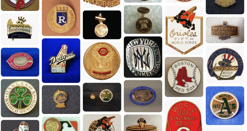
The National League Championship Series begins tonight, with the American League following tomorrow. Soon it’ll be time for the World Series, which means it will also be time for a special little corner of athletics aesthetics to make its annual appearance: World Series press pins.
World Series press pins date back to 1911. The story goes that friends of New York Giants manager John McGraw were were overcrowding the press box. The newly formed Baseball Writers of America decided that admittance would be limited to credentialed members of the press, so some sort of visual identifier was needed — a pin. Early versions of the pins included ribbons, but bright enamel pins with clever, colorful designs soon became the norm, with both teams participating in the Series producing their own designs each year.
Over the years, the pins have become their own little category of memorabilia. They’re now distributed to VIPs as well as to media members, but they’re still produced in very limited quantities, so they’re highly prized among collectors.
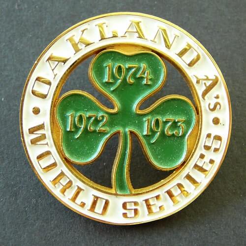
On at least one occasion, press pins have even been worn during a game. A’s outfielder Reggie Jackson wore the team’s 1974 pin (shown at right) on the waistband of his pants during Game Three of the ’74 Series, and NBC’s TV broadcasters even picked up on it, as you can see here:
Anyway: I love creating Uni Watch versions of classic sports collectibles — pennants, gumball helmets, and so on. When our enamel pin turned out to be a much bigger success that I expected (it’s sold over 200 units in less than three months), that got me thinking: Could we do a Uni Watch press pin?
I decided to talk to longtime Uni Watch pal/ally Todd Radom, who’s a big press pin fan (he has a nice collection of them) and is also, of course, a great designer. He liked the idea, so we had a few back-and-forths, a bit of brainstorming, and eventually came up with a new product that I’m proud to show you today — behold the first Uni Watch press pin (for all the photos that follow, you can click to enlarge):

Pretty sweet, right? I really like it. It’s nice that this pin, unlike the other one we’ve been selling, includes the words “Uni Watch.”
As for the other wording, we’ve had a BFBS T-shirt with “BFBS” on the back, an ugly sweater T-shirt with “Ugly Sweater” on the back, and so on, so I thought our press pin should say, “Press Pin.” Now, you may be thinking to yourself, “Er, I’m not a member of the press.” But you are! All of you who scrutinize the uni-verse are essentially part of the Uni Watch media enterprise, whether you send in your Ticker submissions or even just raise uni awareness by discussing uniforms with your friends. You’ve all helped make Uni Watch what it is today, and you’re all fully deserving of wearing a Uni Watch press pin.
A few things you need to know about this project:
1. The pin measures 1″ across. It has a standard butterfly clutch on the back, just like our other pin.
2. Unlike our other pin, which is soft enamel, this one is hard enamel. That means the surface is flat, not ridged/textured. I like both styles, but I wanted to go with hard enamel for this design.
3. We have produced this pin in a numbered edition of 200. Each pin has a unique number laser-etched on the back:
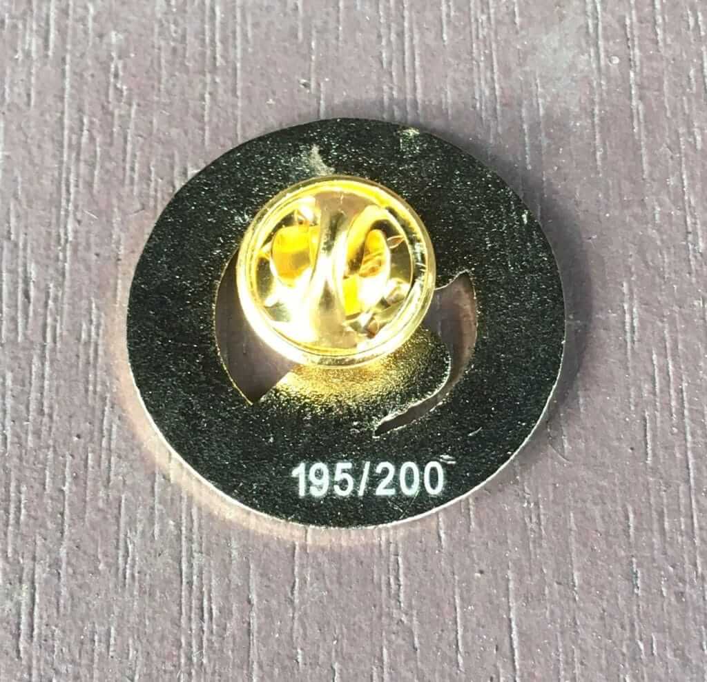
When I received the 200 pins from the manufacturer, I took out 10 for myself and 10 for Todd (those were all chosen at random — I didn’t hunt for pin No. 1 or anything like that) and then sent the remaining 180 pins to Teespring, where they are now available.
4. These are priced at $13.99. That’s more than our other pin ($8.99), for a variety of reasons: Hard enamel costs more than soft enamel; the cutout areas of the design increased the cost; having the numbers etched onto the back increased the cost; and since Todd and I are splitting the profits, I wanted the project to be worthwhile for both of us. I think it’s worth it!
5. Just as new World Series press pins are produced each year, Todd and I plan to create a new Uni Watch press pin each October, right around the time of the World Series. They won’t all necessarily have “Press Pin” printed on them (maybe next year’s will simply have “Press,” just like lots of the Series pins have had), and we won’t necessarily limit the production to 200 pins (if this year’s is popular, we’ll consider doing a larger run next year), but we like the idea of creating an annual ritual around this project.
Frankly, it kills me to know we’ll have to wait another whole year before we can do another one of these. I have lots of design ideas, and it’s my nature to pursue things somewhat obsessively once they get under my skin (you should have seen how I threw myself into the gumball project once the idea took shape in my head), but maybe the long wait will teach me something about patience, or discipline, or something similarly unfun.
For now, though, I’m very happy with this new pin. And look — it fits right in with these real World Series pins from Todd’s collection:

Doesn’t that look nice?
Again, the new pin is available here. Enjoy.
Photos by @Shae_Orr94: click to enlarge
Yet another NBA retail leak: Judging by the photos shown above, which began circulating yesterday afternoon, the Pacers are planning a new alternate that mixes their old FloJo design with some elements of their current “We Grow Basketball” branding.
This isn’t really a throwback or even a fauxback. Maybe a Floback? A Flauxback?
Update: They’ve now been officially announced.
Electric football update: Yesterday I showed you the custom electric football figurines that Uni Watch contributor Gene Sanny painted for the opening sequence of last night’s Giants/Patriots game. In case you missed it (or just want to see it again), the resulting video production is embedded above. Big congrats to Gene — enjoy the moment, buddy!
Click to enlarge
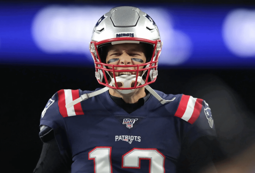
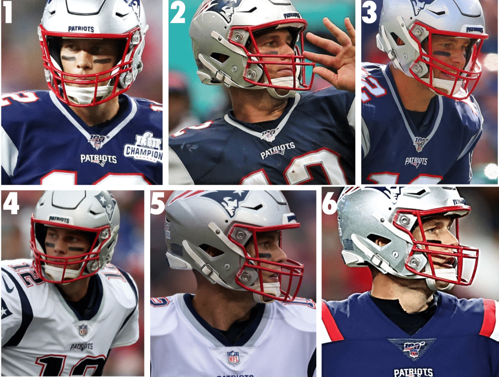
And speaking of that Giants/Pats game: Patriots quarterback Tom Brady did something last night that he hadn’t previously done all season long: He wore a jersey rendered in Nike’s current tailoring template and with the NFL 100 logo on the collar. All of his previous jerseys this season have either been the old, outdated template (Weeks 1, 2, 3) or didn’t have the centennial logo (Weeks 4, 5).
Here’s a week-by-week look at Brady’s collar stylings so far this season (click to enlarge):
Screen shot by Dean Dease; click to enlarge
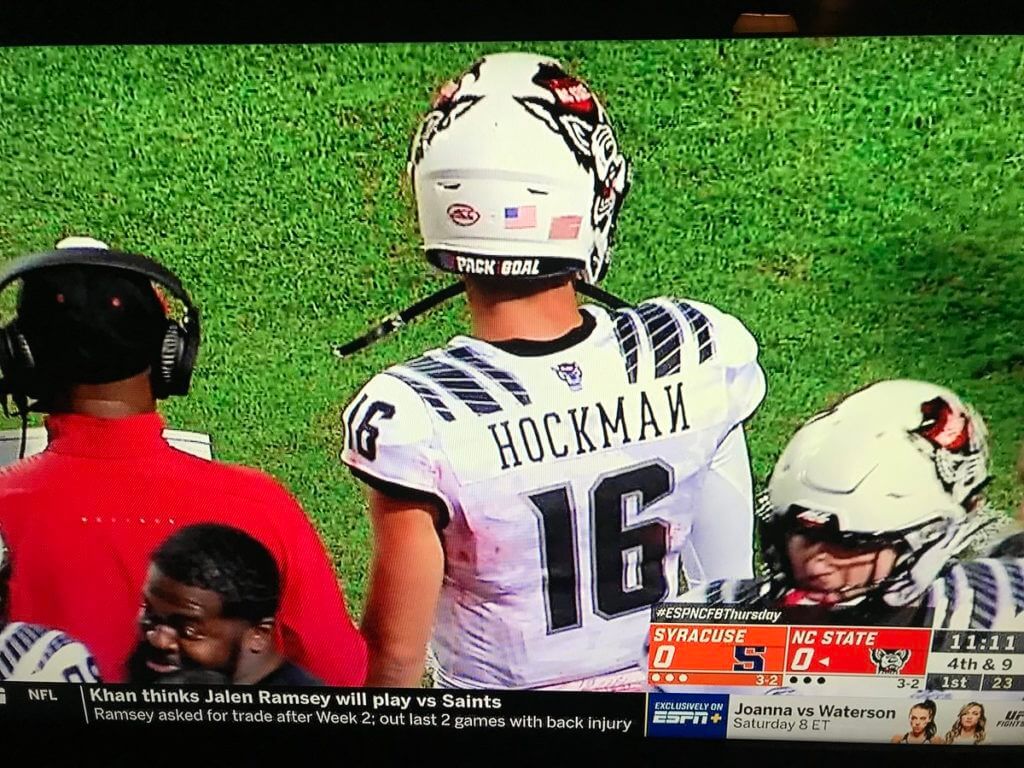
Oopsie: NC State quarterback Bailey Hockman was victimized by a classic NOB glitch last night, as someone applied his N backwards. It’s sort of endearing, maybe even comforting, to see how all of Big Uni’s multi-jillion-dollar machinations are ultimately dependent upon — and can be undone by — the lowest-paid grunt who sews on the letters.
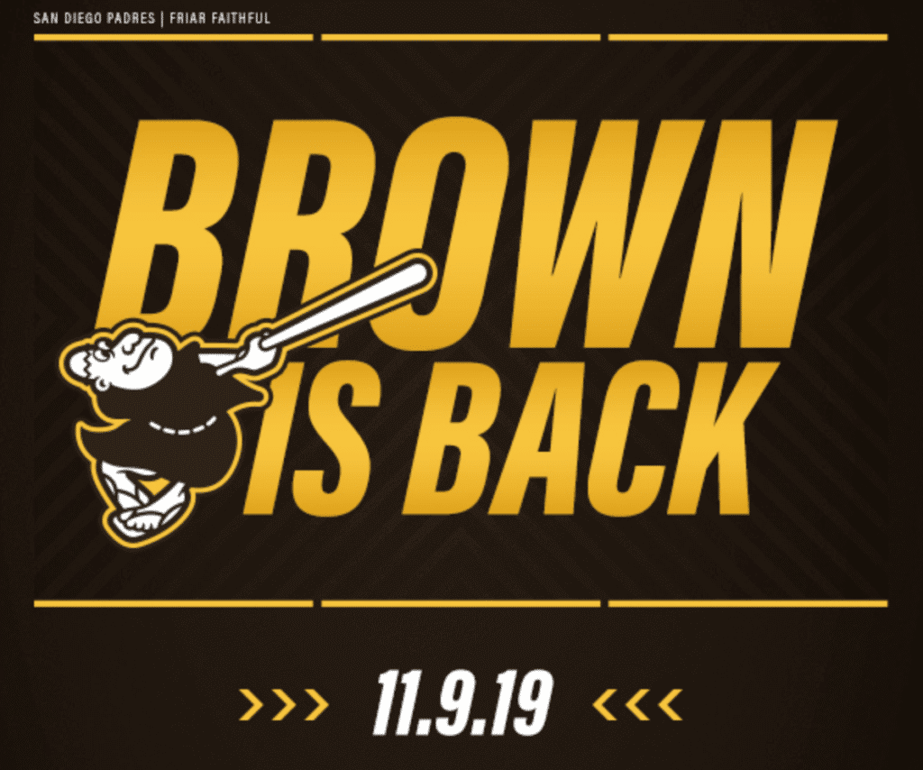
I hear San Diego is nice in November: Got a nice note yesterday from the Padres, inviting me to the unveiling of their new brown-centric uni set on Nov. 9.
Frankly, I’m usually happy to cover uni unveilings remotely. I can often work more effectively by watching the video stream of the event and looking at photos being posted online instead of dealing with the hectic scrum of the unveiling scene.
But some unveilings are worth being on hand for in person, and the Padres going back to brown is definitely one of them. So I think I’ll ask my Sports Illustrated editor if I can fly out to — oh, right, I don’t work for SI anymore. Hmmm.
If any sports, design, culture, or general-interest editors are reading: Would you like me to send me to San Diego so I can cover this event for you? If so, please get in touch. Thanks.

ITEM! One-day Naming Wrongs raffle: An anonymous benefactor has generously offered to pay for a Naming Wrongs T-shirt that I can raffle off.
This will be a one-day raffle. To enter, send an email with your name, shipping address and choice of T-shirt design and size (anything from the the Naming Wrong shop is eligible) to the raffle address by 8pm Eastern tonight. One entry per person. I’ll announce the winner on Monday.
Meanwhile, the winner of this week’s Vintage Brand raffle is Christopher LaBella. Congrats to him, and thanks to all who entered.
The Ticker
By Anthony Emerson

Baseball News: Oriole Park has taken down a vinyl welcome sign as they begin to repaint the brick original (from Matthew Mallen). … To follow up on our champagne celebration conversation from a few days ago, reader David Dahl wrote in: “The last few years the Cubs radio broadcasts have had a live read (the announcer simply reading an ad during the game) calling a sponsoring liquor store chain ‘the official champagne provider of the Chicago Cubs.'” Wow. … Here’s an article about how doubleheaders work behind the scenes at Yankee Stadium (from @brianspeaksnow). … Great article about a former seamstress for the Astros and Colt .45s who’s now 101 years old (from Ignacio Salazar).

NFL News: According to the Gridiron Uniform Database, the Browns and Broncos will be going color-against-color in Week 9, with Cleveland in their Color Rash unis (from Trey Volk). … The score bug for last night’s Giants/Pats game was really inconsistent, with the Patriots’ color alternating between red and blue (from multiple readers).
College Football News: Conference USA’s championship now has a presenting advertiser (from @ThatRodneyGuy). … Louisville is going black-white-black tomorrow (from M. Brinston Berry). … Maryland is going flag-red-red on the road against Purdue this weekend (from Matt Shevin). … UNLV is going silver-white-white against Vandy. … Southeastern is going white-yellow-white against UIW (from Brody McDaniel). … Wisconsin has revealed their latest Camp Randall renovation plan (from Brian Kerhin).

Hockey News: Here’s what Hurricanes G James Reimer’s pads and gloves will look like this season (from Oleg Kvasha). … Also posted in the soccer section: Former Arsenal and Chelsea keeper Petr Čech is starting on his post-football career by becoming a part-time goalie with the Guildford Phoenix of Britain’s NIHL, whose jerseys are based on an old Thrashers template and whose logo is an obvious Flames ripoff (from Charles Garnsey). … New sweaters for the ECHL’s Utah Grizzlies (from Brian Prutch). … New logo for the 2020 Stadium Series game between the Kings and Avs. … Canucks LW Micheal Ferland was wearing pants with the old stick-in-rink logo, while his teammates were wearing the new one (from Wade Heidt).

Hoops News: New unis for Iowa women (from Jay Wright). … New unis for South Dakota State men (from Nick Hartness). … New court design for Syracuse (from multiple readers).

Soccer News: Hallelujah: Chevrolet is “highly unlikely” to renew their shirt advertisement deal with Manchester United, and the club is currently in discussions for a new shirt advert for when the contract expires in 2021. … Sigh: LAFC will have the first sleeve advertiser in MLS history. More details here (from Ed Żelaski and Josh Hinton). … Also from Ed: Hertha Berlin will release a special shirt honoring the fall of the Berlin Wall sometime today. It will be worn on Nov. 9. … One more from Ed: Ukrainian side Shakhtar Donetsk are coming out with their own fashion line. … Cross-posted from the hockey section: Former Arsenal and Chelsea keeper Petr Čech is starting on his post-football career by becoming a part-time goalie with the Guildford Phoenix of Britain’s NIHL, whose jerseys are based on an old Thrashers template and whose logo is an obvious Flames ripoff (from Charles Garnsey). … Uhlsport have some quasi-Adidas stripes on the shoulders of Iran’s kits (from Josh Hinton). … Bleacher Report posted a few mock-ups of what international kits would look like if they took their design cues from national flags (from @TheSportzBucket).

Grab Bag: New logo and identity for the World Fencing Championships (from James Gilbert).
What’s that on your chest, mister? A press pin?
Nice.
And goddamn it, tuck up those pajamas!
Bad link here:
“Canucks LW Micheal Ferland was wearing pants with the old stick-in-rink logo”
Removed from Ticker.
Here is the photo of Michael Ferland wearing the old pants with old Stick-in-Rink logo Wed night.
link
Restored to Ticker!
I think you have an accidental double negative on the Manchester United item, making it sound like the deal will continue rather than be ended: “Chevrolet is ‘highly unlikely’ not to renew their shirt advertisement deal”
Fixed.
Limited edition Uni-Watch press pin???? Just brilliant!!! And gorgeous. Great job Paul and Todd! Here’s hoping for #25!
Maybe “Hockman” is actually Russian, and it’s all Cyrillic! It would be pronounced “nosk-my”, and truly there should be a small diacritical mark (breve) over the И… I’ll show myself out.
1. I LOVE the press pin! Just ordered one, and can’t wait to wear it. I think I’ll start attaching it to my press pass for various conventions and etc that I cover.
2. I say this every time they wear them: As a diehard Pats fan, I really wish the color rush jerseys with corresponding silver pants were their normal home uniforms. They keep the color scheme of the “Brady/Winning era” while at the same time being significantly cleaner.
Typo: Reggie Jackson wore the team’s 1974 pin (shown at right) on the waitband of his pants
Got it. Thanks!
Great to see the Padres going back to brown, and bringing back the swinging friar. However not sure why they went with the original logo, while a classic design, it is dated in its details. The 1997 version, perhaps wearing brown instead of red, would work much better going forward. Same charming concept, but more fitting for modern designs.
In regards to the N on the NC State QB’s jersey. The N must be backwards and not upside-down. As an upside-down N is still simply an N.
Love the press pins! One of my favorite designs was never even used. I saw it in a yearbook a long time ago- the 1951 Dodgers pin, ruined by one Bobby Thompson. Just captures the style of the era:
link
that’s outstanding sez the guy who wore a fedora with a playing card in the band for quite a few years
I feel personally victimized by your new pin scheme, Paul! It’s like you know that I collect lapel pins, and so you’re basically minting money from me here. Also, I no longer regularly need to wear suits for work, so I rarely have the chance to wear any of my pins. So not only did I have to order yet another Uni Watch pin, now I might have to look for a new job that puts me back in an office on a daily basis just so I can wear it!
Kidding aside, great pin design. Any way to request numbers? Like, I’m a fan of any number that ends in 4. Or 30, for Wisconsin being the 30th state. That sort of thing?
Oh, I meant to include a note about that: No, unfortunately, no way to request specific numbers. Luck of the draw!
Shorter Paul, “Do you feel lucky, punk?”
link
Yeah, in this case I do!
I’m weird about numbers, and usually find a way to retcon product numbers like n/200 into something superstitiously meaningful.
Who cares if Chevrolet is ending their advertising on Man U shirts when they’ll obviously just be replaced with another one?
Another ad, sure, but almost certainly less brutally ugly. Which ain’t much, but it’s something.
I personally feel that we go down a dangerous path if we start to apply a sort of relative acceptability for corporate sponsorship BS based on things like the pleasingness of their name or logo.
Totally agree. There’s no hierarchy of acceptability for something that’s inherently unacceptable.
People legitimately do take ads into account when assessing whether they like a shirt or not (FWIW, I don’t, I just ignore them) and complain if, like Man U’s, it’s an odd color/not a team color/has a different color background/etc.
The rest of the world is a little farther gone than us on that.
I agree in principle, but as a practical matter the ad is really and actually present on the uniform, and it looks like what it looks like. So to an observers, a soccer shirt with one particular ad looks more or less attractive than it would with another particular ad.
There are soccer teams that I’d be inclined to casually follow and root for, but their advertising is so ugly or disruptive of their uniforms that I just can’t. Whereas there are teams where I would rather they didn’t have advertising, but everyone does, and their ads are less ugly, so I can mostly ignore them and those are the teams I casually follow. To be clear, aside from Newcastle United back when Newcastle Brown Ale advertised on their shirts, I have never and would never regard a jersey ad as a positive thing. But some are easier to ignore than others. Man U’s Chevy ad is among the least-overlookable ads in sports history, so their post-Chevy advertising is almost guaranteed to be easier to ignore, and therefore better.
So to an observers, a soccer shirt with one particular ad looks more or less attractive than it would with another particular ad.
It depends on what you mean by “attractive.” Attractiveness (or aesthetics, or whatever term you’d like to use) can be affected by many things. If one feels the way I do about ads on uniforms, for example, then there can literally be no such thing as an attractive uniform ad.
also funny as a sponsor because Chevy has effectively quit the UK (and western Europe)
“Hold my beer.”
– ManU’s next sponsor
Need Wales Rugby to go back to sponsorship by “Brains”…a Regional Welsh Brewery.
Press pin is gorgeous, just placed my order! I love they are numbered and looking forward to seeing what number I get. Having it actually say “Uni Watch” increases the appeal for me.
Maybe not practical, but it would be fun to set up a tracking chart to see what number everyone gets. And/or set up a swapping system so people can trade numbers.
Not a bad idea! I’ll see what we can do about that. Would you like to be the point person keeping track of it?
the swap idea could make buying the pin nearly irresistible, but more expensive like the new guy on the team buying his fave number from a veteran.
Does it bother anyone else that the retired numbers on the Syracuse sideline are not centered?
He can’t do that to our Uni Watchers! Only we can do that to our Uni Watchers!
LA is not the first with a sleeve advertisement in MLS. I believe all the teams had them in the early days before MLS chest advertisements.
link
Yup. The Galaxy had a Budweiser ad on the sleeves in the early days:
link
In the last photo of the press pin section, there is a Cincinnati Reds press pin for the 1964 World Series. The Reds finished one game behind the Cardinals (and tied with the Phillies after Philadelphia’s infamous collapse that season). Cincinnati was still alive on the final day of the season, and the Phillies and Reds cannibalized one another in the last couple of weeks to allow the Cardinals to take the pennant.
Back to the press pin, I assume the Reds ordered the pins in anticipation of playing in the World Series? Is there another reason why the pins would exist?
Yes, exactly. These are called “phantom” pins. That’s a whole sub-niche that some people specialize in collecting.
I would imagine its reason for existing would be no different than all the losing-team-Super-Bowl shirts sometimes making their way onto eBay despite the NFL’s best efforts to make sure they all make it to less-fortunate parts of the globe, especially since there was no postseaon back then. Regardless, that’s a great catch on your part though.
To clarify, the Browns announced a series of games for which they intend to wear their primary (ie. Color Rush jerseys/pants) uniforms and it included the Week 9 game in Denver. Broncos announced 2 games for which they intend to wear their navy jerseys at home and 1 game to wear their all-orange Color Rush. Presumably, all other Bronco games are their normal home orange jersey combo…including this Week 9 game hosting the Browns.
Set up a gofundme page to finance, a cheaper than flying, road trip to San Diego for the unveil, along with random stops to biggest balls of yarn etc. That’d be a fun travel log. I’d throw in a few dollars for that, along with probably buying that pin for my jean jacket that I’ll eventually lose enough weight to fit into again.
There are a few sports-related items in an upcoming rock memorabilia auction:
Elvis Presley baseball jersey:
link
A WFL game program signed by Elvis:
link
I’m actually going to be in Long Beach, CA on 11/9 so if you do make it out there, swing by the Queen Mary sometime over that weekend and I’ll give you the full, unauthorized guided tour.
You probably get this a lot, but have you ever encountered anything haunted while on it? I’ve stayed at one of the hotels across from it a handful of times and I always wonder what happens inside at night lol
I don’t believe in such things. That said, I’ve been in almost every nook and cranny of that ship, including off-limits areas, often alone, and never seen or heard anything that scared me.
I’d actually think a team like the Padres should want you there to give your take on the uniforms…or better yet involve you in the process before hand in order not only to get input, but to gauge reactions beforehand.
Has any team ever asked you to participate in the uniform overhaul or redesign process?
I found it interesting that the Giants didn’t wear their Color Rash uniform (as the Patriots did), considering it’s white.
That Cubs live read on the champagne provider is one of, oh, roughly 10,000 such ads they work into every game’s play-by-play. There’s also one for the uniform descriptions (“sponsored” by a paint company) and the national anthem (even though they don’t even BROADCAST the anthem).
MLS used to have lots of Sleeve ads. I remember DC United having Mastercard logos on their sleeve around 2000
link
Well, you’re not wrong.
The mention of press pins/identifiers always reminds me of this:
link
Press
Press
Pull – Nyuk Nyuk Nyuk
Lots of great items in that A’s/Dodgers game/series from 1974
1. Time of Game – 2 Hrs 35 minutes, for a 3-2 ballgame. Longest game in the series was 2 hours 43 minutes. A far cry from the 3 1/2 to 4 hour games of today.
2. At the beginning of the broadcast the clothing worn by Monty Moore (white turtle neck with a red/white jacket) and Tony Kubek (some sort of leisure suit)
3. White hats with green bills worn by the A’s coaches.
4. In the game ending double play, Campenaris must have been 3-4 feet outside 2nd base throwing to first and the Dodger runner was out there trying to break it up.
5. Fingers, the A’s CLOSER, pitched 4 1/3 innings in Game 1 for the win. He had 2 saves as well.
So are we going to do a Padres redesign contest?!