Soon… pic.twitter.com/jhHbSJgimb
— Milwaukee Bucks (@Bucks) October 7, 2019
As you can see in the teaser video above, the Bucks are planning some sort of announcement or unveiling on Oct. 9 — that’s tomorrow.
But the cat — or the deer, if you prefer — is already out of the bag, because this photo began circulating yesterday (click to enlarge):
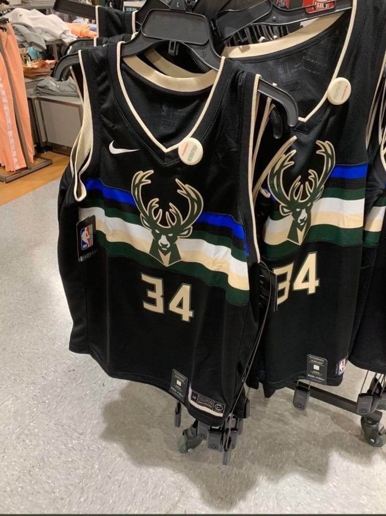
I don’t know where that photo originated (several people forwarded it to me yesterday — my thanks to all who did so). Ordinarily I’d be more skeptical or hold out for more definitive sourcing, but the jersey design is obviously similar to the pattern shown in the teaser video, and NBA retail leaks have consistently proven to be accurate over the past couple of years. So I don’t have any hesitation in saying that this is clearly the Bucks’ new alternate uni.
As you can see below, the new design is sort of a hybrid of the team’s Cream City alternate and the black “Fear the Deer” Statement alternate (and if you can keep track of all that, you’re way ahead of me):

I’ve been saying all along that Nike’s endless parade of NBA alternates — City, Statement, Earned, Pride, Respect, Sick, Fresh, Definitely, Mmm-Hmm, etc. — is unsustainable. But hey, maybe they can keep it going forever if they just keep mixing and matching elements like they’ve done here. Not very original, but it’s a good way to keep pumping out gratuitous product, right? Right.
Click to enlarge
Collector’s Corner
By Brinke Guthrie
Follow @brinkeguthrie
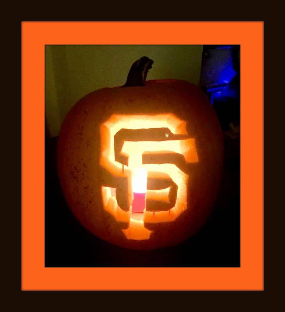
October is definitely my second-favorite month of the year (after December). I love the whole vibe, especially the Great Pumpkin (and when the Giants win the World Series, of course). Speaking of which, there’s still plenty of time to carve your pumpkin with the logo of your favorite sports team. I tried to do a Giants one once; it did not look nearly as nice as the one shown above. Anyway, eBay has pumpkin carving kits for NFL, MLB , NHL, and NBA.
In addition, many pro sports teams offer their own logo stencil pattern. I’ve listed lots of them on this handy-dandy spreadsheet. Yes, this took a long time to compile. [Let’s give Brinke a standing O for putting all of this together! — PL]
Now for the rest of this week’s picks:
• This 1970s Rawlings NFL jersey isn’t identified as “Atlanta Falcons,” but that’s certainly what it is.
• Staying with the Falcons, this is one pretty big a target=”_blank” href=”https://ebay.to/2IslrXo”>belt buckle, from 1979.
• Here’s one shiny-looking 1970s Seattle Mariners vinyl rain jacket. Probably a promo item?
• Dave Winfield of the San Diego Padres knew how to hit, and he offered batting tips on this 1970s LP record.
• This green 1970s jacket says JETS on the back, made by Aladen Athletic Corp. of Pompton Lakes, N.J.
• Mr. Red looks rather, shall we say, diabolical on this 1961 “(National League) Champions” pennant.
• This 1990s NFL Pro Line Kansas City Chiefs pullover by Reebok is a textbook example of BFBS. They have a timeless uniform color scheme (virtually unchanged since the franchise’s inception), yet the dominant color here is, well, take a look.
• Last week we posted a link to a Len Dawson/Chiefs puzzle in a can, but with no KC logo on Len’s helmet due to licensing. This week, we see Terry Bradshaw had the same deal. (Of course, his helmet was always blank on the opposite side anyway.)
• What do we have here? Just a pair of 1970s aqua-colored bell-bottom jeans, complete with a Dolphins patch on the backside. Now who would ever wear these? I know — the same youngster who’d wear the matching shirt.
• Great artwork on this 1970s NFL comforter.
Got an item to include on Collector’s Corner? Send any submissions to uniwatchcollectorscorner@gmail.com!
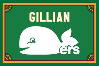
Membership update: We usually refuse to base a membership card on a jersey’s front design, but we made an exception for longtime reader Mike Engle, who wanted to get a card for his wife, Gillian. It’s based on the jersey shown in the center of this old Whalers photo. Since the name on that jersey was on the front, not the back, I figured we could go ahead and do it. Hope Gillian likes it, Mike!
Gillian’s card is one of a new batch of designs that have been added to the membership card gallery. The printed/laminated versions of these cards should ship out by the end of this week.
Ordering a membership card is a good way to support Uni Watch (which, frankly, could use your support these days). And remember, a Uni Watch membership card entitles you to a 15% discount on any of the merchandise in our Teespring shop and our Naming Wrongs shop. (If you’re an existing member and would like to have the discount code, email me and I’ll hook you up.) As always, you can sign up for your own custom-designed card here, you can see all the cards we’ve designed so far here, and you can see how we produce the cards here.

Click to enlarge
Raffle reminder: In case you missed it on Monday, our longtime advertiser Vintage Brand is running another raffle. The lucky winner will get to choose any product from the VB website (including stainless steel tumblers like the ones shown above, which VB has just started offering).
To enter this raffle, send an email to the raffle address by 7pm Eastern this Thursday, Oct. 10. One entry per person. I’ll announce the winner on Friday. Good luck!
The Ticker
By Alex Hider

Baseball News: The Nats went with a dark curly W on the mound last night. They used a light-colored curly W on Sunday night (from JohnMark Fisher). … Reader Brad Eenhuis notes that the Rays’ championship banners aren’t level and sit at funny angles. Also, he says it would make more sense for the banners to go chronologically from left to right, and I have to agree. … The Washington Post’s website was using an old Astros logo on their digital scoreboard yesterday (from @flanerieoconner). … This dog has some pretty good-looking South Carolina baseball jerseys — complete with a jock tag! (From Chris Wellbaum.) … Check out this juicy photo of a minor league baseball team from the 1920s or ’30s from Little Rock, Ark. Jonathan Martin’s great-grandfather was on the team — he’s at dead center — but Jonathan and his family have no idea what team this was. Anyone know? … Tim Shriver reports that Topps partnered with New Era for a set of baseball cards in 2017 and again in 2018. The cards were intended as promo giveaways for retail customers who made qualifying cap purchases. If you click on those links, you’ll see that almost every single card shows the player wearing a cap (not a batting helmet) and is shot from the player’s left, so the maker’s mark is visible.

Football News: This State Farm ad seems to parody the all-too-familiar football uniform unveiling video (from @GameplanChicago). … John Fonte found this early-’90s Sacramento Surge football jersey at a thrift store. They played in the World League of American Football for a few years. … Taylor County High School in Kentucky wore Kentucky National Guard-themed uniforms and Pinktober accessories (from Josh Claywell). … Galesburg High School (Illinois) uses railroad track striping, à la Purdue (from Jackson White). … Colts K Adam Vinatieri has been wearing an older-model helmet the past two weeks (from Ben Grauer). … Purdue — the alma mater of the first and last people to walk on the moon — will wear “moonwalk” uniforms for this Saturday’s homecoming game (thanks to all who shared). … Looks like Syracuse will live up to their namesake and go all orange for their next game (from Jakob Fox). … Appalachian State will wear yellow helmets, white jerseys and yellow pants on Wednesday night (from @OlegKvasha). … Not sure how long this has been going on, but the AP has turned its college football rankings into an ad. Yuck (from our own Jamie Rathjen). … A sideline worker at last night’s 49ers/Browns game was wearing a Super Bowl 50 patch. Supe 50 was played at the Niners’ stadium.

Hockey News: The Avs are now using their team font for captaincy patches on their navy alternate jerseys. They’ve been using a sans serif font in the past (from @ColoradoZebo). … New wordmark for senior hockey club Hamilton Steelhawks (from Ross Taylor). … The Rimouski Oceanic of the Quebec Major Junior Hockey League have a new alternate uniform for their 25th anniversary (from Wade Heidt).

NBA News: The College Park Skyhawks, the Hawks’ D League affiliate, have announced the giant jersey ad they’ll be wearing this season. … Speaking of the Hawks, they’ve added screens inside their midcourt scoreboard so those sitting courtside can see the score (from @dougkeklak). … The Cavaliers are holding a design-a-court contest, and the winning design will hang in the Cavs’ arena (from Sean Thesing).

College Hoops News: We have our first look at Utah State’s new uniforms (from @akaggie and Tim Hansen). … UMass has a new floor (from Nicholas Neilling). … Houston has named the court in its arena after a booster (from Ignacio Salazar). … New jerseys for the Daviess County High School (Kentucky) girls’ team (from Josh Claywell).

Soccer News: Italy will wear green, 1950s-era jerseys during an Oct. 12 match against Greece (from Josh Hinton and Marco Celin). … Lots of pink on the pitch yesterday: Spanish side Las Palmas released a new pink kit (also from Josh Hinton). .. Also also from Josh: Germany’s Euro 2020 home jersey has apparently leaked. … One more from Josh: Henry Clay High School in Kentucky, who has previously poached Manchester United’s crest, is now poaching FC Cincinnati’s logo… Stanford women’s soccer wore pink jerseys against Washington on Sunday (from our own Jamie Rathjen). … Mexican side Pumas teased pink jerseys yesterday (from Ed Żelaski). … New shirt advertiser for Bolton of England’s League One (also from from Ed Żelaski).

Grab Bag: The University of North Carolina’s student newspaper has a piece about the Carolina blue fire trucks that patrol Chapel Hill (from James Gilbert). … Also from James, here’s a piece on the Drum Corps International uniforms.

I want to thank the comm-uni-ty for the outpouring of support in the wake of yesterday’s post about my sudden departure from Sports Illustrated. We had a spike in membership orders and merch purchases, some of you made donations, and a few of you really went above and beyond (you know who you are — I’m truly grateful). Everyone: THANK YOU!
Uni Watch could really use your help during this difficult stretch. If you have the means, please consider give that support via a donation, a membership enrollment, or a merch purch. Thanks again. — Paul
That Bucks jersey really reminds me of link. Guess that’s how Nike keeps it going — borrowing from other sports…
Here’s a super in-depth look at Auburn’s orange jersey history
link
Regarding DCI uniforms:
Best one were the Bayonne Bridgemen — all-yellow great-coats that usually concealed some kind of wacky costume that depended on the theme of the performance.
That’s why they were often called “The Bananas of Bayonne.”
Not Velvet Knights, with their signature red vans?
Chucks
Little Rock baseball team logo looks like that of the Chicago, Rock Island and Pacific Railroad–the “Rock Island Line”: link
Yes, that crest definitely looks to be the same shape as the Rock Island railroad symbol.
My guess is that this is a company team based in Little Rock. Or possibly a town ball team sponsored by the railroad. I love the LR initials on the sleeves.
I don’t think that this is the uniform of the Little Rock Travelers who played in the Southern Association during the 20s and 30s.
Some proofreading:
“Three of the four teams in last night’s playoff games wore navy jerseys yesterday”
There were six teams who played last night, not four. The Braves were playing the Cardinals, the Nationals were playing the Dodgers, and the Twins were playing the Yankees.
“If you click on those links, you’ll see that every single card shows the player wearing a cap (not a batting helmet) and is shot from the player’s left, so the maker’s mark is visible.”
That appears to be correct only for the 2018 set, not the 2017. Looking at the 2017 set, #3 Khris Davis, #22 Adrian Beltre, and #25 Mookie Betts are all shown from the right, with the New Era mark not seen. And a lot of the other cards aren’t even shown.
You can put me in the camp of the people who are not really fond of the Bucks uniforms since the change to the forest green with the cream trim. Not a fan of the cream/vintage white in general on sports uniforms, especially when used as a primary trim colour. The number font does not help. Adding in touches of black and blue trim seems like too many colours. Some of the new alternates I have not liked. I prefer the prior set with the green and red trim more.
I wish the Bucks would just give us what we want. Back to the double green!
link
The cream color really does resonate in Milwaukee (Cream City). I personally wish they’d gone with cream instead of white as their home color.
The jerseys that the dog is wearing in the “baseball” section are actually South Carolina softball jerseys, not baseball :P Apparently the SC coach sent them to the dog!
The dog is Dawn Staley’s. The head women’s b-ball coach and HOF player/Olympic legend. That’s why it has “official” jerseys that look to be made from old softball jerseys or warmups.
It’s hard to tell from the photo but it looked like Houston had already named its court after Elvin Hayes. (Which makes sense, unlike naming it after a booster.) Now it appears they have a court so nice they named it twice.
As someone who misses the traditional Drum Corps uniforms, the key quote in that article is “The members were thrilled that for two minutes, they got to wear something that looked like the iconic Blue Devils look.”
Imagine how thrilled they would be if they got to look iconic for the entire show.
I noticed that the Bucks jersey in the store doesn’t have the ad patch. Is this the common practice?
Retail jerseys, except for those sold at the team’s arena, are usually ad-free.
I didn’t know this before about the NBA’s ad patches. Seems like a really odd place for them to draw the line. For one thing, I know there’s a (frankly disturbing) constituency of consumers who simply have to have the exact same thing as worn on field/court/ice etc. right down to the stupid stickers. For another, I rather thought turning the fans into an omnipresent swarm of walking billboards was basically half the point of ads on uniforms? It certainly is with soccer jerseys.
I mean, the last thing I want to do is tell the NBA to make this shit idea into an even worse one, but it really seems like this is more of an oversight than any form of restraint. Or perhaps there’s some other reason I’m not aware of?
“But hey, maybe they can keep it going forever if they just keep mixing and matching elements like they’ve done here. Not very original, but it’s a good way to keep pumping out gratuitous product, right?“
Ah yes, the Taco Bell menu philosophy, applies to jersey design.
It is bad that I’ve waited for months to pull the trigger on a membership, because I can’t make a damn decision about what jersey back I want on my card? Similar to the reason I stopped buying/wearing jerseys; committing to one player seemed too risky. “What if he gets traded? Or becomes a turd on social media?” In this case it’d be my name and favorite jersey number(21), and I’m STILL undecided. No time to think about it now, I only have an hour and a half to decide on lunch.
In addition to the the Bolton’s shirt advertiser, they have new uniforms made in-house to replace a temporary one made by Hummel earlier in the year.
link
link
Fwiw I beat FH to it; follow this account for similar content.
This has probably been mentioned before but shouldn’t that old Whalers logo just have the letters “rs” in lowercase? Seeing as how Whale ends in “e” this makes it “Whaleers.”
Still maybe the best of the cutesy-cartoon logos though.
That helmet Adam Vinatieri is wearing is an old Bike/Adams Pro Edition 2000 by the looks of it. I’m kind of surprised it’s on the list of approved helmets for the NFL.
Is it just me or does the Bucks jersey look like something a toddler would wear?
New basketball court for the USF Bulls.
link
Those Carolina blue fire trucks are dope as hell.