Click to enlarge
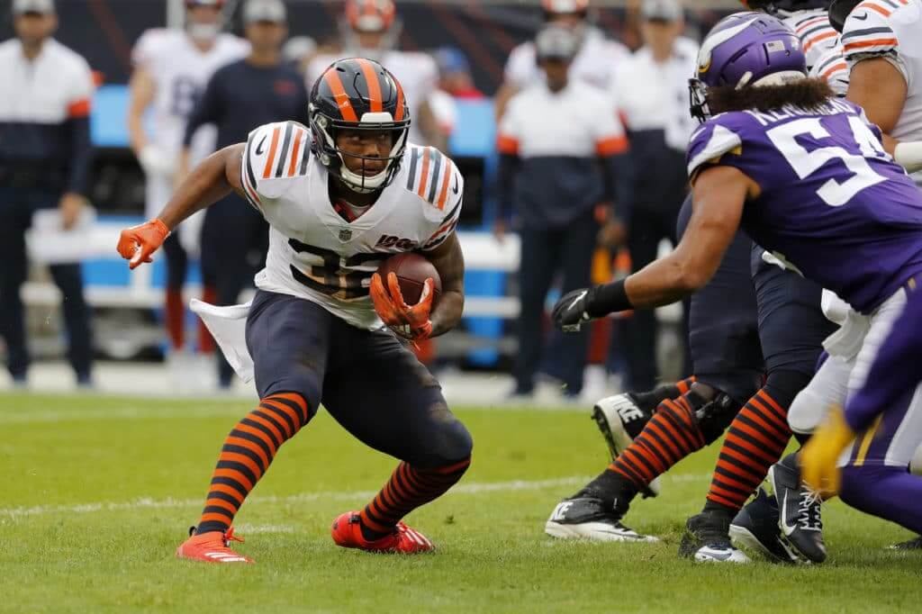
Good morning! The Bears wore their much-discussed 1936 throwbacks yesterday. Since they were wearing white at home, the Vikings wore purple — the first time they’ve ever done so at Soldier Field. Lots of additional photos here, here, and here.
In case you missed it last week, the Bears released a remarkable video statement about this uniform’s history as part of the NFL’s 12-year segregated era, and I wrote an SI article about what that might mean for throwbacks going forward.
In that same game, there appeared to be an extra pylon near the back of one of the end zones:

In other news from around the league yesterday:
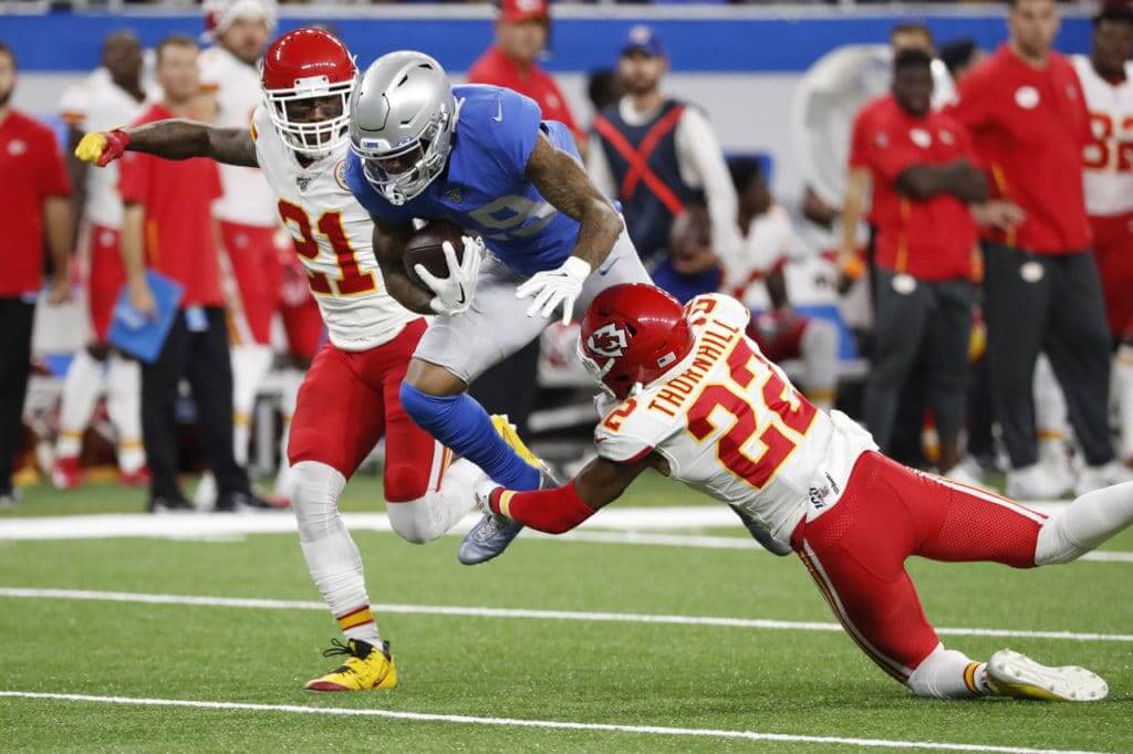
• The Bears weren’t the only team to wear throwbacks. The Lions wore theirs:
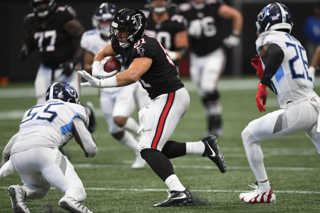
• Still more retro action in Atlanta, where the Falcons wore their black throwbacks:
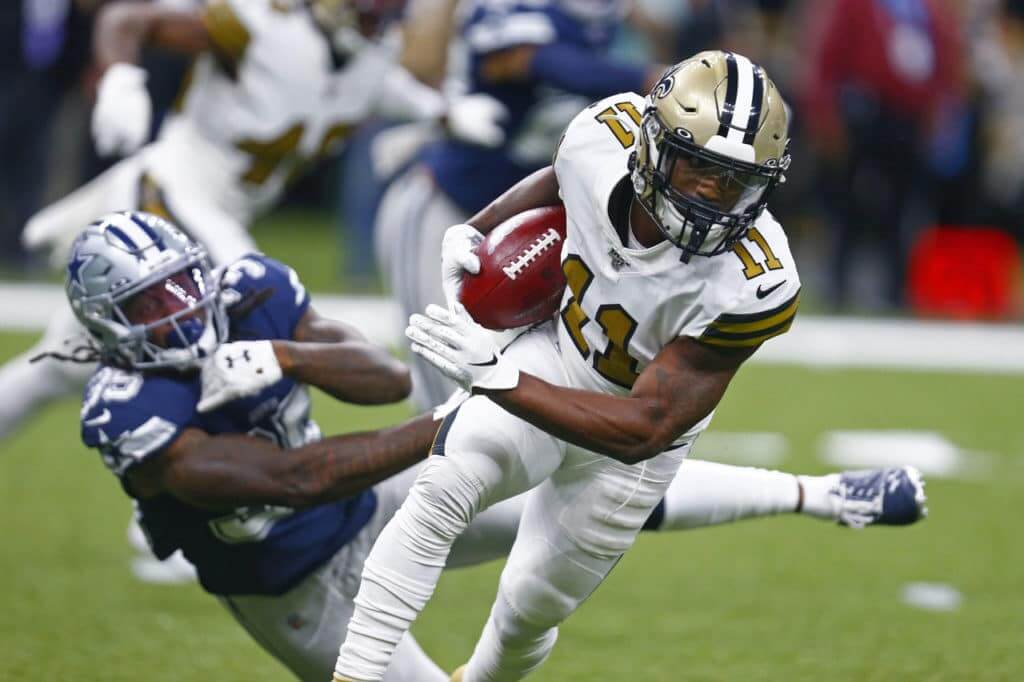
• For the second straight week, the Saints wore their white Color Rash uniforms — this time at home:
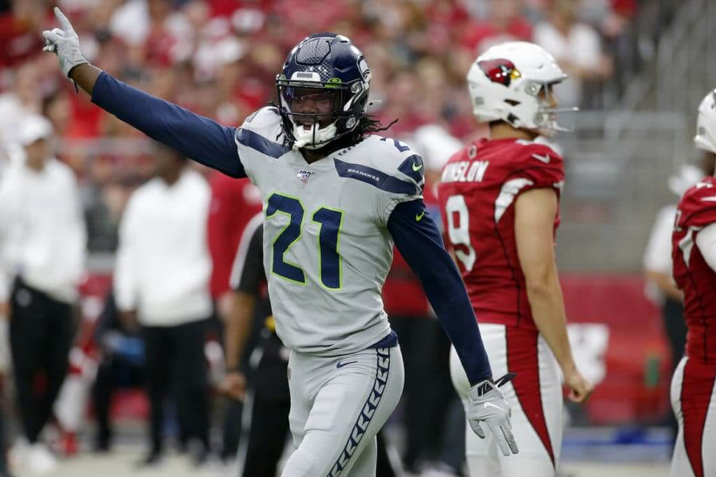
• The Seahawks wore their grey alternates. After eight years of this, it still looks like dirty laundry to me:
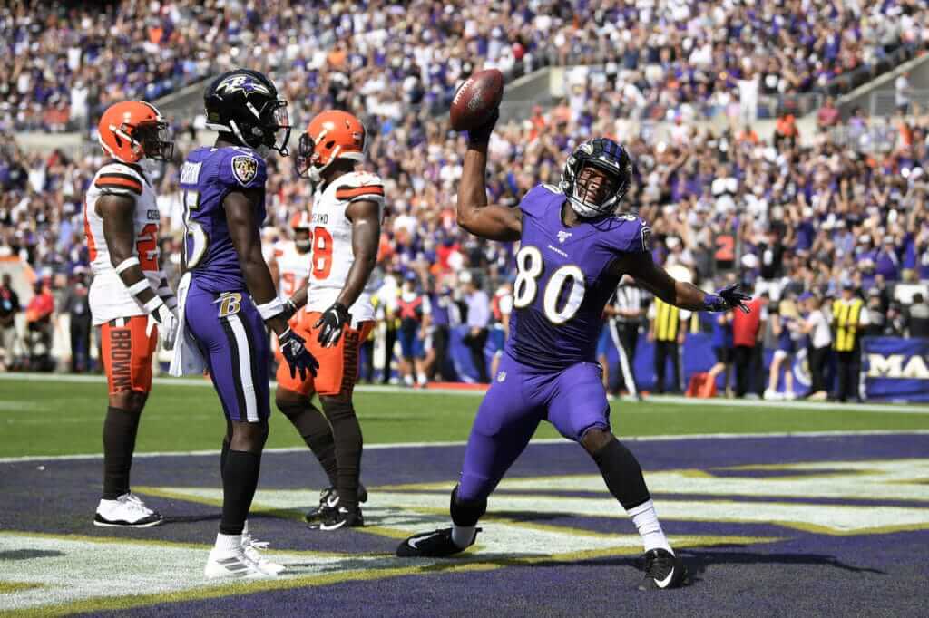
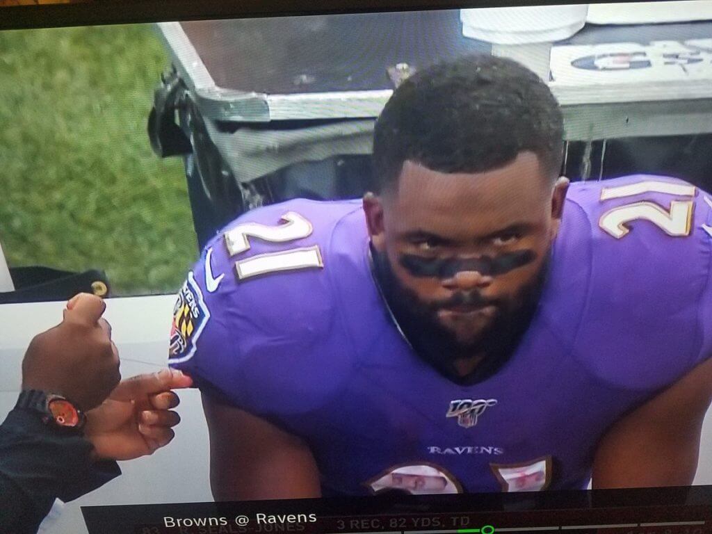
• The Ravens went mono-purple:
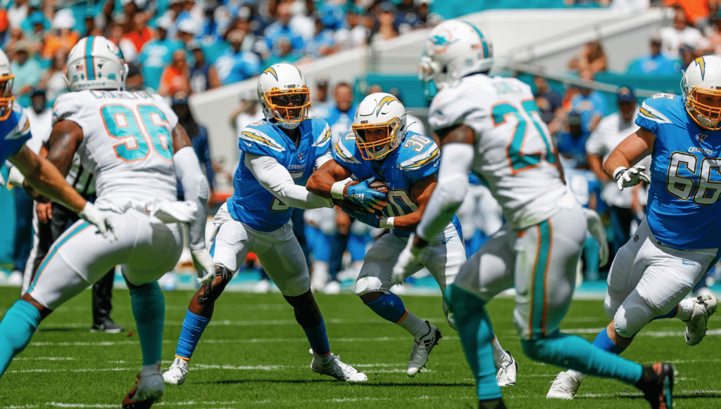
• After wearing white for the first three games of the season, the Chargers finally broke out the powder blues:
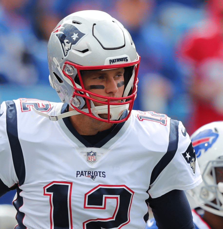
• The saga of Patriots quarterback Tom Brady’s jersey collars continues. For the first three games of the season, all of which found the Pats wearing blue jerseys, Brady wore an outdated tailoring template but still had the NFL 100 logo on his collar. For yesterday’s game against the Bills — New England’s first game this season wearing white jerseys — Brady had the updated template but did not have the NFL 100 logo, which really makes no sense (click to enlarge):
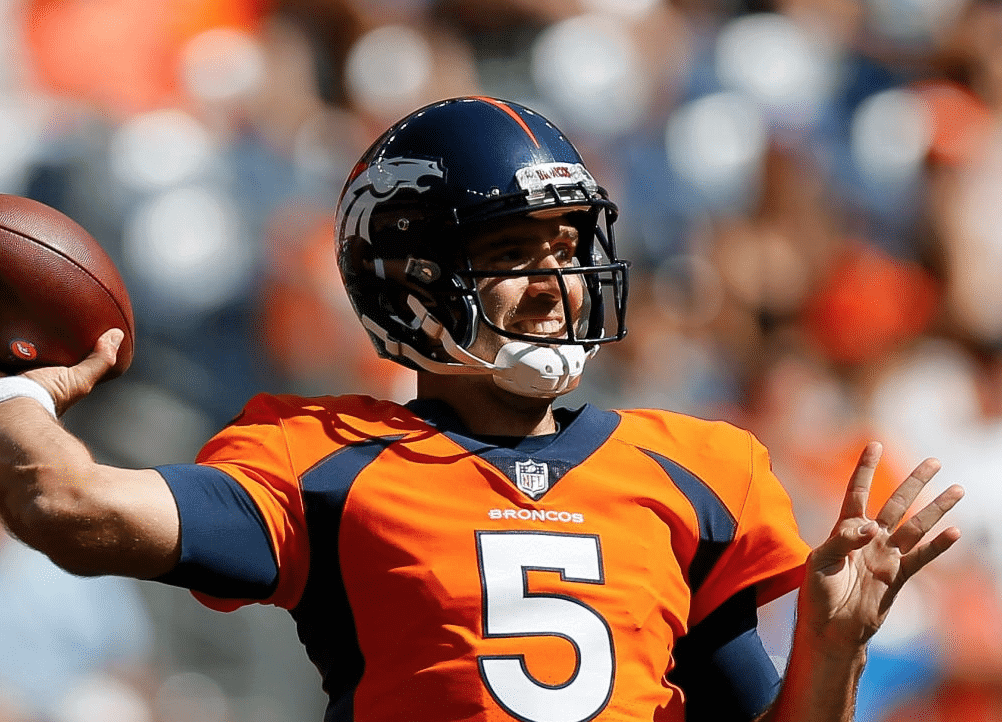
• Broncos quarterback Joe Flacco’s NFL 100 collar patch was also AWOL yesterday:
• The Chargers’ trainer’s box has a helmet logo that still shows the team’s now-outdated blue facemask:
@UniWatch the trainer’s box for the Chargers has the old face mask on it pic.twitter.com/tw0W1St3Ve
— Drew Winthrop (@drew42w) September 29, 2019
• Ravens running back Mark Ingram II suffered some sort of jersey mishap that required a sideline repair with needle and thread:
• Giants kicker Aldrick Rosas wore his chinstrap in a particularly odd manner:
@Giants kicker Aldrick Rosas wore his chinstrap like a mouth guard today in #WASvsNYG WHILE he was kicking. Pic is from immediately before and after a FG he kicked right before halftime and wasn’t adjusted during the play. @UniWatch @PhilHecken @HelmetStalker @ban1helmetnfl pic.twitter.com/1lOs8t0WVj
— What the Helmets?! (@WTHelmets) September 30, 2019
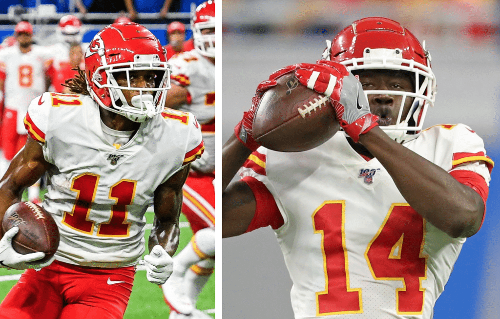
• Here’s a weird one: Chiefs wide receivers Sammy Watkins and Demarcus Robinson were both missing their Lamar Hunt/AFL jersey patches:
• Speaking of Chiefs wideouts, Tyreek Hill was inactive for the game but watched from the sidelines while wearing a very nifty personalized polo shirt:

• It’s been evident for a while that Saints running back Alvin Kamara wears a necklace on the field with some sort of pendant. It now turns out that the pendant is “QC,” which stands for Quality Control, the record label co-founded by his uncle:
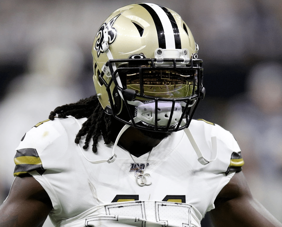
In that photo, you can also see a little divot in the nose bumper where a decal would normally go. The Saints are one of only three teams that leave the bumper blank (the other two are KC and Washington). I didn’t realize that some helmet models have this recessed area for the decal, instead of just a flat surface.
• Four teams wore white at home: the aforementioned Bears and Saints, plus the Rams and Dolphins.
———
In addition, you can see my picks for the best- and worst-looking games of the week over at SI.
(My thanks to all contributors, including Matt DeMazza, Chris Dunn, Jakob Fox, Zachary LoeslScott McKechnie, Gershon Rabinowitz, and @ajenkinsCLE.)
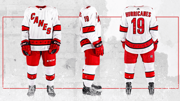
Almost time to drop the puck: Don’t look now, but the NHL regular season begins on Wednesday night, which means it’s time for the annual Uni Watch NHL Season Preview, featuring all of the new uniforms, logos, center ice designs, and related news for 2019-20 (including the Hurricanes’ new road uni, shown above).
The preview is now available over at SI. Enjoy.
Click to enlarge
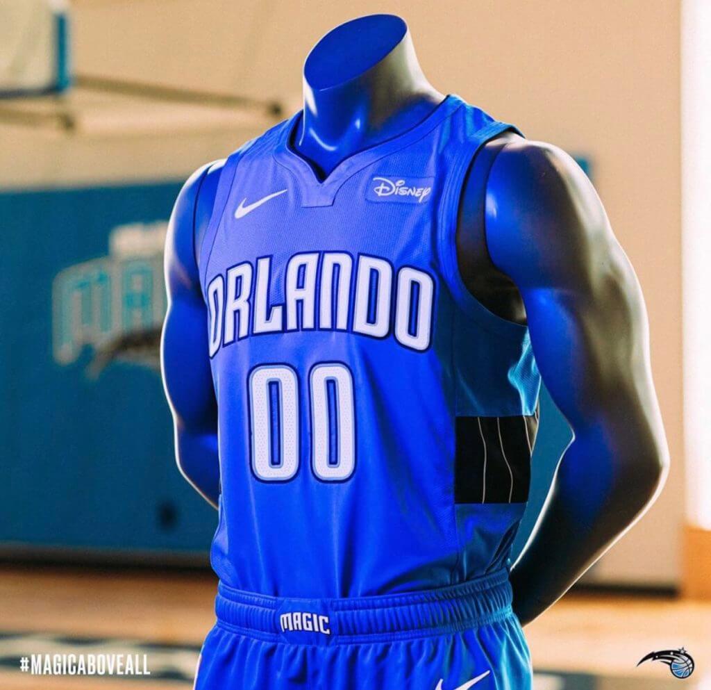
Meanwhile, over on the hardcourt…: Just as I was getting ready to publish today’s post, the Magic unveiled their new Statement uniform on their Instagram page.
Here are some additional photos:
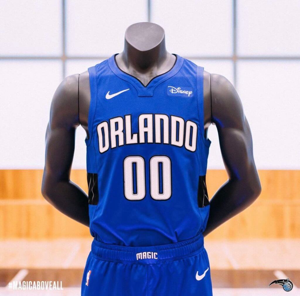
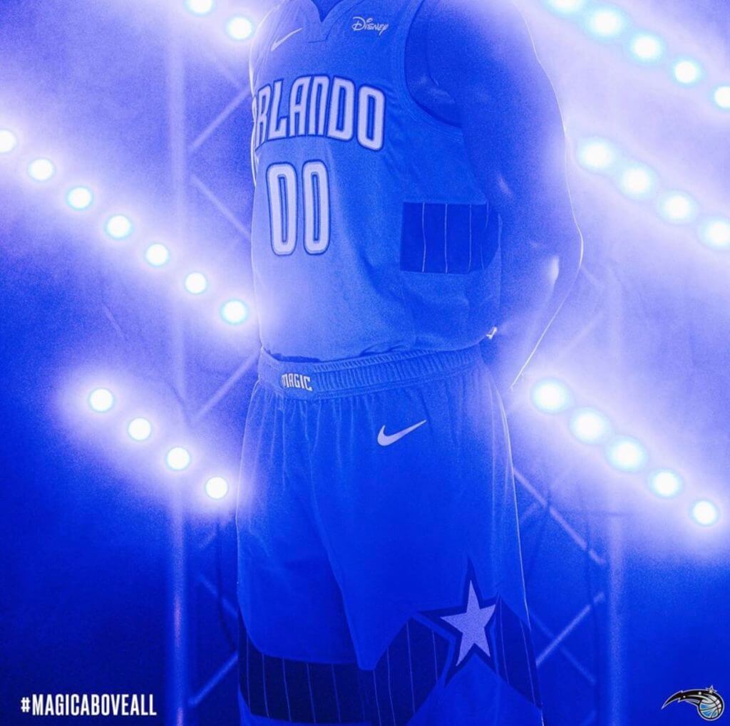
I confess that I have no idea what the recurring plank/boardwalk/Jenga motif is supposed to signify, but I’m sure someone out there can tell us, yes?
Click to enlarge
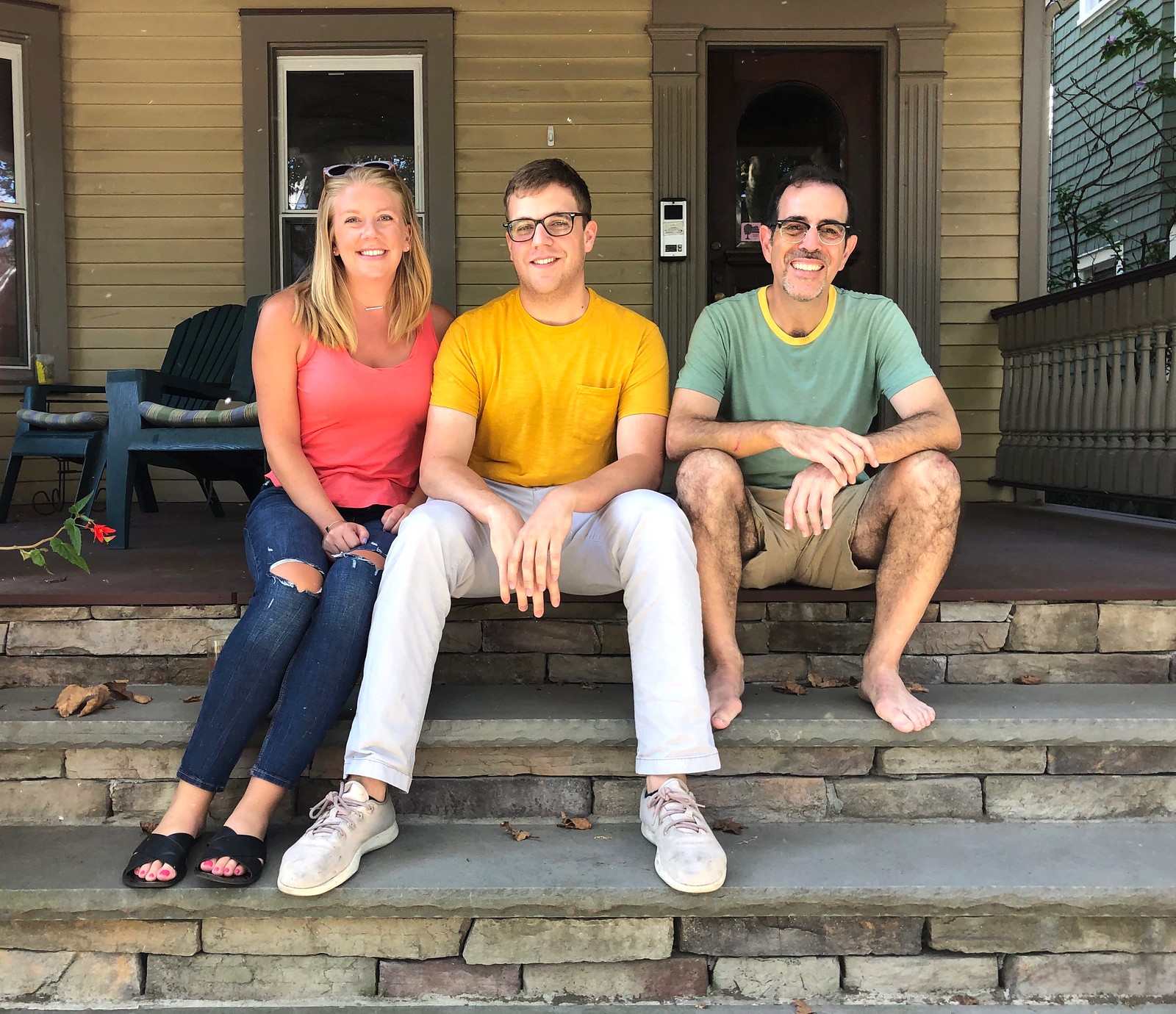
ITEM! Rare Uni Watch staff meeting: Who was that sitting alongside me yesterday on the front porch of Uni Watch HQ? None other than longtime Uni Watch team member Alex Hider, who compiles the Tickers that run on Tuesdays, plus the occasional lede, and his fiancé, Libby. They were in town for a New York weekend and stopped by yesterday for brunch.
I made a batch of apple-walnut waffles. And since Alex and Libby are from Cincinnati, we decided to dish up some of our homemade goetta, Cincy’s signature breakfast sausage. I was both proud and nervous about serving it to a pair of native Cincinnatians, and I was relieved when they said it measured up (although I think maybe they were just being nice). Anyway, it was a swell time — come back again soon, guys!

Click to enlarge
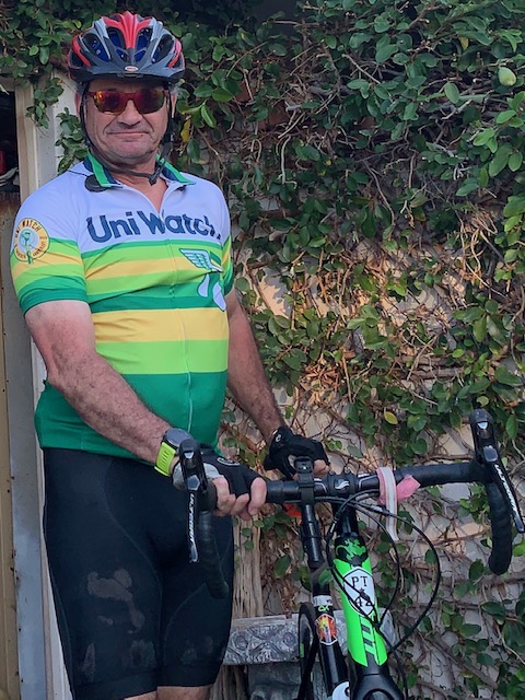
And speaking of Uni Watch staffers: People are starting to receive their Uni Watch cycling jerseys, including own own Jamie Rathjen, shown above, who compiles the Tickers that run on Mondays (including today!). Looking sharp, Jamie!
It’s been fun to see what people used for the numbers and NOBs. Here’s reader Bryant Johnston, followed by the rear view of his jersey:

Here’s Joel Dunn’s jersey:
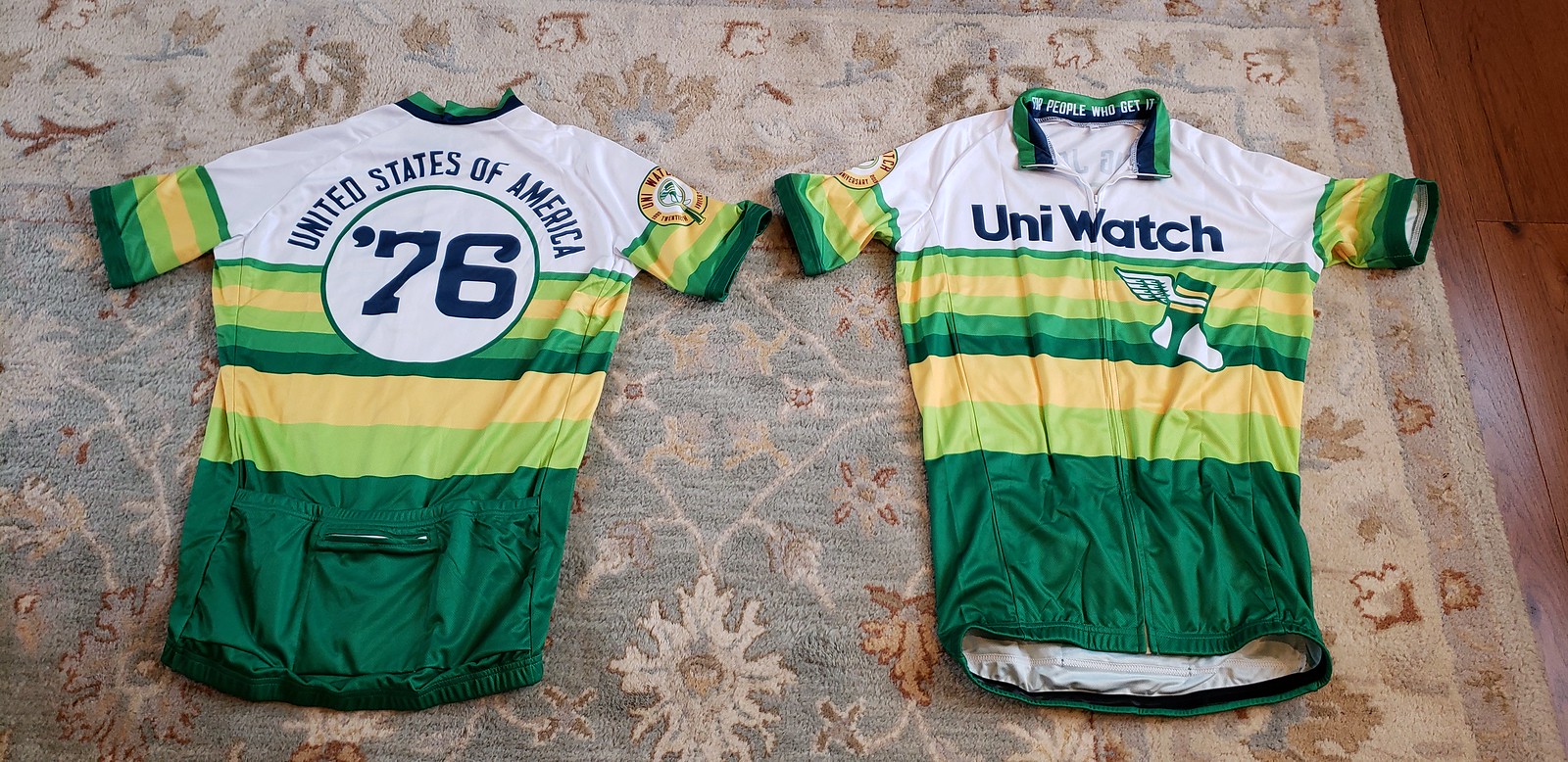
Robert Caplette went the more traditional route, opting to use his surname:

Not sure what Eli Selzer has on the back of his jersey, but he definitely wins the “looks most like a pro cyclist” award:

And so on. Because each jersey is customized, we can only produce them in batches, not as a stock item. If you missed out but would like us to make this item available again, let me know. If there’s enough demand, we’ll open up another two-week ordering window. Thanks.
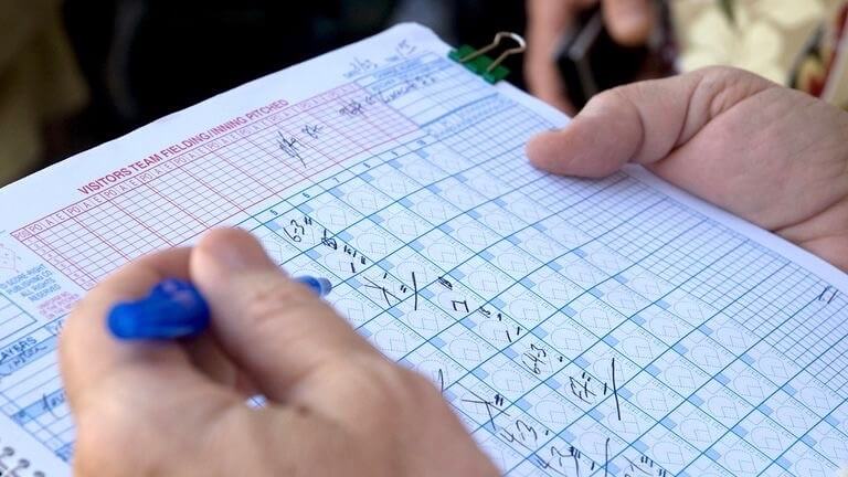
Official scorer update: Last Thursday’s post about MLB official scorers continues to generate a surprising amount of response and reaction, including this one from reader Ryan Atkinson:
A former sportswriter colleague of mine was covering Game Seven of the 2014 World Series here in Kansas City.
As I’m sure most people remember, that was the series where Madison Bumgarner was unstoppable, willing the Giants to the title. He came into the seventh game in the fifth inning, with the Giants clinging to a 3-2 lead, and proceeded to allow just two hits and strike out four over the next five innings.
The official scorer that night decided that MadBum’s performance was epic enough (pitching five innings after having already won two games in the series) that he deserved the win instead of Jeremy Affeldt, who was the pitcher of record when the Giants took the lead in the fourth. [According to MLB rules, that decision is within the scorer’s discretion. — PL]
He made the ruling and the official box scores were distributed to members of the press. Madison Bumgarner would join the exclusive list of pitchers to win three games in a single World Series.
Until … they decided to reverse the decision and award the win to Affeldt, while Bumgarner got the save. Royals employees went around the press box, attempting to scoop up all of the now-incorrect box scores, but my friend slid his under his notebook and still has it today.
Click to enlarge
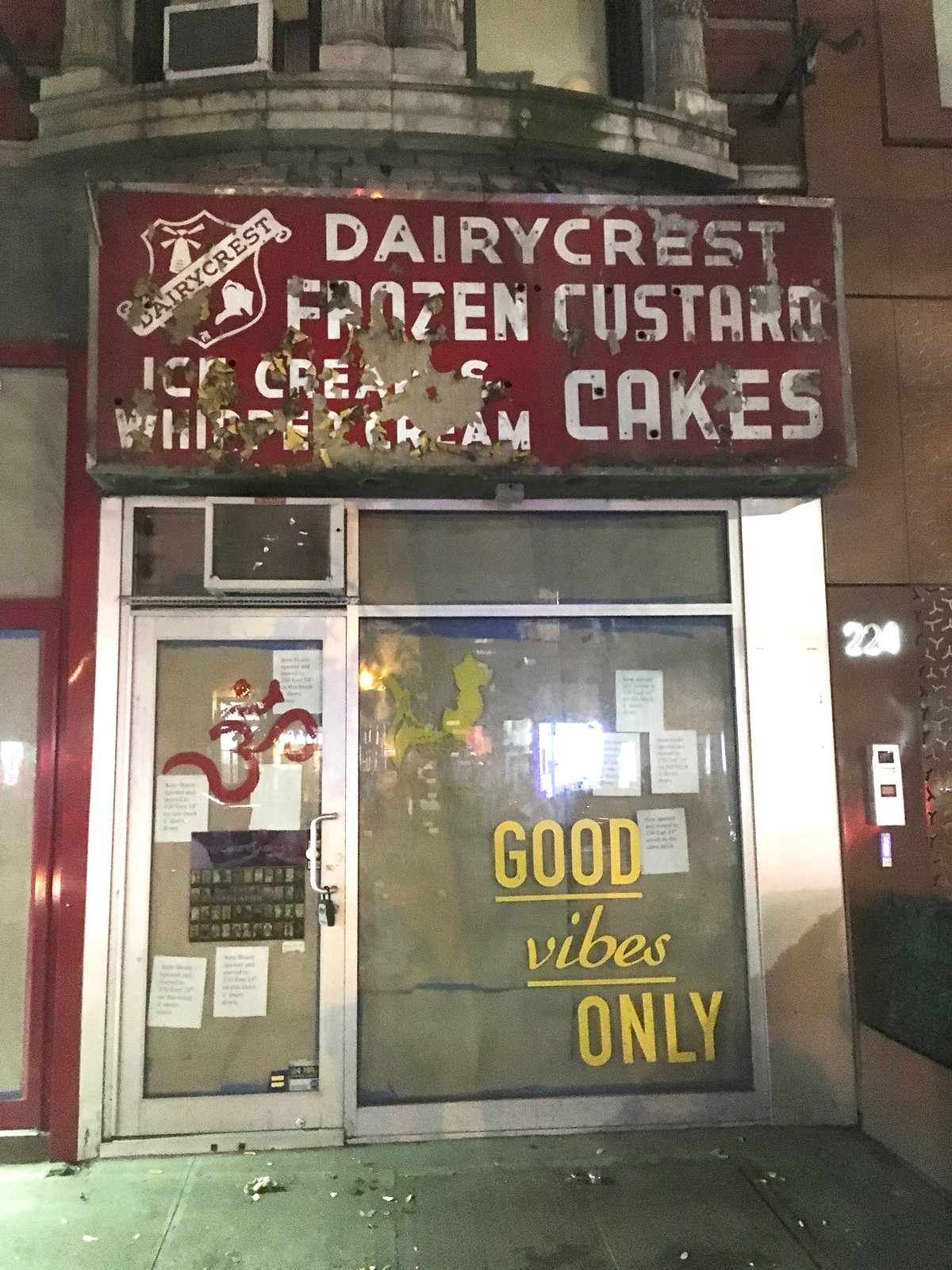
Sign find: I was walking along East 14th Street in Manhattan a few nights ago when I noticed the remains of a gorgeous old sign. Here’s a closer look:

The telltale holes in the letters indicate that the sign used to feature neon tubing. Must have been a beauty back in the day. I’m guessing it dates back at least to the 1960s, maybe earlier, and I’m certain I’ve never seen it before, which means it’s been out of use at least since 1987, which is the year I moved to town.
When I got home, I did a bit of research and found that the storefront had been occupied by a New Age bookshop that moved to another space in March. When the bookshop’s awning was removed, it exposed an old sign for a computer repair shop that had occupied that storefront from 1996 to 2013 (it’s not clear what was in the the storefront prior to that). Then, at some point, the computer repair sign was removed as well, exposing the ice cream shop sign.
Looks like a new business will soon be moving in (the brown paper in the windows means a new buildout is in process), so I’m hoping the old sign is just covered up again — not discarded or destroyed.
If this all sounds familiar, it’s similar to the story of Nathan’s Food-o-Rama, which I wrote about last winter.

Important product question: By now I figure you’re all aware of the Uni Watch enamel pin — by far the most popular non-T-shirt product we’ve ever had, with over 200 sold so far.
I’ve been thinking of doing winged stirrup cufflinks for the holidays, but I’m conflicted about one aspect of the design. Should both cufflinks “face right,” like the enamel pins, or should they be symmetrical, with one cufflink facing right and the other one facing left?
Truth is, I don’t like the logo as much when it faces left. But I did create left-facing versions for the mini-helmet and the gumball helmets, so there’s some precedent.
What do you folks think? If you don’t think you’d be interested in purchasing cufflinks to begin with, please ignore this question. But if you think you would be interested, please tell me:
[totalpoll id=”116424″]
Thanks!
Meanwhile, I have a new pin to tell you about, which I think you’ll really like. Details coming soon.
The Ticker
By Jamie Rathjen

Baseball News: The Padres Uni Tracker’s breakdown of the team’s performance by uniform is complete for this season. … Playoff teams will apparently wear a postseason patch in addition to the MLB 150 patch (from Jason Sellers). … The Giants held a ceremony for retiring manager Bruce Bochy, with former players wearing home jerseys with NOBs and a Bochy sleeve patch. Unfortunately, former P Ryan Vogelsong’s NOB was misspelled (from Brinke and Ryan Maquiñana).

Football News: A McDonald’s commercial that aired during NFL games yesterday features an unmistakable burgundy Washington jersey along with the expected bunch of generic ones (from Mike Wissman). … Mutiple readers told us that Florida revealed 1960s-era throwbacks — which don’t represent one particular year — to be worn next week against Auburn. Helmet expert Blaise D’Sylva tells us that the helmet is technically new. … The school of the day from Blaise’s helmet collections is Penn State. … Wade Heidt says that the CFL’s BC Lions wore orange socks for the first time this season this weekend. … You can see Canadian college uni tracking from Wade in yesterday’s comments, also including Burnaby, B.C.’s Simon Fraser University, who play American football in Division II.

Hockey News: Golden Knights owner Bill Foley said in a podcast that the team’s third uniforms won’t be ready for the start of the season, but he hopes they’ll still be ready for this season (from Thomas Roddy). … During the Golden Knights’ preseason game against the Sharks, referee Gord Dwyer was wearing what I guess was the arena’s backup referee jersey, but his No. 19 was applied with tape (from Paul Fisher). … The Predators revealed their shoulder patch for the Winter Classic (from @SillyGibby). … The Blackhawks played a preseason game against German team Eisbären Berlin and both teams wore white in warmups, because Berlin uses white warm-up jerseys regardless of the color they’re actually wearing in the game. Once the game start, it was the Blackhawks in white vs. Berlin in blue, plus a lot of ads (from @NotHotTakes). … Wade Heidt has some sock updates for the WHL’s Victoria Royals and Prince Albert Raiders. … The AHL’s Syracuse Crunch apparently have a new jersey advertiser (from Shane Bua).

Basketball News: You can get the latest updates on NBA uni numbers on Etienne Catalan’s Twitter feed. … Etienne also tells us that the Hornets are releasing a new version of one of their alternates this morning.

Soccer News: New kit for Egyptian team Al-Ahly (from Ed Żelaski). … German team 1. FC Köln wore several rainbow accents yesterday as part of a “campaign for diversity and equality.” … French team Lyon’s game on Saturday kicked off at 1:30 pm local time — most Ligue 1 games are played on Saturday nights — to accomodate Chinese viewers, which is a growing practice in several countries. The fans responded with a “Free Tibet” tifo in protest. … A game in Wales’s Cymru Premier between Cardiff Metropolitan University and Cefn Druids was postponed because of a kit clash: Cefn brought their red second kit, which was determined to clash with Cardiff Met’s maroon. … Here’s a Twitter thread of outfield players stepping in as emergency goalies, which involves the lucky volunteer wearing the goalie’s shirt over, or instead of, their own.

Grab Bag: Reader Mike Engle sent us pictures of American University field hockey captain Jette Dieckmann wearing the captain’s armband around the sock. That’s the practice for all teams that wear sleeveless shirts in the sport, which at higher levels is most women’s teams and a few men’s teams. As Mike points out, to the uninitiated it can look like one player has extra sock stripes. I’ve also seen Iowa, but nobody else, designate more than one captain, ostensibly to account for substitutions. … An example of the sleeve/non-sleeved dichotomy in field hockey can be seen in the kits for Hockey One, a new Australian league featuring men’s and women’s versions of the same teams: when the kits were initially released in April, the men shown had sleeves and the women didn’t, but now that the league actually started this weekend, all appear to have sleeves. … Reader Hunter Hook spotted a knockoff of Ohio State’s previous logo at a sneaker convention in D.C. … The latest variation on the Trump campaign’s iconic MAGA baseball cap is a “Make America Greta Again” hat — a clever anagram that refers to climate activist Greta Thunberg, although most people probably wouldn’t pick up on the slight spelling change. … The men’s road race at the world road cycling championships in Harrogate, England, featured gloriously atrocious conditions: lots of rain, wind, cold, and some heavy jackets and even towels for the riders. NBC’s commentators pointed out that the riders were difficult to distinguish, as many wore black jackets instead of their team colors. … Here’s an interview with the rugby superfan who’s been having his body painted with the jerseys of all 20 Rugby World Cup teams (from Jeremy Brahm). … Fox Business Network will be unveiling a new logo and design today.
Happy Rosh Hashanah to all who are observing. — Paul
Dairycrest link
Er, yes. The computer repair sign in that post is the one I linked to. (And the Dairy Crest sign in the post was taken by a friend of mine after she took a daytime shot to supplement my nighttime shots.)
That Chiefs-Lions game was a beauty to see. The Lions throwbacks aren’t my favorite throwbacks, but they looked even better vs a team with a classic look and opposite primary colors. I much prefer to see them wear these uniforms against teams like this rather than against the Vikings.
Would have been sooooo much better outdoors on grass. Football looks bad indoors, but throwbacks doubly so — a bad mismatch of old and new.
i thought the bumper on the chefs’ helmets looked pretty odd being a big block of white
Gregg, you’re probably referring to QB Patrick Mahomes, because (a) the camera is on him more than any other player and (b) he wears a Vicis helmet, which has a larger bumper panel than other helmet models. Ironically, Vicis made the larger panel in order to accommodate larger graphics, so it stands out more like a blank billboard when teams don’t put a logo in that spot.
Any idea why nose bumpers are always white?? I’ve never seen a different color.
At least Riddell and Schutt make bumpers in black. A few colleges use them – I’ve seen West Virginia with them, probably Oregon on one of their thousand different alt helmets over the past decade.
But the NFL sticks with white.
Even as a Packers fan I can admit the Bears throwbacks were gorgeous, helped going against a team with a fairly traditional uniform in Minnesota. But I agree, they would have looked better paired against the Lions home throwbacks.
Also, call me crazy but I prefer the Cowboys rarely used navy jersey/road uniform to anything else they wear. It’s so much more cohesive than the horribly mismatched home version. The pants are better, and the navy looks much better than the royal does.
I believe the Orlando jersey makes reference to pinstripes, which they’ve worn off and on throughout the years.
It’s as if they created their own Frankenjersey. It looks terrible
This! it looks like they cut out swatches from the old Shaq/Penny era jerseys and slapped them on the current blues. What on earth were they thinking
Broncos
quarterback Joe Flacco’sNFL100 collar patchlevel of ability was also AWOL yesterday (FTFY)Ouch Dee Gee!
I had a friend call me this A.M. to tell me he had a spare ticket to tomorrows Nats-Brewskies Wild Card game at Nationals Park, which is actually a FOOD COURT with a ball field in the middle.
Before I even considered saying yes or no, I blurted out “I would rather not see another NATS collapse in person”. I apologized for my bad behavior and said I could not make it because I had a previous engagement tomorrow, which was true, but I still felt like a HEEL about it.
My friend said “You know you are not the first to say that to me today. ”
I said “Who else told you that?”
He said “Well my wife, my father, father in law, mother, mother in law, brother, sister (she hates baseball so that doesn’t count) and now most of my friends.
Not very original on my part, but I do wish the NATS well and hope that they do not wear their ‘Murrica Stars and Stripes editon” unis tomorrow.
There’s hope for the Nats. Brew Crew just got swept at Coors. Extra innings on a beastly hot day yesterday so they may still be a bit drained tomorrow
I’m guessing the extra pylon at the Bears-Vikings game was another camera….
Cufflinks should always be mirrored! Not a rule, but should be.
As a sometimes wearer of French cuffs, I’m conscious of the various modern social implications of cuff styles. Often, French cuffs are worn as a fairly aggressive assertion of status. (I like them because they’re old-fashioned and formal, and avoid them if I feel that the setting will make it seem like a status thing instead of a formality thing.) Like, the ways various American presidents have worn their cuffs aligns pretty well with the general public image each tried to cultivate.
French cuffs pretty much always: Trump, Bush the Elder, Reagan, Nixon, LBJ, Kennedy.
Barrel cuffs pretty much always except for black- or white-tie events: Obama, Carter, FDR.
French cuffs in generally formal settings, barrel cuffs otherwise: Bush the Lesser, Clinton, Eisenhower.
Seemingly random cuff presentation: Ford, Truman.
Chiming in to second this, as a fellow sometimes-wearer of French cuffs.
RS,
A French cuff man myself (when I have to) and I think you are spot on about cuff links being mirrored. At least in all of the ridiculously expensive cuff links that I have seen.
I would definitely pay for a UNI WATCH FLYING FOOT cufflink set. “So shut up and take my money Paul”. Another Uni Hit!
I’m the same way. I wear super casual almost all the time, but when I have to throw on big boy clothes, I like to go all the way to French (“freedom”) cuffs with cuffs links. Tomorrow I’ll be wearing Nats links, red white and blue stirrups, and my Nats tie.
Gotta do what I can, right?
What statement are the Magic jerseys making? We’re boring?
The statement is “remember when we wore pinstripes back in the ’90s? We do too!”
PL – Was there ever an explanation from UA about the Wisconsin/Northwestern uniforms for this past weekend? Everything about it makes no sense. The design is kinda-sorta old-fashioned but neither uniform was ever used by either school. They were bland to the point of being boring. The neatest thing about the UW set was the tan pants, which are not anything that UA would be able to monetize, and didn’t pair well with white helmets and white trim. And then they went with 2 different fonts for the 2 teams (Northwestern looked more angular and blocky, UW was rounded sans-serif), but they were again plain to the point of being boring, and I don’t know that either style had any connection to the schools that were playing. Any insight, other than it got us talking about them, and any publicity is good publicity?
No explanations/insights. Honestly, I can’t take most CFB alternates/fauxbacks seriously. It’s just an assembly line out there.
UA put this out:
link
NHL Preview is up: link
No plans for the Kings to pack their throwback uniforms for Carolina’s Whalers Night (since they don’t make their on-ice debut until later in the season)?
Pity.
I can confirm the goetta (and the waffles) were DELICIOUS — and I’m not just saying that to be polite! Thanks again for everything Paul!
I have a thought on the ‘extra’ pylon. I have noticed that in NFL games this season, they place an extra pylon on top of the orange first down arrow that sits on the sidelines. I have decided that this is a camera in disguise. There have been pylon cams in the pylons at the endszones for some time now, so extra pylons are possibly extra cameras.
that extra pylon is a camera. its moved along with the first down markers up and down the field. they place it at the back endzone line during “& Goal” situations, since the front pylons already have cameras installed.
I wonder why Atlanta never goes full throwback when they where the black 90s jersey. They never match it with proper silver pants. The one shell rule make it impossible to do an proper 80s throwback but they don’t have that issue with the black.
It’s a hybrid throwback, paying homage to both the 60s and the 90s. This was explained when they introduced this particular throwback set in… 2017? I forget exactly when they debuted, but the Falcons have had them for a while now.
Ahh, thank you. The annoyed me for years, glad there’s an explanation
It was actually 2016… being on my phone when I posted that reply earlier, but link.
PROOFREADING: You correctly have the Bears wearing white at home at the beginning of the NFL coverage, but they’re missing from the white-at-home list at the end.
BTW, wouldn’t it have been much nicer if the Bears and Lions had worn those throwbacks against each other, instead of against teams in modern garb? I think so, anyway….
D’oh! Fixed. And yes.
The Lions throwback – logo-less – helmets always make me think of the football cards when I was a kid when Topps didn’t have the NFL team rights. link
VERY exciting placeholder logo for the just-confirmed AHL expansion team in Palm Springs, CA:
link
Affiliate of the yet to be named Seattle Hockey Club. Maybe we’ll get some hints as to what that team will be named…
I’ve been seeing that McDonalds ad with the ‘Skins jersey for the past couple of weeks.
Re: BC Lions in orange socks. Has been just black socks at home and white socks on the road with the black pants prior to this weekend.
Other than a preseason game last year and when they wore 1970s throwbacks in 2010, the BC Lions have not worn orange socks as part of their primary uniform since they used to do so on the road in 1990. The days Doug Flutie was getting his feet wet in the Canadian game:
link
I think the Jenga refs in the Orlando Magic shots were to do with their court reveal. They’re using three different layouts this season.
As for the Statement getup – no. Nooooo, nonononono. I remember the 2000s, the block-font uniforms were terrible. Bring back the full stripes. Mix the combinations up maybe (black stripes on blue, blue on white, silver on black), but keep them there.
Guess you could say that Orlando made a pretty terrible statement with these uniforms.
Now, if Nike tries to shoehorn black side panels onto the Lakers again, I’m gonna stage a sit-in at Nike world headquarters.
I imagine NFL equipment managers must hate these throwback weeks….having to remove the striping and decals on every single helmet, and then have to reapply them for the next week.
I think it’s strange (and immature like a lot of your dialogue) when you refer to the beautiful saints alternates as “Color Rash” uniforms. While yes they were born when there was the thursday night color rush program, its not anymore and is such a better uniform them their regular rights I think its disrespectful to still refer to them as “Color rash”
If you said it about the ravens all purple, sure I could see, even tho still the NFL doesn’t call these color rush uniforms anymore.
How exactly can a writer be “disrespectful” to a football uniform?
We use the term “Color Rash” on this site because Nike’s preferred term is a cringe-inducing bit of corporatespeak that I would rather not parrot. Our substitute term is not a commentary on any specific uniform (I agree that the Saints’ version is quite nice) but rather a way of pushing back against inane marketing lingo that pollutes the public discourse.
If you find that “immature,” so be it. At the very least, I hope you no longer find it “strange” now that I’ve explained (for the umpteenth time) the reasoning behind it.
Don’t agree it’s “disrespectful” but…the “Color Rash” line is overplayed, and probably time to retire it.
If you have a better substitute term to the cringe-inducing corporatespeak term, I’m all ears.
Fiancé = Man engaged to be married
Fiancée = Woman engaged to be married
26 on the Titans was also wearing a retro Deion Sanders Diamond Turf cleats.
Something missed from your NHL preview. Sabres also are bring back their black/red uniform for 90’s night January 4th.
link
Thanks! Yes, I totally missed that.
This is late, but the Lion’s throwbacks are almost perfect. Just add the logo on the helmet and it’s a top 5 NFL uniform as opposed to their current bottom 5. Their color scheme bothers me when it gets too cute with fonts and extra outlines but it’s an elite color scheme when the two colors are left alone.