[Editor’s Note: Paul is on his annual August break from site. Deputy editor Phil Hecken is in charge from now through the end of the month, although Paul may be popping up here occasionally.]
GRIFFINS VOTING ROUND 4 IS TODAY. PLEASE SCROLL DOWN FOR THE NEXT SET OF DESIGNS AND TO VOTE!

By Phil Hecken
Follow @PhilHecken
As August enters its final week, I have another reader-submitted article today (as things turn out, I received more articles from readers than I will be able to run, thanks in part to far more breaking uni news than I’d expected, and planned stories — but I promise I’ll get to everyone’s pieces, it just may be when I return to weekend duty. My apologies to those whose articles won’t make the August cut, but they will definitely be run at some point.). Today’s lede is from long-time reader Wade Heidt, who is one who frequently contributes to the ticker — mostly hockey and CFL stuff, but he’s a great contributor and good guy. Today Wade will look at a relatively rare phenomenon — the wearing of an alternate uniform in the biggest game of the year (in this case, the Grey Cup of Canadian Football). I’m never a fan of wearing alternates in the biggest game (with the possible exception of the Rams wearing their throwbacks during the last Supe), or in “rivalry” games. How many ‘big’ moments (like the Mets’ Pete Alonso tying the club’s single season Home Run record, wearing the Players Weekend clown suits) will go down in posterity in a team not wearing its normal uni? How terrible did those Rockies look for some games in the 2007 World Series? But I digress. Wade’s here to talk about alt unis in the Grey Cup. Wonder how teams who wore them fared?
This will be his first ever article on UW. So, without further ado (we have a ton to get to today), here’s Wade with the…
Alternate Uni-verse in the Grey Cup
By Wade Heidt
Remember seeing the Los Angeles Rams wear their alternate uniforms in the last Super Bowl? A rare sight to see an alternate uniform in the NFL’s big game. As a Canadian football aficionado, this got me thinking about times when CFL teams wore their alternate jerseys when battling for the chalice of Canadian football supremacy, the Grey Cup.

The Grey Cup was first awarded in 1909. Generations of players have given it their all to hoist the national treasure. For decades, fans have cheered hard with the hopes that it will be the year that their team gets its name engraved on the Grey Cup. The week-long party leading up to the game in late November is a chance for all Canadian football fans to come together and celebrate our gridiron game with its unique rules. The Grey Cup game is one of Canadian television’s largest annual sporting events.
These days, it appears the alternate jerseys have been banished from the Grey Cup game. You will only see the primary jerseys worn in the Grey Cup. You can look at last season as an example. The defending Grey Cup Champion Calgary Stampeders wore their alternate black uniforms in the 2018 West Final at home. They were the home team for the Grey Cup but wore their primary uniforms featuring the red jersey.
However, in the recent past this was not the case. Between 1998 and 2010, six clubs designated as the home team for the Grey Cup game wore their alternate jerseys. Let’s take a trip down memory lane.
86th Grey Cup – 1998 Calgary Stampeders


The Calgary Stampeders became the first CFL to wear alternate jerseys in 1994. These black jerseys, featuring the cross-guns logo on the sleeves, were initially used as an alternate look for the Labour Day Classic games against the Edmonton Eskimos.
The Stampeders adopted the black jerseys as their home look during the 1998 playoffs. They wore the jerseys over their white home pants and sported black socks for the Grey Cup game in Winnipeg. It was a winning look for the Stamps, capturing the championship on a field goal at the end of the game.
93rd Grey Cup – 2005 Montreal Alouettes


The Montreal Alouettes wore their alternate blue jerseys as their home look in the playoffs. The jerseys featured the front facing meadow lark (alouette en francais) head on the sleeves. Glad that logo was not part of their regular uniforms. The jerseys were worn over the blue road pants. The blue torso, white shoulder stripes and red sleeves gave a subtle nod to the old Alouettes jerseys in the late 1970s. The Als came so close to the title, losing this overtime Grey Cup game in Vancouver.
94th Grey Cup – 2006 BC Lions


The BC Lions wore their alternate uniforms at the big game in Winnipeg. Sporting their orange helmets, with black jerseys and pants. Much different than their primary home uniforms at the time.

The black uniforms featured the vintage paw logo on the helmets and shoulders. They also had worn the alternates during the West Final. Interesting to note that during practice in Winnipeg during Grey Cup week, the Lions wore their primary helmets.

The Lions were crowned Grey Cup Champions in these uniforms and managed to break the Grey Cup during the post-game celebration.
95th Grey Cup – 2007 Winnipeg Blue Bombers


Gold jerseys were the choice for the Winnipeg Blue Bombers for the 2007 Grey Cup in Toronto. The alternate uniforms were a mixture of a present-day look and vintage features. The gold jerseys were worn over navy blue pants. The jerseys had a vintage-style number font. The helmet logo was the old school “W”.
The Blue Bombers also wore this as a road uniform in their playoff run. The alternates were worn as the visitors to Toronto in the East Final, going colour versus colour against the Argonauts.

Unfortunately, the Bombers were runners up in 2007. The current longest Grey Cup drought continues.
97th Grey Cup – 2009 Saskatchewan Roughriders


The Saskatchewan Roughriders went with the throwback-style alternate jerseys and helmet decaling as the home look in the 2009 playoffs. An interesting mixture of old and new as the Roughriders sported their usual silver home pants and black facemasks with this look. It was also marked the last game to date that the Riders have worn silver pants, which had been a staple part of their uniform dating back to 1985.
As a Riders fan, I still cringe today when I hear the penalty announcement of too many men. A gut- wrenching way to lose a championship. A heartbreaking loss for the Riders on a second attempt last play field goal.
98th Grey Cup – 2010 Saskatchewan Roughriders


In 2010, the Roughriders were designated as the home team again. The game was hosted by a West Division city. It was played in Edmonton. By this time, the winner of the division in which the host city played would be the home team. This meant the back-to-back Western Champion Roughriders would be wearing green jerseys again. They would wear their throwback-style alternate uniforms for another Grey Cup.
For their primary uniforms starting that season, the Riders had discarded the black facemasks for white ones. The silver road pants were retired in favour of white pants.

This change improved the alternate uniform compared to the years before. It had the appearance of a truer throwback to the old uniforms with the white mask and pants.
Notable to mention that Riders went throwback both at home and road during this playoff run. All CFL teams wore 1970s throwbacks during the 2010 season. The Roughriders 1970s throwback featured a white jersey. They rocked the vintage alternate road uniform during the West Final in Calgary.

The Riders may have looked good but were denied the championship again. They had the misfortune of running into a strong Montreal Alouettes team on its way to winning back-to-back Grey Cup Championships.
Thanks, Wade! Nice writeup — clearly the alternate uniform has not been a “lucky” one for Grey Cup finalists (in Wade’s examples, the alt-wearing teams went 2-4, losing the last three). Maybe that’s why we haven’t seen any in a while. Readers? How about you — what do you think of teams wearing alternate uniforms in the big (like the World Series) or biggest games of the season?

GRIFFINS DESIGN CONTEST GROUP D VOTING

Today we begin vote on the 4th and final group of contestants for the fourth annual Grand Rapids Griffins design contest. In case you missed it, the contest parameters and rules were laid out here.
The TOP THREE contestants receiving votes in each group will move on to the final group (for a total of 12 finalists — three from each group), from which the Griffins will make a decision and declare the winner who I will announce on Friday, August 30.
I again want to give my great thanks to Larry Torrez, who worked with me to come up with the poll you’ll see below in an aesthetically pleasing format as well! Great work ElTee (of DC)!
REMINDER: While some of the submissions you see below may include gloves, helmet, pants, etc., you are ONLY voting on the jersey design. Please keep that in mind when casting your vote(s).
The Griffins gave the following parameters for the jersey contest, so please keep these in mind when voting:
“The details are that this jersey is going to be worn on our 90’s Night on Saturday, February 22 (with either red or black pants and red gloves/helmets). We’d like the contest to be for a 90’s inspired jersey. We don’t want to set any other regulations, as we’re not looking for the submissions to be any of our old logos or colors. We’d like something that is created fully by the designers.”
OK? That’s about it. First I’ll display all the submissions for today, which will be followed by the new (sharp-looking and hopefully cheat-proof) poll. Click to enlarge any image below.
My thanks to all who submitted and best of luck.

A. L. BRENNEN

B. MICHAEL BUSTIN

C. JORDAN ELWART

D. DAN GUSTAFSON

E. DARREN HOWSE

F. ADAM KNOLL

G. RYAN McEVOY

H. SIDNEY NICKLES

I. BRIAN OESCH

J. TOM QUAGLIA

K. CLARK RASMUSSEN

L. ZACK RUEGER

M. KELLY SALMON

N. DAVID SHAW

O. JOSEPH SOULE

P. PATRICK THOMAS

Q. RYAN TINNERMAN

R. JAY TUOHEY

S. LUCAS VANDERBILT

T. JASON VON STEIN

U. DIEGO YANEZ
And there you have it. Your final 21 submissions. And now, to vote, here’s the poll — to start, click “START”; once you start the poll, the reader design will appear above the name, and you may select as many designs as you like. Once you have finished voting, be sure to scroll to the bottom and hit “SUBMIT” to make sure your vote(s) are counted! That’s it!).
VOTING WILL TAKE PLACE FROM 7:00 AM TO 11:00 PM EASTERN
Collector’s Corner
By Brinke Guthrie
Follow @brinkeguthrie

Football fans don’t always have to wear jerseys or T-shirts, you know. This 1970s 49ers long sleeve button down shirt features Paul’s favorite player, Ken Willard. (Or at least a runner with #40 wearing black Riddell cleats.) The tag says “NFL Team Shirts, Permanent Press.” Now for the rest of the week:
• Peanuts (and SF Giants fans) won’t want to miss this Woodstock bobblehead being given away this Friday night. Got my eye on this one, I do indeed.
• Colts fans have had little to cheer about these last few days, what with their starting QB Andrew Luck calling it a day. So brighten up your Colts collection with this 1970s seat cushion, which no doubt came in handy for those Memorial Stadium games. The size is 15″ X 14.5″, and the cushion has no tears.
• Just one dollar for this 1967 Phillies yearbook. A little dude with a bright red Phils cap, getting ready to dig into a ballpark hot dog. What could be more all-American than that?
• Staying with 1960s baseball, here’s a WIN! TWINS! beer coaster from Hamm’s, your ticket to (Twins) baseball on radio and TV.
• Another 1960s beer coaster for you, this one from Rheingold for the 1969 World Champion Meats. Er, Mets. (Perhaps this one came out in 1970 though?)
• Here’s a metal can for the St. Louis Rams; maybe it originally came full of popcorn for Christmas gift giving or something. Note the team logo during the period incorporated St. Louis Gateway Arch.
• Toast your favorite team with this heavy duty glass mug from the Pro Football Hall of Fame. The logo appears to be enameled. Had one of these! (Or one very similar to it; my visit to Canton was about 1973 or so!)
• Cleveland Browns fans will want to wear this 1970s “puffy vest” to those cold Sunday afternoon home games at (energy company name here) Stadium.
• Couple of Tampa Bay Bucs items here. Here’s a T-shirt sponsored by Publix that says “Ring of Honor 63 Selmon” on the back. This would be for the first ever Buc, the late NFL Hall of Famer Lee Roy Selmon. He was inducted into the Buc’s RoH in 2009, so that’s the year for this shirt I would think, not “1970s 80s” as the seller indicates. We’ve also got a nice looking Reebok NFL Bucs throwback from the 1990s.
• A trio of NFL items from Sears: a 1970s Steelers kids bathrobe; a 1970s Broncos parka; and a New York Giants helmet plaque still sealed in the box.
Got an item to include on Collector’s Corner? Send any submissions to uniwatchcollectorscorner@gmail.com!

And now a few words from Paul: Hi there. A few items of interest:
1. CFB preview update: As I suspected, my annual college football season preview will be running on Sports Illustrated on Thursday, not Wednesday. Thanks for your patience.
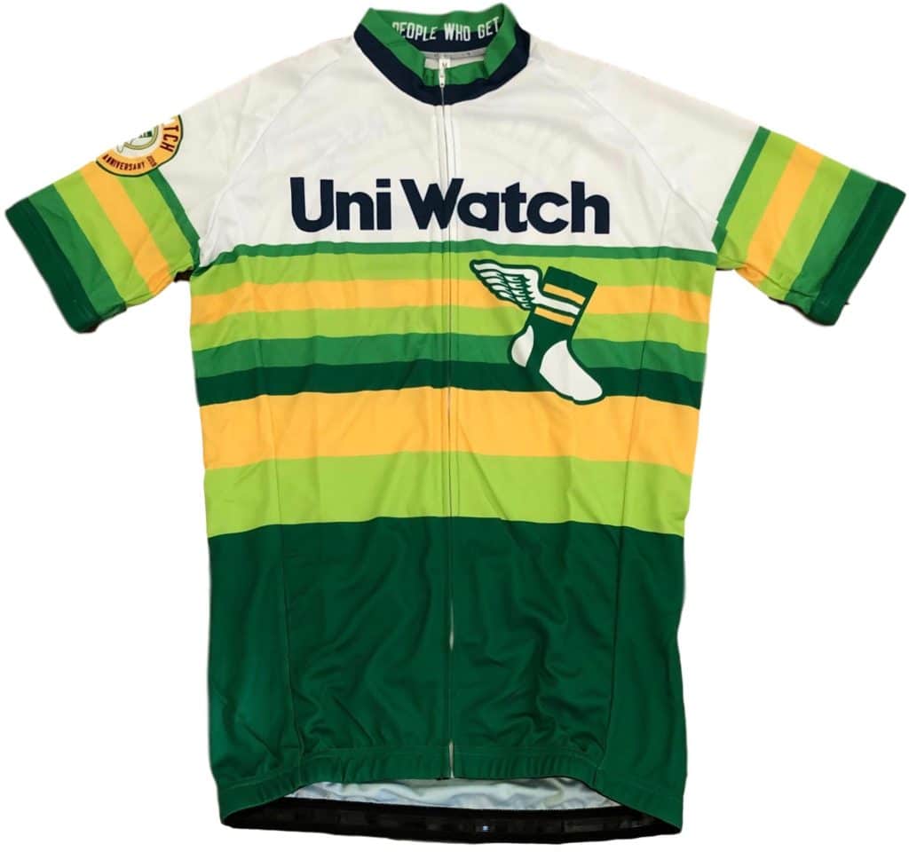
2. Going, going…: Today is the next-to-last day to get in your pre-order for the Uni Watch Cycling Jersey, fully customizable with your choice of number and NOB. Think how great it’ll be when I don’t keep mentioning this every day! Full details here.
3. ITEM! New mini-helmet on the way: I recently asked if people would be interested in a mini-helmet based on the new helmet that Riddell recently made for me. Some people said yes, but even more people said they’d prefer a different design, since this one is fairly similar to the mini-helmet we did two years ago. Fair enough! I’m happy to report that I’m once again partnering with Rocker T Collectibles, and the new mini-helmet will have a green shell, gold facemask, the winged stirrup logo on both sides, no center striping, and “Gets It™” on the nose bumper. The decals are have already been produced:

The mini-helmet should be available very soon — stay tuned.
That’s it for today. Remember, I’m not reading the site comments this month, so email me directly if you have questions about any of this. Now back to Phil for the rest of today’s content.
The Ticker
By Anthony Emerson

Baseball News: Fallout from the MLB’s Players’ Weekend is still raining down on the league, with Buster Olney reporting late Sunday that Dodgers P Clayton Kershaw asked to wear the Dodgers’ usual cap, and was denied, despite the league relaxing that restriction for pitchers. Kershaw wore the black cap against the Yankees on Sunday night (from @westhoff0407), while the Washington Post had a brutal takedown of the entire situation (from Bryan Martin Firvida and Mike Chamernik) and Mets 1B Pete Alonso expressed his relief/excitement at no longer having to wear them (from Mike Chamernik). … Phillies IF Jean Segura’s fly was down during an AB. He zipped up at first base (from @NastySplitter). … Cross-posted in the NFL section: lots of Cardinals players wore NFL jerseys to the stadium on Sunday night (from Josh Claywell). … The Oriole Bird might have had the single best Players’ Weekend nickNOB, referencing this amazing moment in Baseball Twitter history (from Andrew Cosentino). … Alan Topolski went to a Columbus Clippers game, Triple-A affiliates of Cleveland, at Huntington Park, and was pleasantly surprised to find no ads on the outfield walls. It almost looks odd to my millennial eyes to see no ads on a baseball stadium’s outfield walls. … Here’s an extremely entertaining piece on the “funniest baseball card ever made” — no, not Billy Ripken’s infamous ‘fuck face’ card, but Keith Comstock’s “ball-to-crotch” card (from Marc A. Rivlin).

NFL News: A report has indicated that NFL unis will be sans-ad-patch until at least 2023. Enjoy your team’s unis while they last. … The Falcons have released their uni schedule for 2019 (from @GTThrashfan and @nopigs21). … Cross-posted in the NFL section: lots of (St. Louis) Cardinals players wore NFL jerseys to the stadium on Sunday night (from Josh Claywell). … Mike Allison decorated his mancave with 35 throwback helmets — nice!
College Football News: Clint Richardson‘s annual CFB uni roundup article is live over at Auburn Uniform Database. … Wake Forest has unveiled their new unis with a snazzy website (from Will Lawson). … In a new honor, Virginia Tech players voted on which player will wear No. 1 this season, with the honor going to senior safety Reggie Floyd. More info here (from Andrew Cosentino). … Here’s a look at Illinois’ matte orange helmets that will debut sometime this season (from @MrMichael21). … New Mexico’s assistant AD Frank Maggio Mercogliano emailed us to let us know that New Mexico’s unis will remain the same as last year for 2019. … New helmets for the University of Windsor, while there are new unis and a new athletics logo for Simon Fraser University (both from Wade Heidt).

Hockey News: The Blues and NHL have unveiled the 2020 NHL All-Star Game logo. … The ECHL’s Orlando Solar Bears have unveiled their 2019-20 unis. … The WHL is switching to CCM’s QuickLite jerseys, resulting in a minor collar change for the Tri-City Americans.

NBA News: The WNBA’s “Breast Health Awareness” unis are the same for literally every team. … New Lakers C Dwight Howard will wear No. 39 (from Etienne Catalan).
.

Soccer News: The arc of championship stars on LA Galaxy’s crest is different on the keeper’s kit and outfield players kit. … Fox Sports replaced Toronto FC’s logo with New England’s during Sunday night’s El Tráfico (from @reesdabeast). … Tennis player Taylor Fritz was spotted wearing a US Soccer jersey with his own name and No. 7 on it (thanks, Jamie). … Galatasaray’s third kit has leaked (from Josh Hinton). … Napoli D Kalidou Koulibaly has been honored as Serie A’s best defender, and because of that is wearing a small badge on his jersey (from Ryan Lewitt).

Grab Bag: New ball design for the Volleyball Champions League (from Jeremy Brahm). … Navy SEALs will now be subject to “[strict enforcement of] all Navy grooming and uniform standards” in order to “shore up shoddy conduct, restore moral accountability and create better leaders” (from J. Max Weintraub).
I also noticed Kershaw was wearing his normal white pants instead of the Players’ Weekend variety (Players’ Weekend pants had no logos on the back but Kershaw wore the standard Dodger white with MLB logo on back). Several Dodgers players went with their normal blue socks instead of the all whites, especially Chris Taylor in his stirrups.
What if on “players’ weekend” all the players decided not to wear those costumes and just put on their regular unis? What would MLB do? Fine them all? Put them on double-secret probation?
I would have to imagine that would be in violation of the collective bargaining agreement.
Good article, Wade! It’s great when we get to read about different sports.
One of the first Ticker items I submitted was before the 2017 Australian Football League Grand Final, where a pundit on TV went ballistic at the prospect of the link wear their clash guernseys (which are equivalent to alternates/third choices in other sports) to avoid a black vs. dark blue matchup.
Thanks Jamie! It was fun putting this together but not easy. I have serious respect for all you guys that work on this site to have something to present each day.
I’ve predicted here before that all American sports leagues will eventually have ads on uniforms, which annoyed Paul for whatever reason but the linked article on the NFL probably going for them in 2023 seems to prove that I was onto something…
I think Paul was upset because he knew that your assumption was probably correct. Paul has dreaded the onslaught of ads on jerseys for years.
I doubt Paul was annoyed with you. He was annoyed that he knew your assumption was probably correct. Paul has dreaded the onslaught of jersey ads for years.
It would have been nice to see the regular uniforms in comparison to the alternate uniforms for these Canadian League teams. Also the Blue Bombers numbers, helmet stripe, and W helmet logo, look black in comparison to the blue pants. I’m guessing that they are dark blue, but not a good match.
Hi Rick,
The Bombers were wearing the navy blue back in 2007. Here are the regular uniforms at that time:
link
link
IMO, 2007 era inferior to today’s Blue Bombers uniforms. The Blue Bombers have gone back to the royal blue and their classic look in 2016:
link
For the other three that we do not have examples of regular home uniform up:
-1998 Calgary Stampeders:
link
link
-2005 Montreal Alouettes:
link
link
-2009 Saskatchewan Roughriders:
link
link
Excellent article, Wade! The Stamps regular unis were still so beautiful back in ‘98. Sadly, they have looked like absolute s**t for the last number of years. Reminds me of how good the Atlanta Falcons used to look in red jerseys and helmets.
Thanks John! Big problem with current Stampeders uniform has to do with wordmarks on the sides of the pants, the black pants at home, and the red shoulders on the road jersey. When I see a white football jersey, I want to see it white both in the torso and on the shoulders as well. No shoulder yolks.
Things are looking up this year! We no longer have to deal with that black road helmet. I am thankful for that.
To me, it has always been real simple for the Stamps. They could just have a modern version of their classic red and white uniforms. Could basically just go back to 1971 Grey Cup and look at that uniform. Classic and timeless, could just mix in white pants and masks instead of the grey. They could be like the Detroit Red Wings of pro football.
Never mind baseball and football, here’s a team pic where a hockey captain got to wear a “K” instead of a “C” !!
link
Posted on the Hockey History sub-forum of HFBoards, the caption says, “Edmonton Oilers (WHA) 1978/79 team photo. Check out the guy in the front: captain Paul Shmyr. I don’t know the whole story, but Shmyr, a Canadian of Ukranian decent, wanted to wear a “K” instead of the traditional Captain’s “C” (inspired by the Soviet/Russian jerseys of the day). And the league / team actually let him!”
-Jet
More about U. of Windsor Lancers helmets. Appears they have been influenced by the style of the new Montreal Alouettes helmets. They have placed a large version of their logo right on top of the helmet. A bit of a better view:
link
Have to acknowledge some edits needed to my article. I had mentioned 2009 Grey Cup was the last game to date that the Roughriders wore silver pants. It was the last meaningful game. They did still wear silver pants in the 2010 preseason only before being retired fully.
Was mentioned in except about 2010 Saskatchewan Roughriders that the silver road pants were retired in favour of white pants. My bad when typing, the silver pants were the primary home pants. The Riders primarily wore green pants on the road in both 2009 and 2010.
“…at Huntington Park, and was pleasantly surprised to find no ads on the outfield walls.”
Except for the giant Huntington ad.
Exactly. Huntington is a sponsor, so that’s a huge benefit for them to be the only ad on the wall. In rightfield, the Clippers have a single ad for a fast-food restaurant chain.
Great article, Wade! As a Rider fan (born, raised, and still living in SK), I can’t stress enough, how much better the Rider helmets look with the white face masks than with the black ones, that emerged with the “Black Jersey” era, which I’d like to forget. They ARE the “Green & White,” after all! I still wish they could find a way to work a little silver back into the current set, though. #RiderPride
Thanks Craig! Appreciate you commenting because I know you Get It when it comes to CFL due to your residence. I’m a big time Riders fan too. Born and raised in Regina, but I am a transplant, having lived in Vancouver for the last 20 years.
The Riders made the subtle uniform change with the switch to the black mask in 1995. The 2010 switch back to white mask and to white pants was a step in the transition to now, where the team is just green and white again. Only black in the uniform is in the logo.
I am all for the return to just green and white. Never thought I would see it happen paired with a version of the current logo, but here we are. Though they need to fix up the striping and quit with the mono-green. Would prefer green over white pants.
As I have shared on this website before in the July 1 “Meet the Contributors” write-up, I do have a real soft spot for the old 1985-89 uniforms.
I think it would be great to see a modern version of that come back as a third. We can have our Green and White, but why not have a little bit of the silver and black trim once in a while. Silver pants with the beautiful wraparound helmet logo.
We would all like to forget the black jersey era alternate uniform. New York Jets fans, we have already felt your pain with regards to the third uniform that is coming up for you.
Though the weirdest black jersey was in that one game during the Riders’ 100th Anniversary season in 2010. When they went waaay back and dressed as the black-and-red Regina Roughriders. There was barely anyone old enough to have remembered seeing those uniforms live back in the day.
link
Those Regina Roughriders throwbacks were jarring, that’s for sure – just like the neon atrocities that made the Riders look like giant dill pickles!
The mono-white unis, with the white helmet/green face mask combo, were quite a change, as well. I wasn’t a huge fan of the white lids at first, but I admit, they kind of grew on me.
And I’m just spitballin’ here, but perhaps the thin stripes on the left leg, denoting the Riders’ four championships, could be made silver, to match the Grey Cup itself! Could be a nice way to work that little bit of silver back in!
Excellent work, Wade! On a side note, as a Golden Hawk, Axeman, and Golden Bear, I enjoy your breakdown of the USports Football uni match-ups…keep them coming!
Thanks DJ! The guerilla posting known as College Football Uni Tracking – Canadian Rules Style made its season debut last Sunday and will continue until the Vanier Cup if lifted.
49ers played in an alternate/throwback uniform for Super Bowl XXIX.
Cavs won their first title in those awful, awful, awful black sleeved alts.
No Tiger-Cats :(
Wade – Great stuff! Always great to get some goodies from the north suburbs.
Tried ordering the cycling jersey tonight, better almost late then never. Upon completion, it informed me that there was a problem processing my payment and I should update my card. Yet I got a confirmation text from my bank telling me the charge was authorized. Hope I get the jersey..
I looooove those gold Winnipeg uniforms!
I like the blue-with-contrasting-red-sleeves Montreal jerseys too. They look so much better than the regular jersey with the gigantic “MONTREAL” text above the number. Is there a white alternate with blue or red sleeves and those three-layer numbers?
Hey Mark,
Winnipeg also wore those jerseys with white pants at times. These uniforms were the precursor to the Blue Bombers adopting new gold jerseys as the regular road jersey from 2012-15. Bombers had no white jersey during those years:
link
Montreal did a lot of mix and match with that blue jersey. Had also been worn with silver, red and white pants. Als never had a white alternate featuring three-layer numbers. However, they did have a couple of black alternate jerseys in the late aughts, one featuring three-layer numbers. They went black, with blue and silver trim as the colour scheme when wearing the black alt jerseys:
link
Of course, the signature large lettering over the chest number is now a thing of the past with regards to the Alouettes uni, due to the redesign starting this year.
link
It was mentioned tonight on SNY (top of the ninth) that Chris Mazza buys his own stirrups on Amazon. Whenever he is on a new team, he looks up their colors and buys his stirrups online.