[Editor’s Note: Paul is on his annual August break from site. Deputy editor Phil Hecken is in charge from now through the end of the month, although Paul may be popping up here occasionally.]
GRIFFINS VOTING ROUND 3 IS TODAY. PLEASE SCROLL DOWN FOR THE NEXT SET OF DESIGNS AND TO VOTE!

By Phil Hecken
Follow @PhilHecken
Weekend readers will be familiar with Jimmy Parker (a/k/a “Beauty of a Game”), who has been featured on Uni Watch with these great articles on Neil Leifer, Jack Davis, and most recently, his review of the Baseball As Art exhibit. At the time, I warned told folks Jimmy would be back during August with a doozy. And it is. You see, Jimmy has interviewed the wonderful Tim Carroll — who, if you’re not familiar with, you will be soon. Tim is one of the most unique artists out there, primarily taking crappy worthless baseball cards and creating from them true works of art. The Babe Ruth pictured above is just one such example. There will be many sprinkled throughout this article. Now I’ll turn it over to Jimmy (who will be referred to a “Uni Watch” for the purposes of the interview). Enjoy!
A Look at Sports Artist Tim Carroll
an interview by Jimmy Parker
During the baseball card boom of the 1980s and early 1990s millions of people squirreled away cards in hopes of one day funding vacations, college educations or even retirements. Thanks to overproduction and a sharp decline in card collecting in general, most of those cards can now be had for pennies on the dollar. One man has figured out a way to trade those virtually worthless, mass produced cards for some of the most valuable cards in existence. Artist Tim Carroll uses these “junk wax” cards as the basis for his mixed media collages of classic sports cards. Since 2009 Carroll has made a name for himself in the world of sports art by turning common cards of Gregg Jefferies and Sam Horn into “cards” of Babe Ruth, Mickey Mantle and Jackie Robinson. I recently had the chance to sit down with Tim and discuss sports, art and why the 1987 Topps John Shelby card is undervalued.
Uni Watch: Are you a reader of Uni Watch?
Tim Carroll: I am – becoming active on twitter 3-4 years ago played a large part in leading me to Uni Watch.
UW: Did you do any type of artwork as a kid? If so, did you do any type of sports art?
TC: I always liked to draw when I was young. I grew up in north Mississippi, and our school district was rural and like many other districts around the country, underfunded. There were no art classes, so I was limited to using the pencils/pens/markers I had as school supplies. That could’ve been a negative, but not having access to paints or structured art classes may have also allowed me the opportunity to explore other ways. I would draw on the playground with pinecone petals, sticks, straw, rocks, etc.
The subjects varied, but baseball and basketball have always been at the forefront. Looking back and knowing how I always conformed to rules I probably would have done only what I was shown in class instead of exploring and trying things on my own. Saying this is going to raise some eyebrows because of my background as a teacher, but I am thankful for NOT having structure in regards to art at a young age. That freedom set the stage.
UW: What is your sports background? Which sports did you play as a kid, in school, college, etc.?
TC: I began playing baseball at age 7 and played until the summer after high school. I was the baseball brainy kid in the family, while my brother soaked up all of the physical talent. I lived vicariously through him as he went on to play past high school (and was even drafted by the Yankees).
UW: When did you first begin creating sports art? What led you to start?
TC: In March of 2009, I was gearing up to graduate from Ole Miss with a degree in elementary education. My wife was finishing her doctorate and was presenting at a science conference in New Orleans. The heat in NOLA is still bearable in March, so I tagged along to turn it into a work trip/weekend vacation. Creating art was the last thing on my mind, which makes this particular day stand out so much. We spent a day before the conference walking around the French Quarter.
So many art galleries and each with something unique to offer: Mississippi Delta photography, Voodoo art, sculptures, folk art, body painting … it was so fun. The day was cut short when a thunderstorm rolled through. We stopped in at a convenience store, and I picked up a magazine. There was a small 1/4 page blurb highlighting the 100th anniversary of the T206 Wagner. I pointed it out and joked with my wife about trading all of the junk commons in my closet for a copy of that Wagner. The wheels started turning, and when I returned home I pulled those cards from the closet. I began laying the cards out an overlapping them. I realized that to make it work, I needed to cut some of the cards. The first card I cut was an ’89 Fleer common. It was “game on” after that.

UW: At what point did you decide to make a living from it?
TC: After posting that first crude Wagner concept piece to some online message boards, I expected to get a few laughs and nothing more.

[Editor’s Note: In 2019, Carroll recreated his “crude” T206 Wagner as a tribute to his 10 years working as a Sports Artist]
Instead I got an inbox full of player and card requests, all offering to buy the originals. It was nice supplemental income. I was able to take my family on weekend trips, etc. without dipping into the teacher salary. As time went on and the prices increased, the waitlist continued to grow. By 2014-2015, I was teaching 2nd-5th grade math by day, and working several hours a night and on weekends in an attempt to keep up with the art. It was still fun, but it was stressful. It wasn’t a side gig anymore; I was working dual careers and wasn’t spending enough time with my family.
In the fall of 2016, I left the classroom to see where the art would take me. Again, a different kind of stress, but my family was so supportive. The waitlist was already there … I knew I had several months to make everything take hold. New commission orders came in with each completed piece, and pieces that I made just for fun were sold almost instantly after posting. I get to spend a lot more time with my family now, and I do it after waking up and cutting sports cards all day. I don’t take the opportunity for granted, though – I feel extremely blessed to be in this situation.
UW: Do you do work from any other sports besides baseball?
TC: Absolutely! I want to do even more. One look at my site and you instantly think I’m a baseball freak — which is true — but my appreciation for cards from other sports is actually equal to baseball. Most of the commission work has come from baseball collectors, but there are several basketball and football pieces on the schedule. I’ve completed a lot of hockey pieces as well. Having the chance to work with the Upper Deck Company at live events in the US and Canada has allowed me the chance to meet up with many hockey collectors. That’s a passionate group that have kept me busy making their favorites from the ice.

UW: Do you have a favorite card set/year to work on? Why?
TC: Can’t go wrong with any of the Topps sets from 1952-1956. Artist Gerry Dvorak and Topps got it as close to perfect as it comes in 1953, and it has been an honor to pay tribute to the beauty of the set. I’ve worked the Mantle…

…Jackie…

…and Satch from the 53 Topps …

… and can see myself completing several other stars in the future from it. It’s an all-time classic design, and I’m happy that Topps decided to utilize it with the Topps Living run. What Mayumi Seto is doing with that set deserves nothing less than a standing ovation.
UW: Do you have a favorite card set/year to use in your pieces? Why?
TC: 1987 Topps is the standard “go-to”. Reasons: It was the first set I ever collected from, so I feel that connection. There are so many inside jokes I share with my brother from that set. Example: John Shelby was pictured as an Oriole, and then was in a Dodger uni in 1988 Topps. My brother and I were green to collecting, and since Shelby was never going to be in an Oriole uniform again, our 9-10 year old minds decided that 1987 Topps Shelby was going to be a card to protect – it was going to have massive value. HAHAHA. Another reason for the 87 Topps set is the ease in which I have gained commons. I think they multiply when in put in closets. I would guess that I have between 45-60 thousand 1987 Topps commons throughout my garage studio. Finally, it gives me a good portion of whatever colors and skin tones I need.
UW: How long does the “average” piece take? Which (if you can recall) took the longest and why?
TC: Most of the portrait pieces take between 60-75 hours of cutting and gluing. When the player faces and card details are smaller, the time goes up considerably. Everything is 100% cut cards – the smallest of lines are cut cards. The smaller the details, the more time I spend using an X-Acto knife under some lamps and magnification.
Three pieces stand out in length of time: Van Gogh’s The Starry Night…

(I’m an art fan as well, and am working on a Masterpiece Series made from cut cards) took me between 100-200 hours; the Tiger Woods Masters made from golf cards took close to 200 hours; and the Norman Rockwell tribute Game Called Because of Rain was a massive undertaking that was well over 300 hours of cutting and gluing.

UW: What have been some of your most memorable experiences thus far in your sports art career?
TC: First and foremost, the friendships I have gained, the wonderful people I have met and had the opportunity to work for –that’s something I can’t put a price on. I can’t imagine anything ever topping being able to call up friends in cities all around North America that I have crossed paths with on this art journey. I’m also very fortunate to have my work in the collections of Hall of Famers Joe Torre and Andre Dawson; future Hall of Famer Omar Vizquel; the Sports Museum of Los Angeles, the National Pastime Museum, the Ted Williams Museum and Hitter’s Hall of Fame, and most recently, my 1955 Topps Sandy Koufax was chosen to adorn the art wall of the Shoebox Treasures exhibit in the National Baseball Hall of Fame in Cooperstown.
UW: Where can we see more of your work? Do you have a website or blog? Where are your social media presence(s)?
TC: Hopefully I get a chance to work more live events across North America as time goes by, because seeing the pieces in person is a different experience than seeing them online. In the meantime, my work can be seen at www.timcarrollart.com, while news, in-progress art photos, and other tidbits can be seen on my Facebook, Twitter, and Instagram accounts: @timcarrollart.
UW:Thanks Tim! Give Tim a follow on his social media accounts to get a peek at what he’s working on, including some very interesting in-progress shots.
And thank YOU, Jimmy. Fantastic interview and great stuff from Tim. Below are some more of Tim’s creations, for the reader’s viewing pleasure:


GRIFFINS DESIGN CONTEST GROUP C VOTING

Today we begin vote on the third group of contestants for the fourth annual Grand Rapids Griffins design contest. In case you missed it, the contest parameters and rules were laid out here.
The TOP THREE contestants receiving votes in each group will move on to the final group (for a total of 12 finalists — three from each group), from which the Griffins will make a decision and declare the winner who I will announce on Friday, August 30.
I again want to give my great thanks to Larry Torrez, who worked with me to come up with the poll you’ll see below in an aesthetically pleasing format as well! Great work ElTee (of DC)!
REMINDER: While some of the submissions you see below may include gloves, helmet, pants, etc., you are ONLY voting on the jersey design. Please keep that in mind when casting your vote(s).
The Griffins gave the following parameters for the jersey contest, so please keep these in mind when voting:
“The details are that this jersey is going to be worn on our 90’s Night on Saturday, February 22 (with either red or black pants and red gloves/helmets). We’d like the contest to be for a 90’s inspired jersey. We don’t want to set any other regulations, as we’re not looking for the submissions to be any of our old logos or colors. We’d like something that is created fully by the designers.”
OK? That’s about it. First I’ll display all the submissions for today, which will be followed by the new (sharp-looking and hopefully cheat-proof) poll. Click to enlarge any image below.
My thanks to all who submitted and best of luck.

A. DEREK BAUMANN

B. ADAM CAIN

C. DAVE COSIC

D. KENNETH DITTENBER

E. TIM FESMIRE

F. BRIAN FOROSISKY

G. GRANT HAMILTON

H. MATT HENKEL

I. STEVEN KARNES

J. KRISTOPHER KERN

K. BECCA LAMAR

L. GREG MONTIQUE

M. BRIAN PAYNE

N. JESSE RIOS

O. JORDAN ROBERTS

P. GABE ROYCE

Q. DANIELLE STOREY

R. MIKE THOMPSON

S. MARK UREEL

T. JOHN WALLER

U. JOHN WOODS

V. MICHAEL WORTHINGTON
And there you have it. Your third 22 submissions. And now, to vote, here’s the poll — to start, click “START”; once you start the poll, the reader design will appear above the name, and you may select as many designs as you like. Once you have finished voting, be sure to scroll to the bottom and hit “SUBMIT” to make sure your vote(s) are counted! That’s it!).
VOTING WILL TAKE PLACE FROM 7:00 AM TO 11:00 PM EASTERN
Griffins Jersey Contest Vote Results
Groups A & B

The results of the first two days of voting for the Griffins Jersey Design Contest are now in.
Both days featured a pretty close vote for the top four vote-getters, but only three from each day will move on to the finals, where the Griffins will pick a final design winner.
I want to thank the great Larry Torrez for all his help with the polling. In an effort to minimize (though probably not completely eliminate) any cheating and/or vote stuffing, Larry devised a program which attempts to make the voting as fair as possible, with particular attention being paid to multiple votes coming from a single IP address. The good news is cheating/stuffing is down this year from last year, but the bad news is there is still cheating going on. That’s where Larry comes in. You know who you are, so no names will be named, but your efforts to pad a submission’s totals were in vain.
OK, let’s take a look at the results for the past two groups, and Larry will have a brief statement at the end.
GROUP A

Here are the three finalists (you can view their submissions by clicking on their names):
Matt Harvey – 303 votes (34.7%)
Casey Sprogis – 272 votes (31.2%)
Iris Dos Santos – 256 votes (29.4%)
GROUP B

Here are the three finalists (click names to view submissions):
Brandon Lamarche – 225 (54.0%)
Lucas Daitchman – 145 (34.8%)
Kurt Gorecki – 127 (30.5%)
And there you have it — congratulations to our first six finalists.
And now, some quick words from Larry Torrez:
“Congrats to all entrants in the GR Jersey – 90’s style contest.
Our method of vote counting is based on individual IP addresses. Removing the obvious duplicates is step one. Then all the votes are downloaded in a spreadsheet for a final tally review. First the good news – vote stuffing is way down from last year – over 60% lower so far, which makes the vote counting much easier.
There is still some vote stuffing going on although it is now much easier to manage to achieve a fair (or as fair as we can make it) vote. So thanks to everyone who participates for being rule followers.”
Thanks Larry. Good luck to the contestants in Groups C & D!
Portland Trail Blazers Introduce New Uni
We'll be red hot & rollin' in our Classic Edition Uniforms this season!
MORE INFO: https://t.co/rDbfOWf2In pic.twitter.com/Ef01CepLGY
— Portland Trail Blazers (@trailblazers) August 25, 2019
Yesterday, the Portland Trail Blazers, who will be turning 50 this year, introduced a new Classic uniform, which is red and features a vertical “blazers” (all lower case) emblazoned on the right side of the chest. This uniform is a throwback to 1977, when the team won the NBA Championship. The right side of the uni features a thick double stripe white/black/white trim on both jersey and shorts, with a white/black stripe around the collar and shoulders, and a white/black/white stripe around the waistband. So the uni is about as close of a throwback as one can hope for these days.
Here’s a few closeups:


That 1977 team featured, among others, Deadhead Bill Walton (so you know he’s a fave of mine), and the team actually had Bill (who’s barely visible in the video below) help unveil it:
Bill Schonely and @BillWalton unveil our 2019-2020 Classic Edition uniform.@Biofreeze pic.twitter.com/lUxwTUjC5s
— Portland Trail Blazers (@trailblazers) August 25, 2019
According to the team, the Blazers will wear these throwbacks for the preseason game at Veterans Memorial Coliseum on October 8th.
You can see additional photos (and closeups of the finer points of the uniform) here and here.
With the addition of the new uni, the Blazers now have 4 uniforms, with a fifth to be unveiled in November.

I’m pleased to introduce a new feature here on Uni Watch — the Premier League Uni Roundup. Now, I’m not a soccer guy, but Josh Hinton is, so (at least for the remainder of August), each Monday or Tuesday we’ll have the weekly kit matchup for the Premier League. Paul will take over this feature, but it will be on hiatus next week (Labor Day week), and will return the week after that. Ready for week 3? Here’s your…
Premier League Kit Roundup
By Josh Hinton
Hello all fellow Uni-Watchers! I am excited to start this new uniform tracking project – much thanks to Paul and Phil for letting me do this! I will be rating each matchup in the English Premier League based on a ten-point scale. Each matchup starts at a five and, based on the aesthetics (lovely/horrendous kits, clashes, the way kits complement each other, etc.) will receive a final rating out of ten with one being very poor and ten being perfect.
Week 3 (8/23-8/25)

Aston Villa (claret) 2-0 Everton (blue)
Both sides here featured their beautiful home kits, each complimenting each other. 8/10

Norwich (yellow/green) 2-3 Chelsea (white)
Absolutely gorgeous matchup out of Carrow Road, where a nearly perfect Norwich home strip was paired with a classy Chelsea away kit. 10/10

Brighton (blue/white) 0-2 Southampton (grey/neon)
Brutal looking matchup; this Saints change kit is atrocious and Brighton’s home kit is subpar at best. 0.5/10

Man United (red) 1-2 Crystal Palace (white)
Love this Man United home kit; the change to the traditional red/white/black is preferable to last year’s red/black/black. Palace break out a busy but lovely third kit that compliments the Man United home strip well. 9/10

Sheffield United (red/white) 1-2 Leicester (blue)
Leicester have a nice home kit, but that Sheffield United home kit is poor. Too much black, and the sponsor logo is ugly and clashes with the red/white stripes. 3.5/10

Watford (yellow/black) 1-3 West Ham (white)
Watford’s home strip just doesn’t look good on the television, or at the ground. West Ham do sport a classy away kit, though. 4/10

Liverpool (red) 3-1 Arsenal (navy)
Absolutely lovely match at Anfield – the Reds have a classy home kit that worked well with Arsenal’s third kit. 10/10

Bournemouth (red/black) 1-3 Man City (sky blue)
What is typically one of the league’s best looking matchups did not disappoint! 10/10

Tottenham (white) 0-1 Newcastle (orange)
Spurs have a classy home strip, but that neon orange was unwatchable … wish the Magpies ditched that awful kit. 0.5/10

Wolves (“old gold”) 1-1 Burnley (sky blue)
Another lovely matchup, in what was a week of great and atrocious matchups; Wolves lose points for the teamwear but this match looked great. 9.5/10
Thanks Josh! Hope everyone likes this new feature! I enjoyed running it — and it will continue when Paul returns to weekdays during the second week of September.

And now a few words from Paul: Hi there. Greetings from my front porch, where I’ve been putting the finishing touches on this year’s Uni Watch College Football Season Preview. I’m still not certain if it will be running this Wednesday or Thursday (the decision will be up to my editors at Sports Illustrated), but I’m thinking Thursday is now looking more likely. I’ll keep you posted.
Meanwhile, a few items of interest:
1. ITEM! HQ Sports video: Some of you who missed my recent appearance on the HQ Sports trivia app have asked if the video could be posted. I’m not allowed to post the entire 20-minute episode, but here’s an eight-minute clip that includes the three segments in which I appeared (the beginning, the “seventh round stretch,” and the end). Apologies for the rough splices/transitions (and in case you missed it last week, here’s an FAQ/explainer with additional info about my appearance on the show):
2. ITEM! I appear on TV (sort of): Forgot to mention this last week, but my name briefly appeared on the show Adam Ruins Everything. As you may be aware, the show’s protagonist humorously debunks popular myths, corrects people’s misconceptions, and so on, and they post research citations on the screen to back up the info. Anyway, an article about the development of safety razors that I co-wrote for Fortune Small Business magazine way back in 2003 was cited during a scene about how women came to be shaving their legs, so my name briefly appeared on-screen, and longtime Uni Watch reader/pal Jimbo Huening spotted it (click to enlarge):
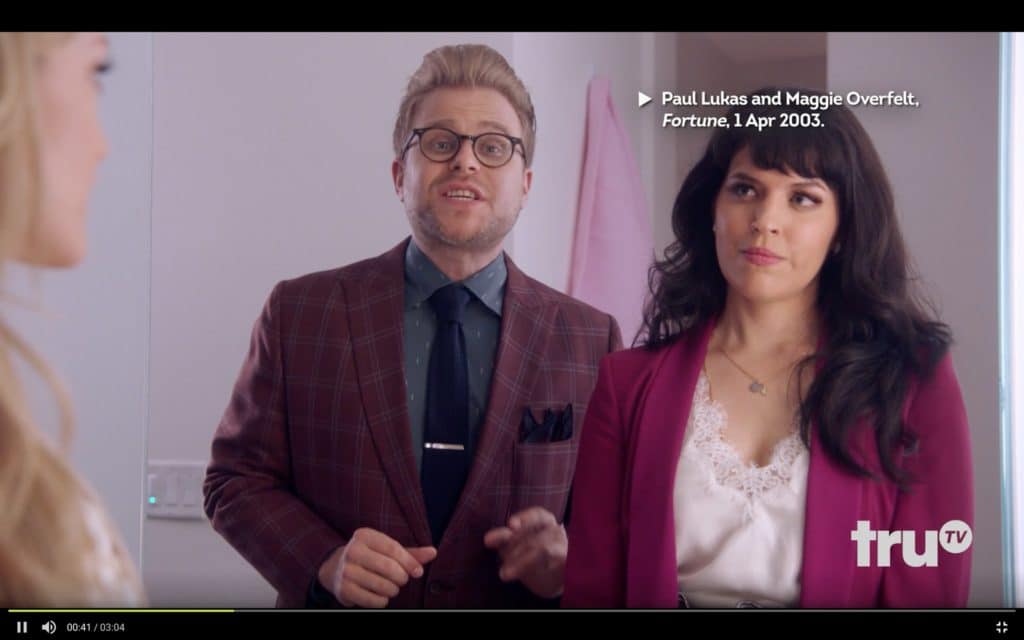
You can see the entire scene, with the research citation appearing at the 0:40 mark, here.
3. Great piece of writing: Outgoing Deadspin editor-in-chief Megan Greenwell wrote a farewell column the other day, in which she pretty well torched the site’s new ownership. The whole piece is worth reading (highly recommended!), but one particularly good paragraph stands out. It’s about the current state of the media industry but is just as applicable to the larger plutocratic movement in America:
A metastasizing swath of media is controlled by private-equity vultures and capricious billionaires and other people who genuinely believe that they are rich because they are smart and that they are smart because they are rich, and that anyone less rich is by definition less smart. They know what they know, and they don’t need to know anything else.
Like so much good writing, this paragraph takes something you probably already knew or sensed on an intuitive level but articulates it really, really well. By spelling it out like this, it takes it from being implicit to explicit. Nicely done.
4. Chain-stitched patches back in stock: I just received a new batch of chain-stitched logo patches from master embroiderer Amy Bengtson (click to enlarge):

As always, Amy made these by hand, so no two are exactly alive. They measure 6″ by 6″ — perfect for putting on a sweater or jacket, or just for displaying. Full ordering info here.

• 5. Teespring sale reminder: Up until midnight tonight, you can get 10% off of anything in the Uni Watch shop or the Naming Wrongs shop by using the checkout code AUGUSTSALE.
• 6. Cycling jersey pre-order reminder: Just a few days left to get your pre-order in for the Uni Watch cycling jersey, which you can customize with your choice of number and NOB. The jersey will probably still be available after the pre-order window closes, but with a standardized number (not yet sure what the number will be) and a standardized NOB (I’m thinking UNI-CYCLIST will be good). So if you want to personalize your jersey, get your pre-order in by this Wednesday.
That’s it for today. Remember, I’m not reading the site comments this month, so email me directly if you have questions about any of this. Now back to Phil for the rest of today’s content.
The Ticker
By Jamie Rathjen

Baseball News: Left over from Players Weekend: dozens of readers asked why the pitchers on white-clad teams wore black hats. As Paul says, it’s to provide contrast with the ball. … Cubs manager Joe Maddon suggested that future uniforms for the promotion should be designed by players on each team (from Griffin Smith). … Reader David Eichblatt suggests that players should wear the uniform of another team that is significant to them. … ESPN ran an article on an anecdote from 1989, when then-minor league pitcher Keith Comstock successfully got a baseball card picture taken where he appears to be hit in the crotch with the ball (from Jimbo Huening). … Probably among the last places you’d expect to see baseball uniforms is a Disney fan convention, but that’s just what happened: a couple cosplayed as Belle and the Beast using uniforms from the All-American Girls’ Professional Baseball League (from Don Martinez).

Football News: Here is the first look at the Patriots Super Bowl champions patch for the first game of the season (from @AayCeeBeee). … Reader ojai76 tells us that the Falcons had bicentennial end zones in 1975, which I thought was a typo, but it’s not. … The first helmet decal problem of the season belongs to Hawaii WR Cedric Byrd, who appeared to have lost his entirely (from Trayton Miller). … A different Georgia Tech player is apparently to wear No. 90 each week to honor DL Brandon Adams, who passed away during the offseason (from James Gilbert). … Helmet expert Blaise D’Sylva is planning to post one helmet history of an FBS or Ivy League school each day during the season. The first two are for Central Florida and Cincinnati. You’ll be able to see the rest on his Twitter feed. … Paul tells us that Army coach Jeff Monken didn’t like how the college football 150th-anniversary patches looked on their black jerseys, so the patches are only appearing on their white jerseys. … The CFL’s Saskatchewan Roughriders now have a “big play chain” in the vein of Miami’s turnover chain after WR Emmanuel Arcenaux brought it in last week (from Wade Heidt). … Also from Wade: Canadian university Wilfrid Laurier has a new purple jersey. Here’s the old one for comparison. … We’ve Ticked these concepts for a CFL team in Halifax before, but interestingly none of the concepts, which were made before the team had a name, used the Atlantic Schooners name that was actually announced (from Tom Pachuta).

Hockey News: Multiple readers sent us the Blackhawks’ new jersey collar. … New Islanders goalie Semyon Varlamov is to wear No. 40 (from @OlegKvasha). … KHL team SKA St. Petersburg switched to Adidas from Reebok (from Michael Yff).

Basketball News: Hawks PG Trae Young posted a picture of what might be the team’s new city-themed jerseys. Make of those what you will (from @DellTreasure). … Multiple readers asked why the U.S. wore numbers outside of the traditional international range of 4-15 — in fact, no player wore a number lower than 24 — in their World Cup warmup games against Australia. FIBA’s rules do not restrict players to 4-15; they allow any conventional number to be worn. Yet USA Basketball lists the final World Cup roster with numbers that are restricted to 4-15.

Soccer News: Multiple readers told us that the Portland Timbers and Seattle Sounders both wore green on Friday. They didn’t have much of a choice because the Sounders second kit is mono-black, which would have provided even less contrast in comparison, and MLS teams don’t generally have or need third kits. … American teams that changed at home included the USL Championship’s San Antonio FC and Louisville City, who both wore third kits at home as the result of fan votes for the league’s supporters week (from Josh Hinton). … The NWSL’s Washington Spirit also changed to mono-white for a home game played at D.C. United’s Audi Field. … Also from Josh: Austrian team LASK released an entire set of Champions League shirts a bit prematurely; they could easily become Europa League shirts, as LASK lost the first leg of the Champions League playoff round at home. … Last week, we had a new patch in Italy’s Serie A given to the top scorer from last season, Sampdoria striker Fabio Quagliarella. Now it seems identical patches have been given to Roma midfielder Nicolò Zaniolo, as the best young player, and Napoli center-back Kalidou Koulibaly, as the best defender (from @Barsotta and Ed Żelaski). … Scottish team Queen of the South wore a special kit for the centennial of their first competitive match.

Grab Bag: A German art collective is making T-shirts and other items with designs from features on the streets of European cities, most prominently manholes (from Matt Edwards). … Reader Craig Ackers‘s old rugby union club, the English seventh-tier side Bolton RUFC, introduced a new crest. … Some high-level sumo wrestlers wear ads on their pre-match outfits — though it may not be obvious because the ads are Japanese text — and some of the ads feature the mascots of their home city or prefecture (from Jeremy Brahm). … From the beginning of the college field hockey season: there is a new mono-black alternate, presumably, for Delaware, while Temple now sports the look recently debuted by the school’s basketball teams, but I’m not sure they had the odd dotted gradient pattern. … Walt Disney World now has a 50th-anniversary logo (from @PhillyPartTwo).
The EPL roundup continues to be a favorite! Thanks to Josh for this feature. Question: Josh has used the term “teamwear” and consistently docked teams for it. What exactly does “teamwear” mean in this context?
Big manufacturers (though primarily Adidas does this) don’t do individual designs for every single team they outfit. They also have a catalogue of templates that the teams pick from, and which are available to the public to outfit youth teams/school teams/adult rec teams/whatever (hence “teamwear”). The teamwear version is invariably much cheaper than the price of the pro teams’ shirts, even though they’re the exact same design.
In all the catalogs I’ve looked through in my 13 years of coaching, “teamwear” incorporates ALL aspects of clothing for a team. Warm-ups, socks, etc. It’s not typically referring to the actual uniform of the team.
The version you (Jamie) describe is often referred to as a “stock” option. All those uniforms (or kits) are stock kits. They aren’t custom ordered. The manufacturer has produced a mass quantity and keeps them in stock.
In past years, when EPL (or anyone big) that signs a new deal with a big manufacturer (adidas, Nike, etc.) they’ve been required to wear a stock option for a certain amount of seasons. This pushes that stock option onto MORE youth clubs to model a pro team and to unload the stock from the manufacturer since they are in [roughly] 3 year cycles.
Does the voting not work on Android phones?
I haven’t been able to vote one time in any round. I’m on an Android.
Works fine on an Android phone if you switch Chrome to Desktop Mode.
Josh Hinton, I wish your opinions were more design-focused than color palette. For example, your dislike for orange on an otherwise acceptable template leads to a silly score.
Johnny,
FWIW, I love orange and, when used properly, it’s one of my favorite kit colors. My youth team wore orange so I am partial to proper orange kits. However, Newcastle’s Orange was literally unwatchable for me yesterday. In any case, thank you for the feedback.
Oh wow… the Player’s Weekend hot takes are flourishing with awful ideas now. Maybe this is what MLB really wanted to happen? It’s certainly drawn attention.
Will the Blazers’ coaches be throwing back to Jack Ramsay’s leisure suit? ;)
Terry Stotts did do it a few years ago. link
Matt Harvey and Iris Dos Santos have the exact same template and exact same wording on their concepts. Just a coincidence?
Did this “Cooperstown Collection” jersey ever actually exist as an official Mets’ jersey? I don’t think they’ve ever had multiple shades of orange.
link
No.
Braves-Mets in those aberrant outfits looked like a big Spy Vs. Spy cosplay, not a baseball game.
That Sounders vs Timbers game was absolutely brutal to watch. The colors weren’t that close at the start, but once the Sounders jerseys became saturated with sweat, it was much harder to tell the teams apart than it should have been. They’ve been playing each other for years now and never had an issue getting one team to wear a clashing kit. The fact that the Timbers weren’t asked to wear their away kit is ridiculous. Swallow some home team pride, and make the game watchable.
That was terrible … shocked That the referee’s (who have the final say on all kit matters) didn’t mandate Sounders change into their black/pink kit (or Timbers change into their white kit in the event Sounders didn’t have their change strip).
USA Basketball always wears these high numbers in the run up to major competitions. The final jersey numbers are not worn until the roster is finalized. Between Saturday’s game and today’s the roster was finalized, so they wore their actual numbers in the game today against Canada.
Yes, but it’s unclear if the 4-15 restriction still exists at all. If it does, my sense is it only applies to tournaments.
The Blackhawks new collar is certainly better than the previous one, but the previous one was a steaming pile of crap. This one is just a pile of crap so its an improvement. Theres no reason to have that blocking just make it go all the way around.
This has to be one of the longest UniWatch morning blogs ever! Lots to chew upon.
-Thanks for identifying which team is which in EPL for those of us who don’t regularly watch soccer.
-The Norman Rockwell of the Dodgers and Pirates with rain beginning has always been a head scratcher for me. It’s the top of the 6th, Bucs up 1-0. Rain starting and the Dodgers manager is happy about the rain beginning. However, based upon the rules of the game, were the game to be called at this point, it was a legal game at the end of the 5th. The rain coming at this time would have the umpires call the game, and the Bucs would win.
Tim, Love your artwork! While the images alone provide a happy walk down memory lane, your process adds such an interesting, vibrant and intricate depth to such familiar images. That they are made from old cards only makes them that much more special. Will definitely be following you online from now on. Very well done!
Josh Hinton, I love the Premier League roundup–please keep it up! One question, though: Are you saying you not only can stomach, but actually enjoy the mix of navy blue shirt and black shorts in Arsenal’s third kit? I love Arsenal, but I thought the pairing was a mistake the first time I saw it live. Woof! And that glorious yellow away kit would’ve played nicely against the Liverpool red.
Also–Norwich home shirt as perfect? Seems very 2017. Anyway, it’s fun to hear others’ views on soccer kits. Thanks.
Haha. Black shorts aren’t ideal, but I do love dark red and navy matches. And I am a sucker for a good gradient. Interesting to hear you like the bruised banana kit — personally I can’t stand it but, not being a Gooner, I don’t have the historical connection. Glad you like the roundup, Thanks for reading!
Interestingly enough, Keith Comstock had more than one error card.
I remember having this one when I was a kid, while knowing about the ’88 card. I did not know about the minor league card until I read the article. link
A safe bet: the winner of the Griffin’s redesign contest will use the 1990s Dixie cup “Jazz” motif.
Most of the top vote getters have nothing resembling a 90’s aesthetic whatsoever.
Am I the only one that thinks it is completely ridiculous that schools like Cincinnati and Central Florida have had as many helmets in the past two seasons as they had in the previous 30 plus?
It is bad enough that some schools have 4, 5, or more unis each season….but to have a new helmet each game or different versions is ridiculous in this mans opinion.