[Editor’s Note: Paul is on his annual August break from site. Deputy editor Phil Hecken is in charge from now through the end of the month, although Paul may be popping up here occasionally.]

By Phil Hecken
Follow @PhilHecken
Yesterday, Adidas unveiled seven new uniforms for seven NCAA football teams, what they’re deeming the “2019 collection of strategy uniforms for College Football’s 2019-2020 season.” Four of these uniforms have been further dedicated as “Selfless” uniforms, the purpose of which is to “unite players, fans and communities throughout the season with the common thread of tackling obstacles both on and off the field.” Hoo boy.
There’s a lot to get to, and I’m not going to show all the images Adidas provided, but I will link to a flickr set so you can see additional images if you want. We’ll start with the four schools in the “Selfless” category:
Miami Hurricanes

Remember last year when Miami introduced their Parley uniforms (scroll down), which are made from repurposed and upcycled ocean materials? Well, they’re doing it again, only this time, instead of the uniforms being in green and orange, they’re white (and they’re also doing the underwater photography thing again). These unis are really plain, featuring white, stripeless pants, and the only color will be on the white helmet (with traditional “U” and green/orange/green striping). Numbers are a new font, in green with a slight pattern (akin to the original Toronto Blue Jays numbering):


The pitch:
DESIGN: A wave print design is used within the numbering, fusing Miami’s signature dark green with the adidas EQT green colorway that has become synonymous with adidas x Parley.
TYPOGRAPHY: Custom-made typography is inspired by the same lettering used for the Orange Bowl, which takes place in the University’s backyard.
COLORWAY: The white base of the jersey eliminates the use of toxic color dyes and materials.Orange color accents are used to resemble the beak and feet of Miami’s Ibis mascot.
The Hurricanes will wear this uniform against the University of Virginia on Sat., Oct. 11, at Miami’s Hard Rock Stadium
Arizona State Sun Devils

Like Miami, these are predominately white uniforms, featuring a white helmet, white jersey featuring almost entirely maroon elements — numbers are a custom font and the shoulders feature a pretty cool visage of the Arizona State flag.

Pants are white with a maroon stripe, and the helmet is also white with a single maroon stripe, and two ASU pitchfork logos on the sides.

The Pitch:
TYPOGRAPHY: Custom-made typography utilizes block lettering, using less material.
SLEEVE DESIGN: Designs resemble ASU’s state flag, and give a nod to the 80+ solar panels on campus.
COLORWAY: To eliminate toxic dyes, the base of the uniform utilizes a white colorway.
The release did not mention when this uniform will be worn.
Georgia Tech Yellow Jackets

The Ramblin’ Wreck will be getting gray uniforms for this promotion. These unis will “honor the kids that are fighting illness at Children’s Healthcare of Atlanta,” and …
The design highlights Georgia Tech’s long-standing relationship with Children’s and the annual “Cape Day” campaign where patients wear capes to showcase their inner superhero .Georgia Tech fans are also encouraged to wear capes to show the kids at Children’s support on October 4 on Cape Day.
The design gimmick on these unis, as you can see from the image above (and below), the pattern on the jerseys and pants (and gloves) is a gold hexagon (which I guess is supposed to mimic the hives of yellow jackets).

The pattern is on the pants “stripe” as well as the shoulder caps of the uni. The team will wear it’s normal solid gold helmets with this uniform.

The Pitch:
COLORWAY: The onyx gray uniform, a first for Georgia Tech, features sleek hexagon patterns with metallic Tech gold accents.
DESIGN: Hexagonal graphics are used within the typography and sleeve-cap accents, as a metaphor towards the Atlanta’s community.
DESIGN: A Children’s “Cape Day” crest is featured on the back neck of the jersey, paying homage to an annual Atlanta tradition that honors the superhero kids fighting illness every day.
The team will wear this uniform on October 5 against UNC at Bobby Dodd Stadium.
Mississippi State Bulldogs

The Bulldogs are getting a mostly black uniform, with a maroon helmet, and an interesting striping pattern on the sleeve caps and pants. If you look closely (closeup below), the white and maroon center stripes are surrounded by a metallic stripe, which features a circuit board pattern that is also “color shifting” (depending on how the light hits it):

The gimmick here is the link to the T.K. Martin Center which provides “assistive technology for individuals to participate in educational, vocational and leisure activities.”

The Pitch:
COLORWAY: The uniforms are inspired by Mississippi State’s original silhouette, with a black base colorway to accentuate the uniform’s metallic accents.
TECH: The jersey features a body-mapping design, using a ribbed, knit pattern on the chest and shoulder pads to produce a refined fit, while knit engineered mesh channels feature Climacool technology to provide enhanced breathability and cooling zones.
DESIGN: Iridescent, color-shifting stripes are throughout the sleeves and pants, paying homage to the T.K. Martin logo. Exhibiting assistive technology through design, graphics replicating a computer’s circuit board are placed within the striping.
The release did not say when these unis will be worn.
Louisville Cardinals

Like Miami and ASU, The Ville’s new uni is primarily white. The helmet is solid white with just a black image of the Cardinal logo on the sides, the jersey is solid white (with tv numbers on the sleeve caps) and the pants are white with a thick black stripe down the sides.

The hook here is boxing. Or rather, their tenuous relationship to Muhammad Ali:
From the boxing ring to the football field, the 2019 adidas x University of Louisville alternate uniforms take inspiration from one of the best boxers in U.S. history. Always hitting the turf with nimble, quick and strategic movements, the Cardinals’ often resemble history’s most renowned and respected boxers —which is showcased throughout the design of the 2019 alternate uniforms.
OK then. The only red (cardinal) on the uniform will be the cleats and the gloves — which are supposed to resemble boxing gloves (no, really).

The pitch:
TYPOGRAPHY: The crest features a new, curved and arched typography.
DESIGN: The pants feature a black stripe down the lateral side, inspired by a boxer’s shorts.
COLORWAY: The jerseys feature a white and black colorway, inspired by a boxer’s famed pre-match robe.
GLOVES: The jerseys are paired with red gloves, giving the allusion of boxing gloves.
The team will wear these unis on October 5, against Boston College, at Cardinal Stadium.
Indiana Hoosiers

The Hoosiers will have a new helmet logo (supposedly inspired by the font on an early football uni) on a nice crimson satin dome, and will have red jerseys over white pants. The shoulder caps on these will feature the “barber pole” (or is it “candy cane”) pattern made famous by the 1970s Bobby Knight hoops squad’s warmup pants, only rather than being crimson and cream, it’s light and dark crimson.

It’s tough to see (and on the field it will be impossible), but the white pants also feature the candy stripe pattern — rendered entirely in white:

The Pitch:
DESIGN: The uniforms feature a candy-stripe graphic throughout –which were originally inspired by Indiana’s 1930s swim team and seen again in the 1970s, when Bobby Knight’s Basketball team sported them in their warm-ups.
TYPOGRAPHY: The IU wordmark font was inspired by one of the first football uniforms worn by the university.
The team will wear these unis against Rutgers on October 12th, in Memorial Stadium.
Nebraska Cornhuskers

The blackshirts are back. Apparently, this is what every Husker fan has been waiting for. The team will have white hats with a black stripe, black jerseys — and solid white pants. The jerseys will not only be black, but they will feature a skull and crossbones…wearing a white football helmet with a red stripe, in contrast to the lid the team will wear:

There’s actually lots of red on this jersey (relatively speaking, compared to the mostly two-color unis of the other “strategy” schools): TV numbers, NOB, patch, the facemask on the helmet the skull and crossbones is wearing. The plain white pants will have a red “N” as well.

The Pitch:
COLORWAY: Uniforms use a black base with traditional red and white accents.
DESIGN: Personifying the players’ relentless attitude, a skull-and-crossbones logo sits on the jersey’s sleeve cap
The release did not mention when these unis would be worn.
Well, there you have it. Seven new uniforms. Enjoy.
Your thoughts?


I’m pleased to introduce a new feature here on Uni Watch — the Premier League Uni Roundup. Now, I’m not a soccer guy, but Josh Hinton is, so (at least for the remainder of August), each Monday or Tuesday we’ll have the weekly kit matchup for the Premier League (once I return to weekends, Paul will likely continue the feature). Ready for Week 2? Here we go. Here’s your…
Premier League Kit Roundup
By Josh Hinton
Hello all fellow Uni-Watchers! I am excited to start this new uniform tracking project – much thanks to Paul and Phil for letting me do this! I will be rating each matchup in the English Premier League based on a ten-point scale. Each matchup starts at a five and, based on the aesthetics (lovely/horrendous kits, clashes, the way kits complement each other, etc.) will receive a final rating out of ten with one being very poor and ten being perfect.
Week Two (8/17-8/19)

Arsenal 2-1 Burnley
Not a bad start to week two, as Arsenal broke out their beautiful Adidas home strip and Burnley debuted their new third kits. Love this Arsenal strip – easily one of the best kits in the league. Burnley’s third kit introduces an interesting dark green color scheme, but the shorts seemed out of place; too dark to be the same shade as the shirt, but not dark enough to compliment the kit. Burnley should have stuck with the same shade of green as is featured on the shirt, or a lighter color shorts (sky blue, white, or light grey would pair well). 7/10

Aston Villa 1-2 Bournemouth
Bournemouth’s garish third kit could be a lot worse, but I really thought we were past the NFNS (neon for neon’s sake) trend; this needs to stop. They rarely look decent, and never look good. Aston Villa sport their popular home strip, which is classy, but not enough to save this matchup. 2.5/10

Brighton 1-1 West Ham
A subpar Brighton home strip paired with West Ham’s decent, but awkward looking (with an unnecessary sky-blue chest and shoulder pattern) home kit did not make for a great matchup at the Amex. 3.5/10

Everton 1-0 Watford
From afar, Everton’s home kit isn’t bad, but the chest pattern looks much better on paper and in the graphics than on the pitch. By contrast, Watford’s busy Juventus-esque home kit doesn’t feel right, but at least it complements the Everton strip. 4/10

Norwich 3-1 Newcastle
Norwich’s lovely home strip is the latest to fall victim to The Newcastle Effect, as the thick vertical stripes of the Magpies, paired with red numbers and a sky-blue sponsor logo, kills the potential aesthetic look of this matchup, with Norwich goal celebrations being the exception. Both kits cancel each other out in terms of rating. 5/10

Southampton 1-2 Liverpool
Aside from the bizarre black shoulder block on the Saints’ home strip, and the sky-blue sponsor logo, Southampton’s home strip isn’t all that bad. While it doesn’t have the Stoke beauty to it (15/16, 16/17, 17/18, 19/20) it isn’t awful. Liverpool’s change kit is busy, but not awful; it looks much better on the pitch than in the press release. 4/10

Man City 2-2 Tottenham
This was far and away the kit matchup of the week – Spurs sport a lovely navy away strip which compliments a beautiful Man City home strip. I could pick out little things to critique, but this would be petty. Very good-looking match! 9/10

Sheffield United vs Crystal Palace
Brutal home debut for the Blades’ return to the Premier League, as they paired their subpar home kits (see Stoke home strips above on how to properly put together a red and white striped kit) with a garish Palace away strip, which isn’t awful but did not pair well at all with the Sheffield United home strip. Interesting development in the second half, as Sheffield United’s goalkeeper wore a baseball cap (uncommon but allowed). 2/10

Chelsea vs Leicester
Interesting first home match for Christian Pulisic, at least from an aesthetic standpoint: the Foxes debuted their new pink change kits (based on Germany’s 2018 World Cup home kit; Adidas then created a set of teamwear templates based on the design). Leicester lose points for the teamwear and for the fact that several Leicester players were without their Premier League sleeve badges. While I am not a huge fan of those Leicester kits up close, it made for a good-looking match from afar. 7/10

Wolves vs Man United
Beautiful match out of Molineux, as Man United had to wear their change socks, complimenting the shorts and red shirt while pairing well with Wolves’ classy old gold and black kits. Not much else to say here. 9/10
Thanks Josh! Hope everyone likes this new feature!
Collector’s Corner
By Brinke Guthrie
Follow @brinkeguthrie

I’ve always liked these “minimalist” Cubs scorecard designs. This one is from a 1965 game with the Phillies…just 15 cents! What is this type of design called? Anyone know? It’s quite unique to the Cubs and I don’t think I’ve ever seen it done with any other team’s scorecards or yearbooks. Now for the rest of the week:
• Here we have a custom-made Cowboys helmet buggy done up in the original white/navy color scheme.
• NFL Game Plan was the greatest NFL board game (IMO) of the 1970s.
• These 1970s Tasco NFL binoculars
• Simple clean design for this 1980s (I am guessing) Bengals jacket made by Stahl-Urban. The ad says 1970s but we all know that’s in error.
• “Wait ‘Til This Year,” proclaims this 1970s Atlanta Braves bumper sticker.
• One more 1970s MLB bumper sticker, this time for the Angels. For some reason, it’s done up in the non-Angels colors of orange and blue.
• This seller is asking quite a bit for this nice looking set of nine NFL single bar helmet stickers!
• Here’s a nice looking Broncos sweater of unknown vintage- the maker is simply “Brandon.” I like the thick bold striping.
• This 1970s Packers sweatshirt looks like a Sears design to me- the Etsy seller says it’s from “Varsity House.”
• Very cool design to this 1970s Buffalo Bills poster! Nice one for the Chiefs, too.
Got an item to include on Collector’s Corner? Send any submissions to uniwatchcollectorscorner@gmail.com!

Kreindler’s Korner
I had the distinct pleasure of featuring the wonderful artwork of artist Graig Kriendler on two occasions over the summer and fall of 2017, and more recently, in August of 2018.
For those who don’t wish to click the links, Graig paints baseball heroes (and regular guys) from the past, and is an immense talent.
Occasionally, I will be featuring his work on Uni Watch.
Here’s today’s offering (click to enlarge):

Title: “Ray Brown, 1938” (color study)
Subject: Ray Brown, 1938
Medium: Oil on linen mounted to board
Size: 5” x 7”If there was one pitcher the Homestead Grays could rely on in the 1930s and ‘40s, it was Raymond Brown. He was known as their “Sunday Pitcher,” designated for mound duty in order to draw a large crowd for the ballclub. Known as one of the great stars of the Negro National League with a wide array of pitches (most notably a wicked curve), he led the Grays to an astonishing eight pennants in a nine-year span.
Here he is pictured mid-career with the club in 1937. Perhaps that year was most notable for him off the field, when he married Ethel Posey – the daughter of the team’s owner, Cumberland – in early June. That winter though, it was back to business as usual, as his 12 wins led the Leopardos de Santa Clara to the title in the Cuban Winter League.
In 1938 he was mentioned with a group black players who were all of major league caliber in a wire sent to the Pittsburgh Pirates by the Pittsburgh Courier. The other four players were Josh Gibson, Buck Leonard, Cool Papa Bell and Satchel Paige.
This is one of 200+ paintings of mine that will be on display at the Negro Leagues Baseball Museum in the spring of 2020.
Thanks, Graig! You can (and should!) follow Graig on Twitter.
And now a few words from Paul: Hi again. Some quick reminders for today:
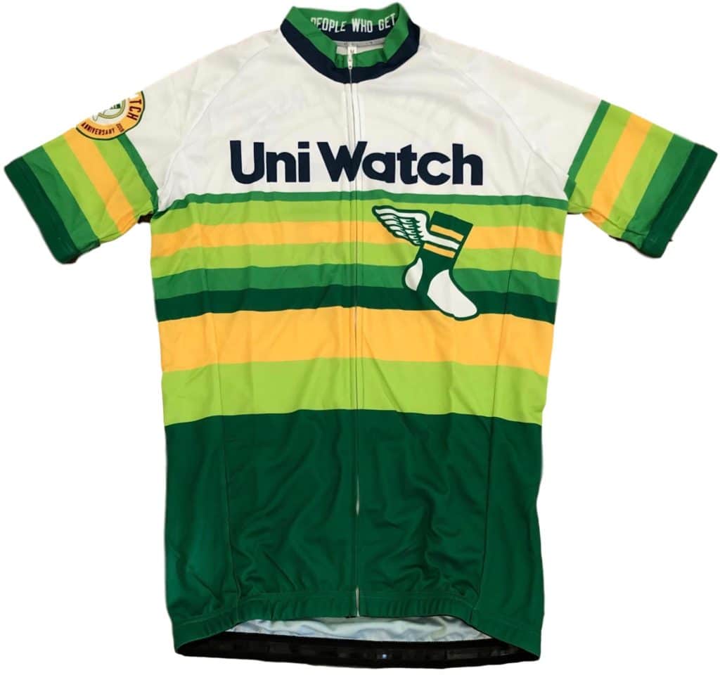
1. Cycling jersey reminder: In case you missed it last week, we’re now taking pre-orders on the first-ever Uni Watch cycling jersey, which you can get with your choice of number and NOB. The pre-order window will close next Wednesday, Aug. 28, so move fast. Full details here.
2. Anniversary patch price drop reminder: In case you missed it yesterday, the Uni Watch 20th-Anniversary Patch, which was originally priced at $9.99, can now be yours for only $6.99. Full ordering details here.

3. HQ Sports reminder: I’m going to be appearing on the app-driven live sports trivia show HQ Sports (part of the larger HQ Trivia empire) tomorrow, 8pm Eastern. It’s going to be a uniform-themed game, and I’ve been involved in writing the questions. Should be fun!
4. Camouflage shirt reminder: In case you missed it last Friday, we now have a Uni Watch camouflage shirt available. Check this out (click to enlarge):
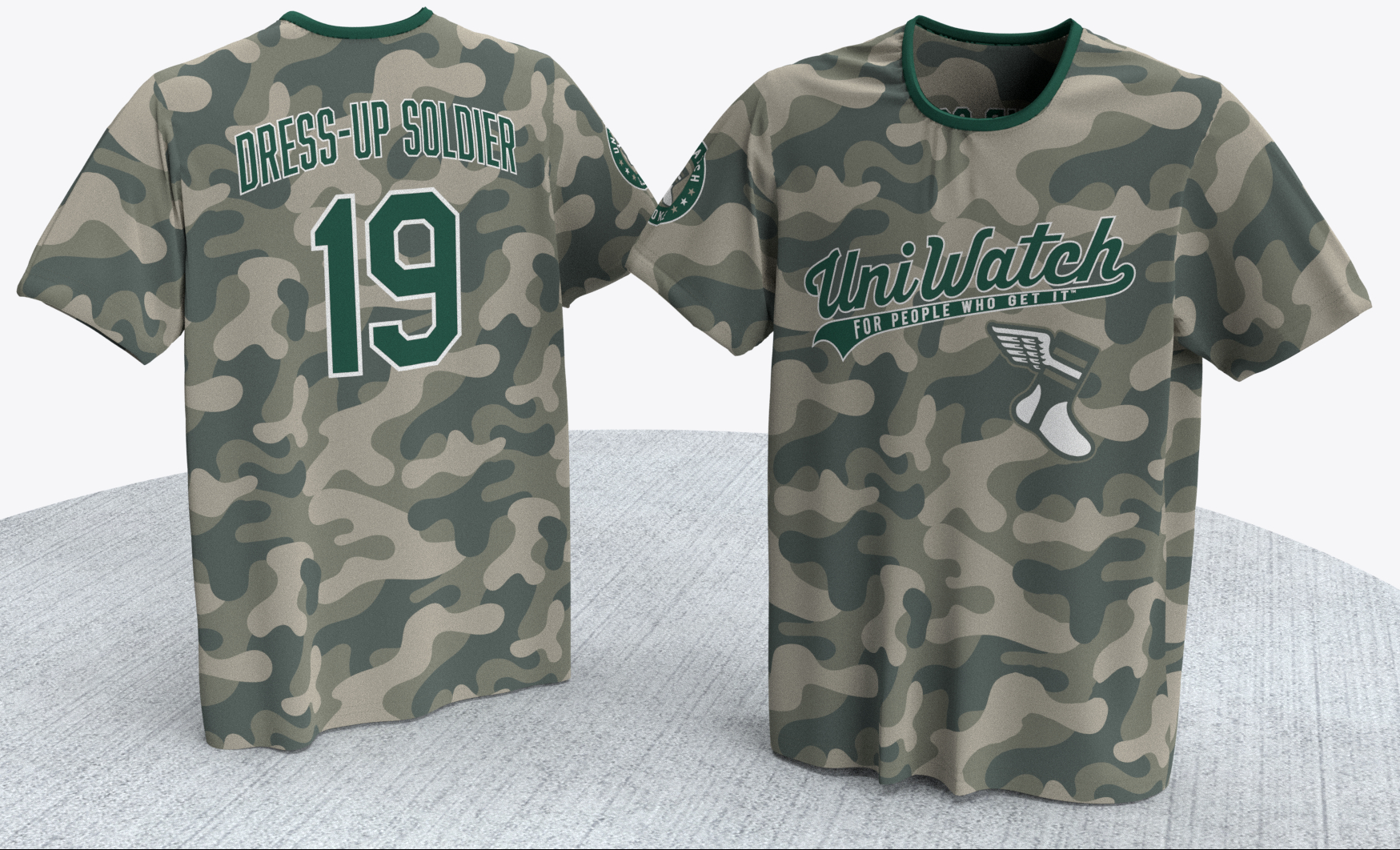
Not bad, right? Full details here.
That’s it for today. Again, I’m not reading the comments this month, so if you have a question about any of this, feel free to email me.
Now back to Phil with the rest of today’s content.
The Ticker
By Anthony Emerson

Baseball News: MLB.com speculates about which number each team will retire next (thanks, Phil). … Also from Phil, Mariners P Sam Tuivailala will wear Moana-themed cleats for Player’s Weekend. … A Nielsen analysis says MLB sleeve ads would be more valuable than NBA jersey ads (from @HitTheGlass). … Tigers P Edwin Jackson has been writing “CB” on his cap in recent weeks for Curt Bailus, a friend of his personal coach Kevin Visser, who passed away recently from multiple myeloma (from Mike Chamernik). … The Iowa Cubs, Triple-A affiliates of the Chicago Cubs, will pinkwash their unis on August 23 (from @00obstructedviews). … The Akron RubberDucks, Double-A affiliates of Cleveland, threw it back to their Aeros days last night. They paired the throwback jersey with the current RubberDucks cap (from @davelb87). … Lots of uni goodness in this season 3 screenshot from Cheers (from Adam Vitcavage). … The Bowie Baysox are becoming the Crab Cakes as part of a Maryland themed promotion. They’ll also give away “Bay-Socks” (from Andrew Cosentino).

NFL News: A user of the /r/nfl subreddit put together a chart of each current NFL team’s primary logos for the 100 seasons of the league (from Jeff Perilman). … The NFL100 logo has even made its way onto the players’ towels. … You can briefly see Jaguars RB Leonard Fournette still using his LSU pads in this Twitter video (from Zach Freese). … The Panthers are going mono-white for their second pre-season game. … If you want to spend $7,500 on a Swarovski crystal Browns helmet, you can! It’s even on sale from the original $10,000. A bargain, I tell you (from @DDberry24).
College/High School Football News: Here’s an analysis of Oregon’s new unis (from @ricknogers). … The second group of Virginia players to get their uni numbers has been revealed (thanks, Jamie). … New road unis for Oklahoma Baptist.

Hockey News: A poster included in yesterday’s edition of The Calgary Star featured the Flames’ 40th anniversary logo. … Sharks G Aaron Dell will have some pretty cool pads for this coming season (from Nathan Hogue and Clint Dickinson). … The Hurricanes will wear their Whalers throwbacks on January 11, and will go white at home — the way hockey should be — on October 12, according to their website. … The OHL’s London Knights revealed their new uniforms yesterday (from Wade Heidt and James Beattie). … Also from Wade, the WHL’s Regina Pats have announced an outdoor game in Regina for the same weekend as the NHL’s Heritage Classic, to be held in the same stadium. The logo for the WHL event is here. … KHL team Jokerit have revealed their new unis (from David Kemper). … New pads for Wisconsin goalies (from Garrett Van Auken). … Here’s a Q&A with Golden Knights owner Bill Foley: Vegas’ third jerseys are coming (from The Athletic), so it’s paywalled (from Thomas Roddy).

NBA News: When there’s good news there’s always bad news. The good news is the Boston Celtics are looking to dump GE as the advertiser on their unis. The bad news is now they’re looking for a new advertiser for their jerseys (from Phil).

College/High School Hoops News: South Carolina revealed a whole bunch of minute details to their new unis in this Twitter thread (from Joel Mathwig and Andy Assaley). … The very last words of this article reveal that Kentucky freshman walk-on Riley Welch will wear no. 13 (from Josh Hinton).

Soccer News: Tottenham’s still-technically-unreleased third kits are now on sale at Nike stores in the US. Can someone please tell me the logic behind waiting so fucking long to release third kits? Spurs have already played two matches! (from multiple readers). … Aston Villa’s still-unreleased third kits have been leaked. … New kits for Russian side Torpedo Moscow. The tartan pattern to honor William Hopper, a Scotsman organized the first soccer match in Moscow (from Ed Żelaski). … Argentine side Quilmes have revealed their new kits, inspired by Tottenham Hotspur kits from the early 1980s (from Gabriel Hurl). … The following are all from Josh Hinton: Spain’s Euro 2020 away kits have been leaked to FootyHeadlines. … PSG’s still-not-officially-unveiled third kit has been leaked once again. … New Barcelona signing Antoine Griezmann would like to wear his trademark No. 7, but cannot because he’s already been registered as No. 17. He had to register as No. 17 as former Barça player Philippe Coutinho had been registered at No. 7, even though he’s subsequently left the club. … Italy loves to add badges to teams’ kits. They already add the Scudetto to the kits of Serie A champions and the Coccarda to the kits of Coppa Italia champions, and now Serie A is adding a badge to the kit of the top scorer of the previous season. … You can catch the rest of Josh’s contributions on his Twitter account.

Grab Bag: If you live in New York State, you can vote on the state’s new license plate design (from David Jaffe). … The Chicago Tribune thought their Brannock device article deserved its own alert. We agree! (from Nicole Haase). … The man who launched the original leather motorcycle jacket has died at age 94 (from Tom Turner).
According to Georgia Tech’s athletic website, “The Cape Day uniform will also include a new look for Georgia Tech’s iconic gold helmets as well as specialty shoes, with details coming in the weeks leading up to gameday.” So I guess we’ll have to wait and see before criticizing the whole uniform.
With the conspicuous absence of gold, the blocky proletarian font and the red (OK, maroon…) star on the shoulders, the Arizona State set looks like what the Arizona Communist Party football team would wear. That’ll play well in Arizona.
West Ham’s shirt is supposed to be a throwback (or psuedoback, a term that R. Scott Rogers came up with for uniforms that borrow elements from a previous design) to 1980, so the blue panels are far from unnecessary because they’re part of the original design.
As for Spurs, they’re likely waiting for the Champions League to start to release the third shirt. They don’t need it before then, or really at all in the PL.
the Browns arent the only ones with crystal helmets. Lids has 11 NCAA schools and 31 NFL teams for sale
link
Interesting turn of phrase by adidas wrt to Louisville’s uniforms:
GLOVES: The jerseys are paired with red gloves, giving the allusion of boxing gloves.
Not ‘illusion’ or ‘alluding to’.
al·lu·sion
/əˈlo͞oZHən/
noun
an expression designed to call something to mind without mentioning it explicitly; an indirect or passing reference.
—
I thought it was a good use of the word
Idiomatically, something can allude to, or it can give the illusion of, but it cannot give the allusion of. The word is proper, but the phrasing is wrong.
The ’65 Cubs program reminds me of 1930s poster art. (This is a big compliment.)
Yes. Very Art-Deco.
I believe the designer of those iconic Cubs’ programs is Otis Shepard. Beautiful work.
link
Otis Shepard also designed the beautiful number font that was on the Cubs’ uniforms in the 1940s, and which has morphed into the one they use now. (Did he design the Bears’ font, too? It looks a lot like the original Cubs one.)
Loving the PL writeups Josh! Keep it up!!
A couple Tottenham observations–the navy second kit is navy and purple, and actually looks more purple to me: link
The third kit pattern is suppsoedly inspired by the facade of their new stadium, seen here: link
Overall, this set of kits is a HUGE improvement over last year’s set. Getting rid of the ugly gradient on the home kit and the understated second kit are two uniforms worthy of a team on the brink of great things. And while last year’s third will go down as a classic for its association with the Champions League run, from an aesthetic standpoint, I think it’s a little busy. This year’s third is really sharp.
Seconding the love for the Premiership writeups! A great feature, and I particularly enjoy Josh’s style of criticism. I hope the feature continues!
Couple of picayune bits of editorial feedback: 1) In the writeup, please include the team’s formal name when using its nickname, either on first/second reference or parenthetically. 2) Is there a reason that scores are missing from several entry titles?
I’ve never been able to settle on an EPL team to root for, largely because of the ads. All else being equal, I think I’d adopt Newcastle United, but they have had such ugly ads for the last decade or so that I just can’t.
Was going to add to this with a suggestion that for the sake of editorial consistency you give the full names for each team in the heading to each fixture as opposed to the weird mix of full (Sheffield United), just the location (Newcastle, Norwich, Leicester) and shortened (Man City, Man United) names, but now I realise that is how the Premier League website itself lists the clubs and now I’m just disappointed in society in general really.
North American teams are typically officially known by their nickname, so one can say “Detroit” or “the Tigers” interchangeably, and anyone who knows enough about the sport to understand the rest of the sentence will understand what team is being referred to. Whereas EPL teams have both formal names and nicknames, often several, so it is not obvious to every reader which team a nickname applies to. Like, which team is the Blades? It’s fine to call Arsenal the Gunners, but when writing for a general American audience, the fact that “Gunners” refers to “Arsenal” needs to be spelled out.
The fact that a fair number of the nicknames are entirely unintuitive (Everton and toffee???) doesn’t help matters. I get that this kind of familiar tone is part of a particular style of writing associated with the Premier League, but there are indeed practical considerations with using it here.
As for my particular nit picking, there’s really nothing practical about it. I’m just a bit pedantic about these things but in fairness I did grow up with the austere, disembodied BBC voice on Final Score reading out every last syllable in perfect Received Pronunciation of every team from Conference North to the Premier league during the listing of the results each weekend.
As much as I have been enjoying and appreciate the Premier League writeups, I don’t think this feature has staying power for the entire season. Once we get past the first few weeks and have seen the majority of PL uniforms the analysis will become very repetitive. This would only leave new material when teams wear change kits for the first time and fresh analysis only based on the pairing of the two uniforms in each matchup, which although adds some value is honestly much more subjective than even “standard” uni analysis. Perhaps this feature could still run on weekends (although it would be a few days old by then) when the site is a little more freeform but I just don’t think it will hold up to the standards of the weekday format. Sorry, I really do appreciate what Josh has been doing so far but I think this is a fair assessment.
Respectfully, I disagree. Weekly Premier League uni match up reviews won’t wind up being much different than Monday Morning Uni-Watch during the NFL season. If there’s nothing noteworthy, I imagine Josh won’t say much, but there are little changes and modifications throughout the season that are exactly the kind of thing this website is for.
I do agree that there should be continued analysis of weekly PL uniforms going forward and this could be in a feature similar to Monday Morning Uni-Watch or just in the ticker. I just do not think that there will be enough content to support the feature in its current format that examines every PL matchup each week. This is coming from a HUGE Premier League fan (up the Villa) who is a daily reader of the site so I am all about adding more soccer uni content, but I also don’t want to see it become tiresome or overdone.
Nebraska uniforms would be better without the logo sleeve. The skull and crossbones wearing the helmet. Understand they are trying to make the jersey look intimidating. Not working with this logo. The logo seems kind of goofy to me.
Not a fan of black for the game jerseys, but that logo is an official one who a long history and a fan favorite. link
Really pleased to see the new modern retro uniforms for the London Knights, but they should be going with green helmets instead of black.
In fact, when they wore this similar design close to 30 years ago, it was green pants and green helmets.
link
“… a chart of each current NFL team’s primary logos for the 100 seasons…”
Must’ve gotten the logos from Creamer as the 1970 – 1971 ‘Skins logo is a horrid/incorrect version of the “feather/R” that Creamer seemingly refuses(?) to update.
Please fix it Creamer.
link
Here, pick one of these.
link
Good catch…I sent him a bunch of Mets suggestions that were treated similarly.
I wrote about the Cubs’ old scorecards for Uni Watch a few years ago
link
When did “colorway” become more prevalent than “color scheme” or just “colors”? Seems weird, like an industry term that is unnecessary to be used today.
I don’t have actual data to back this up, but my feeling is that it leaked out of industry-only usage to civilian use via sneakerheads.
Yea colorway to me has also been a sneaker term
“Colorway” has a specific meaning, the precise arrangement of colors. “White with blue trim” and “blue with white trim” are different colorways.
“Colorway” is the “price point” of sneaker culture.
Using the Nebraska Blackshirts tradition (starters on defense wear black shirts in practice and the squad is called the Blackshirts) as an excuse to go BFBS is disappointing. Kids might have wanted the team to dress this way, but people who appreciate that the only school colors are scarlet & cream are annoyed. Black is NOT a school color. The Blackshirts logo (the skull and crossbones referenced) goes back decades and looks as great as always, but should not be tainted/abused as it is here.
Did they ever get their “blackshirts” back? I remember them being taken away and I am not sure they have really done anything since to get them back…
Sometimes coaches give out the blackshirts before the first game, while other times they make the players “earn” them after a game or two. They are always awarded at some point, though.
Jesus Christ, you think the strategy jerseys have enough fucking patches on them? ‘150’ patch, conference patch, school patch, Adidas patch…blech
Rant aside I do like ASU use of their state flag. See?, THAT’S how you work a flag design into your uni…looking at YOU, Maryland.
I like how gimmicky uniform storytelling has expanded to include explaining “why” the uniform uses a school color.
Re:Adidas Gimmick, gimmick, gimmick
Grew up in NY state. Moved away years ago. So, absentee ballot for Plate 5.
Here is my review of Nebraska’s new(ish) alternate jersey: link
This Nebraska uni is hurting my brain. Their skull and crossbone patch has red mask and striping when the helmet has all black features. Oh how it hurts my little brain. Does anyone else feel this way?
When I think of iconic New York symbols, the Tappan Zee (excuse me, the Mario Cuomo) Bridge immediately comes to mind. People from all over the world make the trek up 287 to marvel at its architectural splendor (even though it is pretty much the same as the Goethals and the Kosciusko).
The Statue of Liberty vote will be split among the three choices making Andy Boy’s daddy the winner. F**king shameless.
As an upstate New Yorker (Rochester), I’m disappointed that 4 out of the 5 designs feature “downstate” imagery. The only one that seemed balanced to me was option 5, for which I voted.
And I don’t agree that the bridge is particularly iconic – I had no idea what it was; nor will anyone who doesn’t have reason to travel through that area. It looks like any old bridge to me, and not at all representative of NY state. At least the statue of liberty is recognizable.
My description of the bridge and use of the word iconic was meant to be sarcastic. I don’t like any of the designs. The new plate switch is just another money maker for the state. F Cuomo.
As a downstate New Yorker, we don’t care ;)
Seriously though, New York should really be two states, since they’re literally worlds apart in everything. I spent plenty of time upstate (went to college there, worked there, etc.) and unfortunately, there’s not much in common between between the two. I’d agree the new Tappan Zee isn’t particularly representative on anything. I like the new “throwback” plates which have no upstate/downstate iconography. And since I have a custom plate, I’m gonna keep it for a while (or at least as long as they’ll let me). Plain blue and gold. Perfect.
I would never recognize that bridge as being from NYC, much less be able to identify it by name. My own sense is that there are one or two US bridges a majority of people would recognize – Golden Gate and maybe Brooklyn.
Us Midwesterners would likely recognize Mackinac, but I doubt others would.
Personally, I like #2 the best – but certainly can see the statewide appeal of #5.
They’re all not great, and a huge downgrade from the Empire State’s current plates, which are among the best American license plates of all time. But the bridge one stands out for its particular awfulity. Low contrast, so reduced legibility of the digits, which is literally the one solitary functional purpose of a license plate. And it prominently features a detail of a not-very-iconic structure. As recognizable bridges go, Tappan Zee is definitely top-twenty, but the number of bridges the average American can recognize and name is closer to two or three, and Tappan Zee is nowhere near the top three in that regard.
#5 is by far the closest to the generic average of a modern American license plate, so no doubt it will win. And hey, if there’s one thing I know about New Yorkers, it’s that they just love being mistaken for Iowans, which is what will happen when #5 starts showing up on Empire State cars.
#4 is like a clinic in bad-but-not-catastrophic license plate design, so it would get my vote. One bit of text rendered illegible by an underlying image! Two mottoes! Three different angles of italicization! Four typefaces! As a non-New Yorker, it’s the only one to which my first reaction is to think of New York the state as opposed to the city.
#1 has the fewest design faults, and so there’s really no excuse for the state even holding a vote between it and the other designs, each of which is objectively inferior.
#5 looks like the person taking the photo or drawing the picture is standing in New Jersey at first glance, though I suppose it could be from Staten Island also.
I believe that instead of “The Panthers are going mono-white for their second pre-season game”, it should be “The Panthers went mono-white for their second pre-season game”, as in past tense. Their second pre-season game was on 8/16.
Lee
Your Adidas Unveils New ‘Strategy’ Unis for 7 Schools post just reinforces that my decision to stop caring or paying attention to college football uniforms was correct for me.
What a load of nonsense.
Lee
I like ASU, Nebraska and Louisvilles uniforms. Indianas helmets are kinda cool and I like that computer striping look MSU uses, just not on those uniforms.
I noticed a guy in the 49ers-Broncos preseason game last night wearing #01. You can see him in the still/video here:
link
I believe it’s WR Shawn Poindexter. Interestingly the 49ers’ roster page lists him just as #1. Page doesn’t support leading zeroes I guess!
True definition of BFBS is that awful Nebraska getup.
A sad commentary on the state of Rutgers Football that the school that was involved in inventing the game and is now a 3-stripes school could not get a special uni from Adidas for the 150th anniversary of the sport. In fact, I feel like Rutgers Athletics has not handled anything involving this anniversary well, so maybe it’s on them and not Adidas for this, but I feel like they should have something to mark their place as the original college football school.
You don’t know for sure that a new “special” Rutgers uni isn’t coming, do you?
Maybe you should just be patient. That’s all I’m gonna say about that.
i must have missed it but when will the Griffins announce the finalists? i look forward to voting.
For a site that hate this shit…it sure love promoting / nit-picking the hell out of it.
You know what…this is for your webmaster…what would a Charles capture look like…I want to know how many ads are firing off and how much revenue you are making off off stuff you “hate”…you know what…I will and can post it if you like…tired of you playing the “poor” man.
What?
This comment is so poorly written that I can’t even follow what you’re trying to say.
They’re called verbs. Use them. They’ll help you communicate with other human beings outside of Twitter.
As to the question posed in the first soccer item in the ticker, my assumption is that the teams (and their kit manufacturers) are trying to capitalize on the timing of games, unveiling new uniforms right before they’re worn competitively for the first time. No hard evidence of this, but I feel like I’ve seen PL clubs unveil a new 2nd or 3rd kit midweek, then wear it that same weekend. It’s especially nauseating when there wouldn’t have been a clash between the two teams’ primary unis, so it really just seems like the maker is trying to sell some shirts.
Are “The U”s uni presentations underwater because the city will be soon due to climate change?
Every day I wake up and thank the Good Lord that My university is not an Adidas school!
to “unite players, fans and communities throughout the season with the common thread of tackling obstacles both on and off the field.”
This is the most vomit inducing corporate speak!
Go home, Adidas, you’re drunk.
NCAA Football has become nothing more than a competition to see who can come up with the ugliest, most ridiculous looking excuse for a uniform. Kudos for teams like Alabama, Penn State and USC for not drinking the Koolaid!
Could you please refrain from swearing and using the Lord’s name in vain. I am very offended and it adds nothing to your comments. Please be respectful
As a Georgia Tech fan, I am torn on the unis. I really like it, but I am big on sticking to our traditional colors – white and gold with blue as an accent. However, I loved the mono-blue unis we wore in the bowl game last year. And I really like this grey look as I said. I like the gold hexagons on the pants and the sleeves. I am excited about the helmet – I am hoping we get a gold chrome “Christmas ornament” helmet. But I keep coming back to the thought that “gray is not one of our colors.” However, I am really thinking about buying a replica jersey – except when would I wear it since I am adamant about only wearing white or gold to games?
That all aside, the best part is our partnership with Children’s Healthcare of Atlanta. The video Tech produced debuting this look featured a CHOA patient who is a Tech fan and it brings tears to your eyes to see the joy a college football player can bring to one of these courageous kids. GO JACKETS!!