[Editor’s Note: Paul is on his annual August break from site. Deputy editor Phil Hecken is in charge from now through the end of the month, although Paul may be popping up here occasionally.]

By Phil Hecken
Follow @PhilHecken
Yesterday, Under Armour, who outfits a couple dozen NCAA football teams, released uniforms and hype videos for seven — or possibly eight — schools who’ll be wearing “Heritage” (a fancy name for throwbacks — or more appropriately, fauxbacks) this season. It was kind of an odd rollout, as there are supposed to be 13 teams who are to be getting the Heritage uniforms this season. The reason for such is college football is celebrating its 150th Anniversary season this year, so Under Armour is playing along and attempting to give some of the schools it outfits with a “throwback” feel.
None of the uniforms is a true throwback, even in the metaphorical sense (and certainly not in the literal sense) as UA has taken some liberties with the uniforms. Fauxback in this case is certainly more appropriate. Some are closer to the originals than others — but that’s not even the point here — it’s the vibe UA is going for, not the replication. And that’s fine. And from the ones that were released yesterday, I’m happy to say, they’ve done a pretty nice job with it. If I use the term “throwback” below, it’s in the loosest of veins.
In no particular order, here’s what was revealed so far.

Notre Dame was probably the biggest (name, anyway) to reveal yesterday, and actually targeted a specific year — 1988 — for their throwback. That’s because the team was declared National Champions in 1988. The throwback is not all that different from the current unis (which is probably a good thing), and features the “faux mesh” numbers on the jersey which is a somewhat common theme here. It looks like the numbers are actually mesh embroidered onto the jersey:

We got to see the full uniform in a photo:

And the hype video:
To send off our seniors, we’re going back to ’88… and adding some modern flare.
More: https://t.co/7dL9FKEQIk#GoIrish ☘️ #CFB150 pic.twitter.com/TPZFfLerYV
— Notre Dame Football (@NDFootball) August 13, 2019
Read a bit more about the unis here.

Like Notre Dame, these jerseys feature the faux-mesh numbers, and these are merely “1980s” throwbacks (since they were worn for several seasons). The jerseys are red, with white, gold and black stripes, and the helmet features the classic “Terps” (short for “Terrapins,” the team’s nickname) script.

The interesting thing about these faux mesh numbers, of course, is that the numbers for the most part back then were screen printed OVER the mesh jerseys, so they appeared more solid than mesh. UMd supplied this picture of Boomer Esiason as the example of the throwback uni:

Notice anything a bit off?
@PhilHecken Maryland’s throwback has incorrect number font and helmet striping. pic.twitter.com/AJh4fs1l91
— Matt Shevin (@mattshevin) August 13, 2019
Sigh. That’s because it’s not a throwback.
This was another reveal with a picture of a player in full uniform:

Here’s the hype video…
It’s Iconic. It’s Maryland.
… and for #UMDHomecoming. It’s BACK! # x #CFB150 x @UAFootball pic.twitter.com/mVGMRQGwRP
— Maryland Football (@TerpsFootball) August 13, 2019
You can read a bit more about these here.

Utah football (or perhaps UA) didn’t make a big deal about the Utes throwback, but it looks pretty nice from the few glances we got. Looks like they’ll have a silver helmet with this (and white pants). It’s tough to see from the solitary photo, but the sleeves say “UTAH” on the left sleeve and “UTES” on the right. Of course, the UA shop is up and running, so we’re able to see this jersey a bit better in the form of the fan version:

Here’s the hype video:
The Process is Timeless https://t.co/0n0OVwuLmg
— Utah Football (@Utah_Football) August 13, 2019
And a short teaser…
Coming 11.16.2019…#CFB150 | @UAFootball @UtesEquipment pic.twitter.com/k9NAYggyG7
— Utah Football (@Utah_Football) August 13, 2019

The Bearcats are throwing back to the late 50s/early 60s with this look (and I like it) — featuring red pants and jerseys with white/black/white stripes (full UCLA loops on the shoulders, from the looks of it too!). The helmet is white with a black/red/black striping pattern.

Hype video:
This reckoning has just begun.#Bearcats | #CFB150 | @UnderArmour pic.twitter.com/7bjy7BeQm8
— Cincinnati Football (@GoBearcatsFB) August 13, 2019
Some more info here

OK — these aren’t actually throwbacks at all. They’re merely “inspired throwbacks” designed specifically to be worn on September 28 when NU faces Wisconsin (more on them below). Honestly, other than describing them (solid purple helmet with white stripe, white jersey and plain purple pants) I don’t know what to say. Did UA run out of ideas?


Unless I didn’t look hard enough, there wasn’t even a hype video for these.
You can read a bit more about them here.

As you can see, it’s very similar in style to the NU uni, featuring a white helmet with “UW” in red, a red jersey with “UW” in white, and tan pants. It’s a pretty attractive look, actually.

Wisconsin alternate/throwback uniforms for the game against Northwestern on Sept. 28. What do you think? (via @BadgerFootball) pic.twitter.com/Uolr4k77h3
— Zach Heilprin (@ZachHeilprin) August 13, 2019
These unis are also “retro inspired,” but aren’t throwbacks.
This one did have a hype video, where you can get really good looks at the uni (and there were shots of UW football at one time wearing “UW” across the chest, but sans numbers) This one is worth the watch:
Classic feel
Fresh look9.28.19#OnWisconsin pic.twitter.com/WSSMQJV9Hx
— Wisconsin Football (@BadgerFootball) August 13, 2019
You can read a bit more on these here.

Another team displaying no photos of players in game gear — albeit the jersey was shown in the fan version in the UA shop. You can see it’s black and has the same faux mesh numbers as other teams. This one is described as a “1980’s black” throwback — if you watch the hype video below (the uni reveal doesn’t start until well over 1 minute in…), you’ll see they’ll be wearing this black jersey with a garnet helmet (with white/black/white stripes) and white pants with stripes, in a pattern similar to the jersey.
Much like the Terps, UA has taken a few liberties with the throwbacks…
It is official… @GamecockFB is taking it back to the 1980s!#Gamecocks x #CFB150 pic.twitter.com/8xlow8Y5kM
— Gamecock Athletics (@GamecocksOnline) August 13, 2019
Anyway, here’s the hype video:
Back in Black #CFB150 pic.twitter.com/iP6hohWDUn
— Gamecock Football (@GamecockFB) August 13, 2019
You can read a bit more about these here.
It does appear as though Hawai’i will have the rainbow throwback (YES!) again this season, and also Boston College should have its own throwbacks (worn before) for at least one game this season.
Also, unveiled later yesterday was Temple, throwing back to 1935. I’m not sure if these are part of the “Heritage” unis, but here they are:
‘][‘HROWBACK THREADS 🔥
Showing love to our 1935 Sugar Bowl team this fall!@UnderArmour x @UAFootball #TempleTUFF | #CFB150 pic.twitter.com/mrW4OUqIQc
— Temple Football (@Temple_FB) August 14, 2019
Since those are shown in that same “open gates” to the field look, it’s possible these are a part of the collection.
I like the spirit that UA is trying to inject into the 150th Anniversary Season — and to be fair, almost all of these uniforms look really good — but it seems like they could have also gone just the extra mile and made all of them true throwbacks.
Your thoughts?


Uni Concepts & Tweaks
After being dormant for a while, the Uni Tweaks/Concepts have returned!
I hope you guys like this feature and will want to continue to submit your concepts and tweaks to me. If you do, Shoot me an E-mail (Phil (dot) Hecken (at) gmail (dot) com).
This concept team was a few months in the making but I introduce The Seattle Chorus.
I wanted to create a team that the state could rally around and going with the Washington state amphibian, The Pacific Chorus Frog, would be something that would give a unique name and color scheme.

The main logo has the team initials, using musical symbols playing along a musical wordplay with the chorus name, sitting on a lily pad.
The secondary logo is the frog itself complete with black stripes that usually run across on the actual frogs nose to the shoulder. The stripes though shape the city of Seattle on the left and the portion of the cascade mountains that run through the state of Washington on the right.
The third logo is the state of Washington with a lily pad pin pointing Seattle.

The Seattle Fog jersey, preferred home jersey, pays homage to the region that rarely sees the sun and would be accompanied with matching color gloves and helmet.

The Green jersey, preferred away, is opposite to the fog sweaters, switching stripes and jersey colors and keeping the brown a minimal focus to complement the main colors.

The third jersey places the frog logo on the center and brown is the secondary color with a stripe running down the sleeves instead of separate stripes like the other two. Two black streaks fully run from chest logo to sleeve as it shows the main feature the actual frog is known for, mentioned earlier.

Hopefully this is considered brief, thoughts?
Sidney Nickles

And now a few words from Paul: Hey there. Greetings from my front porch, where I’m working on my annual college football season preview, which will run on SI in two weeks. Meanwhile, I have a few reminder items for you and a new product launch to tell you about:
1. SI reminder: In case you missed it, I made my debut as a Sports Illustrated staff writer yesterday. Here’s my debut column for them. My thanks to everyone for their kind words about the new gig.
2. Raffle reminder: The folks at our longtime advertiser Vintage Brand are generously running another raffle. The lucky winner will get to choose any product from the VB website.
To enter this raffle, send an email to the raffle address by 7pm Eastern tomorrow, Aug. 15. One entry per person. Phil will announce the winner on Friday.
Also: Vintage Brand is currently giving away a $100 gift card every day to a random person on their mailing list. To sign up for their list and be eligible for this daily giveaway, look here.
3. ITEM! Cycling jersey launch: I mentioned last month that I’ve been working with longtime Uni Watch reader Nathan Haas, who runs a uniform company called Adelph Wear, on a Uni Watch cycling jersey. It is now ready to go (for all images, you can click to enlarge):


We’re taking pre-orders from now through Aug. 28. Full details, including a size chart, can be found here.
That’s it for today. Again, I’m not reading the comments this month, so if you have a question about any of this, feel free to email me.
Now back to Phil with the rest of today’s content.
Griffins Jersey Design Contest Reminder
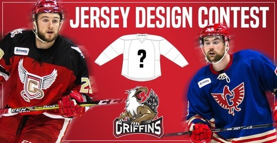
In case you missed it, Uni Watch is again partnering with the Grand Rapids Griffins to allow readers to design an alternate jersey to be worn this upcoming season.
As before, the winner will receive a personalized jersey, tickets to the game when the jerseys will be worn (February 22, 2020), and public recognition at the game.
The jersey is going to be worn on the Griffins’ 90’s Night (with either red or black pants and red gloves/helmets), so for this contest, the team is looking for a “90’s inspired jersey.”
The deadline for submissions for this contest is Friday, August 16th, 2019.
All the details are spelled out in detail here, so be sure to read that.
Good luck to all who submit!
The Ticker
By Lloyd Alaban

Baseball News: The Corpus Christi Hooks, Double-A affiliate of the Astros, have made a 6.2-acre corn maze out of their logo. … The Great Lakes Loons, Single-A affiliate of the Dodgers, are wearing these uniforms for hockey night (from Alex Seder).

NFL News: An update on the Raiders WR Antonio Brown helmet saga: The league will let Brown use his preferred helmet so long as he finds a model his size that is less than 10 years old (from Joe Werner).
.
College/High School Football News: Here’s Syracuse, Maine, and Texas State with CFB 150 patches (from multiple readers). … Look at all the poachings in this map of the top high school teams of the last decade (from Jesse Gavin). … OSU is trying to trademark the word ‘the’ in ‘the Ohio State University’ (from Jimmer Vilk). … New helmet for Indiana? (via Paul).

Hockey News: Blackhawks prospect G Collin Delia showed off his Blackhawk feather-inspired goalie pads on Instagram (from Marc-Louis Paprzyca). … The Rangers are letting fans decide which patch they’ll wear for opening night.

Basketball News: Here’s every single uniform combo worn by every single team last season (from @SacKings_Unis). … Think you can name every NBA player who has worn a captain’s “C?” Then try your luck at this Sporcle quiz (from Mike Chamernik). … Mike also found this set of NBA uniform concepts on Behance. … Someone has compiled all the uniform releases of Japan’s B League (from Jeremy Brahm). … Jordan Brand is expanding its women’s merch line. … The Ottawa University men’s team is letting fans choose their new unis (from Casey Wieder). … For the latest on jersey number assignment updates, check out Etienne Catalan‘s Twitter feed.

Soccer News: Here’s an interesting Q&A with a kit designer (from @jayappletree). … New third kit for Hull City (from Ben Karnish). … From Josh Hinton: The ball for the UEFA Super Cup has been revealed. … Wolfsburg fans aren’t happy with their club’s blue away kit. … In an unusual move, a club — AFC Wimbledon — is actually keeping their kits instead of ditching them after one season. … (NYT link) More and more soccer teams are going the 1990s throwback route (from Ted Arnold). … New kits for South Carolina men’s. … For more soccer uni news, check out Josh‘s Twitter feed and Ed Zelaski‘s Twitter feed.

Grab Bag: Reader Joal Kjarsgaard sent us this article on how Pantone colors are born, which references this Pantone-inspired blog. … Bud Light has released NCAA-themed cans (from Andrew Cosentino). … The University of Texas has sent cease and desist letters to a handful of high schools across the country to force them to stop using the Texas Longhorn logo (from Bobby A.). … Paul’s article in the New York Times about how some people have stopped wearing red caps because they might be mistaken for MAGA caps has been picked up by several newspapers. A Kickstarter campaign has offered a counter: Blue Democratic caps. … A Georgia resident has won the Doodle for Google design contest.
“Splice heer”?
What’s with teams from Dairyland using brown pants in their throwbacks.
Wiscy joins the Pack
It’s weird that UA used their default font for ND and Maryland but did NOT use that font for South Carolina. Both ND and Maryland were Champion schools in the 1980s, and the Champion numbers were the easiest part of the uniform to identify. It’s a glaring oversight, especially because they used their “default” instead. But South Carolina (who normally wears the default UA font, where neither of the other 2 do) went away from the default from the fauxbacks. Very confusing.
UA seems to use that “default” font as their substitute for Champion’s font. Boston College has used it in the past for throwbacks, and will do so again this year.
Man, why can’t Maryland stick to something like this full-time? The MD flag is cool and all, but it’s totally overdone and exhausting on the eyes (I live in DC and see it everywhere CONSTANTLY). The helmet with the TERPS script, sleeve stripes, and white pants are absolutely perfect.
They did!… 30+ years ago.
I’ve never seen a state so obsessed with it’s own flag as Maryland is.
You’ve never been to Colorado then
South Carolina says “Hold my beer.”
*flair
unless it’s on fire
I love the “floating Paul head”!
Yeah. There is just something inherently funny about a disembodied, grinning head floating around.
I respectfully disagree. Disembodied heads have always creeped me out. I think they peaked in the 40s-50s. I’m sure there’s a blog or article or something about them floating (ha!) around the internet but I really don’t want to read it.
It might depend on exactly whose head is floating about. Paul’s face does not exactly put forth a creepy or dangerous vibe. Put Vladimir Putin’s head up there and it’s a different story…
As a musician it irks me to no end that the music symbols on the Seattle Chorus uni are backwards.
And the lily pad looks like a broken green guitar pick.
Noted and agreed.
No link on the Bud Light NCAA can blurb? How will freshman know what to look for??
Fixed.
And I think you spelled “Natty Light” wrong :)
The University of Ottawa men’s team is letting fans choose their new unis (from Casey Wieder).
This should be Ottawa University. University of Ottawa is in Canada, Ottawa University is in Kansas.
Yup, I clicked on that thinking the Gee-Gees men’s team was having their fans decide the uniforms.
Learn something new every day. Did not know there was an Ottawa, KS.
I did they exact same thing. Knowing USPORTS in general doesn’t have what you’d call a large fanbase, I thought it would be a dud of a promo.
I wonder how far Ottawa, KS is from Pittsburg, KS
There’s now an Ottawa University in Arizona too.
Fixed.
Definitely a unique concept. Good job, Sidney!
A fauxback uniform, as the Badgers will wear against Northwestern, is literally the opposite of what the word “heritage” means. We don’t have to use our imaginations to see what the Badgers would have looked like if Wisconsin played football a century ago!
Uni Watch is one of my favorite sites, so I’ve generally kept my adblocker turned off for this site. But I’ve noticed in recent days that the number of ads borderline-freezes my browser (Chrome) while I’m visiting. And today, after about 20 seconds on the site, a Miller High Life ad started blaring out of my speakers here at work.
I’m sorry, but that forces me to turn the adblocker back on. I’ll continue donating and financially supporting the site, but I can’t allow the ads to load if they’re going to be this bad.
The only thing I’ve really noticed that’s annoying is that certain banner ads seem to reload and make the page jump around. Occasionally it takes me to a blank page with an error message, forcing me to reload the page and find my spot again. But, it’s a free site, so not a huge deal.
I had to turn my ad-block back on as well. Those ads that have revolving gifs/pictures annoyed the crap out of me and my old eyes. I’m fine with ads but not distracting ones like that.
Kickstarter for the blue anti-MAGA hats is suspended by Kickstarter.
Colin Delia is should have a second l in Collin. I only know this as I regularly attend Rockford Icehogs games, and they’re the Blackhawks affiliate.
Fixed.
Wonderfully written article on SI, Paul. I believed your talent would ultimately win out. Enjoy the gig as much as I enjoy reading.
FWIW, the Maryland helmet had that stripe pattern for one season (1991).
Egad. The Seattle Hockey concept is awful.
There’s no way I’d commit to a team using UA uniforms. They’re by far the worst in all of division 1. Bleh.
Other than Wisconsin, all of those uniforms look exponentially better than what they normally wear.
It sounds odd to say Notre Dame was “declared” National Champions in 1988. Like they just passively sat there and someone gave them something. They beat the final AP #2, #4, and #5 teams, and the one they didn’t beat (#3 Florida State) lost to the #2 team 31-0.
And yet “declared” is exactly right. There was no objective ranking system or playoffs, just a series of subjective polls. Notre Dame was the best college football team in 1988 in exactly the same way that “Big” was the best movie of 1988 in Rotten Tomatoes’ survey of critic reviews. The Associated Press just asked a bunch of people every week, “Who’s the best football team?” and assigned numbers based on the result. That doesn’t make Notre Dame’s championship invalid or anything, but that’s how Notre Dame won the championship: By declaration.
Why is there an HQ Sports logo embedded in this entry? Am I missing something?
I heard over on HQ tonight that a certain someone will appear next week with a Uni-centric quiz…
Am I the only one confused by the word “drops” in the title?
It sounded like these uniforms were no longer going to be used, as in “the Mets are dropping their black alternate uniforms in favor of pinstripes” or something like that.
yes, you are the only one. it is, as a matter of fact, a term very commonly used in both the music and the fashion (which unis, more or less, are) business to indicate something new (you might also say fresh, even though a football jersey is no produce) has been released.
That is disappointing, because in the sports world, dropping a player means getting rid of him.
A mesh-style font on the shoulder numbers of those throwbacks is idiotic. The shoulders on those 80’s jerseys weren’t mesh.
If I was Luke Fickell, I’d try my damndest to make these the only unis my team wears. Especially since the current set is such an abomination. My god, they are lit af