[Editor’s Note: Paul is on his annual August break from site. Deputy editor Phil Hecken is in charge from now through the end of the month, although Paul may be popping up here occasionally.]

By Phil Hecken, with Harrison Hamm
Follow @PhilHecken
Perhaps more than anything in the uni-verse, I pay more attention to color schemes than anything else, whether that be uni style (pullover, button front, tank top, etc.), striping, piping, logos, workmarks, fonts, etc. It’s probably why I dislike it immensely when teams go BFBS, GFGS, etc., or even abruptly rebrand to a completely new color scheme after decades of wearing a certain set. And even though I’m not usually a fan of alternates, I at least am not as averse to them when they are in the color scheme of them team wearing them.
And yet, I don’t really think I’ve done more than a handful of articles over the past decade which really look into color schemes. So, when I put out the call for reader-submitted articles, Harrison Hamm (whose article is below) mentioned he wanted to write about underused color schemes in sports. “Damn” I thought to myself, “that’s something I probably should have written about” but hadn’t. So I immediately gave him the go-ahead to produce this neat little think piece. And I may, one day, address this with my own thoughts. But for now, please enjoy this article on…
Underused Color Schemes in Sports
By Harrison Hamm
One of the interesting parts of following uniforms, for me, is keeping track of the various color schemes across the sports landscape, and how different teams use different colors. Not all blue and red teams are created equal. I can appreciate aggressive moves at uniqueness, even if I don’t think Wyoming’s brown and yellow looks especially good.
As leagues expand and the regular redesign cycle continues, it’s hard not to consider that there can’t be too many available color schemes out there. With so many major pro and college teams, how many options can there really be? It’s the same principle behind the theory that every song has already been written.
We know, of course, that there are always plenty of options for new uniforms, and plenty of variations to play with. The Vegas Golden Knights came up with a new look. It will be fascinating to see what the Seattle hockey team will produce. Colors show up on a spectrum. With good and creative uniform design, teams can make most schemes work.
An interesting thought exercise, then, is which color schemes are underused. Could teams be using certain colors in different ways? Are there schemes that should be used more? Here are five possible examples, and in keeping with longstanding Uni Watch chromatic policy, none of my suggestions will include purple:
1. Light blue and red
Since the demise of the Houston Oilers, we haven’t seen any major pro teams commit to wearing these two colors. We’ve seen some glimpses, mostly in the form of alternates and throwback jerseys:

But even in the college world, where we see all sorts of color combos in use, pairings of light blue and red have mostly been nonexistent. Considering the frequency with which teams wore these colors in past years, this recent drying up is fairly surprising. Look back at previous decades and you’ll find more teams using this scheme — the Hawks of the late ’60s and early ’70s are an example, as are the 1980s Kings.
Light blue and red used to be more commonly seen in baseball, particularly when teams wore light blue on the road. The St. Louis Cardinals pulled it off beautifully:

The early ’70s White Sox, the Montreal Expos, the ’70s and ’80s Phillies, and late ’70s and early ’80s Rangers were other examples of red-clad teams that wore light blue road uniforms. Powder blue can be effective as a primary color with red surrounding it, but we haven’t seen many consistent examples of it.
Shoutout to Delaware State, though, whose football uniforms are poorly designed but contain hints of light blue alongside a base red. And the NWSL’s Chicago Red Stars have used the colors well in the past, in uniforms based on the Chicago flag.
2. Vegas gold as a secondary color
At times, Vegas gold can be a boring fallback. It is dull when used heavily alongside a color that doesn’t pop, without a design that pushes the concept forward. The Pittsburgh Penguins are probably the most prominent recent pro team to use it heavily, and things improved significantly when they finally switched back to the full black and gold:


The Pittsburgh-style gold simply popped more. Vegas gold can feel like an amateur-ish color, something used as an accent by a high school or lower-level college team. Some teams use it well — the Saints, Purdue, UCF, etc. — but even some of those feel upgradable, outside of the classic UCLA. New Orleans, for example, are in need of a sharper gold.
An effective use for the color, then, could be as more of a background accent, supporting a stronger base color. Not every Vegas Gold appearance has to be as a helmet or pants color — it can work well acting as a simple accent, the way it does for the Golden Knights.

For a team like the Padres, with a bland navy and white design, a sharp, understated gold could work well.
Imagine this design with a little more flavor:

As someone who is not on board with San Diego’s returning to the brown and yellow (unpopular opinion, I know), this is a direction I’d like to see them go.
3. White as a more prominent secondary color
Every team, for the most part, uses white fairly prominently. Uniforms that don’t use any white generally look worse (and are less practical).
But white mainly functions as a striping color, there only because it has to be. That set-up can look perfectly fine. It would be interesting, though, if more teams attempted to use white more aggressively, as a color that actively helps the uniform’s design. I always enjoyed the way the SuperSonics approached this:

The white stripe across the center accentuates the green and gold and makes it nice and easy for the Sonics wordmark to appear across the jersey. This design style set the team apart and afforded a nice opportunity to make the inverse versions of this jersey look good — the white version really popped, and the green and yellow road and alternate unis thrived on contrast.
The Penguins’ old light blue throwbacks are another good example:

How many solid color hockey jerseys have you seen that use white on the shoulders? The Pens made good use of it here, with the white shoulders maximizing the beautiful baby blue.
For teams moving toward BFBS or GFGS: Use white creatively and you have the third color you want!
4. Orange as a base color
This is a broader category; I realize that plenty of teams use orange as their primary color. But it seems like a lot of those teams don’t do a great job with their design: the Denver Broncos could use an overhaul, the Edmonton Oilers have shifted to shades of orange and blue that are darker than they should be; the Syracuse Orange have used more blue than orange, though their recent redesign looks like a success; and we all know the deal with the Bengals.
Orange can work well when teams commit to it. MLS’s Houston Dynamo are a good example:

When teams that use orange as a prominent secondary color — the Astros, Bears, Islanders, Orioles, Mets, FC Cincinnati, etc. — wear orange-centered alternates, it often works well.
Teams should use it more as a primary color, even by itself, the way the Dynamo have.
5. Light blue, yellow, and black
I can’t think of any examples of teams that have used this scheme outright. There is a danger of looking too bright or even minor league. But it would be cool to see a team make this work.
The idea for these colors together came not from a uniform, but from a random place in everyday life: MinuteMaid lemonade cans:

Isn’t that can aesthetically pleasing? The black balances the vibrant light blue and yellow. These colors are my ultimate dream for the Miami Marlins. Make it happen!
Thanks, Harrison! I actually really like the idea of using the colors of the MinuteMaid cans on a uniform — seriously. Nice call, there.
OK, readers? What say you — what do you think are some underused color schemes in sports, and do you agree or disagree with some of Harrison’s choices? If you were starting a team from scratch, what colors might you choose? Love to hear your ideas in the comments below.

Now Here’s A MiLB Promo I Can Really Support!

I don’t usually get too jacked up about Minor League promotions (unless, ya know, it’s your buddy throwing out the first pitch for a special evening), but I really dig this one: the Iowa Cubs (the Triple A affiliate of the Chicago club) will change their name to the “Iowa Caucuses” on August 30, donning a full patriotically-themed pinstripe uniform and red white and blue cap.
Why the “Caucuses”? Well, if you’re a political junkie like me, you know that the Iowa caucuses are the first-in-the-nation kick-off to the Presidential election, similar to primaries. Since those caucuses take place on February 3, 2020, the team can’t really “celebrate” their occurrence next season; the Labor Day series is the Cubs’ final series of their season, so this makes the most sense, timing-wise.
As you can see above, the team will wear a full ‘Murica jersey, with a red, white and blue wordmark, and white stars on blue sleeves. The back of the jersey will feature red numbers outlined in blue and a special Iowa-shaped patch with the words “1st In The Nation.” They will have a very cool cap too:

I love how the team has made the “state” into a head, with Uncle Sam pants, a giant foam finger, and an equally patriotic cap! Normally I hate flag desecration uniforms, but this one is pretty great.
According to the team,
This past spring, the “Iowa Caucuses” were in the news again on a regular basis as candidates declared and anticipation grew for the 2020 Presidential Election. Iowa’s “first in the nation” voting status is nationally recognized as an integral part of the election process, and that is a great source of pride for many Iowans. The Iowa Cubs staff recognized a fun opportunity to blend our organization with one of the signature events of our state. Dan Simon of Studio Simon in Louisville, KY was hired to collaborate on the concept and the MiLB version of the “Iowa Caucuses” was born.
The Caucuses logo development was focused on being inclusive to all who are proud to participate in the process across the state. The team caps are red, white and blue and feature the Iowa Caucuses character logo, shaped like the state of Iowa with “Uncle Sam” pants and a patriotic cap. The character is holding a foam finger with “1st” imprinted on it, to tie in the sports theme with the Iowa’s “First in the Nation” status in the election process. The uniforms retain the iconic Cubs pinstripes while incorporating stars and stripes as a tribute to our nation’s flag. The uniforms will also feature a special “First in the Nation” alternate logo worn above the numbers on the back of the uniform.
In keeping with the theme of celebrating Iowa’s important role in the election process, and encouraging participation from as many Iowans in the process as possible, the Iowa Cubs aim to offer voter registration opportunities at Principal Park, among other fun promotional activities, during the designated game on August 30. More details will be revealed leading up to that game date.
Pretty cool! And any time someone wants to make it easier to register to vote and participate in our electoral process, it has my backing 100%.
An alternate identity we can all get behind:
The @IowaCubs will become the Iowa Caucuses on August 30! 🇺🇸 pic.twitter.com/Z72Zyveffd
— Minor League Baseball (@MiLB) August 7, 2019
There were no actual images of the pants the team will wear, but judging from this graphic, they’ll have matching pinstriped pants to go along with the jersey, so it won’t be your “typical” MiLB promo where the team simply wears specialty caps and jerseys over their “regular” home pants. Well — I take that back — the Cubs regular home uniform already mimics their parent club, but still, it’s nice to see a full uniform for a promo night.

Kreindler’s Korner
I had the distinct pleasure of featuring the wonderful artwork of artist Graig Kriendler on two occasions over the summer and fall of 2017, and more recently, in August of 2018.
For those who don’t wish to click the links, Graig paints baseball heroes (and regular guys) from the past, and is an immense talent.
Occasionally, I will be featuring his work on Uni Watch.
Here’s today’s offering (click to enlarge):

Title: “Bullet Rogan, 1924” (color study)
Subject: Bullet Rogan, 1924
Medium: Oil on linen mounted to board
Size: 5” x 7”Wilbur “Bullet” Rogan is widely considered one if he greatest players to have ever donned a uniform. Though in his mid-20s when he came to the Kansas City Monarchs, it was there where he really made his name. He’s credited with 119 wins as a pitcher, with a 3.68 ERA and 132 complete games. With a bat, there were few who were his equal – a .338 average with a .515 slugging percentage. All of that went with 45 home runs, 99 stolen bases and 251 RBI.
His Monarchs reaped the rewards, winning three consecutive pennants between 1923 and 1925, and taking the title during the Negro Leagues World Series in 1924 against Hilldale.
Rogan is pictured in the jersey he wore during those championship games against Hilldale in 1924. Considered one of his best years, he hit .395 and had an 18-6 record on the mound during the regular season. And in the postseason, he led Kansas City with 13 hits and won two games for the Monarchs.
This is one of 200+ paintings of mine that will be on display at the Negro Leagues Baseball
Museum in the spring of 2020.
Thanks, Graig! You can (and should!) follow Graig on Twitter.

The 5 & 1 position…
…is now filled
I’m pleased to announce that the Sunday Morning Uni Watch position for the “5 & 1” (five good looking matchups and one stinker) has now been filled.
Please welcome aboard Michael Malinowski, who is a long-time reader and posts on the boards as “Memal.”
Michael jumped on the request early and submitted some excellent examples of how he’ll handle the 5 & 1 duties for this coming season. I had a number of “applicants” and I wish to thank them all for their interest, but Michael’s *resume* shone above all others.
Michael will be continuing the fine tradition started almost a decade ago and first occupied by Jimmer Vilk, who in turn was succeeded by Catherine Ryan, and who was then succeeded by Joe Ringham. Michael has some big shoes to fill, but I’m sure he’ll do splendidly. Again, please join me in welcoming him to the SMUW team.
He’ll join Terry Duroncelet, Rex Henry and Ethan Dimitroff, and hopefully I will also have Kyle Acker back, to round out the 5 & 1 squad going into 2019!
Griffins Jersey Design Contest Reminder
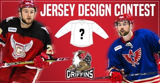
In case you missed it, Uni Watch is again partnering with the Grand Rapids Griffins to allow readers to design an alternate jersey to be worn this upcoming season.
As before, the winner will receive a personalized jersey, tickets to the game when the jerseys will be worn (February 22, 2020), and public recognition at the game.
The jersey is going to be worn on the Griffins’ 90’s Night (with either red or black pants and red gloves/helmets), so for this contest, the team is looking for a “90’s inspired jersey.”
The deadline for submissions for this contest is Friday, August 16th, 2019.
All the details are spelled out in detail here, so be sure to read that.
Good luck to all who submit!
The Ticker
By Alex Hider

Baseball News: The Astros will wear these ’80s/’90s throwbacks on Friday against the Orioles (from Ignacio). … Cardinals P Jack Flaherty has been wearing Memphis Redbirds striped socks during his recent starts. Note the thinner stripes and lack of an STL logo (from Justin Striebel). … Keith Olbermann found a color shot of Braves P Andy Messersmith in his infamous “Channel 17” jersey. … The Single-A Rome Braves will wear these tomahawk jerseys on Aug. 10. … Homer Bailey chose the A’s road gray jersey for the first time since joining Oakland and got rocked for 7 ER in 4.2 innings. Submitter Jakob Fox adds, “I would expect to see him back in green for his next start.”

Football News: The Bears are building statues for George Halas and running back Walter Payton outside of Soldier Field (from Mike Chamernik and Nicklaus Wallmeyer). … Arch-rivals Toledo and Bowling Green both unveiled new uniforms recently (from Phil). … We have our first glimpse of the College Football 150 patch on BYU’s jerseys (from @yze_guy). … It appears that Ohio’s 2019 will lose the dreaded Adidas “tire tread” (from @OhioUniforms). … Looks like Colgate has switched to Under Armour uniforms (from @ColgateFootball). … Resident North Carolina guru James Gilbert has tracked all of the end zone designs at the Tar Heels’ Kenan Memorial Stadium all the way back to 1927.

Hockey News: This blog calls for the return of the Rangers’ “Lady Liberty” alternate jerseys (from Phil). … Rimouski Océanic of the Quebec Major Junior Hockey League has a new 25th-anniversary logo (from Wade Heidt). … The San Jose Barracuda of the AHL have unveiled their specialty jerseys for the upcoming season (from Benjamin Kassel).

Soccer News: Wayne Rooney, one of the greatest English soccer players of all time, is set to return to England and join Derby County as a player/coach in January. The team also sold a new jersey advertisement as part of the move with gambling firm 32Red — and Rooney will wear No. 32 with the club. What a coincidence (from Chris Cruz). … Evan Feick notes that in the World Soccer Shop 2019 catalog, a page labeled “USWNT 2019 home jersey” clearly shows a Jamaican jersey. … New uniforms for the University of Washington women (from Phil). … A few notable soccer items from Josh Hinton: New third jerseys for English club Crystal Palace, Italian club Juventus released a new blue third kit yesterday, Manchester City’s new D Joao Cancelo will go FNOB, and a look at all the jerseys on which betting firm Paddy Power won’t be advertising. … For the latest on many more kit unveilings, head to Josh‘s and Ed Zelaski’s Twitter feeds.

Grab Bag: East Carolina University has a new basketball floor (from Brian Weingartz). …Pennsylvania Interscholastic Athletic Association, the governing body of high school sports in the state, is changing the design of its championship trophies and may change officials’ attire in the near future (from Joe Werner). … Taubate, a Brazilian men’s club volleyball team, has unveiled their 2019-2020 season jerseys (from Jeremy Brahm).
Those Iowa Caucuses jerseys and caps are terrific! A shame that the New Hampshire Primaries chickened out of that name and never took the field. The Iowa cap even features one of my personal uni-obsessions: Cap mascots wearing caps that the team doesn’t wear.
On the underused color thing, I’d add brown in any combination, bright blue and black, and in baseball, road uniforms of any color other than light gray or powder blue. Thought-provoking article!
The cap forgoes an opportunity to use infinite regression.
Which I assume is the design reasoning behind using alt caps on cap mascots. In many cases, the cap that the mascot wears but the team doesn’t is a better cap than the real cap with the masot. The Iowa cap is not one; the mascot’s cap works great for a mascot illustration, but would be a terrible cap on a player.
If that’s your obsession then you’ll love the old Minnesota Fighting Saints of the WHA. They started out with a logo on their jerseys of a big “S” with “Saints” inside it. Near the end of their debut season they scrapped that and introduced a new logo of a Dennis the Menace-like character wearing a jersey with the OLD LOGO!!!
link
link
and later the team folded but was reincarnated (from another team) with new colors!
link
-Jet
Yes! A subset of the alt-capped mascot cap is the mascot wearing a different jersey. A much rarer phenomenon.
I have always wanted to see a pro team use light blue and dark green, similar to Tulane. I think the colors work together really well.
I have an example for No. 5: behold the link!
And wouldn’t ya know, it DOES look excellent.
The Rays’ fauxbacks are close, with dark blue instead of black…and they look mighty sharp!
Gotta add, I love the Bahamian flag thanks to that amazing color scheme…I visited there once and bought a t-shirt of it!
I came to say this too. The Rays second Fauxbacks with the yellow sleeves were amazing!
The popular 2019/20 Man City away strip is a great example of this — even added in a bit of pink (lemonade) too!
link
Also, for No. 1, the cycling team link fits (though this year they’re predominately red).
No. 3 might actually be the most common of the five because any soccer team that wears stripes or hoops of white and another color would fit the definition. White is a team color for those teams (there are a lot).
See also: St. Lucia!
(possibly Barbados?)
Underused colors: maroon/crimson. I’d love to see the Phillies pick it back up (imagine the current design in dark red!) given all the reds and blues.
The USFL Michigan Panthers’ scheme of burgandy and champagne with light blue as the trim color needs to be revived.
Kelly green or forest green with lime green trim. A double green colour scheme that is underused but can look great.
Yes! I second this.
One of the high schools near me wore Carolina blue/red and they always stood out. Another goes orange/brown like Bowling Green.
I’ll throw purple/silver (sorry Paul) as underused outside of Kansas State.
The Milwaukee Bucks used forest, kelly and lime green from 1985-93 and it looked fantastic!
I absolutely loved that. Their best look ever and it’s about time someone else uses it.
Another combo I’d love to see: orange and yellow with blue trim. Every time I see a Federated Auto Parts delivery vehicle I think, man, that would look great on a uniform.
link
Of course, brown is tragically underused. I’d love to see it used like the ’85-’93 Bucks, in various shades.
What about the OKC Thunder uniforms? Navy blue, sky blue, gold, and orange is excellent.
link
Totally off-topic, but half my family work for British Telecom and they’re the jersey sponsor of the Scottish rugby union team. They’ve also recently changed to a “minimalist” logo. So yesterday some PR folks from the team came by BT headquarters and were dishing out free game jerseys with the rebranded BT logo front and center. I’m not a fan of the logo in isolation, but it looks clean as a shirt sponsor link
Almost has the look of some archaic uni designation system (like the old lettering system some rugby union teams used to use). Of course, all fairly moot for the time being since the World Cup which is coming up prohibits jersey ads (though I guess we’ll be seeing it in warm up tests presumably).
That’s true, there was a ton of warm-up jerseys and sweats all covered with the new BT logo. Oddly these are apparently the old jerseys, so they’ll never actually play another game in this design, with or without corporate logos.
Missed opportunity for infinite regression on the Iowa Caucus character…he should be wearing the cap he is on.
TYPO: I don’t usually get to jacked up about Minor League promotions
The only example of light blue and yellow I have seen in modern uniforms is the WNBA Chicago Sky, and I really like the way they pull it off. Also wouldn’t mind seeing the OKC turquoise paired with red, orange and gold (Texas’ Red River Rivalry uni comes to mind, just with a brighter orange), and maybe a team with pink as a tertiary color and not just some October gimmick.
The Denver Nuggets were light blue and yellow for a number of years. You would think I would’ve liked it but something about it always bugged me. Glad they got away from it.
I was surprised by this line, “I can’t think of any examples of teams that have used this scheme outright,” regarding light blue, yellow, and black just after including the picture of the Penguins using that color scheme. Does “outright” mean everyday? Surely the Penguins uniform could have been used as a reference.
I was just scrolling through the comments to see if anybody else caught this. It didn’t even occur to me until I had been through the article twice.
They didn’t use light blue, black, and yellow at the same time, on the same uniform, though. That’s the point.
Yeah, they did. It’s literally shown under point #3.
All that fuss about the Padres….brown or blue….brown or blue….brown or blue…..
Brown AND BLUE!!!!!
NOT SORRY…Padres!
Brown and (light) blue as a color scheme? Perfectly fine.
For the Padres? Absolutely not.
The best example I can come up with of brown and blue. I think it looks spectacular.
link
Cue my time to cite my favourite, underappreciated Vancouver Whitecaps kit from a few years back.
link
“Arbutus Brown” IIRC
Do minor league baseball players get to keep their uniforms, or at least the jerseys and caps? It would be pretty cool to have a collection of promotional jerseys at the end of a career. A career that, hopefully, ends in the Show.
Here in Rochester, the Red Wings (Twins affiliate) usually auction off special one-off jerseys the same night they are worn. Usually these are worn on a night that there is also a fireworks display, so the bids are taken during the game, winning bids announced right after the game, and the jerseys are washed (at least I assume they are!!!) and ready for pickup after the fireworks. So I’m guessing the players rarely get to keep their special jerseys. Not sure if they ever get to keep a regular one.
Houston Oilers come on
A color scheme that I’ve rarely seen, and I think works well together, is purple and red. Linfield College in Oregon is only program that I’ve seen that’s attempted this combination and it works. link
The old Pittsburgh Maulers of the USFL wore purple and red, and it definitely worked.
link
’84 Feds wore silver helmets… you haven’t fixed that yet? ;)
I am partial to orange/purple/white (sorry Paul) ala 1968-73 Phoenix Suns. Something about that combo, especially the road uniforms. link
Also, the brown/gold/tan of the 1969 San Diego Padres. Appropriate given that the Padres were named after Spanish friars. link
As a striped white socks aficionado during the summer, if anyone finds a pair with a pattern mimicking what Phil did with the Minute Maid colors, let me know. I want a dozen pairs.
Team Astana has had light blue and yellow for cycling
link
Tampa Bay Mutiny had that Minute Maid color scheme. They had some pretty cool uniforms back in the day.
link
Those Astros throwbacks look sweet…and as a kid whose first two Starting Lineup figures were Nolan Ryan and Mike Scott in them, that’s what I always picture when I hear “Astros” even over the tequila sunrise set.
Great topic. For the light blue and red, there is also the gorgeous road jerseys for the 72-73 Quebec Nordiques in the World Hockey Association.
link
Sadly, these only lasted one year before changing to a dark blue…
-Jet
How about a simple Green and gold color scheme.One of the best color schemes ever but no one chooses it.How many green and gold teams are there? The A’s(and they have the wrong color green).Tired of everyone wearing red and blue and looking the same no matter how they design their uniforms. Disappointed it wasn’t picked up in the article
Green and gold is my favorite too. Goes with my favorite (defunct) hockey team, the California Golden Seals. Gold home jerseys, green road jerseys. The Chicago Cougars of the World Hockey Association had those colors too but the green was a trim color, they used white home jerseys and gold road jerseys.
Only other hockey team to use those colors was the Minnesota North Stars, but the gold was a trim color – white home jerseys and green road jerseys. Later on they mucked everything (like so many teams) by adding black.
-Jet
Green and gold? One of the most NASL kits ever were the Tampa Bay Rowdies (and I mean that in a good way).
Notre Dame, 1970s. Green and gold.
link
..speaking of the World Hockey Association, it was always bizarre to me that in their first season (72-73) there were 12 teams yet three of them had ORANGE as the base color for their dark (road) jerseys!!!
-Jet
Blue and green is also underused. The only teams to have worn those colors were the Hawks, Mavs and T-Wolves in the NBA, the (Devil) Rays in MLB (though with more black), the Seahawks in the NFL, and the Whalers and Canucks in the NHL. It was a good color combo TBH. I dislike navy and neon though since it looked garish; look at the T-Wolves and Seahawks’ current threads as an example.
I like this color combo, too. Before Charlie Finley took over the club, they were green and blue as the Oakland Seals for three years.
link
and they had this beautiful one-year variation with white shoulder yokes
link
The Penguins got screwed by the Reebok Edge template. When they first introduced Vegas Gold alternates, the material CCM used had a metallic sheen to it. I’m not sure what happened when Reebok came in, but the result was somewhere between beige and khaki, and not metallic at all. If you didn’t know Penguins or Pittsburgh uniform history, you might never associate it with “gold”.
I don’t like to lean too heavily on nostalgia. The Adidas-template 1980-1992 comeback jerseys are beautiful on their own merit, but I would have been fine with the Penguins trying something new. But they really needed to get back to “this gold is on the city’s flag and paints the bridges you see on postcards” gold.
When I saw that Minute Maid color scheme I immediately thought of the Marlins as well.
Black on black on black is a great underused color scheme.
Also: white on white on white.
;)
Vegas Gold. Or as I like to call it, metallic beige. I actually think the Golden Knights shade is more similar to Old Gold.
Back in the ‘90s I gave my brother a Sokol Kiev hockey jersey that was white, sky blue, black, and yellow. Looks great.
Why doesn’t vegas gold exist in baseball?
I’d like to see it tried. Black is a natural, but also navy or dark red might look good with it.
There is Kasota Gold for the Twins, but they also use baseball’s two overused color combos: red and navy (Red Sox, Indians, Braves, Twins, Nationals, Angels, Cardinals, plus White Sox and Pirates formerly). Red and blue is also overused in baseball (Rangers, Phillies, Cubs, Dodgers, Blue Jays). Just too few greens, purples, oranges and golds. MLB is by far the least color-diverse league in America.
I’m surprised that no one has mentioned royal blue and (yellow) gold. A little while back when the Mariners wore Pilots throwbacks, Paul pointed out that other than the Brewers alternates, and when the Mariners occasionally break out the late 80s-early 90s throwbacks, no team in MLB currently uses that scheme regularly. Also, since the Chargers have elected to go full time powder blue, and the uniform the Rams wore in the Super Bowl is technically an alternate, there is also no full time representation of royal blue and yellow gold in the NFL.
Jack Flaherty’s socks are not really Memphis Redbirds socks, as many of the Memphis players wear socks with the STL logo.
link
They are simply old Cardinals socks from the dsys prior to the Stance contract with MLB. I believe they were made by Twin City Knitting. (Now TCK Sports).
There’s some great blue and red combos in soccer.
link
link
How do we feel about pink and black? I’d like to see a team wear it and do a much better job than MLB’s Mothers’ Day merch dump.
I believe the new MLS team in Miami (I am not sure when they start playing, maybe 2020?) will be using pink & black as their regular colors.
Seattle Sounders (also of MLS) wear pink & black as an alternate.
link
Their regular colors are blue & green.
Lee
That’s right; I remember now that the Miami team will use pink and black. And I hadn’t seen the Sounders jersey. I like it! Thanks for sharing, Lee.
Yes, pink and black. I like my Palermo soccer jersey.
My favorite underused color scheme is light blue and brown. Neither color is my favorite on its own, but they look great together.
link
Agreed, it’s a good combo.
I know this is cheating, but I have a solid example for #2. Italian soccer club Napoli pair their sky blue and white home kits with a red kit sponsor/ad.
link
The new Liverpool goalkeeper kit pairs Vegas gold with black any couldn’t be any classier …
link
Cardinals were wearing the powder blue throwbacks against the Dodgers a few days ago, and (at least) Dexter Fowler was wearing powder blue shoes. There were others.
Fowler picture from earlier in the year.
link
GREEN and any other color is under-used for some reason that I’ve never understood.
FYI: The Vikings have updated the color of their helmets to exactly match their uniforms.
Powder blue/red is, in my humble opinion, butt-ugly.
Vegas gold/some form of “dull” gold doesn’t really seem all that rare to me as an accent.
A few combos that come to mind for me as being underused:
– orange/red (old TB Bucs, and slightly the old Miami Heat I guess)
– black/green with green being more secondary (most other variations with black being primary aren’t that rare)
– anything involving PINK!!
Maroon and orange.
Not a single example I can think of beside VA Tech.
Why mess with perfection?
But in all seriousness, there are a few in soccer
AS Roma a few years ago: link
Barcelona alternates a couple years ago: link
Galatarasay – link
The “Memphis Redbird socks” are called stirrups. Note that they’re stirrups. Lol
I totally agree with #2. My favorite jerseys are of Purdue football from the early 2000’s The black, black white, and gold all complement each other very well. It looks simultaneously sleek, but refined.
link:
Underused: Maroon and gold
link
link
I got to wear that color scheme during my final year of youth hockey. It was nice. Those two colors looked good as accents on the crisp shiny home white jerseys we had too. For nine years I wore lovely green and yellow. MN North Stars style jerseys before the black was added. Definitely need more green and yellow in pro sports, bright ’80s colors style.
Love that the Iowa Barnstormers have been rocking the black, red and “Vegas” gold since 1995.
link
A color scheme that I’ve seen a few clubs in England wear that I really like (which is, admittedly, pretty similar to the first item on Harrison’s list): “claret” and “sky blue”. West Ham, Aston Villa, & Burnley all wear shirts that are predominantly claret with blue accents, but I wouldn’t mind seeing the inverse, either.
Love this look. Burnley have the inverted away kit this season, man city have that as their home kit this season, and I think west ham have had it recently as well.
Regarding light blue, yellow, and black… let’s not forget the Cleveland Lumberjacks:
link
What about black, purple, and orange a la the Knoxville Ice Bears? I always thought that was a sharp look. (I bet Paul would disagree. Haha.)
link
Dunno if this got shared yet, but: The Argentina women’s basketball team had to forfeit their game against Colombia at the Pan Am Games because they brought the wrong color uniforms. That ended up costing them a place in the knockout stages.
link
Great topic – Thanks, Harrison!
My high school’s colors are Columbia blue and Sheridan red, and our sister school is brown and gold.
Those schemes are one of the ways current students and alumni stand out from the crowd.
Totally agree that white as a secondary color is (unfortunately) under-utilized. I was bummed when the New York Jets unnecessarily added black to a great color combination.
The Carolina Panthers have added a 25th anniversary patch featuring the outlines of North and South Carolina.
link
Oh, my favorite unused color combo… Tulane Green Wave with blue, light blue, and kelly green.
link
My biggest problem with color choices in sports are the lack of colors used in MLB. Oakland is the only team that doesn’t have as their primary color, and primary hat color, either black, red, or blue. The blues are either a shade of navy or royal, with no light blues. And the red shades vary some, but there are no dark maroons or burgundies. I’d love to see a team with the colors of the Washington NFL team. And since Oakland is only using Kelly Green as an alternate uniform, I’d love to see another team embrace this color. The Diamondbacks should have never changed their colors, but if they really wanted to abandon purple why not go with their teal/turquoise as a more featured color?
“Gold undergoes a electron transition. This is similar to silver’s transition—the element right above gold on the periodic table. Gold’s yellow color is a result of the combination of two reasons: (a) relativistic effects, and (b) higher energy level due to screening level.”
Let’s keep yellow at yellow, and gold at gold. Pittsburgh Steelers/Penguins = yellow. Vegas GOLDen Knights = gold. Why do the millennials need to change yellow into gold???
Bring back yellow!!
Everyone seems confused on their comments today whether they are inserting yellow in brackets while talking about Vegas gold… and I’m the color/colour blind person. Is it color? Or colour? Yellow or gold? When I type color in my device it is underlined which means incorrect, but colour is not underlined-correct.
I think one reason people tend to use “gold” for yellow in sports is that most yellow sports teams use a shade of yellow that’s more on the orange end of the spectrum. It’s a richer (more gold-like, if you will) color than lemon yellow, which seems to be used only rarely in the sports uni-verse.