[Editor’s Note: Paul is on his annual August break from site. Deputy editor Phil Hecken is in charge from now through the end of the month, although Paul may be popping up here occasionally.]

By Phil Hecken, with Alan Filipczak
Follow @PhilHecken
As we enter August, and Paul’s month long (and well-deserved) sabbatical (“blog-cation”), I always reach out to readers to share their interesting uni-related pieces, and today we have a really great one from reader Alan Filipczak, who approached me with his proposal to write about “the Triple-A International League’s 1983 season. That year, the IL celebrated the league’s centennial by adding special patches and making striped pillbox versions of each team’s cap. It would be fun to assemble all the images from the teams that year.” Intrigued, I asked Alan to write up an article, and he’s come through with flying colors! Be sure to click on the many hyperlinks in the text below as well, as there’s a lot of good research here.
You Can’t Spell Pillbox Without IL
By Alan Filipczak
The Triple-A International League was founded in 1884, and 1983 was the 100th season of the IL. Whether or not that constitutes the centennial anniversary is up for debate, but either way, the league celebrated its centenary in ’83. One league-wide promotional rollout was a 100-Year logo that all IL teams wore as a sleeve patch. Another was universal use of pillbox caps with either white or red horizontal pinstripes. There were eight teams in the IL in ’83, and it seems that the pillbox caps were used by each team throughout the entire season. In one case, the pillbox went well beyond the centennial year and made it all the way to Hollywood.

Maybe it was afterglow from the We Are Family Pirates teams of a few years earlier, but pillbox caps were having a bit of a moment within the minor leagues in the early eighties. Several teams across the many leagues and levels of the minors were sporting pillboxes in these days — Oklahoma City, Phoenix, El Paso, Beaumont, and several others. It’s worth mentioning that the minors were still on life support in these pre-Bull Durham merchandise boom years, and teams did not have anywhere close to the promotional uniform options that we see today. At that time, it seems that many minor league teams ordered their unis from the same catalog, with identical cap logos popping up on disparate teams throughout the nation. It’s likely that the pillbox cap was simply an available option and an affordable way to be unique.

Whatever the case, the IL went all-in and used the style for their centennial. None of the league’s eight teams were using pillboxes in ’82, but all were using them in ’83. The main source of images from this time is TCMA trading cards, the indispensable resource of minor league uniform evidence from the late seventies and early eighties. The TCMA photo shoots likely occurred on different days at different locations throughout the season, and it’s wall-to-wall pillbox.
Here’s an overview of all eight teams:
Charleston Charlies

It was a convenient coincidence that Charleston and Cleveland both start with C. In 1982, the Charlies’ caps were essentially a carbon copy of their parent club’s navy-with-red block C. For the ’83 pillbox, they slapped some white stripes over the design, making for an attractive cap. The jersey was a bit busy, with the anniversary sleeve patch competing for attention with the ever-iconic cigar smoking baseball logo patch on the abdomen. This was the final look for the Charlies. In 1984, the franchise was moved to Old Orchard Beach, Maine. In recent years, Ebbets Field Flannels made a replica of the 1983 Charlies cap.
Columbus Clippers

Columbus kept the basic design from ’82, but they added red stripes for the pillboxes. The Clippers were a Yankees affiliate, and the cap pinstripes ran counter to the jersey pinstripes. The sea of stripes gave way to their old look in ’84.
Pawtucket Red Sox

Did I mention that minor league teams operated on a shoestring budget in the early eighties? Yeesh, let’s assume that this TCMA photo shoot was during a practice and these cheap mesh jerseys never saw game action. The Paw Sox pillbox benefitted from the white outlining on the P logo contrasting the red stripes. In ’84, the Paw Sox returned to the familiar look they had worn in ’82.
Richmond Braves

The R-Braves made an interesting move, swapping 1982’s white R-with-red-outline for the reverse. The red R was matched with white cap pinstripes in 1983, and in 1984, the old white R was back. It looks like Richmond put celebration patches on both their home whites and road powder blues.
Rochester Red Wings

The Red Wings looked rough this year. The white pinstripes bury the white R, and you can see the wisdom in Richmond’s decision to change their logo color. 1983 seems to have kicked off a cap identity crisis for Rochester. Their clean red look from 1982 returned in ’87, but first we had this and this.
Syracuse Chiefs

Syracuse must have already been planning for a Blue Jays-based redesign in ‘83, because they swapped out the crudely-drawn Onondaga chief logo that they had used in previous seasons (including 1982) in favor of a lowercase italicized S. After the pillbox year, they kept the little S (with double-line Toronto font) for one season before switching to a more straightforward racetrack S in the latter part of the decade.
Tidewater Tides

In 1982, the Tides had a relatively conservative look—sort of like if you mashed the Rangers and Mets together. In ’83, they brought in some cursive-script blue jerseys without 100-year patches and alternated them with their loud orange shirts with the patches. Tidewater seemed to have liked the pillbox cap. They kept wearing it not only in their “World Champion” Triple-A World Series defending 1984 season, but into 1987, when they wore a mishmash of pillbox and stripe-less standard-shape caps. Billy Beane was a Tide in 1985, and when Ebbets Field Flannels recreated his uniform for the 2011 film Moneyball, the pillbox cap appeared on the silver screen. The caps also appeared on the small screen, in this news brief from Opening Day 1983. Not only do we get to see Tidewater and Rochester’s pillboxes in action–a backward-cap-wearing Darryl Strawberry reveals that the caps were adjustable snap-backs.
Toledo Mud Hens

M*A*S*H wrapped up 1983, and this would also prove be a transition year for Jamie Farr’s favorite club’s caps. They ditched the plain-T two-tone ’82 cap, and by ’84, they had introduced the T-with-embedded-hen logo. Sandwiched in between those two looks was the red-stripe pillbox cap. The Mud Hens already had a fantastic sleeve patch, but they fully embraced the 100-year patch—sewing it on their conservative road grays as well as their wacky multi-toned white and blue jerseys. They also seemed to have kept the 100-year patch into the 1984 season. You can still celebrate a 1884-1984 anniversary, right?
OK, that’s about all I have to say about the International League’s 1983 centennial celebration. Thanks for reading and thanks to Phil for giving me the opportunity to share this dusty corner of the minors.
P.S. I have a lifelong interest in the minor leagues, and if there are any kindred spirits out there, check out the hobby website that I’ve been building for the last few years. I don’t promote the site (till now, I guess) but maybe in a year or two, I can do a more full-scale rollout on Uni Watch and share some of the many cool uniform details that I’ve found in the vast annals of the minors.
Thanks Alan! Terrific reporting. You can see much more of his work at Minor League Geek.


Guess The Game…
from the scoreboard
The game has returned! At least for a trial basis, but I got a lot of positive response to its return, so we’ll see how long we keep this one going.
Today’s scoreboard comes from reader “ojai67”.
The premise of the game (GTGFTS) is simple: I’ll post a scoreboard and you guys simply identify the game depicted. In the past, I don’t know if I’ve ever completely stumped you (some are easier than others).
This one is not a full scoreboard, so I’m not sure if that will throw a wrench into the works (but hell, nothing seems to stop you guys); the home team and location should be easy enough, and player pictured will narrow it down (as will the teams shown). Do your best!
Here’s the Scoreboard. In the comments below, try to identify the game (date & location, as well as final score). If anything noteworthy occurred during the game, please add that in (and if you were AT the game, well bonus points for you!):

If you guys like this, please continue sending these in! You’re welcome to send me any scoreboard photos (with answers please), and I’ll keep running them.
ITEM! Help choose the new Uni Watch pennant: Paul here. Greetings from Ireland, where I’m still on vacation. Along the way, I’ve been working with the good people at Oxford Pennant to create a Uni Watch pennant design (something I really should have thought of doing many years ago). We’ve come up with two designs that I like very much — or to put it another way, I can’t decide between them — so I’m going to let you folks vote on which one you like best.
Here are the two designs (for both of them, you can click to enlarge):


They’re both pretty good, right? Which one should we go with? Cast your vote here:
[totalpoll id=114398]
Thanks!

And while we’re at it: In case you missed it last week, the Uni Watch lapel pin is now available from Teespring — the same company that handles our T-shirts. These are the same exact pins I originally offered, but I’ve outsourced the shipping to Teespring because I was spending too much time dealing with packing the pins and running to the post office. Teespring’s payment process is much simpler that my system, so this should be easier for you folks as well. You can order the pins here.
Okay, back to my vacation!
Griffins Jersey Design Contest Reminder
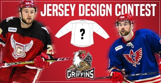
In case you missed it, Uni Watch is again partnering with the Grand Rapids Griffins to allow readers to design an alternate jersey to be worn this upcoming season.
As before, the winner will receive a personalized jersey, tickets to the game when the jerseys will be worn (February 22, 2020), and public recognition at the game.
The jersey is going to be worn on the Griffins’ 90’s Night (with either red or black pants and red gloves/helmets), so for this contest, the team is looking for a “90’s inspired jersey.”
The deadline for submissions for this contest is Friday, August 16th, 2019.
All the details are spelled out in detail here, so be sure to read that.
Good luck to all who submit!
The Ticker
By Jamie Rathjen

Baseball News: A’s vendor and Uni Watch fan Hal the Hot Dog Guy appeared on TV delivering hot dogs to the team’s broadcast booth on Saturday. He also has his own trading card (from multiple readers). … David Murphy sent us more pictures of the Braves’ 1973-4 throwbacks from this weekend. … The jerseys given to former Phillies players for the team’s alumni weekend had two different script thicknesses (from @JohnEye85). … Here’s an article on how teams in the collegiate summer Cape Cod Baseball League stay afloat financially, including one that apparently releases new jerseys every year like a soccer team (from Eric Twiss). … There was a a white-vs.-white matchup in a Little League World Series qualification game, which looks like it’s in the Southwest region between teams from Houston, or “Texas East,” and Tulsa, or “Oklahoma” (from Matt Harris). … Here’s a “bad Esquire uni-related article” that reader John Przebieglec feels the writers are utterly clueless about.

Football News: New uniforms for Bowling Green, though we can only see the white ones for now (from multiple readers). … There are also looks at the college football 150th-anniversary patches for Bowling Green and Penn State (both from multiple readers). … Yesterday was the anniversary of the Browns’ one-off orange numbers in 1984, worn in the first game of the preseason and not again until the team’s current uniforms debuted (from Jerry Wolper).

Hockey News: A restaurant in Falls Church, Va., Gets It: it has a framed North Stars jersey that has the restaurant name in a roundel on the front — the actual North Stars never wore a roundel — and its logo on the shoulder (from Sean Combetty).

Basketball News: New uniforms for Temple. We had the red version last week (from Clifford Blake). … The Wisconsin State Journal did a piece on the Wisconsin equipment manager for the school’s men’s and women’s basketball teams — and apparently swimming as well, though it’s not mentioned in the article (from Scott Hurley).

Soccer News: English League One team Bradford City wore their heritage numbers for the first time, which I wrote about last week. … We’ve Ticked previously that two of the four ostensibly “ad-free” teams in the UK, Huddersfield Town and Motherwell, still wear ads, just not on the front of the shirt. Of the other two, Southend United (in gold) joined them this weekend with an ad on the back of the shorts, while Newport County (amber) genuinely were ad-free. … Welsh fourth-tier team Holyhead Town got a shirt that is a reproduction of Italian team Lazio’s winged-eagle shirt, with the eagle’s head replaced by a ship, and which also functions as a memorial to a former player (from Josh Hinton). … New kits for two women’s teams: London Bees in England and USV Jena in Germany.

Grab Bag: Last week, a cat ran onto the pitch during the Leagues Cup, a friendly tournament between MLS and Liga MX teams. Here’s a collection of other animals running onto fields, roads, or tracks in a variety of sports (from Heather McCabe). … Players on Russia’s women’s volleyball team have been taping over their shoe logos for the European Olympic qualifiers (from Jeremy Brahm). … Australian cricketer Steve Smith has a habit of changing gloves often while batting and so lines up many extra pairs — at least five or 10 — just outside the boundary of the field, which can be seen in this picture from a few days ago. … A bar in Half Moon Bay, Calif., also Gets It: it has a mounted Brannock device (from Scott Winters).
That Esquire article states that the 1984 Mets were wearing “teal, red, and white”….
…say what now?
That may have been the worst uni-ranking list I’ve ever read. The Rockies were in royal blue apparently, and the Orioles road grays were described as “the right way to do a light blue uniform.” Really bad.
And the Rockies wear royal blue. And so on. Sounds like those two had a deadline in an hour and an editor asleep at the wheel. Disappointing content, to say the least.
I hate these listicles, but I couldn’t help but laugh at nearly every single entry in this. They said the Royals wore navy caps with the light blues in the 80s and the ChiSox’s shorts were good. WTF?
And let’s not forget the Pirates in *navy blue* and yellow.
That Esquire article was linked here about two weeks ago. If I recall correctly, we all bashed it then too. But then again they’re not noted for their sports journalism.
I suspect the reason the 150 patch on the Bowling Green football jersey looks “diagonal” is because the person is wearing the jersey without shoulder pads. Putting the jersey over the shoulder pads should properly orient the patch
Same thing I was thinking
That’s true. Thanks for pointing that out.
Clicked on each of the minor leagues cards to see if anyone famous was included. Did not leave disappointed. And a Steve Balboni sighting! He was a favorite when I went to Nashville Sounds games as a kid.
I did the same and came across one.of my favorite players as a kid. A Dennis “Oil Can” Boyd sighting, always makes my day.
Red Sox were playing the Angels
Red Sox were playing the Angels
Red Sox July 10 1983 lost to California 5-3
Great point connecting the 1983 IL pillbox thing with the Pirates. In the late 1970s and into the 1980, Pirates pillbox caps were quite popular – in fact, the first “fashion” use of on-field-style ballcaps I recall ever seeing. You’d see kids who weren’t Pirates fans wearing Pirates pillbox caps, and I knew a couple of boys who adopted the Pirates as a rooting interest because of their uniforms and caps. At the same time in that pre-throwback era, the pillbox was also the one popularly accepted symbol of baseball old-timiness. So the pillbox cap represented both a fashion bandwagon and a symbol of sporting heritage for the IL in their anniversary-ish season.
High on the list of uniform styles that one or two MLB teams ought to adopt to better differentiate among team branding is the pillbox cap. I’d nominate Pittsburgh and Baltimore for the style.
Ironically, the Pirates’ AAA team in 1983 was the Hawaii Islanders of the Pacific Coast League. As far as I can tell, the Islanders never wore pillbox caps in the four years they were affiliated with the Pirates.
Good point about Hawaii. The PCL more of an island unto itself in those days—they were excluded from the Triple-A World Series.
For what it’s worth, there were a bunch of lower level Pirates farm clubs who wore the pillbox in the post We Are Family era. Some were also called Pirates and had knockoff unis, but a few were unique identities.
Alexandria Dukes
link
Buffalo Bisons
link
The Bisons were Double-A at the time and when a Triple-A team took on that name, they were in the American Association until joining the International League in the nineties. Ironically, even though the Bisons wore pillboxes in the early eighties and even though they are in the IL today, the pillboxes has nothing to do with the ‘83 centennial.
Nashua Pirates. Note the tricorner pirate hat (difficult to make out) on the corner of the N.
link
That is amazing. Never noticed the little tricorn cap!
I can’t explain why, but only the Pirates ever looked good in the pillbox caps. They alone should champion their return.
Didn’t both the Orioles and Pirates try the differentiation thing already with those late-90’s gray away caps?
I’d rather see those make a comeback.
The Orioles also already set themselves apart with the white front panel caps.
Guess the Game: July 10, 1983 @ Fenway Park. Angels 5 Red Sox 3.
Unbelievable that the Esquire authors also ripped two teams for their throwback uniforms without mentioning they were throwbacks.
I’m not sure they gave the write up even an hour. Probably got a bunch of pictures dumped on them from the graphics department and told to put words on them.
Man, say what you will about all the gimmicky names, mascots and uniforms of the current MiLB era, but it’s a damn sight better than the days when the parent clubs just outfitted their teams in thrown-together, half-assed versions of their MLB uniforms.
In those days, teams bought uniforms, and getting maximum value for the purchase was their priority. I’m sure the affiliates were happy to avoid the expense of outfitting their own clubs, too.
I know it’s WAY too late, but for the 100th anniversary celebration of the NFL this year, I’d like to see a LOT of color on color matchups.
As to the colorblind people who will whinge and blub, if you can’t distinguish the different logs on your hi-def tv, you’ve also obviously got a vision problem.
Oh, and LIFE ISN’T FAIR.
Did you hear any colorblind people whinging and blubbing back in the 40’s when every team only wore dark unis and NONE of them had helmet logos?
YOU DID NOT.
If only… the NFL and their stupid one-shell rule means we won’t even get any good throwback games. This year could’ve been FUCKING AWESOME from a uniform perspective, and instead it’s just going to be another boring year. The colorblind argument is definitely trash though. If the Bills in red vs the Jets in green is unwatchable, then where’s all the colorblind complaints about Christmas decorations?
What’s up with those Pawtucket jerseys? Never seen them before
Pretty nuts, eh? Like something that a high school team would wear. It’s a far cry from the multi million dollar promo budgets that Triple-A teams have today.
I’m pretty sure they were practice tops (not used in games) but who knows. Very similar style to ones that Syracuse had in those days.
link
Likely the same supplier.
Maybe this will be a future research project…
Many thx for the Campy / Clippers card pic. Never seen it before.
At first I thought he was the coach, but nope, he was still keeping the dream alive in ‘83.
A few years later he would be with the Gold Coast Suns in the Senior League.
ANIMALS INTERRUPTING SPORTING EVENTS
Found on YouTube: Dog interrupts UNC @ Providence basketball game link
UNC played Rutgers at MSG on Feb 11 and at Providence on Feb 12, right after the Blizzard of ’78 (link)) came through.
I happened to catch the interview with Hal (the hot dog vendor) during the A’s broadcast. It was interesting to see that he now carries capers as a topping, which if I recall from Paul’s interview with him, he previously did not. I still have to try this myself.
MLS from this weekend:
New England Revolution wore white at home.
Seattle Sounders wore black (and pink, too!) at home.
There’s some great names in those cards from the minors with the Pillbox Caps…
Bert Campaneris (latter end of his career in 84)
Darryl Strawberry
Ron Darling
Greg Gagne
Tony Fernandez
Dennis “Oil Can” Boyd
Steve “Bye Bye” Balboni…
Excellent article today about the minor leagues and the pillbox phenomenon. I now have a new blog to follow! Would love to see more MiLB history.
Excellent article today about the minor leagues and the pillbox phenomenon. I now have a new blog to follow! Would love to see more MiLB history.
What’s even weirder than the ‘84 Browns orange numbers, is the fact they were playing the Steelers in preseason. I never remember inter-divisional games during NFL Preseason.
Very interesting. The first baseball game took place in the summer of 1846 in the city of New York, and the first baseball card appeared in the eighties, that is, after more than thirty years. It was from this point that collecting baseball cards began, and not only children and adolescents were engaged in this, but rather, on the contrary, adults were so keen on collecting that it was difficult to stop them before anything. It is worth noting that the first baseball cards were issued by tobacco companies, together with cigarettes, that is, a person buying tobacco products, purchased for one and a baseball card.
Looooove the font on the Temple unis
GUESS THE SCOREBOARD:
That’s Jim Rice in the outfield; Jim Rice played between 1974 and 1989.
#49 for the Yankees was Ron Guidry, who played between 1975 and 1988… Narrows it down slightly.
#13 for the Indians was one of three pitchers during that time frame: Blue Man Odom, Juan Eichelberger, and Ernie Camacho.
– Odom only pitched in three games for the Indians, and none against Minnesota.
– Eichelberger played in ’83 and pitched in Minn once.
– Camacho played in ’84-’87, and pitched in Minn three times.
Of those four games, only one had a linescore where Cleveland had four runs and Minnesota three by the fifth inning: July 10th, 1983.
IN THAT JULY 10TH, 1983 game, the Angels won, 5-3 over the Red Sox.
I’m having trouble finding the significance, but here are a few potentials: Rod Carew was hitting above .400 – and he would continue to do so for another few days. Bobby Clark had a big game….. outside of that… I don’t know.
I’m wondering if the significance has something to do with Carl Yastrzemski, who was in his final year… but I don’t think that date marked anything special, like him passing a player or setting the career mark for hits / games / at bats / doubles or anything like that……………….