[Editor’s Note: Paul is on his annual August break from site. Deputy editor Phil Hecken is in charge from now through the end of the month, although Paul may be popping up here occasionally.]

By Phil Hecken
Follow @PhilHecken
As expected (and noted in yesterday’s post), the Philadelphia 76ers unveiled a new throw fauxback uniform yesterday, a rather obscure number which was only worn for a part of the 1970-71 season. I refuse to call it by the Nike/NBA nickname
From the release:
The Classic Edition replicates the jersey that Philadelphia wore for half of the 1970-71 season, where 76ers legend and Hall of Famer Billy Cunningham garnered All-NBA First Team honors. The jersey predominantly features a “Seventy Sixers” wordmark design, inspired by the block lettering “PHILA” uniforms.
Before we look at the new unis, a quick look at the uni to which the team is paying homage:


I almost hesitate to call the new uni a fauxback, as you’ll see, because it more appropriately should be called a throwback. But due to the cut and several minor design changes, it doesn’t replicate the original. Like most unveilings, there’s a lot of story-telling involved, and the players modeling it and the uni itself are often shown using a classic Ford Mustang of that 70-71 vintage. Normally, the disgusting ad patch would be covered with “Mr. Yuk,” but there’s too many of them and I don’t really possess the skill set to blot them all out.
Here’s the “new” uni:


The most prominent feature is the “Seventy Sixers” (with one capital “S”) spelled out in script across the chest:

The large “S” and the letters “ixers” are rendered in red, with a blue outline, while the “eventy” (which at first glance really looks like SeveRty) in simple red script without any outline. The first “e” actually breaks into the blue outline of the large “S.” I’m not sure if this is so much an endearing quirk or a major broadside against my OCD. Either way, it does attempt to faithfully replicate the original jersey, which incorporated this same design element:

The numbers are standard block, also red outlined in blue, and the collar and arm panels have a blue and red striping pattern. The striping down the sides of the jersey are blue/red/blue:

The stripes appear noticeably thicker than those on the original. The back of the jersey features the same number font style as the front, but unfortunately, the striping is truncated, due to the Nike jersey template (this is typical of almost every NBA uniform with sleeve piping). NOB is radially arched.


Mercifully both the back of the jersey AND the shorts were shown for this uniform unveil. We’ve had far too many recently that simply focus on the front of the jersey (because the intent these days is not necessarily to unveil an actual uniform, but to sell a jersey). The shorts feature a blue/red/blue waistband, with blue/red/blue stripes extending down the sides and to the hem of the shorts. These, too, are slightly truncated due to Nike’s shorts template. They also feature a liberty bell where a belt buckle might otherwise be located:

Nice, right? Yes, they are. Of course you’d never design a uniform like this today, and I can’t say I’m totally in love with the script face, but since it’s a faux/throwback, I’m fine with it. Of course, the team doesn’t need a fifth uniform (in addition to this the team still has those four other corporately-named gems, plus a jettisoned sixth uniform, which may still make an appearance). And two of their other four uniforms is also changing this season, per team Chief Marketing Officer Katie O’Reilly:
“Additionally, a couple other things — the City Edition this year will also be different. So we have the opportunity every season to change our City Edition, which is really fun. That will be unveiled later in the year, around late October or early November. And then finally, and this probably speaks to why we chose this uniform, our Statement Edition is going to be a little different this year. In the past, it had ‘Sixers’ in script, but this season it will say ‘Phila.’ So having our Classic Edition spell out the Seventy Sixers allows us to still have that sort of in our portfolio.”
But this has nothing to do with jersey sales, right? Right.
And what would a uni unveiling be without a hype video?
. A storied franchise,
An iconic design,
A timeless Classic.#HereTheyCome x @StubHub
📠 https://t.co/XVUNRrsAQD pic.twitter.com/0wEPDEEVWo— Philadelphia 76ers (@sixers) August 1, 2019
Also unveiling, or more like “revealing,” new unis yesterday were the Memphis Grizzlies, who showed off not one, but two throwback uniforms plus a new court, although only one of the new uniforms will be worn during the upcoming season. Wait, what? Stay with me here.
The team displayed two uniforms, one celebrating their 25th Season — a throwback to the original teal “Vancouver” uniform worn during the team’s founding in that city. They’ll sport that uniform this upcoming season. The second uniform shown yesterday is also a throwback, a “20th Season” uniform that was worn during the team’s first season in Tennessee.

Unlike the Sixers, who kinda went all out for their unveiling, the Grizzlies were much more Spartan in their reveal. No models, no multiple shots and angles. Basically what you see above is all they showed off yesterday. They did give somewhat larger versions of each uniform, and we’ll look at the teal throwback first:


From the release:
The Grizzlies’ 25th Season Vancouver Classic Edition uniform is set to debut on the hardwood this upcoming 2019-20 season. The primary team colors of turquoise, bronze, red and black were utilized throughout Vancouver’s brand system when the franchise tipped-off in 1994. This season’s Vancouver Classic Edition uniforms will not only feature the iconic ‘teal’ base, but it will also stay true to its classic design with the native Canadian Pacific Northwest pattern outlining the uniform. The original Grizzlies wordmark will be displayed across the chest while the Grizzlies’ first iconic bear logo sits on the leg of the shorts.
While this one is also a “throwback,” it still isn’t an exact replica of the original, due to Nike’s uniform cut.
The second uniform, which is black, is a throwback to the team’s first season in Memphis:


Here’s how the release describes this uniform:
In the 2020-21 season, the franchise will celebrate the 20th Season of the Grizzlies in Memphis by donning the black-based Memphis Classic Edition uniforms, which were first worn as an alternate uniform in Vancouver. The uniform introduced a combination of red and turquoise that outlined the jersey and shorts while removing the Pacific Northwest trim. When the franchise relocated to Grind City in the summer of 2001, the alternate uniform not only became one of the team’s primary uniforms, but it also featured a new Memphis wordmark across the chest making the Grizzlies one of the only teams in the NBA at the time to represent their city on a jersey.
Why introduce two uniforms now, when only one will be worn this season?
“The opportunity to connect the history of our franchise over two consecutive seasons deserved a special approach,” said Jason Wexler, Grizzlies Team President. “It was an easy decision to bring back the iconic teal uniforms for the upcoming 25th Season of the Franchise and give our fans the classic look from the Vancouver era that they love. Looking ahead to next season, we get to celebrate the 20th Season of the Grizzlies in Memphis with the Memphis Classic uniform, worn when the team first moved to Grind City. However, we wanted to go even further to enhance the in-game experience for our fans with an alternate court that celebrates and connects the best of both eras. From the black base and two-toned hardwood to the asymmetry that gives nods to our current design, this floor includes elements from every Grizzlies floor featured in both the Vancouver and early Memphis eras while bridging the past with the present.”
Ah yes, the new floor. Here’s a look at the court on which the team will play some of its games over the next two seasons:

The team did put out sort of a hype video for the new unis, but it’s really just footage of the old uniforms in action:
🔥🔥🔥 The #ThrowbackThursday you’ve been waiting for 🔥🔥🔥 pic.twitter.com/xK0QMwNosQ
— Memphis Grizzlies (@memgrizz) August 1, 2019
I honestly wasn’t a fan of the teal unis when they were introduced, but they definitely grew on me over time and now they’re damn near considered classics. They certainly are as good or better than anything the team has worn since. Those BFBS unis introduced when the team moved? Never really liked them and they haven’t really grown on me either. Still, it will be cool to see them on court again. Of course, this is as much a merch drop as anything, but that’s what the uni world has become these days.
If you want to read (and see, it’s pretty great graphically) a bit more on the uniforms and court, click here. It’s not quite interactive, but it is pretty cool.
And there you have it. It’s August. The NBA unveiling season has begun.
What say you readers?


Kreindler’s Korner
I had the distinct pleasure of featuring the wonderful artwork of artist Graig Kriendler on two occasions over the summer and fall of 2017, and more recently, in August of 2018.
For those who don’t wish to click the links, Graig paints baseball heroes (and regular guys) from the past, and is an immense talent.
Occasionally, I will be featuring his work on Uni Watch.
Here’s today’s offering (click to enlarge):

Title: “Pete Hill, 1909” (color study)
Subject: Pete Hill, 1909
Medium: Oil on linen mounted to board
Size: 5” x 7”Considered one of the first superstars in black baseball, Pete Hill was a five-tool player – a great outfielder combined speed and a strong throwing arm with both a keen batting eye and power from the left-side of the plate.
Hill was the man that Rube Foster built most of his team’s around in the early 20th century, with the Philadelphia Giants being perhaps one of the greatest mini-dynasties in the history of the pre-Negro National Leagues. The 1905 outfit was 128-23-3 that season, with Pete accumulating 198 hits – including 37 doubles, 11 triples, and 10 home runs – while also stealing 34 bases.
After leaving the declining Giants in 1907, Hill joined the Leland Giants and again, Rube Foster. He’s depicted here with the 1909 iteration of that club, which although may not have faired well in the standings, made a splash with those incredible jerseys. They remain one of my favorites of the Deadball Era.
This is one of 200+ paintings of mine that will be on display at the Negro Leagues Baseball Museum in the spring of 2020.
Thanks, Graig! You can (and should!) follow Graig on Twitter.
2019 MLB Uni Tracking

For the past two years, reader Ed Kendrick provided uniform tracking for us for four teams: the Arizona Diamondbacks, Washington Nationals, Boston Red Sox and Baltimore Orioles. Last year, he added a fifth team, the San Francisco Giants.
For the 2019 Edition, Ed has now bumped up his tracking to eight teams, adding the Cincinnati Reds, Miami Marlins and San Diego Padres.
You can check them all out via this link.
Thanks Ed. We’ll run this feature monthly until the season ends!
Griffins Jersey Design Contest Reminder
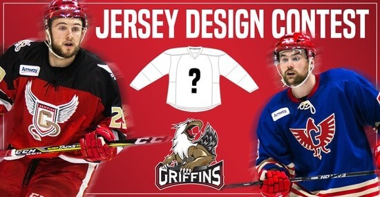
In case you missed it, Uni Watch is again partnering with the Grand Rapids Griffins to allow readers to design an alternate jersey to be worn this upcoming season.
As before, the winner will receive a personalized jersey, tickets to the game when the jerseys will be worn (February 22, 2020), and public recognition at the game.
The jersey is going to be worn on the Griffins’ 90’s Night (with either red or black pants and red gloves/helmets), so for this contest, the team is looking for a “90’s inspired jersey.”
The deadline for submissions for this contest is Friday, August 16th, 2019.
All the details are spelled out in detail here, so be sure to read that.
Good luck to all who submit!

IMPORTANT lapel pin update: Paul here. Greetings from Northern Ireland, where I’m on vacation.
The good news is that the Uni Watch lapel pins have proven to be very popular. The bad news is that this resulted in me spending way too much time wrapping pins in bubble wrap, addressing padded mailers, and going to the post office. So I’ve outsourced the fulfillment of this item to Teespring — the same company that does our T-shirts.
These are literally the exact same pins — I just sent the inventory to Teespring and they’ll handle the shipping. You can order them here.
The Ticker
By Anthony Emerson

Baseball News: The Braves brought back the ’79 throwbacks as part of their Hank Aaron Week celebrations. Some players wore fake stirrup-socks (from Christina Dodson and @BravesATL). … New Cleveland outfielder Yasiel Puig wore Reds flip-flops to his first press conference with his new club, and re-dyed his hair red (from Jim Vilk). … New Cubs OF Nick Castellanos will wear no. 6 (from Josh Hinton). … A’s pitcher Homer Bailey has worn the team’s green jerseys for three of his four starts, including two at home, where the jersey was worn only once prior to Bailey’s arrival. … Here are the inaugural season logos from the Rocket City TrashPandas, who will be the Double-A affiliates of the Angels.

NFL News: Legendary Pittsburgh DJ Sean McDowell did his last show before retirement yesterday, and the Steelers gifted him a custom jersey with no. 41, for his 41 years on the air (from Joe Werner). … The Eagles’ QBs seem to have the new Nike template for their non-contact unis, but every other player’s jerseys appear to have the old template (from multiple readers).
College/High School Football News: Oregon DB Lucas Noland posted a picture on Instagram of the Ducks’ new unis. Writes Edward Del Rosario and multiple other readers: “O logo only on the left chest. Swoosh moved under the neck. Tonal shoulder stripes. Perforated numbers similar to the ones used by the baseball team. Looks like we’re back to regular sizes numbers vs the oversized ones used last year. Also a look at the 150 patch.” … CMU’s new unis were revealed by d-lineman Jacques Bristol. Writes @AVKingJames, “It features no “tire track” look on top, moves the adidas logo from left to right, a slightly different gold color, braiser stripe pants and a number/letter font which matches the recent branding change on social media.” … Here’s a montage of every Clemson player, all of them wearing the CFB150 patch (from @ClemsonUniforms).

Hoops News: Fanatics inadvertently released the new Warriors “Icon” jersey yesterday (from Eitan C.) … Check out Etienne Catalan‘s Twitter feed for all the uni number machinations of yesterday, including the confirmation that PG Chris Paul will wear no. 3 for the Thunder, assuming he doesn’t get traded. … New Lakers big man Anthony Davis said in an interview with Jimmy Kimmel that Nike nixed Davis taking no. 23 from LeBron James, saying it was too expensive for the company. Yeesh (thanks, Phil). … The G-League’s Long Island Nets want fans to design their new unis (thanks, Phil). … Louisville men have a new floor, confirming rumors (from multiple readers).

Soccer News: Tottenham’s third kit has been leaked (from Josh Hinton). … Also from Josh, the USL is renaming their playoffs for all three of the USL’s leagues. … GFGS third kit for Scottish side Hibernian (from Ed Żelaski). … French Ligue 2 side FC Chambly has a kit that is more advertisement than uniform (from @CrystalPalaceDC). … I’m still calling it Anoeta (from Antonio Losada). … UNC’s soccer stadium has faux brick padding.

Grab Bag: Sprinter Allyson Felix has signed an endorsement deal with Athleta after a dispute with Nike over their maternity policy (thanks, Brinke). … New athletic logos for Indiana Tech (thanks, Phil). … The Mayor of Birmingham, Ala., recommended the city purchase new band uniforms for all seven public high schools in Birmingham. Some schools have already received theirs (from James Gilbert). … Also from James, USA Wrestling uses a red-blue MLB-esque logo for not only their national federations, but also their state ones. … Back on Monday, we wrote about how test cricket was adding NOBs to unis for the first time in its 146-year history. We now get to see how it looks on the oval (from Moe Khan). … The Republican Party has revealed the logo of the 2020 Republican National Convention, to be held in Charlotte. Why is the elephant scowling? . … The governing body of pro cycling held a vote for the design of the officials’ cars for the Road World Championships in Yorkshire, UK (thanks, Jamie).
That’s a 1969 Mustang in the Sixers pics. It has four headlights; the 1970 only had two.
Just coming into say the same thing!!
Why’s the bit about Eagles’ QBs seem to have the new Nike template in Hoops News?
Moved to NFL.
Also, the first item in soccer (Spurs’ third kit) was missing a link. Now added.
I thought “Mr. Yuk” was only used when new ads were announced, not new uniforms…?
Yes, Paul’s rule is only using Mr. Yuk for new ads. We don’t have to use it every time any picture of a uniform shows an ad. We’d go insane.
I know, I was referring to Phil’s text: “Normally, the disgusting ad patch would be covered with “Mr. Yuk,” but there’s too many of them and I don’t really possess the skill set to blot them all out.”
Those are 1974-75 throwbacks on the Braves last night.
1979s would have red pinstripes.
Would also have NOBs.
The ’79 homes did not have NOBs. Only the roads did.
Indeed these are 1974 throwbacks for the Braves. It’s Hank Aaron weekend and they will be wearing them through Sunday.
Earlier in the week the Braves played the Phillies and wore 1979 road throwbacks (they look similar to the ’74 home uni’s, except gray instead of white) which may have caused the confusion.
No slights against the new Sixers uni – and it does look nice – but labeling a uniform that was only used for roughly half a season “iconic” only reinforces the notion that “iconic” is the most overused word in the English language today.
This is an iconic comment.
I think the word “charming” would be sufficient.
Wouldn’t impress potential buyers, though.
It’s not just “iconic”, there are literally a million overused words these days.
Calling the Sixers’ uniforms, which are textbook examples of a throwback uniform, “fauxback” unis because of the modern cut of the uniform and a few “minor details” is beyond ridiculous. It’s pernicious, in that it effectively renders the two words meaningless. If the new Sixers uniforms aren’t throwbacks, then neither are the vast majority of throwback uniforms worn on the field in any sport. The last instance of a true throwback under this constrained definition might be the filming of the movie “42.”
The term “fauxback” was coined to describe a uniform designed to appear as if it were from the past when no such past uniform actually existed. There the word should stay, because it precisely and usefully describes an actual and increasingly common phenomenon.
The word “throwback” describes a uniform designed to resemble a uniform worn in the past. Full stop. How faithfully a throwback uniform recreates every aspect of the old uniform it invokes is a question of quality or degree, not of kind. If it makes Phil sad that the Sixers are wearing newly manufactured uniforms instead of outfitting players in museum-piece artifacts still stained with the sweat of the original players, that’s a perfectly valid judgment to express. But that judgment doesn’t change the fact that the uniforms are throwbacks, not fauxbacks, because the uniform they’re designed to invoke actually existed. What Phil’s judgment speaks to is the quality of the Sixers throwbacks: As Phil describes it, the Sixers unis are not not throwbacks, they’re bad throwbacks. It’s like when people ask, “But is it art?” Yes, of course it’s art! That’s not the question. The question is, “But is it good art?”
The NBA in particular, but also to some extent the NFL and even sometimes soccer, produces a class of throwback-y uniforms that perhaps need a third word. The Sixers unis are clearly throwbacks, but we’ve seen examples of uniforms that take one or a few design elements from an old uniform and apply them in an otherwise wholly new uniform where the whole is meant to invoke or refer to the old uniform, not to resemble it.
This is a perfectly-written post. The Rays’ 1970s-style uniforms (Padres ripoffs in navy/light blue, really) are fauxbacks for a team that did not exist in 1979. The Phillies’ Saturday Night Special maroon uniforms were throwbacks, albeit with a modern cut made from modern materials.
I started calling the third category of throwbacks you described “quasi-throwbacks” for my own purposes, usually when I see soccer teams borrowing elements from the past without the goal of entirely reproducing the original (this is also an increasingly common thing).
Just for the sake of the rhyme, how about “pseudoback”?
Yeah, that’s better.
Great post! I think the authors on here just like to be snarky for snarky’s sake and use strikethroughs to add to that snarkiness.
After thought: Snarky Sake would be a great band name and they could brand it with their own version of sake.
I’m looking at those test match cricket sweaters with the numbers and NOBs on them, and I’ve got to ask: what’s with the super-cheap-looking Arial font? And it’s even artificially stretched, probably using a percentage width adjuster like MS Word offers.
It looks really cheap and tacky.
I’m not enough of a cricket fan to have an educated opinion on what looks good on a sweater, but this isn’t it. Imagine numbers in a classic block font like the Yankees wear, in two colors and in felt, sewn on; no NOB. That would look pretty nice, wouldn’t it? Any of the longstanding baseball jersey fonts would look fine; McAuliffe; the Cubs’ Eurostile-ish font (or their old Shepard one); I’ve always liked the simple font that was on the 1960 England soccer jerseys.
Cricket has such a long history that you’d think they would choose something timeless that wouldn’t almost certainly look dated in just a few decades. What’s going on here, cricket fans?
For some reason, that’s what most cricket NOBs/numbers look like, even in the other kinds (One Day International/Twenty20) that already had NOBs. It does look dumb.
England’s County Championship does have a decent font, even though it looks a bit dated because it resembles the late 90s-2008 Premier League font: link
Here is a super-amateurish mockup of an imaginary Aussie Ashes sweater with the 3-D numbers that the Senators used to wear: link.
I’m no professional designer, but it’s a step up from what they’re doing now!
That struck me while watching the ICC World Cup last month, too — world-class cricketers and presumably performance-tactical-wicking-speed-enhancing cutting-edge material, and then typefaces that looked like they were screen-printed on at a mall kiosk.
“Of course, this is as much a merch drop as anything, but that’s what the uni world has become these days.”
Except for the Cincinnati Reds throwbacks. Those, according to some people with less than half a brain in their head, had nothing to do with a cash grab because jerseys are too expensive and people won’t buy all of those jerseys.
I bet the Reds don’t sell t-shirts, caps or other memorabilia with the throwback logos on them. THINK HARDER!!!!!!
What’s up with the ABA style basketball in the 76ers photos?
One corporate dork to another: “Hey, they used a red, white and blue ball back then, right? Perfect for the Sixers!”
I was going to say the same thing.
Yeah, very lazy propping.
Somewhat incredibly (or just a sad statement on my susceptibility to marketing) I own all 3 of those NBA throwbacks!
I have Mitchell and Ness versions of the Sixers and Vancouver jerseys and I have a retail authentic of the first season in Memphis jersey. Crazy, huh?
-76ers uniforms nice, the script on the jersey not so much. Looks like it was created by a young kid practicing handwriting. Understand why the script was around for just half a season.
-Will be fun to see the Vancouver Grizzlies uniform on the floor again. The jersey has really never gone away here in Vancouver. It can be purchased along with tons of other Vancouver Grizzlies memorabilia at pretty much any sports jersey shop in the city.
It is really too bad Vancouver never got a legit chance to keep the team. They were a bumbling mess on the court, the Canadian dollar was weak, and any owner wanting to purchase the team were just trying their hardest to move it to the U.S.
They are residing in Memphis now and in the lower bracket for NBA average attendance, while NBA exhibition games in Vancouver sell out. Considering the economic state of the city 20 years down the line and if the team had stayed for a few more seasons with some success on the court, the team could have been more properous if they had stayed.
I really can’t get behind the lack of polish on the Sixers uniforms. That script is just too rough. It’s less charming, and just mostly bad. I hope they don’t get worn often.
Why the gold outline on the RNC logo? It just looks bad.
Phil wrote:
“I honestly wasn’t a fan of the teal unis when they were introduced, but they definitely grew on me over time and now they’re damn near considered classics…”
Further evidence of what I’m trying to get coined officially as the Tarrant Theory, that any design, if given enough time, will eventually be seen as a “classic”.
This is an especially good example because those teal Grizzlies uniforms are a hot mess.
ERIG: “everything retro is good.” This blog is ground zero for the concept.
Now Martina, you know that’s not true, though you can think that if you’d like. Just last weekend, I pretty much trashed the Phil’s SNS unis.
But this is a uniform watching blog, and many of us want to, at very least, *see* some of the old school unis (which we may not have ever seen due to age or remember from our youth) on the field, gridiron, court, ice, etc. That doesn’t automatically make them good or classic. Some of these throwbacks (yes, Scott) fall into the “so bad they’re good” category, which is certainly damning with faint praise.
If the Sixers had come out with this uniform as a new uni today (which they wouldn’t as outlined in the lede), I’d probably hate it, and I even said I’m still not a fan of the script/wordmark, even now. But overall it’s an attractive uniform, and since I never saw this (I would have been 4 when it was worn originally), it’s nice to get a look at it. Even accounting for the quirky Severty ixers font, it’s still an attractive uniform to my eye. That doesn’t mean everything “retro is good” but it does mean that as uni watchers, we largely would like to see old designs/unis brought to life.
One for the ticker: LSU announced who would wear #18 this year. (It’s an honorary thing).
One of they players selected, Lloyd Cushenberry III, is an offensive lineman. Thanks to NCAA rules, he’ll be wearing 18 as a patch instead of his actual uniform number.
link
In my opinion, the design of those Sixers throwbacks is brutal in the way the “Seventy” script is un-outlined while the “Sixers” script is. Belongs in one of those YouTube “most unsatisfying video” compilations.
Kids today won’t be able to read the script “Seventy Sixers”, since they aren’t taught this anymore. ;)
Is this the first time that a uni has been unveiled with a different number on the front and back of (what I am presuming is) the same jersey?
Are there any other examples anywhere of jerseys with different numbers on the front and back of the same jersey?
I’ve seen it done a handful of times. I can’t think of or find an specific example, but typically you see something like “18” on the front and “19” on the back for the ’18-’19 season. So I agree it’s rare, I know that I’ve seen it.
Re: Philly’s 70-71 jerseys, could it be that the original order called for “Sixers” to appear solo in tackle twill, and then someone protested that the team name was “Seventy Sixers”, and the Seventy was added after the fact in embroidery? Would explain the overlap of the embroidered “e” on the tackle twill “S”. And would also explain why the layout is so out of sorts.
The “Seventy” on those Sixers jerseys always looked like an afterthought to me.
I don’t know about you guys, but playing in Memphis and wearing Vancouver seems a little awkward. And Phil, how about a piece tomorrow about the NFL sideline hats!
link{wt-static_graphic}{dm-FDC}{pt-league}{al-A_Spot}{ct-NFL_SIDELINE_HATS}
I’m not doing weekends in August. Johnny Ek will be though.
At least they could’ve separated the dot on the i on both old and new Sixers jersey.
I always think it’s funny to hear Vancouver referred to as being in the Pacific Northwest. Wouldn’t Canadians say Pacific Southwest? Or would it be something else? The Northwest in Canada would be Yukon territory. Anyone else ever think this way?
My experience: Americans lump Vancouver into the Pacific Northwest. They’re also surprised to learn that Vancouver isn’t on Vancouver Island, and they think we should get on fixing that that.
We call it the west coast. Pacific is redundant and its not north.
It really is just West Coast for how you would refer to in Canada.
Thanks.
That Mustang has aged better than those Sixers unis. Also, I don’t understand why Memphis never changed the team name. When I think of Memphis I sure don’t think of Grizzlies. Methinks a redesign challenge is needed.
Memphis Tams was so weird it actually worked for me.
Memphis had a prior connection (albeit a brief one) to that team name:
link
Wow. What were the odds of them acquiring another Canadian team that just happened to be called the Grizzlies? That’s the best thing I learned today. Thanks!
Maybe next someone can teach me: why Birmingham Vulcans???
There’s actually a sculpture of Vulcan in link — the largest cast iron statue in the world. The Vulcans replaced the Birmingham Americans in the WFL, and were presumably named for the statue. The linked wiki article explains why Vulcan and Birmingham have such a relationship.
Great blog!
Ed’s spreadsheet shows the reds have been wearing a red bill/ black crown hat all season on the road? I think those colors should be reversed.
The Grizz wore that same black uni while still in Vancouver. It had “Vancouver” on the uni where Memphis is.
link
When they moved to Memphis, they simply took the same template for this uni and co-opted it by replacing the wordmark.