I don’t follow soccer, so I don’t usually write about it either (and on the rare occasions that I do write about it, I almost invariably get something wrong or stumble into some sort of factual error), but there’s something going on in the UK that’s very interesting.
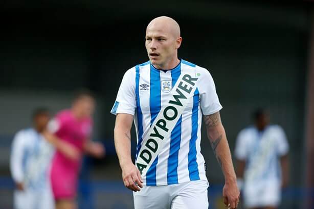
It began last Wednesday, when Huddersfield Town A.F.C., which was recently relegated from the English Premier League to the Championship, announced its new kit (shown above). Instead of having a traditional chest-positioned jersey sponsorship ad, it had a garish sash-styled ad for the Irish betting website Paddy Power.
Many people (including our own Jamie Rathjen) suspected that it was likely some sort of prank or hoax, but Huddersfield did indeed wear the kit for a preseason friendly last Wednesday. Then, on Friday, they announced that Paddy Power was “unsponsoring” Huddersfield this season, and that the team’s new kit will actually be ad-free. It was announced as part of a marketing campaign by Paddy Power, called “Save Our Shirts.” In other words, they’re actually paying to not have an ad on the team’s shirt. (There’s some good analysis of why they’re still getting decent bang for their marketing buck — er, pound — here.)
“Save Our Shirts” gained further momentum in the last couple of days, as two more teams — the Welsh club Newport County and Scottish side Motherwell F.C. — have also unveiled ad-free kits that are “unsponsored” by Paddy Power, and reports indicate that more teams may follow.
Some people (again, including Jamie) have said that Paddy Power’s goals here are more marketing-driven than altruistic, and that the betting site cares more about the attention it’s getting for the “Save Our Shirts” campaign than about the purity of ad-free soccer shirts.
I imagine that’s true. But if we have to have betting websites with marketing campaigns, I’d much rather have a campaign like “Save Our Shirts” than a campaign centered around ads on soccer shirts. Paddy Power’s goals here may be self-serving, but all marketing endeavors are self-serving — that’s the nature of corporate marketing. A self-serving campaign that results in ad-free soccer kits seems like a far superior option compared to the alternative.
Moreover, “Save Our Shirts” has already prompted some interesting tropes on social media. As you may recall, when the NBA announced that they’d be adding advertisement patches, people began posting speculative mock-ups of how the various NBA teams might look with certain ad patches. But the “unsponsoring” news is inspiring people to post mock-ups of how British soccer teams might look without shirt ads. If “Save Our Shirts” gets fans thinking about the possibilities of an ad-free soccer uni-verse — or maybe even pushing for their own favorite teams to go “unsponsored” — that’s a really good thing. Imagine if it gets NBA fans to do likewise. And the timing is good, in light of the recent MLB news.
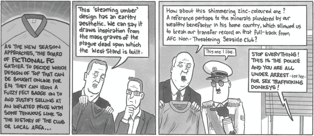
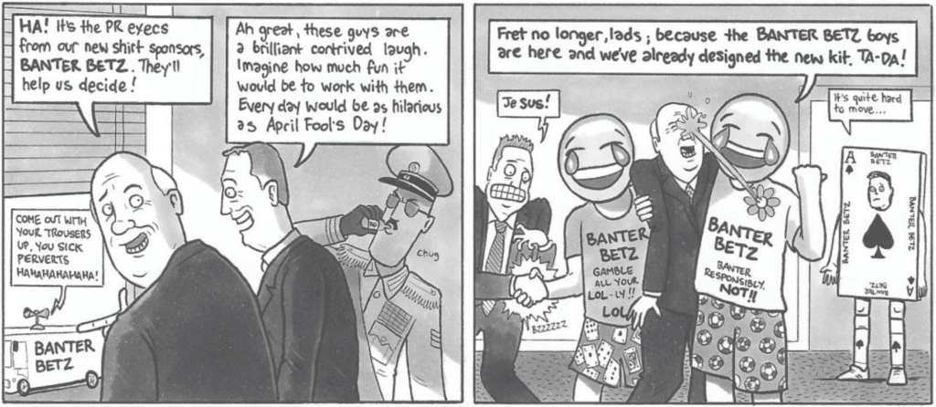
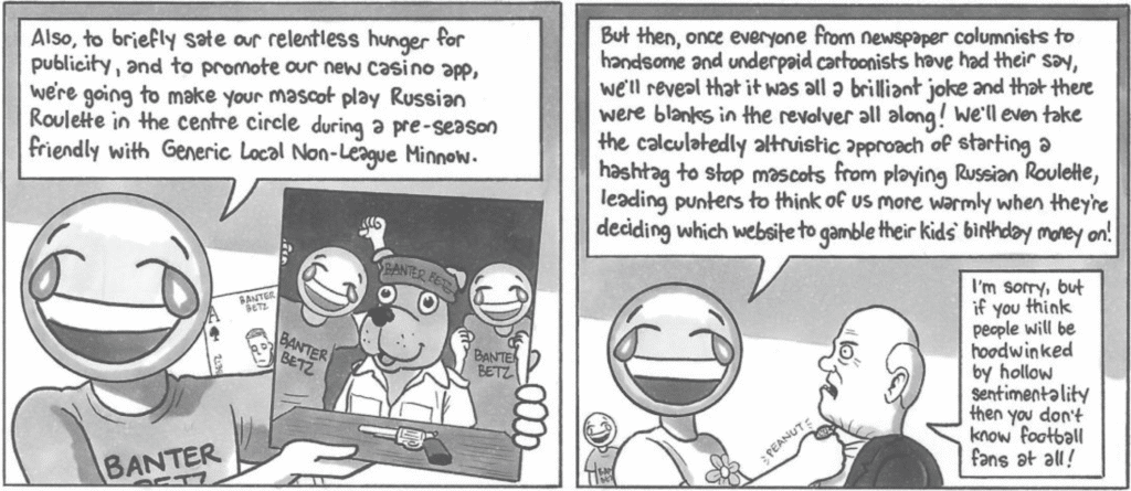
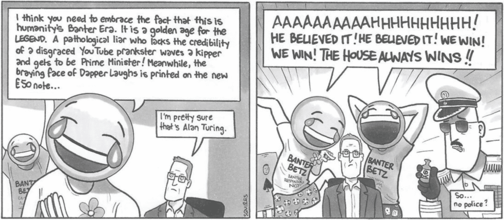
That isn’t to say you can’t take a more jaundiced view of the culture that’s at work here. That’s what David Squires, the soccer cartoonist for The Guardian, has done with this absolutely brilliant bit of work. Can’t recommend this highly enough (for each horizontal row of panels, you can click to enlarge):
Okay, now you can all tell me about the inevitable factual errors I made in this entry!
(My thanks to Paddy Fleming for bringing the awesome Squires cartoon to my attention.)
Click to enlarge
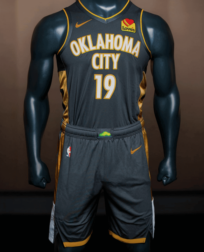
New Thunder uni: The Thunder released a new City uniform this morning. It pays tribute to people affected by the 1995 federal building bombing and was created in conjunction with the Oklahoma City National Memorial & Museum. This uniform will replace last season’s City uni, which was the Native American-themed design. Additional pics and info are available here, here, and here.
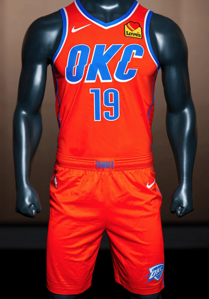
In addition, the Thunder released their new orange Statement alternate. This design had previously leaked, so it’s less of a surprise (click to enlarge):
The team also confirmed that it’s flipping the chest insignias on its blue and white primary uniforms. The blue set will now have “Thunder” and the white uni will have “Oklahoma City,” instead of the other way around (click to slightly enlarge):
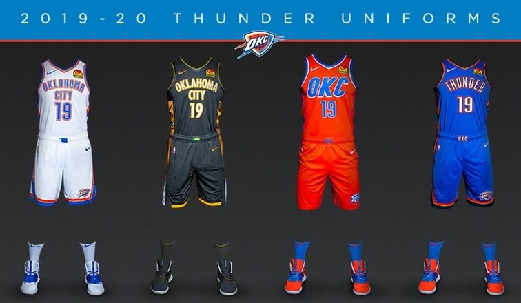
A press release says that the white and blue uniforms will both be worn at home and on the road in 2019-20.
(My thanks to Sam Thomas and Nick Crain for the early-morning heads-up on this one.)
Click to enlarge
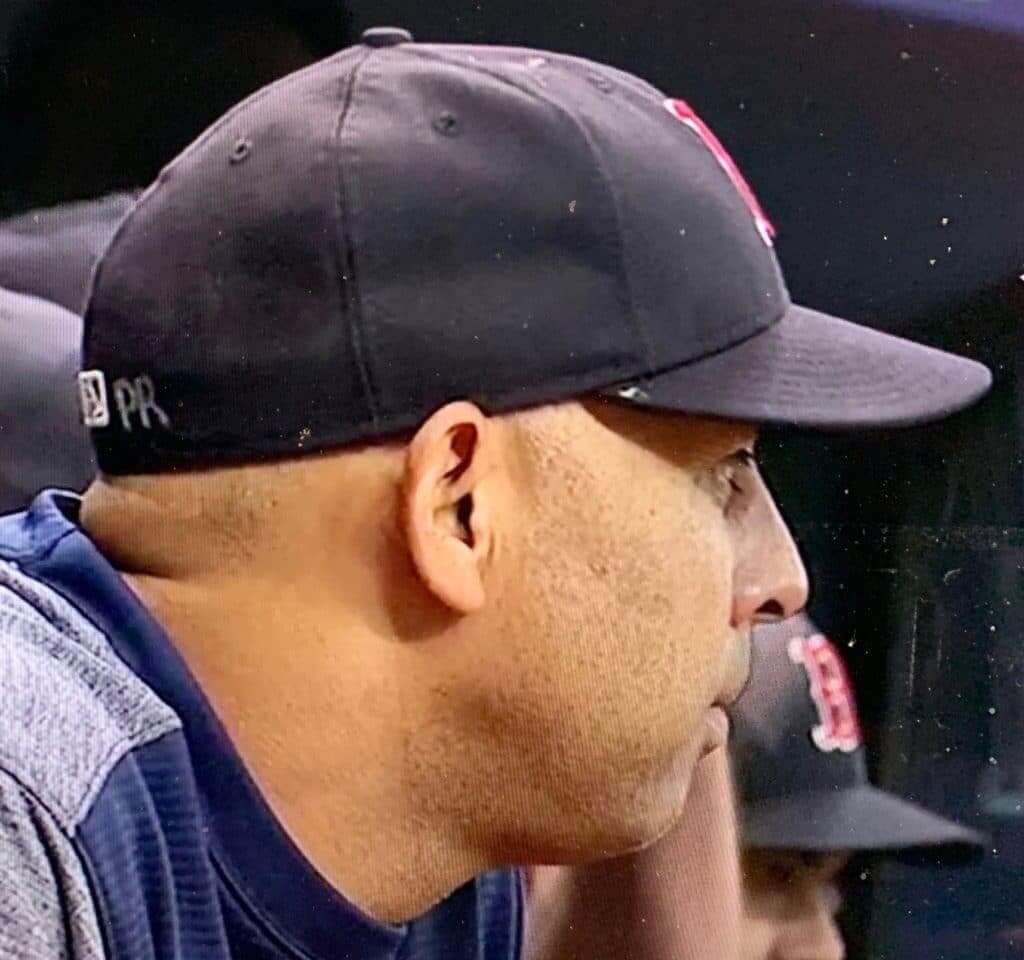
Check your head: We appear to be hitting a peak period of MLB cap messaging. There were lots of players inscribing memorials on their caps for Angels pitcher Tyler Skaggs when he recently passed away; then there was Marlins pitcher Jordan Yamamoto, who is from Hawaii, adding the Hawaiian phrase “Kū Kia’i Mauna” to his cap on Sunday, in support of people protesting against the building of a telescope on Mauna Kea; and last night, as you can see above, Red Sox manager Alex Cora, who is from Puerto Rico, added a “PR” inscription to his cap, presumably a reference to the protests currently roiling the island.
Cap inscriptions aren’t new, of course, but they seem to wax and wane, and we’re definitely in a waxing phase at the moment. I wrote more about this topic, including some historical background, last year, when the A’s added two sets of initials to their caps after two players’ moms died. That piece is worth revisiting if you’re interested in cap inscriptions.
(My thanks to @TweeterTBNL for letting me know about Cora’s cap.)
The uni implications of baseball trades: With the MLB trade deadline fast approaching, ESPN ran a good story about what it’s like to get traded. It includes a good section about uniforms, as follows:
Although Fanatics, the apparel company that bought MLB uni-maker Majestic a couple of years ago, is technically responsible for cranking out new uniforms once a player gets traded, it takes time for fresh jerseys to get shipped from the company’s production facility in Easton, Pennsylvania.
Enter the seamstress.
The Washington Nationals used to be like most teams in that they used a local contractor to come in and sew numbers and letters on a temporary jersey whenever a trade went down (once the official shirt arrives, the temp becomes a backup). But a couple of years ago, when Washington was looking for a new seamstress, the Melnick brothers took matters into their own hands.
“We just Googled: ‘Learn how to sew D.C.,'” says Greg Melnick, who along with bro Andrew helps keep the Nationals Park clubhouses running smoothly (Greg is the visitors assistant; Andrew handles the home side). After a quick one-hour class in the capital’s Adams Morgan neighborhood, the siblings were off and running.
Aided by a Brother 6000 sewing machine they ordered online and that lives in the equipment room at Nationals Park, the bearded and brawny 30-somethings are responsible for crafting new jerseys any time a player joins the home or visiting team while in D.C. If Washington finalizes a deal while on the road (like in 2017 when the Sean Doolittle trade went down while the team was in Anaheim), the host club handles production. That means that whenever a team travels, whether it’s deadline time or not, they have to schlep a giant trunk filled with blank jerseys of all sizes (typically low 40s to mid 50s), not to mention all the letters, numbers, punctuation marks and accents. For the Melnicks, it’s a labor of love.
“I really enjoy it,” says Andrew, who estimates that he has sewn about 100 jerseys (including call-ups and special occasion one-offs) during his tenure as Washington’s co-seamster. Thanks to all the reps, his production time has dropped from three hours on his first endeavor (Matt Wieters, 2017) to about an hour these days. His proudest accomplishment? The one-off he recently made for Patrick Corbin, who wore No. 45 to honor late friend Tyler Skaggs. “That was pretty special.”
Interesting! I don’t think I’ve ever seen the term “seamster” before. Good stuff!
Click to enlarge
Collector’s Corner
By Brinke Guthrie
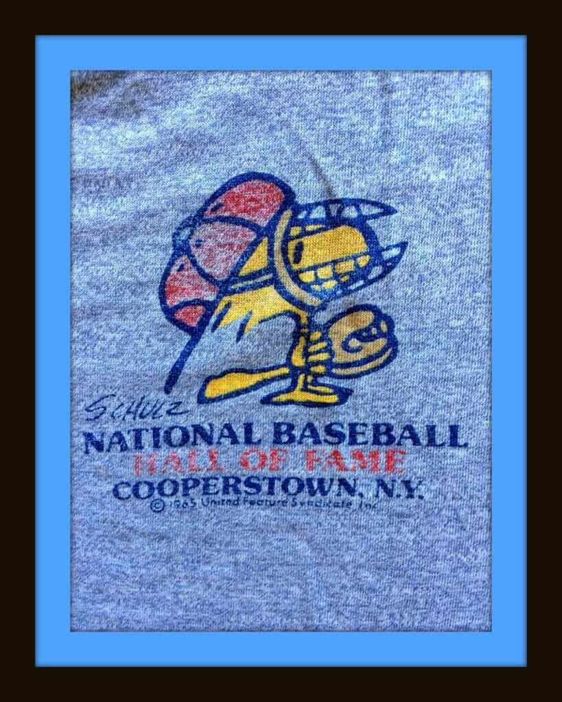
Since we just had the Baseball Hall of Fame induction ceremonies two days ago in Cooperstown, how about this 1960s-1970s Peanuts Hall of Fame shirt featuring Woodstock behind the plate? Woody had a rep as being a light hitter (which will happen when you weigh less than a pound), but he was a savvy receiver, knew how to handle a pitching staff, and had a cannon for a right arm wing. Here’s a better look at the shirt’s graphics from a different website.
Now for the rest of this week’s picks:
• We have a first-ever sighting for Collector’s Corner: this 1960s NFL cap — made of red leather! Now that’s gonna keep your noggin cool on a hot summer day, eh? The cap includes the Falcons helmet, so oldest it could be is from 1966 (the Saints started a year later).
• Another first-time item on CC; a pair of 1970s Bobby Orr hockey suspenders. (“Extra Long 42.”)
• Here we have a 1990s San Diego Chargers nylon/fleece shell pullover by Champion. Had one of these for the Cowboys, and boy was it comfortable. Just can’t say enough good things about the Pro Line stuff that Champion, Russell and Apex cranked out in the 1990s. Affordable, distinctive, and no cookie-cutter looks like we get from Nike. (Now, some of the 1990s stuff went too far. Pro Player and Zubaz, looking at you.)
• Here’s a set of seven 1970s NFL helmet buggies from Sportoys.
• Portland Trailblazers fans will be all over this 1970s bobblehead, still in its sealed bag.
• This lot of three 1970s NFL smoked-glass beer steins, covered with NFL helmets of the period, looks to be in good shape.
• The seller of this Houston Oilers snapback cap says it’s from the 1970s or ’80s. I’m going to say it’s a bit later than that, given the NFL Pro Line logo shown. In any case, a rather avant-garde font used in the front, no?
• This set of six NFL team pens were made by Faber Castell, and it also included an entry form on the back for the “$33,000 All-Star Family Sweepstakes! Void where prohibited.” (Where would they “prohibit” such a thing? Did you ever run into that circumstance?) Given that the deadline to enter was 12/31/1981, we’ll date these pens as early-1980s, not 1970s as the seller posted.
• Rawlings was the maker for this 1970s Kenny Anderson Bengals jersey, available at Sears, of course.
• The seller of this 1970s-1980s St. Louis Blues glass calls it “Rare!” and “HTF!” (that’s “hard to find”). Both claims are HTB (hard to believe), but it’s still a very nice glass.

Click to enlarge
Good-looking brews: The Rhode Island beer Narragansett began showing up here in NYC in 2011. Since then I’ve seen it in cans and on tap (and have also written a short article about an amusing glitch on their packaging), but never in bottles. I didn’t even know it came in bottles until last Friday, when we had dinner at a local restaurant and got this handsome long-neck. That’s a good-looking package design!
Two nights later, we were on the boardwalk in Rockaway and saw people drinking this:
I love that can design! Really nice. It’s actually a wraparound decal, not a printed can (small brewery, limited run, etc.), but it’s still really nice.

IMPORTANT plate update: As I’ve been mentioning for a few days now, we’re taking pre-orders on the Uni Watch 20th-Anniversary Plate. What I neglected to mention is that we’ll only be taking pre-orders up through the end of this week. We’ll probably have a very small supply of additional plates available, but not many. So if you want to get in on this one, move fast. Full details here.
Click to enlarge
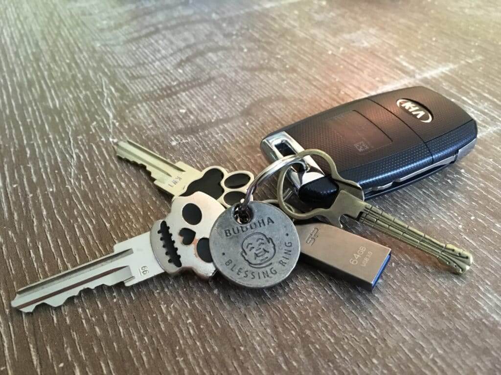
KRC update: The latest installment of Key Ring Chronicles was written by Uni Watch reader and recent Atlanta uni-versary party organizer Jason Von Stein. It’s about a little metal guitar on his key ring. Check it out here.
The Ticker
By Alex Hider

Baseball News: The Korean Baseball Organization held its annual All-Star game on Sunday, and a bunch of players came dressed in costume (from Matt). … ICYMI: Here are all the new Hall of Fame inductee plaques (from Kary Klismet). … The Ogden Raptors, the Dodgers’ rookie ball affiliate, wore “O-Town” NOBs when they wore their Expos-inspired fauxbacks earlier this year (from Brice Wallace). … The Richmond Flying Squirrels, the Giants’ Double-A affiliate, played a “what if” night as the Hush Puppies — one of their potential team names when the franchise was started (from Nicklaus Wallmeyer). … The Long Island Ducks of the unaffiliated Atlantic League are celebrating their 20th season — but their commemorative logo incorrectly refers to it as the team’s 20th anniversary (from Adam Fritzen). … New logo for the Arizona Fall League (from Steve Sher). … Anyone know the story behind this photo of Wade Boggs wearing Nationals gear? It comes from this Facebook post (from David Polakoff). … This 1953 Braves team portrait, shot during spring training of that year, shows some players wearing “B” caps and some wearing “M” caps. “The team’s move from Boston to Milwaukee was officially announced on March 18, 1953,” explains John Moore, so the photo must have been taken right around that time, and they apparently didn’t have a full set of the new “M” caps.

Pro Football News: The Orlando Apollos were a league-best 7-1 when the AAF folded halfway through its only season, so the team got coach Steve Spurrier a championship ring. Hopefully, they paid their players first (from @34inXXIII).
College Football News: The field numbers at Oregon’s Autzen Stadium will now match the team’s jersey number font (from @samuel101ts). … New end zone padding at Alabama’s Bryant-Denny Stadium (from Griffin T. Smith). … It looks like the CFB 150 patch will run onto Ole Miss’ shoulder stripes (also from Griffin T. Smith). … Howard unveiled their 2019 uniform set yesterday (from Kary Klismet). … Here’s a look inside LSU’s new locker room. … This is one of the options for Florida Atlantic’s set this season. … Rutgers’s stadium name has a new corporate advertiser (from James Gilbert).

Hockey News: The Golden Knights’ practice arena has a new red line design, which is based on the sublimated element from the jersey crest. Seems likely that their home rink will get the same treatment (from Trayton Miller). … The Sabres will wear their 50th-season patch on the left shoulder (from Mike Monaghan). … New sweaters for the University of North Dakota (from Greg Enkers). … Mats Zuccarello went from the Stars to the Wild this offseason, and Rangers G Henrik Lundqvist shot a video of him wearing his Stars helmet with his Wild practice sweater (from Benjamin Kassel). … Devils Backbone Brewery is holding a design contest for the label of its new Capitals-themed beer (from @OlegKvasha).

Basketball News: Here’s a good article about Ben Barnes, a graphic designer behind numerous sports logos and the Jazz’s new identity (from @akaggie). … There are unconfirmed reports that the Grizzlies will wear Vancouver-era throwbacks this season (from Kary Klismet). … Max Strus, a two-way signing for the Celtics, will wear No. 28 (from Etienne Catalan). … Maryland has unveiled their new uniforms for the 2019-2020 season (from Slotter).

Soccer News: What a NOB — West Ham’s women’s team has signed F Jacynta Galabadaarachchi. That’s 16 letters! Unfortunately, she’ll be wearing No. 15 (from Chris Cruz). … Real Madrid’s third jersey for next season has reportedly leaked (from Josh Hinton). … Portugese club Benfica added a US flag patch for their trip to America (from Mike D.). … One player for Cleveland SC of National Premier Soccer League wore a jersey without a badge because his usual jersey was lost (he’s third from the left on the top row) (from Ed Zelaski). … New kits for Clemson’s women’s team (from @ClemsonUniforms). … Here’s a site that shows logos, uniforms, mascots and more for Japanese soccer teams (from Jeremy Brahm). … For a roundup of more kit unveilings from smaller clubs and leagues, check out the Twitter feeds from Josh Hinton and Ed Zelaski.

Grab Bag: The NAIA Bethel University (Tennessee) Wildcats have a new set of logos (from Kary Klismet). … Here’s a video of the mascot of the 2020 Summer Olympics in Tokyo performing all of the Olympic sports (from Jeremy Brahm). … This listicle recaps all the sneakers that have been released to honor the 50th anniversary of Apollo 11 (from Brinke). … In a related item, here’s a great video on the seamstress behind the Apollo 11 spacesuits (from Miles Cliatt). … Something Marc Mayntz didn’t mention in his excellent Apollo mission patch review over the weekend: The Apollo 11 patch shows the sunshine coming from the wrong direction, something astronaut Michael Collins has acknowledged (from Brice Wallace). … Matthew Wolfram notes that the “9” on the California Route 92 West sign near the San Mateo Bridge in the Bay Area is a bit cockeyed.

Click to enlarge

What Paul did last night: I had a doctor’s appointment in Manhattan yesterday afternoon. After that, I went to a library so I could use their wifi and get some work done, and then I went to a bookstore to see the great Oakland artist and writer Jenny Odell (she’s the one on the left in the photo above), who was talking about her new book, How to Do Nothing: Resisting the Attention Economy, which is about pushing back against the relentless demands that the internet places on our lives (and seems related to my friend Rob Walker’s new book, The Art of Noticing).
Odell is a bit of a genius. She’s done soooooo many really brilliant art projects, and her New York Times interactive piece about a bizarre series of interconnected businesses is my favorite piece of journalism in the past year. I met her very briefly in 2011, when we were both part of Pop-Up Magazine’s sports-themed production, but I hadn’t seen her since then and was excited to hear her do her thing. Unfortunately, the person who was running the show and asking her questions — comedian/actor Aparna Nancherla — did a pretty bad job, so the event wasn’t as interesting as I had hoped.
The main reason I’m bothering to mention any of this is that on my way out of the bookstore I noticed this:

Arrrgh! Look at that big, honking apostrophe catastrophe — can you fucking believe it? That book was published last month, by Atlantic Monthly Press. I was sort of caught up in the wave of people exiting the Odell event, so it wasn’t logistically feasible for me to stop and grab the book to see who the jacket designer was. But the designer isn’t the only one at fault here — how many editors and sales/marketing people signed off on that cover design? Ugh, ugh, ugh!
First item in collectors corner, but it has the Saints too!
Well, you’re right. Color me dumb for that one.
if that’s the biggest mistake you made today, you’re ahead of 99.44% peoples. you’re a good egg
But no Colts, Browns or Steelers, who left in 1970?
As bad as Rutgers is, I don’t know if SHI Stadium is such a good idea.
would be loads worse for Temple, Tennessee, or Tulane
Temple’s been better than Rutgers over the past 6 years though historically both aren’t good programs
the joke was a reference to Temple’s logo appended to “SHI”
I noticed that you didn’t cover the ad patches on the OKC unis. Oversight, or have we given in to the inevitable?
As I’ve explained literally dozens of times now, we only do that when a new ad patch is announced, not for new photos of existing ad patches.
Alex Cora is the manager of the Boston Red Sox, not his older brother Joey.
Fixed.
No Mr. Yuk for the OKC uniform release? ;)
I am 100% behind #SaveOurShirt; I have never lived in an era where kits weren’t sponsored, so all I’ve known are kit ads. Before I came to UW, I hadn’t thought twice about it. Even when Paul began to warn about NBA ads and the slippery slope that would lead to, i was indifferent (as long as the ad didn’t ruin all the aesthetics of the kit, like Gladbach with a giant yellow block for the ad: link). After seeing H’field, M’well, and Newport all go ad-free, and maintain interesting and original kit designs, I have been “converted” so to speak. I reached out to my local club (shoutout to LouCity) asking if we could at least consider this, and I urge all of the soccer fans of the Uni-verse to purchase some of the #SaveOurShirt kits as well as to write your local club!
Love the soccer lede, Paul!
No Mr. Yuk for the OKC uniform release?
Only do that when new ad patches are announced, Josh.
Gotcha. Been a while since the last one — I must have confused new NBA uniforms with new ad patch.
Yeah, as much as I’ve complained about the intentions behind Save Our Shirt, if it gives the fans (like Josh) ideas then obviously that’s great.
I hadn’t been aware of that many people in the UK vocally complaining about ads on shirts, or wishing for ad-free shirts, before the past week. They seemed to be tacitly accepted as a fact of life (as long as they didn’t look really bad).
Doc Halliday gets the “painted glove” treatment.
link
Seamster came up on ‘Tested’ YouTube channel (the Mythbuster guy), which included the gender neutral term ‘sewist’.
IF you click on the link to Paul’s story about Narragansett Lager Beer (the only beer with straight from the barrel taste, hi neighbor, have a ‘Gansett), then click on the link to the Red Sox 1959 team picture there, you will see MLB’s last all-white team picture.
Timely, as Pumpsie Green just passed away last week.
“this 1960s NFL cap — made of red leather!”
Some interesting facemask colors there too!
Ah, Gansett! In terms of cheap beer, it’s them and Yuengling head and shoulders above everyone else. It’s becoming somewhat easier to find here in Virginia — one of the bars I regularly go to even has it on draft.
I live in New England and never had a Gansett, maybe I should? (I’m not really a beer guy, and only recently became more of a wine fan). For some reason I really associate the old design with the ship on it with my some dive spots in my hometown where I’d imagine all the townies went to drink. Did they change their quality or did they just get better at marketing?
If you’re more of a wine guy, then heck yeah, try a ‘Gansett. The thing that makes most cheap American beer cheap is that it’s made with adjunct grains – that is, grain other than barley. Budweiser is famously brewed with barley and rice; most “adjunct lagers” are brewed with barley and corn. Barley is an expensive grain, so substituting rice or corn lowers the cost of producing the beer. Anyway, most adjunct lagers seem to be brewed with the goal of denying the non-barley grain. As a result, most cheap American beer has a weak flavor with a slight tinniness. ‘Gansett is brewed with barley and corn, and seems to embrace the flavor contributions of the corn. So in addition to the weaker-than-all-barley-beer bready malt flavors, ‘Gansett lets the buttery sweetness of the corn come through. That gives it an interesting, almost wine-like, flavor complexity. I’m more of a wine guy, and I really dislike most adjunct lagers, but I really enjoy ‘Gansett.
Interesting to know! Maybe I’ll give it a go!
RS
Growing up in Rhode Island I remember the big Narragansett brewery (I think it’s still there but didn’t go near where it was when I was home this past holiday season). When they started making it again my Dad ran into one of the guys who were running the operations (they traded ball caps, and Dad gave me the ‘Gansett hat later) they wanted to move the whole show back to RI because one of the things they couldn’t quite get right was the water in the brewing process which came from the reservoir in the town I grew up in.
Paul: Now you have me humming “Spanish Ladies” and thinking about a boat named Orca
The mentions of beer and “Spanish Ladies” reminded me of a drinking game a group of us once played while watch Jaws. You take a big sip everytime a character says “Chief” or “Hooper” (pronounced Hoo-pah) and yell out the corresponding name. There were times we three or four sips behind because the names get used rapid fire.
Rectly Narragansett beer moved most of the production back to RI, in my hometown of Pawtucket. The Lager is the only one still brewed out of state in Rochester, NY.
link
Good assessment, Scott! As a craft beer aficionado myself, I dislike most adjunct lagers for the reasons you highlight – not because of the mere presence of adjunct grains in the beer, but rather because the adjunct grains are used as mere filler, without regard for the flavor characteristics they impart on the finished beer.
A not-particularly-new but growing trend among craft brewers has been to use adjunct grains as featured components in particular beer styles. Traditional American cream ales, a corn-heavy and sweet style with roots stretching back nearly two centuries, have experienced a notable revival in recent years. And rice has even started to gain acceptance as a highlighted ingredient, for example in Michigan-based Kuhnhenn Brewing Company’s Double Rice India Pale Ale.
The emergence of adjunct grains in craft beers is certainly not without controversy, especially among self-appointed “purists.” But the dividing line (often as fine as it is) seems to be whether the adjunct grains are a hidden way to cut production costs or intentionally promoted as part of a beer’s grain bill.
I don’t.consider Yuengling to be a cheap beer-maybe their lower-tier Premium brew but not their other offerings, especially Lager.
Wish they continued with the Summer Wheat; the Golden Pilsner is a nice addition to the lineup.
Wade Boggs….
Since those aren’t Nats’ colors, maybe the “W” is for Wade (his own sort of branding???).
or it’s photoshopped.
Sure looks like a navy blue cap to me, which would make it a Nats road cap from the mid-2000s. Also that sweatshirt was a style worn very briefly by MLB teams. But I only recall the gray version being sold at retail; players wore team-color versions. That particular sweatshirt style was only worn for one season, I believe, and then a modified version with thicker fabric and different “performance” inserts was worn for a couple more seasons. Circa 2007ish?
So the question of “why?” is still out there.
Boggs coached high school baseball.
“Yankees Magazine talks to Hall of Fame third baseman Wade Boggs about coaching baseball for the Wharton High School Wildcats in Florida.”
link
Hearing Yankees gear, likely from mid 90s when the nationals did not exist… if wade looked that good in 2007 I’d be very impressed.
Thank you so very much for letting me and my father be apart of the Key Ring Chronicles. We both greatly appreciate you sharing our story.
Your a very talented person. Thank you for sharing that talent so many ways.
The Von Stein’s
Jason,
Enjoyable read. Thanks for sharing. (I sent my story for the Chronicles a couple years ago; it’s a neat site.)
-C.
PS — No need to use the apostrophe in your family sign off. ;)
No corrections from me. Nice work Paul.
Ads on shirts have been around for decades in England so there is general acceptance. Not to say that fans wouldn’t prefer ad-free shirts. There is concern though about the prevalence of ads for gambling companies (betting companies advertise on half of the shirts in the Premier League). Paddy Power is known for their stunt advertising and this campaign allows them to distinguish themselves from their competitors and get ahead of any potential ban on gambling ads.
Yes … there are dozens of gambling companies sponsoring sides in the EPL and it has gotten out of hand — the youth teams aren’t even allowed to wear the ad!
As much as I want ad free jerseys, the growing presence and pervasiveness of the gambling industry and its culture into the forefront of sports in the British isles is just too big of quagmire to overlook. Just in the last ten years it seems to have just exploded and saturated the mainstream sporting culture. Half of all premier league teams will have betting companies on their shirts this year and I wouldn’t be surprised if every other at least had some degree of marketing deal with one. And to think that soccer is constantly marred by match fixing scandals is it not absolutely insane that the sport would be working hand in glove like this with its main source of corruption? And no need to even get into the moral depravity of an industry that feeds off of the vulnerable and desparate and many just plain ill to make its profits because the the most annoying effect is how gambling has inevitably turned half of all conversations about sports into self-centered bore-offs about who bet on who and how much so and so won.
I want soccer jerseys to be ad free. I feel like that would be a fight for the heart of the sport to do so. But the fight to get gambling companies out of the mainstream sporting culture and back into the seedy alleys where they belong, that is the fight for the soul of the sport. I don’t think it’s worth sacrificing the soul for ad free jerseys.
A bit of detail missing from the NBA.com story about Memphis wearing the Vancouver Grizzlies throwbacks.
IIRC, Vancouver wore the teal uniforms sporadically in the 1999-2000 NBA season. The black alternate became the de facto primary road uniform.
link
The new road uniform in 2000-01 was the black third with a minor tweak. No white striping on the legs. The new white uniform was created to match the template for the black uniform.
I kind of dig the black-and-gold Thunder jersey, but how much better would this and their blue jersey look if “Oklahoma” was above the number and “City” was below it?
Then it would look too much like Indiana’s.
But I too like the new City jersey.
Sad to see that Aparna Nancherla sucked. I like her a lot – what made her so bad at the panel?
Woodstock behind the plate on a Peanuts t-shirt? Everyone knows Schroeder played catcher!
Wood-man is a knuckle-ball specialist catcher.
(Where would they “prohibit” such a thing? Did you ever run into that circumstance?)
Quebec prohibits most things like this.
link
Summary: there are tons of rules that have to be complied with, including registering with the government, paying a big fee, and filing a bond. Easier to not offer your sweepstake in Quebec.
Man, I just read that interactive NYT article that Jenny Odell wrote. What a trip. Thanks for the entertaining read!
Right? A truly amazing rabbit hole!!
Very solid post today. Tons of great information. Thanks!
I don’t particularly like the Jazz identity. They are too easily confused with the Nuggets, and vice versa.
So much to absorb in the 1953 Spring Training Braves photo. Could be my franchise relocation radar is on high alert here in Northern California. Raiders to LV. Warriors to SF. A’s always on the verge of moving,
Bummer that Aparna Nancherla’s moderating work was subpar — she’s a great comic but maybe not great as a panel anchor (also have no idea who put on this program anyway). Very excited to read that Jenny Odell book though.
She was funny — lots of good quips — but not a great interlocutor.
Narragansett Lager, Narragansett Cream Ale and Narragansett Light are all actually brewed by the Genesee Brewing Company in Rochester, NY. The Porter and Ales are brewed in RI. Just felt like I had to throw them some love, the most underrated Brewing Company in the USA, IMO.
Beer can design wise, check out Modern Times in San Diego. They have a very classy designed graphics for their cans & bottles (both regular offerings link & monthly releases link an example from 2017 cans & link reference to most art work for upcoming releases.) Cheers!
Logos and artwork graphics look pretty good on race cars too (Forza liveries I’ve created in game – link)
As has been implied a few times, this is effectively a) Paddy Power taking control of any controversy about yet another gambling company sponsoring a football shirt, and b) Getting ahead of the game if gambling ads are banned from football. Given their track record, there is absolutely no altruism involved here.
Let me put it this way- if ad-free shirts become a trend, it’ll be associated with a Paddy Power marketing stunt- effectively making every ad-free soccer shirt an implied gambling company ad. Does this sound like a good solution?
It sounds like a way better solution than having gambling companies continuing to advertise on soccer jerseys like they’ve been doing.
Can’t resist: Think that red leather NFL cap will be mistaken for a MAGA? Might depress the bid price somewhat.