
By Phil Hecken
Follow @PhilHecken
If you follow me on the Twitter (and I KNOW you do, right?), you see I have been re-tweeting an account named @GoatJerseys for quite some time — he’s most definitely a Uni Watch, and “one of us” for sure. I’ve actually been corresponding with the account owner via DM and e-mail for probably more than two years now. In that time, we had agreed he would definitely do a post for Uni Watch, and in fact, I had him penciled in for over a year, but never got around to pulling the trigger, so to speak. But that ends today.
The account, which is a great follow, is run by Joseph Genovese (but he’ll always be “Goat” to me), and he finds and posts (and often gives some historical background on) jerseys (and unis) from all sports, but with a particular emphasis on baseball. I’d asked Joe for some writeups (which I never got to — my bad) a while back, as I mentioned, but now is as good a time as any to run these. For this article, Joe/Goat has taken a look at some of his favorite San Diego Padres jerseys, as well as the Peyote Coyote edition of the (then) Phoenix Coyotes, and as an added bonus, several decades worth of jerseys from the Alaska Goldpanners! Much of what follows some of you may already know (but for anyone new to Uni Watch, you’re in for a treat), but it’s still enjoyable regardless.
Here’s Joe:
San Diego Padres
Baseball was everything to me growing up. A fifteen minute drive from my house to Yankee Stadium, I was fortunate to witness countless games. My buddies and I were all die-hard Yankees fans, except one. While I was perfecting Don Mattingly’s stance in Wiffle Ball, my pal Daniel was slapping oppo singles in the backyard trying to be the great Tony Gwynn. An Irish-American kid from the Bronx becoming a die-hard Gwynn and Padres fan in the late 80s was unheard of. Daniel tragically passed away after college, and I remember wearing a Padres hat to his wake in his memory.
The Padres sported some of the coolest and most innovative uniforms in sports. There’s also a lifetime soft spot in my heart anytime I see someone rocking a brown and yellow SD jersey or hat.
With that said, I can say without hesitation the 1980-1984 San Diego Padres uni’s will forever be a 🐐 jersey.

Another great Padres uniform was the 1985-1990 pinstripe brown and orange. San Diego went through a whole decade with two awesome uniforms.


Here’s my fav Padres BP jersey (early 80s)👌

Not many know but the 1985 Padres jersey almost a took a look for the best/worse? Here’s the prototype that was made for the ‘85 season.

That patch is phenomenal!

Another cool piece of history regarding the Padres:
In 1973, the Padres were going to be the Washington “Padres”. In May of that year, the Padres were purchased by grocery store chain mogul, Joseph Danzansky & team for a cool 12 million. The sale was unanimously approved by all 11 NL teams. Topps even produced baseball cards that had “Washington Nat’l League” printed on them. Here is minor league pitcher, Dave Freisleben rocking the prototype road jersey:

This was all short lived, as the move was halted as Padres owner C. Arnholt Smith was in financial troubles and was sued by the City of San Diego. Smith ended up selling the team to McDonald’s owner, Ray Kroc and the Padres would remain in San Diego.
As we know the Padres brought the browns back this year, (even though I can’t stand the brown with all white pants). I’m really excited to see what comes next year when they go full force with new (old) look.
Phoenix Coyotes
Some jerseys can be so simple, but yet so beautiful (like those 60’s flannel Yankee roads). Others have such a different look you don’t even care what’s going on in the design, it’s just super fresh!
This brings us to the inaugural jersey of the Phoenix Coyotes (1997-1998).

The unique logo was named, “Peyote Coyote”, it was designed by the company, Campbell Fisher Ditko. It was pretty awesome how the “Kachina” inspired coyote was a hockey player as well. The artist, Greg Fisher was asked to build in a southwestern feel to appease the Arizonans. It featured a great mix of colors: forest green, brick red, sand, sienna and purple. He totally crushed it, a trendsetting look in my book!

The now Arizona Coyotes announced in this past June that they’re going back to these beauties as their 3rd jersey for the upcoming 2018-2019 season. Former Coyotes captain Shane Doan, “It’s funny because in the beginning they were almost ahead of their time or not quite to the level of uniqueness that they are now. I was hoping that this would be the direction they go, because of the players that have played in those jerseys and the history behind it.”
Below is current Coyotes player Clayton Keller wearing the 2018-2019 version (It will be the same look as the originals except for the lighter material Adidas uses nowadays).

As a jersey aficionado, I’m super glad to see an iconic “Goat Jersey” being brought back into play after all this time. Salute to the Coyotes organization for giving us all a chance to see these classics in game action again.
Alaska Goldpanners
One of my all-time favorite uniforms, from our 49th state, the Alaska Goldpanners. Founded by H.A Boucher, and based out of Fairbanks, the Goldpanners (Alaska Baseball League) date back to 1960.
As their website states:
“The club operates in a manner similar to a Minor League Baseball team (playing daily, using wood bats, traveling by bus), thereby preparing college athletes for the rigors of professional life.”
Over 200 Goldpanners have made the majors. Many greats started their careers with the Goldpanners including Baseball Hall of Famers,

Barry Bonds

Tom Seaver (2nd from left, middle row)

Dave Winfield
The jerseys are so unique, the font, color scheme, right down the line it’s fantastic!

This one here of former Mariners 2nd baseman, Harold Reynolds

Bob Boone in the zip-up vest
This team shot is one of my favs:

The good folks at Ebbets.com produce some amazing Goldpanners apparel including this jersey and cap:


The current Goldpanners uniforms still have that unique look to them (and stirrups👍).

With almost 60 years of baseball in Fairbanks, Alaska the Goldpanners will forever be a legendary program. In my opinion they’re trendsetters in player development, with tons of history.
As their slogan goes, “Love the team, love the town.”
Thanks Joe (and sorry it took so long to post this!) — great stuff. If you haven’t already, be sure to give @GoatJerseys a follow (or his personal twitter page @TheRealGenovese). You’ll definitely enjoy the parade of jerseys (and sometimes full unis) he posts on a daily basis!

Astros & Mariners Party Like It’s 1990-92

Last evening, the Astros and Mariners both wore throwback uniforms, in an evening billed as “90s Night” in Houston. And both teams did indeed wear uniforms from the early 1990s — the Astros in their post-tequila sunrise “rainbow racing stripes” and the Mariners in one of their better uniform sets (just picture Junior Griffey). The Mariners wore uniforms they had from 1987 through 1992, while the Astros wore their (home) set from 1982-1993. So it could just as easily have been called an “80s Night” as well. The Astros had pullovers and sansabelts with this style from 1982-88, and wore belts and button fronts from 1989-93.
And of course, since both of these clubs wore these uniforms before Interleague Play, and both were in different leagues at the time, this was a matchup never before seen on the field of play.
Let’s take a look at some of the unis:
Houston Astros


Nice right? Not my favorite of the many uniforms the Astros have worn, and not even their best rainbow look, but a nice one to see. I never particularly liked the moving of the rainbow guts (aka “Tequila Sunrise”) from the jersey to the sleeves, making racing stripes, nor was I a fan of the thick black stripes that went down both the jersey and pant legs. As far as accuracy, it seemed like the team got it right, and they were wearing the later iteration with the button fronts and belts. Even though I’m a purist when it comes to uniforms, to me these should have been the earlier style, with pullovers and sansabelts — that look just never “looked” right once they put it on a traditional cut.
Seattle Mariners


While this isn’t my favorite Mariners uni, it’s close. The M’s never looked better than when they wore royal and gold, and this set totally fits that bill. The Mariners also seemed to get this uni correct, and it was nice they went the extra mile to wear the period appropriate helmets as well.

I did not see this game (I was off curling) so the only uni notable moment I know of was brought to my attention by reader Arthur Vint, who noticed Jose Altuve has a slight stirrup mishap:


As you can see from some of the above photos, some players went stirruped/high cuffed, while others went the pajama route, which is a shame.
You can see the uniforms in action here:
Josh Reddick. That's it, that's the tweet. #TakeItBack pic.twitter.com/ZP3r3bXVYu
— Houston Astros (@astros) June 29, 2019
and here:
Austin. Adams. Send tweet. #GoMariners pic.twitter.com/5Pc6w6CbQi
— Seattle Mariners (@Mariners) June 29, 2019
You can see more photos here.

Kreindler’s Korner
I had the distinct pleasure of featuring the wonderful artwork of artist Graig Kriendler on two occasions over the summer and fall of 2017, and more recently, in August of 2018.
For those who don’t wish to click the links, Graig paints baseball heroes (and regular guys) from the past, and is an immense talent.
Occasionally, I will be featuring his work on Uni Watch.
Here’s today’s offering (click to enlarge):

Title: “Monte Irvin, 1939” (color study)
Subject: Monte Irvin, 1939
Medium: Oil on linen mounted to board
Size: 5” x 7”By the time Monte Irvin found his way into the bigs, he certainly had not been the first to integrate the sport, as many thought he might be. A multi-sport hero while a high school student in New Jersey (16 varsity letters in four sports at Orange High), he was signed by the Newark Eagles in 1938.
He became a five-time Negro League All-Star, as well as a Triple Crown winner in the Mexican League and an MVP in the Puerto Rican Winter League.
When he and Hank Thompson finally joined the New York Giants in 1949, Leo Durocher held a meeting with the team, claiming that they were going to help the ballclub win. Two seasons later, he finished third in the National League MVP voting and helped guide New York to the pennant (with a little help from Bobby Thomson). In that year, his first full one with the club, he batted .312, knocked in 121 runs and hit 24 homers.
I chose to depict him with the Eagles in 1939, when the Newark jersey designs still had some nice flair to them. This is one of 200+ such paintings of mine that will be on display at the Negro Leagues Baseball Museum in the spring of 2020.
Thanks, Graig! You can (and should!) follow Graig on Twitter.
Another Day…Another Pod

Earlier this week, I was a guest on a podcast called, “Show To Be Named Later,” hosted by Seth Goldberg. Seth had reached out to me to comment on the newly released Syracuse football uniforms, which were released last Friday, and which I wrote about last weekend.
We mostly talked about the new ‘cuse unis, but also the Cleveland Browns unis and a few of my favorite NCAA FB unis towards the very end. The entire podcast is about 25 minutes long, and my portion starts at about 11:15 in. To listen, click the play button in the embed below (if you want to skip to my part, use the little blue slider bar to scroll ahead to 11:15).
You can also listen by clicking here, which is the SoundCloud version, but for some reason I’m not able to embed directly.
Love to hear your thoughts. Thanks for listening.
Threads Of Our Game

Occasionally I receive an e-mail update from Craig Brown, the designer and proprietor of the website, Threads of our Game. As the header explains, the website is a databuse of 1800s base ball uniforms. If you haven’t checked it out before, you’re welcome.
Anyway, got an e-mail earlier this week with the subject line: “Lost & found — 1892 Washington team photo”. The body was as follows…
In my email last month I asked the question, how many 19th-century team photos are lost? I speculated then that it is more than we realize. This came to mind again last week when researcher Ken Samoil sent me a newly discovered gem — one I’m sure none of us has seen before. It’s a team photo of the 1892 Washington Nationals, published in a Washington newspaper in 1924, some 32 years later. It’s easy to assume team photos like this never existed—but now we know they did—especially in the 1890s, there surely was a team photo for almost every team and every year. For the ’92 Nats, what once was lost is now found.
See the uniform and photo here.
This entry has also been posted to the Threads News Feed Page
Enjoy!
Craig
How great is that? Very! Thanks, Craig!
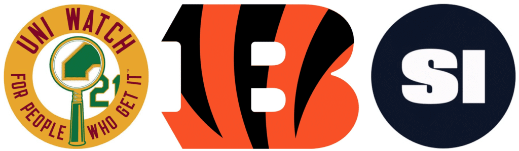
And now a few words from Paul: Hi there. In case you missed it earlier this week, I’m teaming up with Sports Illustrated for a Bengals-redesign contest. Full details here.
Also! Today is the day uni-versary parties taking place literally around the world. Here are the updated map and spreadsheet showing all of the currently planned gatherings.
Phil, Jamie, and I will be at the Brooklyn party at 773lounge.com, which will take place today from 2-6pm. Hope to see lots of you there!
Okay, handing the baton back to Phil now.
Uni Watch News Ticker
By Phil

Baseball News: GROSS! (but not entirely unexpected): the Yankees (and presumably the Red Sox as well) will have ad patches on their jerseys for their London Series games (from @NYYDJ2). And also on their helmets. Here’s a another look (from Trav). Paul notes that the “Yanks are technically the road team, which perhaps explains why they brought along their matte road helmets rather than the home glossies.” Also from Paul, here’s a good look at the sleeve patch that Yankees and Red Sox will wear today and Sunday. … A broken bat helped Justin Upton leg out an infield single Thursday night (from Mike Chamernik). … Also from Mike, I’m not sure this is necessarily a new phenomenon, but Yankees caps have become a “global fashion sensation.” … Check out these Dansby Swanson cleats honoring the USWNT (from Megan Brown). … Here’s a really good article on how a Major League team sets up travel (from Sean Newberry). … “As a was watching the MLB all star election on ESPN, I saw that the fake field graphic that they had put the Orioles in the NL east, but also had an outdated Marlins logo,” from Nicklaus Wallmeyer (who is ELEVEN years old!). … We don’t really track the Braves unis that much here, but they’ve worn 10 different combos this season, according to the AJC, and they’ve tracked how the team has done in all of them. … The Fort Wayne TinCaps celebrated the hit TV comedy “The Office” on Friday and dressing up for the occasion by wearing a uniform straight from the Dwight Schrute collection. … The Madison Mallards have become the Wisconsin Cheese Curds (via Paul). Also got this e-mail from Nick Mueller, who adds, “Hey! I live in Madison, Wisconsin. I used to work for the Collegiate baseball team in the Madison Mallards. I just found out that they are rebranding as the “Cheese Curds” every Thursday in July!” … The Toledo Mud Hens wore these uniforms last night in honor of the 180th Fighter Wing – more than 1,000 men and women and 20 aircraft (from Mark Monroe). … The NY Mets are honoring the 50th Anniversary of their 1969 championship team this weekend, and last night they put “1969” graphics on the scoreboard (from Gordon Blau). … Speaking of the Mets, and apostrophe catastrophes: “Mets giveaway #1969Weekend jersey the apostrophe is upside down!” says Al N. Kreit. … The “Colorado Rockies affiliate community is pushing for a great rename!” writes Evan Feick. “There is now a twitter feed too!” … What hath Hunter wrought? Ronald Guzman is the latest to go the biker shorts route (from Jeff Hanten). … The Samsung Lions will be wearing ‘Lion King’ uniforms.today (from Dan Kurtz via Jeremy Brahm). … The Salt Lake City Bees wore Utah Jazz “City” jerseys last night (from Carter Williams). Here’s some more looks (from Landry Heaton). … “Miguel Sano wearing that logo again. Anyone figure out if he has his own brand? I can’t find anything” asks Chris Lather. … Here’s a nice graphic of all the uniforms to win the College World Series since 1975 (from Peter).

NFL News: Friend and frequent contributor Gene Sanny writes, “You’ve probably seen this but I hadn’t. Cross on the back of the helmet. Probably some athletic tape.” Looks like a Rams/Browns game, probably 1951 — I’ll admit I’ve never seen that before. Thanks, Gene! … It’s offseason in the NFL, which means we’ll be seeing lots of articles like this one from Sports Illustrated which asks which throwback unis need to make a comeback.
College Football News: Here’s a look at the 150 year patch on the white Utah Utes jersey (from Utes Equipment). … HA! Check this out: 1929: Atlanta Constitution columnist Ed Danforth is not a fan of Duke’s new football uniforms (from Quirky Research via Jerry Wolper). … It’s offseason in college football, which means we’ll be seeing lots of articles like this one, which ranks Syracuse football’s uni combinations. … Griffin Smith seems a bit concerned that Oklahoma still hasn’t added the 150 patch to their unis (spoiler alert: they will).

Hockey News: Reader Russell Lucas (almost the same spelling as Paul) writes, “read with interest this story about a goalie at Penguins named Matt Murray who isn’t THAT Matt Murray.” He adds, “I hope the guy makes the NHL team at some point, if only because I would love to know how the equipment guys and in-arena guys find a way to differentiate between the two of them. I bet they make the younger guy go by initials or something. Has this ever happened before in an American pro league?” … ICYMI: Here’s a look a the top 5 Robert Luongo goalie masks (from Hockey By Design).

NBA News: Nike just announced a signature shoe for Giannis. The Zoom Freak 1. The shoe includes two custom logos. A modified “G” and “A” for his initials, and then a stylized “34” that looks like the Greek flag (from Johnny Okray). He adds, “Here are some logo descriptions from Nike.” And of course, the corporate-speak. … Thrift shop gold: Halifax’s Matt Boyle found Ray Allen’s warmup pants buried near the bottom of a bin full of oversized items in the discount clothing store (from Jeff Worth).

Soccer News: FC St. Pauli English have released a new home kit (from Ed Żelaski). … Preston North End announced it will abandon the red change strip and revert back to last season’s yellow after “significant” numbers of supporters expressed “disquiet” over the switch to red (via Paul). … Also via Paul, Leyton Orient FC have new kits. … Nike is selling a record number of USA women’s soccer jerseys thanks to World Cup fever.

Grab Bag: Bees seem to be the culprits in stopping sports action in several sports — including Cricket (from Jimmer Vilk). … Oooh, check out this Unlabeled Dalhousie University rugby team photo at the Canadian Potato Museum. Player James Champion (3rd from left back row) identified elsewhere as practicing medicine 1917-37, so likely mid-1910s (from Scotty Rogers). … A man who was once featured in the 2017 Army uni reveal video (which introduces the football uniform of the Army-Navy game that honors the soldiers in the 10th mountain division) was arrested for murder (from a submitter who prefers to remain anonymous). … Check out the Czech Republic women’s volleyball NT jersey, the Czech flag as the side panel (from Jeremy Brahm).
PHEW!
That’ll do it for today. Everyone who is attending, hosting or joining a Uni Watch Anniversary Party today — ENJOY and please send in your photos (Paul listed where above) and feel free to ALSO send in a group shot to ME (phil (dot) hecken (at) gmail (dot) com) and I will try to run one shot from every gathering around the US and elsewhere tomorrow. Paul will have a full wrap, I’m sure, later on, but a few group shots would be great to run Sunday.
I’ll be at the Brooklyn gathering, so hopefully many NYC-area readers will be there. OK? OK! See you guys in a few hours!!!
Happy Uni Watch Anniversary everybody! If there was only an anniversary party at Newark Airport where I am traveling today!
That Padres’ 1985 prototype would’ve had them going from pullover to buttoned jersey back to pullover in just three seasons, thus tearing a hole in the time-space continuum.
If you’ll excuse a little Saturday morning cloud-yelling…
To me it’s just as bad when a player goes high-cuffed showing miles of dark sock on an 80s – 90s throwback as it is when they wear pajamas on a 60s throwback.
Thanks for your indulgence.
I love how the Goldpanners stayed with that funky ‘Alaska’ wordmark through several different stylistic changes to the uni.
If they don’t still use it, they should.
Hope everyone attending a UW anniversary party has s great time – Enjoy!
“Here is minor league pitcher, Dave Freisleben rocking the prototype road jersey”
I’ve seen that photo many times before but never noticed until now how similar that pose is to the one Okkonen used for his DTTN’s mannequin.
A couple of masks missing from the Roberto Luongo top 5 list that should get included if I were making the list.
-The mask he started wearing in 2007 featuring Johnny Canuck skating on a frozen English Bay:
link
-The subsequent mask featuring Johnny Canuck also excellent:
link
Great write-ups on the Padres and Coyotes. I’ve never seen that Padres prototype. One thing about the coyotes peyote coyote – their inaugural season in Phoenix was 96-97, not 97-98.
I’ve seen that prototype before, most likely from a previous Uni Watch post (but probably a few years ago).
On the Astros jerseys, “thick black stripes that went down both the jersey and pant legs”.
It’s actually dark navy blue. Same with the lettering and star.
I’d love to see the coyotes wear the uniform that the Peyote Coyote is wearing. Brick red jersey with the crescent moon and forest green pants. That’s a really cool look.
Brick red and forest green pants? Ecch. Minnesota dumped that look, why would anyone bring it back?
With regard to the question about the Matt Murrays, the Mets have twice had two pitchers with the same name. The 1962 Mets had Bob Miller and Bob Miller. Of course there were NNOBs in those days, but they were referred to on the team as “Righty Bob” and “Lefty Bob”. In 1999, the Mets had Bobby Jones and Bobby Jones–and, again, one was a righty and one was a lefty. The two Joneses were teammates again with the Padres in 2002. I don’t recall what the Mets did about their uniform names–if they used middle initials it would have been “B J Jones” and “B M Jones”, but I suppose if there were “B J Jones” uniforms they’d be easier to find images of, so probably they just went with “Jones” for each.
It appears that both just wore “Jones” for the Mets:
link
link
I can’t find a rearview jersey of lefty Jones with the Padres, but righty just wore “Jones”:
link
Bonds isn’t in the hall of fame but he’s getting closer
Anyone know why the graphic of 40 years of College World Series winners excludes the 1985 Miami Hurricanes? Has their 82 team and also has “repeat unis” (87-88 Stanford and 2010-11 South Carolina, as well as similar togs like 2002 & 05 Texas). Just curious.
Alright, because there was no scoreboard challenge today, here’s my trivia challenge. Identify the player from an extract on his baseball reference page.
link
Difficulty: You’re either going to get it instantly, or never. No middle ground.
Moonlight Graham.
Archibald “Moonlight” Graham.
Yep. Moonlight Graham
As an aside (and I should have made this part of the question) I posted this because he made his one appearance 114 years ago today.
Regarding the mural of College World Series-winning jerseys:
Why does the jersey representing the year 2000 have number 31 on it? Shouldn’t that one be 00?
Time and circumstance can sometimes change a perspective on uniforms. When I saw the Phoenix Coyotes inaugural uniforms in 1996, I felt it was an eyesore. The great looking Winnipeg Jets were now going to be wearing these? Not a fan of the triangular shoulder yoke at the time, dark colours or the southwestern style striping.
Now, when the Coyotes wear these as an alternate, I think I like them better than the regular uniforms. I guess having the Winnipeg Jets back in the league helps. Also the nostalgia factor. Maybe this uniform not so bad after what we had to witness with the Reebok Edge debacle in 2007.
I know I am sounding like a broken record, but my theory that any design becomes a classic if enough time passes is being confirmed more and more often on Uni Watch these days.
Seriously, can anybody tell me that if the Alaska Goldpanners came out with that getup that Harold Reynolds is wearing as a new design today it wouldn’t get laughed off the field?
When the Yotes first changed their logo and colors in 2003, I thought the base design of the uniform was reminiscent of the 1931-38 Montreal Maroons, and I kind of liked it. But from the onset of Edge onward, they’ve just gotten worse and worse, and like you, they’ve made me appreciate the original Peyote Coyote unis (though not the green alternate – that thing can stay away forever).
I was a Jets partial season ticket holder when they left.
I hate that uniform because of what it meant, it meant that we lost our team. They could have come up with a uniform that was better than the Canadiens and I would still have hated it.
Some things, you can’t evaluate objectively.
It’s just FC St. Pauli. The “English” just denotes the fact that the Twitter account is in English, rather than their native German.
Always loved the original Coyotes’ uniforms. Ditto with the original 1969 Padres. That becomes their signature look. Very few teams go back to their inaugural jerseys, but I would love to see it.
There is a reason why Mitchell and Ness became so successful.
Congratulations on 20 years. Chris Mazza is obviously all in with a Uni-Watch tribute
Jose Altuve’s stirrup issue is something that’s been fairly common for me since little league.
No matter what I did/do to position the loop, my stirrups have always popped out the back. My solution is to put them under my orthotic inserts. Super awkward to put on when I’m trying to slide my foot and the insert together into my spikes, but the stirrups stay in place the whole time.
I went to Alaska three summers ago and became really interested in the Goldpanners while there and wanted to buy a hat but they didn’t have my size. I planned to buy one online but never got around to it. Jump forward to yesterday where I saw a man in a Goldpanners hat while I was at the Angels game. I didn’t think much of it other than that it was the first Goldpanners hat I have seen outside of Alaska. Now today I see the bit on the Goldpanners jersey and I am wondering “is this a sign to finally add a Goldpanners hat to my collection?”
My cousin just got drafted by the Rockies and is playing in Grand Junction and I am so glad for his sake that GJ didn’t change their name to the Humpback Chubs!
The Phillies and Orioles logos are outdated as well.
Happy Uni-versary, Paul & Uni-Watch! The parties coincided with my 50th birthday, but even though I was in Chicago briefly, I couldn’t squeeze it into my trip to Milwaukee. It looks like everyone had a great time, regardless of venue. Thanks for all the great content!