The 2019-20 NHL campaign will be the Canucks’ 50th season. They unveiled a commemorative logo (shown at right) earlier this year, and yesterday they unveiled their new uniforms.
Actually, check that — they only unveiled new jerseys. This is a trend that’s gotten out of hand, as an increasing number of teams don’t pretend that their uniform programs are anything other than a front for their merchandizing programs. They even referred to the new designs as their “50th season jersey collection” (emphasis mine), which is the word typically used by apparel companies for their new clothing lines. Sigh.
Anyway: Here’s a uni-by-uni jersey-by-jersey look at the new designs, with the usual caveat that we need to see it on the ice and the added caveat that it’s hard to assess a jersey, on or off the ice, without the context of the full uniform. For most of the photos, you can click to enlarge.
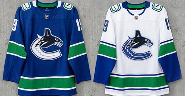
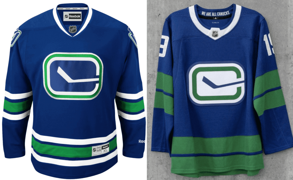
Home (old on left, new on right)
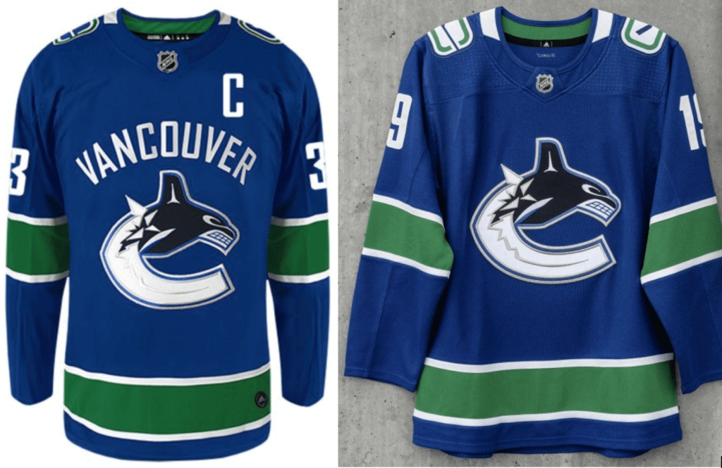
On the plus side, thank god they finally got rid of the embarrassing chest lettering. On the minus side, I’ve never liked the orca, changing the shoulder patches from blue to white makes them stand out too much (looks so clunky), and I still hate the collar.
Road (old on left, new on right)
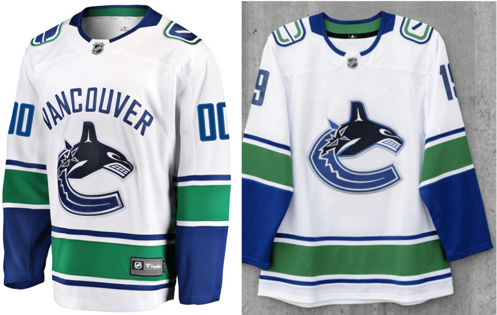
Same comments as above, although in this case I think the recolored shoulder patches are too faint. The contrasting patches worked better on the old white jersey than on the new blue one.
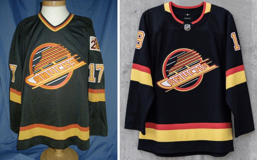
Stick-and-rink throwback (old on left, new on right)
The Canucks haven’t had a throwback in the Adidas era, so the “old” photo shown above is the Reebok design they had as part of their uni set from 2008 through 2017. As you can see, they’ve changed the crest’s background to white, which matches the original 1970s design, and I like how the green trim new version looks more like a “C.”
But they’ve really amped up the green striping and removed most of the white trim. As you know, green is my favorite color, but this feels like too much. Interestingly, this article includes the following quote from the team’s art director, Max Young: ““We used to have a rule, for many years, that green and blue never touched. There was always white separating them. We’ve kind of gone away from that now.” Too bad.
Flying skate throwback (old on left, new on right)
The Canucks have never worn this design before as a throwback (well, once as a one-off, but not as an true alternate that was part of their regular uni set for a given season), so the “old” photo shown above is a game-used 1990 jersey. We’ve known for nearly a year that they’d be reviving this one, and for the most part it appears that they’ve been faithful to the original. Not bad, although I would’ve preferred to see the flying V.
Hometown newspapers (or, really, any newspapers) tend to have pretty boilerplate coverage of uniform unveilings, but The Vancouver Courier has a pretty good assessment of this one. Sharp, well-written — recommended.
(My thanks to Phil for that last link.)
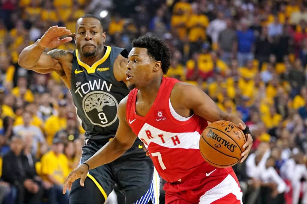
Meanwhile, over on the hardcourt: The Warriors played the final game in Oakland last night. Granted, this has never been the most uni-traditional team, from the numbers in the cable car to being the first modern NBA team to wear sleeves, but I still find it a bit surprising that they wore their BFBS alts for their Oracle finale.
I was surprised by how many people asked me if this was the first time in Finals history that neither team wore their team name or city name. No, silly — the first time that happened was six whole days earlier, in Game Four.
Once the game ended, several people also asked me if the Raptors were the first team to win the title while wearing a jersey without their team name or city. How soon they forget!
Congrats to the Raptors and their fans (including SportsLogos.net’s Chris Creamer, who lives outside of Toronto), who’ll have a small uni change to enjoy next season.
Click to enlarge
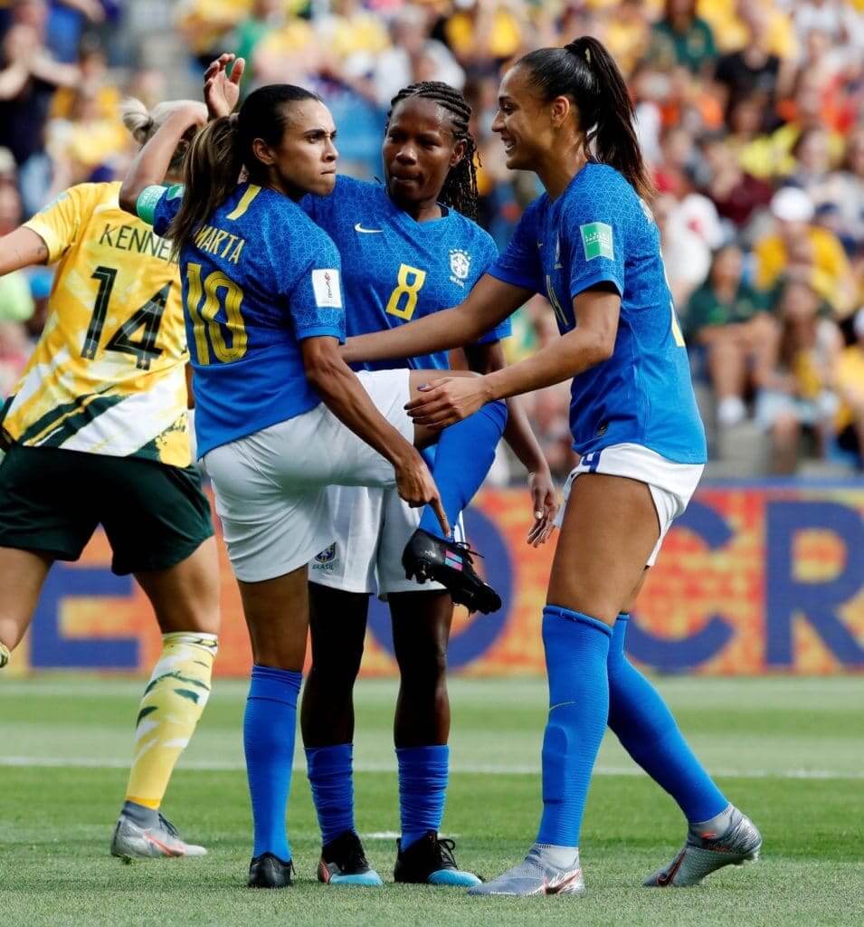
How aboot that: Interesting moment in yesterday’s Women’s World Cup match between Brazil and Australia, as Brazilian forward Marta scored a goal and then celebrated by lifting up her foot and pointing at a symbol on her boot — the symbol for gender equality in sports.
According to soccer writer Tim Stillman, “Marta has turned down all boot sponsorship deals to wear this symbol” and “Her most recent boot sponsorship deal expired last summer and she has gone without a sponsor for the last year or so to make this gesture at the tournament.” Good for her.
(My thanks to @ohhhsourry for pointing me toward this one.)

Click to enlarge
Stirrups aren’t the only things with wings: Love this late-1940s shot of the LSU track team, which at the time used a winged L! Dig the uni-numbered shorts, too.
(Big thanks to @valleyshook for finding this photo and to Chas Kelly for bringing it to my attention.)
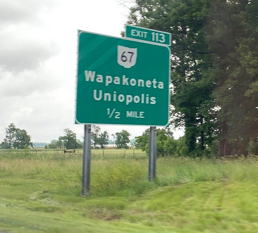
Ich bin ein Uniopoliser: Twitter-er @JasonRL78 reminded me yesterday about something I’d once known but had long forgotten: There’s a town in western Ohio called Uniopolis! I actually wrote a couple of grafs about it way back in 2006, when the blog was just a few months old, but at some point that knowledge became lost in the dark caverns of my mind.
As you can see, Uni Watch has changed a bit since those days, but one thing I wrote back then still holds true today: There needs to be a Uni Watch party in Uniopolis. Unfortunately, it’s a very small town (and getting smaller — the current population is 222, down from 256 when I wrote about it 13 years ago), and it apparently doesn’t have any drinking establishments. But surely there must be some Uni Watch readers in western Ohio who could organize a gathering in a nearby town, no? We could add it to our list of 20th-universary parties taking place on June 29!
This really needs to happen. Because let’s face it: If you’re reading these words, we’re all from Uniopolis.
Meanwhile, speaking of the uni-versary parties on June 29 (and June 27 for those of you in Paris), here’s the updated map and spreadsheet showing all of the parties that have been scheduled so far. Still nothing west of Des Moines, oddly — come on, you Mountain and Pacific Time Zoners, step up!
I should note that the Atlanta party, which will take place at Smith’s Olde Bar, is shaping up as a particularly good shindig. Reader Jason Von Stein, who’s organizing that one, plans to have a uniform contest (wear your best jersey — or a full uni!) and a trivia contest. Live music, too. Here’s that gathering’s Facebook page.
Remember, if you want to organize or attend a gathering in your city, contact party coordinator JohnMark Fisher.
Click to enlarge
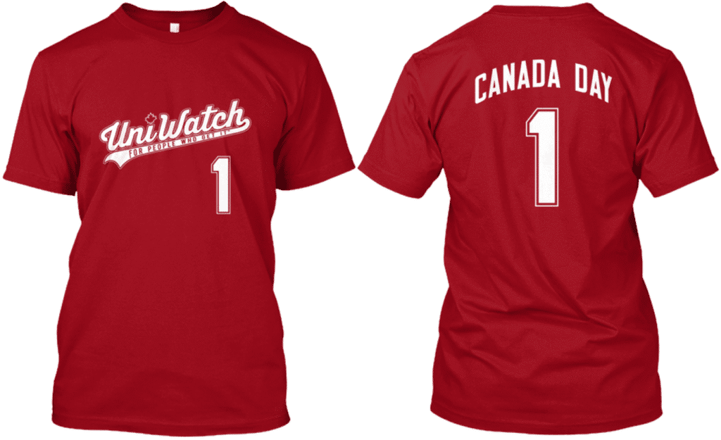
IMPORTANT national holiday reminder: With Canada Day and Independence Day both now just around the corner, our Canada Day shirt, stars/stripes shirt, and stars/stripes tank top are just the things to enhance your holiday enjoyment (or at least enhance the number of quizzical looks from your friends and family members).
Word to the wise: Based on Teespring’s usual production and shipping times, you need to order now if you want to get them in time for the holidays with regular non-rush shipping. Okay, end of sales pitch.
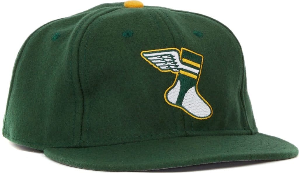
But wait, one more sales pitch: We had briefly been sold out of the adjustable version of the Uni Watch Classic Cap. I’m happy to report that adjustables are now back in stock, and we’re also fully stocked on all fitted sizes from 7 to 8. ordering details here.
Okay, now end of sales pitch.
The Ticker
By Anthony Matthew Emerson

Baseball News: Red Sox P David Price did not have the MLB150 patch on his right sleeve during last night’s start (from Jonathan Shaw). … Speaking of the Sox but not uni-related, here is an absolutely amazing article about Fenway’s organist (from @walbergLines). … Also not uni-related, ESPN has a cool story about MLB’s various changes to baseballs (from Mike Chamernik). … Players for the Delmarva Shorebirds, Single-A affiliate of the Orioles, wore pants from at least three different manufacturers last night (from Billy King). … The Wisconsin Timber Rattlers, who are becoming the Wisconsin Udder Tuggers on June 20, need help naming their cow mascot. … The American Association’s St. Paul Saints are wearing jerseys with “Ope” on them, a reference to the Minnesota accent (from Nick Hannula). … The CanAm League and Frontier League are playing an All-Star Game against each other tomorrow and are giving away a commemorative coin to mark the occasion (from John Cerone). … Vanderbilt players went HSOB — that’s home state on back — for their College World Series warm-ups (from Phil Bergman). … Royal Key toured Stanford’s equipment facility (from Griffin T. Smith). … These Little Leaguers have the 2019 Marlins logo on their shirts and and the 2012-2018 logo on their caps (from Billy King). … The A’s still have their gold alternates as part of their uni set, but they haven’t worn them even once this season because the pitchers haven’t chosen to wear them (thanks, Phil).

Football News: Reader Jacob Ventura notes that when the Patriots unveiled their first Flying Elvis uniforms in 1993, LB Andre Tippett was wearing a sock design that the team never ended up wearing on the field. … Good Morning America was broadcast live from Philly yesterday and had former Eagle John Runyan on. Runyan gave customized Eagles jerseys to the hosts, including former Giant Michael Strahan. Strahan returned the favor by giving Runyan a customized Giants jersey. …
Here’s some rare photos of Clemson with purple paw helmet stickers, worn from 1985 to 1988 (from @ClemsonUniforms). …

Hockey News: Remember yesterday’s sublede about various rec league hockey teams calling themselves the Hat Trick Swayzes? Brad Pramberg found a 2011 article about that phenomenon. … Brad Gillies notes that the Stanley Cup Champions caps have the Fanatics logo on the side, rather than the New Era logo. Considering Fanatics is literally just a retailer, not a manufacturer, it’s like if Kohl’s had their logo on the hat. Maybe the team’s logo should be the only logo on the hat! … These 1996 Rochester Americans unis absolutely deserved the Calder Cup and maybe even the Stanley Cup, too (from Derek Weber). … The Orlando Fire Department’s hockey team has some gorgeous Ottawa Senators-inspired sweaters (from Kyle Speicher).

NBA News: The New York Times says that “Oracle” is the perfect name for the NBA’s oldest arena (from Mike Chamernik). … Bruins fans (rightly) freaked out when Zdeno Chara played in the Stanley Cup Final just days after breaking his jaw. But it wasn’t the first time it had happened in Boston sports: Celtics F Gerald Henderson played the day after he broke his jaw in the middle of the 1980 regular season and wore a neck brace on the floor! (From Antonio Losada.)

Soccer News: Yesterday’s Ticker mentioned that the French top league Ligue 1 would be renamed as Ligue 1 Uber Eats. Now it turns out that every match ball will be delivered to the pitch by an Uber Eats driver (from many readers). … Charleston Battery wore home kits and Atlanta United wore road kits in Atlanta for the US Open Cup. The match had originally been scheduled to take place in Charleston (from Gregory Koch). … DC United will wear Pride kits on June 26 (thanks, Jamie). … New away kits for Brighton & Hove Albion of the Premier League (from Adam Vitcavage). … The Dynamo’s stadium has a new corporate name that’s close to the old corporate name (from Ignacio Salazar). … This article (in Portuguese) reveals that from 2020 onward, the Brazilian women’s national team’s crest will only carry stars for World Cups the women’s team has won. The crest currently features five stars, for the five World Cups the men’s team has won. Brazil has — as of this writing — not won a Women’s World Cup (from Raul). … New away shirt for Middlesbrough FC (from Ed Zelaski). … Also from Ed: New home shirt for Hull City. … The design of Botswana’s new kits sort of makes it look like the players are wearing faux neckties (from Lucan Denfield). … New kits for PSV.

Grab Bag: University of Missouri-Kansas City has a new mascot, the Roos (from several readers). … The 2020 Kentucky Derby logo has been released (from Ben Garner). … The USGA has added a trophy to caddie bibs to signify players who are former champions (from Chris Howell). … President Trump’s proposed new Air Force One livery looks similar to his own private jet (from @verbDC). … Is this a new Carrier Dome logo? (from @GenerationInk). … If you know where to look, you can find all sorts of demonic, anti-Christian messages in a Monster Energy can — or at least one person thinks so (from James Gilbert).
The glove-repair auction winner is Michael Gray, who’s gotten himself a complete glove re-lacing/reconditioning and a glove-leather wallet for a bid of $150, with the proceeds going to Uni Watch. Congrats to him, and my repeated thanks to Jimmy Lonetti of D&J Glove Repair for donating his services.
I find teams only revealing jerseys, rather than uniforms, to be the single most annoying thing about the uni-verse.
To illustrate, let’s look at the soccer reveals today. Is anything besides the shirt visible?
Brighton: No.
Middlesbrough: No.
Hull: No.
Botswana: Yes.
PSV: Yes, a bit of shorts.
Also, when I saw the Canucks said they were revealing their “collection,” combined with normal people wearing jerseys, I actually thought it was a merch thing and not the new uniforms.
Thank you so much for the kind words Paul. I’m honored to be apart of this wonderful anniversary.
I submitted this incredibly late last night:
Auburn is making their first appearance in the College World Series in 22 seasons. Here’s a look back at Auburn’s previous 4 trips to the CWS with some absolutely beautiful uniforms.
link
The Canucks have worn the black Flying Skate as a throwback before. A game in early 2016 against Toronto. Goalies had matching gear and masks.
link
link
OK, but it’s never been part of their regular rotation as an alternate — only as a one-off. That’s what I meant. I’ll adjust the text.
Ture – the black uniforms will be worn 3 times this year. If I end up going to one of those games I will need to break out my black, salmon and yellow Canucks garb instead of the usual blue and green I wear to games.
Still disappointed that the Flying V did not win the vote.
The orca is a symbol of ownership, The Orca Bay Corporation (Now Canucks Sports and Entertainment) , but also is a symbol of the city and the Haida people who are native to the area. I think it is far more apt a symbol for a Vancouver team than the “Flying Plate of Spaghetti” or the “C” in the rink that no one notices until it is pointed out to them. I personally like the Johnny Canuck logo, but they never seem willing to implement in anything besides merch and the odd goalie mask.
Of their past and present logos I think they’d look sharp wearing the V with Johnny Canucks head. Its clean, simple and easy to identify and would look good as a Crest. A real shame they don’t use it tho.
link
Hey Paul! Long time reader from Lima, Ohio. Uniopolis is a quick 15 drive from Lima and I’d be happy to represent UniWatch there, even if it’s just a quick appearance for a photo next to the sign.
Awesome, Jared. I’ll email you to discuss further.
I would love to make a jersey for a fictional Uniopolis hockey team.
Ooooooooohhhhh…..
I’d buy that. -C.
I’m from New Bremen, which is around 30 minutes south. If we can work out a time, I’d be glad to meet you there!
I know Munch Suchland is a Uni Watch reader also from the area, but I don’t have his contact info. Not sure if he’d be willing/able to join as well.
I live in the greater Columbus area about an hour away. Sadly I will be in Pittsburgh on the 26th (I may join the party there), but I would love to be a part of more Uni Watch gatherings with you all!
Fanatics actually did manufacture the Stanley Cup Champions hats for the Blues, as well as the Capitals last year. They’ve been ramping up their manufacturing wing in recent years, and sadly I think we’ll be seeing more and more of the Fanatics logo on hats and clothes in the future.
In regards to the mismatched logos on Little League uniforms, this is common in the league my sons have played in. I have complained, but they are confined by the supplier and the inventory. (Some indirect affiliation with MLB) Additionally, we were restricted to only current teams – no Expos, Senators, Browns, Grays, etc. Rather disappointing. I believe part of being a coach is passing on some of the history traditions too.
Those Rochester Americans jerseys have been worn as alternate jerseys over the years. They did win the Cup in 1996 wearing them, but they’ve worn them over other seasons.
Fun note: in 1999, they lost to Providence in the Final and didn’t wear them. In 2000, they lost to Hartford in the Final and didn’t wear them.
Teebz: Do you happen to be in the Rochester area? I’ve been holding out hope that more people might express interest a having a Uni Watch anniversary party here, but so far there are only 2 people noted on the master spreadsheet (one is me, the other is my neighbor across the street!!!). So I’ve been trying to find other Uni Watchers in the 585. If anyone else reading this is in Rochester, and would be interested in having a party here on the 29th, feel free to chime in.
Too bad they couldn’t use the white version of the flying skate. It’s well past time for NHL to switch back to whites at home.
Minor upgrades all around for the Canucks. Count me as not caring so much about “jersey only” reveals in hockey. The pants are a minor thing in hockey uniforms and I’m guessing we can be safe in assuming they’ll not be changing anything about the socks.
I feel like I’ve seen some teams occasionally wear white at home over the last few years. I know it’s more of the exception than the rule, but if teams do it here and there, is there anything in the NHL rules that would prevent a team (or teams) from breaking protocol, and just wearing their whites at home all the time (similar to the Cowboys in the NFL)? And I agree, I’d like to see white at home in the NHL make a return, maybe just because that’s what I grew up with, and also because they still do it that way in college hockey (which I probably watch more of these days than the NHL). That said, I’ve started to get used to color at home.
I don’t know what the rule book actually says about it, but that one team deciding to wear white at home would force teams on multi-game road trips to haul around two different sets of gear with them instead of just traveling with their white set like they do now. In the NHL a team might have 3 or 4 games in a week all in different cities. It’s cheaper and easier if they only need to bring one uniform set with them.
Fanatics actually bought Majestic a couple years ago, so pewrhaos this is a sign of things to come.
link
Maybe this is too corny, but I would think it would be cool if you talked with Uniopolis about having a parade and then dinner in the town a year or two from now. I imagine it wouldn’t be larger than 50 people, but you would have locals and UniWatchers wearing a variety of jerseys.
Boo to the third Canucks blue jersey with less white trim. It’s not a question of too much green on the jersey, it’s truly not enough white. The blue and green will get muddled and look like one dirty color. Thank goodness the numbers are white though. Legibility won’t be a problem. But that’s easily the worst jersey in the rotation. Too bad the stick in rink is front and center on that jersey.
Other blue jerseys: sure, it’s an upgrade. City name arched across the top was dumb. That alone is addition by subtraction. I’m indifferent to switching the colors of the stick in rink shoulder patches. A white veiny maple leaf over white numbers on the blue Maple Leafs jersey isn’t too jarring, so this should look fine on the ice.
The 1994 special: sure, I guess it’s as good as it gets, if you have to graft it onto the Adidas template. I personally like those colors, and I get why the fans hold onto 1994, but all that being said, I like that it’s just a special, and not a permanent part of the look. Better for the Canucks to do blue and green AND WHITE well!
The third is to pay homage to the striping on the very first NHL Canucks blue jersey. The blue and green touching does look muddled and it was a good idea a few years into the existence in the 1970s to change the striping so that the colours did not touch. Even more muddled with no white on this new third.
Would have been nice to have at least the one white stripe between the 2 green stripes.
No surprise from the Aqulinis that we were getting a blue third and Stick-in-Rink (version 3.0) was going to be the crest. A bit surprised no Johnny Canuck at least as secondary patch like on the old third.
I would have preferred the third to be green with Johnny Canuck involved.
Perhaps the Warriors wanted to make sure “The Town” got one more time on the court in Oakland?
Paul, you’ll see the Flying V in 2 weeks…loved your gig on MSG150. I hope they make it a regular spot. It’s good to see some uni-love out there!
I don’t think the Canucks have ever had a particularly great look in their entire history, and that’s owing to some lame logos. I actually love every color scheme they’ve used, but the logos take the whole look down a few notches.
The “stick-in-rink” might be the blandest, most generic logo in sports. The “C” looks more like an accident than it does clever design. It’s a much worse version of the Brewers’ ball-in-glove logo.
The “flying spaghetti” tugs at my nostalgia strings, but it’s a mess. First, it needs to be noted that one of the reasons that it barely looks like a skate is that the skate design used is extremely old. It looks like something that would have appeared in an NHL game in the 1930’s. Second, it just doesn’t work from any kind of distance. It’s just a bunch of squiggles in a vaguely hockey-like shape.
And then there’s the Orca. Not bad on its own, but the corporate lameness of it is just too hard to overlook.
I know this has been shown before – do you think Johnny Canuck would be better? link
I’ve always hated the Orca logo, even without knowing the corporate connection until recently.
I love blue, green & white together, seems like they could create something nice out of those.
Lee
Yes Cleveland clinched with a “C” jersey, and the Yankees clinched many times with an “NY”, and I’m sure are lots of other examples. But those stood for Cleveland and New York, respectively. In this case there is no reference at all to Golden State Warriors” or “Toronto Raptors”. Just “North” vs. “The Town”. Bad decision for both teams, especially Toronto.
What’s particularly interesting is that both uniforms worn will likely never be seen on court again, as the Warriors are getting new uniforms, and the raptors wore their “Earned” design, which, as far as I know, teams will change every year, much like the “City” uniforms.
Though I wouldn’t be surprised if the Raptors make an effort to keep the uniform they clinched the title in a part of their rotation.
Fanatics has been manufacturing clothing and hats for awhile now…
right?
In what city is the Fanatics Manufacturing Plant located?
Lee
The Warriors clearly wore their “The Town” throwbacks in game 4 adn 6 as a nod/Thank You to Oakland as they would be playing across the bay. Yes, it’s BFBS… but it was a nice gesture.
The hats the Blues wore with the Fanatics emblem is consistent with last year’s on ice Stanley Cup hats and shirts as well as other gear that the players wear. Fanatics used to be just a website that sold other brands gear but they now are also a manufacturer. Hate to break it to you, but the ticker is incorrect with this one. Fanatics has also been manufacturing and selling the replica jerseys for the NHL, which even the players parents seem to get (Brian O’Reilly – Ryan O’Reilly’s dad). This article talks about Fanatics vertical manufacturing link
UMKC has been the Roos for as long as I can remember. They just did a re-brand.
Redesign, not rebrand!
I will be knocking back a few long necks of budweiser in your honor on 6/29 Paul, Phoenix party or not.
I know it’s not exactly “Uni…,” but over the hill from the house where I grew up is an old mining town called “Unionville” and it’s also in Ohio.
I lived up near Uniopolis for two years, not that long ago. They always reminded me of each other when I saw the signs to Uniopolis.
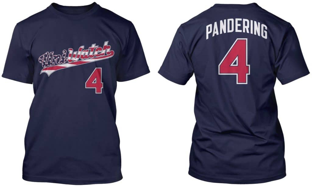
I’m not a t-shirt wearer, but the Pandering t-shirt is tempting.
With the Raptors winning a title on Thursday night, every team that has worn the Nike wishbone jersey when it was first introduced in 1999-2000 has won an NBA title: Lakers (three-peat TM), Pistons (once), Heat (three times), Mavericks (once) and Raptors (once), with the Heat and Mavericks winning all of their titles while wearing that design and both teams in the Finals donning that design in 2004 and 2011.
The Bobcats also adopted that design for two seasons before they folded so I won’t count them since they weren’t one of the original five teams. Now if Jordan’s Hornets ever win a title then technically it will be 6/6 teams, but for now in my book it’s 5/5, even though the Raptors has dropped them three seasons ago in 2015.
EDIT: Lakers won five titles wearing those jerseys (three-peat TM plus two more with Gasol).
Josh Kantor is one of the few things I really like about the Bosox. He’s super talented and an asset to the Fenway experience. And he plays the best requests! And he’s fun on social media too.