Click to enlarge
Paul here, pinch-hitting today’s lede for Phil, who’s off at a bonspiel (read: curling tournament).
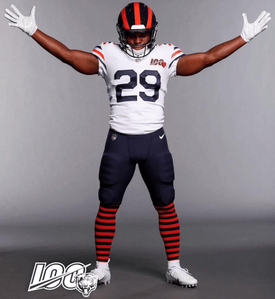
So: The Bears unveiled their new throwbacks last night. As we’d been expecting all week thanks to last Sunday’s retail leak, the design turned out to be from 1936, complete with the hoop-striped socks. The one thing that the retail leak didn’t show is that the jersey, like all of the Bears’ jerseys this season, will carry the team’s centennial patch.
Note that this will be the rare (but not unheard-of) NFL jersey without any TV numbers.
Happily, it’s easy to simulate the old leatherhead helmet design using the Bears’ existing navy shell, thereby keeping them within the bounds of the one-shell rule. I’m a little surprised they’re going with a navy facemask instead of old-school grey, but it doesn’t seem like a big deal either way. Meanwhile, note the blank nose bumper — a nice touch for a throwback.
Here’s a rear view (click to enlarge):
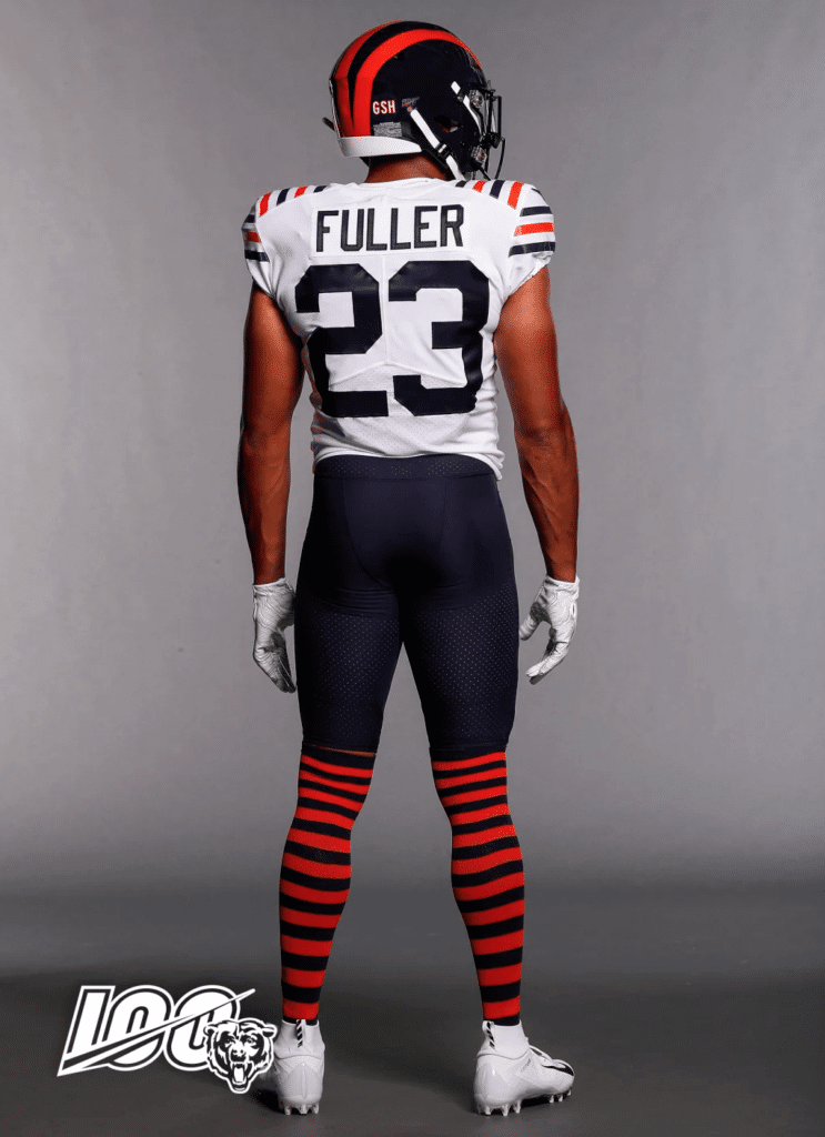
As you can see, the “GSH” perma-memorial for George Halas is on the back of the helmet instead of its usual sleeve positioning — a good move.
Personally, I love this design and can’t wait to see it on the field. The Bears will wear it for two home games this fall: against the Vikings on Sept. 29 and against the Cowboys on Dec. 5 (a Thursday). Since the throwback jersey is white, the road teams will wear their colored jerseys for those games (which means Dallas will be wearing blue, for those who believe in the curse or whatever). According to the Gridiron Uniform Database, these two games will mark the first time the Bears have worn white at home since 2010, and only the fifth and sixth times ever.
This uniform replaces the team’s Monsters of the Midway throwback, which is being retired, at least for now. (They’ll also wear their retro orange alternates for a game this season. To my knowledge, the date and opponent have not yet been released.)
You can learn more about this uniform, and see a gallery with 20 additional photos besides the two I’ve shown here, on this page.
The rest of today’s content was prepared by Phil, plus the Ticker by Anthony. I hereby hand the baton to them.


Your 2019 Women’s World Cup Kit Preview, Part I
By Phil Hecken, with Kyle Evans & CJ Fleck
Follow @PhilHecken
The 2019 Women’s World Cup has already begun — kicking off yesterday, June 7th and lasting for an entire month. And once again I’m back with my “soccer guys,” Kyle Evans and CJ Fleck, who have been reviewing the kits of the beautiful game for several years on Uni Watch. There are a total of 24 teams playing and we’ll take a look at half the teams today (Groups A through C), and the other half tomorrow (Groups D through F). Click any image to enlarge.
Here’s Kyle & CJ:
Thanks Phil! Glad to be back to preview the kits for the Women’s World Cup, which is taking place in France from June 7th to July 7th. This is the 8th edition of the tournament, and the United States are the defending champions and have won three of the seven titles. This is just the second time that the tournament will feature 24 teams, which means there are plenty of kits to discuss!
Group A

France (hosts)
The hosts will be wearing the traditional French navy / white / red primary kit and pair that with a white with navy dots secondary jersey.
Kyle: You can’t go wrong with the classic primary look and the secondary works well for me. Easily one of the best sets of kits in the tournament.
CJ: I’m sure the dots are pure marketing: I’d have to see it on the field. But, France is timeless, so they get a good.

Nigeria
If these look familiar, it’s because they are the same pair of kits worn by the Nigeria men in the World Cup last summer. The primary jersey received a lot of attention at the time and became a fashion symbol off the pitch as well.
Kyle: That primary jersey is just as aesthetically pleasing now as it was a year ago.
CJ: Still good as ever.

Norway
Norway will feature a red to navy gradient jersey and a white jersey with a red and navy horizontal stripe pattern on the top.
Kyle: I’m rarely a fan of gradient designs, but for some reason I like this one – maybe it’s the particular colors? And the flag color stripes are a lovely touch on the white jersey.
CJ: Flag stripes? Count me in. Gradient? Count me out. Good and stupid, respectively.

South Korea
South Korea’s kits are also a carryover from the men’s World Cup last summer and include a red over black primary and a white secondary with a curved red and blue pattern drawn from their national flag.
Kyle: I’ve really wanted to love that white jersey, but I’m still not sold on the execution. Why all the small horizontal lines?
CJ: I have to agree with Kyle, I’m not sold. Points for trying? Push.
Group B

China
China have traditionally worn red, but are moving towards orange this summer. The primary jersey seems to be a shade between red and orange, and the secondary is gray over orange.
Kyle: Other than the Dutch, orange is not a widely used color on the international level (there were exactly zero orange jerseys in the men’s 2018 World Cup). Red may be the “usual” look, but I’m okay with sliding down the color spectrum a bit especially when it’s mostly unused territory.
CJ: Unlike Kyle, I’m less concerned with color choice here. Those sleeves automatically get a stupid from me as I cannot stand them.

Germany
The Germans introduced new jerseys for their women’s team, which include a unique German flag colors (black / red / yellow) design on the primary white jersey, and a mostly maroon secondary kit.
Kyle: I’m always impressed with Germany’s kits, and these are no exception. Unlike the small horizontal stripes on South Korea’s white jersey, I like how Germany’s design integrates (rather than overlaps) the front numbers.
CJ: This design seems to harken back to previous German kits that use the flag motif on the front, and I have to say I like that. Not a great change kit, but overall good.

South Africa
One of four teams making their Women’s World Cup debut, South Africa will wear yellow and green and feature stripes in different ways. The primary yellow jersey has green stripes on the shoulders and sleeves, and the green secondary jersey has horizontal light and dark green stripes on the entire jersey.
Kyle: A solid pair of kits, especially the primary yellow / green / yellow. I love the way the sleeve stripes complement (rather than overwhelm) the entire uniform.
CJ: I agree with Kyle here, which I’m aware is contradictory to my earlier statement. Maybe it’s a color scheme thing. Push.

Spain
Spain will wear red (with a sublimated diamond design) over navy for their primary kit and a mostly white secondary kit.
Kyle: Nothing wrong with Spain’s traditional look, and as was the case with Germany’s secondary jersey I’m trying to ignore this Adidas random vertical off-color stripe design or whatever it is.
CJ: I’m not sure what’s going on for that secondary kit, but I don’t like it. My uni-gut says so. But, classics are classics, so overall push.
Group C

Australia
Australia make a splash with a 90’s-esque yellow, green, and white primary jersey and retain a green secondary jersey from the men’s World Cup.
Kyle: Most people will love it or hate it, and I’m in the “love it” camp. Really unique and I know CJ loves when the socks match.
CJ: Guilty as charged. But, I’m on the fence here. The 90s brought a lot of things to the table, but uniform design was not a strong suit. I can’t call this stupid though because it’s executed so well. A reluctant push.

Brazil
A traditional pair of kits for Brazil, with yellow / blue / white primary and blue / white / blue secondary. There’s a sublimated / gradient design on the blue jersey.
Kyle: You’ll never see me (or anyone for that matter) complain about the classic Brazilian looks.
CJ: It’s Brazil. Good.

Italy
Le Azzurre will be in the tournament for the first time in 20 years and will wear a solid blue or solid white jersey.
Kyle: Simple but effective – this is more or less what I picture when I think of Italy on the international level.
CJ: Again, it’s Italy. Good.

Jamaica
Making their World Cup debut, the Reggae Girlz will sport a yellow / black / yellow primary kit and a black* / yellow / black secondary. More than half of the black jersey contains a yellow and green diamond pattern design.
Kyle: Ugh. No thanks to a jersey in which the company logo (Umbro) is used as the main visual element and design of the jersey. The yellow jersey is nice though.
CJ: Yikes. I can’t imagine this will be very fashionable, unlike some of the other wild designs recently. An easy call for me: stupid.
What are your favorite (and least favorite) jerseys and kits in this edition of the Women’s World Cup? Feel free to share in the comments and follow us on Twitter @KyleEvans17 and @RealCJFleck.
Awesome guys, thanks for the preview! We’ll be back tomorrow with the second set of Groups for the Women’s Draw!

Guess The Game…
from the scoreboard
The game has returned! At least for a trial basis, but I got a lot of positive response to its return, so we’ll see how long we keep this one going.
Today’s scoreboard comes from Ronnie Bolton (though he didn’t submit it as such).
The premise of the game (GTGFTS) is simple: I’ll post a scoreboard and you guys simply identify the game depicted. In the past, I don’t know if I’ve ever completely stumped you (some are easier than others).
This one probably rates a 3 out of 10 on the difficulty scale.
Here’s the Scoreboard. In the comments below, try to identify the game (date & location, as well as final score). If anything noteworthy occurred during the game, please add that in (and if you were AT the game, well bonus points for you!):

If you guys like this, and want to continue this as a weekly feature, let me know in the comments below. You’re welcome to send me any scoreboard photos (with answers please), and I’ll keep running them.
Father’s Day 2019

Next Sunday is Father’s Day, and I will be continuing my tradition of posting photos of all the Uni Watch readership “Dads In Uniform” as I have for the past several years.
It’s a tradition that began in 2013, and continued in 2014, 2015, 2016, 2017 and last year as well. I’d like to keep that tradition going strong for 2019.
So, dear readers, I’d love to feature a photograph (please just send ONE) of your father in uniform (it doesn’t need to be a sports uniform — military, sports, work — any uniform will do) along with a short (please try to keep it to 100 words or less) description of your dad in his uniform, or how it relates to him. You can use prior years as a guide to what to say. Even if you’ve submitted before, feel free to do so again.
This is always a very special day and I’d love for as many of you (particularly those who’ve never sent in a photo or description of your dad in his uniform) to participate.
Please send me an e-mail with the subject “UNI WATCH FATHER’S DAY 2019” along with a photo (one picture please) and description, DEADLINE Thursday (June 13) at 11:59 pm. I’ll run all submissions next Sunday, Father’s Day, 2019.
Thanks. Looking forward to it, once again!
The Ticker
By Anthony Emerson

Baseball News: The Brewers wore Negro League throwbacks last night, and Christian Yelich did not have a logo on his helmet while the rest of the team did. Magically, the logo appeared for his next at bat (from Steve Hurley). … Mets OF Dom Smith suffered some torn pants after sliding last night (from @UntillTheNight). … Rangers OF Hunter Pence seems to be wearing a cut Stance sock as a sleeve in this pic (from Cody J. Edwards). … MLB’s Cut4 asks, what is the “most athletic” uni number (from Chris Avila). … The Hartford Yard Goats became the Hartford Steamed Hamburgers yesterday. Front view here (from Joe Nocella). … The New Hampshire Fisher Cats celebrated Greek Heritage Night with special unis last evening (from Mike Lucia). … BFBS for Lousiville in the Super Regional opener (from Chris Mycoskie). … Grey jerseys with brown pants for Rowan University last evening (from John Elbertson).

NFL/Pro Football News: A pylon got stuck to Jets WR Rob Moore during a game in 1992. Has this happened before or since? (from Mike Chamernik). … Unsurprisingly, the Packers are adding a helmet decal in memory of Bart Starr (thanks to everyone who sent this in). … The Patriots have always been of the mind that anything worth doing is worth overdoing, and it was probably with that in mind that Robert Kraft gave the champions the largest Super Bowl rings ever (thanks, Paul). … The Ozarks Mountain Express, a new team in the Elite Indoor Football League, has one of the worst logos I’ve ever seen (from Kate Sutter). … Brutal orange-vs.-red matchup in the CFL last night.
College/High School Football News: Here’s a great shot of the letters and numerals for JMU’s field being laid out before the season (from Andrew Rader). … Here’s how the CFB150 patch will look on Ole Miss unis. Unbelievably garish (from Griffin T. Smith). … New unis for Wisconsin-Oshkosh (from Josh Nelson).

NBA News: The Athletic has an article (paywall) about rejected Dallas Mavericks logos from the 1990s (from Tod Meisner). … Also posted in the soccer section: The Celtics gave Benfica legend Luisão one of their BFBS jerseys, while Daniel Theis got a soon-to-be retro Benfica home jersey (from @mikeDfromCT). ..

Soccer News: Cross-listed from the NBA section: The Celtics gave Benfica legend Luisão one of their BFBS jerseys, while Daniel Theis got a soon-to-be retro Benfica home jersey (from @mikeDfromCT). … Agence France Presse has come out with a graphic of all the Women’s World Cup home kits (from David Hanson). … Liverpool’s away kit has been released. Anyone else think they look exactly like Spurs’ home kit? (thanks, Jamie). … Real Madrid has finally released its long-leaked home kit (thanks again, Jamie). … Here’s a close-up of Rio Ave’s 80th anniversary patch. Their third kit has also been released (from @mikeDfromCT). … Cambridge United have released their away kit, inspired by their 1993-94 away kit (from Ed Żelaski). … Also from Ed: Poland has teased its centenary shirt, which will be released sometime today. One more from Ed: New kit advertiser for Nottingham Forest. … The following are all from Josh Hinton: The Premier League’s ball has been leaked. … Barcelona’s third kit has been leaked. … Derby County’s home kit has been released (also from Ed Żelaski). … EA Guingamp has a new crest. … Troyes’ new home and away kits have been released. … Plymouth Argyle’s home and away kits have been released.

Grab Bag: I still call it the Coliseum’s field (thanks, Paul). … Tequila sunrise has made its way to esports, from Houston’s Overwatch League team (thanks to everyone who sent this in). … Paul’s least favorite rugby match features both teams and the ref in purple (from @RallyLamb). … Former Jeopardy! mega-champion James Holzhauer says the show’s producers have created a new rule preventing contestants from having team logos in their signatures because of him. For reference, here are all of his signatures during his run on the show (thanks, Jamie). … Rich Energy has pulled its logo from Haas F1 cars after Rich lost a copyright case (from @VictoryCB). … Today’s sign of the apocalypse: NASA is opening the International Space Station to “commercial and marketing activities.” Just last week, I turned in a paper on Stanley Kubrick’s capitalist space in 2001: A Space Odyssey, and how it contributed to the film’s sense of dystopia.
The Bears wore white at home a lot in the 30s. Not sure how it’s calculated that this year’s throwback games will be “only the 5th and 6th times” they’ve done it. Are we not counting Wrigley Field games?
Hmmmm, good points. Like it says in the text, I was just going by that Gridiron Uniform Database page that I linked to. If any of the GUD guys are reading this, little help..?
To clarify:
The list of White At Home goes back to 1957. Prior to that season, there was no real distinction as to what jerseys colors were worn by what team and where, other than the colors should contrast.
The GUD starts the WAH list at 1957 because that was the first season when the NFL decreed that one team wear a white jersey and one team wear a jersey of color. In 1964 the rules were loosened a bit so that the home team could choose between their color jersey or their white jersey for select or all games.
Hope this helps.
Great. Thanks!
WWC Kits – A random observation… Thinking of the primary uniforms for France and Brazil (both of which I absolutely love) an always “classic” look is when the shirt, shorts, and socks are all different colors and there is no loud striping or pattern. Those two are also instantly identifiable which is great for them. Are there any other countries that pull this off so well that I am not thinking of?
Mexico with green-white-red is pleasing and consistent. I’m starting to think we (USA) should adopt red-white-blue and stick with it, though maybe that’s too similar to France…
Also Columbia and Costa Rica. That’s my favorite look and I’m glad someone else appreciates it. 3 distinct colors. It almost always works. And not just in soccer. Ole Miss when they go blue helmet, white jersey, and gray pants looks phenomenal. Titans when their helmets were white. Patriots in white (silver/white/blue) … other combos seem out of balance in comparison. It’s why I’m starting to prefer softball tops in MLB too. The contrast is awesome.
Others include Cameroon (green-red-yellow), Scotland (blue-white-red, same as France) and Spain in the past (red-blue-black).
Mexico switched to mono-black this year for the second time, though.
Oh man, good call on Cameroon. Their green-red-yellow is eye candy.
The scoreboard game was a tricky one but I found it finally.
link
What threw me off was the empty bleachers. Wouldn’t have expected a de-facto playoff game (really a three game tiebreaker series that was considered an extension of the 162 game season) to be played to a more than half empty Dodger Stadium.
It was the top of the 8th, so all those fans had already left.
Even then, the attendance was only 25,000ish.
The reason behind the red vs. orange Calgary Stampeders and BC Lions tilt in Vancouver last night? CFL teams wear one set of jerseys during the 2-week pre-season. Some teams will wear their dark jersey and some their white, both for their home game and road game.
However, if the league is going to schedule BC vs. Calgary, and both teams wear dark in the pre-season, they cannot do this as colour vs. colour. Someone has to break out the white jersey.
This is the 2nd year in a row we’ve seen this.
On the positive note, it was unexpected that the Lions would go orange over orange for their new primary home look. Yet it looks not bad out on the field. It gives a subtle nod to the original BC Lions back in 1954 who started their existing wearing black numbers trimmed in white with orange over orange.
link
I believe that this game set the then record for longest game in time. Subsequently broken
For the Bears, going with the navy facemask instead of old school grey is fine. Not really compromising the throwback look because the Bears didn’t wear grey masks anyway. They really didn’t wear masks at all in 1936.
Oh, for sure — there’s no way to match a mask that didn’t exist. I just meant that the navy mask is more of a contemporary look, while the grey mask is more of an old-school look.
The navy mask was actually a good idea in this instance (coming from someone who LOVES old school grey masks) because it’s unintrusive… A grey mask would have really stood out, and since, as stated above, they didn’t wear masks back then, it blends in nicely, allowing you to focus on the parts they actually wore back then, albeit short sleeved and squished together striping.
As a Bears fan I like these throwbacks, but the NOBs are hyooooge. Why?
With the stripes covering some of the shoulder real estate, this might have been a good opportunity to try the NOB-under-the-number style that you sometimes see in other sports.
No, names under the number wouldn’t work in football. The jerseys are too tight; you’d have less space to work with as opposed to across the shoulders. The reasons it works for women’s hoops are because the jerseys are a bit baggier and because the sports-bra-type cuts that you see on women’s jerseys reduces the space available above the number to put a name.
Would have been worth it to ask the NFL to go no name at all on the back on the field for these throwbacks. It is the 100th anniversary after all. You could still sell the jerseys retail and put names on the back if the team wanted.
NNOB is a little icing on the cake for a good throwback uniform. I think back to the CFL in 2009 when every team wore 1960s throwbacks. Each team was able to go NNOB (though they still wore jersey advertising which helped hinder it).
link
Wade, I’m totally with you on NNOB. I had been assuming that the NFL didn’t allow NNOB jerseys anymore given how they put names on all the original 1994 throwbacks.
The normal jersey cut, with the big panel across the shoulders, really lends itself to putting a NOB there, so in ’94 I don’t remember any of the jerseys really looking hideous.
NOBs aren’t really necessary in this era of copious TV graphics and stadium Jumbotron displays. I’d love to see them disappear entirely.
I’m sure the dots are pure marketing
They aren’t dots, they’re hexagons. Nike uses the hexagon as a graphic symbol to represent France.
Interesting detail! Though it’s gotta be because the FFF’s crest is a hexagon link
“L’hexagone” is a common nickname for/abstract representation of France. The FFF’s crest is a hexagon.
Here is an up-close picture: link
France is thought of as a hexagon due to the shape of the country: link
Only the Bears, in their 100 years of history, would pick a jersey from a year the Packers won the NFL Title. Go Pack Go!
No offense intended, but the player modeling the Jamaica change kit really does look like a male.
He is. They gave the men’s team the same ones at the same time.
The Houston eSports team is just another team that doesn’t know how to do the rainbow jersey. The number SHOULD NOT be split between the white top and the stripes. How hard is to google “Houston Astros rainbow jerseys” and find photos of how the Astros wore them and then mimick that? If you’re not putting the circle on the back like the original 1975 versions, then the number should rest completely below the white top and solely in the stripes (like the 1976-86 versions).
If you can’t get the number on the back right, don’t do it at all.
“How hard is to google “Houston Astros rainbow jerseys” and find photos of how the Astros wore them and then mimick that?”
Harder than you might think, because Houston’s several attempts at reproducing them always have the stripes too far down the back, pushing the number much too far down. Check out link, in which poor Mr. Wallace is stuck lifting his jersey out of his pants by an inch or two so that his number isn’t stuck in there.
In the real-life ’80s, the numbers were still positioned low, but link. Majestic, for whatever reason, likes to shove every jersey element several inches downward with more space between each element (collar, NOB, number). It drives me nuts.
Love the Bears throwbacks. One nitpick though. The front and rear number fonts don’t seem to match. Big deal or no?
Love the Bears uniform. However they should be time appropriate and wear black shoes. Also not a fan of Fuller’s short pants, which maybe stand out more with these great striped socks.
Although I like both the Brazil and Italy kits, it is disappointing to see that they are using the men’s crests that represents their World Cup championships. Brazil has 5 stars and Italy has 4. They should do away with that element and display the star when they earn it. Germany displays two stars as their women’s team has won two World Cups as opposed to the men’s team who have won four.
All I can think of about the Bears throwback is “I want those socks!”
Me too; will they sell them?
The number 2 font seems inconsistent between the 29 and 23 jerseys. The 2 on the back of the 23 jersey seems incorrect.
Game is Giants vs Dodgers 1962 National League play-off Game 2 Oct 2.
Jack Smith pitching Orlando Cepeda hitting Giants trailing at this point but would go on to tie it up and Dodgers would win in a walkoff in the 9th, 8-7
Game took 4 + hours to play. About another hour from the point of the picture. At that time I believe it was the longest 9 inning game ever played. Note the time 4:28pdt That means it was 7:28 in the east and prime time baseball on tv, a rarity for 1962.
Bad link to the 2013 Father’s Day edition of Uni Watch.
link
I for one love the scoreboards. I get to the site a bit later than many (living in the west) and extra late today, I still try to solve it before checking the comments. I’d love to see it continue and if volunteer labour is needed to hunt scoreboards I’d be happy to help.