
By Phil Hecken
Follow @PhilHecken
I’d originally planned to lede with the Pirates (playing as the Negro League Crawfords) vs. the Brewers (playing as the NLB Bears), and even had the great Chance Michaels lined up to do a review of the game.
Then the leaking started. I’m not sure if this was the first tweet, but if not the first, it was one of them:
@UniWatch possible leak of the bears alternate for this year? pic.twitter.com/X4xmd02LGg
— Strum00 (@Strum0085) June 1, 2019
Paul tipped me wise to this one — although it’s not entirely unexpected, if legit. What you’re looking at is a modern take on the 1936 Bears uniform modeled by none other than the great Bronko Nagurski, and rumors have been swirling that this would be the jersey which the Bears are expected to officially unveil this coming Friday:

I’m not alone in wanting the Bears to break this one out, so let’s hope it’s true! In fact, one of the first ever posts I did for Uni Watch, waaaay back in 2008, was about Nagurski and featured this very uniform as the splash.
When the “leak” photo appeared on Twitter, Paul wrote this to me in an e-mail:
Since the original 1936 helmet was a navy leatherhead, they could even use tape decals to simulate the original design on their current navy shell. And imagine the socks!
Retail leaks have, in general, proven to be pretty reliable. Obviously, build in plenty of caveats, but the guy took the photo himself, so we know the source. … His full name is Scott Strumberger, and the Dick’s where he took the photo is in Algonquin, IL.
Shortly afterwards, Paul tweeted this out. That got a bazillion replies — if you scroll down, you’ll see that one of Paul’s followers posted another photo from the same Dick’s.
Paul adds, “So the first tweet from Scott Strumberger was definitely not a hoax or anything like that. Only question is whether this is what the Bears will be unveiling on Friday. Seems very likely.”
Shortly after, there was a new photo of this jersey with the authentic collar, lending even more credence to the leak:
Did the @ChicagoBears announce this as their 100th anniversary throwback? Or is this something else? @UniWatch @UniWatch pic.twitter.com/acregkbIcM
— MBDChicago (@MBDChicago) June 1, 2019
More stuff began flying across the Twittersphere, and the Dick’s is located in Algonquin is selling two Nike “On Field” jerseys, one of Khalil Mack and the other of Mitch Trubisky. There were multiple photos from that store. AND, the Bears did not comment when asked if this was legit — lending even more credence to it being the real thing.
As noted above, the particular jersey has been rumored for a while, so this is almost confirmation. We’ll just have to wait about a week to find out.
On that note: normally I’d cover this and include it in Saturday’s post. However, I’m going to be at a curling bonspiel this weekend (and I’m still without a laptop — but even if I had one, I would not likely have any time to write this up). I will have full content this coming weekend, and Paul has graciously offered to cover the new jersey (it will either be Saturday’s lede, or possibly, a sub-lede) so we will have full coverage of whatever jersey (pleaseletitbethis!) for Saturday.
I’m not sure if the Bears chose this uniform because it’s awesome, or because they actually wore a painted blue leather hat back then (which will allow them to relatively easily avoid the one-shell rule that cripples a great number of throwbacks, and as Paul mentioned above, they could totally convert the current blue shell into a modified leather helmet — as we’ve seen, a few college teams have done this, some to better effect than others). Either way, it would be a perfect uni to throwback to!
Also notice there are no TV numbers — which would make the jersey period correct as well!
Can’t wait until Friday to find out if this is the real deal. I wouldn’t bet against it.
Brewers & Pirates NLB Throwback Game
And now for the part of the post that was the original lede. I tapped my buddy (and UW Stalwart) Chance Michaels a while back to cover this one (he also covered the NLB throwbacks the Crew & Bucs wore last year) and it was, as always a fantastic looking game. I’ll keep my intro short, but please, sit back and enjoy Chance’s review of the game! If you don’t already give chance a follow on the Twitter!

By Chance Michaels
In July of last year, the Brewers and Pirates played a Negro League throwback game, and I was privileged to review it for Uni Watch. So when it was announced that the two clubs would reprise their game this season, I was honored that Phil asked me to cover it again.
I was struck that the home team was wearing gray, and the road team white; this is an unusual circumstance, but not unheard of. I know that the Brewers have done it on at least two previous occasions, both as part of home-and-away series with the other team. Rather than create two full sets of throwbacks, the teams each get one, and wear the same uniform during both legs. The Brewers first did it in 1993 (their first Turn Back the Clock Games), when they and the Texas Rangers wore 1920s-ish fauxback uniforms. More recently, in 2013, the Brewers and Twins played a 1948 throwback game in Minnesota in which Milwaukee wore home whites in Minnesota while the Twins wore road St. Paul Saints uniforms. In that case, it was originally intended to be a home-and-away event, but the Brewers decided not to host their half after all. They did a big throwback event already that year, and coupled with all their other alternate uniforms seem to have drawn the line there.
So when I realized that the white/gray was going to be swapped for this game, I wondered if it was the first of two between the clubs. And sure enough, the second leg of this Negro League throwback series will be played at Miller Park next Friday.
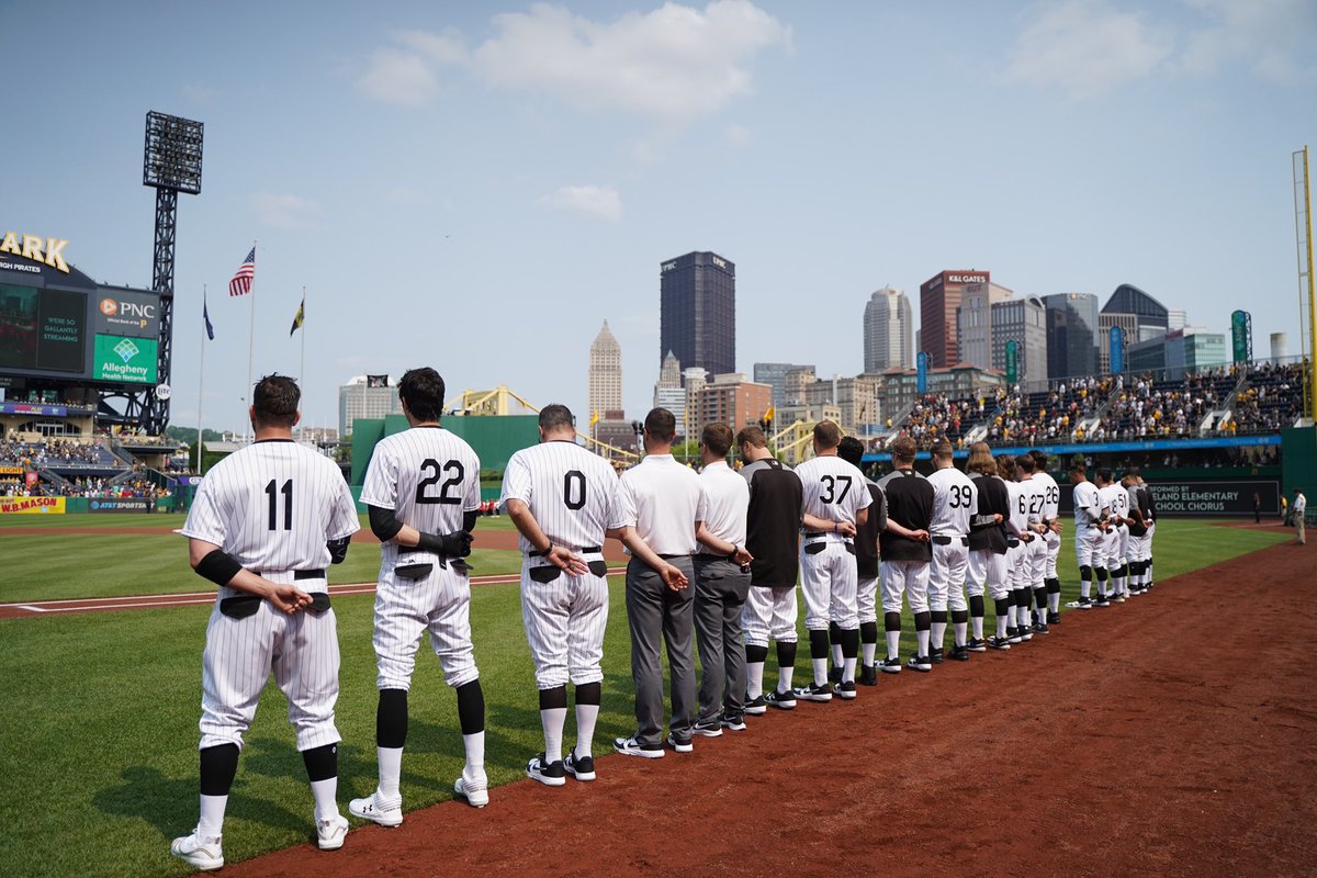
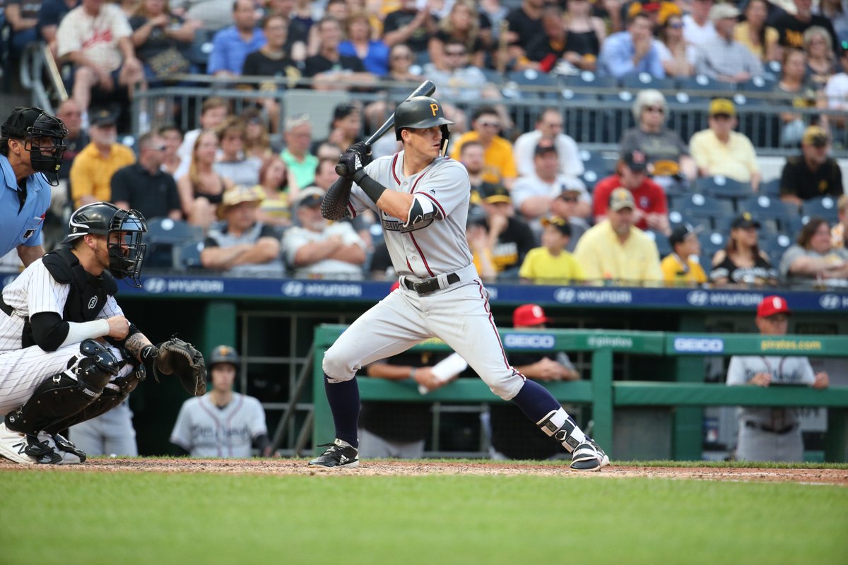
That may explain the uniform colors, but what of the uniforms themselves? The Pirates wore a reproduction of the 1938 Pittsburgh Crawfords. It was a striking uniform, with navy and red details, and the name “Crawfords” in a tail below “Pittsburgh” across the chest. It was topped off by a red cap with block white “C”. It’s one of those uniforms that shouldn’t work, but somehow does when viewed in context.
Unfortunately, they wore their contemporary helmets without even a logo swap, creating a somewhat-jarring appearance at the plate.
Pittsburgh was home to two storied Negro League teams, the Crawfords and the Homestead Grays. And the Pirates have taken full advantage of this, participating in Turn Back the Clock games devoted to both historical clubs.
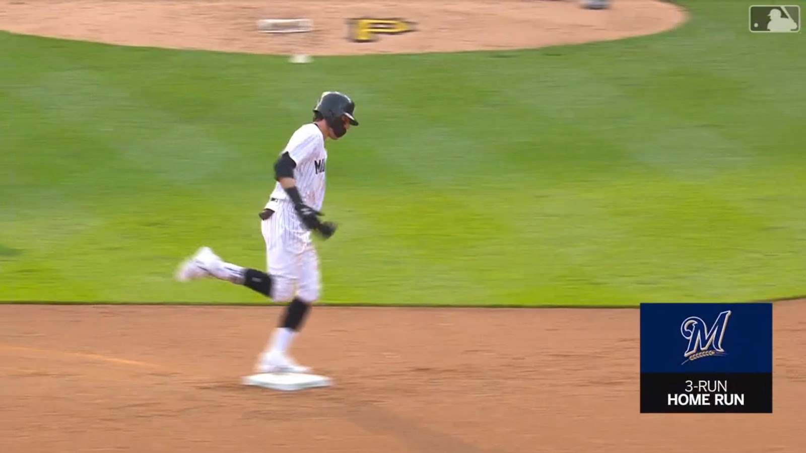
The Brewers, for their part, don’t have the same storied Negro League tradition from which to draw. The city only hosted one Negro club, and that for only a single season. So the 1923 Bears live again.
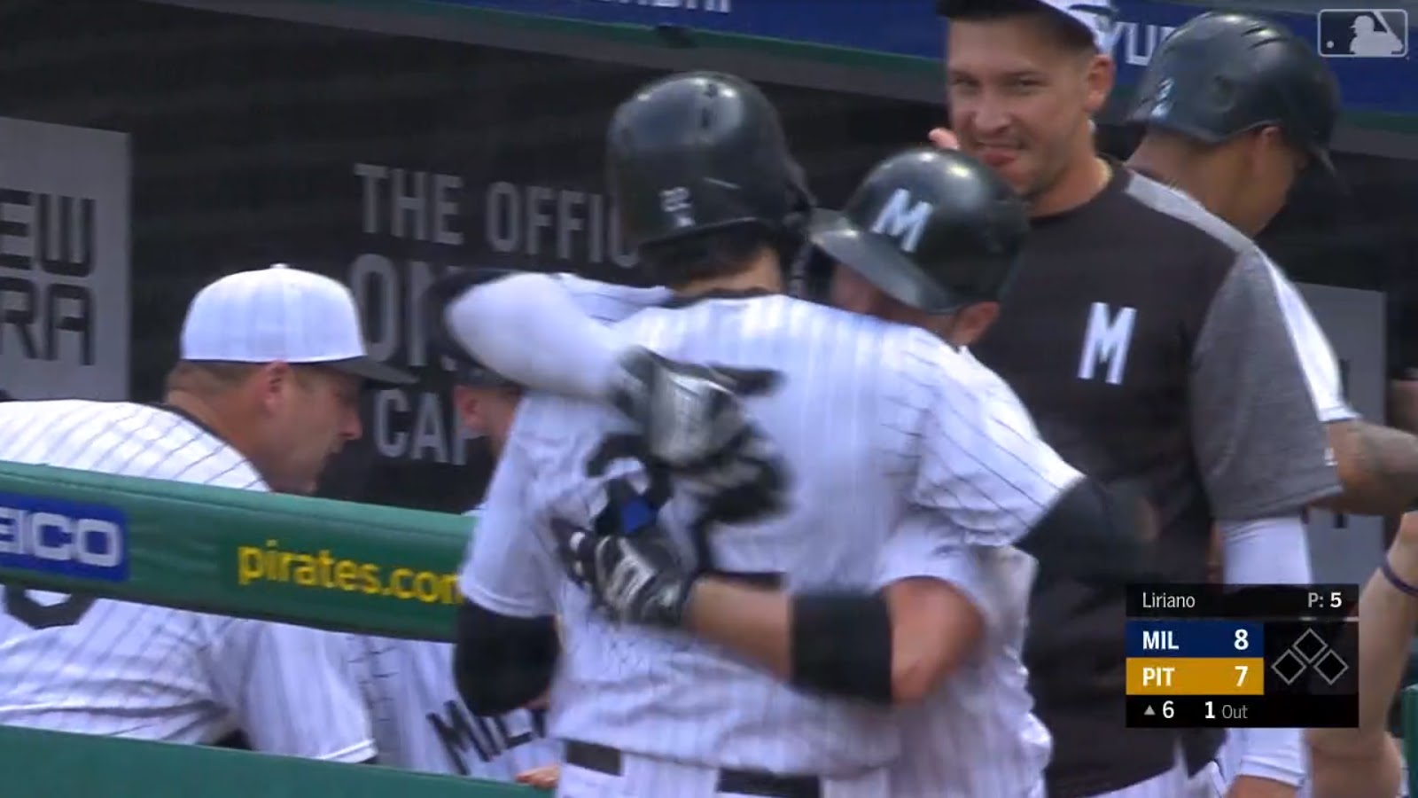
The Brewers tend to go all out for these throwback games, and this was no exception. The squad had all-new accessories for this event, from black catcher’s gear to special dugout shirts featuring a black/white/gray color scheme and a white sans-serif “M” on the chest.
Interestingly, it wasn’t the angled “M” of the caps and helmets, but a version with straight vertical bars, as found on the jersey wordmark.
Some Brewers did continue to wear their blue accessories, like Ben Gamel’s batting gloves, but on the whole it was an amazing effort.
The Pirates, however, were more restrained. In addition to the batting helmets, the Pittsburgh coaches wore regular Pirates shirts in the dugout.

The ball boys and ball girls wore throwback uniforms without anything on the back, as seen when one of the women made an amazing catch of a foul ball. But other than that, the usual trappings of the game remained standard. The on-screen graphics were unchanged, as was the Pirates logo behind the mound.
A wasted opportunity, and one I expect to be rectified when the two teams next play in Milwaukee; the Miller Park groundskeepers seem to delight in changing the mound logo to reflect events of the day.

If you missed the chance to watch this magnificent game live, you’ll get another soon enough. The Brewers and Pirates will play the second half of their home-and-away throwback series next Friday. And if you’re really lucky, lucky enough to be able to see it in person, the Brewers are giving away a Lorenzo Cain Milwaukee Bears replica jersey as part of a special ticket package.

Kreindler’s Korner
I had the distinct pleasure of featuring the wonderful artwork of artist Graig Kriendler on two occasions over the summer and fall of 2017, and more recently, in August of 2018.
For those who don’t wish to click the links, Graig paints baseball heroes (and regular guys) from the past, and is an immense talent.
Occasionally, I will be featuring his work on Uni Watch.
Here’s today’s offering (click to enlarge):

Title: “Old and in the Grey”
Subject: Honus Wagner, 1912
Medium: Oil on linen
Size: 30″ x 24″This might have been one of the first visuals of Honus Wagner I can remember seeing. When it was taken in 1912, he was about 38 years old, and still one of the most feared hitters in the league. Still a few years away from retirement as a full-time player, he posted a .324 average and drive in over 100 runs that year, helping his Pirates take 2nd place to the Giants.
This classic image always appealed to me because of the possibilities of juxtaposing the soft, haloed fabric of his sweater to the hard wooden bats and weathered planks of the dugout area. Even if the minutia in that sweater was going to be the star of the show, there’s so much more to the image – especially the diagonal thrusts in the design of the thing, most noticeably in the bat he’s holding, the angle of the stands at Brooklyn’s Washington Park, and even the leg of his teammate that’s propped against the dugout post. All of it working together just leads the viewer’s eyes around so nicely.
Wagner himself is always such a joy to paint too. The profile of his nose is so strong, and with those long arms and his hands, it just makes every depiction of him so interesting. As odd as his body may have looked, and the fact that he looked 100 years old his whole life, it’s nice to be reminded sometimes that he was one of the greatest baseball players who ever breathed.
Thanks, Graig! You can (and should!) follow Graig on Twitter.

Guess The Game…
from the scoreboard
The game has returned! At least for a trial basis, but I got a lot of positive response to its return, so we’ll see how long we keep this one going.
Today’s scoreboard comes from Ronnie Bolton (though he didn’t submit it as such).
The premise of the game (GTGFTS) is simple: I’ll post a scoreboard and you guys simply identify the game depicted. In the past, I don’t know if I’ve ever completely stumped you (some are easier than others).
This one probably rates a 2 out of 10 on the difficulty scale.
Here’s the Scoreboard. In the comments below, try to identify the game (date & location, as well as final score). If anything noteworthy occurred during the game, please add that in (and if you were AT the game, well bonus points for you!):

If you guys like this, and want to continue this as a weekly feature, let me know in the comments below. You’re welcome to send me any scoreboard photos (with answers please), and I’ll keep running them.
2019 MLB Uni Tracking

For the past two years, reader Ed Kendrick provided uniform tracking for us for four teams: the Arizona Diamondbacks, Washington Nationals, Boston Red Sox and Baltimore Orioles. Last year, he added a fifth team, the San Francisco Giants.
For the 2019 Edition, Ed has now bumped up his tracking to eight teams, adding the Cincinnati Reds, Miami Marlins and San Diego Padres.
You can check them all out via this link.
Thanks Ed. We’ll run this feature monthly until the season ends!
And now a few words from Paul
Hi there. In case you missed it over the past week, there have been lots of developments regarding Uni Watch’s 20th anniversary. One thing at a time:
• First and foremost, I had a long post last Sunday to mark the uni-versary. It talks about how I got interested in uniforms as a kid, how Uni Watch was created in 1999, how it has evolved and grown since then, and how special the Uni Watch community is. If you haven’t already seen it, I encourage you to check it out.
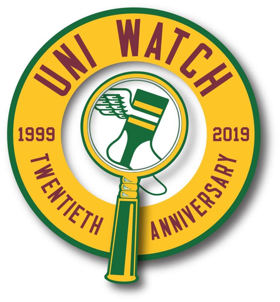
• Our new 20th-anniversary logo is now available as a high-quality vinyl sticker and is also featured on a new line of T-shirts (click to enlarge):
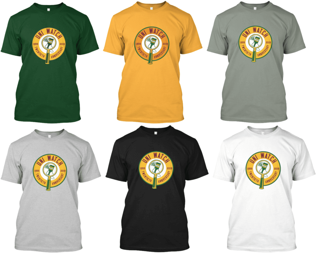
All of these are also available as long-sleeve tees and as hoodies. Here’s where you can order the green version, the gold version, and the various shades of grey, black, and white.
• 2019 isn’t just the 20th anniversary of Uni Watch — it’s also the 20th anniversary of MLB’s infamous “Turn Ahead the Clock” futuristic uniforms. So we’re marking that dual uni-versary with a special new Uni Watch TATC shirt (click to enlarge):
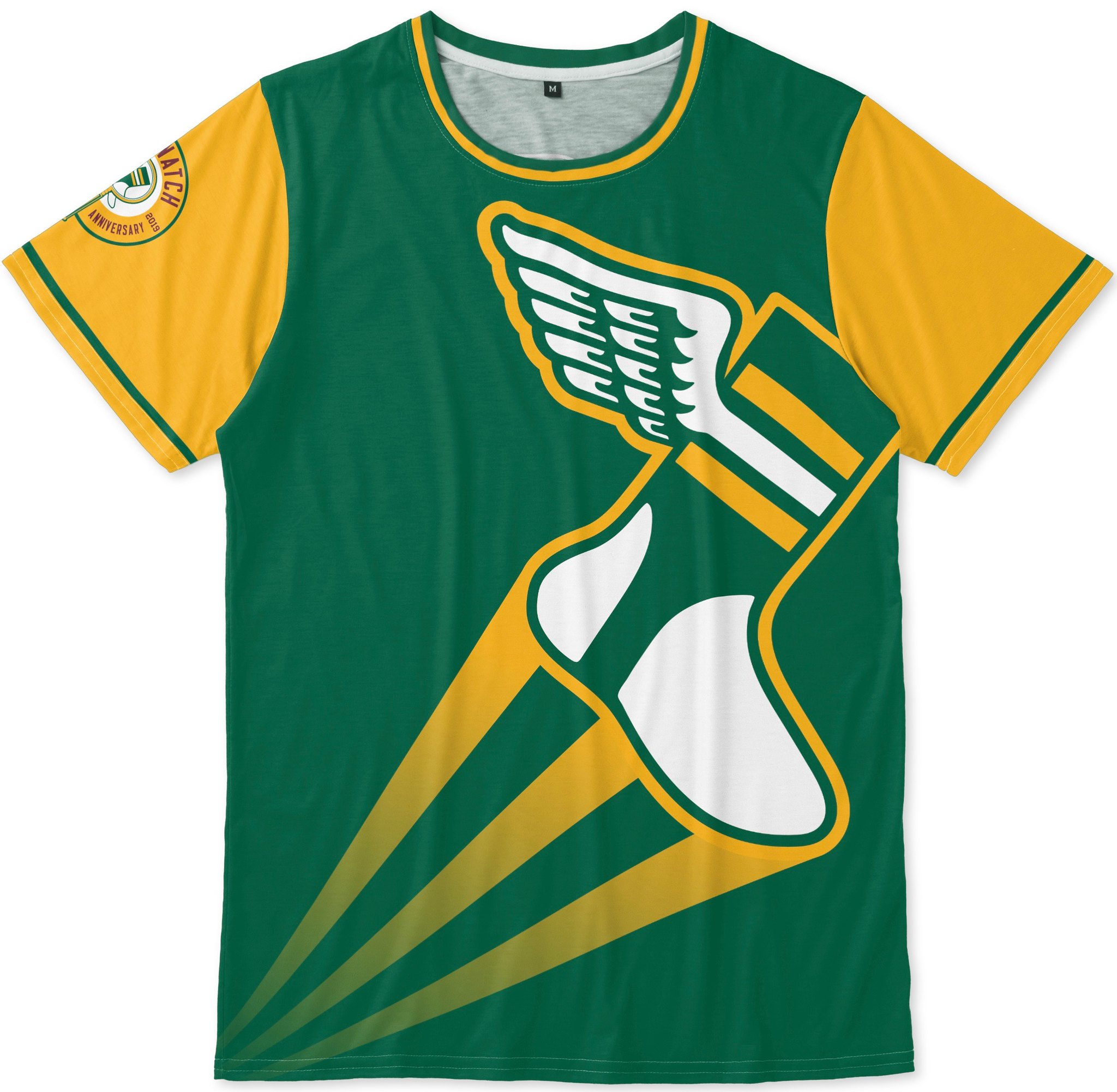

Pretty good, right? Note the 20th-anniversary logo serving as a sleeve patch, too. You can order this shirt here.
• We will be having a 20th-anniversary party here in Brooklyn, at the 773 Lounge, on June 29, 2-6pm. It looks like there will also be satellite parties taking place in other cities on that same afternoon. If you want to attend one of these parties, or if you’d like to organize one in your city, look here.
That’s it for me. We now return you to your regularly scheduled Phil-fest.
Uni Watch News Ticker
By Phil

Baseball/Softball News: Our first item comes from reader Bill Kellick, who writes, “Not sure if this Oklahoma State softball player has been brought to your attention, but Rylee Bayless is the first softball player I’ve seen wearing a pacifier-style mouthguard.” … The Padres have a uni tracker on Twitter, Padres Uni Tracker (lol), and here’s a link to their uniform record through May. … The Reds will be wearing their 1919 throwbacks today, and here’s a look at their cap for the game (from Steve Hemsath). Here’s a bit more on the game unis. … Speaking of throwbacks, on June 22nd, the Seattle Mariners will wear Seattle Pilots throwbacks. … The St. Louis Cardinals Harrison Bader wore a Cat in the Hat arm sleeve Friday (from Shaun Grantski). … On Friday, the Fresno Grizzlies had a Star Wars night. If you read the comments on that (there are many), you’ll note folks haven’t forgotten their AOC faux pas from last weekend. … Check out these Packers softball uniforms, which Patrick Jordan wanted to make sure were covered. … Check out former Giants pitcher Brian Wilson appearing in McNeese State’s beautiful Mariners/Brewers like powder blues (from Kurt Crowley). … Apparently Wrigley Field is the place to see “obscure” jerseys (although I’d say that you could say that about almost any ballpark). … Yesterday the Nationals wore their blue jerseys on the road (from Tom Sileo). … The Fayetteville Woodpeckers had 70s Night yesterday (and check out how that “retro” logo looks like the logo on the Astros prototype cap (that is intentional). Via Paul. … Also from Paul, there’s a lot going on in this photo of a Georgia Premier Academy pitcher: contrasting nameplate, diagonal cross on the 0, logo-emblazoned stirrups, white cap. … On June 9, the Omaha Storm Chasers will be celebrating celebrating Latinx culture & traditions as they suit up as the Cazadores de Tormentas for the 1st time in 2019 (that’s part of the Copa de la Diversión that a number of MiLB teams are doing (or have already done) this year. … Here’s another (fairly rare, but Jerry Wolper can fill us in on exactly how many times it happened) white pinstripe vs white pinstripe game (from Goat Jerseys).

NFL/CFL News: Big set of CFL news, all of which comes from Wade Heidt: “We had a couple of CFL preseason games on Friday night. We are getting a chance to see the new pants now that New Era is providing uniforms. Teams have switch away from specific adidas templates to a more traditional style of football pant striping. It is an upgrade. Lets consider the game between the Winnipeg Blue Bombers and the Edmonton Eskimos. Here is a look at them playing each other last season. Each team wearing one of the pant striping template options from adidas. Edmonton had the truncated stripes. Winnipeg had the colour from the pant striping wrap around to the back at the bottom of the pant leg. Now lets take a look at Friday night. Both teams wearing the more traditional style pant striping that runs down the full length of the leg. The last 3 seasons, the Saskatchewan Roughriders had the same style as the Blue Bombers. Colour from the pant striping wrapping around to the back at the bottom of the pant leg. Here are the Riders Friday night in Calgary with the updated pant striping.” … Here’s a great shot of “dryer damage” to the numbers (from John Turney). … Hmmm. This logo looks familiar but I can put my finger on it (from Griffin Smith). … This is pretty awesome, from Marcus Hall: “Cleaning out my basement and I found this. My parents laminated my letter to the newspaper. I didn’t think I still had it! Too bad they went with the Ravens :)” … Interesting facemask on the New Orleans Saints’ Pat Hughes in 1979 from 1970s NFL).

Hockey News: With the Stanley Cup Final(s) in full swing, fans from both franchises are in full Cup fever, but the Broons have been there before, and more recently. So, you gotta give props to this fan who constructed a Stanley Cup basically out of beer cans (from Robert McClimans). Ok, that is pretty awesome. Also note the jersey NOB and number!

NBA News: Tweeter FK Yaaj asks, “Am I late on this? First time I’ve seen this. Drake’s OVO branding on Raptors practice gear. These Finals sure have been a huge marketing boosting for him.”

Soccer News: Here are three gentlemen with a clever take on Tottenham’s Son Heung-min’s jersey (from our own Anthony Matthew Emerson). … Tweeter Daniel wasn’t in love with the all white Spurs kits. Apparently the white jersey, because of the blue gradient, is designed to be worn with blue shorts, not white ones.

Grab Bag: Reader Brian Crago writes, “My alma mater, UCF, is calling on artists to submit designs for a large-scale outdoor mural, funded by UCF Athletics.”
“Here’s another (fairly rare, but Jerry Wolper can fill us in on exactly how many times it happened) white pinstripe vs white pinstripe game”
I count eight. (The photo would be July 3, 1977.)
link
Connie Mack Stadium, Philadelphia.
10 July 1969.
Cardinals 9, Phillies 3.
I couldn‘t tell you the significance though.
Fwiw, the stadium got the pitchers’ #’s next to the line score flip-flopped… Phils’ reliever Bill Wilson was #24 while Cards’ reliever Mudcat Grant wore #22.
On scoreboard, also note “1st” to record score of first game of a double header … in ‘69, teams played about 15-20 twin-bills a year.
The authentic collar as quoted in the piece is not authentic. That’s the higher replica version of the first photo. Also the number font seems to be really watered down on the lowest replica version. It’ll be a road alternate most likely as well, so the orange will be probably two home games this year. I’m pumped for these!
July 10 1969
Cardinals 9 Phillies 3
Cards scored three in the 9th after leading 6-3 in the 8th
Clues:
Connie Mack Stadium scoreboard and slatted right field fence give it away
Last game of play there was Oct 1970
SD and Mont on board. Both came into the league in 1969, so game could only be in ’69 or ’70
These last two scoreboard pictures were on the essay side, but this is a very enjoyable feature and I hope you will consider continuing it
Also, they list the Phillies next home game v the Cubs on the 18th. I still don’t know the particular significance of this game.
I second your call – I love this feature.
UEFA have stricter rules regarding the primary colour of a uniform than the Premier League. Spurs have to wear plain white shorts & socks in the Champions League to comply (their regular socks also have a blue to white gradient).
Spurs have worn white shorts in European games for as long as they’ve been playing them (since 1962). The idea was to look like Real Madrid.
When I saw this year’s jersey, my first reaction was “that’s going to look silly with the white shorts”.
I’m honestly not familiar with Spurs’ European uniform history, but regardless I don’t think they could register their PL uniforms along with either of their alternate kits based on these 3 rules:
8.01 If a playing attire item comprises three or more colours, one must be clearly dominant on the surface of that item. For hooped, banded, striped or checked items (i.e. with two dominant colours), any use of a third colour must not dominate or affect the distinctiveness of the shirt or socks
8.06 Shirts that comprise small horizontal or vertical lines that cover the whole length or breadth of the shirt, do not exceed 2mm in width (pin stripes) and are spaced at least 5cm apart do not constitute striped shirts.
9.02 If one playing attire comprises predominantly dark colours, the other must comprise predominantly light colours, or if one of the playing attires is hooped, banded, striped or checked, the other must not contain either of the colours of the hoops/bands/stripes/checks.
link
Home jersey is considered a white/navy striped shirt. With navy shorts, second kit is out. Third also contains navy panel on the chest, but I think this is ok as home is considered a light kit with white shorts.
UEFA uniform rules are ridiculous.
Arsenal wears red over white. Valencia wears white over black. Man U wears red over white.
If Spurs insist on all white, then Nike should make a white jerseynwithout thenstupid gradient.
Several points:
-They haven’t worn different socks specifically for the UCL this season. (link link)
-No evidence that mono-white is supposed to look like Real Madrid. It’s more likely that it’s just a coincidence which started because of dim ’60s floodlights. (link)
I wish in these throwback/fauxback games that the teams and/or MLB would have the umpires wear period appropriate uniforms as well. I know it well never happen because they wouldn’t sell the merchandise, but it would be fun to see Laz Diaz blowing a call while wearing a bowtie and sportcoat.
Nice Milwaukee throwbacks… It’s a shame that pinstripes are falling out of favor in baseball. Only six teams out of thirty have pinstriped jerseys (home or away) – Colorado, Philadelphia, both New York teams and both Chicago teams.
This is probably in line with the ratio that has always existed in baseball. Other than the Marlins, what team used to wear pinstripes that doesn’t today? The Brewers (who wear them on their alternates). Other teams have flirted with them over the years (Braves in the late ‘70s, Reds in the ‘90s, Expos at the end… (R.I.P.), Twins in the ‘80s-‘90s, the Disneyfied Angels, Pirates for a bit in the ‘70s). And some teams did historically before 1940. But the teams that don’t wear pinstripes today traditionally never did or haven’t for the majority of their histories. So I am not sure what you are lamenting here.
Pirates did in the 90s as well on their road grays.
My favorite uniform set of the Padres was their ’85-’90 home and road pinstripes.
phoenix had pinstripes for a while too
Astros from 2000-2012. They were awful.
All of these posts make my point. We’re talking about a few teams who did it for a few years, outside of the Yankees, Phillies, Cubs and Mets. What fraction of the Pirates’ seasons did they wear pinstripes? 10? 15? In 120 years? Even the Astros and Padres have gone without pinstripes for the vast majority of their history. So it’s never been more than about 20-30% of MLB at one time, and we are currently at 6/30, or 20%.
I’m guessing the Pirates didn’t go all-out because Bob Nutting is a cheap bastard and did it as a cost-cutting move. Explains why they are 26th in attendance while the Brewers–thr smallest market in the majors–is 8th.
I give it until the All-Star break before Josh Bell is traded to the Red Sox.
Thought for sure clock on top of Phillies scoreboard was broke, but sunset time on July 10 in Philadelphia is 8:31 p.m., so there would still be plenty of daylight at 8:07 p.m.
Also time of game went 2:12, and start time listed was 6 p.m., so in keeping of an actual start around 6:05 – 6:07 p.m., the game would had been exactly two hours old at this point, meaning STL tacked on their three runs, then retired Phils in the ninth, in about 12 minutes – MLB contests flew without the constant late-inning pitching changes, etc..
Also, this would had been a Thursday getaway day, Phillies would had been at Wrigley Field the next afternoon for a 1:30 p.m. start., there would be screaming at the schedule makers today.
BTW – Thanks for the hat tip Phil!
Deeper pitch counts is the real reason games take longer today. More walks and more strikeouts mean longer at bats. Players in the olden days often didn’t think much of drawing walks as an offensive weapon.
That’s retail, and the way the real ones are basically sleeveless, means it’s not going to look so great with a minimal amount of space between the upper shoulder stripes and the sleeve/shoulder stripes. The helmet makes sense since they actually can do it with the navy shell
Yep. Kickers and QB’s are the only ones on which you’ll really be able to see the sleeve stripes. Still a cool look though.
I don’t know who that is in the McNeese State picture but I’m pretty sure it’s not Brian Wilson. There’s no evidence of him being a coach or connected in any other way to McNeese State, and the beard has been gone in all his more recent appearances (like when he was inducted to the Giants Wall of Fame last year)
Bears jersey looks great as shown above. Unfortunately on the field only about two of those seven stripes (and, of course, the swoosh) would survive
Ball girl catch
“This video is not available in your location”
So, The Marlins haven’t worn their new blue uniforms yet? They are a weird team.
We’re the blue Marlin alternates for Spring training only?
I believe Ed Kendrick has made a small error for the Reds tracking. His spreadsheet lists the hat as “red bill/black crown”. The correct orientation is black bill/red crown. Maybe, if we are all lucky, someday it can just be a red bill/red crown.
Working with poor reception here, but I will try posting again. For the road cap Ed Kendrick has listed red bill/black crown, that should read black bill/red crown.
The Mets and Rockies did the link at Coors Field when the Rockies were commemorating their first-ever game, which was 20 years earlier at link. The visiting Mets donned the link while the home team wore its 1993link.
For these Bears throwbacks, what happens to these sleeve stripes? Do they wear the compression shirts with these stripes like some CFB uniforms? Thinking of the Oregon State Beavers as an example.
The compression shirts with sleeve stripes is an awesome idea for throwbacks to the uniforms that used to be long sleeved.
I’m pretty sure that is NOT Brian Wilson in the McNeese baseball photo. Wilson pitched at LSU, and he’s not listed on the McNeese baseball staff.
link
And he also doesn’t have the beard anymore.
link
link
This pic, with the information on the stadium, etc., has run already on Uniwatch.
May have been suggested already, but why not make the anniversary patch on the TATC uniform the 40th, or 50th, or 75th etc. ?
In the Bears throwback jersey photos, in the last photo shown from Twitter, the 52 number font doesn’t match the other photos number font.