
By Phil Hecken
Follow @PhilHecken
Uni Watch readers know I will sometimes feature the art and artistry of folks with whom I interact via the Twitter, and today is another one of those days. I’d like everyone to “meet” Tim Godden, who I recently began following and who is quite a skilled illustrator whose specialty isn’t limited to baseball players (but that will be the main focus of today’s article). Tim has an awesome minimalist style (as you can glean from today’s splash — which you’ll see in full below — of Mel Ott of the New York Giants).
I asked Tim if he could provide us with nine of his illustrations (why nine? C’MON! It’s baseball!) and to provide some brief writeups. But before we get into those, I did a quick and dirty Q&A with Tim, which I’ll run below, and then get into this art. OK? OK! Here we go…
Uni Watch: OK. Standard question I ask of everyone first: Are you a reader of Uni Watch, and if so, how long have you been a reader? How did you “find” the blog?
Tim Godden: Yes, of course. I guess I’ve been a reader for about the last 3 years. Once I started illustrating baseball I began following lots of baseball, and particularly baseball history, twitter accounts. It didn’t take long to see Uni Watch tweets appearing in my feed and so I came to the blog that way.
UW: How old are you and where do you live?
TG: I’m 37 for a few more weeks and I’m very fortunate to live on a National Trust estate called Arlington Court in North Devon, England. Though, I’m originally from the other side of the country in Norfolk.
UW: I first came across your work on Twitter, which is really an amazing place to find artists, colorizers, painters, uni fans etc. I note in your bio you call yourself “illustrator and PhDer.” What is your doctorate in?
TG: I’m just going through the process of submitting my doctoral thesis, which looks at the British cemeteries of World War One on the old Western Front. More specifically it looks at how the young architects, all of whom had served, and the design policies of the Imperial War Graves Commission allowed the the cemetery designs to retain aspects of landscape memory and war experience within them. It offers a perspective on the cemeteries that moves them beyond just sites of mourning.
UW: Is drawing/sketching/illustrating your vocation or is this more of a hobby?
TG: Yes its my full-time job, though the actual hours I get to work vary depending on family commitments and, of course, researching and writing. That said, it started out as a hobby, a kind of release from the intensity of researching cemetery architecture, then it progressed somewhat!
UW: Did you do “refrigerator art” (as we call them) — basically drawings of unis or baseball players — as a kid?
TG: Not of baseball players, no. I’ve been a Red Sox fan since I was about 12 or 13, though it wasn’t particularly easy before the internet to follow any US sport, but not to the extent that I drew it from a young age. When I was young I drew a lot of soldiers, airplanes, cars and soccer players.
UW: I love the style of your illustrations. Did you model it after any particular artist or was this just the way you’ve always done it?
TG: Thanks very much, that’s kind of you to say. I wouldn’t say I modelled it after any artist in particular, but, of course, there have been many influences on my style. I guess principal amongst those who have influenced me would be Herge, Bruce Bairnsfather and Edward Bawden. Though I get inspiration from a whole load of other artists living and dead. Right now I find the work of Anika Orrock, Paine Proffitt, Jeff Baker aka Gypsk Oak, Paul Bommer and Gary Cierradkowski incredibly inspiring, for a range of different reasons. But then I also find huge inspiration in the the designers Todd Radom, Bethany Heck, Nick Stroia of Buffalo Nickel, Joshua Minnich and Brett Colvin, and a whole range of independent baseball companies, such as Huntington BBC, Pillbox Bats Ebbets Field Flannels, and Mitchell Bat Co. – all for different reasons. As for my own style, it has evolved over the years, but even looking back to art school days I can see the beginnings of the way I draw things now.
UW: When did you first begin illustrating and at what point did you decide to make a living from it?
TG: I’ve loved drawing since I can remember, but it didn’t become a job for me until I started my PhD. Once I got funding for my academic research I began to draw after a day of research to unwind, and to fuel my creative instincts. that was in 2014. Though, it wasn’t really until 2017 that it became a full-time thing for me.
UW: I admit I haven’t done a very deep dive into your work, but it seems most of your work is baseball related (though I did see at least one soccer illustration). Do you do any other sports?
TG: Actually, the vast majority of my work in the past has been in relation to World War One. I have worked extensively on a whole range of subjects. These have included animated shorts, a book that was published last year and a whole range of private commissions as well as my own work. I have done quite a number of soccer illustrations, too, including match day program covers, pieces for television, and had a couple of exhibitions based around one particular series I produced. I have illustrated a number of other sports, but they have been for commissions rather than something I have any particular passion for. But, having said all of that, my focus these days is very much on the baseball side of things. It is a subject with seemingly endless possibilities and one that ticks my love for illustrating and research.
UW: You have a link on your Twitter bio to your work. I see there are a couple World War I illustrations there — you mentioned you have done others? Were those commissioned or did you do those for “fun” or … how did that come about?
TG: As I mentioned, my back catalogue from 2014 through to 2016 was primarily only World War One illustrations. Some of them were commissioned once I became more established, but on my site they are nearly all works I have done out of my own interest in a particular topic or theme. I would guess all in all that half or more of my creative out put since I began illustrating for others has been related to the Great War. Even now, I like to combine my interests in illustrations, such as the Leonard Wattelet illustration below.
UW: How long does the “average” illustration take? What (if you can recall) took the longest and why?
TG: Hmm, that’s a tricky one. To draw and render, I would guess the average illustration takes about 5-6 hours. But, that’s not the whole story. With every historic subject, be it baseball or otherwise, there is a fair amount of research into uniforms, stadia, players etc. It has to be said, particularly with the sad news of this week, the work of the late, great Marc Okkonen has been a god sent in regard to uniform nuances. But even then, there is still the hang and shape of the uniform and any particular player idiosyncrasies to find. So there can easily be several hours of research before the pencil hits the paper for the first time.
The longest time I’ve spent on a single piece was about 2 weeks, it was quite a large piece on canvas for the Casey At Bat exhibition curated by the National Pastime Museum. It was quite a bit larger than anything I’d worked on before (or since) and was also on canvas, which is not at all common for me. The combination of the two things meant it took a lot longer than normal.
UW: What first really attracted me to your work was the “Cracker Jack” sets. Obviously, those are modern day players dressed in circa 1915 attire. How did you come up with that concept?
TG: That’s great to hear and I’m pleased you liked them. It’s always nice to know that someone digs your work. Often I come up with these ideas wondering if they will translate across the pond, and I’m glad this one does. I love the look of the old Cracker Jack cards, in fact, so many of those early twentieth century cards inspire me. I wanted to do something fun and liked the idea of putting modern day ballplayers in the old uniforms. The illustrated element is important because it would be so easy to make photographic replies of these cards (in fact they have), but the illustrated nature of the portraits makes them a little more authentic in feel, but also a distinct piece of art in their own right.
UW: Along those lines, we obviously see some players depicted who wouldn’t have been permitted to play in the Major Leagues during that time period. I assume this was a conscious decision (and an awesome one at that).
TG: It’s an interesting one. Initially I just thought bout who are some of the most exciting players around at this moment that would be on a CJ card if they were produced now. It was only really when I began the process of illustrating that this juxtaposition dawned on me. I’m sure it sounds incredibly pretentious, but I’ll say it anyway; they’re how baseball should have looked when the 1915 cards were produced, but, as we all know, was not that case for a long time after they were first made. I guess it’s one of those unintentional outcomes of producing art that brings together different societal norms.
UW: Well, I totally agree and I’m pleased you did it! Switching gears slightly to women’s wartime baseball, as we’ll soon see below, you included an illustration of Margaret Eloise Berger (aka “Sonny”). Do you have other sketches of the AAGPBL ladies? What sparked your interest in this league?
TG: I don’t at the moment, no, but it’s something I hope to rectify soon. I would imagine the same thing that sparked the interest in a lot of people, the film ‘A League of Their Own’.
UW: We’ll also see one of the great Ernie Banks, but depicted as a KC Monarch, rather than a Chicago Cub. Obviously this was another conscious decision, but what made you go this route? Readers know I absolutely love Negro League throwbacks, so this is like a double bonus!
TG: Ha, well I’m pleased you like it. The decision was really made about the uniform. I wanted to illustrate a Monarchs uni from that period so looked into who was playing at the time for them. Though the influence to illustrate Ernie Banks came from one of my favourite baseball books, Joe Posnanski’s beautifully written memory of travelling around America with the Negro League legend Buck O’Neil. To be honest I could have illustrated many, many more of those wonderful anecdotes. As an aside, I think that would make a really lovely illustrated edition. Plus, I liked the idea of illustrating Mr Cub before he became Mr Cub.
UW: Where can we see more of your work? Do you have a website or blog besides the one I linked to above? We can obviously follow you on twitter @TJGodden but do you have any other social media presence(s)?
TG: At the moment I’m working on my new website, so it’s just the one you’ve already linked to. By far and away the best way to see my new work is on twitter and instagram, I have the same handle on both. Twitter in particular really has enabled me to feel a part of the baseball community – and it’s a great community to feel a part of. Also, if you happen to be passing through Shelby, NC between July 11 and August 21 you’ll be able to see some of my work alongside some other fantastic baseball artists as part of the Baseball as Art Exhibition.
UW: Great! Thanks, Tim — let’s take a look at some of your work and your descriptions!
TG: Thanks ever so much for taking the time to look at my work. I hope you and your readers enjoy it.
Click any illustration below to enlarge.

1939 World’s Fair Patch – Mel Ott, 1938
This illustration was all about that patch. Having seen a thread on twitter about arm patches on baseball unit I remembered this one and how I’d been meaning to put it in an illustration.

A to Z Dead Ball Era Nicknames
It’s a rite of passage for every illustrator to do an A to Z at some point. I thought it would be cool to see if I could list ballplayers by coolest nickname and not necessarily ability.

Destiny
The last in a series of poster designs created for each match-up of the 2016 postseason.

Bryce Harper 2019 x Cracker Jack 1915
One of a series of illustrations putting modern ballplayers in the uniforms of their respective teams (or as near as possible) in 1915.

Let’s Play Two
Inspired by the wonderful story told by Buck O’Neil, Ernie Banks surveys the field at Kansas City Municipal Stadium, in the summer of 1953, declaring, ‘It’s a great day for a ball game; let’s play two!’.

Mister Shortstop – Marty Marion
A few weeks ago I found a battered old mit, probably from the 1950s. I’m a sucker for anything linked with a bit of baseball history and so I bought it. As with most gloves it had the signature of all old ballplayer – this ballplayer was “Mister Shortstop” Martin Marion. Inspired by the glove, here is Mr. Shortstop in his 1943 uni, his first of 8 All-Star seasons he would have in his playing days with the Cardinals.

Sonny Berger
I wanted to illustrate an AAGPBL player in the style of a card of the period. After a little bit of reading on the subject I settled on Sonny Berger, though it could have been several others, too, that I’ll get around to doing one day.

The Catch
In game one of the 1954 World Series at the famous Polo Grounds, New York Giants outfielder Willie Mays made one of the greatest catches in the history of baseball. Here is a limited edition print capturing the moment as Willie eyes the ball dropping towards his glove.

Leonard Wattelet
One of my other areas of interest is World War One. This illustration was my own little memorial to a minor league ballplayer whose grave I had been to visit in Belgium. The chapel in the cemetery is the building at the top of the design.
Wow — wonderful stuff, Tim. Thanks so much for sharing. OK readers, please let Tim know how much you enjoyed his art, or any questions you may have for him, in the comments section below!

Uni Concepts & Tweaks
After being dormant for a while, the Uni Tweaks/Concepts have returned!
I hope you guys like this feature and will want to continue to submit your concepts and tweaks to me. If you do, Shoot me an E-mail (Phil (dot) Hecken (at) gmail (dot) com).
I received the following e-mail from Johnny Woods, who has a new Canucks concept:
Looking at the old stick-in-rink logo, you can wrap a thick C around the stick. If you hand write the C with a serif notch (I don’t know the term) you can get a V.
To the right of the V you get a negative space of an arm holding the stick (Thanks John Elbertson). To that I added Johnny Canuck.
Looking of photos of British Columbia I wasn’t struck by green trees as much as I was by light blue water and sky with bright white mountains, so the team colors were changed. The third logo isn’t really “hockey” or “Canuck” but it makes a nice tourist promotion on the road jerseys. The water is in a V shape, and lightning bolts always means power.
– Johnny Woods


Thanks John. OK readers (and concepters). If you have some tweaks or concepts, shoot ’em my way with a brief description of your creation and I’ll run ’em here.

Guess The Game…
from the scoreboard
The game has returned! At least for a trial basis, but I got a lot of positive response to its return, so we’ll see how long we keep this one going.
Today’s scoreboard comes from reader ojai67.
The premise of the game (GTGFTS) is simple: I’ll post a scoreboard and you guys simply identify the game depicted. In the past, I don’t know if I’ve ever completely stumped you (some are easier than others).
This one probably rates a 3 out of 10 on the difficulty scale.
Here’s the Scoreboard. In the comments below, try to identify the game (date & location, as well as final score). If anything noteworthy occurred during the game, please add that in (and if you were AT the game, well bonus points for you!):

If you guys like this, and want to continue this as a weekly feature, let me know in the comments below. You’re welcome to send me any scoreboard photos (with answers please), and I’ll keep running them.
And now a few words from Paul
Hi there. In case you missed it over the past week, there have been lots of developments regarding Uni Watch’s 20th anniversary. One thing at a time:
• First and foremost, I had a long post last Sunday to mark the uni-versary. It talks about how I got interested in uniforms as a kid, how Uni Watch was created in 1999, how it has evolved and grown since then, and how special the Uni Watch community is. If you haven’t already seen it, I encourage you to check it out.
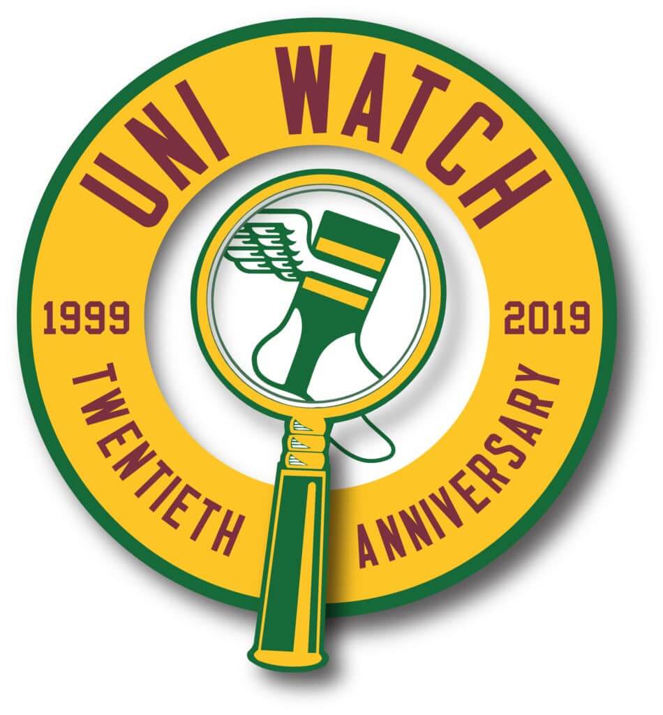
• Our new 20th-anniversary logo is now available as a high-quality vinyl sticker and is also featured on a new line of T-shirts (click to enlarge):
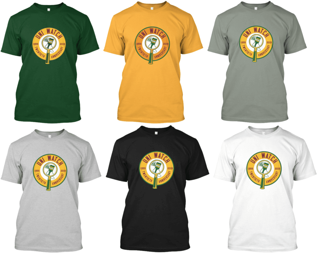
All of these are also available as long-sleeve tees and as hoodies. Here’s where you can order the green version, the gold version, and the various shades of grey, black, and white.
• 2019 isn’t just the 20th anniversary of Uni Watch — it’s also the 20th anniversary of MLB’s infamous “Turn Ahead the Clock” futuristic uniforms. So we’re marking that dual uni-versary with a special new Uni Watch TATC shirt (click to enlarge):
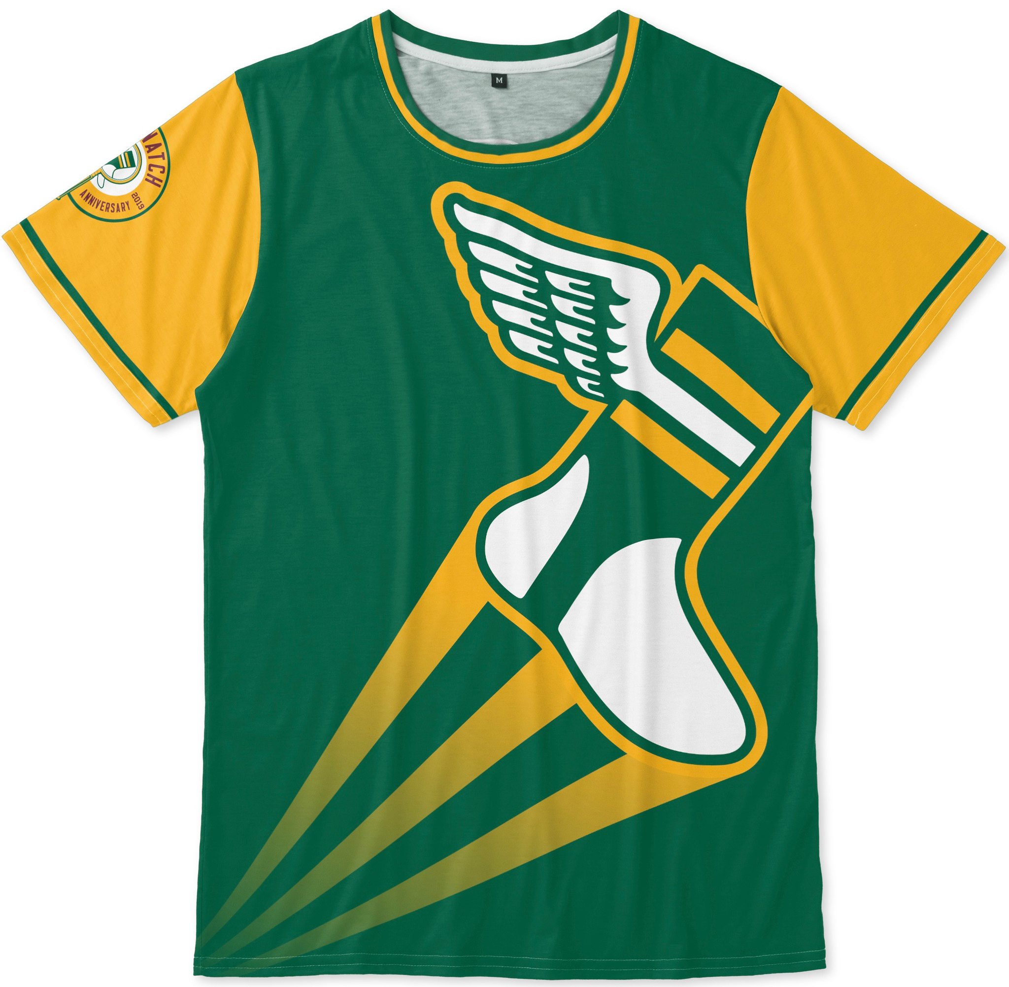

Pretty good, right? Note the 20th-anniversary logo serving as a sleeve patch, too. You can order this shirt here.
• We will be having a 20th-anniversary party here in Brooklyn, at the 773 Lounge, on June 29, 2-6pm. It looks like there will also be satellite parties taking place in other cities on that same afternoon. If you want to attend one of these parties, or if you’d like to organize one in your city, look here.
That’s it for me. We now return you to your regularly scheduled Phil-fest.
The Ticker
By Anthony Emerson

Baseball News: Here’s a fun NYT article about Yankees pitchers keeping their notes inside their caps (thanks, Paul). … The Padres new unis could come as early as November (from Mike Chamernik). … Dodgers IF/OF Kiké Hernández has a new helmet (from Jakob Fox). … Also from Jakob: Dodgers OF Alex Verdugo has his rookie number 61 on his shin pad and “Dugie” on the back of his cleats. … Gorgeous new Sunday unis for the Myrtle Beach Pelicans, Single-A Advanced affiliates of the Cubs. The cap’s design evokes the flag of South Carolina, and South Carolina is of course the Palmetto State (from Timothy Phillips). … Fauxback caps on tap for the Fayetteville Woodpeckers, Single-A Advanced affiliates of the Astros (from Ignacio Salazar). … The Wisconsin Timber Rattlers, Single-A affiliates of the Milwaukee Brewers, wore lederhosen unis last night! (from @262Michael). … The Single-A Lakewood Blue Claws, affiliates of the Phillies, have revealed their special jerseys for each promotional night this summer: Phillies-style powder blues for Player’s Day on June 20, tie-dye for Grateful Dead Night on June 22, camo for Military Appreciation Night on July 11 and pink jerseys and caps for Breast Cancer Awareness Night on August 15 (from John Cerone). … The CPL’s Savannah Bananas have new gradient jerseys (from @CaliGlowin). … Auckland Tuatara of the Australian Baseball League have a potential new jersey incorporating Maori designs (from FAU has their own version of the 1982-86 ChiSox unis (from Christopher Jones). … Southern University’s Tyler LaPorte Gets It™ (from Preston Salisbury). … Last night was “Pride Night” for the Dodgers in LA, and the mound logo was rendered in rainbow (from MMB Sports).

NFL/CFL News: The Bills’ 60th anniversary logo has been released (from @jeffreybigmoney). … The Chicago Bears will unveil their “new classic jersey” on June 7th (from Phil).
.

Hockey News: Colleyville Heritage (Tx.) High has pretty blatantly cribbed the Canadiens’ logo (from Trent Guyer). … New sweaters for the QMJHL’s Sherbrooke Phoenix. Video here (from Wade Heidt and Moe Khan).

NBA News: Drake wore a black armband during last night’s NBA Finals game to cover up tattoos of Kevin Durant and Stephen Curry. Why he didn’t just, you know, wear a long sleeve shirt is beyond me (from Jeffrey Sak). … Speaking of Drake, counterfeit Dell Curry Raptors jerseys similar to the one he wore courtside during Game 1 have already gone on sale on Ebay. … Kia Nurse and Asia Durr have joined Jordan Brand (thanks, Paul).

Soccer News: A whole bunch of FootyHeadlines leaks from Josh Hinton: Real Madrid’s home, Juventus’ away, Bayern Munich’s third, Birmingham City’s home, Trabzonspor’s home and away and Flamengo’s “Icon Retro” along with the official release of EC Vitória’s home and away. … Benfica’s home kit has been formally released (from @mikeDfromCT). … New home kit for Scottish side Heart of Midlothian (from Ed Żelaski). … Also from Ed: Celta de Vigo’s home kits have been released. … One more from Ed: Ross County’s home and away kits have been released. … Is the Nike wordmark making a comeback on this leaked Chelsea kit? I guess we’ll find out when it’s formally released (from Gabriel Hurl). … According to our own Jamie Rathjen, Adidas and MLS have designed the same Pride warm-up kit for every team.

Grab Bag: A Maine-based coffee shop — whose India Street location in Portland is one of my favorite haunts — is suing a Utah-based coffee company for cribbing the former’s logo for its cannabis-infused coffee products. … Tuesday’s sublede about the pinstripe-text on Mark Malarzarte’s membership card reminded Stephen Krupin of the personalized pinstripe-text on suits worn by former Egyptian dictator Hosni Mubarak and current Indian Prime Minister Narendra Modi. … Bryson Dechembeau paid homage to his 2018 win at the Memorial Golf Tournament with an image of a milkshake and his score on the back of his cleats (from Jim Parry).
Awesome illustrations.
I could definitely see these in kids’ books too. Perhaps for ‘Paul, The Boy Who Loved Uniforms’?
Thanks, James! Glad you like them.
Amazing artwork! Leonard Wattelet resonates with me. We often think of history in a detached manner, but here’s someone who played minor league baseball, got into the business side and then paid the ultimate price less than two weeks before World War I ended.
Thank you, Trevor! I’m pleased my little tribute to Leonard resonated with you. I’m going to leave one at his grave when we visit again in a few weeks.
Nov 14 1965 KC Chefs vs SD Chargers @ KC municipal stadium. Key factor…the so it had to be 1966 or earlier Upcoming game on Nov 28th vs Houston on scoreboard also helpful
Drake can’t wear long sleeves because that would cover all his other tattoos. People who get tattoos must dress so that their tattoos are showing or what is the point?
11/14/65
Municipal Stadium (KC)
Chiefs 31
Broncos 7
That Canadiens logo next to the word baseball messed me up.
The Nike wordmark on Chelsea’s third kit is part of a 90’s soccer throwback Nike are doing this year. All third jerseys they make will feature that logo.
Fantastic illustrations, Tim. And Johnny, that’s one of the best concepts I’ve seen on here. The Canucks should really consider that uni.
I concur on both counts!
Thanks, Jim!
Proofreading:
Imperial War Graves Commission allowed the the cemetery
In case you want to know how all the games on the scoreboard ended:
AFL Scores (left side)
Kansas City 31 San Diego 7
Denver 31 Houston 21
Buffalo 17 Oakland 14
New York 30 Boston 20
NFL Scores (right side)
Baltimore 41 Minnesota 21
Los Angeles 3 Green Bay 6
St. Louis 13 Chicago 34
San Francisco 27 Detroit 21
NFL Scores (not pictured)
Pittsburgh 17 Dallas 24
New York 21 Cleveland 34
Washington 14 Philadelphia 21
Re: Fayettville.
Those are amazing hats; a throwback to the Astros design from 1974 that never made the field.
They’re also breaking out the red and black Rainbow Guts this evening for ’70s Night.
Pic here:
link
Speaking of Negro Leagues – the Brewers and Pirates are playing a throwback game today at Pittsburgh. Milwaukee is dressed as the Milwaukee Bears and the Buccos as the Pittsburgh Crawfords. I’ve said it before, but the Negro League throwbacks – at least the ones I’ve seen – are realy sharp.
link
Says only 21,968 at that Chiefs game, would had been third year franchise in KC.
They obviously chose to put scores involving NFL Western Conference teams with room remaining on out of town scoreboard.
Keep the “Guess the game” pictures coming!! I did not get a chance to look into it until this morning (Sunday), but it was still fun! Putz was right, as was Marc.