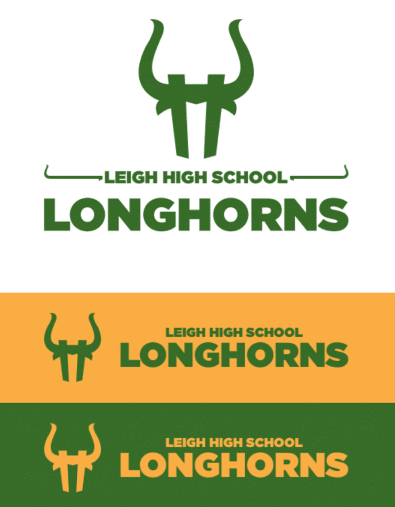
Three weeks ago I announced a design contest to create new uniforms for the Leigh High School Longhorns girls’ basketball team in San Jose. Today we’re ready to announce the winner.
“This was a tough decision,” says Bobby Williams, the team’s coach, who commissioned the contest. “We received over 30 entries. I wanted to let the coaching staff have some input on choosing the winning design [Uni Watch did not participate in the judging — PL]. We narrowed it down to a few finalists and then we fought a lot over who should win.”
Before we get to the winning design, here are the runners-up that Bobby liked best (for most of these, you can click to enlarge):
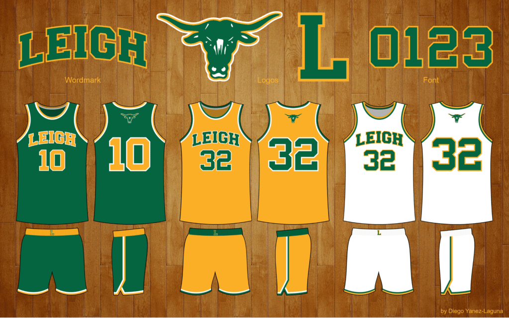
Runner-Up: Diego Yanez-Laguna
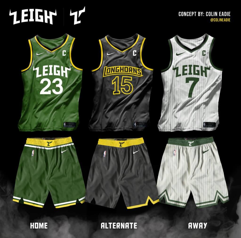
Runner-Up: Colin Eadie
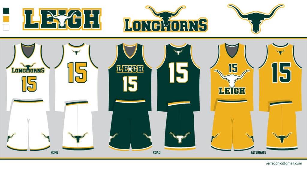
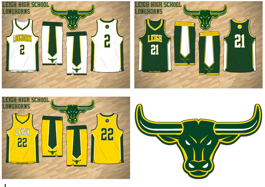
Runner-Up: Ron Verrecchio
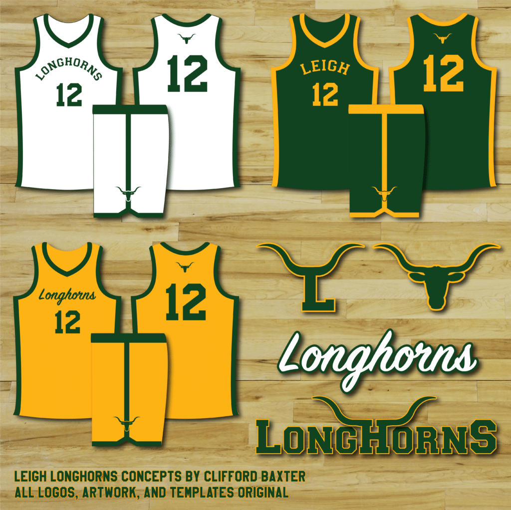
Runner-Up: Clifford Baxter
Runner-Up: Brady Ivie
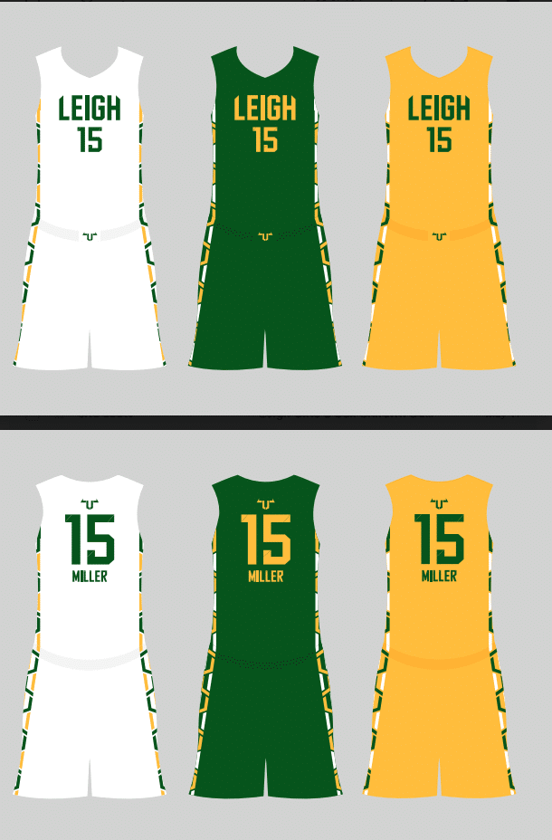
Runner-Up: Trayton Miller
And now, here’s our winner …
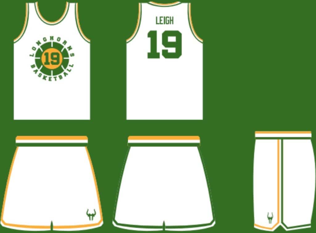
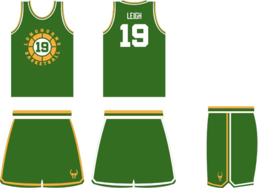
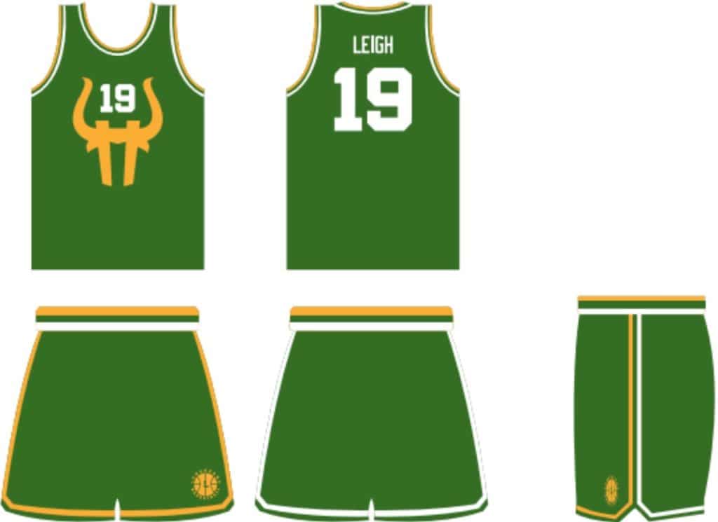
Winner: Lee Traylor
———
“I think Lee’s design really ticked all the boxes we wanted,” says Bobby. “And I absolutely loved his minimalist design take on our longhorn logo.”
Lee has won himself $375 for his efforts, and Bobby is a very happy client: “Thanks for hosting this competition — it was amazing to see all of the designs, and the whole experience was more than I could have hoped for.”
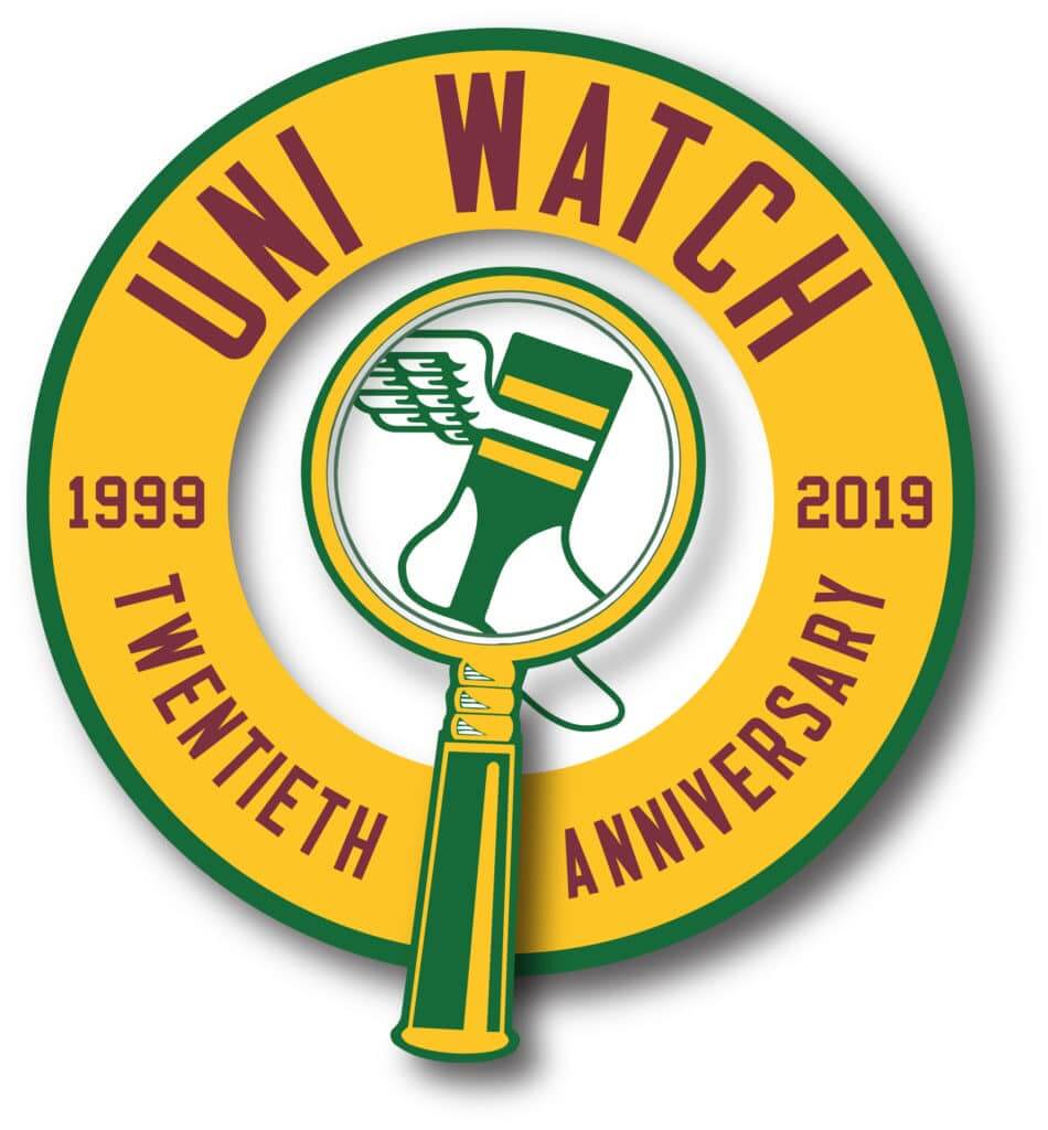
ITEM! Big uni-versary announcement: As I hope you all know by now, Uni Watch’s 20th anniversary was on Sunday (in case you missed it, here’s the post I wrote for the occasion). But 2019 also marks the 20-year milestone for another notable moment in the uni-verse’s history: MLB’s infamous “Turn Ahead the Clock Program,” which launched on June 26, 1999, with an Angels/A’s game.
When we did the month-by-month designs for the Uni Watch T-Shirt Club in 2015, I thought about doing a TATC design, but there was really no good way to do it with a screen-printed shirt. But Teespring has really upped its sublimation game lately (as seen via our Tequila Sunrise Deluxe shirts and hoodies, plus the 2019 Purp Walk shirt), so it recently occurred to me that we could now do a TATC shirt — a perfect way to mark the 20th uni-versary of both Uni Watch and the TATC program.
I was lucky to have the assistance of Teespring designer Jimmy Nutini. Check out what we came up with (click to enlarge):
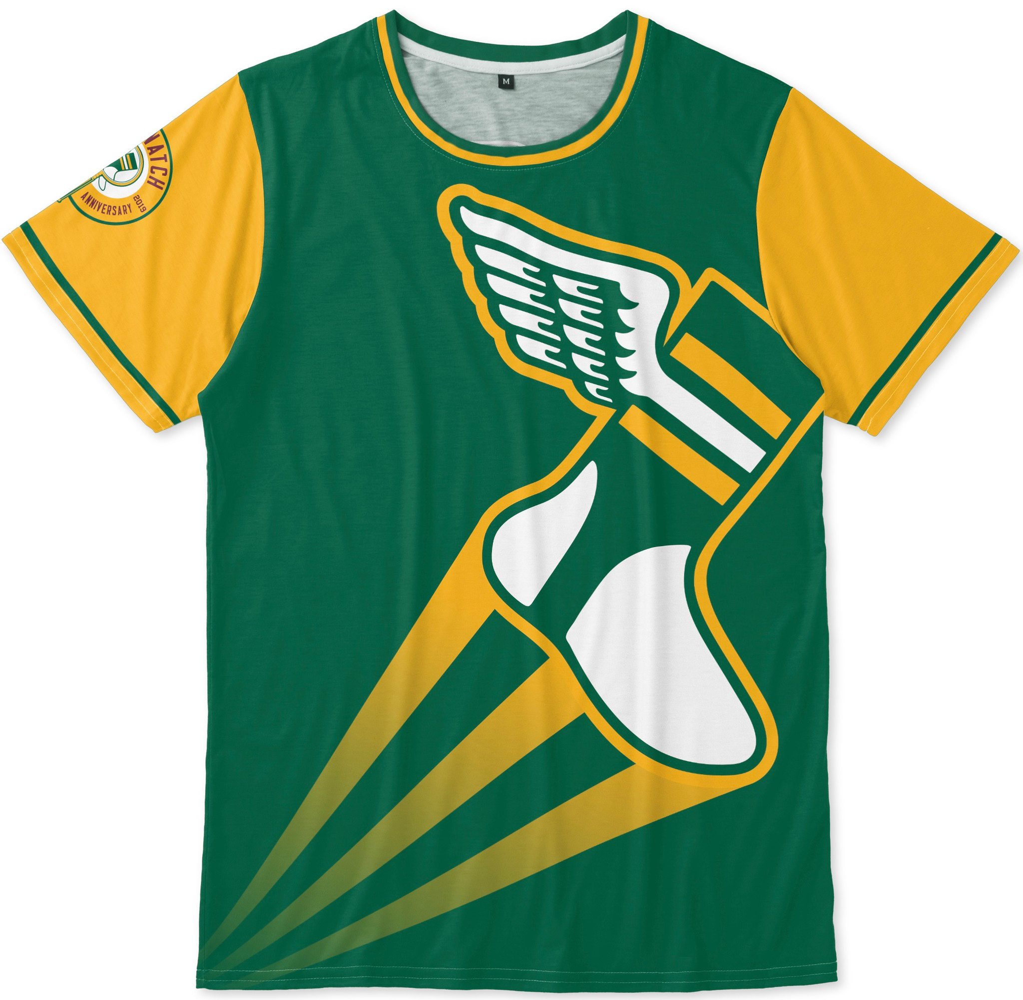
Pretty good, right? It was Jimmy’s idea to combine the TATC program’s oversized logo trope with the fadeaway gradation lines that were originally used on the Phillies’ TATC jersey — a great combination that really captures the spirit of the TATC silliness. Note that we also have the Uni Watch 20th-anniversary logo printed on the right sleeve as a “patch” (not an actual embroidered patch, obviously).
And here’s the back, which matches the original TATC style, complete with a vertically stacked NOB (click to enlarge):

My original plan was to launch this on June 26, to coincide with the anniversary of the first TATC game. But then it occurred to me that people might want to wear it to the Uni Watch parties that are taking place on June 29, so I’ve decided to make it available now. You can order it here.
(Meanwhile, you can also get T-shirts with our anniversary logo, in green, gold, and various shades of grey, charcoal, black, white, and so on, along with anniversary logo stickers. Embroidered patches should be available in a week or two. My thanks, as always, for considering our products.)
I’m super-grateful to Jimmy for making this happen — hope you agree that it’s a really fun addition to the uni-versary celebration.

ITEM! Satellite party update: Meet JohnMark Fisher. As you can see, he likes hot dogs (no capers, but we’ll forgive that for now) and also likes hats with excellent NBA logos. He’s also a card-carrrying Uni Watch reader, a geographer for the U.S. Census Bureau, and the holder of a master’s degree in geographic information systems and cartography, all of which makes him the perfect person to be the Uni Watch 20th-anniversary satellite party coordinator — which, by happy coincidence, is precisely the position for which he volunteered and was promptly hired yesterday.
Here’s the deal: We’re going to have a uni-versary party here in Brooklyn, at the 773 Lounge, on June 29, 2-6pm. A few non-NYC-area readers have expressed interest in organizing their own satellite parties in their respective cities for that same afternoon, and I like the idea of having a network of simultaneous Uni Watch celebrations taking place (which perhaps we can even link via Skype or Facebook Live or some such). JohnMark will be the point person for keeping track of all these parties, and he may even put his cartographic skills to good use by creating an interactive map showing all the party locations (which will be pretty fucking embarrassing if there are only one or two satellite parties, but I’m trying to stay optimistic here).
So:
• If you want to host a Uni Watch satellite party in your city on June 29 and have an idea of where you’ll be doing it, email JohnMark and give him the details.
• If you want to attend a Uni Watch party in your city on June 29, assuming someone else organizes one, email JohnMark, so we can have a sense of how much interest there is in a given area. (If a bunch of people in a given city are interested in attending but nobody has stepped up to organize a gathering, JohnMark may write back to you all to say, “People — come on, one of you step up and organize something!”)
JohnMark will compile the information onto a spreadsheet (and possibly a map!), which I’ll share here on the site shortly.
I want to mention that this is another great testament to the Uni Watch community. Not only is JohnMark volunteering his time (as did several other readers — I had several good candidates to choose from!), which is a very community-minded gesture, but he’s doing so to help organize these satellite parties, which are also community-minded gestures. As I mentioned on Sunday, Uni Watch’s 20th anniversary belongs to all of us, not just to me, which is a big part of why I like the idea of having lots of simultaneous parties, not just the one in Brooklyn. Community!
And speaking of the Uni Watch community…: Check out what happened yesterday in Vancouver:
Impromptu Uni Watch meeting on a street corner in downtown Vancouver. I was recognized by awesome contributor Wade Heidt – turns out we work in the same building!@UniWatch pic.twitter.com/KgQUlYhGIn
— Wafflebored (@wafflebored) May 30, 2019
How did Wade even recognize the notoriously reclusive Wafflebored? You may recall that back in February we ran a photo of WB wearing his own DIY’d Uni Watch hockey jersey, which we then auctioned off. Wade apparently committed that photo to memory.
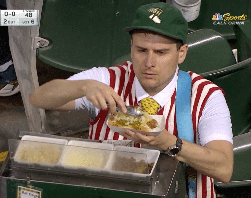
ITEM! Condiment update: I checked in yesterday with ace A’s vendor Hal the Hot Dog Guy (who, in case you somehow missed it earlier this month, is the subject of one of the greatest blog entries in Uni Watch history) to see how the caper crusades are going. He responded with the following:
I still got ’em. Most people are just mystified that I have capers, and I would say I serve them maybe on two to three sales a game. I do have about five or 10 people a game ask me if I have them, but I those are just people who read the article and are keeping me honest (so you got people out there making sure I’m keeping my word to you). I would say that Jim [Hal’s fellow vendor] and I are eating an equal amount of them on the stadium pretzels we snag once in a while.
I think the caper crusade is going to be a marathon and not a sprint.
Whoa — capers on a pretzel? How do they even stay on? I’ve asked for a photo. Stay tuned!
The Ticker
By Anthony Matthew Emerson

Baseball News: Good news out of Seattle, where the Mariners announced that they’ll be wearing Pilots throwbacks on June 22 (from @Ea_zy_E). … The Cardinals and Cubs will play in London in 2020. Wonder if they’ll both wear their home uniforms, as the Yanks and Red Sox will be doing next month. … The Memorial Day remembrance poppy was still on some Angels players’ jackets yesterday (from Jakob Fox). … Also from Jakob, the Angels are the only team whose flag at Oracle Park does not feature their city’s name. Perhaps they couldn’t decide between Los Angeles and Anaheim. … Former MLB player Matt Antonelli has posted a new video discussing the MLB jerseys he kept from his playing days (from Lucan Denfield). … Aaron Phipps found some awesome vintage MLB wrapping paper at a thrift store. Looks to be c. 1990. … Beautiful mismatch of uni eras at the annual Hall of Fame Classic in Cooperstown (from Mike Chamernik). … The Orioles appear to have used an upside-down 2 instead of a 5 in this graphic (from Andrew Cosentino). … Actor Wayne Knight went with a BFBS replica jersey whilst throwing out the first pitch at Dodger Stadium the other night. All I can say is “NEWMAN!” (from @EvilEmpireFan). … I’ve never seen a beer can repurposed into a candle before, let alone one with the tequila sunrise motif (from @CDud1970). … Did you know that Jimmy Dean, the sausage company, once made baseball cards? I didn’t. They only had the MLBPA license, so the airbrushers had a lot of work (from @Jimbollini). … A bit late for Purple Amnesty Day, but Washington softball went mono-purple for yesterday’s game against Arizona (from Griffin T. Smith). … Interesting ump jerseys for the NJCAA World Series (from @MRedcross). … Joe Holloman sends along this fun letterhead from the Detroit Clowns, a sort of pre-Globetrotters novelty baseball team that wore Spalding-manufactured clown suits. Look at that letterhead! More info here. … Adrian Bischoff sends along this absolutely stunning 1930s Mexican baseball jersey for the “Electricitas.”

Football News: The CFL’s Toronto Argonauts added “We The North” uni patches to support the Toronto Raptors in the NBA Finals. Both teams are owned by Maple Leaf Sports and Entertainment (from many readers). … The Argos also showed off their new white pants (from Wade Heidt). … Pitt released an odd promo image for this fall’s game against Penn State, featuring Pitt’s new unis with a 2018 ACC Championship Game patch, which is most certainly not going to be on their new unis (from Doug Keklak).

Hockey News: The Las Vegas Metropolitan Police’s hockey team have some decent unis with a pretty awesome crest (from @MaxMetalFriar). … The AHL season is literally half a year away but the Ontario Reign have already announced their Pink the Rink date (from Jack Wade).

NBA News: The official version of the NBA Finals logo includes a YouTube TV ad, which has crept onto the baseline (from Chris Dougherty and @AVKingJames). … Cross-listed from the football section: The CFL’s Toronto Argonauts added “We The North” uni patches to support the Raptors in the NBA Finals. Both teams are owned by Maple Leaf Sports and Entertainment (from many readers). … Uber driver indicators were replaced with Raptors logos in Toronto yesterday (from @samuel101ts). … Counterfeit Warriors gear was showing up in spades ahead of the NBA Finals (thanks, Brinke). … The Raptors gave away these T-shirts featuring every logo in franchise history to every fan at Game 1 last night (from Austin John and Jakob Fox). … ABC/ESPN was using gold Raptors and Warriors logos on their score bug last night (from Andrew Cosentino).

Soccer News: Nottingham Forest have unveiled their commemorative jersey for the 40th anniversary of their European Cup victory. No ads, except for the maker’s mark (from Ed Żelaski). … Liverpool uploaded a brief video of the embroidery process for their kits’ Champions League Final lettering (from Moe Khan). … A Norwegian Air jet with an image of Tottenham legend Gary Lineker on the tail was spotted at the Madrid airport ahead of Spurs’ appearance in Champions League Final in Madrid (from Griffin T. Smith). … The SheBelieves Cup and Women’s International Champions Cup both have title advertisers now (thanks, Jamie).

Grab Bag: Here’s an equipment brand breakdown for the Premier Lacrosse League’s Atlas LC squad. … Speaking of the PLL, the league’s logos have been applied to the turf at Gillette Stadium ahead of the inaugural match (from @PhillyPartTwo). … Brazilian men’s volleyball club Taubate has added a third star to their crest. The bottom two represent Cup wins and the large one represents their first league title (from Jeremy Brahm). … The font on England’s new cricket unis has changed since they were revealed a short while ago (from @Stumpy7780). … This summer, Hershey’s is replacing its logo on the individual pieces of their chocolate bars with emojis, for some reason (from Jason Hillyer). … John Lennon’s tracksuit is up for auction, with an opening bid at a cool $35,000 (from Tommy Turner). … Here’s a whole bunch of retro Metro Boston Transit Authority logos (from Mark Tang).
Good Morning!!
-Link in the first sentence not working.
-“…where the Pilots announced announced…” (Should be Mariners??)
Both fixed. Thanks!
Another typo: for the Mexican vintage jersey, *Electricitas should be Electricistas, with an S.
“WE THE NORTH”…. as opposed to “WE’RE THE NORTH”?
Good grief.
My teacher-issued red grading pen almost marked up my monitor..
Call it a peeve, but I cannot stand when bastardized English language is purposely used on uniforms/t-shirts.
Perhaps I’m wrong, but is it not meant to be read like “we the people”?
That’s how I took it too.
Exactly. It’s not that they dropped the contracted “are,” it’s that they dropped the comma. Punctuated properly, it would read, “We, the North …”
Fair points!
The comma would help immensely, but would probably look odd on the patch…
I read/interpreted it as slang… for example the expression, “we here”.. slang for “we are here”.
Most tweets/statements from pro sports teams now tend to lean toward incorrect/slang grammar, which is what I based my view on.
I am using this example in my Sociology class discussion/debate today.
I’d be inclined to agree that the comma should be there,but the preamble to the US Constitution thinks otherwise as it turns out.
Doesn’t make it any better but I read it as WE, THE NORTH.
Also, Toronto (43.6* N) is nearly the southern-most team in the CFL. Only Hamilton (43.2* N) is closer to the equator.
Do Canadian fans roll their eyes (politely, of course) at Toronto claiming “the north?” At least the Raptors are farther north than everyone except the Trailblazers and Timberwolves.
Three NFL teams (Seattle, Minnesota and Green Bay) are north of Toronto and Hamilton, btw. Seattle is north of four CFL teams.
Nope, it is absolutely been embraced. I see it as a bit of a reach out to all of Canada, being the only Canadian franchise.
I was curious more about the Argos adding the patch and hitching themselves to the “We represent Canada” message, but I suppose if it’s strictly about supporting the Raptors then it’s OK. My opinion will change if the Argos don’t stand down after the NBA Finals.
I get the sentiment they’re conveying here, but it’s also at least a little humorous that Portland & Minnesota are located farther from the equator.
Good lord that TATC shirt is hilariously awesome!
It’s so crazy, it’s terrific!
It’s amazing! Ordered already!
Congrats on another contest with terrific entries. Hope they send some pics of the Longhorns in action!
Yup – those entries wear some good uniforms.
Agreed. I liked all of the entries featured today, and I loved most of them. Any high school would be the envy of its conference wearing any of these designs.
So who owns the rights to the Seattle Pilots logo, unis, etc: the Mariners, Brewers, or MLB? Trying to figure out how this works from an ownership standpoint. It would be like the Colorado Avalanche wearing the old Rockies uniforms for a throwback night, but the Rockies eventually moved to New Jersey.
Aside from the Texans/Titans Oilers situation, in most case the teams and leagues are not jerks and they work it out. In fact the Jets let the Oilers have the Titans name, so their lack of cooperation with the Texans is all the more striking.
The Mariners have done Pilots throwbacks at least twice before, and the Rangers have done throwbacks to the old Washington Senators, which became the Twins. The Nationals have also done Senators throwbacks even though they were the Expos. In hockey, the current Winnipeg Jets have an alternate hat is a throwback to the old Jets who are now the Coyotes.
So, not being able to do this is more the exception than the rule. Everyone just wants to have fun; except for the ownership of the Tennessee Titans.
Lou, when have the Texas Rangers done throwbacks to the original Washington Senators? I’m only aware of the Rangers wearing throwbacks to the expansion Senators, which franchise moved to Dallas and became the Texas Rangers. The Rangers throwing back to the previous Senators franchise, which now plays in Minnesota, would be very interesting, so I’d love to know more about the circumstances.
As for Seattle, I still hope that both the Mariners and Brewers break out Pilots home and road unis when the Ms visit Milwaukee the following week.
According to the Henderson book, the Rangers have never thrown back to the original Senators. They have done two versions of the 1960s Senators, a ‘40s-style fauxback, and a Negro League throwback.
The Rangers own the rights to the original Senators. I did a college paper on the Twins move and was told by the Twins that they had very little information in their archives because the Rangers own it all.
I have no issue with the Titans retaining and protecting their Oilers history…it belongs to them, not the city of Houston and clearly not the Texans.
I like having fun as well, and it interferes with my fun knowing that there are teams out there who think it’s a-OK to pass themselves off as an identity they never were, and their league offices see ‘no harm, no foul’.
There’s plenty of off-the-field ways to celebrate a city’s sports history respectfully and accurately.
IIRC, both the Rangers and the Brewers wore recycled jerseys (removed Senators and Pilots branding)for their first spring training season.
The link for the new Burnaby Lakers Jersey is not working
Link appears to be dead. Now removed from Ticker.
Hi guys,
Here is the link for the new black jersey for the Burnaby Lakers. They trotted them out on the road in Langley. Back wearing predominantly black jerseys again after some years of wearing forest green jerseys. Lack of white in the jerseys. The numbers must be tough to see from the stands.
link
I’m fairly certain your 2008 ESPN piece marking the ten year anniversary of the first TATC game was my very first exposure to Uni Watch so it feels extra fitting that this new shirt should coincide with the anniversaries.
From the Detroit Clowns letterhead: REAL BALL PLAYERS WHO WEAR CLOWN SUITS
Insert joke about real clowns who wear ball player suits here.
Great work everyone who contributed to the Lehigh contest! Great submissions.
I did have some thumbs down to the Toronto Argonauts after removing the stripes from their sleeves. However, after seeing them in the Oxford (dark) blue jersey over the new white pants on the field, my complaints are taking a back seat. Really hope they are wearing the blue over white as their main primary home combo. This new uniform is top notch!
Montreal Alouettes looked pretty darn good in their new road unis as well. They have received quite the upgrade too.
I think I liked all the other Leigh entries better than the winner. The winner isn’t bad, but we know they play hoops already. I don’t think it needs to be notated on the kit.
For me Diego Yanez-Laguna’s entry was superior to everything else. I wouldn’t have even considered the winner as a finalist. Now I just need to be a coach of a sports team with money to spare so I can outfit them as I wish!
Am I missing something on the winning design? Is it a skull? Is it supposed to read as an H? I really can’t make sense of it
ABC/ESPN was using gold Raptors and Warriors logos on their score bug last night.
Perhaps a continuation of the Finals’ branding. Both teams sported black warmups with metallic gold logos in pregame.
A question on the high school uniforms: Do they have to follow the national rules about the layout of the uniform itself? Fonts, letter size, arching and such….I have seen teams get called for technicals before a game even tips off and they are down a basket to start. I was just wondering….
It looks like the winning design doesn’t even comply with the rules… It’d be a shame if they pay all that money and can’t even wear the uniform.
The uniform is, technically, illegal, but I understand Federation schools have until 2023 to be completely up to standard.
Here’s what I see wrong:
“The first and last letters (of a team name), either above or below the number, must be on the same horizontal plane. When above the number, the plane may not be below a plane extending through the top of the number(s). When below the number, the plane may not be above a plane extending through the bottom of the number(s).” It looks like “longhorns” is too kerned, while “basketball” is OK.
Huge gray area about the basketball and/or skull. There’s nothing that appears to disqualify these graphics around the numbers, as long as the numbers are legible.
My understanding is that the front, from the bottom of the collar down, must be totally blank with the exception of school name/mascot and number. Designs are restricted to the shoulder area and “decorative accents” must be above the number. This, combined with the horizontal plane and 1-inch rule, is supposed to ensure that there are no designs or distractions to potentially obscure the uniform number for the officials.
I think the 2023 compliance date is only for uniforms that don’t comply with the new rule that the number must be a different color than the base of the jersey (ghost number rule).
Another vote for Diego’s design. Simple is better again in this case.
I don’t know if anyone caught this, but the website selling the ’30s Mexican jersey is incorrect – it’s an “ElectriciStas” jersey, not an “Electricitas” jersey, so they’re the Electricians, which I like even better.
I still have my 15 year Uni Watch Anniversary patch and I’m looking forward to getting my hands on the 20 year version later this month.
Was there ever a 5 and/or 10 year patch? I don’t recall.
Nope, didn’t mark the 5- or 10-year anniversaries.
I still can’t get over how Pitt and Nike fouled up the new unis with that stupid number font.
Typo alerts: hooides should be hoodies, and Uni Wactch should be Uni Watch.
The thought of two uni-watchers running into each other in the wild and recognizing one another stuns me a little.
Both fixed. Thanks, Mike! (And yes, I was stunned too.)
Nobody was more stunned than me.
I was stunned too. It is a small world. I knew we both lived in Vancouver, but we work at the same building (though a lot of people do work in that building).
After seeing Wafflebored’s photo on this website in Feb, started to notice this gentleman when walking around at lunch with a similar hat and glasses, thinking I recognize this man somehow. It was the Twitter posts with the photos of the jerseys in the shop window that Wafflebored mentioned he walked by every day that made me realize it. I recognized the shop and it is really close to the building.
Great meeting with you Wafflebored in person and we will hang out in the future. It was really too bad I had to go back up to work. Chatting uniforms with you was much more exciting than my job!
I don’t know if you guys are organizing a Vancouver satellite party for 6/29, but you should!
June 29 is the only day all year when I have prior obligations all day and into the evening. So not possible for me although I’d love to know how many Uni Watchers we could get out for an event.
First off, great job on all the Leigh hoops uniforms. I can’t wait to see pix of them in action.
Really looking forward to the satellite parties, especially with Mr. Fisher’s involvement. I consider myself a map geek as well so I’m curious as to what he has up his sleeve.
As far as the TATC shirts go, is this a limited time offer? Will there be a certain allotment of shirts to sell? I’d like to get one but am still waiting on my 2019 purp walk shirt.
The TATC shirt will be available at least through the end of this calendar year, so no rush. (But don’t wait *too* long!)
Dumb question? Why is the masthead on this page the 15th anniversary logo when the 20th logo is available?
I really think Colin Eadie’s entry is the best. Love the usage of the horns in the first and last letter!!
I learned about the Leigh High contest too late to create an entry I would be proud of, but I’m stunned at the winning entry for this reason: Coach Williams said he wanted “Something clean and classic, something that is minimalist in design but will still look and feel fresh in 5-10 years.” In my estimation, Lee Traylor’s winning design went against all of that (and other entries suffered for having heeded those requirements).
The winner has a basketball graphic w/numbers in the center (whatever you call that, it can’t be called “minimalist”) and a cryptic longhorn graphic, which appears to be a stylized “L-H-S.” I feel it’s safe to say very few people unfamiliar with Leigh or its nickname would be able to decipher it, but maybe that’s not important to the coach. Of those presented, my preference would have been Colin Eadie’s.