By Phil Hecken, with Brinke Guthrie
Follow @PhilHecken
Bonjour mesdames et messieurs.
See, I knew that seven years of French I took in middle and high school would come in handy some day.
Normally, I would have run this piece tomorrow, as 26 May is the first day of the 2019 French Open, but there just happens to be something a tad more important taking place in the Uni-verse on that day, something I can assure you you will not want to miss. Let the countdown begin…
So, today, I’m back with my doubles partner, Brinke Guthrie, who I asked to provide us with a rundown of the fashion for the second leg of Tennis’ Grand Slam, the French Open. He didn’t hesitate when I asked. Let’s get right to it then, shall we? Here’s Brinke:
French Open Fashion … 2019 Style
By Brinke Guthrie
The French Open’s first round of competition for men and women begins tomorrow. Roland Garros: where men’s American tennis hopes go to die. (Last American to win: Agassi in 1999. The women have only fared marginally better: Serena Williams has three wins there since 1999, and Jennifer Capriati won in 2001.) As usual, this is one of the big events for apparel and gear makers to unveil their new stuff. Before we break down some of the bigger brands, a French history lesson. D’accord?
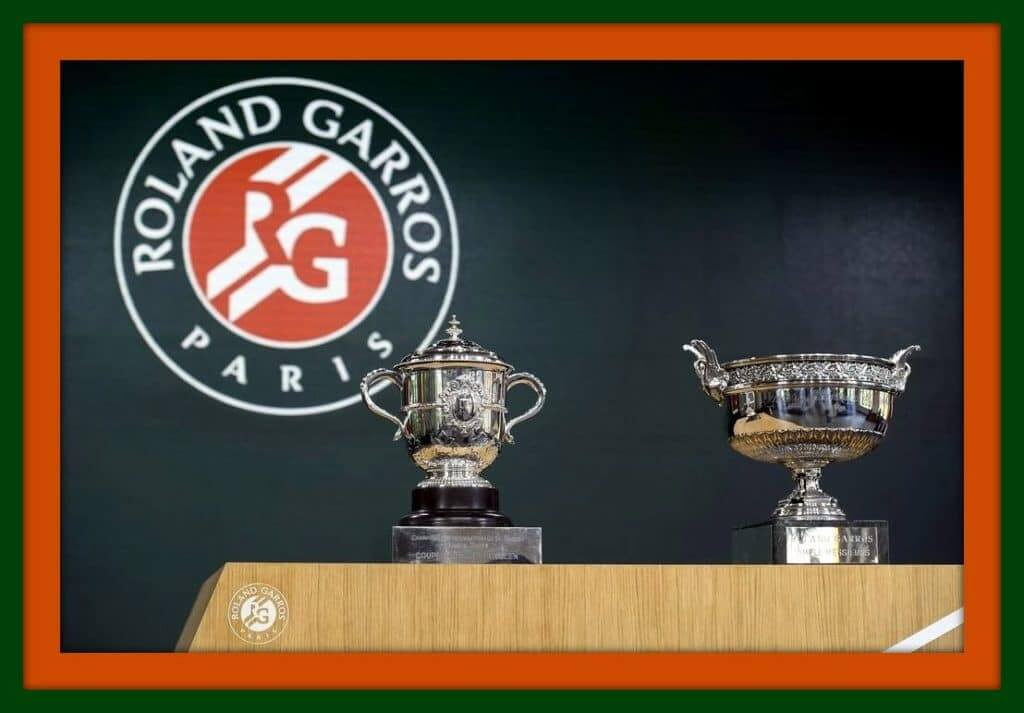
A Bit Of Roland Garros background
First off, “French Open” and “Roland Garros” are the same. Either name works. (Garros, BTW, was a French WW I flying ace.) Lacoste is the big dog croc here, and is synonymous with French tennis. Crisp tennis whites all day long- check out Rene Lacoste. Fila holds a special place in RG history, from back in the 1970s-1980s when Bjorn Borg won six titles. (Here’s Borg with fellow Fila-mate Guillermo Vilas in the 1978 final, won by Borg.) Nike has had a big showing at the French over the years; Federer, Serena and Sharapova have all scored titles there, and then there’s Rafa Nadal, winner of an astonishing eleven titles on the RG clay.
And now, a look at some of the gear:
Hydrogen
The mainstream tennis audience probably doesn’t know this in-your-face Italian brand- but judging from the designs on their website, they’re targeting teens, period. You won’t see a 60 year old CEO wearing Hydrogen at the club. That’s Tomas Berdych, trying not to be too embarrassed; he is getting paid for wearing it, you know. Just a 2019 riff on the late 1980s-1990s Nike/Agassi campaigns. Their website also shows some, er, slightly more conservative looking stuff with a big “V” on it- “V” for victory.

Uniqlo
They only have two players; one is the biggest in Japan (Kei Nishikori), and the other is the biggest, period. (Roger Federer). Don’t much care for brown/beige as a tennis color, despite what that fawning Esquire advertorial says. (And neither does this Twitter thread.) I miss his elegant RF logo on the Nike stuff, and the logo AFAIK is still in legal limbo, despite what this site says. I’ll wait for Wimbledon (white) or the US Open (who knows) to see if they come up with some color scheme I can live with. (I do like this T though- but only available on their French site as best I can tell.)


Nike
Let’s just cut to the chase and cue up Nike PR-speak, since no one does it better: “Extending Nike’s longstanding history of unique prints and patterns, the summer 2019 NikeCourt collection uses an 18th-century art form to decorate the apparel for Paris. A toile print depicts pastoral scenes of skeletons amid tennis-specific details, including a served ball, a dapper spectator and more. Other details are specific to Nike (check out the Swoosh on the skeletons’ shoes) and its World Headquarters in Beaverton, Oregon, like the trees and geese that populate its campus. Player options will include two more looks: a floral print, which appears on the men’s jacket, pant and shorts; and a bee, a classic French mark, on the women’s top.”
Aha. That explains the bees. I guess.
Got all that? So here are Simo and her bees:


And here we have some skeletons playing tennis. (A Grateful Dead deal, Phil?) I must admit, I’ve never ever considered skeletons as a tennis thing. I stand corrected. [That was THE first thing I thought of when I saw those, Brinke — PH]


Roses and tulips on tenniswear? No. [That reminds me of the pattern on my grandma’s couch. No joke. — PH]


A fellow on Twitter posted those with this comment: “Nike’s outfit for Dimitrov, Kyrgios etc. for Roland Garros. It almost makes me like Federer’s hideous Uniqlo outfit #whateverhappenedtoNike”. Nike also recently signed world #1 Naomi Osaka away from Adidas, and she is included in this clip. This will be Osaka’s first Swoosh Slam, and she will be getting her own personal line and logo. Osaka has three sponsor logos on her attire, two on the top and one on the visor. No other Nike sponsored player has this clause in their deal; the look usually needs to be “clean.” The retired Li Na got the same deal a few years back; Nike wanted into the China market.
Fila
Fila, help restore some sanity to this article. Whew- We get a crisp clean look for their pros, like Kiki Bertens and recent Italian Open winner Karolina Pliskova. They’re both sporting the classic Fila Heritage Collection. Nothing like some basic blue to restore order.


Lacoste
Novak Djokovic will wear this in Paris; he wore a blue version in Melbourne and rolled out the orange at Miami. Matching ASICS, of course. According to the tournament website, Lacoste will also have a co-branded Roland Garros line this year.

More croc looks below:


Adidas
Once an official sponsor of the French, Adidas would have a line for their players to wear that included the RG logo. Always wondered why both Lacoste and Adidas were big sponsors, since they’re competitors in the sport. Adidas no longer has that designation, so their gear is RG logo-free. It’s called the Escouade (“squad”) Collection, and the colors include light blue, black and white. Red/light gray/purple will be introduced for other Spring Masters events. Caroline Wozniacki and 2016 winner Garbine Muguruza shown below.


Sweet. Thanks, Brinke! Nice rundown of the French Open attire. Looking forward to watching tomorrow.


Kreindler’s Korner
I had the distinct pleasure of featuring the wonderful artwork of artist Graig Kriendler on two occasions over the summer and fall of 2017, and more recently, in August of 2018.
For those who don’t wish to click the links, Graig paints baseball heroes (and regular guys) from the past, and is an immense talent.
Occasionally, I will be featuring his work on Uni Watch.
Here’s today’s offering (click to enlarge):

Title: “Nap”
Subject: Napoleon Lajoie, 1902
Medium: Oil on linen
Size: 12″ x 16″Another portrait based on the brilliant work of Carl Horner, “Nap” depicts the great Hall of Famer Napoleon Lajoie in 1902. As the rest of his Cleveland teammates were that year, the legendary second sacker is depicted in his navy road togs with a large “C” on the left side of his chest.
Like the Horner-based portraits of Honus Wagner and Ty Cobb, this particular image was used as the basis for one of his T-206 tobacco cards. The lithography process placed a pastel yellow background behind Nap’s head on the card, but I still found myself wanting to keep the idea of these heads being in front of simple muslin tarps, which is most likely what Horner’s setting was like inside his Boston studio. The light source seems to be some sort of window or skylight, which I always figured would be northern light. That exposure was very often chosen by portrait painters due to a sky plane that doesn’t usually change drastically through any given day due to the sun not passing through it. That sort of consistency is crucial when painting a figure over multiple sessions, which was pretty much the norm. The northern light usually leads to cooler lit planes with warmer shadows, something that’s most evident in Lajoie’s face.
As mentioned in previous entries, the hope is that I can create a large number of portraits of the Hall of Fame players who were both photographed by Horner and eventually had those images represent them in that T-206 set. Ideally, I’d love to see them all under a single roof in a gallery setting, maybe seeing the paintings paired with their cards. I’m happy to say that something might be in the works, though I can’t speak of any details yet. There are more of these paintings in progress, including those of Walter Johnson, Joe Tinker, Rube Waddell, Eddie Plank and Bill Dahlen (who I think will make it into Cooperstown before this whole project is done).
Thanks, Graig! You can (and should!) follow Graig on Twitter.
Why Is This Man Smiling???

Tune in tomorrow to find out!

Uni Concepts & Tweaks
After being dormant for a while, the Uni Tweaks/Concepts have returned!
I hope you guys like this feature and will want to continue to submit your concepts and tweaks to me. If you do, Shoot me an E-mail (Phil (dot) Hecken (at) gmail (dot) com).
I received the following e-mail from John Elbertson, who is back with some concepts for the Cincinnati Bengals
What’s up Phil?
Here’s a concept I was working on for the Bengals. I kept the striped helmet, and used the AFL helmet treatment on the arms. Besides the sleeve treatment, the rest of the set is traditional. The third jersey arm logo features an infinite regression.
Lastly, the black jersey cannot be paired with the black pants, and same with the orange, because. Hope all’s well, talk to you soon!
– John E. (@HungryJohn18)

Thanks John. OK readers (and concepters). If you have some tweaks or concepts, shoot ’em my way with a brief description of your creation and I’ll run ’em here.
Time To Update My 1985 Dead Concert Tee


Guess The Game…
from the scoreboard
The game has returned! At least for a trial basis, but I got a lot of positive response to its return, so we’ll see how long we keep this one going.
Today’s scoreboard comes from Mike Engle.
The premise of the game (GTGFTS) is simple: I’ll post a scoreboard and you guys simply identify the game depicted. In the past, I don’t know if I’ve ever completely stumped you (some are easier than others).
This one probably rates a good 5/6 out of 10 on the difficulty scale.
Here’s the Scoreboard. In the comments below, try to identify the game (date & location, as well as final score). If anything noteworthy occurred during the game, please add that in (and if you were AT the game, well bonus points for you!):

If you guys like this, and want to continue this as a weekly feature, let me know in the comments below. You’re welcome to send me any scoreboard photos (with answers please), and I’ll keep running them.
The Ticker
By Anthony Emerson

Baseball News: A John Wayne Gacy painting of an oriole that was maybe signed by Cal Ripken Jr. is up for auction (from Mike Chamernik). … Bryce Harper’s new personal logo has been revealed, dropping the “34” and going just with a “3” for obvious reasons (from Blake Fox and Nick Tesluk). … Also posted in the hockey section: YouTube TV had a thumbnail of the New York Rangers rather than the Texas Rangers for the Fox Sports Southwest show Rangers Insider (from @heyvittas). … The first 4,000 fans to today’s Corpus Christi Hooks Blue Ghosts game get this pullover jersey (from Ignacio Salazar). … Duke baseball coach Chris Pollard’s son has his own uniform, but unfortunately incorrect NOB and number fonts and colors (from Griffin T. Smith). … Miami of Ohio has a somewhat odd placement for their helmet numbers (from @JayJayDean). … Iowa’s Mitchell Boe wears a helmet with two c-flaps (from Jacob Russo).

Football News: We now have a look at the Toronto Argonauts’ new pants and socks (from Wade Heidt). … Jim Vilk found this amazing Ohio State helmet-themed bus while out and about. … The following are all from Phil: Do you really want to see 247sports.com’s “Memorial Day Helmets” for major college football programs? Really? Okay, I warned you. … Here’s a BIG 10 schedule, featuring the helmet matchups for each team. … If your answer to the question “should Notre Dame change its look?” is anything other than a “NO!” this might be the wrong website for you.

Hockey News: Former NHL defenseman Hal Gill tweeted out a picture of old helmets and gloves he kept from his NHL career (from @redbuppy). … The Bruins pro shop at the Garden has a mannequin in full Stanley Cup Final uniform — except the socks are wrong. The Bruins switched to black socks from gold during the changeover from Reebok to Adidas before last season (from Adam Femino). … Cross-posted from the baseball section: YouTube TV had a thumbnail of the New York Rangers rather than the Texas Rangers for the Fox Sports Southwest show Rangers Insider (from @heyvittas).

NBA News: Nike gave Raptors head coach Nick Nurse his own personalized hat. There’s only four of them out there (from @_bkuhn_ and Andrew Cosentino).
.

Soccer News: Here’s a very good article about how the Premier League is adapting to include more accent marks to NOBs (from Jason Jarrett). … Sports Illustrated has a rundown of every Women’s World Cup kit (from Brandon Lewis). … Celtic FC are reintroducing giant numbers on their shorts for the Scottish Cup Final. The shorts numbers were their primary uni numbers until the 1990s (from @jamesesiddall). … Brazilian club Bahia created a camouflage jersey not as a military appreciation gesture, but to raise awareness and combat the epidemic of post-match violence in Brazil (thanks, Phil). … Leicester City have revealed their away and third shirts (from Jamie and Charles George). … Nike sewed an Internacional player’s badge on upside down (from Rafael Loureiro). … Manchester United’s Jesse Lingard is the latest footballer to appear on BT Sport’s What I Wore. … Speaking of United, Adidas has released replica kits to celebrate the 20th anniversary of the club’s 1999 victories in the Premier League, FA Cup and UEFA Champions League, but sans the Umbro logos, natch. … New kits for English League One side Ipswich Town (thanks, Jamie). … New kits for Scottish League Two side Stenhousemuir (thanks again, Jamie). … The following are all from Josh Hinton: PSG’s home kit has been leaked. … Manchester City’s home kit has been leaked. Note the small “125 Years” beneath the badge. … The Royal Spanish Football Federation surprisingly severed a decades-long relationship with Adidas as the Spanish national team’s kit provider last week, and are already looking to Puma and local retailer Zara to replace them. … Olympique Marseille have unveiled their new home kit. … FC Heidenheim have released their new home kit. … Red Bull Salzburg’s new home kit has been released. … Not uni related, but York9 FC’s new mascot, Yorky, is a “time-travelling humanoid robot” sent from the future to help the team win in the present day.

Grab Bag: Collingwood has revealed its indigenous guernsey, with a very nice 6-minute video (from Jeremy Brahm). … New training kit for England Cricket (from Jim Vilk). … Happy Memorial Day Weekend, here’s a ‘Stars and Stripes’ Dodge Challenger Fiat Chrysler cooked up (blame goes @DenverGregg). … Here’s a (paywalled) Washington Post article titled “How Empty Displays of Patriotism Allows Americans to Forget Troops“, relevant to Thursday’s lede (from David Wilcock).

Uni Watch’s 20th Anniversary Coming In…

That’s It For Me… for the weekend. Tomorrow is Uni Watch’s 20th Anniversary (as if you weren’t aware) and Paul will have what I am CERTAIN will be a post you will not want to miss.
Everyone have a safe remainder of the weekend and Memorial Day.
Peace,
PH
Like the sleeves on those Bengals redesigns, but BENGALS should be radially arched, not vertically, to match the old helmets.
Card and Padres – 7/22/2003
Boom.
Actually the Bruins mannequin, dare I say, “gets it.” The on-ice product has just been wrong for the last two years. Yellow socks with the black jersey needs to return. Along with yellow shoulder yoke on the white jersey.
…and the gold B on the black sweater!
…and the white stripe on the side of the pants.
The Iowa player with the two C flaps was in an outfield collision a couple of weeks ago, and has also been wearing a mask like some basketball players do. Internet rumor was the other player needed season-ending facial surgery :(
I’ve always wondered if “Happy Memorial Day Weekend” was the appropriate phrase for the commemoration or set quite the correct tone for the day’s intention.
I don’t believe it is, myself. That’s why I didn’t say it.
Re accent marks on football/soccer NOBs. My reply is not about accents but I always loved the NOB of “Vennegoor of Hesselink” formerly of PSV and Celtic, possibly the longest name ever as a NOB.
The “of” doesn’t represent a location but way back in the 17th century, two farming families in the Enschede area of Holland intermarried. Both the Vennegoor and Hesselink names carried equal social weight, and so – rather than choose between them – they chose to use both. ‘Of’ in Dutch actually translates to ‘or’, which would mean that a strict translation of his name would read Jan Vennegoor or Hesselink, or hyphenated like “Vennegoor-Hesselink”.
Well, I thought it was interesting.
I always forget about Vennegoor when we have long NOB discussions because he was just before my time as a Scottish soccer fan. He’s like the NOB-length trump card.
I say this because Phil just retweeted a picture of the NOB for the Mariners’ Dom Thompson-Williams, which of course is only the second-longest NOB we’ve mentioned today.
On this eve of 20 years, congratulations to this place of peoplke. . Whatever happens in the future, the success of Uni Watch is undeniably been through the labor of hard work and a passion for that thing we all strive for-doing what we were meant to do. Phil, I think your great on those Hall of Very Good podcasts. Keep me happy! Do more!
July 22, 2003. Padres 3, Cardinals 2. Qualcomm Stadium, San Diego. Jesse Orosco was traded to the Yankees that day.
Pretty awful choices for Tennis Outfits. Give me Wimbledon and all white please.
I typically enjoy the French and seeing the play on clay, but I probably won’t even watch this year with these ridiculous outfits.
At first glance i thought paul was holding a black bottle of champagne but i finally realized they ar binoculars. A brannock device would have been more apropos.
Congrats on two decades! I wish you 20 more!