Hello there! Welcome to the 2019 edition of Uni Watch’s Purple Amnesty Day — or as I now like to call it, the Purp Walk. Today is the 13th anniversary of the first entry ever posted on this website, which by longstanding tradition is the one day of the year when I grudgingly acknowledge the world’s most accursed color.
People sometimes say I have “purplephobia.” But as I always explain, that’s not accurate, because “phobia” means fear. I don’t fear purple; I loathe purple. If anything, purple should fear me.
What makes me hate purple so much? Short answer: a near-bottomless reservoir of good taste. Longer answer: I actually think purple in nature is quite nice — violets, plums, eggplants. But purple as a human-imposed design element has always struck me as tasteless and tacky (well, almost always). It’s the diva of colors, the Celine Dion of colors — loud, grandiose, never content to do just enough when it can do way too much.
But do I think teams like the Vikings, Rockies, LSU, and other purple-clad teams should stop wearing purple? Honestly, no. They chose their colors and now they’re stuck with them that’s part of who they are. Today — and only today — I salute those teams and their fans.
As usual, Purple Amnesty Day has three components:
1. Obviously, the site looks a bit different today, and so does my Twitter page and the Uni Watch Facebook page. I find all of this more than a little distressing (imagine your eyeballs being gouged with rusty barbed wire), but I’m trying to tell myself that it’s therapeutic or something. Assuming I don’t slit my wrists in desperation at some point today, everything will revert back to normal at midnight. And not a moment too soon.
2. As always, this is the one day of the year when I’ll accept Uni Watch membership card orders with purple-inclusive designs. So if you’ve been waiting for the opportunity to order a card with a Ravens, Northwestern, or Lakers motif, now’s your chance. At midnight Eastern tonight, the window will slam shut and you’ll have to wait until next year’s Purp Walk (although I may extend the midnight deadline by a few hours for people on the west coast).
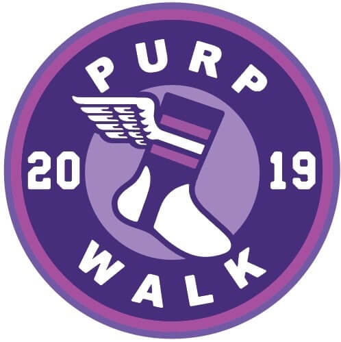
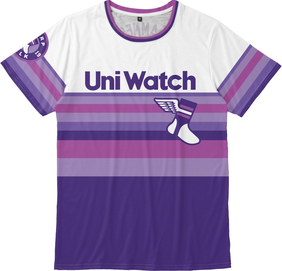
3. For the fifth consecutive year, we have a special piece of purple merchandise (here’s what we offered in 2015, 2016, 2017, and 2018). This year it’s this stupendously hideous shirt (click to enlarge):

.
Disgusting, right? I even took the purple plunge and tried one on myself (click to enlarge):


Naturally, I underwent a full decontamination procedure after that photo shoot, but the taint still lingers.
The shirt is available here until midnight Pacific time tonight. The sizing on these tends to run a bit roomy, so be sure to check the sizing chart before ordering.
But wait! If your name is Greg Lamm, then you won yesterday’s raffle and will be getting your shirt for free (courtesy of reader Rod Richards, who sponsored that raffle). If that’s not your name, go ahead and order the shirt.
Finally, amidst all the purple silliness, it’s worth remembering that Purple Amnesty Day is the site’s anniversary, and that anniversary belongs to all of us. Thirteen years of daily posts — amazing! Thanks to all of you for building the community that has made all of it possible.
(Big ups to Bryan Molloy for the shirt design, to Teespring’s Jimmy Nutini for his help with the shirt, to membership card designer Scott M.X. Turner for coming up with the term “Purp Walk” back in 2015 [and for all of the purple cards he’ll soon be designing], and to reader Tim Cox for coming up with the whole idea of Purple Amnesty Day back in 2010. You all rock!)
Zero/double-zero update: Earlier this week I wrote about NBA teams that had a No. 0 and a No. 00 on the roster during the same season. But as I explained in that entry, a team having a 0/00 pairing in the same season is not the same as having those two players on the team’s active roster at the same time.
Thanks to several hard-researching readers, most notably longtime contributor Jerry Wolper (who, unbeknownst to most of you, proofreads the site most weekday mornings and finds an embarrassing number of typos and other glitches that I quietly fix), we’ve weeded out the non-overlapping players now have an updated list that shows the true 0/00 roster pairings. All of these 0/00 pairs were on their respective team’s roster at the same time:
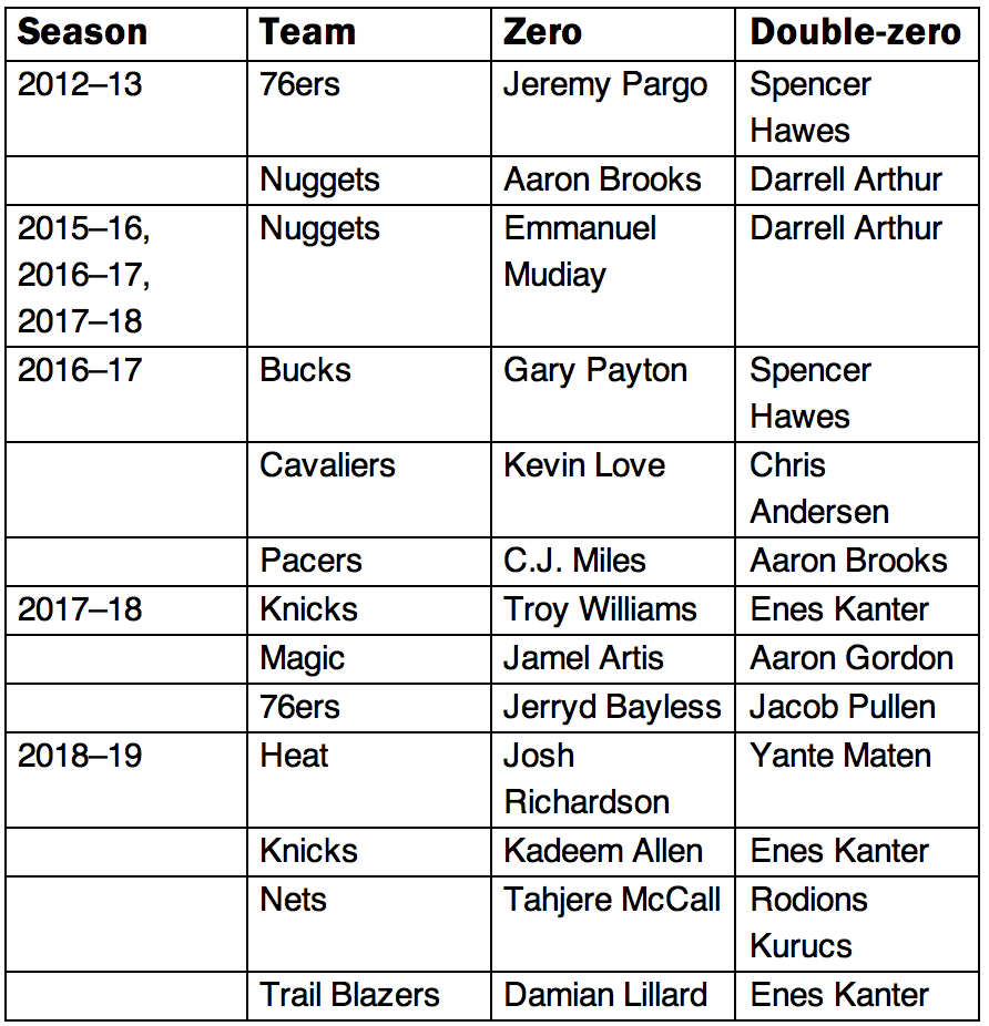
Jerry, incidentally, has dubbed 0 and 00 the “green roulette numbers,” for obvious reasons. I like that.

Click to enlarge
MLB G.I. Joke starts today: Tomorrow, May 18, is Armed Forces Day, a minor holiday that many Americans are not even aware of. But in the latest example of MLB’s holiday creep, teams will be wearing brutal-looking camouflage caps (along with stars/stripes jersey patches) today, tomorrow, and Sunday.
As you can see above, New Era is promoting these caps with the phrase “We reign as one.” What does that even mean, from a military perspective? It also marks the second consecutive year that New Era has used monarchical language to promote camouflage caps. Last year they ran this ad campaign for Memorial Day:
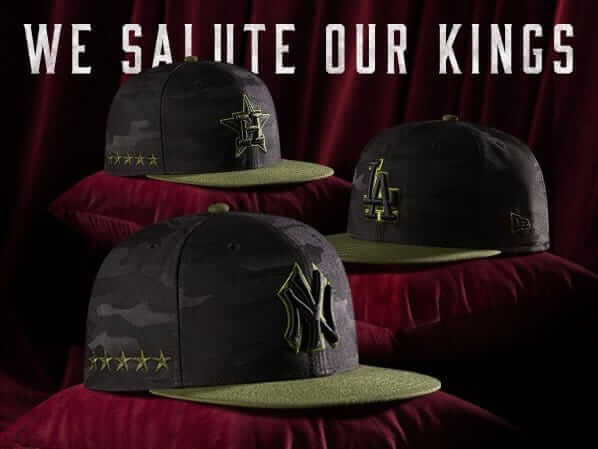
Memo to New Era: Perhaps you haven’t heard, but America actually came into existence by fighting a revolution to reject a monarchical society. Seems pretty weird, if not outright repellent, for you to repeatedly use that type of language when referencing our military.
Update: Reader Noah Kastroll reports that New Era is currently running an ad featuring Phillies first baseman Rhys Hoskins wearing the G.I. Joke cap — but instead of wearing the Armed Forces Day patch on his jersey, he has the Independence Day patch (click first photo to enlarge):
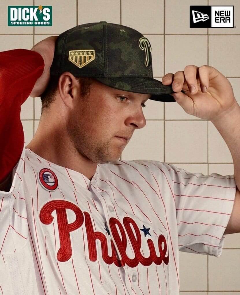
Of course, players won’t be wearing the pandering G.I. Joke caps for Independence Day; they’ll be wearing pandering flag-desecration caps instead. But hey, Armed Forces Day, Independence Day, camouflage, stars/stripes — it’s all the same at the cash register, right?

Membership update: As you may recall, Uni Watch cap-wearing and capers-serving A’s vendor extraordinaire Hal the Hot Dog Guy (whose recent Uni Watch interview is one of the greatest entries in this site’s history) works in a custom-made striped vest. Hal totally Gets It™ in every conceivable sense of the term, so we made him a membership card based on his vest.
We normally base the card designs on the back of the uniform, not the front, but Hal’s nameplate is on the front of his vest, so that seemed like the way to go. We also included a few mustard stains, just like on the real thing.
Although this is Purple Amnesty Day, I’m also accepting orders today for non-purple cards (which would actually provide some welcome relief from the purple onslaught). Ordering a membership card, of any color, is a good way to support Uni Watch (which, quite frankly, could use your support these days). And remember, a Uni Watch membership card entitles you to a 15% discount on any of the merchandise in our Teespring shop and our Naming Wrongs shop. (If you’re an existing member and would like to have the discount code, email me.) As always, you can sign up for your own custom-designed card here, you can see all the cards we’ve designed so far here, and you can see how we produce the cards here.
The Ticker
By Anthony Matthew Emerson

Baseball News: Yankees P Domingo Germán still has No. 65 on his glove. He switched to No. 55 this season (from our own John Ekdahl). … Oh my god, check out pro golfer John Daly’s Astros pants! (from Jeff Cook). … MLBshop.com’s jerseys for Cubs SS Javy Báez include the accent mark on his NOB on men’s replica jersey, but not on women’s. Odd (from Ryan Ziolkowski). … Great image of AL umpires who had lost their luggage and dressed in A’s gear for a 1977 game at the Coliseum against the Yankees. You gotta love Billy Martin’s bemused look (from Arthur Kinney). … Also posted in the soccer section: AutoZone Park in Memphis had to go from a baseball diamond to a soccer pitch in 29 hours, and the ballpark’s Twitter account posted this fun time-lapse video of the conversion (from Don Gale). … The Reading Phillies have added a memorial patch for Dave Montgomery (from @HOF_for_Charlie). … The Worcester Bravehearts probably need to reconsider their catch phrase (from James Gilbert). … The CanAm league has launched its 15th-anniversary logo (from John Cerone).

Football News: The Steelers will wear their throwback and Color Rash unis in 2019 (thanks, Phil). … Browns blog Dawg Pound Daily wants the team’s helmets to stay the same following the team’s forthcoming redesign (thanks again, Phil). …Derek Linn found a parking lot by Lawrence North High in Indianapolis painted like the Colts’ field! Note the blue facemask and neck bumper. … The city of Dayton, Ohio, and the NFL have mutually agreed to not install a new field at Triangle Park after maps and surveys indicated the park may be a Native American burial site (from Patrick O’Neill). … The BBC Archive Twitter account posted a 1968 video of children’s television presenter John Noakes in an American football uni (from Kevin Grimstad).

Hockey News: Blood sweater for Canada F Kyle Turris at the IIHF World Championships (from Steven Schapansky). … The Halifax Mooseheads gave us a sneak peek at what their commemorative uni will be for their Memorial Cup opening game. Says Wade Heidt: “Each year, the [Memorial Cup] host team wears a special commemorative jersey for the opening game. Only worn that one game and is to commemorate the military. … We have not seen the uniforms yet this year but we have seen something unusual in their practice. The Mooseheads are red with forest green trim. They have been practicing in royal blue helmets, pants and gloves.”

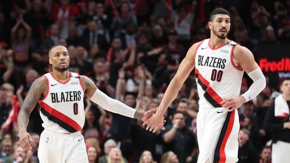
Hoops News: The Timberwolves have won the Silver CLIO Award for their Prince-inspired City Edition unis (thanks, Phil). … The Athletic writer Tim Cato is polling people on the Mavericks’ logo and unis (from Sam McKinley). … Approximately one million people sent us screenshots of ESPN using the Rockets logo during pregame coverage of Warriors/Blazers last night (from the aforementioned approximately one million people). … Southern Illinois University’s basketball arena has a new corporate name, with a very odd logo placement on the floor (from David Tolcou).

Soccer News: The Adidas maker’s mark on George Honeyman’s Sunderland kit is so misplaced it actually makes me angry (from @DDberry24). … Yesterday we linked to Manchester United’s new home kits. Now they’ve released their new keeper kit, and the club’s press release incorrectly said it was purple to evoke the famous 1998-99 keeper kit worn by Peter Schmeichel. Of course, Peter Schmeichel actually wore a green kit that season (thanks, Jamie). … German side Mainz 05 have launched their new home kit. They’ll debut them on-field in their final match of the season on Saturday (from Gregory Phillips). … Cross-posted from the baseball section: Memphis’s AutoZone Park had to go from a baseball diamond to a soccer pitch in 29 hours, and the ballpark’s Twitter account posted this fun time-lapse video of the conversion (from Don Gale). … Indy Eleven have released their “Racing Indy” kit and it’s a beaut (from Mike Miller, John Flory, Josh Hinton and Paul). … New kits for FC Monmouth of the NPSL (from Ed Żelaski). … The following are all from Josh Hinton: new away kits for Flamengo. … Hertha Berlin’s new kits have been released (also from Ed Żelaski). … Panama’s Gold Cup kits have been released.

Grab Bag: We’ve found it: Paul’s own personal hell (from Elan Tavor). … LIU finally has a new nickname: The Sharks (from John, who declined to give his last name). … Jordan Spieth looked a lot like fellow pro golfer Rickie Fowler by wearing a bright orange shirt — Fowler’s signature look as an Oklahoma State alum — during the first round at Bethpage Black (from Gabe Cornwall).
Like a damn moth to a flame!
Nice. And since you live in the Central time zone, Norb, you didn’t even have to wait up until midnight!
Why delay making everyone else violet-ly ill?
Paul – Purple Amnesty Day “pioneer” Tim Cox here. Just a word of gratitude for continuing to give me credit on P.A.Day, but mostly for your perseverance in keeping the site alive against all odds. We have house guests here for my youngest daughter’s high school graduation, and I just remembered that it is Friday already on the East Coast. Promptly placed my order for the tasteful and understated purple shirt, all the while explaining the history of Uni-Watch to friends and family.
Thanks again and best of luck!
So good to hear from you, Tim. Congrats to your daughter, and thanks for making time to check in while hosting guests!
Paul,
– What size t-shirt do you have on in the picture and how tall are you?
– Do you know if Teespring has any kind of special/discount code available? I was considering buying multiple shirts.
I’m 5’8″, 150 lbs, and I’m wearing a Small in that photo. Here’s the sizing chart for these shirts: link
If you’re a card-carrying Uni Watch member, your 15% discount can be applied to this item.
What, no “petite” size??
;^)
First, congrats to Paul and the crew on the anniversary! UW remains one of the most enjoyable, thoughtful reads out there. Thank you!
Second, a note on military “appreciation” merch. As a citizen of a country with mandatory military service under constant actual threat (Israel), the idea of people dressing up as soldiers to show support for people that actually serve is absurd.
Here, showing support for the men and women that literally defend our nation means donating to causes that help them, picking up their tab when you them grabbing a bite off-duty, and, unfortunately, going to their funerals and shiva houses when they get killed.
“Supporting” soldiers does not mean purchasing overpriced merchandise (1) to advertise a private corporation (the baseball team), and (2) to broadcast your “patriotism.”
I don’t mind citizens wearing clothing to “virtue-signal” their support for their country’s armed forces. I mean, I think it’s tacky and I don’t do it. (Full disclosure: Years ago I bought a Nats Memorial Day cap to wear as a fishing hat.) But that’s ultimately just a political expression, and if people want to wear their politics on their literal sleeve or cap, fine by me.
What I do mind is the kabuki spectacle of teams signaling their patriotic commitment by forcing their athletes to play dress-up in soldier costumes. American pro athletes can be divided into two categories: 1) Citizens of foreign countries, whose loyalty in the event of a conflict would properly align with their home countries, and so no decent American would seek to force them to pantomime wartime loyalty to the United States. and 2) American citizens who are young; spectacularly physically fit; highly trained and capable in teamwork and small-unit physical and mental coordination; and mostly college graduates. That is, they are exactly the people who should be serving in uniform. But because we do not have compulsory service, these young athletes have chosen not to serve their country. Which is fine; we allow young people to make that choice. But having made that choice, it’s obscene for any of these young Americans to play dress-up in soldier costumes. Want to wear camo uniforms? Want to wear the flag on your sleeve? Great! Go find your local Armed Forces Career Center. If you can play at even a minor-league professional level, you will almost certainly qualify to become an officer in the armed forces of the United States, and you can serve for a short enough term that you’ll still have plenty of years left to pursue professional sports after your discharge.
All pro leagues should have some kind of device or symbol for military veterans to wear on their uniforms. That way fans can see exactly what athletes and teams really think about military service.
^^^ What he said.
Congratulations on another milestone. Back to the days of “Page 2” you’ve always given us good insight, well produced topics and excellent opportunity to contribute back.
Long may you run. Forever young.
“Finally, amidst all the purple silliness, it’s worth remembering that Purple Amnesty Day is the site’s anniversary, and that anniversary belongs to all of us.”
Indeed it does – it’s also my wedding anniversary. Bit more than 13 years though.
As for G.I. Joke…funny coincidence to see “king” and “reign” references on Purple Day.
Happy Purple/Anniversary Day to the Uni-Watch crew.
I own a purple car. Not a plum crazy Mopar – but a subdued, classy purple. Suck it :p
Ironically, I did originally want to buy the car in green…but upon seeing it in person, it wasn’t green enough for me. Looked more like a black under poor lighting.
Finally, I took advantage of Purple Amnesty Day! As much as I wanted to go with the University of Evansville I thought it was too plain vanilla. So I went Barkley-era Suns.
Word to one eyed one horned flying purple people eaters everywhere!
This is the first year in a while I won’t be buying Purple Amnesty Day merch, mostly because I literally just bought the green tequila sunrise shirt last week and can’t think of a place to even wear that one! But I am still a proud Purp Walker, with Purp Walk stickers on my car! Long live Uni Watch and long live Purp Walk!
The Ticker has now been added to today’s post.
Paul, don’t known if Uni-Watch is responsible for this or if it is just a coincidence but today is Put on Purple Day from The American Lupus Foundation to support victims of lupus.
First time I have heard of this. So, I have three reasons to wear purple today!! (“Purple Friday” is a Ravens thing in Baltimore, and I keep kosher with it all year long, Purple Amnesty Day, and Lupus Foundation!)
Following up…
link
Happy Anniversary!
Happy anniversary and big thanks to Paul, Phil, and everyone else who contributes to the site! A Happy Purple Amnesty Day to us all!
The date of today’s post is incorrect.
Good catch! I apparently clicked the “Publish” button a few seconds before midnight. Now fixed!
Happy anniversary!
As to the odd logo placement on the SIU basketball court, I suspect it’s a decal placed there for the press conference, and easily removed once the press conference is over. I imagine they’ll deface the court in more traditional locations in time for basketball season.
Wow. You managed to get Purple the mattress company as one of the side bar ads on the web page today.
Happy anniversary! This blog has been part of my life for almost all of its 13 years. I think I discovered Uni-watch through ESPN shortly after this site went live.
And, congratulations (I think) on the purple celebration shirt. You have outdone yourself. It’s just…so…purple!
Happy Purple Amnesty Day!
It has been a nice run with the Los Angeles Kings wearing black and silver. Am I the only one who thinks they just need to change back to their traditional purple (Forum blue) and yellow full time? I’d love that. If the Lakers can make it popular, why can it not be with the Kings these days?
link
No, you are not the only one.
They got it right the first time.
link
“Derek Linn found a parking lot by Lawrence North High in Indianapolis painted like the Colts’ field”
Looks like it could be a school parking lot. if so, it is likely where the marching band practices. (nice touch with the helmet though)
sorry to reiterate the *school* aspect of his post. (eesh)
Yeah, I was going to say, I imagine that’s where the band practices. First I’ve seen with a midfield logo, though, and definitely the only one I’ve seen where the midfield logo doesn’t match the logo on the actual football field.
And based on the parking spots in the other lot, it looks like Lawrence North is really into painting parking lots. I dig it.
Oh, and Happy Anniversary, gang!
I also find it interesting that the school’s mascot is the Wildcat, complete with a poached Kansas State logo done in orange.
I get it, it’s Indy, but I would have put the school logo on the parking lot.
In Indiana, marching band is a big deal, and Lawrence North has a great competitive marching band.
The state finals are held every year at Lucas Oil Stadium, and I suspect that this field was painted so that they could practice on the field where they would compete for a state title. The helmet and both sets of hashes (not the high school hashes though!) are really key indicators to set forms.
Happy Anniversary Paul and the whole crew! I’m so appreciative of your perspective–I’ve been a reader of the blog since day one, and a proud member, complete with my 2017/2018 Tottenham Hotspur third jersey-inspired membership card.
Paul, I apologize if this gives you anxiety, but I think I like purple MORE now than I did before Uni Watch came into my life.
Congratulations on another anniversary! The color purple should definitely fear Paul at least as much as it fears knife-wielding senators.
“We Salute Our Kings!” agree these participants in the American Revolution and American military history:
link
It’s just a gorgeous shirt. I could cry.
Happy Anniversary! I’ve been following Uni-Watch through a few platforms and glad to see it celebrate another year.
Also, the purple links and backgrounds are a hoot.
What is the reason for showing every sports graphics screwup found on tv? Do people care about that? Are they the same people who like to laugh when someone slips on something?
Debated with myself for a minute and then decided to get one of the shirts.
If the Border Cats ball team have a Whiskey Jack throwback night again this season, I’ll be sure to wear it there.
Just an idea: why not Uniwatch Tequila Sunrise shirts in many different colors? Kind of like what you might have seen in a Rawlings or Majestic catalog back in the 80s?
Wow, the Dimetapp Daydreams shirt is really something. Happy Purple Amnesty Day to all.
What a spectacularly ugly shirt. Ordered!
“If anything purple should fear me” haha thanks for the hearty LOL, Paul.
Congrats on another trip around the sun with this site
Is Aaron Brooks the only guy in NBA history to wear both 0 and 00? I know that was just a list of teammates with that pairing but I somehow did not notice it the first time you ran the list. Very interesting…
Not sure. But you can look that up yourself on basketball-reference.com, where you can see all of the players who’ve worn No. 0 and all of the players who’ve worn No. 00 (and any other number).
No way. Eric Montross is better known as #00 for UNC and most of his NBA career, but he got his pro start with the Boston Celtics, and the double zero is retired for Robert Parrish, so he wore single zero there.
The Sunderland adidas logo placement is not an error, but a very intentional design choice. Adidas have done this before with other stripe designs. A smaller shirt size (small or medium) may have the adidas logo and club crest centered vertically across the two stripes whereas a larger shirt size (large, extra large, two-x) May have the logos centered in the middle of one of the stripes. This is because if the logos on a small shirt were placed in the usual spot as the larger shirt, they would look unnaturally places towards the outer edges of the chest. A larger size is obviously afforded more room for the logos to “breathe” if you will. This probably happens a lot on plain colored shirts, but we don’t notice it as much whereas it is very obvious when adjusted on a striped shirt. Look at some pictures from Atlanta United kit the last two seasons. It was the exact same thing. Smalls and mediums were given logos in the middle of a stripe and larges on up were given logos straddling both stripes.
It’s still surprising to me to see so many slip ups, especially on programs where the people should have that task locked down.
In reply to Neil at 11:21am
Happy anniversary to Paul and everyone that helps bring us Uni Watch!!!!
Wow, can’t believe it’s been 13 years. Congratulations on the anniversary and for embracing purple for a day. Prince is very proud. :)
It’s interesting that the T-Wolves won an “innovation and creative excellence” award for the Prince jerseys when part of the design (the numerals) was a retread of the never-used New Jersey Swamp Dragons design.
Ya know, for the longest time I thought that Paul’s anti-purple stance was over-the-top…sure, it’s not my favorite color, either, but it’s not anything to get worked up over.
But you know, after a bit of time having gone by, and looking at that purple tequila sunrise shirt as well as typing this into a now purple website…I’m starting to come around. It is kind of an awful color.
In his anti-purple screed, Paul mentions that he doesn’t mind purple in natural settings. But I wonder if that’s just because it’s really rare to find purple in natural settings. There are a few fruits and vegetables, maybe a handful of birds and animals have purple markings, but not much more than that. So perhaps from an evolutionary perspective, we have found that purple is more “natural” in very small doses (for example, most people agree it works well as a trim color to complement the Hornets’ teal) but it becomes an eyesore when it becomes the dominant color, because there is no real situation in nature where you’d find yourself surrounded by purple.
Just a theory.
Welcome to the club, Daniel. Always room for one more!
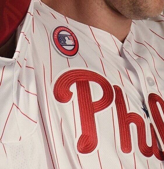
Love the chain stitching on the Phillies uniform. Nice close-up.
PROOFREADING: Billy Martin is amused, not bemused, in that picture. “Bemused” doesn’t mean “amused”; it means confused or puzzled.
Hal the Hotdog Guy’s membership card is superb. Well done!
You an ugly bastard Paul
Saluting the Kings? Are there no women in the US Armed Forces?