Last month I wrote about the new New York Lottery commercial that managed to pack a ton of uni-related details about a fictitious baseball team called the New York Pigeons into less than 30 seconds. (If you missed that entry, or if you just want to refresh your memory, I strongly suggest that you check it out, or at least watch the commercial, which is embedded above, since today’s entry is a follow-up to that earlier one.)
A few days after that entry ran, I received an email from the commercial’s director, Conor Byrne. As it turns out, he’s a big Uni Watch fan and was excited to see his commercial featured on the site. I asked if he’d be willing to do an interview, and he explained that he was about to head to Asia for a shoot, so I emailed him a bunch of questions and he said he’d respond when he was able.
Conor eventually sent back an essay in which he addressed most of the questions I posed — a nice approach. He also sent along a bunch of visual resources from the commercial, which provide a great sense of how the project’s uniforms and logos were developed. (For all of the images that follow, you can click to enlarge.)
Take it away, Conor.

The Story Behind the New York Pigeons
By Conor Byrne
I’m Conor Byrne. My brother Tyler and I make narrative films under the moniker Brudder Films, and we’re represented by the production company Hungry Man for advertising work. I’m the director and Tyler is the producer.
It’s a huge honor to be featured by Uni Watch. I’ve been an avid reader of the site for many years, and I’ve been obsessive about athletics aesthetics my whole life. In fact, my first creative passion, when I as about seven, was designing logos and uniforms for fictitious NBA expansion teams. [I asked Conor if he still has any of those old logo designs. He looked for them but couldn’t find them. Too bad! — PL]
We grew up in New Jersey and are based in NYC, so we’re lifelong Knicks, Giants, Yankees, and Rangers supporters and remain quite loyal in wearing only those teams’ jerseys and caps. But if I could cheat on my favorite teams and wear another club’s merch on a purely I-love-that-logo basis, I’d wear a 1990s San Jose Sharks cap (before the ’07 logo tweak, of course).
About the New York Pigeons commercial: This job came to us via the ad agency McCann Erickson New York, who wrote the script for their client, the New York Lottery. When we landed the gig and officially had the opportunity to create a fictional baseball team, we knew it was finally time to harness our affinity for athletic design, so we went all in.
Part of our vision for this commercial was about creating a baseball team that felt premium, rich with heritage, detailed design, and a robust fan culture. One of my biggest pet peeves about on-screen depictions of sports is poorly designed teams and uniforms. Nothing makes me cringe more than seeing fake athletes and fans wearing blank, generic, one-color jerseys, completely devoid of the small particulars that real teams have. I firmly believe that even the smallest visual details of what we shoot will affect the audience’s experience, whether consciously or subconsciously, so we set out to create a team so nuanced and meticulously constructed that, well, even the discerning readers of Uni Watch might take a second glance.

Once we booked the job, we scouted locations and storyboarded the script for a couple days. While driving from location to location, we spitballed potential names for our fake team. Some names we considered included the New York Nightcaps (we drew a martini glass logo with a ball and bat as an olive-esque garnish), the New York Minutes (we imagined an alarm clock with a baseball inside), the New York Accents (a talk-bubble with a baseball in it proved too obscure for an instant read) and the New York Manholes (complicated imagery), along with lots of alliterative options (the New York Numbahs, the Newsies, the Nogoodniks, the Nice Guys).
But in the end, we settled on the New York Pigeons. This nickname felt quintessentially New York, for obvious reasons, and it was also the clearest and richest nickname that we could flesh out amongst fans. We pictured bird logos on hats, tiny pigeons perched atop letters, and diehard fans wearing wings and beaks. We knew we could draw from the long heritage of birds as baseball team mascots while still putting our own cheeky spin on things. It just felt right.
In designing the team’s identity, we wanted the Pigeons to seem as storied and tradition-oriented as, say, the Yankees — they definitely weren’t a 1992 expansion team. So I gravitated toward a blackletter font because it felt iconic, classic, and like it was maybe around since the 1930s. The chunky blackletter identity also evoked the stoic, monolithic buildings of the New York skyline and echoed the design of the New York Knights from The Natural.
Graphic designer Brandon Smith, who worked for our production designer, Michael Krantz, was integral in designing the team. Brandon provided us with many logo options, responded to our tweaks of logo minutiae, and endlessly tinkered with color schemes. He was the guy who brought the specificities of the Pigeons to life. And Michael’s expert eye, artistry, and wit were essential throughout the process — he had a huge hand in shaping the team.
As far as team colors, we started with basic navy blue to evoke NYC’s major league teams. We then explored a grey/purple/green color scheme, to evoke the colors of actual pigeons. But after the sticky process of agency and client approvals (and legal clearances), we landed on black, grey, white and gold.

For the jerseys worn by the fans at the ballpark, it was important to us to make a few different types — home jerseys, road jerseys, alternate jerseys, etc. And we wanted it to feel like the team had a lot of merchandise (as all real teams do!), so we made sure to make a few different styles of T-shirts, caps, hoodies, and jackets to pepper throughout the crowd. We looked at lots of photos of real fans and playoff games for inspiration. This is where our costume designer, Jill Pallad, came in — her expert eye, ideas, and enthusiasm helped flesh out the uniforms and create the myriad fan garb.
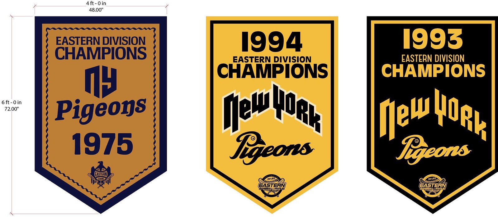
The hanging stadium banners, which were visible in the background, helped make Staten Island Yankees stadium more Pigeons-specific and also helped the team feel like a winning club, with years’ worth of pennants and victories. Visually, these banners also provided pops of color deep into our shots that helped give our frames depth and rounded out our world.
We also felt like our stadium vendor deserved a similar level of detail. We wanted to pay homage to NYC’s amazing stadium vendors, so the buttons on his straps have slogans like “I Survived The ’96 Playoff” and “Stadium Vendor’s Union.” We knew that most of these buttons might never be visible to our viewers, but these were little touches that made us laugh, gave more visual depth to the vendor, and maybe even helped the actor get into character. Again — the details matter!

Commercials move fast (this whole thing happened in about two weeks!), so there are things we’d have done differently if there had been more time. I wish we could have linked the on-field Pigeons (who were real live extras!) to the fans in a more immediate way — maybe giving the players yellow tops or pants instead full white uniforms (not sure it was a quick enough pop for a 30-second spot). And we built an amazing set of Moonrise Kingdom-esque “fan-made” pigeon wings that aren’t visible in the final cut — bummer!
Also, the “no name on back” format on the main fan’s jersey was a homage to the Yankees — but if I did it all over again, maybe I would’ve come up with some funny last names instead. In the end, we were bound by time and budgetary constraints, but I’m proud that my team and I were able to bring the Pigeons to life with as much detail as we did!
After we wrapped, we split the hats, jerseys, and merch with our friends at McCann. We even gave a jersey to our barber bud Clark, who liked the look of it. After Paul wrote about the commercial last month, he told me that some people asked if Pigeons caps were for sale (nope, sorry), which tickles me to no end! The response has been amazing.
Tyler and I wear our Pigeons hats all the time, so if you see us sporting one, say hello and give us a high-five — or better yet, like a true uni-watcher, tell us what you would’ve done differently.
———
Paul here. Sensational behind-the-scenes reporting there from Conor. Big ups to him for sharing his story with us.
I followed up with a few additional questions for Conor, which he answered by email:
Uni Watch: Were you aware that the ad agency behind this commercial, McCann Erickson, was responsible for the creation of the Astros’ famous tequila sunrise uniforms back in the 1970s?
Conor Byrne: We had no idea! Love those Astros uniforms, though. They’re way better than the Utah Jazz’s “City edition” uniforms, which seemed to play on the same “sunrise” concept.
UW: Aside from the main couple in the commercial and maybe the vendor, all of whom I assume are professional actors, were the other fans shown in the commercial actors or just non-professional extras?
CB: We were very lucky to work with some incredible SAG actors for our principal cast — David Ebert as our main dude (Tony), Iliana Inocencio as his fellow fan, and Guy Whitlock as the stadium vendor. We also had the amazing and hilarious Adrian Martinez as the voice of the glove. The fan and player extras, who braved the February weather and were awesome all day, were split between union and non-union talent. It was a great cast all around.
UW: One of the fans appeared to be wearing a feather boa. Whose idea was that? Was it supposed to be a riff on pigeons having feathers? Something else?
CB: We had tons of ideas about how to build out the Pigeons fan culture. There were some fans in beaks, some in pigeon heads, some holding massive oversized pictures of players’ heads, and others hoisting cheeky homemade signs. The feather boa was another one of these ideas — a funny visualization of pigeon feathers. We looked at pictures of Raider Nation costumes and Hogettes as inspiration!
UW: The talking glove had no manufacturer’s logos. I assume that’s because you didn’t have rights to show the Wilson or Rawlings logo, right? Did you remove the logos physically or digitally?
CB: Our talking glove was built by Legacy FX in Los Angeles, and it was an amazing work of art. It was fully animatronic and operated by Christopher Swift, who is a true genius. We decided to forego any manufacturer’s logo on the glove mostly because we didn’t want any distractions on the glove’s “face” — we wanted the audience’s attention to be focused solely on the fact that the glove is talking!
———
And there you have it. I asked Conor for a photo of himself and Tyler wearing their Pigeons caps. He said he couldn’t convince his brother to do that, but he did provide the following shot of them — that’s Conor on the right and Tyler on the left (click to enlarge):

That photo is from the set of their short Knicks-themed film Porzingod — hence all the Knicks paraphernalia. As you’ve probably heard by now, the Knicks didn’t win last night’s NBA draft lottery, so Conor and Tyler are probably a bit glum about that today. Cheer them up by telling them how much you appreciate today’s entry, won’t you?
(My continued thanks to Mets Police blogger Shannon Shark, who sparked my interest in the Pigeons commercial.)
Lid chatter: Minor leaguers are required to wear double-earflap batting helmets, while big leaguers are allowed to wear single-flap helmets. That about wraps up the differences between MiLB and MLB lids, right?
Wrong. Former big leaguer Matt Antonelli, who run his own instructional camp these days, has posted a 12-minute video in which he discusses the differences between minor and major league helmets, and it’s surprisingly entertaining. Recommended!
(My thanks to longtime reader/contributor Ferdinand Cesarano for this one.)

ITEM! One-day Purp Walk raffle: As I hope you all know by now, this Friday, May 17, will be the 13th anniversary of the first post that appeared on this website (which is pretty amazing when you stop and think about it, right?).
By longstanding annual custom, that means Friday will also be Purple Amnesty Day — the one day of the year when I accept orders for purple-inclusive Uni Watch membership cards. And now an anonymous reader has generously purchased a membership for me to raffle off in conjunction with this year’s Purp Walk. This membership will only be redeemable on Friday, and only for a purple-inclusive card.
To enter, send an email to the raffle address by 8pm Eastern tonight. One entry per person. I’ll announce the winner tomorrow, and then the winner can redeem the prize on Friday.
Design contest reminder: In case you missed it on Friday, we’re currently running a design contest to create a set of three uniforms for the girls’ basketball team at Leigh High School in California.
The winning designer will get a cash prize of $375, so this is a good chance to help out a school and make yourself some coin. Full details here.
The Ticker
By Lloyd Alaban

’Skins Watch: The teams at Birmingham High School in L.A. used to be called the Braves, until they changed the name to Patriots in the 1990s. But instead of coming up with a completely new logo, they modified their old Native American logo (from Pedro Naranjo). … The Tulsa Drillers will wear jerseys to honor the local Muscogee (Creek) Nation on May 24 (from Kyle Lee).


Baseball News: This might be a possible closeup of the Padres’ new brown/yellow jersey for 2020 (from Jim Vilk) Never mind, it’s a fake. … Speaking of the Padres: P Chris Paddack showed up to the on-deck circle in last night’s game wearing his dugout jacket (from Adrian Kang). … Cubs P Kyle Hendricks did not have the MLB 150 patch on his jersey last night (from Stephen Scheffel). … Nationals OF Gerardo Parra had to wear a Cody Bellinger first baseman’s mitt last night (from @ThatElJefe). … Reds OF Jesse Winker wore custom-painted cleats last night featuring lots of Reds greats (from @JDaniel2033). … The Astros will be giving out an LSU-themed Alex Bregman shirt for their next homestand (from Ignacio Salazar). … Damian Lillard of the NBA’s Portland Trail Blazers arrived for last night’s Western Conference Finals game in Oakland wearing a customized A’s baseball jersey. Lillard is an Oakland native (from multiple readers). … NASCAR driver Justin Allgaier showed up at last night’s Phillies game wearing a custom No. 7 jersey (from David G. Firestone). … Reds SS Barry Larkin was once so close to joining the Dodgers that the Dodgers prepared a jersey number for him (from Dwayne White). … The Salt Lake Bees, Triple-A affiliate of the Angels, will wear Transcontinental Railroad-themed uniforms on Monday to celebrate the sesquicentennial of the driving of the Golden Spike in Utah (from several readers). … The Rocket City Trash Pandas, the future Double-A affiliate of the Angels, have already moved a ton of merchandise — despite the fact that they don’t begin play for another 11 months (from our own Phil Hecken). … The Hartford Yard Goats, Double-A affiliate of the Rockies, have released some military appreciation merch (from Matthew Sprague). … The Toledo Mud Hens will rename themselves the Stingers for military appreciation weekend. They released uniforms based on the fighter jets of the 180th Fighter Wing based in Toledo (from Leroy Arthur). … The Charleston River Dogs, Single-A affiliate of the Yankees, will wear Trivial Pursuit-themed uniforms on Saturday to honor the classic Seinfeld “Bubble Boy” scene. … Here’s a good look at Clemson’s raised batting helmet logo (from @ClemsonUniforms). … The Fresno Grizzlies, Triple-A affiliate of the Nationals, wore their taco-themed uniforms yesterday (from Paul Braverman). … The Staten Island Yankees, Single-A affiliate of the Yankees, will reprise their Pizza Rat uniforms this season, with a new cap (from @ChrisRiz). … Can you recall a baseball team wearing a jersey with one period on it? (From Griffin Smith.) … Also from Griffin: Alabama announcers Eli Gold and Lance Cormier shared their thoughts on their favorite MLB uniforms. … It appears that Nike is using the same font for both BYU and Michigan State (from Parker Bushnell). … Reader Grant Young made this awesome-looking helmet cubby that he updates according to each team’s standings.
Football News: Here’s a follow-up to an item from yesterday: In the 1961 preseason photo of Raiders QB Tom Flores with FNOB, one of the coaches he’s conferring with is wearing French cuffs and cuff links! (Great spot by Jerry Kulig.) … Here’s a Packers-themed ice fishing tent (from Russell, who didn’t give his last name). … Here’s a good (albeit inverted) look of what the NFL 100 logo will look like on the Bills’ home jerseys (from @ThtGuyMatKaczor). … Here are the numbers Rams rookies will be wearing (from Cameron DaSilva). … New turf going down at Ford Field, home of the Lions (from James Gilbert). … A Seahawks-themed seaplane had to make an emergency landing in the Hudson (from TC Payne). … Here’s how the college football 150th-anniversary patch looks like on Nebraska’s home reds (from multiple readers). … Here’s how not to mess up choosing your NFL number, according to this sportswriter (from our own Phil Hecken). … Former Broncos WR Rick Upchurch is seen in this 1975 photo wearing a blank helmet with no logo or stripes (from Edward Pelky). … Here’s a great shot of old football and hockey helmets that @akaggie’s father wore while in college in the 1960s. “The wordmark on the hockey helmet is larger than anything in modern era,” he said.

Hockey News: Going into last night, the Hurricanes were 16-2-2 wearing their black third jerseys this season and 5-0 in playoffs, although they lost last night to make that 5-1 (from Scott M. Trembly). … Cross-listed from the football section: Here’s great shot of old football and hockey helmets that @akaggie’s father wore while in college in the 1960s. “The wordmark on the hockey helmet is larger than anything in modern era,” he said. … USA national team F Jack Hughes recently turned 18, which means he was allowed to ditch his helmet with facemask bars and don a visor. He had some interesting comments about that (from @kodywiddak).

Basketball News: Cross-listed from the baseball section: Trail Blazers PG Damian Lillard arrived for last night’s Western Conference Finals game in Oakland wearing a customized Oakland Athletics baseball jersey. Lillard is an Oakland native (from multiple readers). … Brothers G Seth Curry of the Blazers and G Stephen Curry of the Warriors faced off last night in game one of the Western Conference Finals. That meant their parents had to split duties on who to root for, so they wore Frankenjerseys to the game (from @TheSkyShowCHI and Spencer Cooper). … This year’s NBA draft caps were revealed last night (from multiple readers). … New court for the Chicago Sky of the WNBA (from Michael Brighton). … The Blazers are undefeated so far when wearing their City and Statement uniforms on the road in this year’s playoffs (from @samuel101ts).

Soccer News: New kit for Aberdeen of the Scottish Premiership (from our own Jamie Rathjen). … Hertha of the Bundesliga will wear diversity-themed shirts for the last home match of the season (from Ed Zelaski). … Austrian club LASK Linz have released new shirts (from Josh Hinton). … Here are the kits for the upcoming FIFA Women’s World Cup in France. For the first time in Women’s World Cup history, most teams will have their own uniforms and not carbon copies of their countries’ men’s uniforms (from our own Phil Hecken). … Also from Phil: Costa Rica men’s national team released new shirts for the upcoming Gold Cup. … The latest team in Australia’s A-League will be called Macarthur FC (from Tim Coffey).

Grab Bag: Here’s an interesting article on the rise of hyphenated names in sports (from Trevor Alexander). … Here’s what golfer Jordan Spieth will be wearing for this weekend’s PGA Championship (from our own Phil Hecken). … NASCAR driver Jimmy Johnson revealed his military appreciation livery for the upcoming Coca-Cola 600 (from Mike Tilley). … Louisiana Lieutenant Governor Billy Nunguesser showed off a pair of Donald Trump socks to the president (from Trip McNeely). … Boxer Deontay Wilder has released his own clothing line (from Griffin Smith).
first item in baseball section should read “brown/yellow”
Fixed.
Brown and yellow … on blue pinstripes? Never underestimate the Padres ability to get stuff wrong.
Was going to say the same thing
That appears to be a fan-made jersey by the guy who posted it. One of the comments asks is the pinstripes are blue and the poster says “black – it’s all they had” so I’m assuming it is a DIY.
Then I hope that this is a case of the Padres exec not sweating the details, rather than than of having committed to a bad design. Still, if the blue pinstripes are not part of the new uniforms, then their presence in the mockup would provide ample grounds for the exec to have denied the question and said something more like “No, but if you like that look, you’ll love what we’ll show you next winter.”
Thanks to Conor for sharing. Nice job, especially in so little time. And kudos to the crew.
Agreed! Great work, and a very informative essay about the work. My top five favorite fictional teams are now:
1) Westish Harpooners
2) New York Pigeons
3) Chico’s Bail Bonds Bears
4) New York Knights
5) Iowa Baseball Confederacy All-Stars
Syracuse Bulldogs at the top of my list:
link
Halifax Highlanders are my top choice for fictional hockey team. A Highlanders-Bulldogs game would be a great-looking fantasy matchup!
I have to give a shout-out to the Washington Sentinels.
the hurricanes lost last night in the black jerseys. they’re 5-1 in the playoffs.
Text now adjusted.
5-1, as opposed to 5-0
Also how can we get Connor to make Pidgeons merchandise? Fantastic.
Seconding this. Can we get a Pigeons hat or t-shirt?
A good friend of mine from college is the star of that commercial. He was also the “Lime-a-rita” guy for a long time. Small world!
Enjoyed the Byrne Bros story. The details are what makes the commercial a short film. Phil had discussed the Upchurch helmet in ’17. His first game as a rookie, his helmet was broken. They got him a plain practice helmet and he had a career day against Chiefs.
Great entry today, Paul. You’re really knocking out of the park lately!
I’d love to see one of the local minor league teams wear these unis for a game. Of course, that’d probably come along with a ton of lottery-related promotion (yuck).
I was thinking the exact same thing. This Pigeons article and the recent one with the hot dog vendor are both absolute gems. NY Pigeons cap would be great!
No Upchurch photo link
Fixed. Here’s the link:
link
Maybe Ebbets or Ideal Cap would be interested in making some of those Pigeons caps!
Or Hatclub….
C’mon, that Padres jersey isn’t legit. First of all, the pinstripes are the wrong color. The wearer says they’re black, they look blue to me. The dude also says he got the jersey from a site named DHgate, which looks like a clearinghouse of Chinese counterfeits.
The exchange still provides useful hints. Keeping in mind the chance that the report is to some extent false in the sense of being exaggerated for humorous effect, and the chance that even if the report is true, the Padres exec may simply have been lying. The basic characteristics of the thing are pinstripes, current script/letter styling, brown lettering with yellow outlines. That basic combination was always a high-odds proposition for the new unis when the Padres announced they would commit to brown. So this report adds a very small quantum of evidence in favor of that being the team’s new look.
I might be missing something with the Samford jersey, but don’t the St. Louis Cardinals have a jersey with one period on it?
link. link, actually.
And so do the link.
Those draft hats look like a K-Mart knockoff. Adding a lapel pin doesn’t really help. Wouldn’t mind a Knicks one, though.
THE PADRES JERSEY IN THE FIRST LINK IS A CLEAR FAKE. THE TACKLE TWILL IS THE SAME GARBAGE THAT’S ON ALL FAKES
Based on the Twitter thread, that Padres jersey is a knockoff purchased for $20 on DHGate, and not anything actually affiliated with the Padres. He jokingly said that the Peter Seidler blinked twice when pressed on if that was what the new jerseys looked like.
Thanks. Text now updated.
Any way to find out what typefaces are used for “Eastern Division” on the 1975 and the 1993 Pigeons banners?
Hi Steve,
Sure thing – the fonts used are:
1975 – Cartel Medium link
1990s – Antique Olive Bold link
*Jimmie Johnson, not Jimmy
Gonna need a deeper dive on Parra using Bellinger’s glove…!
I agree. How, and why did that come to be? Strange!
Great story re NY Pigeons. Love the extra effort / detail that went into the bringing the team to life.
Aberdeen: They’ve never worn a saltire, but anyone else sorta wishing a team sponsored by Saltire Energy had a full saltire on it, visible from the stands?
That Pigeon-with-a-backward-cap logo is just great, it feels like an early 80’s throwback design that I would buy on a faux-vintage t-shirt!
I was going to ask when did the Pigeons either add the backwards cap, or change it from front-facing to backwards?
Definitely not a look that would have been in place since the ’30s.
I was thinking like 1991, 92, 93-ish.
Lee
Skins Watch: The Birmingham HS logo switch makes me feel very uncomfortable, knowing the history of how Native Americans were forced to modernize and assimilate into the English culture of the US. I can’t fully articulate how it makes me feel, but its not good.
Yeah it is not good… btw Lloyd you misspelled my last name it’s Naranjo.
Didn’t mention something else that bothers me about this whole thing. Although it seems Birmingham HS has embraced the new Patriots name, it seems alumni don’t embrace it. Photos are periodically posted on social media with people wearing old Braves gear with pride. Again just sad.
It will be that way for a long time, sadly. You would not believe what percentage of people attending an Illinois football game are wearing knockoff Chief t-shirts.
Still have Marquette alums complaining about “Warriors”. And that was a quarter-century ago.
My fault on the spelling, Pedro, not Lloyd’s. Now fixed.
Birmingham was one of the high schools my high school played against in SoCal in the late 70s. We didn’t think anything about the mascot name. All we cared about was winning.
Probably just me, but I’d kinda prefer if men’s and women’s national teams had the same uniform. Unless it’s for a one-off tournament or something. I’m not saying the women should conform to the men, rather that a country’s visual identity be consistent. I’d rather the announcement be, “In honor of the USA Women’s World Cup team, here’s what the country will be wearing.”
For the USA, the men’s and women’s teams do have the same uniforms as opposed to prior years where some of the women’s unis were completely different. The only real differentiation at this point is the cut and the fact that the women’s jerseys (or male versions of the women’s jerseys) have three stars over the crest.
Whoa, this is amazing! Congrats to Conor and Tyler for putting so much thought into their short-lived fictional team. You guys created a better identity than many actual baseball teams.
I so want to steal “New York Nightcaps”. Would love to see what you could have come up with.
Now I really want a version of that link adapted to soccer, for the link.
You buried the lede on that Matt Antonelli MLB/MiLB helmet video – check out his logo! It’s the 90’s Astros logo turned on its side to make an “A”.
Clever, and reminds me of the AHL’s Binghamton Whalers’ logo.
I read the article in the Football section about not screwing up your NFL jersey number. I guess I just don’t understand the hatred for #46. Like some of the commenters on that article, I immediately thought of Doug Plank and the 85 Bears defense. Sure, beyond that I have a hard time thinking of any great players who have worn that number, but you could say that about quite a few numbers.
My first thought on hearing #46 is of my favorite football player when I was a kid — Danny Abramowicz of the New Orleans Saints. That guy could catch the ball!
Seconding some of the earlier comments:
Paul, today’s story and the two stories on Hal the Hot Dog Guy are all brilliant and thoughtful. These are the kinds of stories that make it so much fun to start my day with Uni Watch.
Also, so impressed by the work Conor and Tyler Byrne put in to creating a whole story for the NY Pigeons. I want a Pigeon hat!
Another great day on the blog, Paul!
We get our cable FOX station from Rochester, NY so I was familiar with the Pigeons commercial before it was discussed here.
I’m extremely happy to see it get the attention on Uni-Watch that it so richly deserves. It’s a brilliant, superbly produced commercial. Congrats to Conor and Tyler on a job well done!