
Click to enlarge
So that was a fun night, at least for me. Maybe not so much for Jets fans who were hoping for a better uniform design than this one turned out to be. Here’s my take on the new uni set, which I wrote for Sports Illustrated.
Additional notes from the unveiling:
• So the leak turned out to be legit! It’s still not clear to be where it came from or where it was originally posted. Does anyone know?
• Unveilings often have someone talking about the uniforms’ “storytelling” aspects, which I find cringeworthy and embarrassing. There was none of that last night, though — they simply brought out the players wearing the uniforms, the players preened a bit while we all took photos, and that was that.
• As far as I can tell, the words “Color Rush” do not appear in any of the press releases. It’s not clear to me if the mono-black alternate will fill that role, or maybe the mono-green combo, or if there’s another design still to be unveiled at a later date.
• I wrote a good portion of my SI piece in advance, based on the leak and hoping it was real. I also did a phone interview yesterday afternoon with Jets prexy Neil Glat, which was helpful. Once the players had all come out in the new uniforms and I’d gotten enough photos, I went over to a table in the corner of the room with my laptop, banged out the rest of the story in about 30 or 40 minutes, and sent it to my SI editor.
• SI also sent a photographer, the very wonderful Taylor Ballantyne, who was great to work with. You can see her pics here.
• SportsLogos.net’s Chris Creamer came down from Canada for the event, and he enlisted uniform designer/historian Todd Radom to serve as his photographer. The three of us had a great time hanging out during and after the event (and Chris was sitting next to me, banging out his own story for his own website, as I wrote my story).
• There were six open bars with a lot of booze (including green cocktails). I couldn’t drink too much, natch, since I was working, but I did have a coupla beers. Thanks, Jets!
• The hors d’oeuvres were awful, except for some little lamb skewer thingies, which were excellent.
• The unveiling took place at an event space on Broadway, so it was fitting that Broadway Joe was in attendance.
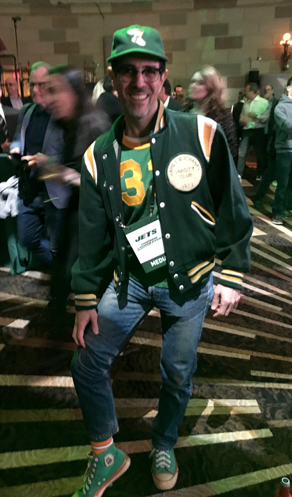
• I wore my Uni Watch cap and lots of green/yellow clothing. I figured all the green would be appropriate for a Jets event, right?
• A guy named Mike Vernon approached me, said he was a Uni Watch reader, and chatted with me for a few minutes. Mike, if you’re reading this, it was great to meet you!
• They sent us home with giveaway tote bags, which contained a mini-helmet, a T-shirt, a cap, and a small bottle of whisky. I’m keeping the whisky; the rest, along with my press pass, will end up in this year’s year-end raffle.
I’m sure there are other details I’m forgetting, but that’s enough for now. It was a busy night, I didn’t get home until 1am, and then I woke up early-ish to write this entry, so I’m a bit frazzled. Gonna take it easy this morning, and then Chris C. is coming over in the afternoon to check out the new Uni Watch HQ. If you have questions about last night’s proceedings, feel free to ask in today’s comments, and I’ll do my best to answer.
Click to enlarge
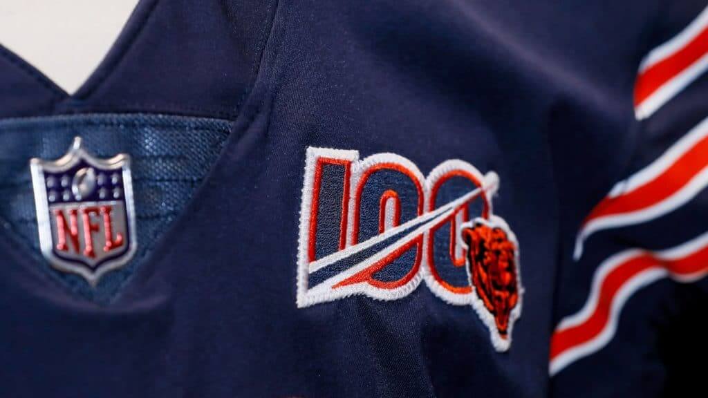
And speaking of the NFL…: We had been told that the Bears would have some sort of uni announcement this week. It turned out to be an announcement of another announcement, as the Bears said that they’ll unveil a new “classic” jersey on June 7. Additional info here.
Details:
• The Bears will have four jerseys this season: primary navy and white, orange alternate, and the new one that’s being unveiled in June.
• The Monsters of the Midway throwback will not be worn in 2019. (Too bad, because I loved it.) It’s not clear, at least to me, if it’s being mothballed for just one season or for the foreseeable future.
• All four jerseys will carry the Bears centennial patch, as shown in the photo above. I had thought they’d only wear it on the jersey collar, much like the other teams will be wearing the league centennial logo on their collars. And actually, if you look at that Vikings photo I just linked to, it doesn’t show the part of the jersey where a patch would normally go. Is it possible that the non-Bears teams will be wearing the centennial mark on their collars and as a chest patch? Hmmmm.

ITEM! Yet another one-day raffle: I really appreciate how people are purchasing memberships for me to give away. Our latest benefactor is reader Steven Fidrych, who bought several cards for himself (including a replacement for his original card, which he got way back in 2007!) plus one for me to raffle off.
To enter this raffle, send an email to the raffle address by 10pm Eastern tonight. One entry per person, as always. I’ll announce the winner on Monday. We’ll have yet another one of these one-day membership raffles next week.

Meanwhile, a bunch of new designs have been added to the membership card gallery (including Steven Fidrych’s excellent Chargers-themed card shown at right).
If you’d like to order a card instead of (or in addition to) trying to win one in the raffle, that’s a good way to support Uni Watch (which, quite frankly, could use your support these days). And remember, a Uni Watch membership card entitles you to a 15% discount on any of the merchandise in our Teespring shop and our Naming Wrongs shop. (If you’re an existing member and would like to have the discount code, email me.) As always, you can sign up for your own custom-designed card here, you can see all the cards we’ve designed so far here, and you can see how we produce the cards here.
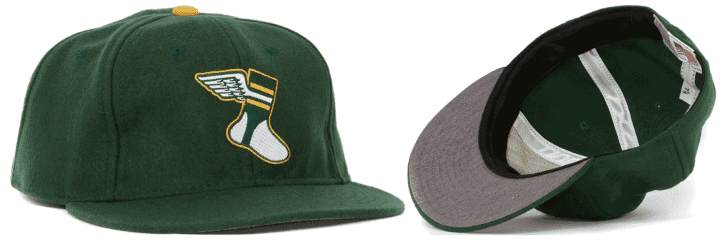
ITEM! Cap update: Our Uni Watch Classic Cap has been a big hit since we introduced it last spring. But the caps have caused some bookkeeping hassles for Ebbets Field Flannels, which has been selling the caps for us, so as of now they’re no longer selling them. EFF will still manufacture the caps, but the caps will now be stocked here at Uni Watch HQ and I’ll handle the orders myself.
The good news (for you) is that I will probably be able to lower the price a bit from the $49 that EFF has been charging. The bad news (for me) is that I have to stock up on cardboard mailers, buy some storage bins for the various cap sizes, and figure out where I’m going to keep all of that stuff in a small NYC apartment. Plus I’ll have to start making a lot more trips to the post office (or hire a shipping intern). But I’ll figure it out.
EFF had 85 caps in stock that I had already paid for, so they’re shipping those to me. I hope to receive them in a few days, and I’ve also looked into getting some cardboard mailers. Once everything’s ready, I’ll let you know. Until then, the cap is temporarily unavailable. Thanks for your patience!
The Ticker
By Alex Hider

Baseball News: The Orioles added a black memorial bow to Frank Robinson’s retired No. 20 sign at Camden Yards (from Marcus Hall ). … Wahoo is still hanging around: When the Indians re-signed manager Terry Francona on Wednesday, the team’s email to fans opened with a picture of him in a Wahoo cap (form Greg Winson). … Speaking of the Indians, P Trevor Bauer was wearing an undershirt with his personal logo last night (from Brian M. Waltz). … Mets broadcaster Gary Cohen went the extra mile on Opening Day, wearing a team-colored tie, but Tigers broadcaster Craig Monroe may have one-upped him with an orange blazer (from Shane Shockey and Brandon Veale). … Speaking of the Mets, someone spotted a fan at the game in a full uniform, complete with stirrups (we’ll give him a pass for wearing them wrong) (from @OlegKvasha). … More Mets: The team was selling the wrong blue jersey at its team shop on Opening Day (from Ryan Brown). … The New Orleans Baby Cakes grounds crew made this awesome opening day art out of colored stones (from Matt Bessette). … This is a good piece on Bob Hope’s attempt to keep the Senators in Washington in the late 1960s (from Max Weintraub). … Naked hot dogs — sort of uni-related, right? Monday was $1 hot dog night in Pittsburgh, and the ballpark ran out of buns (from Joe Werner). … North Myrtle Beach High School (South Carolina) is poaching the Brewers logo (from RH).

Pro Football News: In honor of the Jets unveiling, USA Today listed a number of teams they feel need a uni overhaul (from Kary Klismet). … New number assignments for the 49ers (from Brinke). … All teams in the Arena Football League will have new uniforms for this upcoming season, with the unveiling to take place on April 8. Reports indicate that the league is dropping Under Armour in favor of Phenom Elite (from Mike Chamernik and Jacob Bogage).

Hockey News: Senators G Joey Daccord made his first start last night, and wore the same pads he wore this season at Arizona State (from Rich Sports Talk and Simon Williams). … The Predators warmed up in their white sweaters last night at home but ended up wearing yellow for the game itself (from Patrick Johnston).

Basketball News: Hawks G Trae Young has his own Icee-themed shoes. For those who don’t know, Icees are the equivalent of a Slush Puppy or a Slurpee (from Mike Chamernik). … New Spurs F Donatas Motiejunas will wear No. 28, and new Sixers PF Greg Monroe will wear No. 55 (from Etienne Catalan). … The Canadian Elite Basketball League, a new six-team pro league, unveiled the championship trophy for its inaugural season yesterday (from Wade Heidt). … We have our first look at Auburn’s jerseys with the Final Four patch (from Clint Richardson). … Interesting note from Mike Chamernik, who writes: “Here’s something I don’t think we knew (but should have figured): When an NBA team adds a uniform ad patch, the players on the team need new headshot photos, even if the switch is done during the middle of the season. The Thunder added a patch a few weeks ago. Nerlens Noel’s headshot from the beginning of this season (it must be from then because Noel is in his first season with OKC), and here’s his updated pic with the uni ad.” Odd that they didn’t just Photoshop the ad into the image, no?

Soccer News: Here’s an in-depth piece on soccer kit mashups — essentially, whenever a team wears a non-standard uniform combination (from our own Jamie Rathjen). … Could the Chicago Fire be in for a complete rebrand next season? (From Josh Hinton and @bryant_rf). … The seven teams in the new Canadian Premier League unveiled their inaugural kits last night (from Gabriel Hurl and Wade Heidt).

Grab Bag: The NN Running Team, the world’s first professional road running team, has a new uniform for 2018 (from Jonathon Bean). … The Twitter account for the 2020 Olympics in Tokyo tweeted photos of the games’ mascot, Miraitowa, playing all the sports the game will host (from Jeremy Brahm). … If we didn’t have proof that Paul was in New York last night, I’d be inclined to think he was in Utah with a license plate like this! (From Warren Junium).
The Tiger broadcaster in the orange suit is Craig Monroe. Rod Allen was fired last year for trying to choke out his boradcast partner after a game at Comiskey Park (Yes, I’m still calling it Comiskey!).
Fixed.
It will be definitely interesting to see what the Jets green uni looks like on a sunny day on TV.
Any thoughts on a different color (other than black) that would have pared well and created something overall a little more exciting? (i.e. the Jets considered other colors). I might go with a light blue (but not vibrant)?
I’m thinking silver.
I would agree, but too close to the Eagles?
The other color I think would work, is a very rusty orange, used very selectively, but it would likely fall victim to being too close to the Dolphins. But I suspect a whole lot more of excitement would have been generated.
Kelly green and silver would make the Jets look like they copied the Eagles. Ironically, they could have gone GFGS and use a shade of gray to match how we paint our fighter jets.
Grey like a fighter jet is exactly what I was hoping for
Outlining the numerals in black also looks like they copied the Eagles, who link five years before the Jets did it in 1990.
I think “Vegas Gold” would have worked much better, especially on the face mask.
I came here to wonder about third color alternatives, too! Light blue would’ve been great, but maybe Tulane-y. Ya’ll might kill me, but a muted rose pink would be solid. NJ is the garden state.
Anyway..not sure why a third color is necessary (other than to have more “official” merch).
That would “shock the world”, a more purple than pink shade of magenta, used only thin stripe on what left of a sleeve, and a one inch solid stripe on pants, with green outlining – other than maybe suffering from a 90″s look, would have created some buzz.
I think 2 colors CAN work but it limits design as well.
The Colts have a cromulent two-color uni, though the best NFL unis employ three. The Jets did not need a third color. Can you imagine the Colts adding a third color?
Green and gold like colorado state.
I thought purple
Paul the USPS has a free small box for 2 day priority. Add the fee for that rate to your shipping costs and you have all the free mailing supplies you need.
A cap does not fit into the Small Priority Box.
I am glad you enjoyed yourself, Paul, because you were so front and center you appeared to find the whole over the top pomp ridiculous (as I and many other Jets fans probably did)! Lamenting the addition of black facemasks and number outlining, etc (not to mention the monoblack 3rd uniform). Interesting they wanted to add a 3rd color to the mix, what do you think other than black wouldve worked w the green/white? Also, curious to hear what kind of ‘flourish’ you wouldve preferred to the contrails, simple stripes of some sort? Thanks as always for the report!
Really, the only third color that would work is grey/silver (which I’m sure they tried). You can’t do yellow, because that’s the Packers. You can’t do red, because that’s Christmas. I suppose you could do blue, but that doesn’t seem very Jets.
And that’s the real issue: Why do you need another color at all?
“Flourish”: Again, why do you need one at all?
Yeah and grey/silver wouldve also worked better as a color theme of actual jets. That just got me thinking, a chrome facemask would be amazing with that helmet. Damn!
I agree on your take Paul. Hate the black face mask and number outlines. The all black alts are bush league AFL style. More points:
1.Just green & white would have looked so clean.
2. The NEW YORK on the jersey is way to big.
3. Fonts aren’t the worst I’ve seen; but still too tacky for NFL.
4. Don’t like the sleeve strip at all.
5. Was hoping for a “jet design” on the helmet. Maybe not like the 80’s design…but something less generic that what they went with.
“Was hoping for a “jet design” on the helmet. Maybe not like the 80’s design…but something less generic that what they went with”
I think the problem is that modeling an actual jet could get dated too quickly.
I do give them credit for not falling into the military fetish. I really feared that’s where they were going.
Pretty amazing that a team called the JETS hasn’t had a depiction of an actual jet since 1963! (a creaky-looking plane silhouette actually preceded the oval crest for one year…)
Was really hoping for some forward-zoomy jet coming up and over the earhole (think USFL’s Michigan Panthers meets AAF’s Memphis Express.) Maybe just a simple numeral on the other side.
The good: Green helmet color/sparkle, simple numerals, a wordmark that doesn’t render all previous merch obsolete.
The bad: shoulder and pants stripes.
The ugly: Black. (why not deep forest green for outlines/face mask?)
Oh, and count me in on the big ‘NEW YORK’ – let ’em all know where you’re from.
C plus/maybe warming up to B minus…
Interesting to hear your thoughts Paul about this and maybe you could ask a fellow Canadian in Chris when he stops by. Doesn’t the new Jets away look like a Saskatchewan Roughriders (CFL) uniform?
Riders uniforms: link
New Jets uniforms: link
Comparison (via Sportsnet): link
As a devoted Roughriders fan I wondered if I was the only one thinking that.
Riders uniform in the link is the 2012-2015 unis (when they used black trim). Current green and white unis a little less so like the Jets in comparison with 2012-15 Riders unis.
For the Jets Nation hoping for a better uni design outcome, we feel your pain. The rebranding effort seems to have fallen a tad short of expectations. The new uniforms look like the 5th place finisher in a Uni Watch design contest.
However, the real loser in all this is the CFL’s Saskatchewan Roughriders. They learned their shade of green is no longer contemporary, at least compared to the Jets newly conceived and modern Gotham Green. Even more discouraging was the news the Jets new Spotlight White makes the Roughriders white look like dirty laundry. If Kraft can make their mac & cheese even cheesier, I suppose it’s possible Nike can make their white even whiter. Who would have known?
Seriously, this Nike marketing blather is just an embarrassment. The Jets would have experienced a better result if only they let the Uni Watch nation perform the rebranding.
You can’t do yellow, because that’s the Packers.
How many red/blue teams are there? The Packers don’t own green/yellow (not saying I’d be in favor of that combo however).
You can’t do red, because that’s Christmas.
The Raleigh-Durham Skyhawks beg to differ.
link
And it would go well with that other New Jersey team, the Devils.
I suppose you could do blue, but that doesn’t seem very Jets.
Sky blue for the Jets!
Actually I don’t have a problem with the new set, but then my expectations were pretty low for a Nike unveiling. They’ve done much worse with other teams.
Loved those Raleigh-Durham Skyhawks uniforms! There were many really good uniforms in the WLAF inaugural season.
Those and the San Antonio Riders were my favorites. They’d be great in any league.
when you said they looked “collegiate” you hit it right on the head. they look like a mediocre college football program that wants to be taken seriously by getting flashy new jerseys from riddell or champion or some lesser designer.
the sparkly helmets, the black facemask, the wordmark on the chest, the darts on the shoulders and legs, the BFBS alternate, the black number outline. all of these things in combination make it a very chintzy look. one of those elements would have been OK i suppose, but all together, not a good look. not bucs ugly, not seahawks complicated, just not becoming of a pro team that has always had a simple, classic look.
to top it off, they are a little close to the philly market to roll out a uni set that could be called “philly lite” or even “discount philly”.
The closest I could find for a source of the leak was on a reddit thread of the leak.
link
“Yea this was my post. It got removed from the fb page for whatever reason. This s*** blew up all over twitter. The guy who leaked it to my guy is sh****ing bricks (allegedly).”
Hoping the Bears wear navy pants with their orange alt jerseys…would be a nice symmetrical look.
What kind of whisky did the Jets send you home with? The enthusiasts want to know!
Glenrothes.
Thought it would be worth pointing out that when I viewed this post that the first ad embedded into the article was for The Glenlivet (at least that is what displayed for me). It is apparent to me that this was a contextual ad resulting from your reference to the small bottle of whiskey in the schwag bag, since I don’t like whiskey enough to have ever searched for or clicked on related content (and I clear my browser cache/cookies regularly anyways). I only know a little about contextual online advertising but could this be an avenue for further monetization of the website? Perhaps you are already doing this or maybe the ads don’t generate enough revenue to warrant any such effort. I’d understand if you had no interest in modeling your posts to include references that will generate more specified ads… but also would understand if you did. I’m certainly not trying to tell anyone how to run their business either, but I can’t help but wonder if that ad would have been for Glenrothes if you had specifically mentioned that in the post.
I’d understand if you had no interest in modeling your posts to include references that will generate more specified ads…
No way would I ever do that. Ever. The fact that some people *do* do it, without disclosing that they’re doing so, is a huge ethics problem on the web.
I completely respect your stance on that. I do think it is becoming more common on the web these days though… at least that is the impression that I get. Now let’s see if an ad for the Mighty Mighty Bosstones station on Spotify appears on the site! (the idea of contextual ads based on comments is scary but humorous)
Glenrothes. Nice. I figured with JB Smoove hosting, they stuck you with a bottle of Crow Royal Vanilla.
Correction in the soccer ticker. There were 14 kits unveiled but there are only 7 Canadian Premier League teams. It was home and away kits revealed for all teams.
Further to that, Macron did a great job with the CPL kits. They are fabulous. In my opinion, doing much better looks for the league compared to what adidas is doing for MLS.
Fixed.
100% agreed. Uni-Watch should give all 14 CanPL kits the once-over.
100% agree, Wade. League-wide suppliers typically don’t work out if it’s a major kit producting company like Adidas, but a smaller (but still relevant) brand like Macron really impressed me with those kits!
My favorite is that the Rally Rabbit is back for FC Edmonton.
RE Jets Unis (fan of the team here): I like the shade of green and the almost emerald look of the helmet. The black alt is crap and over a decade stale. The “New York” on the jersey is stupid looking; as if they need to be distinguished from,you know, all the other green-clad NY teams called “Jets”. This is the same reason the “Cleveland” on the Browns unis is silly. The stripes and numbers were not overdone for my tastes, so that’s a win (or perhaps at least not a loss; could’ve been so much worse. See: Tampa Bay).
The part I hate with a passion is the damn helmet logo. Boring, unimaginative, lame-looking, etc. Reminds me of TCU (letters over a graphic). My brother jokingly (I think) asked, “why do the Jets have a rugby ball on their helmets?” Can’t un-see it now. I’m also not a fan of the ball covering the bottom of the E and T. From a distance it almost looks like J F T S. Let’s go Jfts! If they changed just that one thing I would count it as a huge improvement.
For the life of me, I can’t understand why they didn’t figure out a graphic with an actual jet or likeness for the helmet. Or some version of “NY” or “Jets” with a fin/tail, somewhat like they had in the 80s (not the same one though. Never liked that logo).
I’d sum up by saying much of this is probably generational. I love the Namath era unis (particularly the unique sleeve striping, which is now gone) and would likely not have been thrilled with any change. My sons, by contrast, really like them, so there’s that. I think the best part is that in 5 years they will likely do something different again.
That, to me, is the strangest thing about this rebrand, notwithstanding the baffling visual hark-back to the Kotite era with the black facemask and numeral outlining (although having the numerals but not the stripes trimmed in black creates a weird asymmetry). I was kind of hoping for numerals resembling the tail numbers of military jets, which these kind of do but kind of don’t, and as Paul and others have mentioned here the only third color that would have made sense is gray or silver, given that jets tend to be that.
But without opining or speculating as to whether the result would have been good or stupid, the fact that they did a full rebrand and still didn’t add or create anything resembling an actual *jet* — not a jet plane, not a jet engine, nothing; not even a jacuzzi jet — is mind-boggling.
I think the helmet as-is could grow on me, but I’d like to see how it looks with the new primary logo, which I actually like. I’d also like to see if they try to do an ’80s throwback with it. Hopefully the NFL will lift the one-shell rule and they can do a Namath-era throwback in the not-too-distant future.
Redesign, not rebrand!
;)
Well, OK, but with basically everything changing — uniforms, colors, primary & secondary logos — and the new “Take Flight” slogan, it seems like a rebrand to me. The only holdover, really, is the thick sans-serif italic lettering font used in the logos and promotional materials. But, whatevs. ;)
Not even close. It’s a redesign. Don’t fall into corporate-speak!
LOL.
I know he was only there two years, but looking like the Kotite unis is bad mojo, unless you enjoy thinking about the most embarrassing two years in the team’s history (and there’s a boatload of embarrassing history). I also forgot to mention the freaking leotard effect we’ll now have to deal with. No idea why anyone thinks that looks good, although its rampant in the NFL.
I guess we can also look forward to Seattle not being referenced as having scuba suits now: the all-black is much more scuba suit-like!
I am really surprised more folks are not asking why there’s no jet/airplane references in the graphic. As I said, I think it’s the most significant missed opportunity and the one that’s by far the most logical idea.
“I was kind of hoping for numerals resembling the tail numbers of military jets”
I am really, really glad they didn’t do this. “Jets” doesn’t have to refer to military jets, after all.
Of course not; the idea was for the numerals to look like link and not like link or link link. The military jet was just a reference point for the style, not vice-versa.
I know Paul likes the helmet too, but to me it doesn’t go well with the green jersey.
Agreed! A ton of Nike jersey colours do not match helmet colours. It’s very frustrating and seems like something a team would want changed. Perfect example are the Viking’s
Paul, why did none of the Jets jerseys last night have the NFL 100 patch/logo? I am guessing this was more of a design reveal than what they will specifically be wearing on the field this season?
Exactly.
You ever show those green Chucks here before? They look custom.
Pro Keds, not Chucks. Bought them at a vintage shop years ago. Only wear them for special occasions. They’re old, and the rubber is drying out, so the soles are actually kinda slippery! No grip, lots of slip!
shoe goo
I’d love to see photos of the giveaway tote bag from the Jets and it’s contents. Very interesting. Anything worth auctioning off?
As I already said, it will be in the year-end raffle. It’s nothing remarkable, trust me. A basic Jets logo cap, a basic Jets logo t-shirt, and the new mini-helmet.
“Is it possible that the non-Bears teams will be wearing the centennial mark on their collars and as a chest patch? Hmmmm.”
I’m guessing not, since the chest patch is commemorating the team’s 100th season in the league, not the league’s 100th season. Maybe the Cardinals? They’re the only other charter franchise still around, right?
Have they announced any uni-related 100th season stuff?
So yeah, that quoted text was supposed to have been italicized, not a link. Bad html. Shame on me.
The Cardinals are actually older than the NFL itself, having been founded in 1898.
A great bit of trivia I learned while researching a football trivia book I wrote a while back…the origin of the Cardinals’ nickname is uni-related. The team in its early days wore hand-me-down jerseys from the U. of Chicago. Those jerseys were originally burgundy, but after repeated washings they faded in color to cardinal red, and the team adopted the name.
regarding the bears patch/nfl collar. bears are the only team celebrating 100 years so while all teams will have the nfl100 collar, bears will be the only team to have both.
So the Bears will have that awkward logo on the collar and the even-more-awkward derivative logo three inches to the left?
Yikes.
yeah its especially weird because the team chose to basically have the same logo as the league for the year.
I am really liking the new New York Jets unis. The Gotham green is basically a kelly green – what I was hoping for. We got a kelly green helmet back in the NFL.
I like the white jersey by far the most. The green is OK. The black is just BFBS.
My read on the green is it seems about half way between kelly green and the green shade the Packers wear? I won’t comment on the shade the Jets wore previously, as it seemed that changed depending on lighting, from drab to beyond drab
For the amount of excitement the Jets attempted to create in the months leading up to the unveiling, I’m disappointed that they just came up with a design to appease fans of both former uni sets instead of coming up with something truly unique. While I think they’re ok, I was expecting a lot more. However, at least there wasn’t a two-toned helmet involved in the ceremony last night.
So do the students at NMB High School all have six fingers, or is it just the baseball players?
the striping on the Jets’ jerseys harks back to an old Uni-Watch trope: superheroes. the stripes look kinda like the upper part of a cape
I’m surprised you gave such a high grade to the socks. Even halfway-decent green/white striped socks would make each of these uniforms much better.
These are just basic 1980s socks that may be ok with the white pants but blend into the green pants, made worse by the “stripe” that doesn’t make it down to the socks.
These Jets unis seem like they’re trying to be all things to all people, and failing at all of it.
1. This is the NFL, not D-3. The uniforms should be recognizable at a glance, and unique. People should say that other uniforms look like the Jets, not the other way around. No one mistakes the Bears or the Steelers for anyone else. So should it be with every team.
2. The black is unneeded and worse, dated. I feel as if the person approving this uniform was stuck in the early 90s. Or Jerry Glanville. (Hopefully, not stuck in Jerry Glanville).
3. The New York on the jersey is unnecessary. Between this and Cleveland, I feel like I’m seven years old and looking at the replica jerseys for sale in the Sears catalog.
4. Luckily, I find I don’t really care. This has just been an entertaining way to spend ten minutes on the Internet.
So here is the observation about the Jets unis I made last night with my little uni kaffeeklatsch…
These honestly look to me like someone just started designing them on a uniform builder website and got tired of it really quickly.
It bothers me that the NFL, a load of tradition with awesome old school football unis, but they keep trying to go cheap gimmick. Own your old awesome football look, FFS!
Pro football looks best in traditional style uniforms unless it’s a brand new franchise. I loved the Titans original look, the Texans isn’t too far out there and has been around long enough to be classic, but after that no, we know them too well to picture them as something else.
Lost in the shuffle of all the hype over the Jets new unis is the sad fact that the Jets are now the only team in New York *without* a classic, traditional uniform.
*New Jersey.
They are IN New Jersey.
You want to say “the only team “representing” New York”, fine.
Otherwise, HQ, practice facilities, taxes, tickets, parking dues, everything, is NJ…just because they call themselves NY, doesn’t make it so.
Sometimes a dead horse deserves to be beaten…
…and sometimes it doesn’t.
really, really doesn’t.
…..but this time it does
If the jerseys (even the BFBS one) said “New Jersey” on them, I’d wear that.
My thought upon seeing the new Jets uniforms last night was “I think I saw those on Eastbay.”
But hey, maybe the new threads will work out of them and they’ll win State this year.
Eastbay still exists???
Precisely.
I love minihelmets. Could we see a photo of the new minihelmet in the future, if it’s not too much trouble? Is the minihelmet glittery the way the actual helmet is, or is it just flat green plastic?
It’s fairly glittery/shimmery. Sorry, no photo — it’s already stowed under the bed with all the other year-end raffle stuff!
Hahaha, OK thanks – guess I’ll have to get in on that raffle action!
I now have absolute 0 faith that the new Browns unis will be anything but a disaster.
Get rid of the shoulder “stripes” and the leg horn and these Jets unis are palatable.
Paul, were you in a coma during the 90s when the Jets added black to their color scheme. Or is it traumatic amnesia.
Yes, I’m aware that they used black trim. I didn’t like it then, and I don’t like it now.
Correction. North Myrtle Beach is in South Carolina, NOT North Carolina.
Fixed.
White over green is the best combo. The black is awful, and I suppose we will periodically see the green over black and vice versa a la Baltimore. Was hoping they might go for an alternate with navy and gold as a nod to the original 1960 Titans. Could have included a green element to that.
I really don’t like the BFBS unifroms. But, if the Eagles are able to get them to drop the 1 shell rule, I think those unis paired with a black helmet would look great once a year.
Is Lurie the only owner interested/lobbying for the rule change? Dan Snyder? Robert Kraft? Is Lurie really that influential to carry this over the goal line?
From a player-safety standpoint (which I understand is somewhat debatable) I don’t see one-shell going away for throwback purposes.
With the Jets re-design it’s my opinion that the Eagles’ path to wearing Kelly/Lighter/Whatever It’s Called Green just got blocked a little bit.
I’d imagine more than one owner is interested, but seems like Lurie is spearheading it. Gotta figure that anyone who another helmet would allow a throwback figures theres money to be made there.
Something else I just thought of.. I don’t see any pics of white on white as an option. Are they not planning on wearing that, or did they just not show it?
Robby Anderson modeled the white-on-white at the unveiling event.
Robbie Anderson was wearing that combo last night, and there’s tons of pics on their SM depicting that look.
My apologies for the dupe, i shouldve refreshed before replying.
Nice green. Shame about literally everything else.
Whether the Jets uniforms will stand the test of time I don’t know. I’d consider it a good start, and likely in 2024 we will see some tweaks that will make it better.
I don’t have anything against the Jets using black, kelly green and black is an appealing combination. The team was and always has been green and white, and that remains the case today.
Except for when they were the New York Titans ;)
So in the photo of Keith, Ron and Gary, according to the highlight, are they actually doing impressions of the Mets offense? If so, I guess Ron thinks it is a shame, Gary thinks it’s funny and Keith likes it aggressive…
Re: the Jets unis – overall, I like them. If they HAVE to have black, it’s not terrible, although green numbers with a white outline would have looked kinda neat. At any rate, they will look GREAT draped over Tom Brady.
Paul, I watched the Jets reveal on their twitter feed and cringed throughout the entire program. It looked like they were trying too hard and that the crowd wasn’t buying it. What was the mood in the room? Were people into it?
My favorite part: Darnold’s comment that the unis won’t matter if the team doesn’t play well. It was a small but refreshing moment of honesty.
Honestly, I wasn’t paying much attention to the crowd at that point. I was just trying to get some good reference photos, think about what I was seeing, etc.
Paul, I like your takes on thes but thought your grades too generous.
Color Scheme B-
I love the new green, but because of the BFBS I drop the grade down.
New Logo B+
I liked some of the logos done on this site better that incorporated the jet plane with the wording.
New Helmet B
Even though I’m one of the few who like white helmets, I really love this green helmet. But not a fan of the “JETS” on the side, and hate the black face masks.
Jersey C+
Agree with you here.
Pants C
Yeah hate the pointy stripes.
Black Alternative F
Enough said.
Socks D
Since 2 of the 3 combos have the leotard look, not good.
Overall C
Could have been so much better. This site had many better options.
These grades are close to mine. Only a few differences for me: I am a fan of the JETS on the helmet. And pants for me are more like B-plus; I’m getting over my born-in-the-1970s aversion to non-linear pants striping. These side-wedges are about as good as any in the NFL now.
I don’t think the new Jets unis could have been much better by way of tweaks or addition of new elements. Discard the black alt and the black facemask, and these would be B-plus or A-minus uniforms to me. They’d be good enough that I would stop hoping that the Eagles return to kelly green. But the black is not just an F, it’s a low F, and it brings the overall grade down to C-minus for me.
I’m kinda Mr. Inbetween (hey, don’t mess with me)
Color Scheme: B+ would be solid A if they reduced the black to only outlines for numbers and stripes
New logo: C even though they have a long history with a wordmark, that’s just not an element I am big on. the improvement to the football is good. it might just be me, but since removing the backdrop the left stroke of the J looks disproportionally big.
New helmet: B- color is great, but I prefer a graphic element instead of a wordmark and black facemask is not good
Jersey: C+ green and white ones have great colors. wordmark and stripes are lame
Pants: B given what nonsense the Falcons, Cardinals, and Browns have done, this is a big step in the right direction
Black alt: F
Socks: C- would be an A if they would contrast socks and pants
Overall: C
My changes would be to get rid of the black, including black face mask, have normal shoulder stripes, maybe like the USC shoulder stripes, and have normal linear pant stripes. Then I’d have the logo different with a combo of the original but with the jet plane of the 90s, like someone did here a few months ago, and put that on the green helmet.
I’m honestly shocked that pointed stripes and BFBS found their way into this new Jets design. Definite downgrade.
Titans last year and now Jets leave us with two less white helmets in the league. White helmets are highly underrated. They complement so many Jersey and pant combos.
Also, I’d bet the Jets wear the black pants with all three jerseys pretty often during this 5-year run—a look that would be better with a white helmet.
The time is now for the Texans to switch to white helmets so they can finally dress up as the Oilers!
Uhh, no.
The 5 remaining teams using those is a good number and 4 of them look pretty good overall (sorry, Cardinals).
Totally agree about the white helmets, but I’m actually a fan of the new green because nobody else has a good green helmet. I hate the dark green of the Eagles. Green is such an underrated color for sports teams. MLB is so boring with every team but the A’s having either red, black, or blue, for their primary caps. Happy that the Padres are bringing back the brown next season.
The Jets new helmet is the best one Oregon ever had since Nike took over. The metallic green always looks great.
Dear Jets and Patriots. The joke is over. You will now go back to wearing your 1970 uniforms.
Honestly the worst thing about the Jets unis is they are all wearing shorts….
Paul seems to be a tad more positive on these than I am, but generally I’m in agreement here. The helmets and shade of green are the best parts, the BFBS and the trails/stripes the worst parts. I think the black jersey might work better over the green pants, but I doubt that combo will be used since I’m sure the black jerseys will have some kind of “blackout” branding for those games.
I think theyll mix them up sometimes..NFL teams have been trying more combos lately.
I’m pretty sure I know the answer, but just in case … if the Jets want to tweak these uniforms by switching out black outlining and black facemasks for white, or changing the size of the word font on the front of their jerseys, can they do that anytime, or are they required to wait five years?
I believe they can’t make any changes to the jerseys for 5 years, but the pants and helmets can be modified like the Rams did.
Not trying to be funny at all, but the Jets number 11 looks a bit too “Twin Towers”. link
First thing I thought of when I saw that.
Agree with Paul and most others that the Jets emerald (or “gotham green”) helmet is a beauty. Sad to see the contrasting color sleeves go; that was the one signature item they had….. You knew it was New York just by seeing that part of the uniform even if nothing else showed. Of course, since sleeves themselves no longer amount to much on the new cut of jerseys, I guess they felt they should just eliminate that feature. It would be tough to figure out a way to update that sleeve aspect.
Too bad Namath didn’t were an updated #12 jersey at the unveiling!
As a fan, who might like to wear a new Jets jersey, I’m disappointed in the “New York” mark on the front. This makes the jersey very generic. I don’t want to represent the city, I want to represent the team.
Also, without the Jets TM, won’t it be easier to bootleg this design?
I think I’ll stick with my Reebok Curtis Martin jersey.
“The food here is terrible.”
“I know, and such small portions!”
Furthermore, why would I want to belong to a club that would accept me as one of its members? :-)
Really enjoyed your coverage of the unveiling. I would love to have eavesdropped on your conversations with Chris and Todd. Would also have been fun to have seen a pic of the three of you together, or at least, of Chris’s visit to your place today!
Here we are:
link
Great shot…thanks!
Paul,
Any idea what the Pantone is for the new Jets green? Do they provide that kind of technical information at unveilings?
I specifically asked for that, but they didn’t give it to me.
From the ticker when Mayfield is showing his reaction to the Browns new uniforms, in the back round there is a mannequin with a Browns uniform. Is that the new ones?
Its gotta be cheaper and faster to photoshop or digitally add the patches on NBA jerseys versus retaking the pictures.
I was wondering if ESPN would even cover this since they decided to let you go Paul, some guy Rich Cimini did a write up. Ok job, he’s no Paul though. I’m sure they miss your take.
Rich has been a Jets beat reporter for decades. First-rate writer, although not a uni specialist.
Yeah that’s what I was implying.
Oh I forgot to mention ESPN does have a picture of Robbie Anderson wearing white Hersey with white pants, looks way better than with green pants.
I’m assuming the angled football on Broadway Joe’s helmet in the pic you used in your SI article (link) wasn’t the norm back then?
It was. The decals were set at an angle until 1972, when they were set horizontally.
Call me Non-Plussed with the Jets. Both the Uniform and the Team.
I finally figured out what doesn’t sit right with the Jets uniforms.
I don’t like that the numbers are outlined in black and the wordmark and wings aren’t.
I agree that these would be better uniforms without black. But if you’re going to do black outlining, do it everywhere. Be consistent.
I noticed that too; it’s a weird incongruity. Another reason to not have a third/trim color at all.
Jets unis are really a dud. No creativity. The helmet itself is nice, excluding the logo. But the logo is dying for some creativity, and the jerseys and pants look like a high school template. it’s kind of unbelievable that you can have something with as many graphic possibilities as a JET to work with and end up with this. They look like the best somebody could up with using the generic uniform designer on an old version of Madden.
As I predicted here several times, nothing the Jets could come up with was going to be liked by most people, especially Uni-Watchers. I’ve noticed over the years, however, that any sort of new uniform, unless it’s a modern look reverting back to a classic look, is generally well-liked at first.
But I’ve also noticed that any look, if a team keeps it long enough, will eventually be considered a “classic” or at least will come into more general acceptance. I mean, the previous Jets look was really pretty lame, mostly serving as a reminder that the team hasn’t been really good in fifty years…
As for the new uniforms themselves, I’ll give them a B minus. Helmet is definitely an upgrade. Jerseys manage to be modernized without going too far over the top. Would have preferred to have them keep with just green and white, but what are you gonna do?
But I’ve also noticed that any look, if a team keeps it long enough, will eventually be considered a “classic” or at least will come into more general acceptance.
Really? The Bucs’ current look is on its way to becoming a “classic”?
The Bengals’ current look is on its way to becoming a “classic”?
The Padres’ current look is on its way to becoming a “classic”?
The Blue Jays’ previous look — the one they scrapped before going to their current look — was on its way to becoming a “classic”?
And on and on.
Radical thought: People like good designs. They’re not so enthusiastic about bad designs.
Where I’m coming from is that the nature of what people consider a “good” or “bad” design is subjective for starters and the tastes of the general public change over time. Especially with sports uniforms, the actual design is only part of the equation, with the other part being what fans associate with a design, being the success of the team in the past and the memories of star players.
As for the examples above, I can remember when the Bengals came out with the tiger-striped helmets. They were almost universally mocked as they were so different from what a football helmet was “supposed” to look like. Now I’d wager that few fans would want them to give them up. Everybody hated the old Tampa Bay creamsicle look, now it tends to be looked upon fondly. Same with the Astros’ “tequila sunrise” sets. Teams like the Padres and Jaguars switch designs so often that they can never really establish a classic look.
If nothing else, I think you have to grant me that generally speaking, younger players and fans are more accepting of “modern” uniforms while older fans tend to pine more for looks that remind them of yesteryear. When the Cleveland Browns change their look again soon, the only way it will be accepted is reverting back to their old style, even though if an expansion team decided upon plain orange helmets and stock brown jerseys, nobody would care for them because there would be no history behind them.
If nothing else, I think you have to grant me that generally speaking, younger players and fans are more accepting of “modern” uniforms while older fans tend to pine more for looks that remind them of yesteryear.
Sure. But that’s a long, long way from saying everything eventually becomes considered a classic.
It is, but I kind of cover myself by saying that every uniform design becomes a classic if it is in use long enough. So if a design isn’t considered a classic at the present time, then it simply hasn’t been.
And yes, I realize that borders on circular reasoning…
I really don’t feel the need to analyze every piece of every new Jet re-designed uniform. But overall, as a lifetime New Yorker non-Jet fan, I have one word…hideous. I am surprised there isn’t more outrage, but to each his or her own.
Just noticed something else…in the photo of Namath at the event, the JETS wordmark looks odd…I am no font expert, but the J looks too close to the U to be aesthetically pleasing…any font experts out there? Bill Henderson?
I meant to close to the E
Browns Ownership – “Have you seen our SWEET jerseys?”
Jaguars Ownership – “They’re almost as sweet the two tone helmets we had”
Jets Ownership – “Hold my beer”
The Mets team shop at Citi has been trying to unload the Blue Alt/Mr Met patch jerseys for 2 years.
The Amazin’ Mets Memorabilia shop on the field level had undersold the team shop when they dumped their remaining team issued/blank inventory 2 Aprils ago. From my discussion with the guys in the game worn shop it had pissed off the retail manager and they were forced to change their price (which is still cheaper).
Even when there is a sale- the store can’t compete with the game worn shop if you don’t care what name you wear.
On the new Jets jerseys, the little wings or whatever look like the patches that the Chargers use only without the lightning bolts. It’s like they’re recycling someone else’s uniform element. It really bugs me for some reason.
I like the Jets new uniforms, especially the helmets with the exception of the logo. I’m glad they ent back to a green shell & the JETS logo. Just wished they’d drop the football and add the jet flying across the top of the logo!