For all photos in this section, click to enlarge
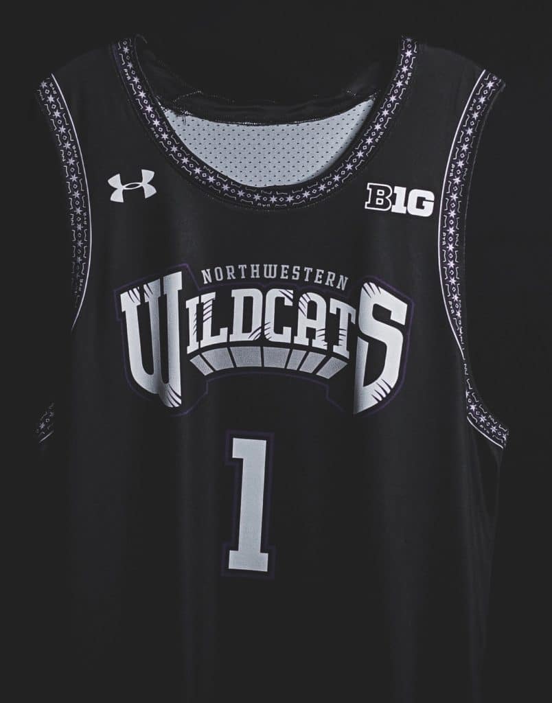
Fascinating series of events yesterday that raise all sorts of interesting questions about the creative process, intellectual property, and so on. Let’s start at Northwestern, where the basketball team unveiled its annual Senior Day uniform, which will be worn this Saturday against Purdue. If the design looks familiar, that’s because it’s based on an old NBA uniform:
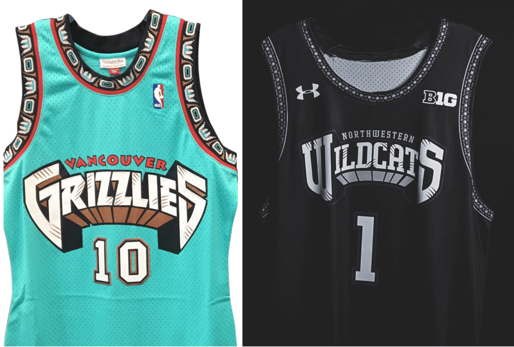
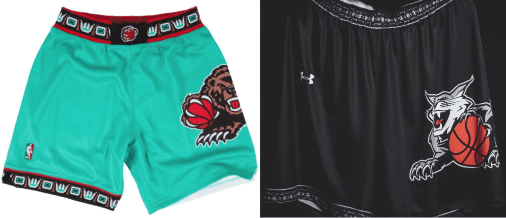
Why it’s our old friends, the Vancouver Grizzlies! And the Griz influence isn’t restricted to the jerseys — check out the shorts:
There’s nothing sneaky about any of this. Northwestern’s press release is upfront about the uniform’s inspiration:
For the third time in program history, Northwestern basketball has collaborated with Under Armour to create its latest edition of the ‘By The Players’ uniform. The tradition has evolved to each senior class meeting with UA representatives to help design the uniform they will wear on their Senior Day.
• Northwestern’s senior class met with Under Armour in August 2018 to come up with a concept.
• Design is inspired by NBA uniforms from the 1990s, the decade in which NU players fell in love with the game of basketball. The Grizzles look was one of their favorites and they communicated that to UA.
• UA created a new Wildcat logo that is in line with the look of the 90s. The Wildcat is featured prominently on the shorts and the shooting shirt.
Leaving aside the somewhat dubious explanation for the 1990s influence (a current college senior would typically have been born in 1997, so it’s hard to see how any of the Northwestern players “fell in love” with basketball during the ’90s), it’s interesting to see a college team borrowing from a pro team. The Grizzlies, of course, are no longer in Vancouver, but the franchise still exists in Memphis, so I assumed there must have been an interesting arrangement between Northwestern and Under Armour on one side and the Grizzlies and the NBA on the side in order to make this uniform possible (similar to what happened when the Arkansas football team honored alum Jerry Jones by wearing Cowboys-themed uniforms). At the very least, you figure NU and UA gave everyone a heads-up, right?
But when I got in touch with a Grizzlies source to ask him about this, he expressed surprise at the design. So I went back to Northwestern and asked their media guy if the school had consulted with the Grizzlies or the NBA. I made it clear that I wasn’t playing gotcha or accusing anyone of anything — I was just curious about the creative process on this uniform and was wondering to what extent, if any, the Grizzlies and/or NBA had been involved. He said, “That’s a good question,” and then suggested that I check with Under Armour.
So I went to Under Armour, asked the same thing, and got this response:
The process of this uniform creation was a collaborative journey where our design team met with the NU seniors (I believe it was three separate trips) and talked about the kind of uniform they’d like for Senior Night. In the initial meeting with the team, the Grizzlies were one of those mentioned as an example of uniforms the seniors liked while they were growing up. Our team then came back to Baltimore and created a couple of concepts, which one of them eventually landed as the one for Saturday.
Long story short, the seniors gave us teams they liked while growing up and the style of uniforms they like, and we applied those “wish list” characteristics to the Senior Night uniform.
I thanked him and said, “So, just to confirm, you’re saying there was no consultation with the Grizzlies, right?” His response: “The creative direction came from the era, with the lines, fonts and blocking that were prevalent throughout the ’90s.” At that point I gave up and basically said to myself, “Okay, I’ll take that as a no.”
I’m not sure what to think of this. I’m generally opposed to design poaching, but this seems more like an example of interpretation and homage (something I’ve done myself, although I’d argue that there’s an added meta factor when Uni Watch references a uniform design). It’s worth noting that there are certain uniform designs that have almost become design templates unto themselves, like the Astros’ tequila sunrise design, which is used by countless teams at virtually every level of pro and amateur baseball. So if that’s okay (and I’m pretty sure we all think it is), then why not the Northwestern design?
I’ve never thought of Vancouver uni in that same “template unto itself” category, but maybe it is. After the Northwestern uni began circulating yesterday, Twitter-er Dean Garcia posted this:
Eastern New Mexico University Greyhounds also going with the throwback Grizzlies look for their road uniforms this year. pic.twitter.com/wZjs3RljfP
— Dean Garcia (@deangarcia1) March 7, 2019
All very interesting. I’m just surprised that these colleges and their legal departments weren’t worried about getting some sort of blowback from the NBA.
Meanwhile, just as the Northwestern situation was unfolding, a remarkably similar set of circumstances was developing in Tampa, where the logo for Wrestlemania 36, which will take place at Raymond James Stadium in 2020, was unveiled:
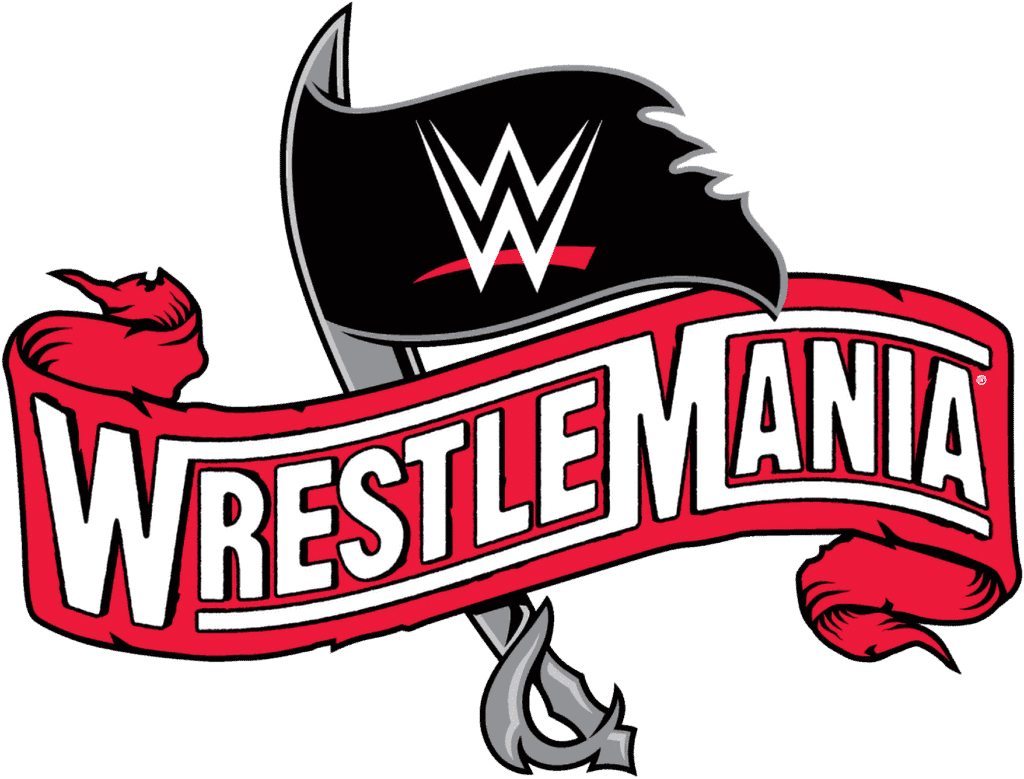
And if that one looks familiar, it’s because it owes a heavy stylistic debt to the logo of Raymond James Stadium’s primary tenant, the Tampa Bay Buccaneers:
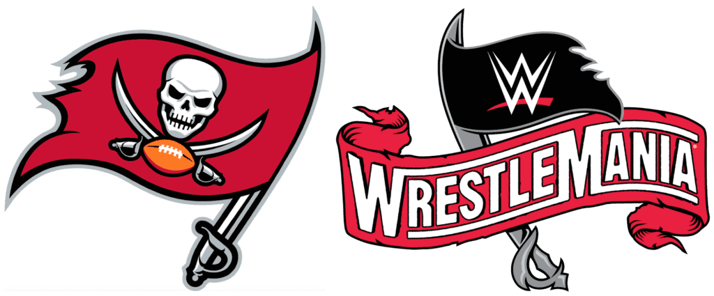
I don’t follow pro wrestling, so I have no idea if Wrestlemania logos typically reference the logos of the teams that play at the host venue. But either way, I figured they must have consulted with the Bucs on that, right? So I contacted the Bucs, where a very friendly spokesman said, “I actually do not know the answer to this, so let me see what I can find out.”
He hasn’t gotten back to me yet. I suppose I could contact WWE and ask them, but there are some things I just will not do.
Click to enlarge
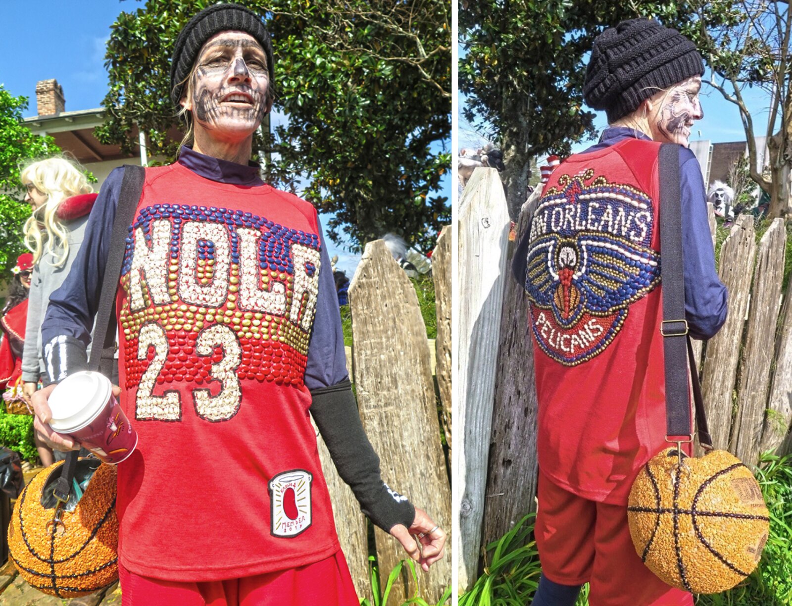
Mardi Gras scene report: Membership card designer Scott M.X. Turner moved to New Orleans last summer, which means he’s now experiencing his first Mardi Gras. He was pleasantly surprised to see some of the revelers, like the woman shown above, in uni-themed costumes (additional pics showing other uniforms here). He also provided some interesting background info — take it away, Scott:
Most of these are from the Krewe of Red Beans parade. Red Beans krewe members decorate their costumes with…beans. The most interesting designs are the ones that use natural bean colors, though some people paint the beans.
Specifically, these are from the Red Beans sub-krewe Dead Beans — more macabre. The theme this year was Dead Poets. Casey is “Casey At The Bat,” and the Pelicans treatment is Anthony Davis, who’s clearly dead to Pelicans fans these days. I couldn’t tell if there was a sub-sub-krewe of AAGPBL skirts or just Satan 666 and Casey. You, of course, would have gone up to folks and asked. I was too busy being overwhelmed by it all.
Puns are a big part of New Orleans culture — hence the “Great Bambeano” baseball undershirt.
There was a fella dressed as an LSU baseball player. One point for going high-cuffed, point taken away for the abysmal sock execution.
Another very-oft-occurring theme in this year’s carnival season: NFL referees suck.
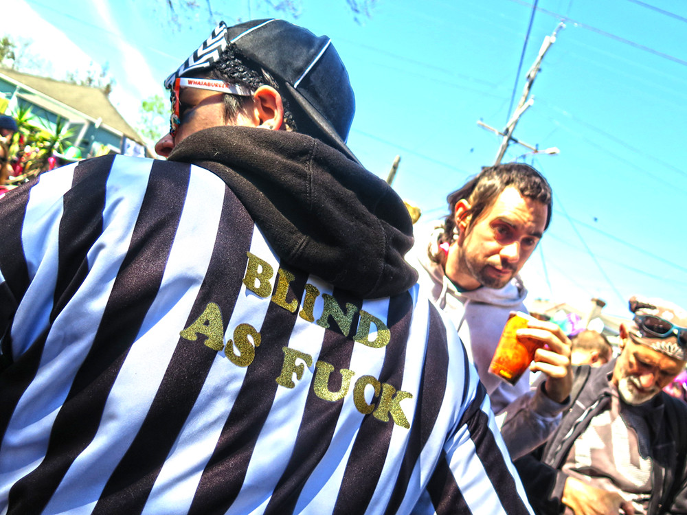
Every parade had a float or floats dealing with the non-call in the Saints’ NFC Championship Game loss. Lots of throws were yellow penalty flags, lots of referees with canes for the blind. One parade known for its ribald themes, Krewe du Vieux, featured a penis dressed like a ref continually ramming itself into a Superdome with a roof shaped like an ass. You get the idea.
I hope this becomes a tradition whose origin story gets lost in the ether. I’d love for there to be conversations a century from now:
“Mommy, why are there so many people in black-and-white shirts throwing yellow handkerchiefs?”
“I don’t know, darling…something that happened a long time ago when New Orleans was still above water. Grandpa told me once, but I can’t remember what it was…”
Now that, my friends, is a lede-worthy scene report (indeed, it would have been today’s lede if not for the Northwestern thing). Thanks, Scott!
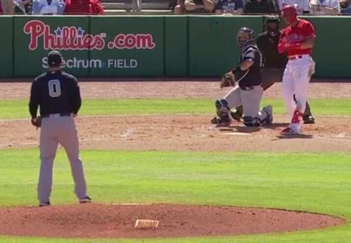
Whole lotta nothin’: We’ve known for a while now that reliever Adam Ottavino would be wearing No. 0 with the Yankees (thus becoming the first Bronx Bomber ever to do so), but it still looks really weird, right?
And it’s gonna look even weirder when he does it in pinstripes during the regular season.
(My thanks to @kodywiddak for the screen shot.)
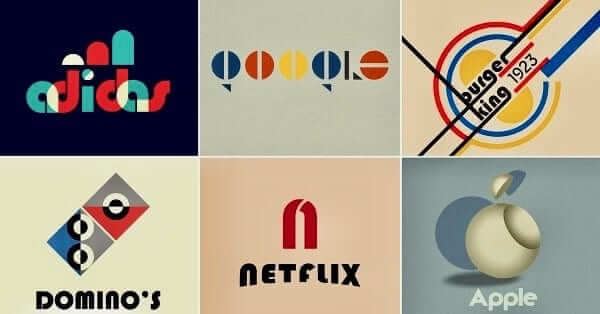
’Haus work: This year marks the 100th anniversary of the founding of the great Bauhaus art school, so some graphic designers have been trying their hand at redesigning some contemporary corporate logos in the Bauhaus style, with very entertaining results. You can see more examples (and larger versions of the ones shown above) here.
(Big thanks to my longtime pal/hero David Greenberger for this one.)
The Ticker
By Yianni Varonis

Baseball News: Here’s why baseball managers wear uniforms (paywalled) while football coaches no longer wear suits (from @retrojayhawk). … Here’s a fun look at the origins of the Rays’ first branding attempt. … The Reds Hall of Fame and Museum has a new logo (from Matt Bach). … Speaking of the Reds, their 150th-anniversary logo, which will appear on jerseys and caps this season, will also appear on the baseballs at their home games (from our own Alex Hider). … Illinois Secretary of State Jesse White told a local TV station that the state’s most popular vanity plates were Blackhawks- and White Sox-themed. … Only in spring training: Cubs SS prospect Nico Hoerner wore two different uni numbers on consecutive days. … Minor League Baseball has a logo for both opening day as well as opening night (from Al Jones). … From Phil: The Milwaukee Milkmen unveiled the uniforms that they will wear during their inaugural 2019 season. … To celebrate Kentucky Derby season, the Louisville Bats will become the Derby City Mint Juleps for two games later this year (from multiple readers). … New retro-inspired jerseys for Virginia (from @chef__carey). … Marlins photographer Tony Capobianco noticed that OF Curtis Granderson had written “Don’t Think, Have Fun” on his underbrim, and Granderson explained that he’s been doing that on his caps since he was a kid (from Aaron Stock).

Pro Football News: QB Case Keenum was traded from Denver to Washington last night. This published attempt to Photoshop him into a Washington uniform, however, missed the mark on several levels (from Jon Solomonson). … Cross-posted from the baseball section: Here’ why baseball managers wear uniforms while football coaches no longer wear suits (paywalled) (from @retrojayhawk). … The newest Arena Football League team will be the Atlantic City Blackjacks featuring this logo (Mike Chamernik).
College Football News: If you’ve never seen this before, North Carolina is practicing with a football that will emit a sound indicating if it’s not being held tightly enough by a player (from James Gilbert). … LSU produced a video to unveil the next player that will wear No. 7, which in recent history has been worn by standouts (from Griffin Smith). … Air Force is asking fans to vote bracket-style on which alternate helmets they like most.

Hockey News: Prior to last night’s game, the Red Wings painted No. 7 onto their home ice in memory of Ted Lindsay, who passed away this week. In addition, the team wore a memorial patch, coach Jeff Blashell wore a memorial pin, and fans were given memorial placards (from Moe Khan, James Beattie, and Al Kreit). … Last night the Coyotes wore wore first responders-themed sweaters during warmups, featuring NOBs describing the character of first responders (from Peter Quinn). … The Penguins have a new partnership with a Pennsylvania-based tool maker that includes the team logo and head equipment manager’s signature featured on a line of products (from Jerry Wolper and Kevin Krawz). … Cross-posted from the baseball section: Illinois Secretary of State Jesse White told a local TV station that the state’s most popular vanity plates were Blackhawks- and White Sox-themed. … The Quad City Storm will host KISS Night this week during which it will wear KISS-inspired uniforms. … The Cincinnati Cyclones will wear Black Panther-themed sweaters that will be auctioned-off for charity (from @labflyer). … Soccer player Madison Tiernan, who plays for Sky Blue FC, dressed up in the hockey uniform of Metropolitan Riveters G Kimberly Sass, pads and all (from our own Jamie Rathjen). … This is the green sweater that the Chicago Wolves will wear to celebrate St. Patrick’s Day (from Steve Johnston).

NBA News: A writer at Sports Illustrated gave his opinion on how the Lakers should handle the rest of a very disappointing season. Among his suggestions was to “Burn those purple jerseys” because of the black side-panel. Agreed! (From @HitTheGlass.) … The new athletics logo of Contra Costa College was originally just a part of its basketball court design that was inspired by the Cavaliers’ secondary logo.

College Hoops News: Troy G Jasmine Robinson wears “J. Rob” NOB while her teammate, G Kayla Robinson, wears her full last name (from Jonathan Sellers).

Soccer News: Somehow, Manchester United MF Mason Greenwood’s shirt against Paris Saint-Germain had a PSG badge on his back-jersey number (from Phil McDaniel). … It appears that English club Tottenham Hotspur’s third kit has been copied by the top team in Iraq, Al-Shorta SC. … Colorado Springs Switchbacks FC unveiled its new shirt for this upcoming season (from Josh Hinton). … Argentinian club Newell’s Old Boys unveiled new away kits (from Ed Zelaski). … Cross-posted from the hockey section: Sky Blue FC MF Madison Tiernan dressed up in the hockey uniform of Metropolitan Riveters G Kimberly Sass, pads and all (from our own Jamie Rathjen). … Also from Jamie: This really great photograph of Welsh club Cardiff City’s laundry room surfaced featuring other team’s jerseys, most of which are likely opponents the team played. … New home kit for New York Red Bulls II (from Josh Hinton). … New World Cup kits for the Scottish Women’s National Team (from our own Jamie Rathjen). … New home kits for Birmingham Legion FC, the new USL Championship Division franchise (from Brandon Seale).

Grab Bag: President Trump called Apple CEO Tim Cook “Tim Apple” during a public event Wednesday. Making light of the situation, Cook changed the last name on his Twitter account to the Apple logo. … From Phil: In a new deal that was announced yesterday, Nike will continue to be the official outfitter of U.S. Olympic athletes through the 2028 games in Los Angeles. … Canada’s national rugby team recently wore orange shoelaces to raise awareness to the threat of leukemia and to support a four-year-old Canadian girl battling the disease (from @ohhhsourry). … Check out this Michigan State-themed, custom-made carousel horse (from Griffin Smith). … Military appreciation uniforms upcoming for Cleveland State lacrosse (from Ed Zelaski). … Reader Jay Wright shares that a local bank sent his household a mailer specifically to explain its decision to change the company’s logo. … We wrote earlier this week that Goldman Sachs is loosening its dress code. This opinion piece argues why that was the right decision. … British airline Virgin Atlantic will no longer require female flight attendants to wear makeup and has made it easier for them to wear pants. … IKEA’s former head of design recently made the argument that companies need to refocus their energies on designing better products instead of expansive marketing campaigns. … The New York Times recommends the following books chronicling the history of design. … A video of a teenage girl who doesn’t recognize the Metallica logo on a T-shirt has gone viral among metalheads.
I still have no idea why the Yankees are allowing somebody to wear 0 – no less a pitcher!
I know I won’t watch any game with a pitcher wearing 0.
Good for you! Now go yell at those kids to get off your lawn. If you’re willing to forgo watching a game because you don’t like a player’s uniform number, you weren’t going to watch the game.
You can take your arithmophobia and narrow-minded views out off this site…hate monger!
The Yankees have retired so many numbers that they really don’t have much choice other than to allow 0 – or to switch to a different numbering system entirely, like base 16. “Now batting, the shortstop, number E6!”
I’d heard they’d already had to start using 3-digit numbers in training camp, but haven’t found any photos to confirm this.
I’m waiting for the first “1A” like they do in horse racing. I don’t think it’s been done.
Steve Sax could have been E4.
David Wells was a huge Babe Ruth fan and asked for #03 when he came to the Yankees. Obviously they shot it down.
But he *did* wear 3, briefly, with the Red Sox!
link
I can’t wait for the Yanks to allow 00, 01, 02, 03, etc.
And single digit pitchers are as awesome as quarterbacks wearing numbers in the 20s.
Something wrong here: Only in spring training: Cubs SS prospect Nico Hoerner opening day as well as opening night (from Al Jones).
The opening day link leads to a page that doesn’t exist and the whole sentence is wonky.
Coding error. Now fixed.
Regarding the Greenwood Man Utd kit with the PSG badge, I thought Random Reader explained it in yesterday’s Comments section:
After looking at the other photos of him, it seems that the NOB *and* number font are both PSG’s (the PSG crest was blacked out). The shorts had the correct number font for Manchester United’s Champions League kit.
If I had to guess, his kit was possibly prepped the day of the match in Paris.
Agreed. With the injury situation in Manchester United, the scramble to pull up Academy players for the trip, they likely arrived in Paris without proper/enough pieces for his shirt and had to borrow from PSG.
It always shocks me that there are people who like those 90s era NBA uniforms. I guess there’s a fine line between being inspired and stealing. I think the Northwestern design seems more wrong because the Grizzlies uniforms were so unique. Any idea what the previous “by the players” uniforms looked like?
The Wrestlemania logo reminds me of bands that create merch incorporating versions of team logos.
The Buffalo Big 4 (Buffalo, St. Bonnaventure, Canisius, Niagara) did something similiar to Northwestern back in 2014 where they all wore jerseys that were based on Buffalo Braves (current LA Clippers) jerseys.
link
“I suppose I could contact Wrestlemania and ask them, but there are some things I just will not do.”
You should contact the WWE and not WrestleMania. WrestleMania is a WWE Event.
Not to reemphasize the recent unpleasantness, at the bottom of the high school logo poaching FAQ, there’s a mention of your ESPN connection…as a SI man now (among the many other connections you have) that may need to be changed.
I’m still under contract to ESPN for another week. And I will not be “a SI man” — I will simply be doing an article for them.
I was re-reading that FAQ as a refresher today, and noticed that mention of your proposed “design-services project”. Too bad that didn’t work out with ESPN, but is that something you might pursue with another outlet going forward? Sounds like a really great idea!
i just re-read the FAQ too. Can we just pro-bono them new logos? (“Uniwatch: Pro-Bono Our Logo”?) If someone names the identity i’d be happy to throw together some proposals.
Three years ago when Wrestlemania was in Dallas they had a Cowboys-like star in the logo but this is the closest thing it’s been to an actual team’s logo.
According to several wrestling news websites, the WWE is indeed partnering with the Bucs for publicity around the Tampa Bay Area for the next year in order to hype and promote Wrestlemania 36.
The Wrestlemania logo each year, at least for the past several years, has borrowed from local sports logos, physical landmarks, industry, and traditions from the host city. For example, for this years Wrestlemania in NY/NJ at Met Life Stadium (and other wee events in Brooklyn), the crown of the Statue of Liberty is featured in the logo. Recent years have also included:
Wm34: purple green and gold fleur de lis for New Orleans
Wm 33: a sun logo for Orlando/sunshine state
Wm 32: the blue star of the Dallas Cowboys at the bottom of the logo (held At at&t stadium)
Wm 31: at Levi’s stadium/49ers (direct from wikipedia): “The logo for the event included a red “play” button. According to a San Jose Mercury News article, Vince McMahon explained that the play button highlighted the technical prowess of Silicon Valley.”
Wm30: purple fleur de lis-see wm34 – New Orleans
Wm29: Empire State Building for Met life stadium NY/NJ
Hope this brings some light to the conversation!
As an avid WWE, the Wrestlemania logo doesn’t normally resemble the logo of the stadium’s football team. They do try to incorporate the city into the logo either by the color scheme or some other symbol sometimes, i.e. the fleur de lis in NOLA or the crown of the Statue of Liberty for MetLife Stadium this year. This is a very unique Wrestlemania logo we have here.
Wow, that’s a lot of corporate speak from Under Armour. The fact that the UA Rep couldn’t even answer your question directly was sad. It’s almost like “I have to read from a script and cannot stray from this script”. And it took them three trips to Evanston to basically poach an already used logo/design? No wonder they are/were having financial troubles! Even designing a brand new logo from scratch, wouldn’t one meeting with the NU Seniors be enough?
An homage is great, but these feel like knock-offs. Even the scratches in the lettering match exactly.
UA produces garbage uniforms, so I expect nothing else from their “creative department”.
What is the objectivd difference between an homage and a knock-off? Seems to me that the distinction between the two boils down to the intentions and motivations of whoever is doing the thing, which is an entirely subjective distinction.
If the distinction is a subjective matter of intent, then we have to look at the available evidence of motivation. All parties involved in the NU uniforms claim that they intended the uniforms as a tribute or homage; there is no evidence that the intent was merely to copy or steal the Grizzlies’ intellectual property. So I would propose that the NU unis are clearly intended as an homage. The question is whether, as an attempted homage, they succeed and are any good. To which I would propose the answers are “yes, barely,” and “no, emphatically.”
I fundamentally don’t understand nostalgia for 1990s NBA uniforms. But then again, I hold many 1970s MLB uniforms in high regard, so I understand the irrational appreciation of the sports uniforms of one’s early childhood.
A knock-off is when something attempts to fool others into thinking it’s the real thing. This in not the case here.
So today is International Women’s Day. Surely some trivia expert in the Uni-verse knows when the LAST MLB “Ladies Day” occurred.
These were fairly common for all teams in the 1950s and 1960s.
link
As I recall, the Pirates just started offering the Ladies Night discount to everyone for one Buc Night a month. That eventually disappeared.
Does it bother anyone else that if the flag in that Wrestlemania logo were flattened out, the WWE logo would be crooked?
Former UNC and NBA player Rasheed Wallace was just named as the new men’s basketball coach at Jordan High School in Durham, NC.
The Jordan Falcons logo appears to be a mashup of the Blue Jays’ old “J” cap logo and the Atlanta Falcons classic bird.
link
In a world where school logos can so-closely resemble pro marks, I’m impressed that they’ve restrained themselves from using a variation on the Jumpman logo. I think that one would conjure the name “Jordan” almost subconsciously.
Hey Paul, is that Vancouver Grizzlies uniform still your least favourite all-time NBA uniform?
There have been so many new NBA uniforms that have not been so great.
Metallica ticker makes me cry.
We all thought – and many wrote about – that the Yankees would not have any player wearing a single digit uniform number (after they retired Jeter’s #2 and Torre’s #6). No one ever thought they would trot out a player wearing #0 – much less a pitcher!
Re: Seattle’s NHL team colors
We were out in Vancouver a couple of weeks ago and decided to visit the beautiful Museum of Anthropology. An award winning building with a spectacular backdrop, and we were visiting on a picture perfect day. We took a highly entertaining tour. The Museum is full of indigenous artifacts. Our guide mentioned towards the end of the tour, all the older art work of the indigenous community was done in only three colors…..red, black and white. i.e. that’s the colors they could produce. I immediately thought of Seattle, who is rumored to be considering an indigenous inspired logo and that they’re favoring those three colors.
As a HS teacher for over 2 decades I’ve always marveled at students that wear classic rock band t-shirts… I always engage the students in fun conversation about the band (or album cover). Of the hundreds I’ve seen there have been, literally, only a handful who are actually fans. Some memorable t-shirts: Abbey Road (album cover), The Beatles (general band), Def Leppard (VERY popular), Nine Inch Nails, Led Zeppelin, Tattoo You (album cover, once and only once!), Pearl Jam, Van Halen (1984 cover)…
Def Leppard: Back when we listened to music on tapes and discs, I had two albums repeatedly stolen from my desk and office at various early-career workplaces. Elvis’s “Golden Records” and Def Leppard’s “Hysteria.” I must have lost at least five copies of “Hysteria” to workplace pilferers. It’s like, the shame of purchasing an album that everyone secretly loves but publicly looks down on was high enough to lead people to a commit larceny.
Perhaps the NFL should take a design cue from the WWE and design their Super Bowl logos like the WM logos. WM font stays generally the same, but the logo of each event changes each year. You can have your brand recognition font and have basically a different logo every year and still keep that brand recognition. Have your cake and eat it too.
As an aside, it’s a travesty that WWE had to shoehorn in their No. 2 poster child Charlotte Flair into this year’s Wrestlemania. Should just be a Lynch-Rousey main event only.
How anyone can draw inspiration from the Vancouver Grizzlies is baffling. Everything about the them was an abomination from the unis to the product on the court. As a Vancouverite, I’ll wear the Canucks, Lions, and the single A Canadians, anything but the Grizzlies.
First unis were a bit gaudy and product not good on the floor, but the last Vancouver Grizzlies uniforms were nice.
link
link
Well this sucks, I really wanted to read the story about why NFL coaches don’t wear suits anymore
They donated Northwestern stripes to the uniform world, I think it’s fine if they borrow a random old design from a team that doesn’t even exist in the city anymore.
It also appears that the Northwestern uniforms utilize the star from the Chicago flag on the collar, arm holes and waistline. This keeps in line with NU’s assertion that they are “Chicago’s Big Ten Team”