
By Phil Hecken, with Kyle Evans & CJ Fleck
Follow @PhilHecken
Hey everyone — it’s time for the annual MLS Preview, and I’m back once again (for their fourth season) with soccer guys Kyle Evans and CJ Fleck, who’ve not only previewed and reviewed the MLS kits and jerseys for four straight years, but have also reviewed other leagues plus the Olympics and World Cup. I’m actually away right now (I’m up in the Albany area curling in a Bonspiel), but the guys were gracious enough to get me their review in plenty of time for me to bring it to you today. [As an aside, I still haven’t replaced my laptop, but even if I had it, I’d be waaaay too busy to bring you this weekend’s content — so apologies in advance if there’s any “breaking” uni news I am not covering.]
There’s a lot to get to — and if you remember how Kyle and CJ work: Kyle gives his thoughts (not on a 5 star scale this time around) while CJ gives them the classic “good” or “stupid” designations. So let me turn this over now to the lads as they bring you their…
2019 MLS Preview – Eastern Conference
By Kyle Evans & CJ Fleck
Thanks Phil! We’re excited to be back for another year of previewing all of the new MLS jerseys – it’s already our 4th year on Uni Watch!
Yes it’s still winter in most of the country, but MLS is back and kicks off this afternoon with a full slate of matches. In league news, the expansion trend continues with FC Cincinnati joining the Eastern Conference this season as the league’s 24th club. This marks the 3rd consecutive season with a new team and two more (Miami, Nashville) are set to join next season.
In jersey news, Adidas remains the league-wide kit supplier and you will notice the “three stripes” template on the shoulders or sides of each new jersey. This is also the annual reminder that MLS rotates their kits so that each year a team receives either a new primary or a new secondary kit, meaning that each design is (generally) on the field for two seasons.
The main trend this year is white. A lot of it. Exactly half (12 of 24) of the teams released a jersey that is predominantly white (I’m including light gray in this). It is rare for teams in MLS to have a third jersey option, so when combining with last year’s releases, this now means that 19 of the 24 teams have a white jersey as one of their two choices. (The only teams without a white option are Columbus, NYCFC, Houston, Seattle, and Sporting Kansas City.) Yes, the more teams that have white options means it is easier to avoid color-clashing, but it also results in many simple all-white uniforms with few (if any) design elements.
With the context out of the way, enjoy all of the new jerseys and share your thoughts on what you do or don’t like in the comments! (Click any photos below to enlarge.)
FC Cincinnati (primary and secondary)
The league’s newest expansion team will be wearing a blue primary jersey with a pinstripe within vertical stripe design and orange accents along with an all-white secondary jersey. Because of an accelerated timeline in joining the league to playing in the league, the designs came together quickly and per this Twitter exchange with Paul, FC Cincinnati’s players will actually be wearing replica-quality jerseys as opposed to authentic-quality on the field this season.

Kyle: So I’ll start by saying that I preferred their recent USL jerseys in comparison. I don’t love the diagonal pinstripes and the orange portions seem random. And I understand there was a rush, but couldn’t there be some blue or orange on the collar or at the end of the sleeves?
CJ: I love the color combination, it’s good to see MLS get some fresh expressions of color. Strangely I like the stripes! I have to call it good. Endless white secondary kits, however, are a continued aggravation.
Atlanta United (primary)
Last season’s MLS Cup champions won the title in only their second season, so this will be only their second primary jersey in their existence. The main difference is that the “Five Stripes” are now the “Nine Stripes.” And as defending league champions, Atlanta will sport a gold star on their jersey.

Kyle: Easily one of the best looks in the league regardless of how many stripes there are.
CJ: The number of stripes should bug Atlanta fans. Didn’t they advertise on the “Five Stripes”? Insert your own version of Paul taking down the concept of branding. Stupid.
Chicago Fire (secondary)
The Fire add new white secondary kits with a wide red horizontal stripe. The red primary remains the same, but has been updated with their new advertiser.

Kyle: The red stripe with the navy accent is nice and I appreciate the consistency in the set. Try to pair the white jersey with the red shorts when possible!
CJ: I do like consistency, but more white is boring me. Call it a push.
Columbus Crew (primary)
An all-yellow primary with a very subtle checkerboard pattern.

Kyle: No complaints with the Crew’s traditional look. #SavedTheCrew
CJ: Any Columbus jersey is good for this year. #SavedTheCrew
DC United (secondary)
All-white with light gray accents.

Kyle: Really disappointing to see DC with the most basic design you could imagine. Throw some black or red in there!
CJ: Is that a training top? Stupid.
Montreal Impact (primary)
Montreal has narrowed the width of their stripes, increasing from five to thirteen while adding a gradient design on the bottom half of the jersey.

Kyle: I love the blue and black stripes and I understand some of the bottom half will be black when tucked into black shorts anyway, but this feels like an unnecessary use of a gradient design.
CJ: Why is the gradient necessary? I can’t stand it. Stupid.
New England Revolution (secondary)
Supposedly modeled after jackets worn by Colonials in the Revolutionary War, the Revs’ new secondary jersey is white in the center flanked by a pale slate color.

Kyle: On the field this looks like a solid light gray jersey. If you’re really trying to sell the “Colonial jacket” look, why not make the colors more distinct?
CJ: The “colonial jacket” market buzzword is ridiculous. Always gotta be #on #brand I guess. It’s a boring jersey. Stupid.
New York City FC (primary)
NYCFC retains sky blue as the main color on their primary jersey and adds an off-center vertical navy and orange stripe.

Kyle: Admittedly my least favorite team in the league from a fan perspective, but without a doubt this is my favorite new jersey in the East this year. A perfect reflection of their logo and the thin orange stripe pops in a great way.
CJ: It’s not a stadium, but it’s an improvement! I hate that the ad breaks the stripe, though. Ruins the look a little. Good.
New York Red Bulls (secondary*)
The Red Bulls add a new gray jersey complete with thin white diagonal pinstripes and a sublimated gray “digital” design.
*Having released a new red secondary jersey last season, the Red Bulls were due to release a new primary jersey. Instead, they released the new gray jersey as their secondary and re-designated the red jersey as the new primary.

Kyle: Gray jerseys haven’t been nearly as common in MLS as they have been in American football and basketball, so I don’t mind the color, especially amongst many white jerseys in the league. (Yes it effectively operates as a white jersey.) Not a fan of the sublimated design though, no matter how visible.
CJ: Yikes. What is this digital concept? Gray is fine; it’s not white? I can’t call it good though, so we’ll give it a push.
Orlando City (primary)
Orlando’s new primary is all-purple with a tread-like black design.

Kyle: I love the purple (sorry Paul) and I guess (I hope) the sublimated design will mostly go unnoticed on the field. Maybe it’s just me, but I‘d love their next purple jersey to feature gold accents instead of black.
CJ: Purple is purple, but that sublimated pattern is not enough to save this. Stupid.
Philadelphia Union (secondary)
All-white for the Union with a subtle sublimated starburst design.

Kyle: The Union seem to have changed course from their original block stripe jersey designs and now have two jerseys which are both a solid color. The starburst design isn’t bad, but again don’t expect it to be visible on the field.
CJ: The Union are my team, and they’ve been disappointing me sartorially and competitively for 10 seasons. However, they did run a promotion with the back tag of this jersey, allowing fans to choose when they purchase their jersey. The creators included a number of Philadelphia noted citizens and players from other teams in the city. It’s creative, but it doesn’t save a boring design. Good idea to make the ad monochromatic, though. Stupid.
Toronto FC (primary)
An all-red primary jersey for the Reds. This is the only new jersey that contains a button at the neck.

Kyle: Was there a design process at all? I don’t mind this being simple, I’m genuinely curious.
CJ: To answer Kyle – “Throw a button on there and call it a day.” I like the button. I’m a simple man. Good.
Thanks, guys! They’ll be back again tomorrow with Part II — the Western Conference — tomorrow.

Kreindler’s Korner
I had the distinct pleasure of featuring the wonderful artwork of artist Graig Kriendler on two occasions over the summer and fall of 2017, and more recently, in August of 2018.
For those who don’t wish to click the links, Graig paints baseball heroes (and regular guys) from the past, and is an immense talent.
Occasionally, I will be featuring his work on Uni Watch.
Here’s today’s offering (click to enlarge):

Title: “A Breakthrough”
Subject: Jimmie Foxx, 1929
Medium: Oil on linen
Size: 16″ x 20″My favorite anecdote about Jimmie Foxx comes from Yankee pitcher Lefty Gomez. Apparently in 1937, Foxx hit a home run off of Gomez at Yankee Stadium that landed in the upper deck of the leftfield stands – something that was very much a rare feat accomplished by precious few. When asked how far the ball traveled, Lefty answered, “I don’t know, but I do know it took somebody 45 minutes to go up there and get it back.”
I’ve only been able to paint Foxx a handful of times, as for whatever reason, he’s not the most popular player with my clients. I never knew why, as he always was super fascinating to me – especially considering how much of a monstrous physical specimen he was, yet supposedly also rather gentle and even-tempered.
When I was given the chance to depict him on canvas for one of my favorite collectors, I was given carte blanche, image-wise. I had always been (and still am) in love with the photography of Charles Conlon, so it was his work I gravitated towards. I wanted an image of him early on in his career, as I love imagining him with Philadelphia as opposed to Boston (not to mention Philadelphia or Chicago). So, here he is, pictured in his first big year with the Athletics. 1929 saw the 21-year-old bat .328 and hit 29 home runs. He also helped lead his club to a World Series victory against the Cubs that year, cementing the team’s legacy as one of the greatest ever assembled.
And still, when I look at this painting, I can only think of him gazing away from the camera, perhaps to the deep leftfield stands in Yankee Stadium that he would someday make Lefty Gomez wax poetic about.
Thanks, Graig! You can (and should!) follow Graig on Twitter.
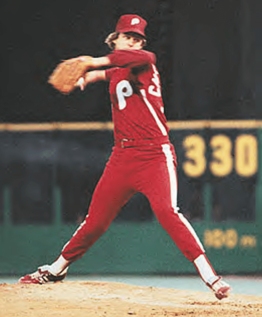
What a maroon: Paul here, with some big news: This season marks the 40th anniversary of the Phillies’ mono-maroon “Saturday Night Special” uniforms, which were worn for one game, on May 17, 1979, and then mothballed forever.
Lots of fans have been pushing for the Phils to bring back this design as a throwback, and now they’re finally doing it. According to Phils beat writer Matt Breen, the team will wear maroon throwbacks on July 27 (a Saturday night game, appropriately), as part of a “’70s Night” promotion.
Anyone else think this will end up being the Phils’ “Color Rush” uniform once Nike takes over MLB’s uni contract in 2020?
Meanwhile, speaking of the Phillies: Breen also reports that Bryce Harper will wear No. 3. His usual No. 34 is probably out of bounds because that was worn by Roy Halladay, who’s being inducted into the Hall of Fame this summer, which means his number will presumably be retired.
The Ticker
By Anthony Emerson

Baseball News: Nameplates live! At least for Spring Training (from Eric Abneri). … The Orioles have added a uni patch for this weekend’s Athletes & Artists promotion (from Marcus Hall). … Someone on Twitter is claiming that these are the unis the Padres are focus-grouping for their return to brown and mustard. Take it with a grain of salt, though (from Alex Kite). … Nats P Sean Doolittle continued to fight for New Era employees with a Washington Post op-ed (from David Goodfriend). … The new turf at Chase Field eliminates the dirt path from home plate to the pitcher’s mound, leaving Comerica Park in Detroit as the only MLB stadium with that unique quirk (from @squatcheeontop). … Here’s a timelapse video of the Safeco Field sign being removed from what was once Safeco Field (from Chris Dougherty). … It appears Nike is using their wordmark with a backwards K on their baseball gear (from @tdobrezj). … Eagle-eyed viewers of the Oscar-winning movie Spider-Man: Into the Spider-Verse noticed the number 42 hidden in the background of many scenes. It’s a deliberate reference to Jackie Robinson (from Thomas Juettner). … Here are the uniforms the University of Houston wore for yesterday’s Shriners Classic (from Ignacio Salazar and Billy Snider). … Philips Andover has added a memorial patch for President George H.W. Bush, in all likelihood the most notable former Philips Andover baseball player. … A yearbook from Pete Rose’s high school on eBay right now has several photographs of him playing football (from Brice Wallace)

NFL News: I’d really like to know what the deal is with the jersey Bears LB Sam Acho wore while visiting schoolchildren yesterday (from Jordan Ryan). … Mike Monaghan sent along this extensive mini helmet collection from a friend of his — 103 in all! … Marty Stevenson bought this old Browns pin at Municipal Stadium in the ’80s or ’90s, and dates it to approximately the ’50s or ’60s. They certainly don’t make memorabilia like they used to.
College/High School Football News: Cross-posted from the baseball section: A yearbook from Pete Rose’s high school on eBay right now has several photographs of him playing football (from Brice Wallace).

Hockey News: The Red Wings are having Grateful Dead night on March 14, and wearing these jerseys pregame as part of the celebration (from @MarxeIIXLII). … It appears that Penguins G Les Binkley either suffered a major tear in his pants and had them sewed back together rather than getting a new pair or had extra padding sewn into his pants in this circa-1970 photograph (from @GameplanChicago). … The ECHL’s Cincinnati Cyclones wore sweaters designed to look like Hogwarts robes from the Harry Potter franchise for their “Wizarding World” promotion last evening (from Brian Henke). … Also posted in the high school basketball section: Flint River Academy in Georgia uses the Carolina Hurricanes’ logo at center court (from @OlegKvasha). …

Basketball News: SG B.J. Johnson will wear No. 5 for the Hawks (from Etienne Catalan). … College/High School Hoops News: Also posted in the soccer section: Missouri Southern State men’s basketball honored women’s soccer player Denine Tahbaz with a handmade memorial band on their jerseys. Tahbaz died from cancer on Feb. 28 (from Ryan Atkinson). … Iowa State University has submitted a $25 million renovation project for the Hilton Coliseum to the State Board of Regents that includes more prominent displays of school colors (from Kary Klismet). … West Charlotte (N.C.) High has a double-decker SNOB — don’t think we’ve ever seen that before (from Chad Fields). … Cross-posted from the hockey section: Flint River Academy in Georgia uses the Carolina Hurricanes’ logo at center court (from @OlegKvasha). … Hasting (Ne.) High girls have amazing candy-striped warm-up pants (from Brett Baker).

Soccer News: New kits for Argentine side River Plate (from Ed Żelaski). … Also from Ed: new kits for another Argentine side, Vélez Sarsfield. … Columbus Crew are giving away captains’ armbands to fans for their season opener. I’m a pretty big soccer fan, and this is the first time I’ve ever heard of a captains armband giveaway. Pretty cool (from John Flory). … Sacremento Republic FC unveiled their new kits (from Josh Hinton). … Cross-posted from the basketball section: Missouri Southern State men’s basketball honored women’s soccer player Denine Tahbaz with a handmade memorial band on their jerseys. Tahbaz died from cancer on Feb. 28 (from Ryan Atkinson).

Grab Bag: New logo for Southern Illinois athletics (from Ryan Keberly). … A Harvard runner won two races despite turning his foot into a bloody pulp after losing a shoe. Caution advised on the link (from Iain Landon).
I’ve got the Phillies beating the Cubs 23-22 at Wrigley Field on Thursday, May 17, 1979.
If this was a “Saturday Night Special” uni, that date is definitely wrong. The Phils wore their standard light blue roads on 5/17/79.
It was two days later, Saturday 5/19/79. Home vs Montreal.
Bill Henderson has the date wrong in his book (probably where Phil got it), but he has a picture of a ticket stub that shows the right date.
Err, where Paul got it.
If the Phils had worn the all-maroons two days earlier, would the notoriety and constant replaying of the 23-22 win have made everyone more accepting of the uniforms?
Discuss….
The Phillies in maroon from head to toe for one evening will look much better than the team wearing the red jerseys with white pants for weekday afternoon games during the 2016 season.
That Les Binkley picture would be from the 1967-68 season, since the Penguins only wore those jerseys for their inaugural season.
When Casey Keller retired, the Seattle Sounders gave away captain’s armbands to everyone in the stadium – it was a cool moment.
The Phillies put out a Facebook video of them making a jersey for Harper.
Here is a link to the video
link
re: Sam Acho – the Broncos have “champions in the community” jerseys that players wear for community relations events such as visiting pediatric hospital patients. Bears may do the same thing. these jerseys don’t look very much like the real ones which i guess is to reduce the number of requests from fans for the shirt of the guys’ backs
Montreal jersey has a button too! Maybe because it gets cold up north, eh?
I appreciate the detailed and thoughtful write-up of the MLS uniforms but I can’t take the kits seriously. Those ads are blindingly atrocious. It’s like someone commenting on your beautiful suit but not saying anything about the big steak sauce and blood splatter across the front.
Most of the teams have gorgeous crests you simply can’t see. Admittedly, most of the uniform is hard to see from seats in the stadia and it generally looks grand on the pitch — the stripes and colors pop, even, for me, the white. I still love the game and will attend matches but it all could have been so much better (and I’ll do my best to not complain when I’m there!). but now it feels like we’re locked in to this international pattern for the long haul. Oh well.
Some extra hockey stuff. Interesting happening in the Philadelphia Flyers vs. New Jersey Devils game last night. Both teams wearing their alternates.
link
link
The Devils look great! The Flyers… meh.
Agree. Was a mistake for the Flyers to hang onto those outdoor uniforms and wear them as thirds. I don’t like them. No reason needed to have a sleeve number that large on a regular third.
Arizona Coyotes wearing throwbacks tonight as well. Way better than the generic uni they currently sport.
The guy with the mini helmets has quite the basement! He’s either wealthy or single.
Having taken part in a recent focus group for the prospective 2020 Padre uniforms, I can confirm that the illustrations are accurate. The white home options had generally favorable reviews, however the cappuccino-like light brown roads were found hideous by our entire 30 person group. I suspect there will be a change on those.
LOVE: the Padres’ color scheme, VERTICAL ARCHING!!!, font, overall design.
LIKE: cappuccino road tans… better than the urine-colored attempt at road tan a few years ago
DISLIKE: the Swingin’ Friar on a game cap. Stick with the monogram SD.
Road pinstripes…love ’em!
I can’t wait for BMO to play BMO! Soccer is ridiculous with those ads. At least NJ changed their name to the Red Bulls.
Yeah, it’s sort of ironic that the Red Bulls have easily the best uniforms in MLS simply because the large ad at least doubles as a team logo and if somebody didn’t know it was a beverage company, “Red Bulls” at least sounds like it could be a legit team nickname.
I was reading recently that the German club owned by the same company, RB Leipzig, got creative in circumventing the German football association’s rules that prevented the club from calling themselves “Red Bull Leipzig” and using the corporate logo the way the New York & Salzburg clubs do: they named the club “RasenBallsport Leipzig”, which literally translates as “Lawn Ball Sports Leipzig”, and naturally abbreviate it to RB. They also tweaked the logo so it omits the corporate name as well as alters the appearance of the bulls… somewhat.
link
It is interesting to see the shirt, though, because its main advertiser is, naturally, RedBull, but the crest is different enough that it looks like one or the other is a mistake:
link
This is why many people can’t take soccer seriously. I can’t wait for the Acura vs. Bimbo match up LOL! Why even bother having a team nickname? It’s completely irrelevant. Also, is the best anybody can come up with for more than have these teams “FC”? Imagine half of the MLB calling themselves “BT” (Baseball Team). Tonight is the Atlanta BT vs. the Philadelphia BT.
Also, as a proud Red Wings fan, why do they have to have “Grateful Dead Night”. Why do professional “big league” teams do this in the first place? It is soooooooo minor league! If you want people to come to the games, instead of having stupid AA Baseball-type promotions, why not just….oh, I don’t know……LOWER THE TICKET PRICES?!?!?!
Agreed. Even worse is that so many teams are going by “FC” simply to sound European when the sport isn’t even known as football here in the US. At least call yourself “Atlanta SC” if you must go that route.
It’s not much different than Japanese baseball teams wearing uniforms with English lettering, or Japanese soccer teams adopting names derived from Italian or Portuguese words. It’s an homage to the culture that sport comes from.
Fan of the HS yearbook Pete Rose photos. My wife went to HS w/Keith Hernandez in Millbrae Ca, and her Mom w/Billy Martin at Berkeley High. Paul posted them here after I sent pics from the yearbooks to him some years ago, if anyone’s interested.
The Atlanta United primary kits are a train wreck from the back. I’m fairly indifferent to the 5-or-9 stripes, but the way they wrap around to the lower back this year is a mess.
Old: link
New: link
I’m totally with you on this and feel like this kit was not properly judged on. The back looks ridiculous. Grade F or “stupid” as these rankings seem to be going by.
Noted it on Twitter, but the signature on the Andover patch, isn’t GHWB’s, but his son’s GWB.
-FC Cincinnati white jersey is way too plain. Hope they at least wear blue shorts with that.
-Would have been nice to see some gold trim in the Orlando jerseys.
I’m just going to say it…soccer uniforms are lame. It’s a t-shirt with advertising on it. The team crests are OK, but too bad you can’t make them out while watching a game.
It appears that the Orlando Apollos of the AAF have a second jersey. Since Salt Lake has a light gray jersey, I figured they’d need a contrasting jersey, but I was under the impression that each team had only one uniform for the season. They don’t sell a blue one in the team shop either.
I just read that Bryce Harper is not taking number 34 because he has unilaterally decided that the Phillies should retire it, despite having given it to several players in recent years, and the comment sections are full of people calling him “classy”.
In what world is it “classy” to be telling a team you have just signed with and have not played an inning for that one of their jersey numbers should be taken away permanently from all future players?
Harper is as entitled to his opinion as you are to yours. Much more importantly here, he can decide to take a different number than 34 without committing the Phillies to anything permanent. (Not that I’d be surprised if the Phils were planning on retiring the number anyway.)
He didn’t just pick a different number; he actually said that the Phillies should retire it. Almost like he was trying to shame them into doing so.
Regarding stripes on soccer jerseys: I never noticed that the number of stripes would be fixed. Do they vary in width for fatter players?
Pinstripes on baseball jerseys, for example, are a fixed width apart, so if they’re an inch apart, a player whose jersey is 22 inches across has 22 stripes. Do soccer jerseys maybe have wider margins on the sides, under the armpits, for fatter players?
When did the Red Wings join the SPHL? Those Grateful Dead warm-ups are one of the worst examples of ‘going minor league’ I’ve ever seen from an NHL team.