For all photos, click to enlarge
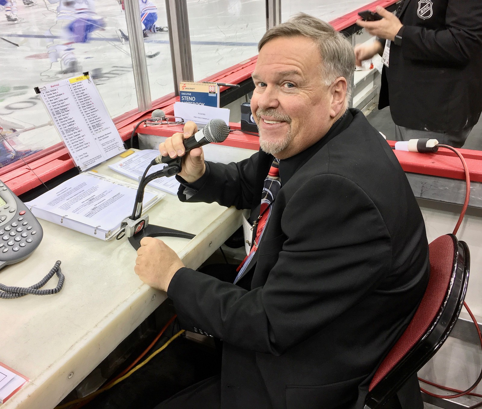
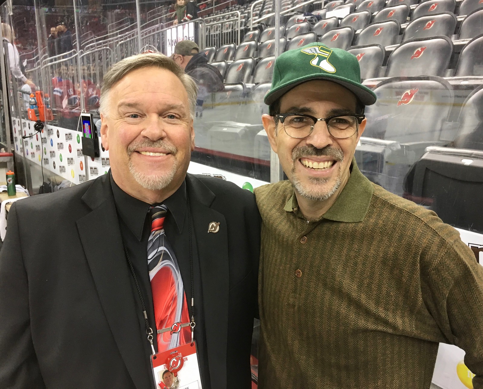
Some surprising people out there are Uni Watch readers. One of them is New Jersey Devils P.A. announcer Kevin Clark, who’s been emailing me with tips, contributions, and off-the-record insider info for many years now. But we had never met in person until two nights ago, when I finally attended my first Devils game since, I think, 1988. I made sure to get there early so we could get acquainted, and so Kevin could show me his “office,” which as you can see is literally the best seat in the house — right on the red line, right at the glass.
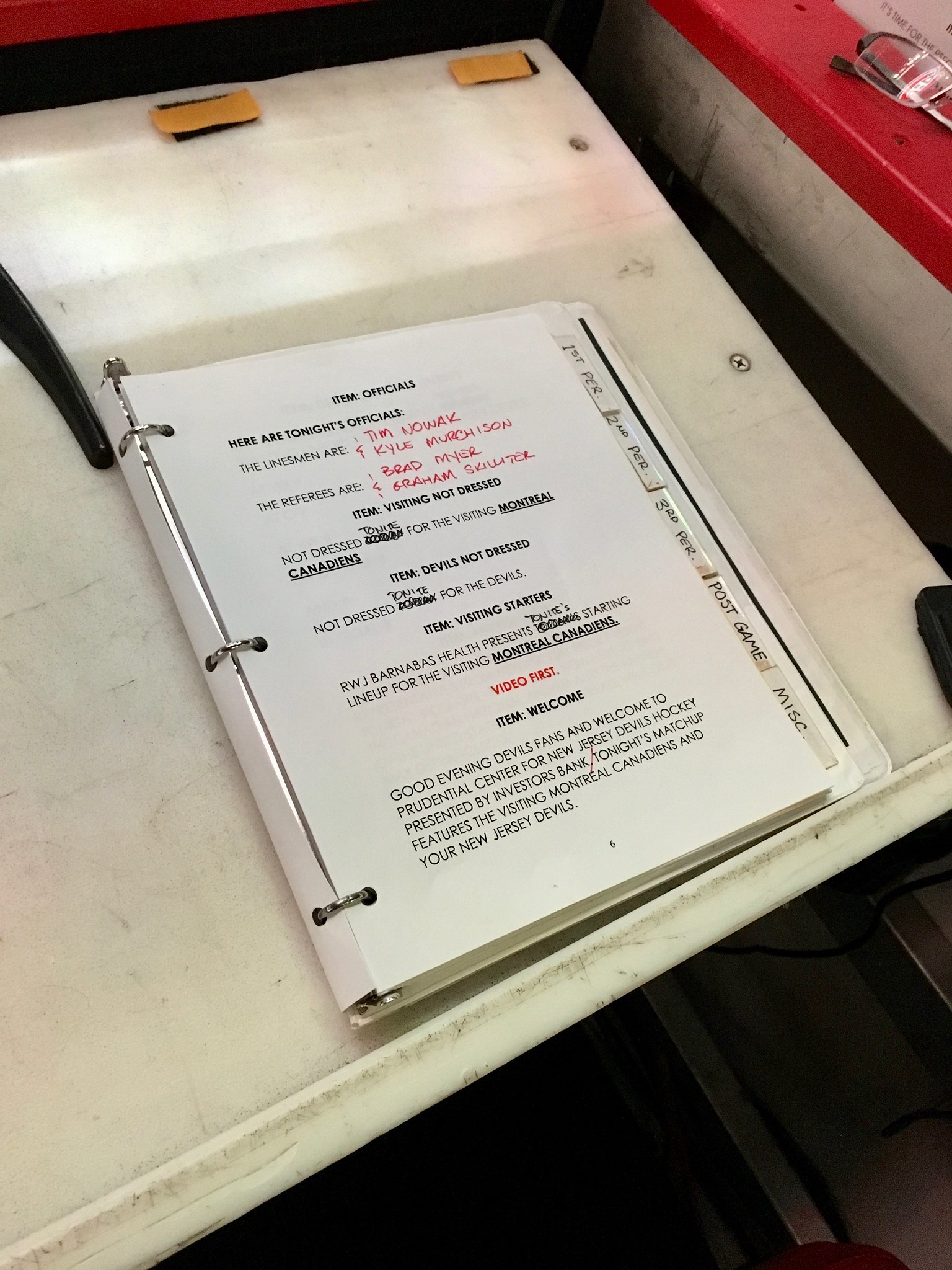
Kevin said he always wears a suit (but his tie isn’t always in Devils colors). As you’d expect, he keeps both teams’ rosters at the ready, along with a binder with scripts:
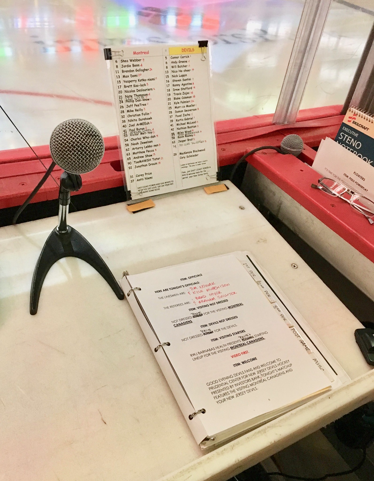
Right next to him are two telephones — one that goes to the league’s video-replay offices, and another that goes to the game’s off-ice officials:

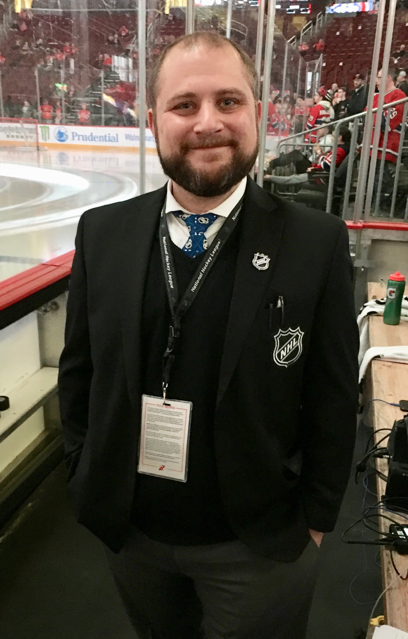
Kevin’s work space is flanked by the two penalty boxes, each of which has its own penalty timekeeper, one of whom I spoke with and photographed (I think his name was Ryan, but I’m not positive). I liked how he wore an NHL blazer, an NHL lapel pin, and even an NHL necktie:
Soon it was time for Kevin to say, “Here they are, yooourrr Neeewww Jeeerrrssey Deeeeevvvillllss!” as the players came out for their pregame skate. With the players on the ice, I shot a bit of video just to give you a sense of how the game looks from Kevin’s vantage point:
Kevin’s an interesting cat. In addition to his announcing work, he’s also a visual artist, as he explained to me in a recent note:
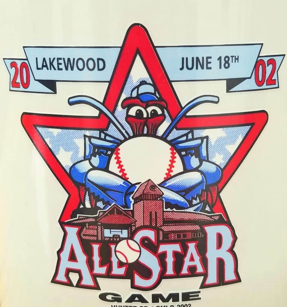
Prior to 2005 I had a fairly decent amount of success with sports art and logo work. I didn’t go to art school — just self-taught and a lot of trial and error (especially error!). I’ve done several on-ice and on-field presentation paintings and private work for athletes like Martin Brodeur, Craig Biggio, Floyd Little, Nomar Garciaparra, etc. Maybe my funniest project was creating the logo for the 2002 South Atlantic League All-Star Game. I also did a piece for the Baseball Hall of Fame for Steve Carlton’s induction in 1994.
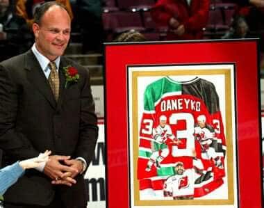
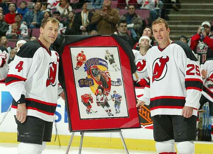
Here’s that All-Star Game logo, along with some of Kevin’s other work:
Not bad, right? And since Kevin’s a Uni Watch reader, I asked him for some thoughts on NHL uniforms. Here’s what he had to say:
My tastes in uniforms veer from the norm. My favorite hockey uniform of all time is the Canucks’ flying-V design. I have the yellow home and road black hanging in my basement now. A lot of people hate it, and I get that, but it’s creative and I love the logo.
I am underwhelmed by the Dallas Stars’ latest version. The plain numbers and lack of yellow is boring. If you’re going to use that team name, at least keep the yellow as a nod to your roots.
NHL teams should wear white at home! Always!
Best thing the NHL did was require players’ numbers on the front of the helmets. That’s me being selfish — very helpful for us announcers.
As far as the Devils, I’ve always loved the green and red. The retro uniforms are so nice and different from all the others. Let’s go back to those.
I like looking at the goalies’ masks and pads when they stretch in front of my booth during warmups. I especially like some of the nuances of the mask backplate. That’s an area that you don’t see so much on TV.
Random non-hockey uni thoughts:
• Love the ’70s White Sox softball uniforms. Not the shorts, but the regular pants and untucked shirt. Chris Sale and I definitely differ on that one.
• Stirrups: Please come back! Love all the college kids wearing them and hope it makes its way back into the bigs.
• I’m a diehard Denver Broncos fan. Time for a change.
• I’m really happy that the Padres are going back to the brown. Looking forward to what they come up with.
• I’m a big fan of the uniform concept contests on Uni Watch. The Grand Rapids contests are incredibly interesting. Please keep the contests coming. Some very talented and creative people out there.
Kevin also has a good sense of humor, as you can see in this video that the Devils posted on their YouTube channel back in 2012:
Kevin couldn’t have been a nicer host. He works really hard during the games (he doesn’t even get a bathroom break between periods!) and is a total pro, not to mention a swell guy. It was great to finally meet him, and I’ll definitely make sure not to go so long between Devils games in the future.
For all images, click to enlarge
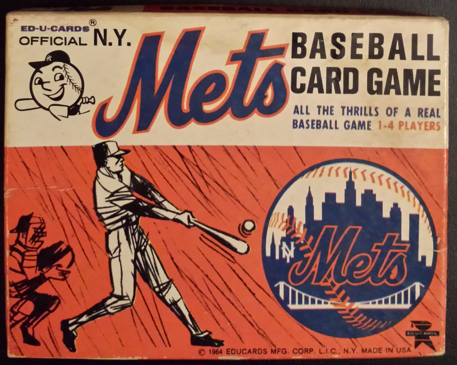
Mr. Met update: Yesterday we Ticker-linked to a trio of Mr. Met cards from an old game. I asked on Twitter if there were more cards to the set and if anyone had the full game, and Kristen Sensenig answered the call. The game’s box cover is shown above, and here are the cards:
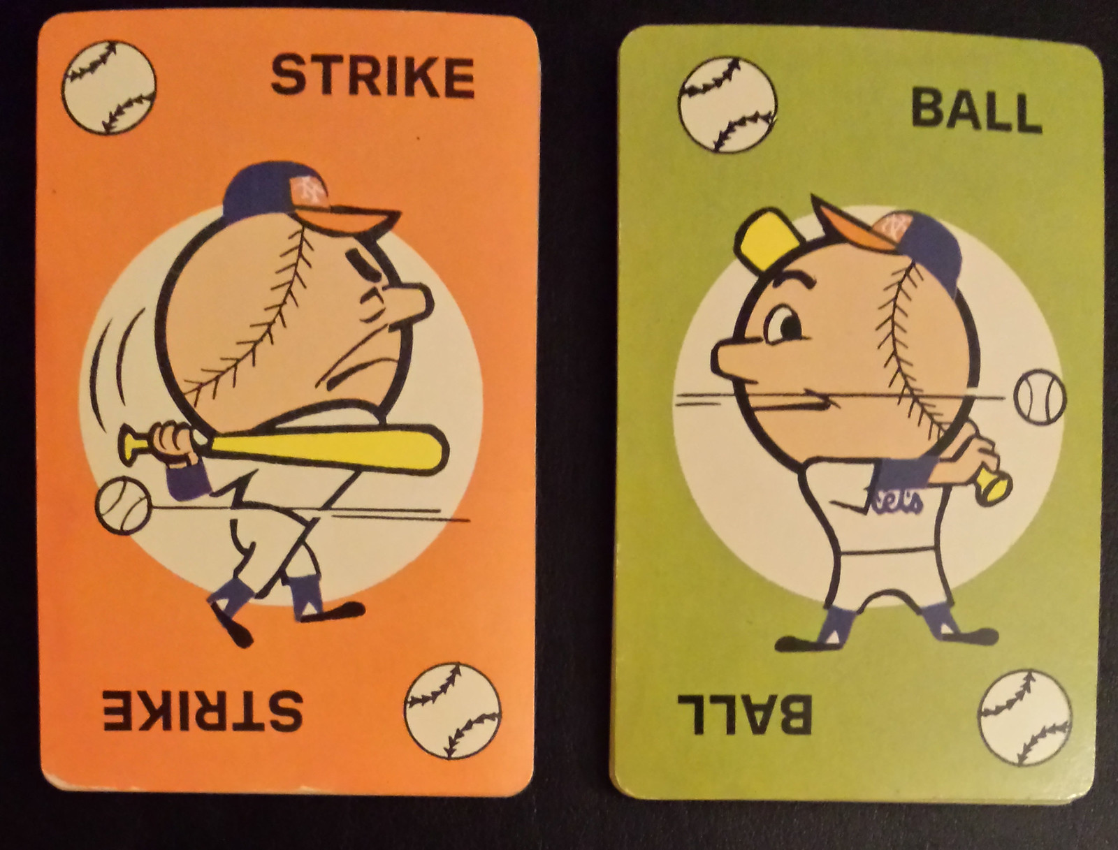
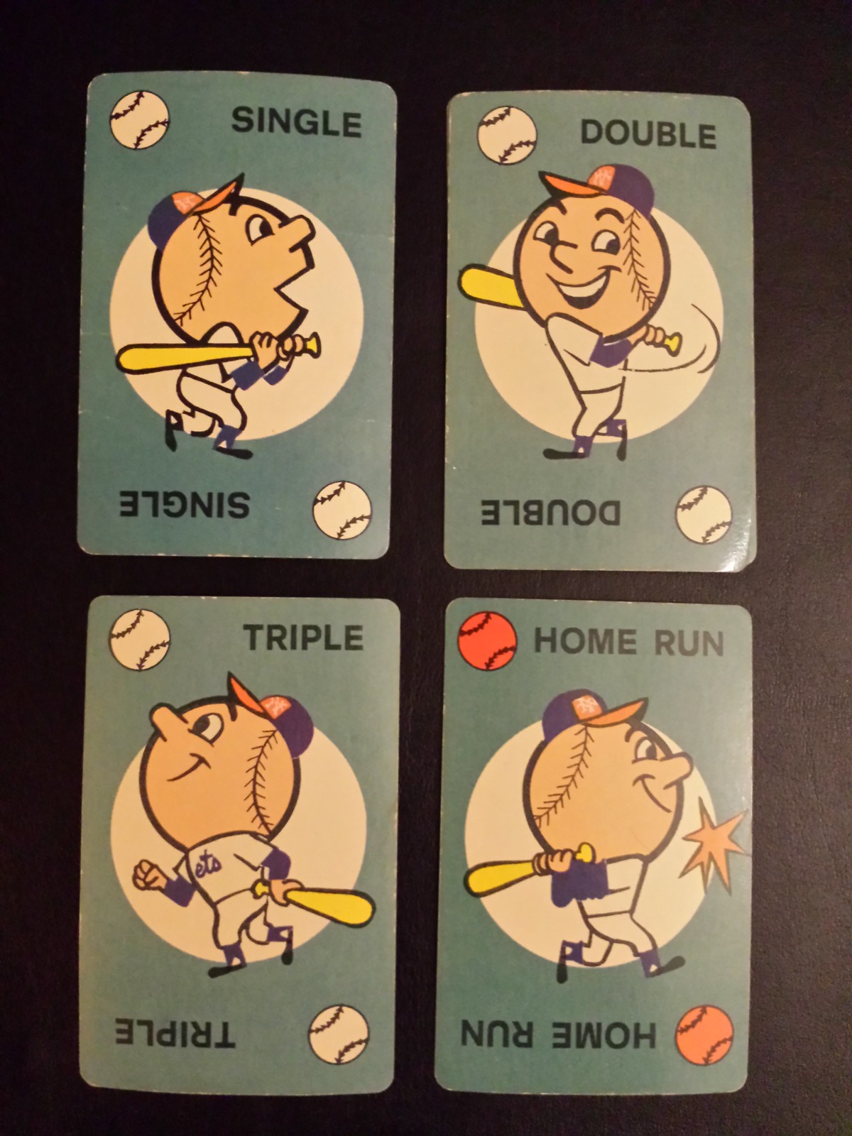
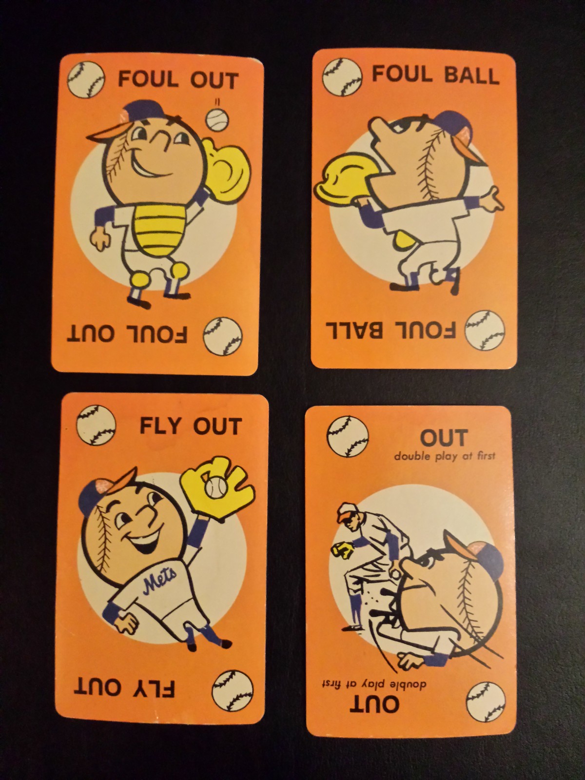
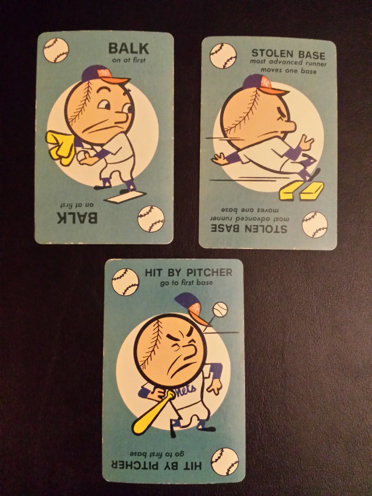
I especially love that last one.
Here are the game’s instructions (note that you can also play a variation called “topsy-turvy baseball”). It’s all pretty great, and it’s even better that the game was manufactured by a company called Ed-U-Cards. Here’s their completely awesome logo, which appears in the bottom-right corner of the box cover:
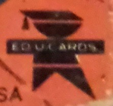
You know it’s educational because he’s wearing a mortarboard! I have to say, that logo looks very familiar — I must have had some Ed-U-Cards products when I was growing up, or maybe we had some at school.
(Major thanks to Kristen Sensenig for sharing the photos of her vintage game set.)
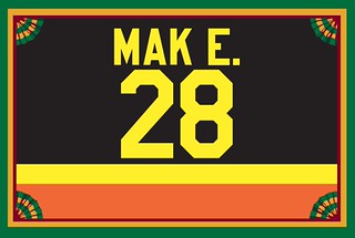
Membership update: Eight new designs have been added to the membership card gallery, including Craig Maki’s, which is shown at right. There’s a really good story behind this one — I’ll let Craig explain:
I decided to go with the team I really loved growing up, the MISL’s Baltimore Blast. I’d like my card to be modeled after goalkeeper Sepp Gantenhammer’s jersey from 1980-81. I grew up playing keeper and figured I might as well do a keeper jersey as a homage. Sepp wore “Sepp G.” on his jersey because his last name was so long. My last name isn’t long, but I want to mirror his style by going with “Mak E.” on my version, which is how my last name is pronounced.
How great is that? (Answer: Pretty damn great.) And as is so often the case, this is another example of a jersey that looked garish on the field but looks awesome as a membership card.
Craig’s explanation for his card is precisely the sort of thing we’re trying to encourage in the membership card gallery, where you can leave a comment about your own card, ask questions about other people’s cards, and so on. Full details here.
Ordering a membership card is a good way to support Uni Watch (which, quite frankly, could use your support these days). And remember, a Uni Watch membership card entitles you to a 15% discount on any of the merchandise in our Teespring shop and our Naming Wrongs shop. (If you’re an existing member and would like to have the discount code, email me.) As always, you can sign up for your own custom-designed card here, you can see all the cards we’ve designed so far here, and you can see how we produce the cards here.
Click to enlarge
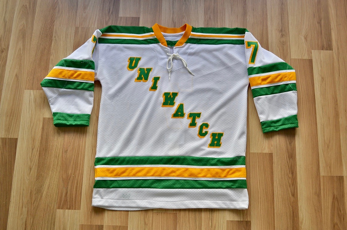
LAST CALL for the Wafflebored jersey: Today is the last day to enter a bid for the very excellent Uni Watch hockey jersey, made by the one and only Wafflebored, that we’re auctioning off. Although this is a blind auction, I will reveal that the current high bid is more than $200 but less than $250. Full details here, or you can just email your bid to me. I’ll announce the winner tomorrow.
The Ticker
By Lloyd Alaban

Baseball News: The Rays and Marlins went light blue versus light blue Monday, making for a confusing uni matchup (from Billy King). … Padres P Chris Paddack wore great striped stirrups yesterday (from @sdpunk52). … Wouldn’t it be great if the Dodgers wore this old Brooklyn design as a throwback? (From @BSmile.) … Alex Cheremeteff found this 1944-45 Philadelphia Blue Jays (the Phillies’ former name) wool warmup jacket. Bob Carpenter Jr, the team’s then-new owner, changed the club’s name from the Phillies to the Blue Jays in 1943 to distance the team from the gambling scandal of its former owner, William B. Cox. The change was deemed unpopular with fans, and the team reverted back to its original name in 1949. This particular jacket has a number 6 on its right sleeve. Players who wore No. 6 for the Blue Jays were SS/2B Granny Hamner, IF Charlie Letchas and 2B Tony Daniels. … A bakery in DC doesn’t want to let free agent RF Bryce Harper go, so they’re pleading their case with some Nats-themed doughnuts (from John, who didn’t give his last name). … The Altoona Curve, Double-A affiliate of the Pirates, have unveiled a uniform in the style of their parent team’s throwbacks. The uniform celebrates the 40th anniversary of the Pirates’ 1979 World Series victory (from @gone_postin). … In other Curve news, the club will release these Seinfeld-themed bobbleheads of Pirates SS Kevin Newman and Pirates 2B Kevin Kramer this summer (from multiple readers). … The Amarillo Sod Poodles, Double-A affiliate of the Padres, unveiled their new home tops (from Ignacio Salazar). … The Fresno Grizzlies, Triple-A affiliate of the Nationals, have released their latest Fresno Tacos uniforms (from our own Phil Hecken). … It appears this Kentucky player has a card for his team’s plays on his belt buckle (from @BrentRead). … Nice touch on the back of Columbia softball’s helmets, which feature New York’s skyline (from Eric Espada). … Color vs. color for North Alabama versus Alabama (from Griffin Smith). … Also from Griffin from that same game: A 2003 Blue Jays cap was spotted in the Alabama dugout. … New Mexico national baseball team uniforms with Aztec calendar details (from Giannis Antetucompa). … Fun article about the Nats’ bullpen cart drive tryouts (WaPo link) (from Pete Clark).

NFL/Pro Football News: Under Armour has released the uniform all prospects will wear at the NFL Combine (from Matthew Jordan). … Reader Alan Kreit was at a Florida bar that had a Dolphins-themed gas meter. “It had been turned into a bank with a coin slot on top,” he says. … Alex Niles has a complete mini-helmet collection, with almost all of the helmets up to date as of the end of the 2018 season. … How do you make yourself look even bigger at practice? Wear a sharp-looking sweatshirt over your pads (from Pro Football Journal). … New lids for the Jalisco Tequileros of the Mexican League of American Football (from @cesarcu52).

Hockey News: New mask for G Juuse Saros of the Predators (from Lee Wilds). … C Kevin Hayes, who was traded from the Rangers to the Jets this week, was still wearing his Rangers gloves last night (from Garth Volbeck). … Where are the 2016-17 Senators now? This picture will tell you (from Zeke Perez).

NBA News: Here’s another article on those “Karate Kid-style” headbands that have become so popular with NBA players. … G Tahjere McCall will wear No, 0 with the Nets. With F Rodions Kurucs already wearing 00, this will make the Nets the latest NBA team to have a zero and a double-zero on the roster simultaneously (from Etienne Catalan). … Josh Youstra found these skates that poached the Bulls logo in a weird neon green. … New uniforms for the Jazz’s esports team (from Jack Appleby). … See those socks on Celtics G Kyrie Irving? According to Jake Pippert, they’re not official NBA socks — “they’re from the Nike and Kyrie collection.”

College and High School Hoops News: Ohio State men’s wore their grey throwbacks last night against Iowa (from Ben Teaford). … This high school basketball player from Oxbridge Academy in West Palm Beach, Fl., wore two different shades of blue shoes (from Jake Elman).

Soccer News: The Seattle Sounders have revealed a new third shirt (from multiple readers). … Inter’s shirt for the Milan derby will be a mashup of ten kit designs from the last 20 years (from @DukeStJournal). … Here are some proposed designs that DC United rejected for their new home kit. … Here’s what every uni matchup this week in the Premier League looks like (from Josh Hinton). … Max Weintraub noticed some sloppy NOB work while watching a Premier League match: “Watching the Liverpool v Manchester United Match on Sunday, I was taken aback by how sloppy the non-arched lettering of some of the Liverpool player kits looked. The long names (Robertson, Henderson, Wijnaldum) extended into the darker grey of the shoulder yoking. It just looked … amateurish.” … Croatian team Hajduk Split are considering legal action against Oasis frontman Liam Gallagher because of copying the club’s famous logo for two new shirts (from Ed Zelaski).

Grab Bag: Jack Nicklaus made his professional debut at the 1962 Los Angeles Open. He shot 289 and finished in a tie for 50th and last place, receiving this check for $33.33 for his efforts (from Graham Clayton). … The new Premier Lacrosse League has revealed its teams’ logos. More on the process here (from multiple readers). … This guy has a uniform of his own: Meet a man who wears the same thing every day. … Here’s an abridged history of the wrestling singlet, in Lego form (from Ross Bendik). … Here’s a review of the many different designs on transit seat covers around the world (from Jim Watson). … Sweet doorknobs at the 60 Centre St courthouse in New York (from Andrew Muccigrosso). … Election Day in Chicago yesterday meant it was Purple Day for some local newscasters (from Griffin Smith). … Alleson Athletic, an Iowa-based uniform manufacturer, is closing (from Joe Werner).
Found this on ESPN this morning – link
In my opinion, that’s part of the problem with having more than just one cap and road greys and home whites, but an interesting solution.
Makes sense. 3-D Visual feedback takes quicker than a picture buried under a whole lot of clutter.
…when he was in Tampa, manager Joe Maddon did have a mannequin in the locker room, but not for business purposes. “It wasn’t for uniforms,” says Hellickson, who has also pitched for the Phillies, D-backs and Orioles. “Joe would just dress it up sometimes.”
Holy crap, that’s a more interesting and disturbing story than the Nats’ clubhouse mannequin
The article also mentions that the mannequin is likely the first of it’s kind for MLB, but we’ve seen one previously for the Giants.
link
link
I love this, especially seeing his script. It’s reassuring knowing that even a seasoned pro needs that.
I’d love to know more about the penalty box official. I’ve always wondered what they’re for. In my imagination, they chastise players for the penalties they’ve committed, administer confession, and try to prevent recidivism. But assuming that isn’t the case, couldn’t an electronic timer serve the same purpose?
“I love this, especially seeing his script. It’s reassuring knowing that even a seasoned pro needs that.”
That’s what pros do. Pros don’t wing it.
The penalty timekeeper is something of an anachronism, going back to the days when he actually kept track of penalty time remaining and the official list of penalties, long before the current state of electronics. Now, it’s someone to open the door when the penalty’s over, and occasionally to be another body in the way if opponents take grievances into the box.
Also shows the professionalism, preparation and work required to be the PA guy for a top level professional sports franchise. Really enjoyed reading about him.
Agreed – what a terrific lede today! Also a fun look at that Mets card game.
On top of what everyone else has said (open the door) he keeps track of who gets to come out when. When there are multiple overlapping penalties, or offsetting penalties (where players done come back on until a stoppage in play), or where serving some penalties is delayed because two guys are already off, he has to open the door and keep track of who gets to go out when.
With brawls pretty much gone from the league, I guess it might not be as complicated as it used to be.
“…high school basketball player … wore two different blue shoes”
Doesn’t everybody always where two different shoes?? ;^P
I’ll assume they were same make/model, just different colors, right?
Text now adjusted.
Footy Headlines has the DC United rejected designs without the paywall:
link
Thanks — new link now swapped in.
For reference, the Jets gloves for the Heritage jerseys have red cuffs.
Happy coincidence, those gloves don’t look out of place on their own (though they wouldn’t match the teammates).
link
Kind of similar situation to when Wayne Gretzky was traded to the St. Louis Blues. Wore his old Team Canada gloves from the Canada Cup tournament, which did not look horribly out of place:
link
Then started wearing his St. Louis Blues gloves:
link
Looks like his mini-helmet collection needs a small update. That Dolphins helmet is a pre-2018 version as it still has the darker aqua stripes on it.
On Kevin’s roster, what is the significance of the handwritten numbers in red next to each players name?
Not sure. I’m hoping Kevin will check in at some point today and respond to queries like this one.
Number of goals they’ve scored? Although I don’t remember away goal announcements having the season totals.
Kevin just confirmed to me that the red numbers are indeed up-to-date goal totals, which he revises in real time.
This is unrelated to today’s content, but I’d like to thank you Paul, for the somewhat recent mentions of the 99% Invisible podcast. I absolutely love the show and its plethora of interesting stories. My 2 hour commute to and from work flies by now!
It’s my number one favorite podcast! And I subscribe to over 100 podcasts… :P (read: I have no life)
I found the article about the chap with his own uniform facinating.
My wife also moans about me wearing the same thing all the time and having multiples of things I like but wearing a uniform for work I don’t see why I shouldn’t be able to wear my favourite clothes all the time.
Obviously this chap doesn’t have a work uniform so his clothing is constant everyday but it makes a lot of sense to me.
In the first photo, does he have two pieces of velcro stuck down to stick the card between them and the glass to prop it up?
Yes, exactly. There’s a closer view in the second photo.
I really enjoyed the lede story today. Such a cool behind-the-scenes look. And Kevin seems awesome! (Go Broncos!!!) I’d love to see the artwork he did of/for Floyd Little.
Just want to say it’s a thrill to find someone else who loves the Canucks’ “flying V” unis. As a kid that was the uniform that stuck in my memory, above all. Can’t believe there are some who dislike it.
And I also miss white at home. In hockey and basketball.
I second the comment on wearing white at home. Especially in basketball, where a team’s colored uniforms often is the same color as the court’s paint scheme.
Adjusted for inflation, Jack’s check is for $279.12 in 2019 dollars.
I don’t understand why Chicago newscasters would feel the need to wear purple on this election day, seeing it is a non-partisan election. Nearly all of the 14 candidates for mayor had a campaign logo based on the Chicago city flag, with light blue stripes and/or red six pointed stars: link
Since there is less than a zero chance of someone running as a Republican and being elected mayor of Chicago, they have a nonpartisan election where all of the candidates run together (which was held yesterday). Since none of the candidates received 50% of the vote, the top two vote-getters will proceed to a runoff election on April 2.
I never liked the phrase “less than zero” as the “zero” already amounts to nothing. Saying “less than zero” doesn’t even qualify as redundant, as being less than zero does actually have positive logic and IS plausible as a result, and in many cases (such as sports) is the desired result.
In politics, you’d should say “has zero chance” then, as having “less than zero” could amount to a possibility with a winning result, given the often used sports-analogies in reporting (especially politics)
Yes, of course I am aware that there is no such thing as a less than zero chance. I was using what is known as hyperbole, exaggerating or overstating my point. It is similar to when people talk about giving 110%.
There were non mayoral races in Chicago, with many Alderman races containing members of different parties.
For how strongly I’ve disliked the Sod Poodles nickname, I’m really enjoying their uniforms.
I love how those phones just convey “serious tools.”
Good stuff as always Paul, very interesting to get to know team employees that don’t get attention regularly. Out of curiosity do you have a favorite hockey team? Not sure if you’ve ever disclosed that to us, my guess is the Islanders would be too obvious.
I was already a Rangers fan a year or two before the Islanders existed, and remain one today. Also a Canadiens fan, because my big brother got me a hockey magazine with Ken Dryden on the cover when I was seven or eight. In fact, the reason I chose to go to Monday’s Devils game is that the Habs were in town!
Thanks for the response, now that you mention it I do remember reading that you were a Habs fan.
Comic Fing Sans…….
link
I had a deck of these cards growing up. My brother and I would play (and I think we even kept score).
Cricket also has card based games. “Run-It-Out” was available from the 1930’s up to the 1950’s:
link
Makes sense. 3-D Visual feedback takes quicker than a picture buried under a whole lot of clutter.
Great lede today…thanks Paul! My co-host (also a regular reader of UniWatch)of the Impending Loom (CHLY 101.7 FM) does the announcing for our Vancouver Island University Mariners sport teams, and he also does all the music for the games…live, with a synth keyboard beside the mic!
There is an artist in Minneapolis (Scott Seekins if memory serves) who wears white head to toe half the year, and black the other half. It’s his trademark look and he has achieved a certain level notoriety for his monochrome sartorial regimen.
Re Portland dude with persibal uni, if you’ve ever spent time in a place like Flatbush, Brooklyn or Silver Springs, Maryland, the idea of someone wearing the exact same outfit every day is not much of a novelty.
The penalty timekeeper is wearing NHL logos because he’s an NHL off-ice official and that’s the uniform. That includes the officials who are in the penalty box and the ones in the press box who compile stats for the official scoresheet
Thumbs up for the Baltimore Blast themed card. Their logo (which of course can’t be on a UniWatch card) is an all-time favorite of mine.
the name Phillies was never removed from the Philadelphia NL club uniform – “Blue Jays” was unofficial nick-name for few years – surfacing in form of patch