
By Phil Hecken, with Timmy Brulia
Follow @PhilHecken
With the Super Bowl kicking off tomorrow, I’m back once again with my buddy and Gridiron Uniform Database co-founder, Timmy Brulia, who has — as he has for the past several seasons — provided YEOMAN research into the uniforms worn by the two Super Bowl combatants.
Unlike past years, when I/we featured the uni histories of both teams, this is the third consecutive year the New England Patriots will be playing in the Super Bowl. If you’re interested in the history of the Pats unis, I direct you to last year’s Pats history. If we were to add the 2018 season to that post, it would read as such:
2018: The basic combos are worn as well as the navy color rush set, which is worn for two games (Weeks 5 and 9).
Instead of running the Rams uni history over just one day, I’m going to break it up into two days. Part I will run today and cover the Rams unis from their inception in Cleveland in 1937, through their blue and white beauties (worn through 1972).
All of this research has been painstakingly and lovingly worked into the aforementioned Gridiron Uniform Database (or GUD, for short), which readers of Uni Watch know is THE go-to site for NFL (and other football league) uniform histories. Each year, I ask Tim to please send me a year-by-year breakdown of the uniforms — then I go hunting for the photos which appear with the writeups (which takes me hours, but is honestly a labor of love). I can’t imagine how long it’s taken Tim to do the written research.
So without further ado, here’s Tim with the first part. He’ll be back again tomorrow with the second:
In The Beginning: Cleveland

1937: After spending a season in the second edition of the American Football League, the Cleveland Rams become the 10th member of the National Football League. They wear solid red leather helmets, black jerseys with red numbers and red sleeve panels, red pants and black socks. [See GUD note here — PH]
1938: The Rams change up the color scheme. The helmets are now a dark blue, the jerseys also become dark blue with yellow numerals, the pants are a generic khaki with black rear stripes and the socks are dark blue.
1939: Yet again some changes in store for the Rams. Helmets now have a gold sheen, the jerseys are more of a royal blue with yellow shoulders and yellow numbers, the pants are yellow with a thin blue side stripe and the socks are a solid royal blue.
1941: The helmets change from gold to yellow, to match the trim with the rest of the uniform.
1943: The Rams take a year off due to World War II depleting much of the roster.
1944: The team re-enters play and with it, come some changes. The yellow helmet remains unchanged. The blue jersey drops the yellow shoulders, and a yellow jersey debuts. The yellows have blue shoulders and blue numbers. The pants change from yellow to white, with a very thin yellow/blue/yellow stripe pattern on the sides. The socks feature three thin yellow stripes on the blue pair and the yellow socks have three blue stripes on them. In an interesting twist, the Rams slap white tape on the shoulders of their blue shirts in their 10/15 game at Detroit, for contrast against the Honolulu blue Lions.

1945: The Rams feature a patriotic patch on the left sleeve of their jerseys.
The Move To Los Angeles
1946: After winning the NFL Championship, the Rams head west to Los Angeles and make a few tweaks to the unis. The yellow jersey strips the blue shoulder inserts and both sets of socks are no stripeless.
1947: Yellow helmets are replaced by blue lids.

1948: The year the iconic Rams horns are added to the helmet. Player Fred Gehrke is given the green light to paint yellow ram horns on the helmet, starting at the forehead, curling up and around the sides and below the earhole and coming to a point above the earhole. The pants are changed to a rather pale yellow with a blue/yellow/blue stripe pattern. The yellow socks (worn with the yellow jersey) are dropped.
1949: For whatever reason, the Rams ditch blue in favor of red. The Rams switch from leather to plastic helmets and the yellow horns are now ribbed and curl above the earhole. The plain blue jersey is changed to a plain red jersey for one game (at Detroit). The pant stripes become a single red stripe. The socks are solid red.
1950: The Rams return to blue. Helmets are blue again, the yellow horns are smooth again and curl under and around the earhole again. The yellow (primary) jerseys feature blue numbers again and as a bonus, add blue northwestern stripes to the sleeves. The red jerseys become blue again. Stripe pattern on the pants return to the blue/yellow/blue combo. And the socks return to blue.
1951: The Rams pants are 100% white again, with the blue/yellow/blue stripes remaining. Yellow jerseys are worn exclusively.
1953: White outlines are added to the numbers.
1956: As with many other teams, the Rams add blue sleeve numbers (aka “TV” numbers) to the sleeves, above the stripes. Compared to other teams, the Rams TV numbers are quite tall.

1957: With the NFL mandate that all teams must have two sets of jerseys (in another bow to the impact of TV), the Rams bring back their blue jerseys and they mimic the style of the yellow jerseys in reverse with yellow front and back numbers outlined in white, tall yellow TV numbers positioned above yellow northwestern sleeve stripes. Speaking of the yellow jerseys, they are worn for three early season road games. On their next three game road swing, the Rams break out white jerseys designed the same as the famed yellow shirts, without a trace of yellow trim to be had!
1958: The white outlines on the numbers of the blue jerseys are eliminated.
1962: The white jerseys get a slight facelift, as the northwestern stripes are dropped in favor of shoulder stripes with blue/yellow/blue, which match the pant stripe pattern.
Ditching the Yellow

1964: With the exception of the socks, which remain a solid royal blue, the Rams make wholesale changes. Yellow is dropped entirely as a trim color. The Ram helmet horns turn white and are fully separated at the front (previously they had been cojoined). The white jersey now becomes the home jersey and the shoulder stripes become one, a very thick blue shoulder loop. The blue jerseys also drop yellow trimmings in favor of white, with white front and back numbers, tall white sleeve numbers and two white stripes on the sleeves. The pants remain white with a blue stripe on the sides.
1968: The white jersey is worn for all regular season games.
1969: Again the white jersey is worn for all games, including their playoff game at Minnesota. The 50/NFL patch is worn on the left shoulder above the blue shoulder stripe.
1970: For the third season in a row, the Rams wear white all season long. With the merger, the Rams add blue lettered player names on the backs of the jerseys and they are very large. A blue v-neck replaces the white crew neck as well.
1971: The blue jerseys return for two away games (New Orleans, Dallas) with white names on the back (NOB).
1972: No changes, but around mid-season, the Rams decide to wear the blue jerseys at home.
Great stuff Timmy! We’ll be back tomorrow — game day! — with Part II of the Rams uni history.


The First 26 Super Bowl Matchups
With Super Bowl LIII kicking off tomorrow between the New England Patriots (their eleventh appearance!) and the Los Angeles Rams, we should get a pretty decent-looking matchup — not even close to the best (nor even a Top 10), but certainly not the worst. At one time, I’d have ranked the games, but since it’s all opinion (based in fact), I won’t rank the games — but I thought it would be cool to take a look at every match up we’ve seen so far.
Today (below) I will post photos from the first twenty-six Supes, with the second set of 26 to run tomorrow. You can judge for yourself which game(s) looked the best (and feel free to rank any of the 26 below in the comments). Click any photo to enlarge, and click the Super Bowl # for further information on each game. Here we go:
Super Bowl I
Green Bay Packers 35 – Kansas City Chiefs 10

Super Bowl II
Green Bay Packers 33 – Oakland Raiders 14

Super Bowl III
New York Jets 16 – Baltimore Colts 7

Super Bowl IV
Kansas City Chiefs 23 – Minnesota Vikings 7

Super Bowl V
Baltimore Colts 16 – Dallas Cowboys 13

Super Bowl VI
Dallas Cowboys 24 – Miami Dolphins 3

Super Bowl VII
Miami Dolphins 14 – Washington ‘skins 7

Super Bowl VIII
Miami Dolphins 24 – Minnesota Vikings 7

Super Bowl IX
Pittsburgh Steelers 16 – Minnesota Vikings 6

Super Bowl X
Pittsburgh Steelers 21 – Dallas Cowboys 17

Super Bowl XI
Oakland Raiders 32 – Minnesota Vikings 14

Super Bowl XII
Dallas Cowboys 27 – Denver Broncos 10

Super Bowl XIII
Pittsburgh Steelers 35 – Dallas Cowboys 31

Super Bowl XIV
Pittsburgh Steelers 31 – Los Angeles Rams 19

Super Bowl XV
Oakland Raiders 27 – Philadelphia Eagles 10

Super Bowl XVI
San Francisco 49ers 26 – Cincinnati Bengals 21

Super Bowl XVII
Washington ‘skins 27 – Miami Dolphins 17

Super Bowl XVIII
Los Angeles Raiders 38 – Washington ‘skins 9

Super Bowl XIX
San Francisco 49ers 38 – Miami Dolphins 16

Super Bowl XX
Chicago Bears 46 – New England Patriots 10

Super Bowl XXI
New York Giants 39 – Denver Broncos 20

Super Bowl XXII
Washington ‘skins 42 – Denver Broncos 10

Super Bowl XXIII
San Francisco 49ers 20 – Cincinnati Bengals 16

Super Bowl XXIV
San Francisco 49ers 55 – Denver Broncos 10

Super Bowl XXV
New York Giants 20 – Buffalo Bills 19

Super Bowl XXVI
Washington ‘skins 37 – Buffalo Bills 24

And there you have it — the first 26 Super Bowls. Check back tomorrow for the second set of 26!

Kreindler’s Korner
I had the distinct pleasure of featuring the wonderful artwork of artist Graig Kriendler on two occasions over the summer and fall of 2017, and more recently, in August of 2018.
As you’re all probably aware by now, Graig (mostly) paints baseball players. But not always. And today, with the Super Bowl tomorrow, I have a FANTASTIC trio of paintings from Graig of what many consider the greatest play in NFL history — even if it’s not, it’s up there, and it’s certainly the greatest catch in Super Bowl history. Check out the video of the play here.
I’m sure many (most?) of us remember exactly where we were when that play occurred (I know I do). Not only was that a great catch at a crucial moment in the game, it propelled the Giants to the win, knocking off the previously unbeaten and untied 18-0 Patriots. So there’s that too.
Anyway, it being Super Bowl weekend, I asked Graig if he could share and discuss (click each image to enlarge). Here’s Graig:
Title: “The Great Escape”, “The Throw”, & “Catch-42”
Subject: Eli Manning & David Tyree, 2008
Medium: Oil on linen
Size: All 30″ x 24″
The play itself is, at this point, legendary. The most memorable moment of that night. One that propelled the New York Giants to a come-from-behind touchdown to win Super Bowl XLII, pulling off one of the biggest upsets in sports history. Their opponents that evening, the New England Patroits, who were looking for ascension to immortal status as the only team to have a perfect season since the Dolphins in 1972. As the shirts would go on to say, “18 wins and one Giant loss.”
My client, like most of us, watched this whole thing unfold on national television. And in his mind, if he were to get a painting of this World Champion team, it had to be about that play. Thankfully, he was willing to trust that it would be best to depict it in a series of same-sized canvases, rather than a larger composite of sort on a single one. Even more thankfully, he chose me to do these paintings.
When Eli made his scramble, New York was down 14-10 with only 1:16 left on the clock. In the painting, it was important to work from an image that gave an idea of what kind of madness he attempted to escape, so the photograph I opted to work from was one that included as many players as possible, while still being close to the action so the viewer didn’t feel that removed from it. I also really happened to like the visual arrow created by the back of Eli’s jersey being tugged on.

The Great Escape
The painting depicting the throw needed to have a different perspective. In a way, that one was more about suggesting the distance the ball had to travel, and less about the action of Manning’s desperate pass. So, with the cluster of Patriots on the left, there’s another visual arrow to the New York quarterback – I wanted the viewer’s eye to follow the painting from left to right and onto Eli. It also helps that he appears separated from the pack and surrounded by a halo of green turf, of which makes it more obvious that he’s the focal point.

The Throw
The final piece, which would highlight Tyree’s outstanding catch, had to be about his athleticism. Clearly, the most important part of the painting would be David’s hand on the ball, but just as important were the bodies of the receiver, as well as Rodney Harrison’s – both seemingly mangled in mid-air. I also loved the juxtaposition of them undulating in space against a flat backdrop with the Super Bowl logo. There are barely any shadows on the ground, so it almost reads as a flat vertical background, which added to the uniqueness of the image. In other words, like the actual play, this last canvas had to defy normality.

Catch 42
In the end, my client was ecstatic for his three new paintings, as well as the Super Bowl Champion moniker. Me? I was thrilled to successfully tackle my first football paintings and plant the seeds that would lead to more.
Thanks, Graig! Incredible set of paintings there.
It Wasn’t Always The Super Bowl…

…that decided the Champion
This Super Bowl Weekend, I’m pleased announce the return of Ronnie Bolton, who you probably know, has a tremendous Twitter feed. While Ron usually graces us with amazing old baseball photos and the stories that accompany them, today I asked him if he’d score us some great old football shots. He happily obliged. Here are two NFL Championship Games and one AFL Championship Game (for those of you kids out there, we didn’t always have a Super Bowl — prior to this invention, the NFL simply determined a League winner after a regular season and playoffs, and called it the “NFL Championship Game”; the AFL did so as well until 1970; the Super Bowl pitted the two league champs, from 1967 to 1970, until the leagues merged and the NFC & AFC were created). So, without further ado, with a quick trip into the way-back machine, here’s Ron…
The 1934, 1945 NFL and 1964 AFL Championships
By Ron Bolton

Polo Grounds, December 9, 1934
Ken Strong (#50) races on a icy frozen field to the end zone to give the Giants an improbable 17-13 fourth quarter lead against the undefeated Chicago Bears (13-0 record coming in). The fullback would moments later score again in the 1934 Championship game on a 11-yard run. And the New York squad wasn’t done adding one more touchdown for a 30-13 win.
And to think the Giants headed into that final quarter losing 13-3.
What changed everything was canvas sneakers. Before the game the Giants were slipping and sliding wearing football cleats. It was suggested by one of the players that sneakers might be a better option, except they had none. However, trainer Gus Mauch knew where some could be had and sent an assistant to Manhattan College locker room for pairs only to get back at halftime, and after the Bears were having there way in the first half taking a 13-3 lead.

But with sneakers on the Giants would soon turn the tables on the Windy City visitors, so much so that Bears coach George Halas was screaming at the referees – to no avail – to have Giants switch back to cleats.
But the sneakers stayed on and the NFL had its first watershed moment as a result.

Cleveland Municipal Stadium, December 16, 1945
The 1945 NFL Championship game between the Cleveland Rams and Washington is the championship game that history forgot about. The game was played in -8 degree weather, however any article that ranks the coldest NFL games ever played, they always seem to omit this one. And it was brutally cold.

It was also the first time a team came practically out of nowhere to capture the crown when the Rams beat Washington 15-14. The Rams entered the league in 1937 and in their first seven years they won just 25 games and never had a winning season, but in 1945 they finished the regular season with a 9-1 record, more than good enough to earn them a trip to the Championship game.
But the city of Cleveland had little time to enjoy the victory for in a weeks time, Rams owner Dan Reeves secured a deal moving the team out west and into the 103,000-seat Los Angeles Memorial Coliseum for the 1946 season.

War Memorial Stadium, Buffalo, NY, December 28, 1964
With his Bills up comfortably on the San Diego Chargers 20-7 with just minutes left in the 1964 AFL title game, quarterback and future U.S. Senator Jack Kemp looks to run the clock out to give the city of Buffalo its first professional sports title.
The Chargers jumped out to an early 7-0 lead just plays into the game and were looking to pounce again the second time they got the ball, however all that changed when their star running back Keith Lincoln got creamed on a swing pass by Bills linebacker Mike Stratton knocking Lincoln out of the game and killing the Chargers chances as well.

It’s no surprise that this brilliant color photo was taken by none other than the legendary sports photographer Neil Leifer.
Thanks, Ron! Great stuff as always.
And now a few words from Paul: Hi there. In case you missed it, I’ve had a bunch of Super Bowl-related content in the past few days:
• Here’s my annual Uni Watch Super Bowl Preview, with lots of uni-related tidbits about the big game.
• Yesterday on the blog, we took a look at the very odd shoes that Rams running back Wendell Tyler wore in Super Bowl XIV.
• Remember, Super Bowl Sunday is also Puppy Bowl Sunday! Here are 243 photos and 29 videos that I shot during the taping of this year’s event.
That’s it. Enjoy your weekend!
Bigger Isn’t Always Better!

Well, that didn’t last long.
According to a story yesterday in the Detroit Free Press, after playing the 2018 season with a larger Olde English “D” logo on their home and road caps, the team will change back to the smaller “D” for the 2019 season.
According to that article,
When asked about the game caps for the upcoming season on Friday afternoon, Tigers vice president of communications Ron Colangelo said, “Based on fan input, we made a slight adjustment to the size and positioning of the iconic Old English ‘D’. We love the traditional look and we’re excited for the start of the upcoming season.”
Interestingly, they’re not completely reverting back to the pre-2018 size; instead,
While the size of the Old English ‘D’ on the Tigers’ game caps this season will not be the exact same as those worn on the team’s game caps prior to last season, it is described as being “very similar,” according to a person with knowledge of the situation.
So, does that mean it will be slightly larger than the pre-2018, or smaller? I guess that remains to be seen.
For a team that has barely changed uniforms for decades, the switch to the larger “D” last season was jarring to the teams’ fans. The Tigers decided the larger logo worn on the team’s game caps last season “took away from the team’s rich tradition.”
Just how drastic was the change? See for yourself:

I honestly didn’t mind the tweak, but then again, I’m not a Tigers fan.
The Tigers have tweaked the logo on their game caps plenty of times since the team joined the American League in 1901, but last season’s tweak was most jarring, because of the size of the logo.
Bigger isn’t always better.
The Ticker
By Anthony Matthew Emerson

Baseball News: J. Max Weintraub found one of the most blatant cases of grand theft logo we’ve ever seen at a an athletic shoe store in a Virginia suburb of DC. … Love them or hate them, it seems like weird MiLB team names are here to stay. All I know is, Brandiose better not touch my beloved Portland Sea Dogs (thanks, Brinke). … Speaking of the minor leagues, the Eastern League’s Akron RubberDucks unveiled a new orange alternate jersey last night (from @SGCLE4). … Clean-looking new unis for the Longhorns (from Griffin Smith). … I adore Maryland’s new uniforms (from Jeff Shober). … I also adore TCU’s new unis. Never knew I needed a “Frogs” script on a pinstriped uni (from Ivor von Esch). … Holy stirrups! Oklahoma State is wearing 1959 throwbacks — and, more importantly, 1959 throwback stirrups — for select games this season (from Mike Harris, who says that he’d do “horrible, unspeakable things for a pair of those stirrups”). … 3D helmet logos for San Diego State softball (from @WestCoast_Banks). … Nice orange jerseys for the Miami Hurricanes (from Terence Kearns).

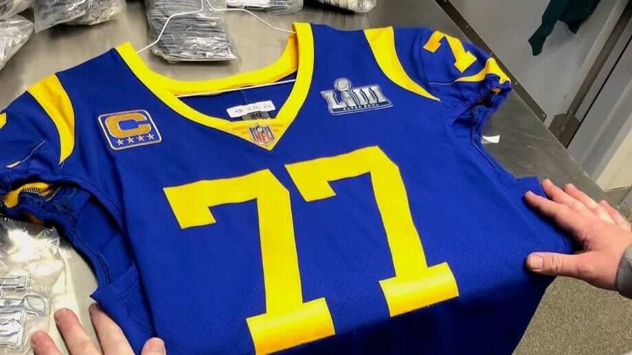
NFL/CFL News: Rams COO Kevin Demoff has dropped a hint about the team’s new jerseys debuting in 2020 (thanks, Phil). According to this article, the Rams’ goal for 2020 uniform redesign is a “Modern take on our historical jerseys” [Uh oh. But I do smell a contest coming — PH] … Rams fans are furious the jerseys the team is actually wearing in the Super Bowl are unavailable for purchase with the Super Bowl patch, especially since the Super Bowl popup store has them on mannequins (from Mayer Weisel and Rob Mason). … Les Alouettes de Montréal revealed their new identity yesterday. Due to the length of today’s content, we’ll try to expound on the Als’ reveal in the future. Here are my takes: I love the helmet, the unis are okay, but the fact they’re trying to make MontréALS a thing is atrocious. More pics here, here, and here (from Wade Heidt, Lucas Barrett and everyone else who sent this in). … Johnny Woods took screenshots of the Als’ announcement video to highlight other proposed logos. … If you can’t wait for a good review of the Als new logo & unis, this article from Chris Creamer will help. … This ad for the Alliance of American Football features a player in a 2002-2010 Bills uni, albeit with a different helmet logo (from Chris Chmura).
College/High School Football News: We may have covered this before, but just in case: here’s a complete database of every helmet from Texas high school football (from @TheBigJamesG).
.

Hockey News: So, we’ve seen the Pens and Flyers’ Stadium Series unis, but now it’s officially official (thanks, Phil). … PNC Arena’s new projection system is now active (from James Gilbert). … The AHL’s Tucson Roadrunners are wearing Phoenix Roadrunners throwbacks tonight (thanks, Phil). … Last evening, the Red Wings retired Red Kelly’s jersey.

NBA News: According to NBA uni number guru Etienne Catalan, new Knicks DeAndre Jordan will wear No. 6, Dennis Smith Jr. No. 5, and Wesley Matthews No. 23. … Spectrum SportsNet identifies the Clippers as “LA” but the Lakers as “Los Angeles.” Apparently the Clippers prefer the “LA” designation, but whether or not it’s their “actual” name is anyone guess (from Rick Ho). … The G-League’s Texas Legends went pink last night against the Sioux Falls SkyForce (from Erik Gamborg).

College/High School Hoops News: For Black History Month, Adidas has created new uniforms, supposedly inspired by the Harlem Renaissance, for a bunch of schools from Power Five conferences. Additional info here. … Louisville will wear Muhammad Ali-inspired unis against UNC today (thanks, Brinke). … Drake is wearing 1969 throwbacks next weekend (from Romelle Slaughter II, Jay Wright, and Nick Pfeiffer). … As Hope College and Calvin College get ready to play their 200th game, Hope posted a gallery of the rivalry with lots of great unis (from Jonathan Cain). … Avert your eyes, Paul: Chelsea (Mi.) High went all purple for their one-off Coaches Vs Cancer promotion (from Seth Kinkler).

Soccer News: New kits for Reno 1868 FC. Note the centered crest, which has been rare on soccer kits for most of this decade (from Josh Hinton).
.

Grab Bag: New logo and identity for Northeastern University (from Mike Brodsky). … Golfer Cameron Champ wore one black shoe in honor of Black History Month (from Chris Howell). … A boxer has a Nike logo on his back (from Andrew Cosentino).
The Als white uniform is quite good. The blue one looks too generic
I like it. The white one is quite good.
Some pluses about the new Alouettes uniforms:
-These are better simply because the prior uniforms that were around for so many years were atrocious. It was a continuous downgrade up to last year when they were going white helmet/that dark jersey/blue pants as the primary look at home.
-I had real concerns when I heard New Era would start making football uniforms and start supplying the CFL. However, this is a great relief. The uniforms have traditional style football striping on the pants and jerseys. No truncated or triangular pants stripes or random bumpers on the jerseys. This could be a good sign for future CFL uniforms to come for the other teams.
-Red socks with the navy pants. No ballerina pant look with same colour pants and socks which is becoming prevalent in football.
-Cartoon bird logo gone.
-It is a cool idea with the helmet. On kickoffs from an above view, will look like a flock of bird swooping in the make a tackle.
Some minuses:
-The navy blue jersey is really similar to the Houston Texans.
-I like the switch to primary blue uniform, but I think I would have preferred them staying with royal blue. There are no royal blue helmets in the CFL and the Als have a history wearing royal blue as primary colour. We already have the Toronto Argonauts wearing primarily mono-navy at home.
-And well, I’m a born and raised Saskatchewan Roughriders fan. I still cringe when I hear the announcement of a too many men penalty. I’ll never give the Als to much praise as they stole our 2009 Grey Cup. Then again in 2010.
Agree on the Texans, it is way too similar. I like the kick-off “flock of birds swooping” analogy.
Wade this isn’t you ranting about Saskatchewan weather?
link
LOL, not me. It’s been deathly cold there.
Well, I have lived in Vancouver for 19 years now. The grass is green at home outside right now. Still miss things about living in Regina, but not in the dead of winter.
Agree on the cartoon bird logo being gone is an upgrade (have never liked it), and that a lighter shade of blue than they picked would have been much, much better.
The new logo is a pretty good won and I have known for some time they were going to go with a completely different look but ideally I wished they would have gone with something like this:
link
100% agree. The Alouettes logo from 1970 has always been my favorite. I wish they went back to it as well. That being said, anyone else think the 70’s logo looks a little like Donald Trump in profile?
Anyone else wonder if the Alouettes new slogan could be confused with Montre-ALS, as in the disease ALS?
I could be being morbid but sadly it’s where my mind went.
I thought the exact same thing. I’m pretty sure the emphasis on ALS will have more English speaking people thinking about about the disease than the team, except in Quebec, their home market, where the French equivalent to ALS is SLA.
I don’t mind the logo or Uni change. My favorite Alouettes Uni/logo was when they went green, white, red in 1970, but the last thing the league needs is another green uniformed team.
What they need to do now is start to win. No new uniform, logo change or Corp speak is going to put more people in the stands if the onfield product continues to be lousy.
Yeah, not in French!
I like the Rams in blue and yellow. I lot of people love the familiar blue and yellow throwback from 1970s-1990s like they will wear in the Super Bowl.
When it comes to the blue and yellow uniforms, I prefer the 1957 uniform over the 1970s-1990s one any day.
Grab bag of thoughts today
Love the Alouettes helmet. There is something to be said about using the helmet as a round canvas. Kind of like the Michigan Wolverines, it’s not just a logo slapped on. And it’s really cool. I went to McGill and saw a game once, so I’d welcome a mini-helmet of this for my bookshelf or desk.
LA Clippers are officially known as LA. Just like Vegas Golden Knights are officially Vegas. Never mind the city is called something else, that’s the name. We didn’t even notice until 8/19/2016, when Mike Chamernik noticed copyright filings. Meanwhile, nba.com had called them the LA Clippers for a year. But Los Angeles Lakers.
Wake me up when the Detroit Tigers bring back the old rounded “jersey D.” Now THAT’s tradition. They could have the Dodgers policy: the jersey script is only official on jerseys, and literally nowhere else. And that could be fine.
Now my favorite piece of Super Bowl trivia for tomorrow’s SB53
The starting quarterbacks are a former Montreal Expos draft pick as a lefty hitting catcher, and a son of a former Lefty hitting catcher who actually played for the Montreal Expos! Credit Christopher Kamka for that. Found him/it thanks to a Jonah Keri retweet.
On the Texas High School football link, it seems it may have been a while. My high school changed helmets like 4-5 years ago, though the old ones were way better. Several of the teams in my district also have new helmets. Still though, it’s kinda cool to see my high school in a uni watch link. Accurate or not.
*it seems like it’s been a while since they updated that.
You repeated the Akron Rubberducks jersey unveiling twitter post twice.
Shit. That’s my fault — second mention came in late after Anthony had handed the ticker to me, and I simply missed the earlier mention. Second mention now deleted.
Re: the slogan from the Longhorns “Look good. Play good.”
Good describes job, which is a noun, so good is an adjective. Well is an adverb describing how the job was performed. But I guess what can you really expect from a major university that exists under the pretense of delivering higher education?
I certainly don’t want to defend bad grammar, but I’m pretty sure sayings like this (or riffs on it like “link“) have been around for a while. Yes, it should say “play well” but that kinda ruins the slogan. Can’t really blame the ‘horns for this one.
Why not?
I wonder if other traditional teams will follow the Tigers’ lead and shrink their cap logos. Last I looked the Yankees and Red Sox logos appeared swollen.
Great recap of the rams unis and first 26 SB’s! Very enjoyable, looking forward to tomorrow !
Tomorrow’s post will be yuge.
Just sayin’
(and thanks for the kind words).
You’d be surprised how difficult it was to find some good Supe pics.
I can only imagine how hard it is to find these pics for us to see! Awesome work as always!!!
Grew up in Long Beach where the Rams practiced and remember both the white/blue and blue/yellow fondly. I love the Rams royal blue and yellow they will be wearing for the Super Bowl, but I probably prefer the white and blue from the Roman Gabriel era. What I’d love is for them to wear the royal blue and yellow when wearing colored jersey, and the white and royal blue when wearing the white jersey, and change out the horn colors on the helmet accordingly. They would be the first to have 2 official helmets while still only wearing one helmet. “Modern take on our historical jerseys”…First off it should be “uniforms” and not “jerseys”. And secondly I have absolutely no confidence that they will get this right with Nike involved. Probably will have some funky striping and stupid numbers.
I love when teams manage to play all season wearing only their white jerseys.
It’s like going “low” in spades, and winning.
According to GUD, the Rams, Dolphins and Cowboys have succeeded at that. Speaking of the Cowboys, I always thought the Rams blue jerseys during their 64-72 blue/white period were pretty much the same as the Cowboy’s blue jerseys during those same years. Only the tall tv numbers said, “Los Angeles.”
Excellent photos from GUD today.
Excellent photos from GUD today.
I don’t want to take anything away from the GUD or Timmy’s AMAZING research, but I’m the one who found the pics ;). Some of those were originally posted on the GUD, by Bill Schaefer, however.
Without Timmy’s yeoman efforts tho, I would have had a harder time matching pics to years.
Phil,
You’re being too modest. I love the way you supply the pics to the text. I supply the potatoes, you have the MEATS!
I’m sorry, Phil. I figured GUD had pics or links for research. Well, they’re even more excellent now that I know the whole crew was involved! (Kidding aside,) great job!
BTW – did anyone else notice what looks like hay that kept the players’ feet warm in that sideline pic of the Rams/Redskins game?
That’s because it was hay. Some of the players actually got blankets from people in the stands.
Born in 1960, the first Rams uni I knew was the white and blue set, it was elegant and gothic…to my young mind, the football equivalent of Yankee pinstripes. When they added the garish yellow, I couldn’t believe it, and thought they were trying to emulate the Packers or Chargers. While I later learned that the two tone uni was only a short blip in their history, it didn’t change my opinion, they were and still are the definitive Rams uni for me.
Never understood why the blue set didn’t mirror the white one with a shoulder hoop.
Weak. That Texas database doesn’t include any of the private and parochial schools in Texas.