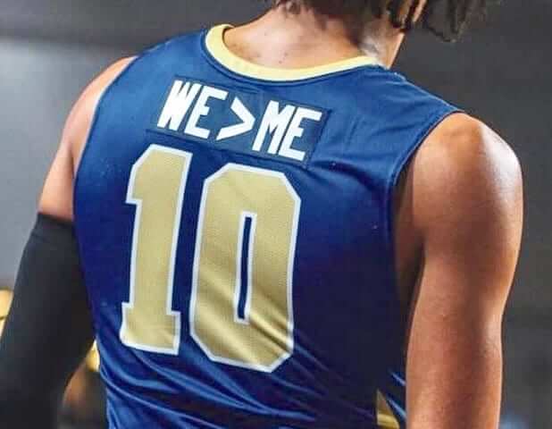
Reader Josh Claywell was watching a high school tournament a few nights ago and noticed something interesting: One of the schools — McEachern High from Powder Springs, Ga. — was wearing “WE>ME” nameplates. It seemed like a clever way of turning the old “Play for the name on the front of the jersey, not the back” cliché on its head.
I did some quick research and found that McEachern appeared to have been wearing the motto all season long (you can see some additional photos here). I wanted to know more, so I got in touch with the team’s coach, Mike Thompson, who readily agreed to a phone interview.
Before we go any further: It’s worth mentioning that McEachern’s teams are called the Indians. I asked Thompson if there’s been any controversy about that, and he said no. It’s not really the topic at hand, so I don’t want to get bogged down in it, but I did want to acknowledge it.
Here’s an edited transcript of my chat with Thompson, which took place yesterday afternoon:
Uni Watch: Who came up with the “WE>ME” idea, and when?
Mike Thompson: This past summer, I was sitting in my living room, watching a Little League baseball game. And some team from — I don’t even remember where they were from, maybe another country. Not even sure. But they had that slogan on the back of their jersey. I only saw it for a second, but it kinda stuck with me.
I don’t know how much you follow high school basketball, but the climate and culture is very much “Me, me, me.” I’ve been doing this for 36 years, so I’ve seen that culture change from being just a hometown team to all-out high school recruiting, kids being interested only in what’s in it for them, not what’s in it for the team.
I’ve got good kids, good players, but they’ve sometimes been guilty of that same thing, where they think they’re entitled to a lot. We ended our last season getting upset by another school, and I couldn’t help but think that some of it had to do with individualism on our team. So when I saw that motto on the Little League uniform, it got me thinking, and I decided to do it.
UW: Prior to wearing “WE>ME” this season, did your jerseys have the players’ names on them, or did they have no names?
MT: I’ve always been a guy who didn’t have anything on the back, until about three years ago. I had a really good group of kids coming in — the group that I have now — so I put their names on the back of the jerseys. But after what happened last season, I had ’em all ripped off. We have little plates on the back, so we can change ’em every year, so I decided to put that [motto] on there, because I thought it would remind us of what we really should be doing.
UW: How have your players responded?
MT: I didn’t really tell them — I just did it. They got their jerseys, and there was a little bit of silence, and then they said, “You know what, coach? We like that, that’s cool.” So it went well for us. I didn’t have any kids who showed any disappointment, at least not outwardly.
I explained it to them why I did it, just like I’m explaining it to you. And I think they’re smart, they understood. I think it’s good for basketball — I think all teams should be thinking like that.
UW: As the season has gone on, has the motto become a sort of unifying theme or a rallying cry for your team?
MT: I’ve heard the kids say it a couple of times. It’s not something that we’ve hammered into the kids. When I originally talked to them about it, I explained that if we were gonna accomplish what we wanted to accomplish this year, we’d have to kinda live by that motto. But we don’t harp on it. But it’s there, sort of like a reminder.
UW: Any response from your players’ parents?
MT: I haven’t had a lot of comments from the parents. Maybe one or two who liked it. Haven’t heard from anyone who didn’t like it.
UW: Nobody said, “Put my kid’s name back on the jersey”?
MT: No, nothing like that. To be honest with you, Paul, I don’t see how anyone could argue with it. You want your kids to be thinking about the right thing and maybe change their attitude a little bit — not just about basketball, but about everything.
UW: What about opposing players and coaches — any response from them?
MT: Haven’t heard any comment from anybody.
UW: No coach has said, “Hey, that’s a great idea, we might do it too”?
MT: No. But if they wanted to do that, I’d be all for it. I didn’t do it for it to be an exclusive thing. I would be proud for anyone to wear it, really, because I think it’s the right message. I wish I could think of that Little League team that I saw wearing it!
UW: When you told your uniform supplier what you wanted, was it weird to explain it to them?
MT: Yeah, I had to draw it for them, kinda show ’em how I wanted it to look. They said, “Do you want this on all the jerseys?” And I said yes, and that was it.
UW: Did you have to check with your local league or conference to make sure they were okay with it, since it’s a slightly unusual approach?
MT: If I was supposed to, I didn’t. But nobody has said anything.
UW: Do you expect to keep doing it next season, and beyond?
MT: I do. Unless I come up with something better! But you know, it’s short, to the point, universal in sports — I don’t know that I could come up with a better one.
UW: What about the coaches of the sports teams at your school — have they talked to you about maybe putting the motto on their uniforms?
MT: No. Some of them have said they think it’s a good idea, but I don’t think any of them have said they’re gonna do it too. But again, this is the first year we’ve done it, the football season was mostly over when our season started. So we’ll see. But I haven’t politicked for it or anything like that. The other coaches have their own teams, they can do what they want. I just felt that this was the right move for our team.
UW: The “greater than” symbol is used in math. So are the math teachers at your school particularly happy about the slogan, and have some of your players joked that this will help them be better at math?
MT [laughing]: When my players first saw the jerseys, some of my higher-academic guys probably had to explain to the other guys what that meant. And to be honest with you, I’m not sure a math teacher has even seen any of our games — I’m not sure they get out that much.
(Major thanks to Josh Claywell, who brought the “WE>ME” nameplate to my attention.)
Naming Wrongs update: Everyone wanted us to do a shirt for the Brewers’ stadium. But as I already explained, that won’t be happening. But if you really want a Brewers shirt, we’ve done them for the team’s spring training complex, which is also being renamed. This is the first time we’ve done a shirt for a spring training venue, and it’s available in royal, grey:
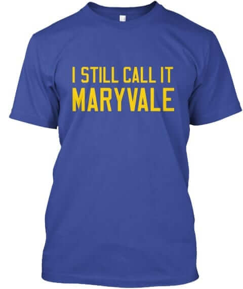
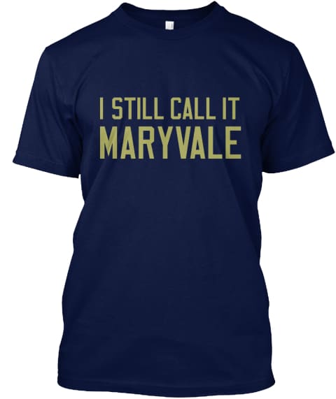
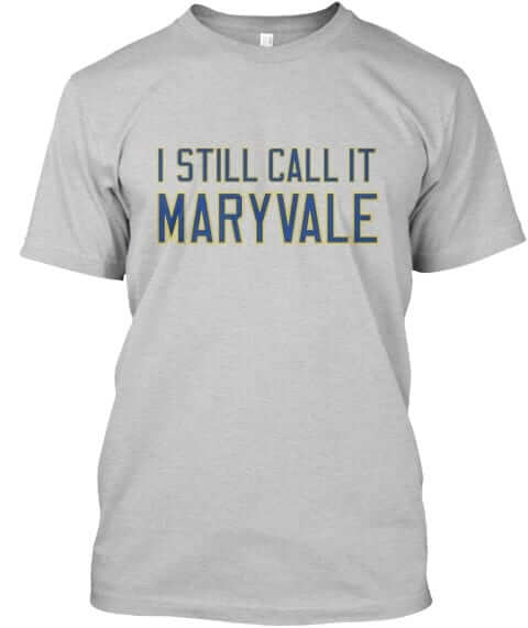
These shirts are now available in the Naming Wrongs shop. My thanks, as always, for your consideration.
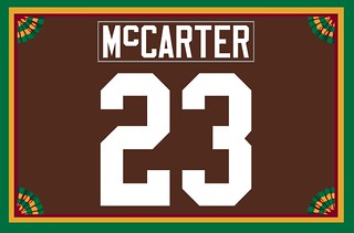
Membership update: Whenever we get a membership order from a reader with a “Mc”-based surname, I always ask, “Do you want your NOB styled as all-caps, or with a small c, or with a small raised c?” It’s rare that the person opts for that last option, but Vaughn McCarter did for his new Browns-themed card, shown at right. I like that!
We’ve been getting a nice flurry of membership orders this week (thank you!), so another five designs have been added to the membership card gallery. I have three slots open on the current sheet, so the next three people who sign up will get their cards very quickly.
Ordering a membership card is a good way to support Uni Watch (which, quite frankly, could use your support these days). And remember, a Uni Watch membership card entitles you to a 15% discount on any of the merchandise in our Teespring shop. (If you’re an existing member and would like to have the discount code, email me.) As always, you can sign up for your own custom-designed card here, you can see all the cards we’ve designed so far here, and you can see how we produce the cards here.
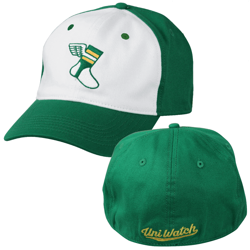
LAST CALL for the S/M cap: In case you missed it earlier this week, on Monday I asked how many of you would be willing to pre-order a flex-fit Uni Watch Alternate Cap in size S/M for the cut-rate price of $10.99 plus $4 for shipping (further details here), and now I’m asking those of you who responded affirmatively to put your money where your mouths are by going ahead and pre-ordering the cap.
Without going into specific numbers, it would be fair to say that the number of people who said they’d pre-order has been a lot higher than the number of people who actually have pre-ordered. After today, I will stop taking pre-orders, so if you want one of these caps, please do one of the following today:
1. Send me $14.99 via Venmo, using @Paul-Lukas-2 as the payee. (This is my preferred payment method, because there are no fees.)
2. Send me $14.99 via Zelle, using plukas64@gmail.com as the payee. (Again, no fees.)
3. Send me $14.99 with this Amazon Payments button (if you don’t see the button, refresh the page):
Whichever payment method you choose, please email me and give me your shipping address after making your payment.
Sorry, American customers only for this deal.
I should be able to ship the caps in early February. Thanks for helping me move this inventory.
Signal flare: Yo, Todd Burnside and David Crane, I received your cap payments (thank you!) but didn’t receive the follow-up emails with your shipping addresses. Little help..?

Candela update: It’s been several years since I had anything to say about the Candela Structures, the two fiberglass structures located just north of the Mets’ ballpark, which I was totally obsessed with for a while (additional details here and here). But I’ve periodically checked in on the structures — they’re not in good shape, and I’ve been concerned that the NYC Parks Dept., which owns them, might declare them a hazard and tear them down. Winter is always particularly worrisome, because water gets into the structures’ cracks and then freezes and expands, causing further damage.
But this week I got some good news: A design consultant emailed me to let me know that his firm is pursuing a project with the Parks Dept. that includes restoration and reconstruction of the Candelas. He stumbled across our old Candela website during his research, which is how he got in touch.
The timeline on this restoration project isn’t yet clear, but it’s great to hear that the structures may be saved. Fingers crossed.
Click to enlarge
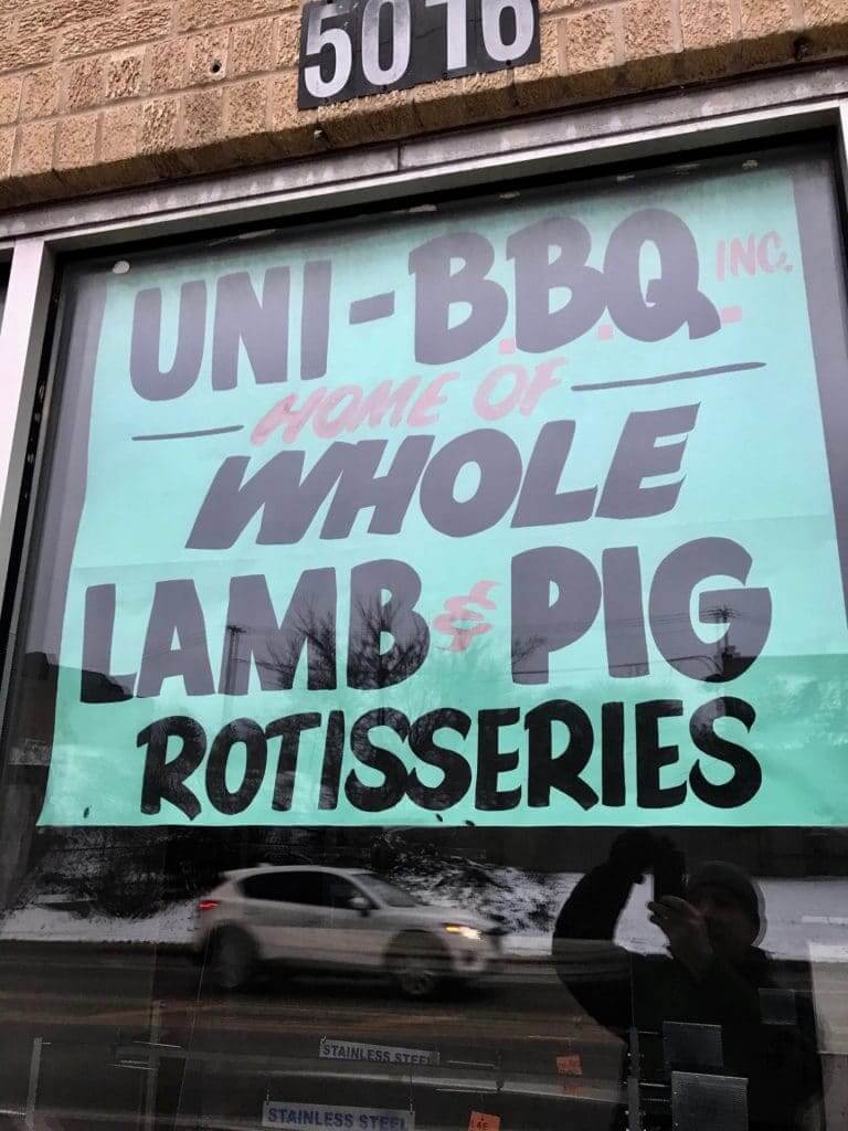
And it’s green, too: My friend Tim Adams lives in Chicago, where he recently spotted this sign that combines many of my favorite things in one very efficient package. Perhaps I should partner with these people in some way!
Chicago, incidentally, is full of great hand-painted signs like this one. This type of signage has almost completely disappeared from New York (and, I gather, from most other places), but Chi-town remains a sign-lover’s paradise. Gotta get back there soon.
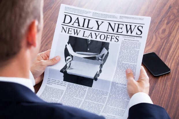
Journalism in crisis, continued: I don’t mean to be a downer, but it’s been another terrible month for the industry I work in. This week alone, Gannett laid off workers at newspapers across the country; Verizon Media, which owns HuffPost, AOL, and Yahoo, announced plans to lay off seven percent of its workforce (the HuffPost bloodbath began yesterday); and BuzzFeed announced a 15 percent staff cut. Earlier in the month, The Dallas Morning News laid off 43 people and The New York Daily News axed its sports editor (with no plans to replace him), among other hits.
I’ll say it again: If you value journalism, please consider paying for it. The old ad-driven business model no longer works, and the expectation that you can get content on the internet for free is a long-term death sentence for that content and a pink slip for the people who produce it. That includes the content you get here on this site, which you can support here. Thanks.
The Ticker
By Paul

Baseball News: It’s official: Newly acquired Yankees P Adam Ottavino will become the first player in team history to wear No. 0. … The Devil Rays didn’t play their first game until 1998 — but here’s a shot from one of their games, with plate ump Jim McKean wearing the 1997 Jackie Robinson sleeve patch (good spot by @Core4WantsMore). … Last year the Tigers had beautiful season tickets designed by Todd Radom. This year, alas, they’re going with digital season tickets (from Howard Bosworth). … New spring training jerseys and caps for the Mariners (from Josh Claywell and Tim Dunn). … Speaking of spring training, St. Paddy’s Day caps are starting to show up. Here they are for the Rangers, Reds, and Mets. … New logo for the College Classic.

Football News: Here’s our first look at this year’s Super Bowl sideline caps. … Forty-eight years ago yesterday, the two Gene Washingtons — one from the 49ers and one from the Vikings — played together on the NFC squad in the Pro Bowl (from Jerry Wolper). … News flash: Super Bowl jersey colors have sparked a lot of superstitions (thanks, Brinke). … Oh baby, check out this old 1980s shot of the Browns’ basketball team! (Big thanks to Cleo Macin.) … Fun DIY project from Diego Yanez, who’s made what he calls “2-D bobbleheads” for the Super Bowl. … At the Pro Bowl, players are apparently wearing caps featuring their regular team logos rendered in Pro Bowl colors (from David Hanson). … Emory University doesn’t have a football team, but they created jerseys — with no maker’s mark! — for Emory alums who served on the Super Bowl Host Committee (from John FitzGerald). … Check this out: NFL helmet bluetooth speakers! (Nice find by Eric Wright.) … The Bears, who already have two throwbacks in their wardrobe, will reportedly be adding another throwback for their centennial-anniversary season in 2019. … The bleachers at Oklahoma’s stadium are getting a makeover. … Check out this video clip from 1998 Oilers/Buccaneers game in which Bucs QB Trent Dilfer wore former Steelers QB Terry Bradshaw’s old facemask from Super Bowl X, and broadcaster Joe Theismann talks about it (from Gene Sanny). … Great shot of Joe Namath in an AFL All-Star Game uniform. And dig that old NBC logo, too!

Hockey News: The OHL’s Peterborough Petes will go back to maroon/white uniforms next season. … Another one-game makeover: The ECHL’s Cincinnati Cyclones will become the Cincinnati Flying Pigs on Feb. 15.

NBA News: The NBA All-Star uniforms have finally been officially unveiled, but nobody cares because they were leaked more than a week ago. … Tiny photo, but it looks like Josh Howard was given a seriously oversized Mavs jersey for his rookie photo shoot (from Brad Eenhuis). … The BIG3 league has some new teams this year, including the Triplets and Aliens. Those uniforms, like all of the league’s attire, were designed by Todd Radom. … Cross-listed from the NFL section: Check out this old 1980s shot of the Cleveland Browns’ basketball team (big thanks to Cleo Macin). … F Bruno Caboclo will wear No. 5 for the Grizzlies. … “Every day I bike past the site of the Warriors’ future arena,” says Justin Adler. “Recently there’s been a commercial truck running a mini-team shop with Warriors-branded hi-vis construction gear. I think it’s pretty neat to see the team’s logo and ‘Strength in Numbers’ slogan on this kind of gear.”

College Hoops News: Kentucky’s women’s hoops coaches will wear custom footwear in honor of Pat Summitt (rare non-soccer contribution from Josh Hinton). … Throwbacks on tap next month for Albany (from Solomon Syed). … South Dakota State and North Dakota State went color vs. color last night (from Chris Lather). … The Norfolk State women’s team had already retired Tracy Saunders’s No. 10, but now they’re finally raising her jersey to the rafters. … UNC’s JV team played its only road game of the season last night and wore white because that’s their only uniform (from James Gilbert).

Soccer News: Here’s some info on Manchester City’s upcoming third kit (from Josh Hinton). … Also from Josh: There’s a new USL Two team in Sarasota, Fla. … New jersey advertiser for the Chicago Fire. … Here’s the logo for Houston’s bid to host the 2026 World Cup. … A rare instance of “rebrand” being used appropriately: USL League Two club North County United is now the Treasure Coast Tritons (Josh Hinton again). … And yet another one from Josh: The New York Red Bulls’ new home kit has leaked.

Grab Bag: The esports operation Berlin International Gaming has a new sponsorship advertising deal with the online bookmaker Betway. … More esports: New ad partnership for Team Liquid. … Asics is turning used clothing into Japanese Olympic uniforms. … Under Armour is going to produce “spacewear” for Virgin Galactic’s astronauts. … Throwbacks this Saturday for the NLL’s Philadelphia Wings (from @PhillyPartTwo). … Former Trump campaign manager Paul Manafort will be permitted to wear a suit instead of a prison uniform when appearing for a court hearing today. … Oh man, look at these great speed skating sweaters and caps from the 1950s (from Jimmy Lonetti). … Mississippi State’s tennis team will open the season wearing teal jerseys in honor of MSU softball player Alex Wilcox, who died of ovarian cancer last summer. … Uniqlo will supply the uniforms for the 2020 Swedish Olympic team.
There a still quite a few hand-painted signs in the neighborhood near my job. My favorite is the store that’s about six months into its “going out of bussiness (sic) sale”.
Great interview with Coach Thompson. World of sports (and in general) can use more like him.
I wonder though whether he thinks of his real mistake as a mistake at all: Putting high school athletes’ names on their jerseys in the first place. The ratchet effect of expectations and practice being what it is, it’s all but inevitable that this particular team will sooner or later revert to having surnames on the backs of the jerseys.
Paul, can you at confirm that the “leaks” of the new Jets uniforms are fake (if you have seen them).
Yes, I have seen them. I do not know their source or their legitimacy, which is why I haven’t tweeted, retweeted, or written about them, nor will I do so until I know more.
I would strongly prefer that we not discuss unverified leaks of dubious legitimacy here on the site. Once we have a confirmed design — either via a verified leak or an official unveiling — there’ll be plenty of time to discuss it.
Yikes, I just searched them out. Seems like loads of negative feedback too. Is it possible for a team to retract a new design? Say this is legit, and with overwhelmingly negative responses (and also head-scratching they thought people would like them to begin with) could the Jets decide to just scrap it not make the switch next year? Are teams basically stuck with their new design at this point in the process?
FWIW the logo at the point of the neck doesn’t match the NFL 100 logo that was officially announced. That doesn’t argue in favor of its legitimacy and does seem like a uni-watchy detail. Apologies if this rustles anyone’s jimmies
Who runs the Uni Watch (@uniwatch) Facebook page, the one with the green/gold sock avatar?
I am sure it isn’t you.
Lee
Brinke. Is there a problem?
No “problem”… Above you mentioned you wouldn’t talk about the Jets ‘leak’ unless you actually knew something.
But there was a post on that FB page about the Jets leak, and a long thread. I was thinking “there is no way Paul would post that, as is.”
Just wanted to be sure I was correct.
Lee
I think Lee asks because he probably saw what I saw. Uni-Watch post the leaked designs on Facebook last night.
Now deleted from our FB page.
North Dakota State is playing South Dakota State not San Diego State.
Fixed.
Man that “Maryvale” shirt tugs at all my heart strings. I grew up in Maryvale, went to Maryvale High down the street and had my H.S. graduation on the field at Maryvale Stadium (it was almost brand new at the time.) It’s still my favorite spring training venue for that reason and more (Brewers fans are, unscientifically, the best).
Love the shirts. Not sure my wife would have the slightest bit of understanding, but that’s not really the point.
Dig that old NBC logo?? I have had it with these [melon farming] snakes on this [melon farming] blog!!
GOODBYE link
link
I’ve been known to use the phrase ‘monkey fluffing’ in the same way you used ‘melon farming’ keeps more of the original sounds
I’m being nitpicky here but….The Bears orange jersey is just an alternate, not a throwback. If the letters were blue, and had only blue stripes on the sleeves, it’d be a throwback to what the team wore in the late 1930s. It’s currently their regular blue home jersey with the blue and orange colors swapped.
I love the “Monsters of the Midway” throwbacks, so I’m excited to see what they develop for the 100th anniversary!
Well, you could say the orange jerseys are a throwback to the orange alternates they wore from 2005-2011. Granted, that’s not very long ago, but it is a design that they wore for 7 years, then stopped wearing for 6 years, then started wearing again this season.
Had no clue UNC fielded a JV men’s basketball team. Fascinating, and curious if they wear the same uniforms as the varsity squad or they wear the years prior “hand-me-downs.” Interesting!
I went to a 2 year school in NC and was a manager/stats guy for the basketball team. We played the UNC JV the two years I went to school there. Got to sit at the scorer’s table in the Dean Dome (I kept the scorebook as well). Very cool experience, although, as you can imagine, the place was VERY empty when we played.
Some of you might wonder why we played in the Smith Center rather than Carmichael Auditorium (where MJ, Worthy, et al played their games). We actually played a doubleheader with the varsity men’s team following (one year it was DePaul and the next was Roy Marble’s Iowa squad). The PA guy announced the “starting lineups” at the beginning of the second half since the arena started filling up for the big boys. I recall us beating the JV both years, so that was kinda cool, plus we stayed in the same hotel as the visitors, so we interacted with them the night before the game.
Thanks for igniting some great memories, Paul.
Fun facts: UNC head coach Roy Williams coached the JV team while he was an assistant under Dean Smith.
Currently, the UNC JV coach is Hubert Davis, the former UNC/NBA sharpshooter.
The JV uniforms are slightly different than the varsity and aren’t the previous year’s hand me downs either. There is no argyle trim for the JV and the neck trim is dark blue. They also have the Nike swoosh instead of the Jumpman logo.
Paul, I was curious when I saw the I Still Call it the Citrus Bowl shirts (very nice by the way) if they were intended to reference the stadium or the game. That made me wonder about how the stadium came to have that name.
Turns out the Citrus Bowl was the 3rd name. It was originally known as Orlando Stadium. From 1947-8275 it was the Tangerine Bowl. It only changed to the Orange Bowl in 1976 only to go back to Orlando Stadium from 1977-82. In 1983 it became the Florida Citrus Bowl thanks to the Florida Department of Citrus becoming title sponsor for $250,000.
We did it for the stadium (in response to a request, as is the case for almost all of our shirts). Was not aware that that name was essentially a purchased ad — may have to scrap the shirt. Thanks for letting me know.
Albany not Albana
Fixed.
Thoughts on a couple topics:
– Instead of a “I Still Call it Miller” shirt, why not push “I Miss County Stadium” tees?
– With your unfortunate ESPN news, have you reconsidered putting a paywall up here? I’ll bet that people would pay if the other choice was you giving up uniforms to get a “desk” job to pay the bills.
Instead of a “I Still Call it Miller” shirt, why not push “I Miss County Stadium” tees?
We already did that last year.
Blue: link
Gold: link
Grey: link
have you reconsidered putting a paywall up here?
I proposed that last year and everyone plotzed. Patreon setup probably coming soon, though. I’m waiting to see what my new primary work arrangement will be.
Oops. Missed those. Sharp.
As for the paywall, I remember that episode. Maybe people would have a different perspective after ESPN’s shortsighted decision. But then again, what I proposed sort of sounds like blackmail. That’s (probably) not your game.
RE: Naming wrongs
Yes, the rules are the rules and understood, but “I still call it the Champagne of Stadiums” is not the worst idea.
Wait, who has ever called it that? I’ve literally never heard that nickname, nor anything like it. Curious to know where that’s a nickname for the ballpark, and how I missed it!
I think he means it as a euphemism.
It refers to Miller Beer calling itself “The Champagne of Beers”.
Fun fact: Before Miller High Life was called “The Champagne of Beers,” it was called “The Champagne of Bottle Beer”:
link
Solid and proper decision by the Peterborough Petes. The recent uniforms were BFBS and are fine as a third. I did not like the choice a few years back to make that the primary dark uniform. Also, they decided to wear cream or vintage white as the primary light uniform. Glad that is being scrapped too.
Just need to bring back a today version of the classic, longstanding design:
link
MLB will play its first-ever London game this season:
link
(As a colleague of mine just said, “Points to the British press if they call it ‘American cricket.'”)
The MLB press release says that the league is “sending two of its most storied franchises” to London. So obviously it’s a Reds-Dodgers game, right? Nope. Freakin Yanks and freakin Red Sox, because apparently that over-hyped “rivalry” must now be inflicted on our global friends, and not just on domestic baseball fans.
MLB/Nike deal, originally reported last summer but never officially announced/confirmed, is now finally a done deal:
link
I had no idea that Fanatics bought Majestic too. I missed that somewhere. Should be good news for the employees at Majestic, as MLB was pretty much their entire business.
If you’re interested in seeing the rest of the 2019 MLB St Patty’s hats go to lids.com and enter in this skus
2107823 through 21072853
If you go further down the list they show the low crown 5950s as well.. starting at 21072853
The Giants have an all-green cap with a white SF with an orange outline, a break from everyone else’s white cap, green brim template with either green logos or white logos with green outlines:
link
Marlins use their new fish without an M; Brewers use BiG.
Interesting that the Giants break the template again. They don’t have as much blue as most teams on Father’s Day so as not to look like the Dodgers, but here, curiously, the green cap will make the Giants look like the Oakland A’s across the Bay. Slash, kind of good on the Giants for breaking up the template. If all of the caps are “special” in the exact same way, then none are special.
Paul,
One question and one opinion of yours I’d like:
Your thoughts on Nike as the provider of the MLB uniforms in 2020.
In your opinion, what do the Jets look like before the new uni’s are unveiled?
Thank you.
Nike: No particular thoughts. As we’ve seen with the NFL and the NBA, it really depends on what the teams want, not what Nike wants. Teams that want to look newfangled will do so; teams that want to look traditional will continue to do so.
The Nike logo will presumably appear on the chest (since that was the plan for the Under Armour logo, before the UA deal collapsed), which is a serious downer. But that doesn’t have anything to do with Nike per se — it has to do with MLB’s willingness to sell that spot on the jersey.
Jets: No idea what the Jets will look like, sorry.
The Houston bid logo for the 2026 World Cup is curious. The ball has stars on it, which these days is synonymous with the UEFA Champions League.
Proofreading:
UW: As the season has gone on, how the motto become a sort of unifying theme
Kudos to Adam Ottavino for figuring out how to get a single-digit uniform while playing for the Yankees (motto: Let’s retire everyone’s number!)
Ecstatic to see this! One less player stuck wearing some garbage 60+ number!
Sorry, my iPad wouldn’t let me copy a second set of text until the first comment published for some silly reason…
Proofreading:
MT: … But again, this is the first year we’re done it,
Great speed skating pic.
Was checking out this YouTube video of a 1979 Pirates Phillies game. If you hit about the 12:30 mark of the video, it’s quite noticeable the pitcher Dickie Noles is missing the red body side stripe on the jersey.
link
When Kevin Saucier comes in to relieve Noles at the 1:41:41 mark (in a sponsor-branded Toyota Celica liftback…like the Yankees used as their bullpen car?), his stripes are missing too.
Rawly Eastwick and Tug McGraw come in later, both fully striped.
By sad coincidence, the photo of umpire Jim McKean reminded me that there was mention of his passing in today’s paper (which is still delivered to our door every morning).
Aloha! Hawaii’s Little League team had the we>me motto. It’s been all over Honolulu and great to see when I’m around town.
Follow up: here’s a link to a story with an image of their uniform. Looks like they had it up to the LLWS.
link
Ah, thanks for clearing up that mystery! I’ll alert Coach Thompson.
I still call them the Devil Rays.
I still call them the Stink Rays.
Another suggestion for the “Naming Wrongs” series would be “I Still Call It Charlotte Bobcats Arena”. Except nobody still calls it that. Still, it would be kind of a funny shirt to have.
Or maybe a Carolina blue one that reads “I Still Call It Carmichael Auditorium”, which would probably be accurate as few people seem to be aware that it was renamed “Carmichael Arena” a few years back.
It does have me wondering if any other venue has kept its primary name while changing (I guess what you’d call) it’s venue type, like going from “Stadium” to “Park”, etc.?
If you wanted to purchase either those shirts, Dan, we’d make them for you. The main reason we haven’t done them is that nobody has requested them.
Okay, I’ll let you know.
Re Josh Howard photo: Josh wore #5 with the Mavericks. Looks like he has on a Rolando Blackman jersey.
That Mariners spring training jersey is sharp! I love the powder blue. Hats aren’t bad either.
Wow, those oilers uniforms were great and in hindsight the bucs uniforms were great as well. I’ve never been a fan of Joe Theismann as the color analyst, but Mike Patrick was great on play by play.