Click to enlarge
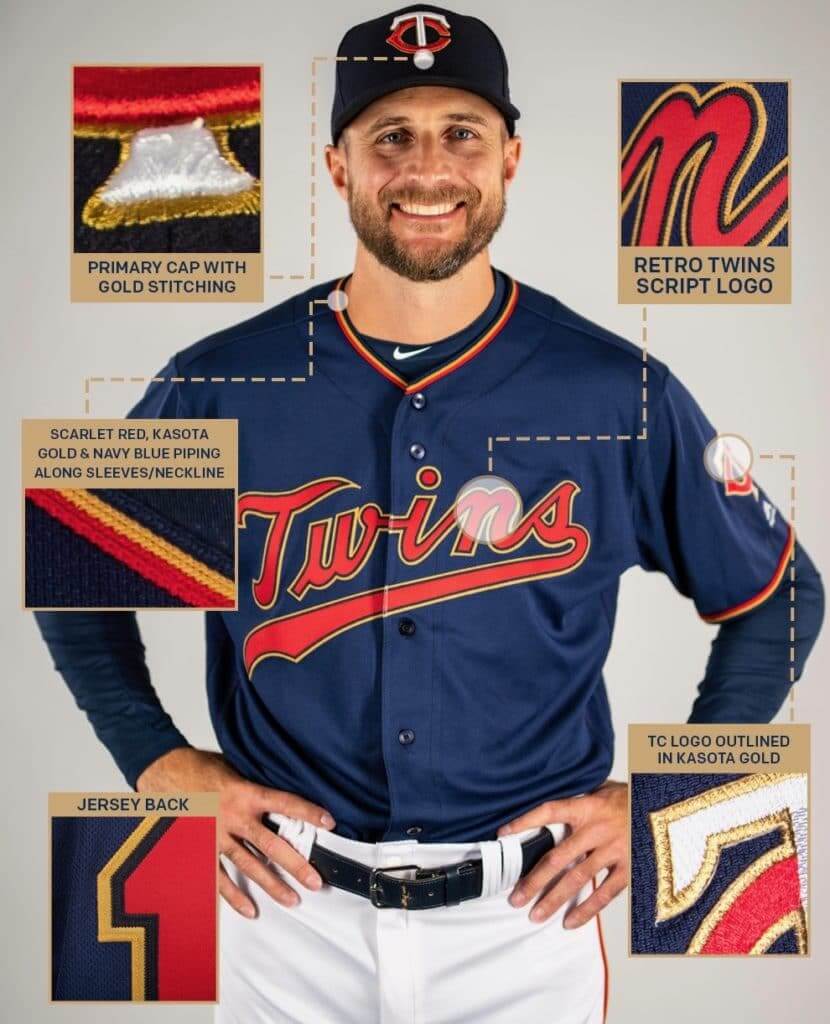
The Twins stirred the hot-stove pot a bit yesterday by unveiling a new alternate home uniform. As you can see above, it features a new navy cap and jersey that both have a lot of gold trim. The script is the same retro insignia that they wore for the past nine seasons on their throwback alternates, which unfortunately are now being retired.
In what may be a first, the Twins “unveiled” this design via an interactive 3-D rendering, which you can play around with (the view up through the bottom of the jersey is amusing):
Smash that play button to unveil our NEW HOME ALTERNATE UNIS! Then grab the jersey and spin it around to take a look.https://t.co/sHYg59Ti1W
— Minnesota Twins (@Twins) January 23, 2019
Meanwhile, F.K. Yaaj has done a public service by comparing the scripts on various Twins jerseys through the years:
@UniWatch @PhilHecken Quick compilation I did with the @Twins different scripts used in its history. Roughly flannel era-70s-80s/90s-recent. Note '09 alt was similar to 60s Wilson made home jerseys/'72 Wilson road, while 2017/2018 script is like 60s Rawlings made road jerseys. pic.twitter.com/oom3lBLReH
— F.K. Yaaj (@Redsunhero) January 23, 2019
As for the new design: Not a fan. Don’t care for the gold trim (cue the “This is as close as they’ll ever get to wearing gold after winning the Series” jokes), the old-school script doesn’t make sense on the relatively newfangled base design (as much as I dislike the Twins’ primary home insignia, it would make more sense on this jersey), and the red numbering and lettering seems like it might vibrate a little on the navy background. Definitely a downgrade from the throwback.
Click to enlarge
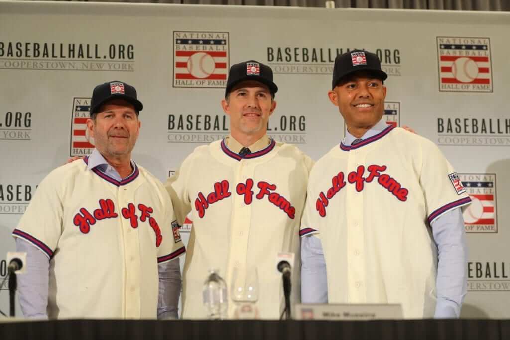
Our regularly scheduled plea: Dear Hall of Fame: Edgar Martinez, Mike Mussina, and Mariano Rivera deserve better than to be dressed in those painfully lame-o jerseys that you make all the inductees wear. If you insist on having them wear jerseys, Uni Watch readers came up with some much better designs a few years ago. But why not scrap the jerseys entirely and go with blazers, or old-school dugout sweaters, or anything other than these awful jerseys? Signed, Almost Everyone.
In other Hall of Fame news:
• Roy Halladay’s widow says his Hall plaque will feature a logo-free cap, rather than a Phillies or Blue Jays cap. Seems like the right way to go.
• Mussina still hasn’t decided which cap he’d like to have on his plaque, but New York Post baseball columnist Ken Davidoff has some interesting thoughts on that.
• In a related item, here’s an argument for doing away with team logos on Hall plaques altogether. (I happen to agree with it.)
• You probably know that Rivera was the last MLB player to wear No. 42 (Jackie Day notwithstanding). But did you know that Mussina also wore No. 42 early in his career? I didn’t!
(My thanks to Eric Nits and Kary Klismet for their contributions to this section.)
Click to slightly enlarge
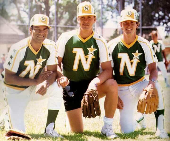
Too good for the Ticker (or the comments): In yesterday afternoon’s comments, longtime reader/commenter Jet posted a link to this awesome shot of the Minnesota North Stars softball team. Are those some sweet uniforms or what? From left to right, that’s Tony McKegney, Willi Plett, and Ron Wilson.
After Jet posted that, fellow reader/commenter Wade Heidt responded with this shot of the Edmonton Oilers softball team (click to enlarge):
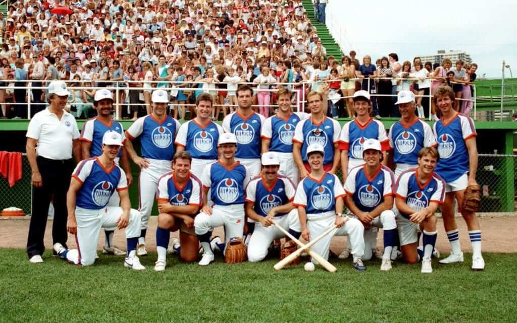
Definitely not as good as the Minnesota uni, but you’ve still gotta love a hockey team in baseball stirrups.
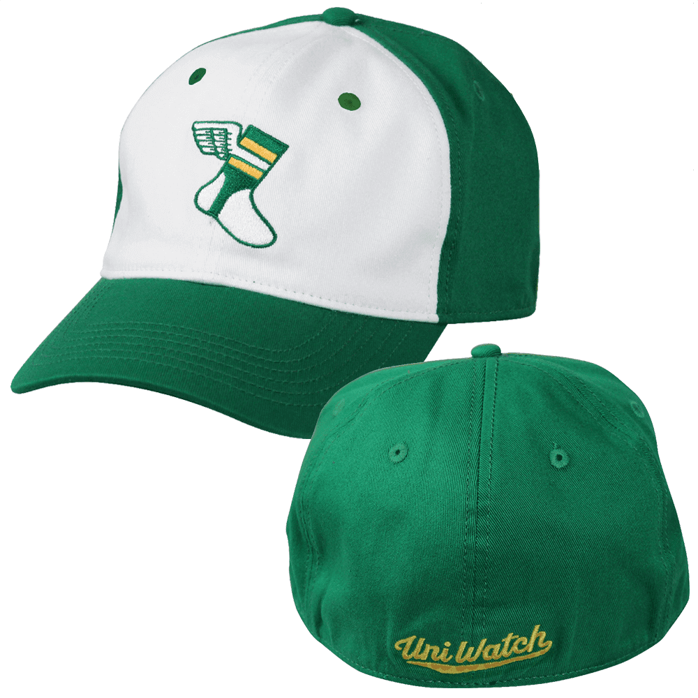
ITEM! Cap reminder: In case you missed it earlier this week, on Monday I asked how many of you would be willing to pre-order a flex-fit Uni Watch Alternate Cap in size S/M for the cut-rate price of $10.99 plus $4 for shipping (further details here), and now I’m asking those of you who responded affirmatively to put your money where your mouths are by going ahead and pre-ordering the cap.
Without going into specific numbers, it would be fair to say that the number of people who said they’d pre-order has been a lot higher than the number of people who actually have pre-ordered. So I’m asking again — if you want one of these caps, please do one of the following:
1. Send me $14.99 via Venmo, using @Paul-Lukas-2 as the payee. (This is my preferred payment method, because there are no fees.)
2. Send me $14.99 via Zelle, using plukas64@gmail.com as the payee. (Again, no fees.)
3. Send me $14.99 with this Amazon Payments button (if you don’t see the button, refresh the page):
Whichever payment method you choose, please email me and give me your shipping address after making your payment.
Sorry, American customers only for this deal.
I should be able to ship the caps in early February. Thanks for helping me move this inventory.
Signal flare: Attention Todd Burnside and Scott Thomas — I received your cap payments (thank you!) but didn’t receive the follow-up emails with your shipping addresses. Little help..?
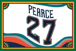
Membership update: A bunch of new designs have been added to the membership card gallery (including Zach Pearce’s Islanders fisherman card, shown at right, the latest example of how the worst uniforms make the best membership cards). I expect the printed/laminated versions of this latest batch ship out early next week.
Ordering a membership card is a good way to support Uni Watch (which, quite frankly, could use your support these days). And remember, a Uni Watch membership card entitles you to a 15% discount on any of the merchandise in our Teespring shop. (If you’re an existing member and would like to have the discount code, email me.) As always, you can sign up for your own custom-designed card here, you can see all the cards we’ve designed so far here, and you can see how we produce the cards here.

Still an important date to me: My father would have turned 95 yesterday. We always loved that his birthday was 1-2-3 (Jan. 23) while mine is 3-2-1 (March 21) — birthday bookends! He’s no longer with us, unfortunately, but I had a good time reminiscing about him yesterday with my mom, who’ll be 95 herself in April.
Mom’s battery has run down a bit since the mild stroke she suffered last summer, but she’s still pretty spry. I felt bad lying to her when she asked, “How’s work? How’s ESPN?,” but I still haven’t told her about the recent unpleasantness because it would just upset her. I’ll fill her in when I’ve figured out what I’m doing next (still working on that).
That necklace Mom’s wearing in that photo, by the way, consists of two old shoe buckles. The shoes eventually fell apart, but she removed the buckles, strung them together on some leather cord, and voilà — a good little DIY project!
The Ticker
By Paul

’Skins Watch: Buried within this article about Maine’s new governor attempting to improve relations with Maine’s indigenous people is the news that there’s been a bill proposed in the Maine legislature that would ban the use of Native American mascots in public schools (from our own Anthony Emerson).

Baseball News: Here’s a video of Nats P Max Scherzer talking about why he wears No. 31 (from Steve Johnston). … Some uni number changes for the White Sox (from Sean Jankowski). … According to this page, the Royals will be giving away 1970s jerseys on May 25, which makes me wonder if the team will be wearing pullover/sansabelt throwbacks that day. … Pretty cool new cap for the El Paso Chihuahuas. … Angels P/DH Shohei Ohtani, INF David Fletcher, and broadcaster Mark Langston took part in the pregame puck drop at last night’s Anaheim Ducks game and wore Angels/Ducks mashup jerseys for the occasion (from @ratmfoo).

NFL News: You apparently need the NFL’s permission to use a team logo on a headstone, but that permission is usually granted (from John Dankosky). … Jags DE Calais Campbell was issued a Pro Bowl T-shirt with his name misspelled but says he has no hard feelings (from @stone_rousseau). … According to a bullet point in this article, the Steelers will wear their block-number throwbacks again in 2019, but there are no plans to bring back the block numbers on a permanent basis. … Here’s a look at all of the uniforms that the Patriots have worn, along with the game outcomes, in their many Super Bowl appearances (from John M. Williams).
College Football News: An old Washington Huskies helmet cart, originally built for the team’s appearance in the 1977 Rose Bowl, is on display at the Museum of History and Industry in Seattle (from Paul Dillon).

Hockey News: Here are the stories behind the Bruins uni number choices (paywalled) (from Matt Bessette). … New cancer-awareness uniforms for the University of Nebraska (from dakotabluesing). … Outsiders House Museum Night uniforms upcoming for the ECHL’s Tulsa Oilers (from Mike Iles). … Here’s the mask that new Coyotes G Calvin Pickard wore for his ’Yotes debut last night (from Josh Pearlman). … The Canadiens went with Twitter-handle NOBs for last night’s pregame skate (from Wade Heidt). … Cross-listed from the baseball section: Two players and a broadcaster from MLB’s Anaheim Angels took part in the pregame puck drop at last night’s Ducks/Blues game in Ahaheim and wore Angels/Ducks mashup jerseys for the occasion (from @ratmfoo).

NBA News: Anyone know what this black Mavs patch was for? It’s not the same shape or size as most NBA memorial bands, and it’s on the right shoulder instead of the more common left. Here’s a closer look on a game-used road jersey (from Sam McKinley and Jeff Bartlett). … We had previously seen a leak of the NBA All-Star jerseys. Now the shorts have leaked as well.

College Hoops News: Reader Jason Collins received an email invitation to volunteer for the B1G hoops tourney. One of the positions is “Cup Monitor,” whose duties include “requir[ing] all members of the media and others sitting on press row that their beverages be poured into a Big Ten or a United Center cup.” Douchebags. … Brutal-looking game last night as Providence and Xavier went black vs. grey (from Paul D.). … Oklahoma State and Oklahoma going red vs. orange wasn’t much better (from Brian Murphy). … Pitt is teasing some good-looking throwbacks, which will apparently be worn on Feb. 2 (from Jay Yander).

Soccer News: Fans of the Venezuelan national team are upset because the team’s new kits are the wrong shade of red (from Ed Zelaski). … “South Georgia Tormenta FC, a founding member of the new USA third tier called USL League One, already had a team in the unofficial fourth tier (USL League Two, the old PDL),” says Josh Hinton. “Their League Two team has a new club name.” … Also from Josh: There’s a new New USL League Two club, called Daytona SC. … Here are the inaugural uniforms for Wayne Rovers SC, an amateur team in Wooster, Ohio (from Ed Zelaski). … The Scotland national team’s Twitter has account restarted a thread featuring drawings of current players wearing vintage kits. “The first two are Celtic winger James Forrest and Manchester United midfielder Scott McTominay wearing some late-’70s kits,” says our own Jamie Rathjen. “They’re supposed to be from 1977, but Forrest’s shirt clearly has 1978 World Cup detailing on it and McTominay’s mono-white appears to have only been worn once in that era, in 1980.” … Also from Jamie: Aberdeen MF Greg Stewart returned to the team last weekend and wore No. 14 for one game. But he switched to No. 7 yesterday because that number just became available when its previous occupant left the team.

Grab Bag: The cryptocurrency Litecoin has a new logo. … New uniforms in the works for the Boy Scouts (from Dan Liszka). … The high school in Belding, Mich., is adopting a new team name — the Black Knights. But the local school board doesn’t want the logo to include any swords. … Members of the Vatican’s Swiss Guard — technically the world’s smallest army — received their first new helmets in 500 years this week.
“Oklahoma State and South Carolina…”
You mean OSU and Oklahoma
Right. Fixed.
Edit: Calvin Pickard was making his Coyotes debut but he has previous NHL experience with Colorado among other teams
Thanks. Fixed.
That third Angel looks like radio analyst Mark Langston
Video identifies MARK LANGSTON (12), Shohei Ohtani (17) and DAVID FLETCHER (6).
link
Confirmed. Fixed.
No one is a bigger critic of the navy/red hegemony in baseball than me but I think those Twins alts look fantastic. I am surprised by how much I think the gold trim improves the bland navy/redness – it really makes things pop and creates a surprisingly different feel from all the other navy/red alts one can point to around MLB.
YES. To everything you said.
Gold as a trim makes the colors pop..i really think the Jags should also use it on their numbers.
I agree! I wish the Nationals kept their gold trim.
It’s Oklahoma vs Oklahoma state in the crimson vs orange
There’s so much that I dislike about the new Twins alt, but the mustard works for me. I hope it’s a preview of how the Twins will incorporate the mustard accents into all uniforms and caps.
Am I late to the party in noticing that the arm-trim on the NBA All-Star jerseys isn’t truncated at the back? Is that a Jordan-not-Nike thing?
Looks so much better!
Good spot!
Coincidentally, my mom is still alive, my dad passed away (in 2007), and his birthday also was Jan. 23. He would’ve turned 91 yesterday.
Love the classic Twins script on anything but really don’t like gold on their uniforms at all!
This has been covered to some degree on this site, but the argument regarding what logo to display on HOF hats also the fact that some teams, like the D-Backs, have had like 20 logos in their existence, which further dilutes the importance. Deadspin’s ranking of Roy Halliday’s hats provided great insight into this situation.
Really good point if it was decided that Halladay would go in as a Blue Jay. His Cy Young and all-star years with the team occurred while wearing 2 Blue Jay hats that most fans would want to forget.
link
link
I really hate this whole idea of a player “going in as” a member of a particular team. Halladay goes in as Halladay! This is why I think they should stop putting team logos on Hall plaques. It just creates factionalism.
The Halladay family has said his plaque will have no logo on his cap.
In general I agree with Paul that it’s silly for a player to “go in as” a representative of a particular team. But, on the other hand, I kinda do like the idea of having logos on the plaques, just because it makes them a little more interesting and distinctive visually.
Of course one option would be to simply display logos for all the teams a player played with during his career, but this could get a little busy for players who moved around a lot.
If you want to stick with just one logo per player, you could use a comprehensive metric like Baseball-Reference’s RAR to decide which logo best represents the player. For example, Roy Halladay’s best single-season RAR was in 2003 with Toronto, so you could go with the Blue Jays’ 2003 primary logo for his plaque.
Obviously you can poke some holes in this approach as well, but at the very least, it puts some objectivity behind it, which would eliminate some of the hurt feelings of fans who feel their team should have been chosen.
Put the logos of the teams played for at the bottom of the plaque below the text describing the player. No more logos on caps. Solved.
The blank caps just don’t look right, especially since players spend their entire careers playing WITH a logo on the cap.
Always liked the M logo on the hat for the Twins, more than the TC.
Once the writer says the cap logo is just an advertisement, his argument lost me. The HOF is a collection of things that have logos on them, from jerseys to caps to bats with the manufacturer label to gloves with the same to balls with the same.
If that’s part of his argument, why not just take all the memorabilia that’s in the HOF now, and airbrush it, strip it, etc. or just throw it all in the trash can?
Not the strongest part of the argument. Personally, I dislike logos on HoF caps because they turn fans against each other. You end up with competing groups of fans arguing over who gets to “own” the player. HoFers really belong to all of us as baseball fans, and putting a team logo on the plaque just turns it into another form of factionalism, which something the sports world (and the world in general) doesn’t need more of.
While I’ll agree about the world in general, what is sport if not factionalism? Why even have teams if not for the fun of rooting for one and hating all the others? Taking that further, why have a site dedicated to uniforms and their myriad differences? The beauty of it is, I’ve been to many opposing teams’ home fields and it is often our differences that brought us closer for the duration of the game. Except on 161st St., of course.
Discussing different designs is not the same as factionalism. Love of uniforms is what *unites* us on this site; arguing over which logo belongs on Mike Mussina’s plaque *divides* Yankees and Orioles fans. The Hall of Fame should be about uniting all of us as baseball fans, and there’s no reason for any fan of any HoFer to feel left out.
The Twins’ cap isn’t new, and they’ve had 2 different jerseys (and hats) trimmed in gold for a few years now.
link
link
My guess is within the next couple years the navy road jersey will be retired and the road gray will be given gold trim, too. Not sure why they’re making these changes one at a time, but they now have either as many or more gold-trimmed jerseys as non-gold, depending on if they keep the throwback.
Hey Paul, or anyone as a matter of fact, I’m wondering how many teams have worn a different helmet in the conference championship and Super Bowl, as the Rams will be doing this year.
This was mentioned in yesterday’s Ticker: Never happened before.
Thanks!
Would state that new Twins alternate a downgrade compared to the old pinstriped throwback, but these new ones are OK. I like ’em.
The “cup monitor” thing has been around for at least 15 years. I played in my D1 college’s band in the Big Dance, and we had to empty our concession drink purchases into a Dasani cup before setting them down.
There used to be a very large NHL Slo-Pitch tournament in Niagara Falls, ON. Looks like 1986. link
Unfortunately, I don’t have any pictures but every team had a great baseball version of their jerseys. It was so different back then, I remember my dad drinking in the beer gardens with all the players like it was nothing. Would never be able to do that now.
Didn’t the Twins do this – or try to – a couple years back? This feels like it’s been done.
The Twins newfound love with gold trim is a mystery. It has yet to look very good in any context. They may be trying to work in some of the colors of Target Field, aesthetically? But it’s not a great decision.
Oddly, their strongest jersey is their road grey look: link
Yes, the “gold” trim is called “Kasota Gold” and is named for the type of local limestone used on the exterior of the park. I think the attempted connection between the two is a bridge too far.
As a long time Twins fan, I think the whole uni set is in disarray now. Gold trim on some, not on others… Modern font on some, not on others… No more pinstripes… Plus, the gold trim on the TC logo of the caps looks absolutely ridiculous.
If that’s not Gordie Howe standing next to Wayne Gretzky in the Oilers’ softball picture, you can knock me over with a feather, No one has ever had shoulders like Gordie.
Yep – Gordie’s time as an Edmonton Oiler was on the softball field and not on the ice :).
The wrong infielder was listed in the ticker for the puck drop at the Ducks game. That’s David Fletcher; Andrelton Simmons wears number 2
link
Fixed.
Paul. Love your Mom’s Necklace. Too cool.
Re the HOF: I think blazers would be fine but the sweater idea is outstanding – what honoree wouldn’t wear one of those around the house?
Yogi in a blank hat? That is odd.
Um….
Was that the first installment of The Necklace Chronicles? I smell a spin-off! As fantastic as The Key Ring Chronicles have been…in the words of Jim Vilk: I’d read that!
My birthday is Jan. 6 (1,6) and my father is June 1 (6,1).
We have the same name as well. Many times this has led to issues, especially when we went to the same doctors offices, or that time I got a speeding ticket in high school and they expected him in court…
Proofreading:
The UW helmet vehicle is referred to in the article as a “helmet car” as opposed to a helmet cart; it is built on a VW chassis.
If I were going to be inducted into the Baseball Hall of Fame, I’d have no problem wearing no logo on the cap in my plaque. Just make it look like it was airbrushed out, like they used to do on some baseball cards!
Twins uni starts looking a bit too much like the Braves when they add the gold trim.
Not as visually appealing but here’s a variety of photos from a 2017 Montreal Alumni charity softball game:
link
Jags DE Calais Campbell was issued a Pro Bowl T-shirt with his name misspelled
As a youngster I used to spell and pronounce it “Cambell” until I was corrected. “Campell” seems like a really strange one, even to me.
1. Entertaining thread from a baseball writer on how bad the HOF jerseys are: link
2. I was wondering yesterday if we’ll ever see a player go with a Frankencap for his HOF plaque? For instance, I’m picturing Barry Bonds with a half-Pirates/half-Giants cap.
Re 2: it’s a shame that the writers wont get over themselves and their faux gatekeeper attitude and let Barry and Mark into the HOF where they belong
Only if they go into the hall of shame wing…
The original Twins script has always bothered me. I love script on baseball uniforms, but the Twins script comes across more like sloppy handwriting than an elegantly executed design.
Geez, the Swiss Guard’s getting new helmets after 500 years and we’re all over here wringing our hands over when the Bucs are *finally* going to get rid of their ugly lids after a few seasons.
So, the Boy Scouts changed their name from ‘Boy Scouts of America’ to ‘Scouts BSA’? Isn’t that a little redundant?
I don’t know if this has already been previously announced, but I was listening to an interview with George McCaskey on the McNeil and Parkins show on 670 The Score this evening, and he said that the Bears would have a different throwback uniform next season as part of their 100th anniversary celebration.
Best to your Mom (she looks great and spry). Condolences re: your Dad. And I hope you land the best gig for you very soon.